Increased Conversion Rate to 20% for a Tech Startup
About the Project
Timeline Oct-Nov 2022
Platform Redesigning an Old website
My Role Product Designer
Introduction
Flash Sites is one of the leading cyber security companies in Europe they help other businesses to secure their website from various cyber security attacks and also enhance their website performance. For the new website design, I set out to solve the problems below within 1.5 months. The results were amazing.
My Role
I led the design, user testing, and development of this project from end to end. I collaborated with stakeholders of this project throughout the entire project to arrive at some solution.
Problem
The company was concerned that its existing website was outdated and lacked modern features, and they were also worried about losing sales due to the poor user experience of its old website.
Objectives
Our objectives for the website redesign were to:
Enhance Website Performance
Improve website performance to enhance user experience and reduce bounce rate.
Redesign with Purpose
Update the website design to provide a modern, professional look that reflects the company's branding.
Increase Engagement
Increase engagement and conversions through effective call-to-actions (CTAs) and user journey optimization.
User-Centric Design
Provide an optimized user experience across all devices.
Impact
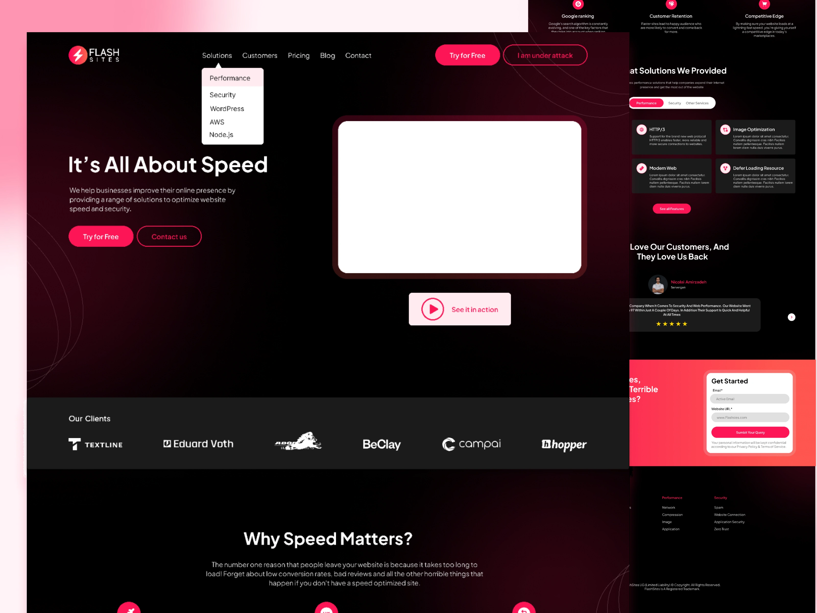
Hooray, we launched the landing page in November 2022! For confidentiality reasons, I have omitted the actual values for these metrics.
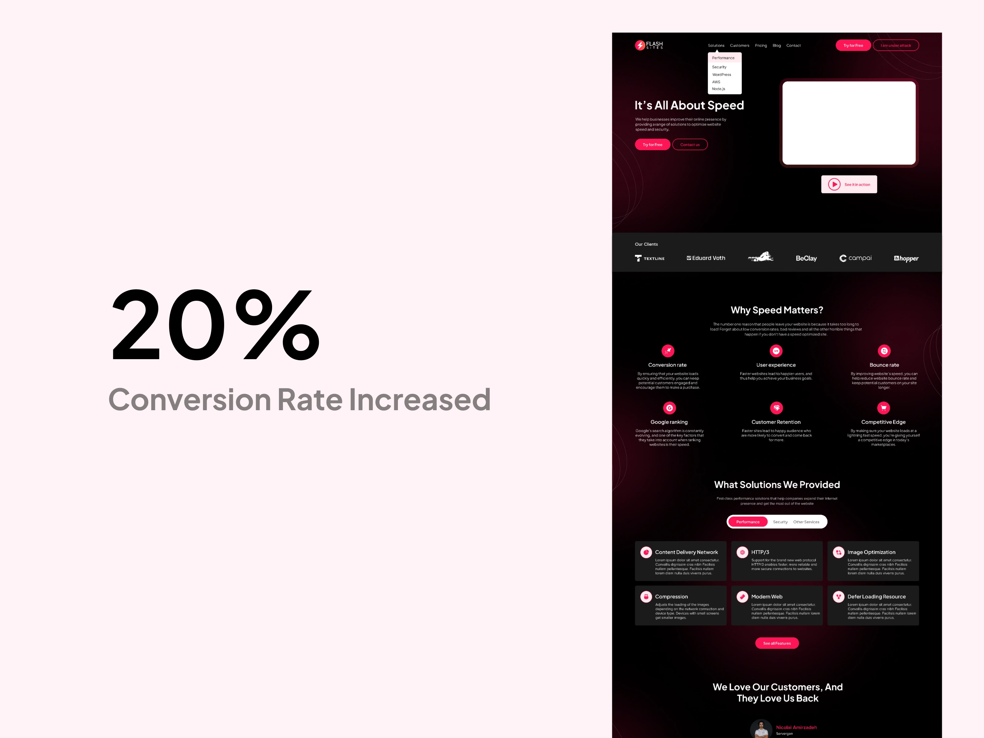
Flash Sites Homepage
The moment it goes live, we immediately saw a 20% increase in conversions to our website as compared to the old website.
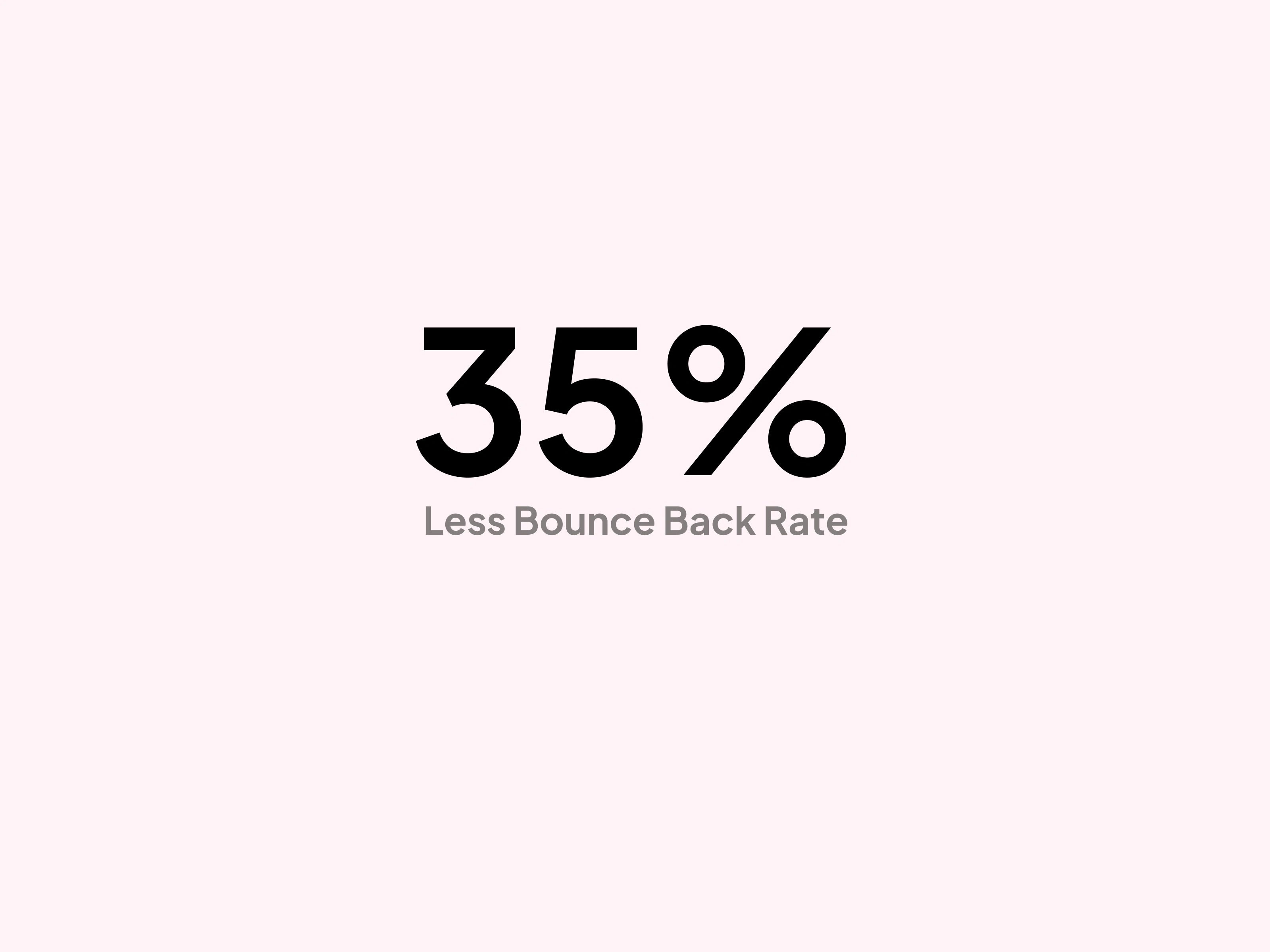
The bounce-back rate decreased to 35%.
Bounce rate is defined as the percentage of visitors that leave a webpage without taking an action (such as clicking on a button). The healthy bounce rate on our website is a sign that the content is relevant, engaging, or clear to visitors.
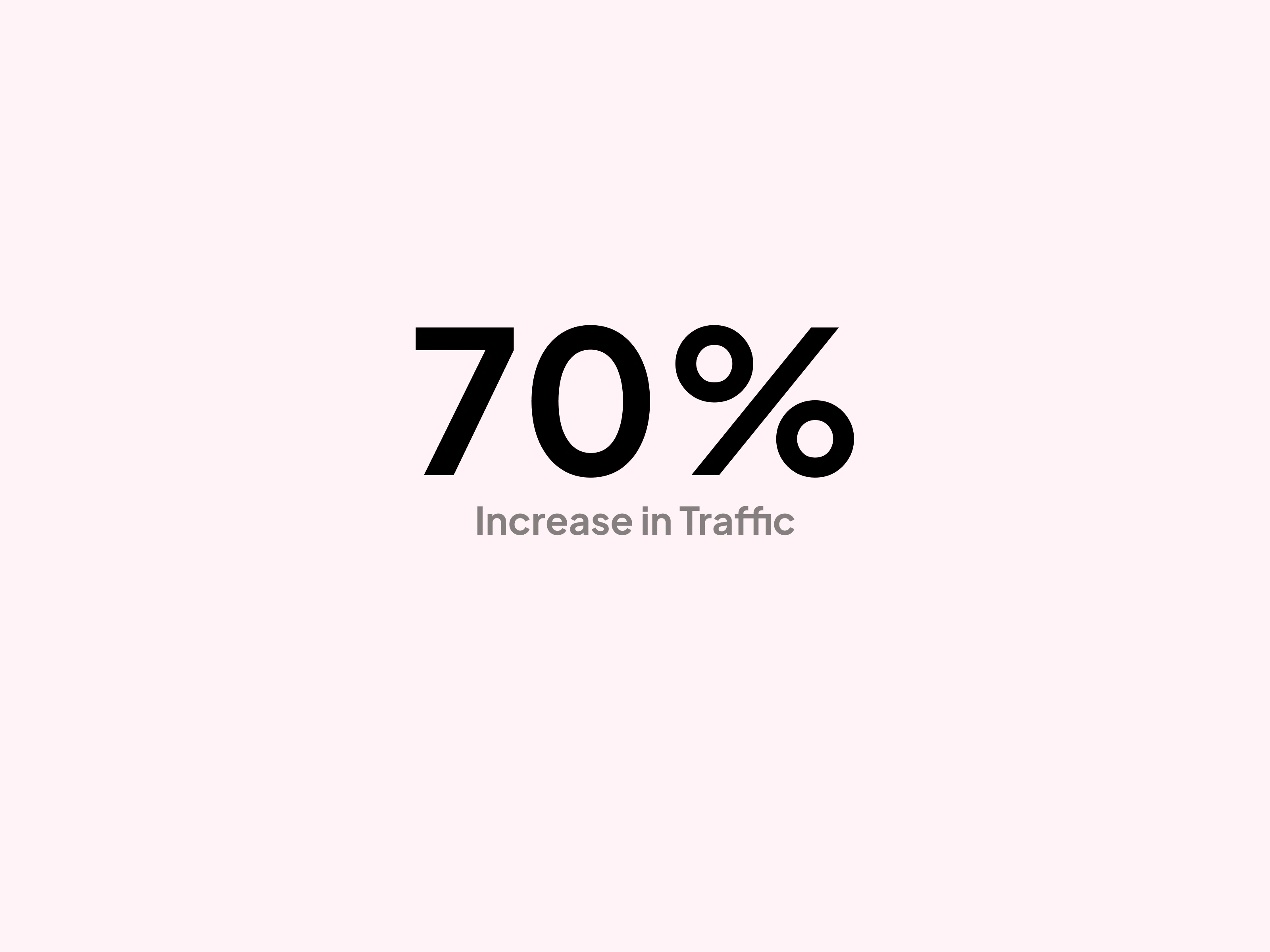
70% Increase in Traffic
Visitors are mainly from Germany, USA, and UK.
Design Approach
We started with a thorough analysis of the existing website to identify potential issues with the user experience of the old website. We identified a range of issues, including slow page loading times, outdated insufficient user flows, and inefficient navigation.
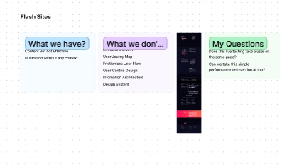
Discovery Workshop
Then instead of jumping onto the actual design, we discover some of the existing platforms to study them and analyze their user flows.
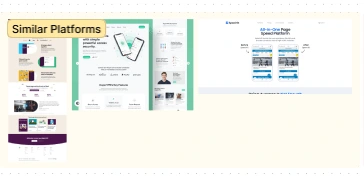
Similar Platforms
Based on our findings, we decided to redesign the website from scratch. We created a modern and sleek design that reflected the company's brand identity while ensuring a user-centric design approach.
Final Design
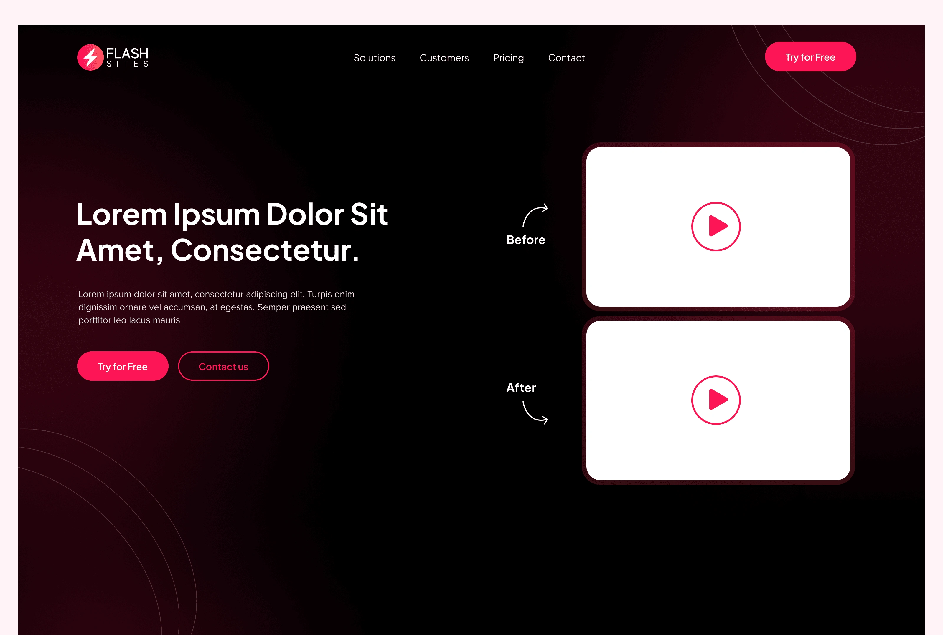
Before and After (Homepage)
Before the redesign, there was a lack of focus on what Flashsites offers. The website was cluttered. The design language was inconsistent.
Here's a detailed walkthrough of what I improved.
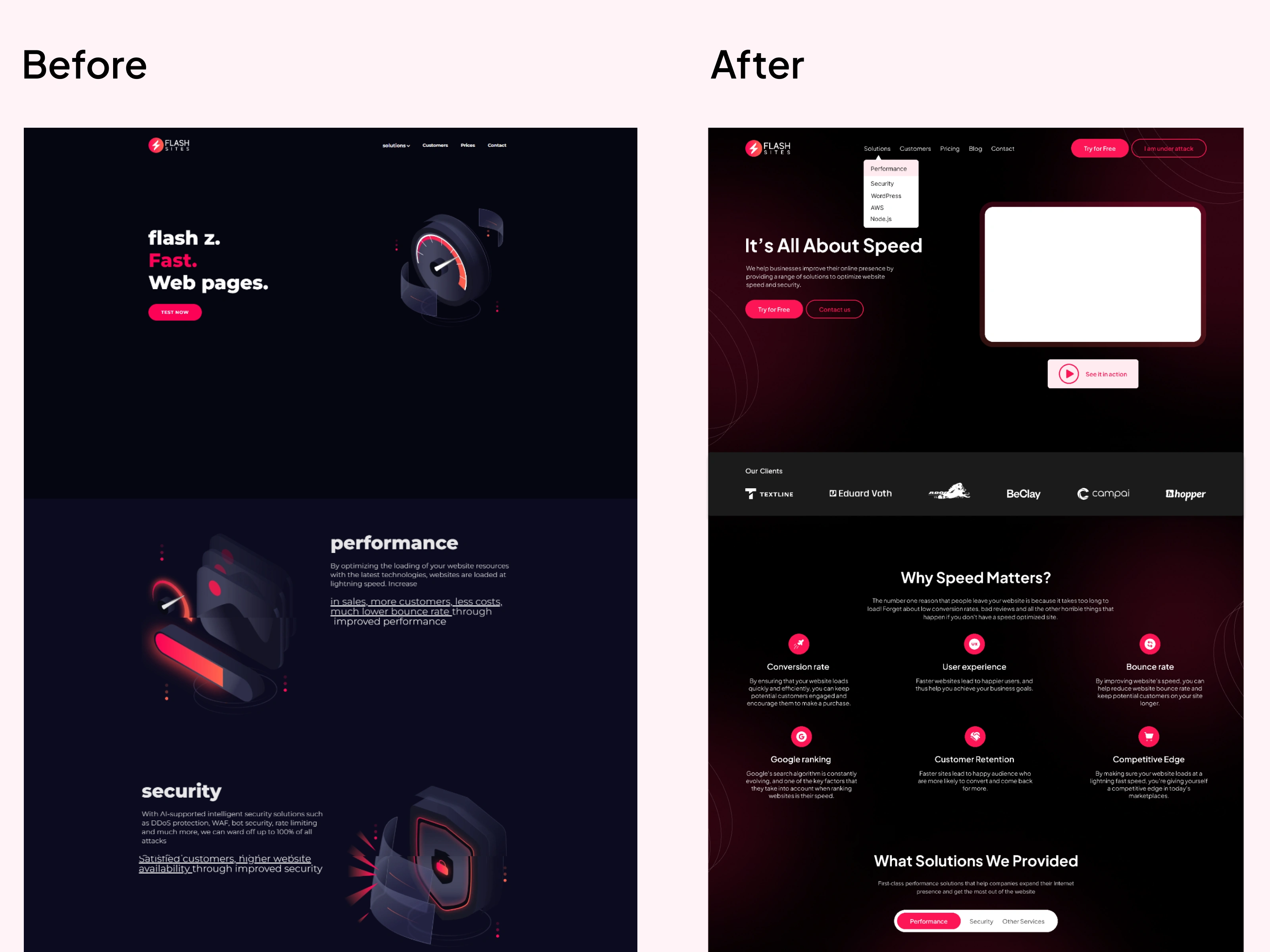
Before and After Homepage Design
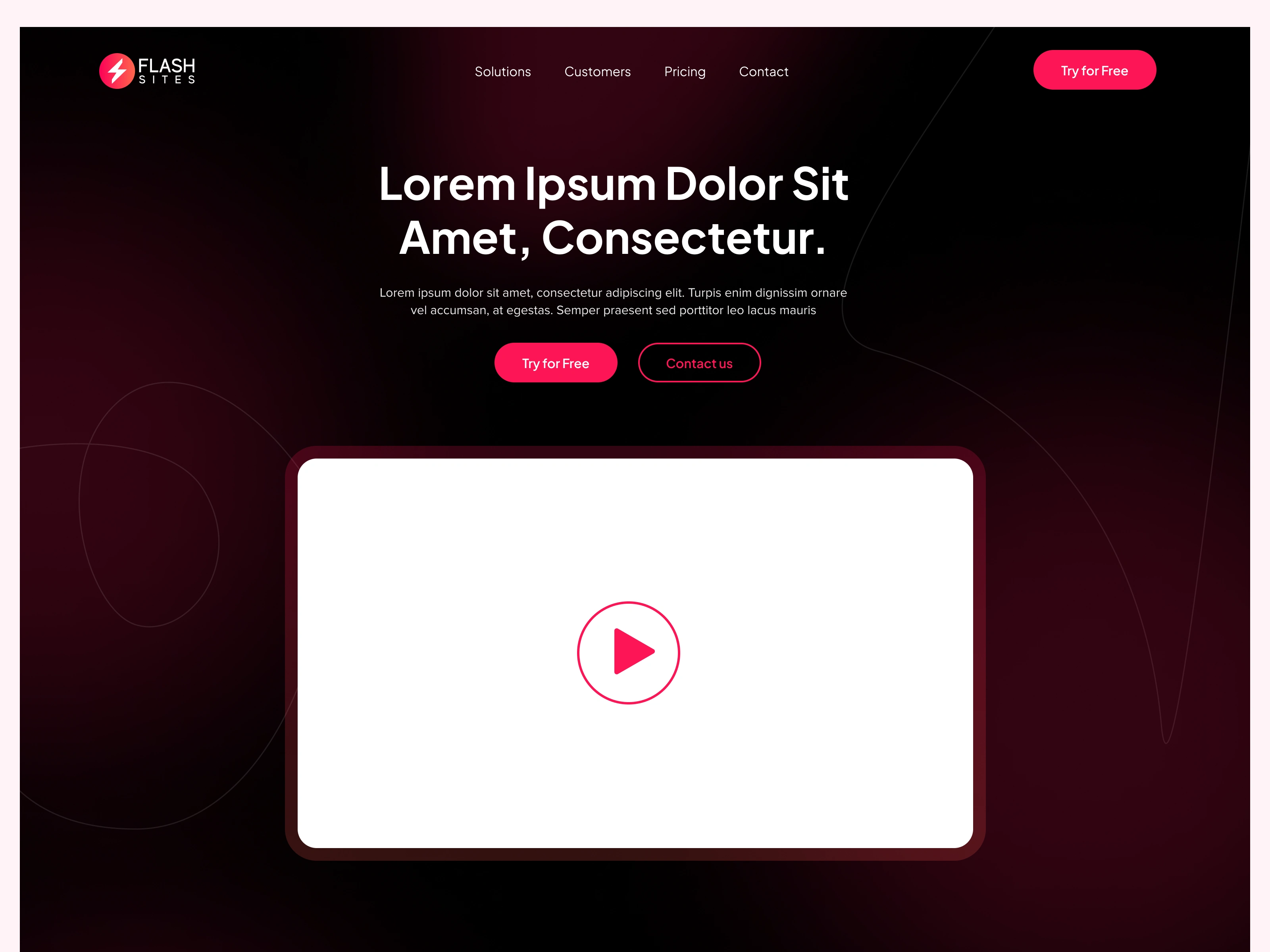
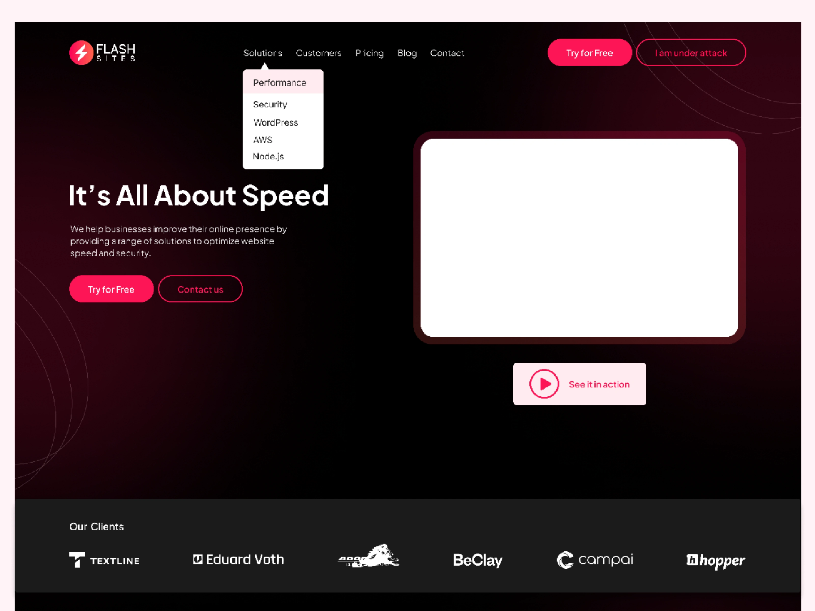
I have also designed 3 different homepage designs for Flashsites.
Social Proof
Social Proof is good to build trust on your website.

Social Proof
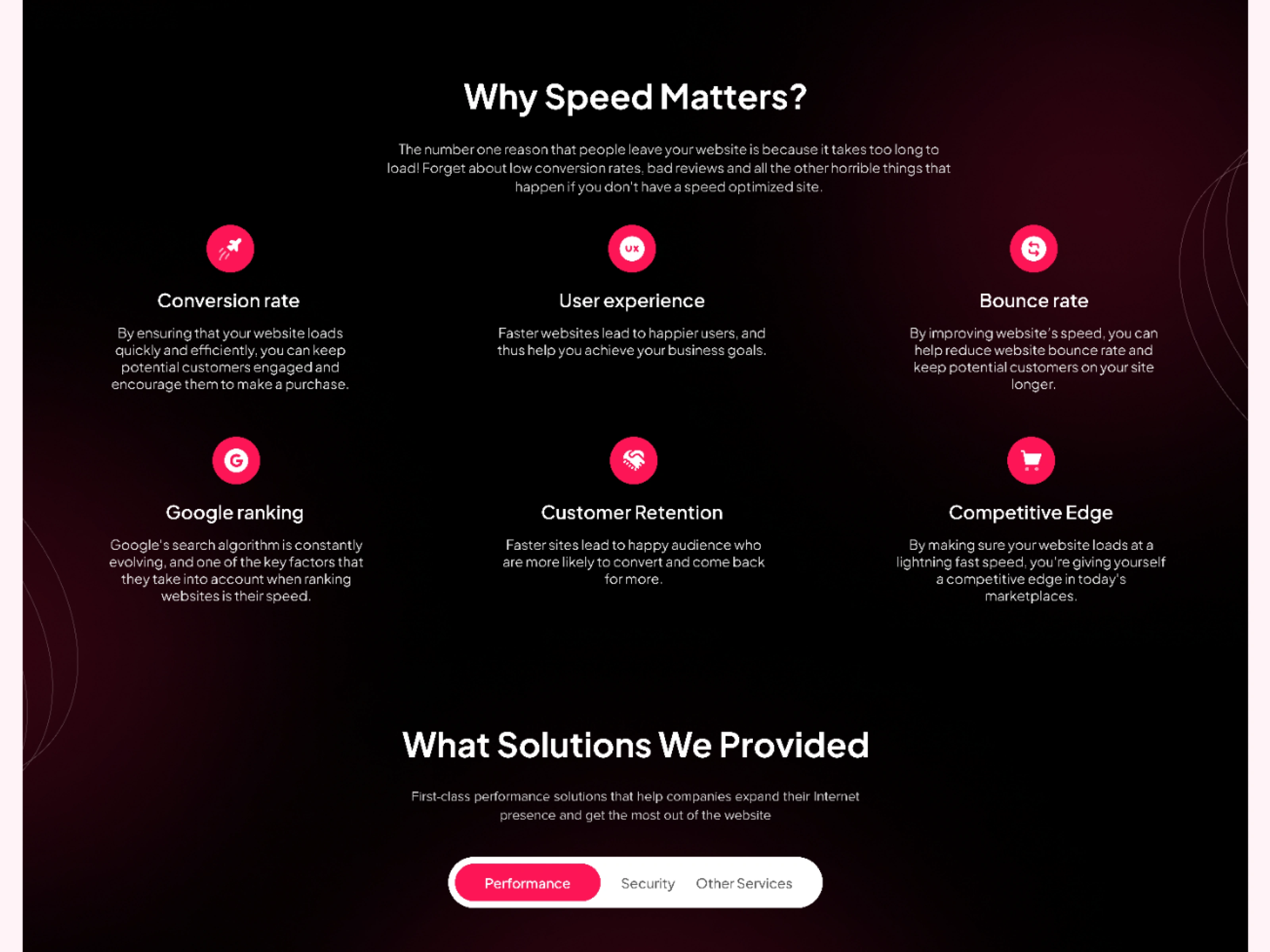
Why Choose us?
This section describes the USP of Flash Sites.
What Services do we Provide?
A glimpse of the user what they are looking for on this site.
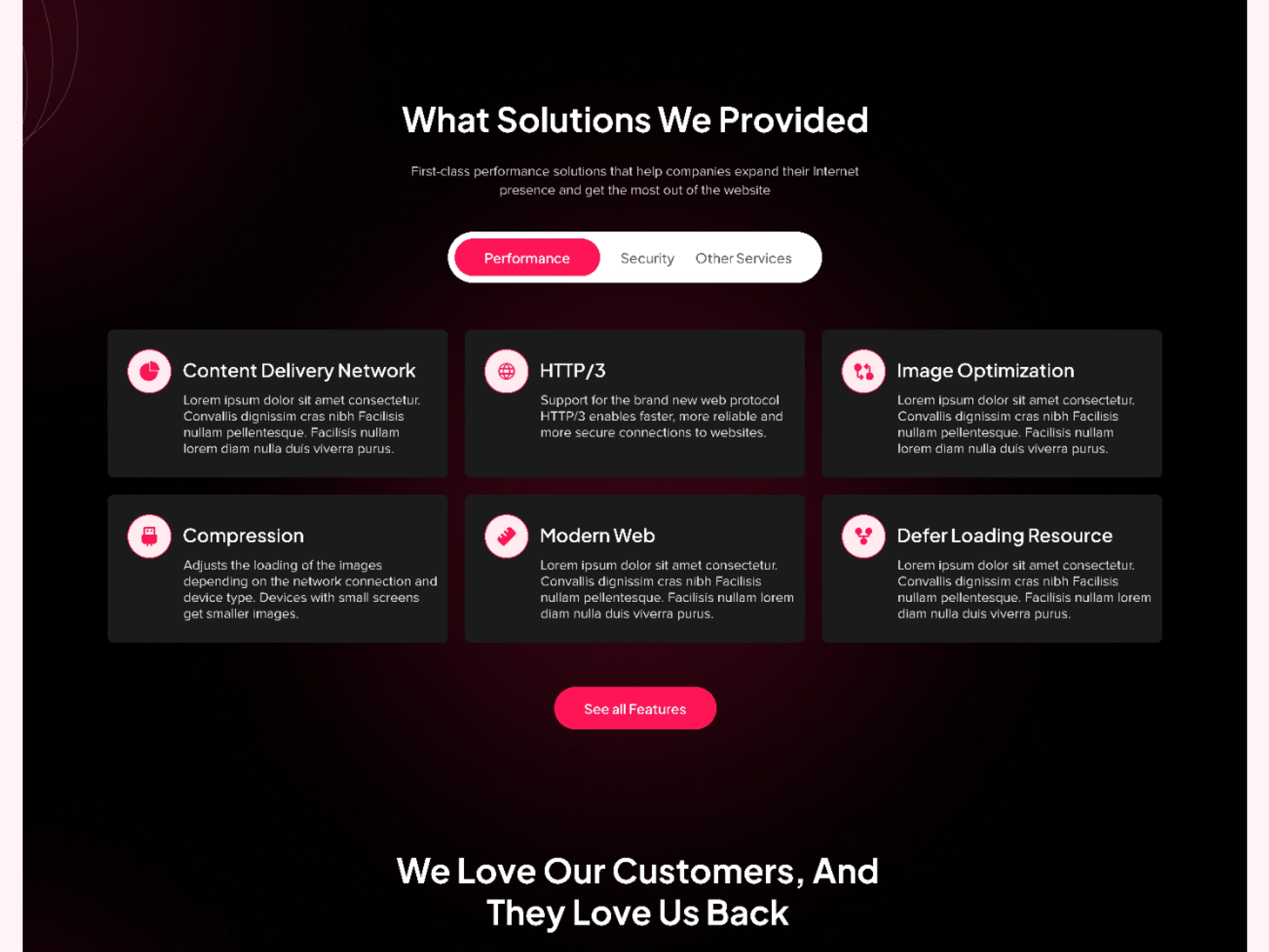
Services Section
Testimonials to Build Trust
Testimonials have been placed here to build trust among the users.
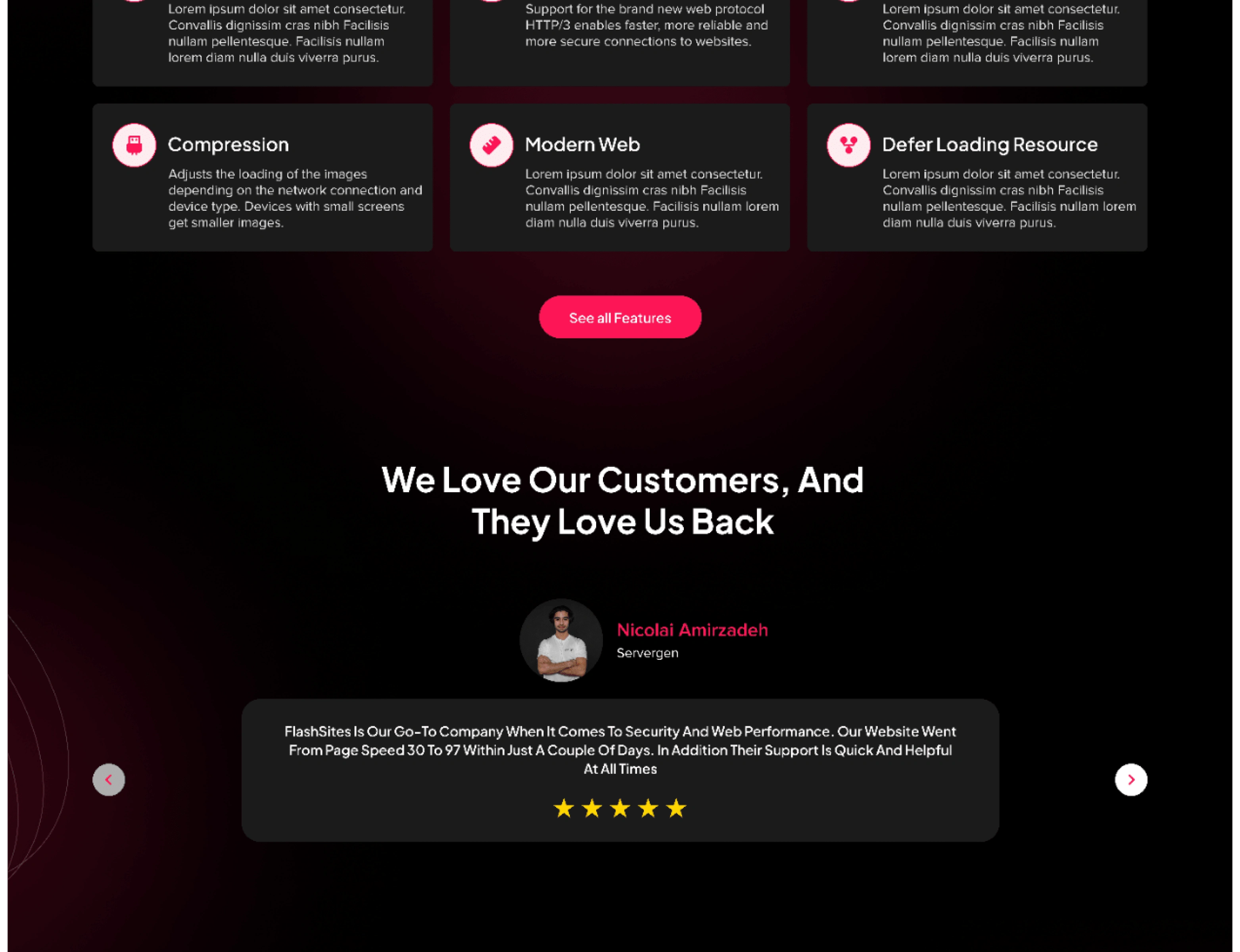
Testimonials
Call to Action (CTA)
Now we have shown the user value CTA is placed here to tell the user if he wants to buy any service from them they can contact a service provider.
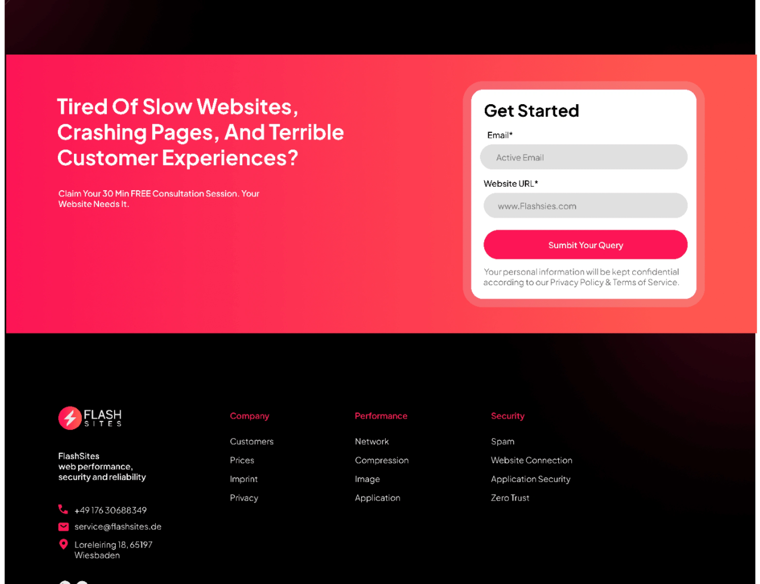
CTA (Call to Action)
Updated Services Page
Finally, we eliminate all the friction points on the services page and allow users to surf easily through the services page.
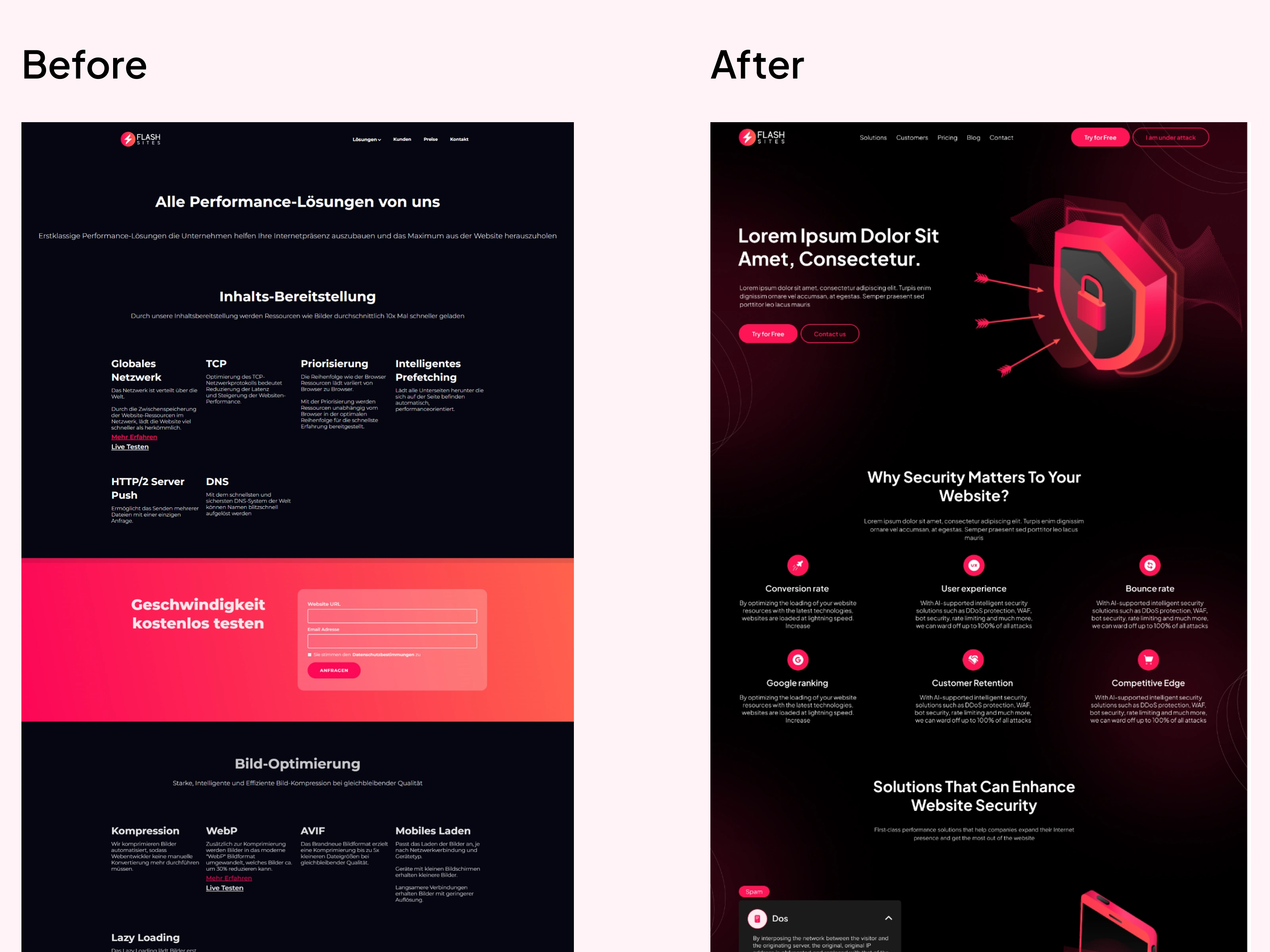
Service Page
Result
The website's modern design and optimized user journey also resulted in increased engagement and conversions. The bounce rate decreased by 35%, and the average session duration increased by 50%. The number of leads generated through the website also increased by 20%.
My Learnings
The redesign of the cyber security company's website was a great success, providing a modern, secure, and optimized website that delivered a seamless user experience across all devices. My focus on enhancing the user experience resulted in a highly effective website that met all of the company's objectives, ultimately contributing to its continued growth and success.
Explore the website at:
Like this project
0
Posted Feb 17, 2023
Flash Sites is one of the leading cyber security agencies in Europe. They approached me with a request to redesign their website.
Likes
0
Views
28


