Landing Page for SaaS Web-Based Application
Short Case Study about SaaS Landing Pages
About the Project
Timeline Aug 2022
Platform Design a Landing Page for more Bookings
My Role Product Designer
Introduction
Ringo is a Software as a Service (SaaS) platform that provides a modern, user-friendly solution for project management. The platform is designed to help businesses of all sizes organize their projects, tasks, and communication processes.
Challenge
When Ringo first launched, it struggled to gain traction and attract customers despite its potential to improve the project management experience.
The landing page was cluttered, and confusing, and did not effectively communicate the value proposition of the platform.
As a result, potential customers were not able to understand what Ringo offered and how it could benefit their organization.
Solution
Header Section
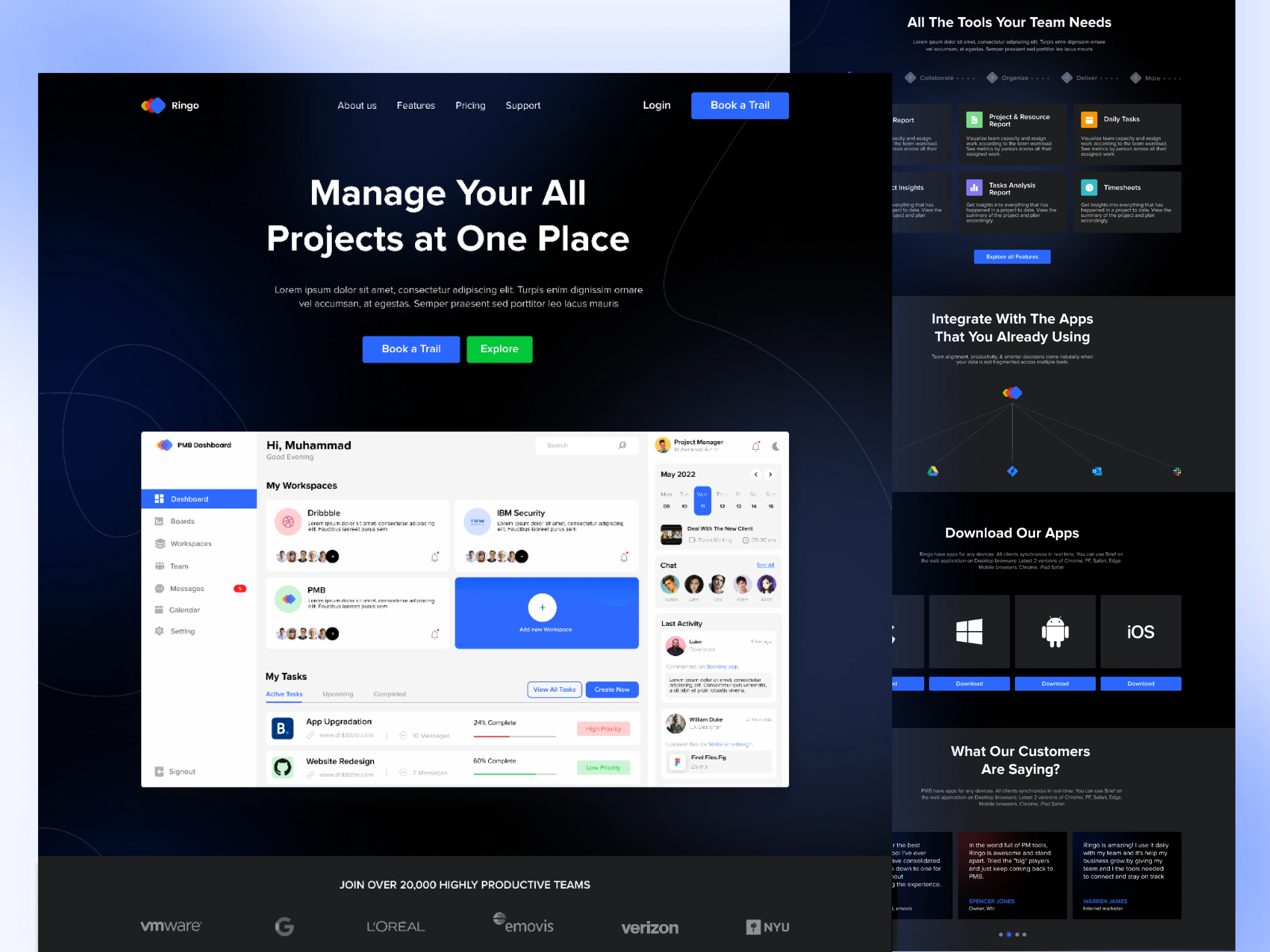
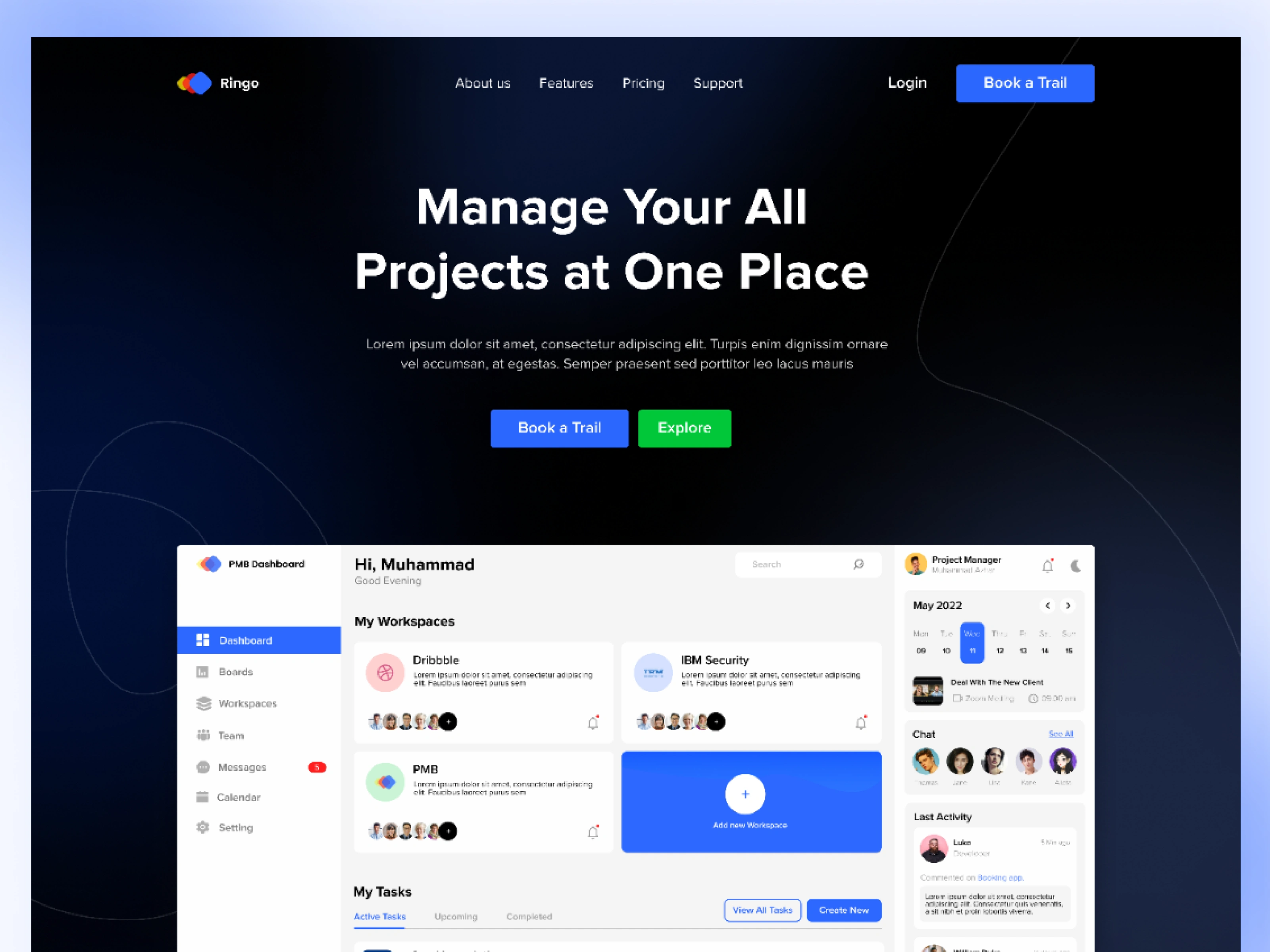
I showed a screenshot of the actual project management dashboard for the purpose of creating attention for the user to scroll down.
Header Section
Make it relatable
In this section, I placed company logos that are using Ringo as their PMB and after that, I mention features of the PMB.
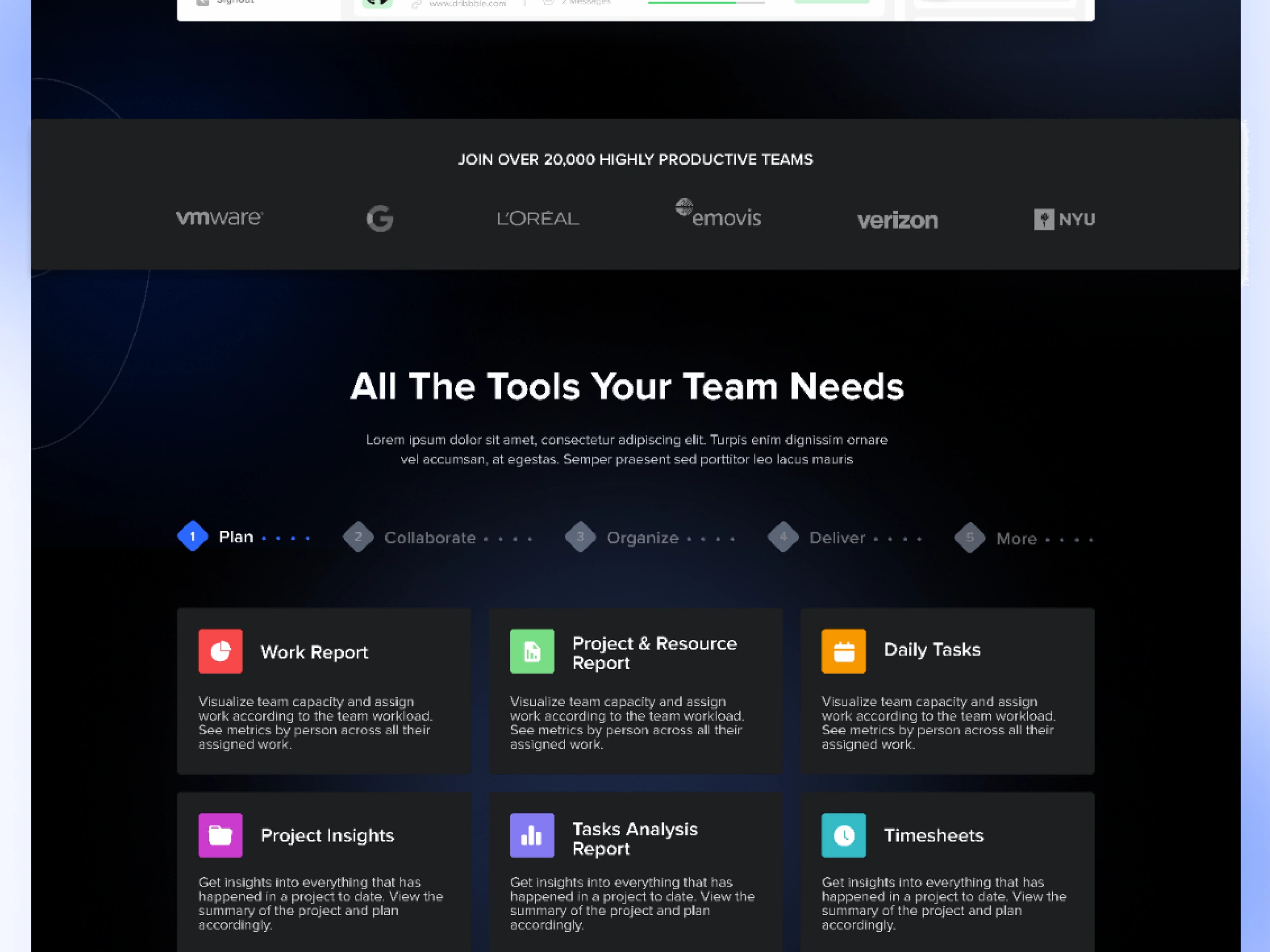
Social Proof and Features
Integrations they offer
Listing down a few of the integrations in a visual style that Ringo Offers.
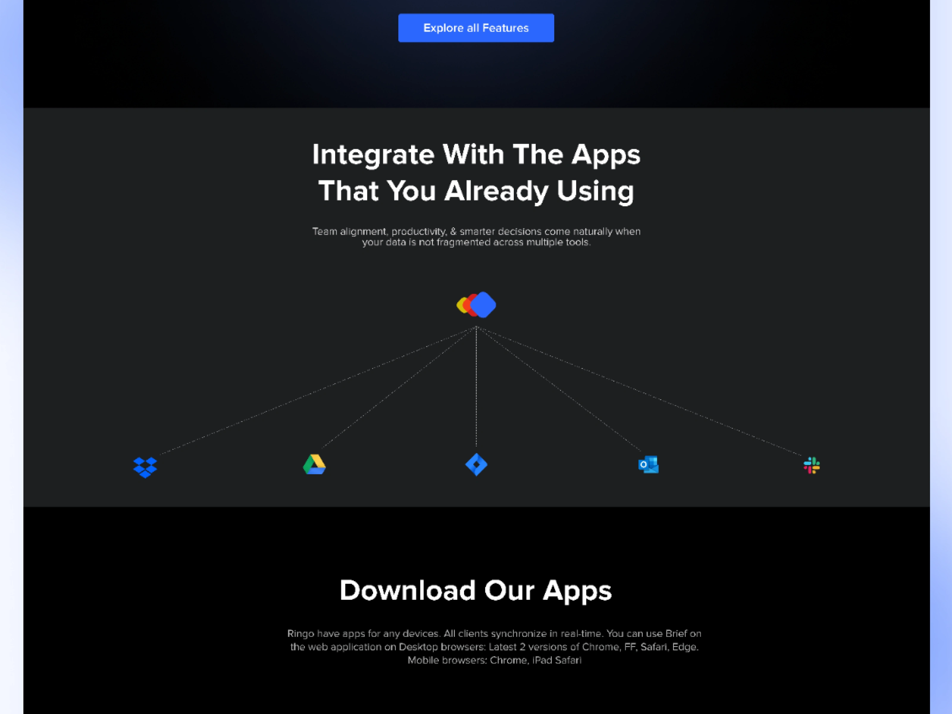
Integrations
Ask them to download
For a better user experience, I list down all the apps along with the link so that users can easily download them.
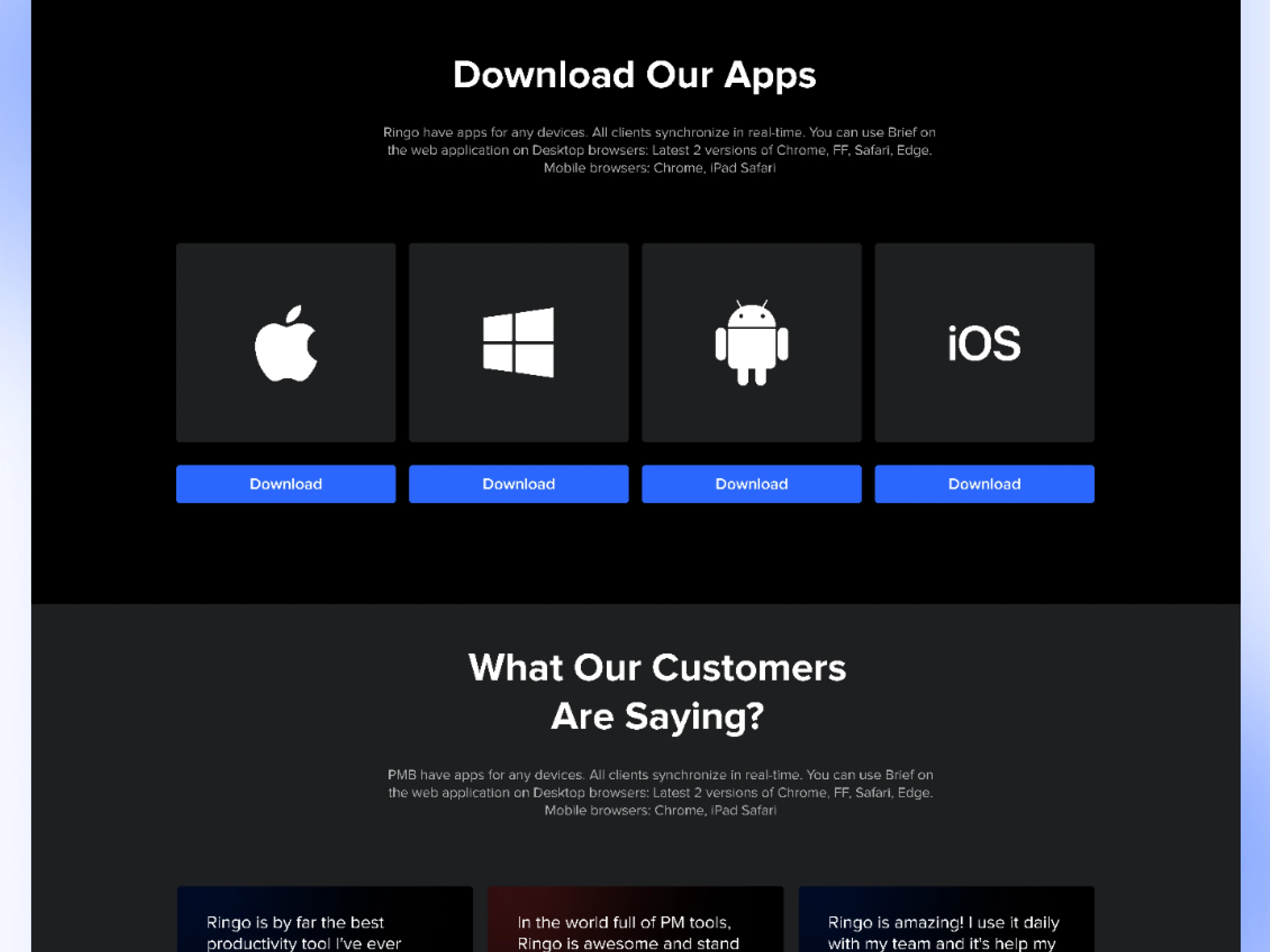
App Links
Testimonials and CTA
Again Social Proof along with the CTA for bookings.
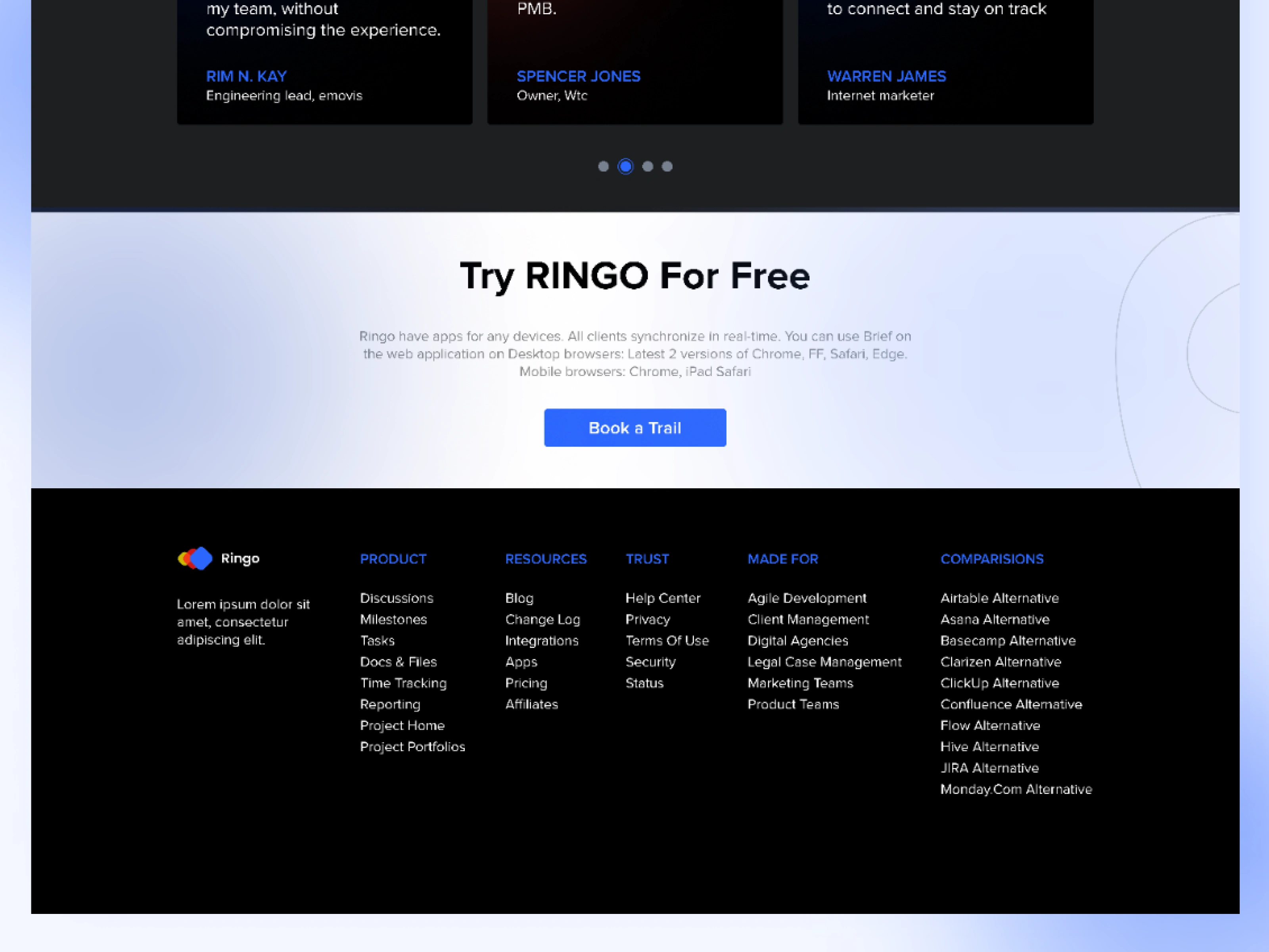
Results
As a result of these efforts, Ringo began to gain traction and attract more customers.
The simplified landing page design and targeted marketing campaigns helped potential customers understand the value of the platform and how it could benefit their organization.
Explore More:
Like this project
0
Posted Feb 18, 2023
When Ringo first launched, it struggled to gain traction and attract customers despite its potential. The landing page was cluttered, confusing, and did not....
Likes
0
Views
9


