Built with Framer
eSIM: Modernizing Travel Connectivity
For this eSIM company specializing in Turkey travel connectivity, I undertook a comprehensive website redesign. The goal was to create a modern, user-friendly platform that showcases the convenience and innovation of eSIM technology.
Key Features:
Neuro Web Design Principles: The layout and user flow were designed based on cognitive psychology, ensuring intuitive navigation and encouraging user engagement. Key information and call-to-action buttons are strategically placed to optimize conversion rates.
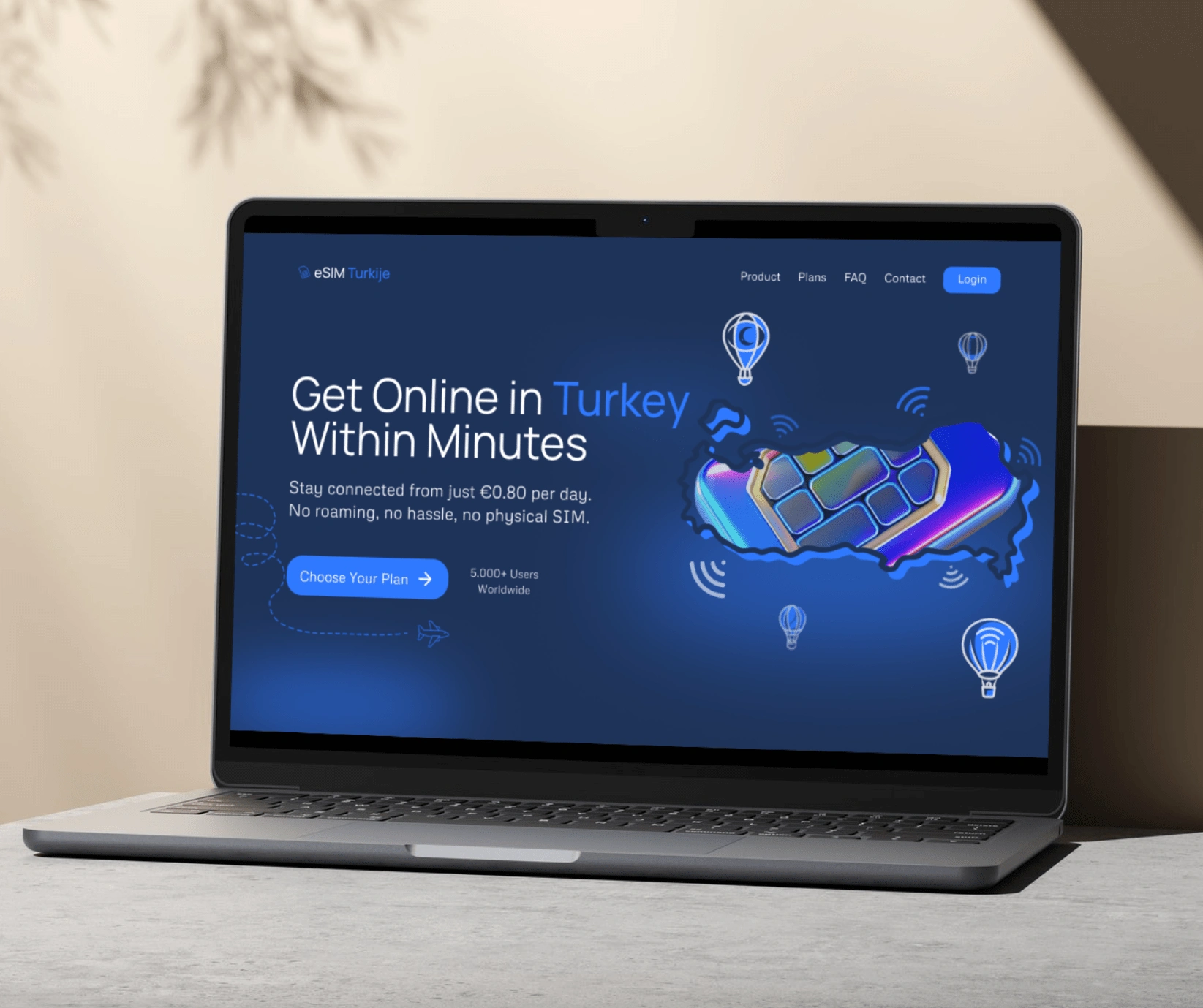
New Design Dark Mode
Custom Graphics: I created bespoke illustrations, including a stylized eSIM card and hot air balloons, which blend Turkey's iconic imagery with modern tech elements. These graphics not only enhance the visual appeal but also help explain eSIM concepts in an accessible way.
Dual Mode Design: The site features both light and dark modes. The dark mode, in particular, emphasizes the tech-forward nature of the product, using contrasting colors and subtle glow effects to create a futuristic feel.
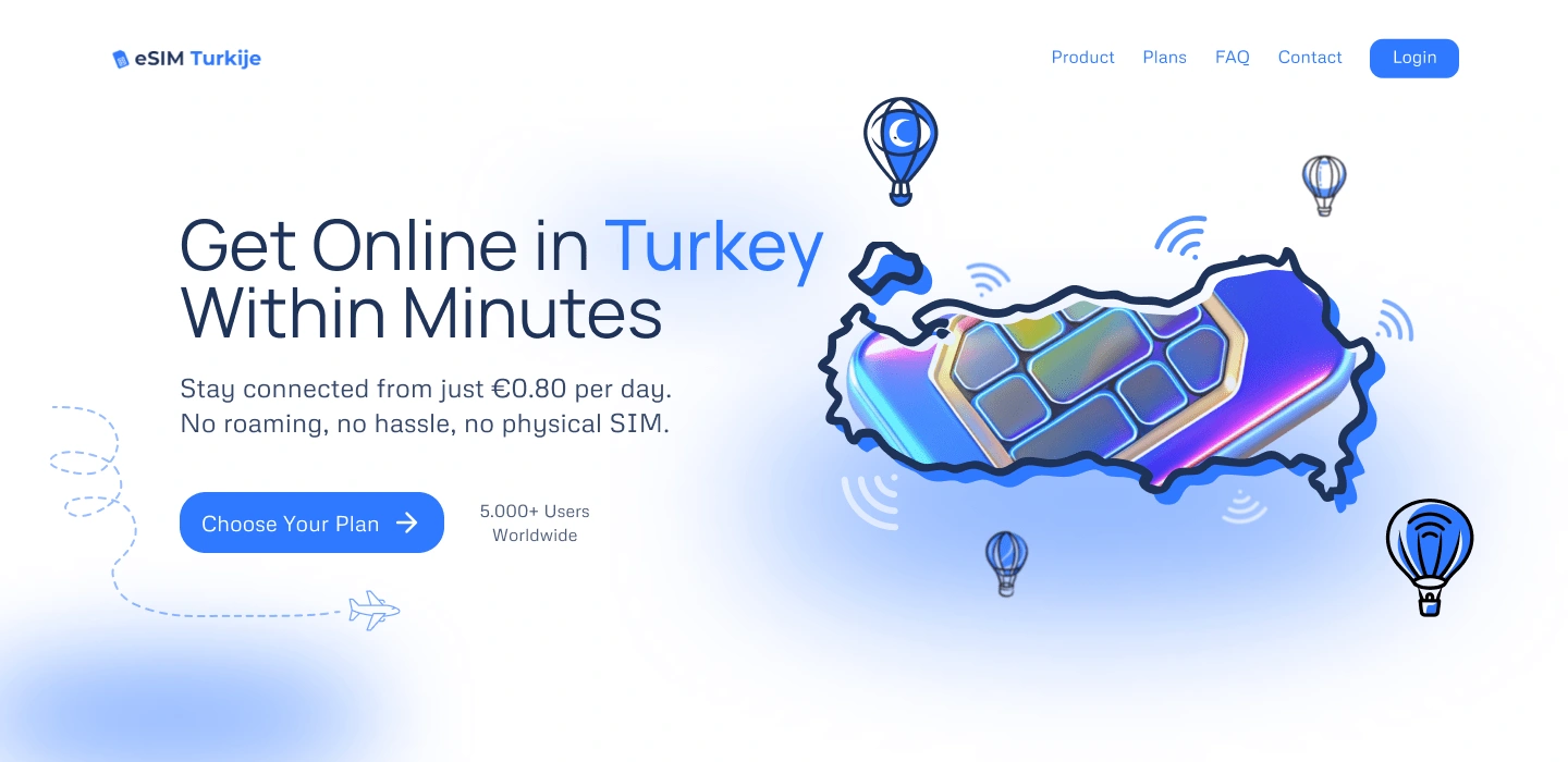
Lightmode
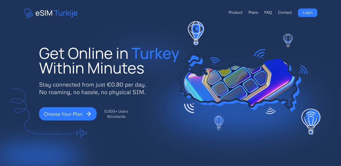
Darkmode
Mobile-First Approach: Given the nature of the product, the design prioritizes mobile users, ensuring a seamless experience for travelers accessing the site on the go.
The result is a website that not only looks modern and tech-savvy but also effectively communicates the benefits of eSIM technology for Turkey travelers. The design balances aesthetics with functionality, creating an engaging platform that caters to both tech-enthusiasts and casual travelers alike.
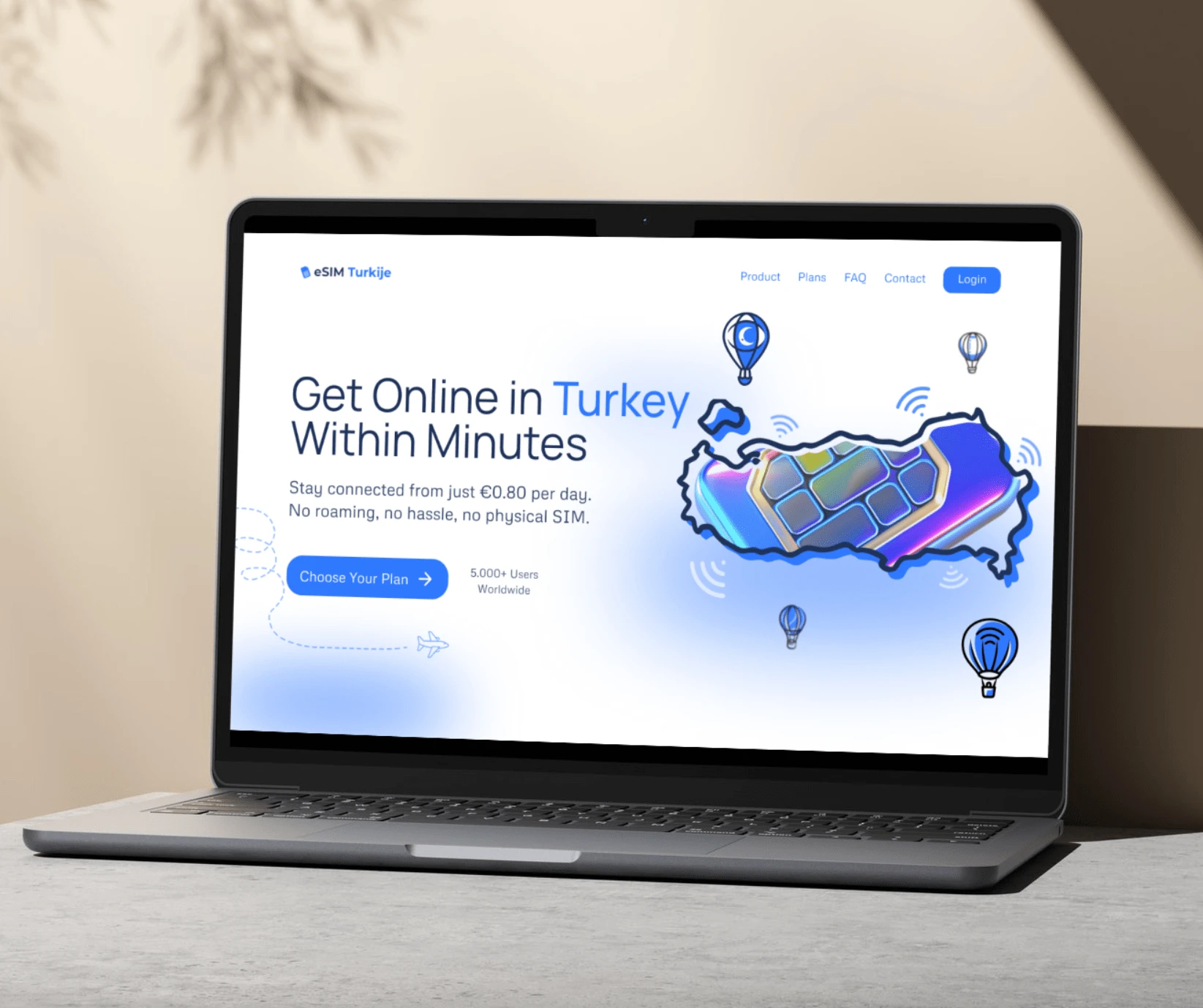
New Version Light Mode
Like this project
Posted Oct 15, 2024
Redesigned an eSIM company's website for Turkey travel. Applied neuro web design principles, created custom graphics, and implemented a sleek dark mode.

