Bean: Comfort Redefined in Web Design
For Bean, a company specializing in beanbags, I designed a website that embodies comfort and modern aesthetics. The project focused on creating a digital space that mirrors the relaxation and style their products offer.
Key Features:
1. Soothing Color Palette:
I chose an earthy color scheme that resonates with comfort and natural materials. Warm browns, soft greens, and muted terracottas create a welcoming atmosphere throughout the site.
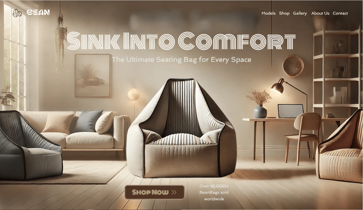
2. Tranquil Hero Section:
The hero section features a background that immediately evokes a sense of peace and comfort. Gentle animations of beanbags in various settings showcase the versatility and coziness of Bean's products.
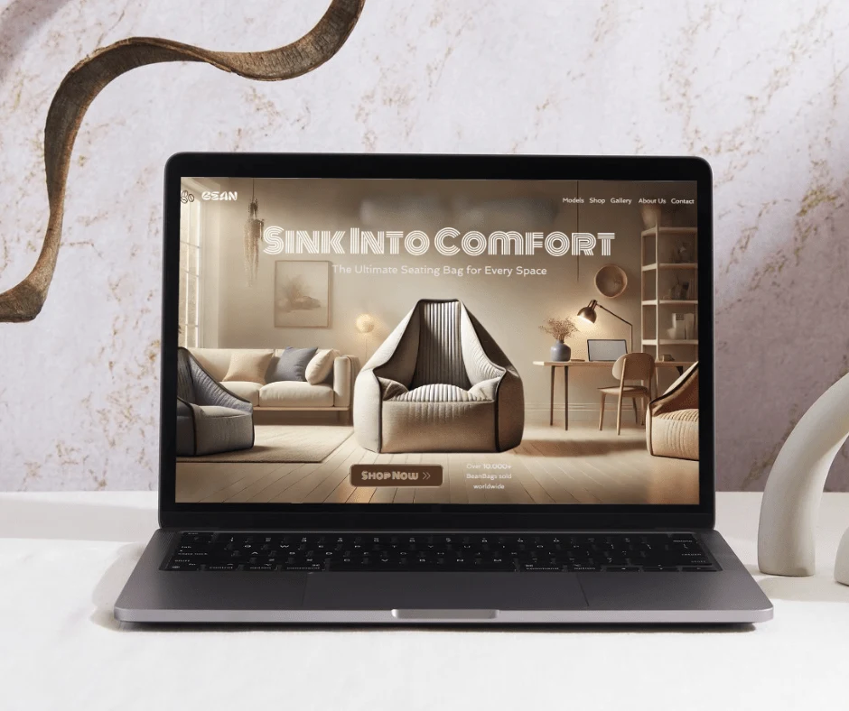
Bean Hero Section
3. Engaging Product Grid:
I designed an interactive product grid that allows visitors to explore Bean's range of beanbags effortlessly.
4. Dynamic Product Slider:
Integrated within the product section is a smooth, responsive slider. This feature enables users to swipe or click through featured products, providing a tactile, app-like experience that's especially effective on mobile devices.
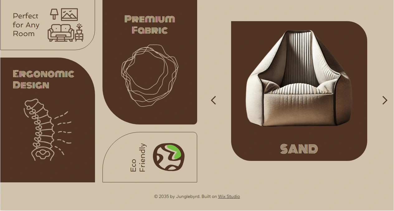
Bean Product info Grid Section
5. Responsive Design:
The website is fully responsive, ensuring that the comfort Bean promises is reflected in the user experience across all devices.
The result is a website that not only showcases Bean's products but also immerses visitors in the comfort and style the brand represents. Through soothing visuals, intuitive navigation, and interactive elements, the site creates an online experience that aligns perfectly with Bean's brand identity.
Like this project
Posted Sep 14, 2024
Created a modern, earthy website for Bean, a beanbag firm. Features serene hero section and an engaging product grid with slider, showcasing comfort and style.


