Certum.AI: Eco-Scoring Dashboard Reimagined
For Certum.AI, a startup providing AI-driven environmental friendliness scoring for banks' investment decisions, I undertook a comprehensive redesign of their dashboard interface.
Old version:
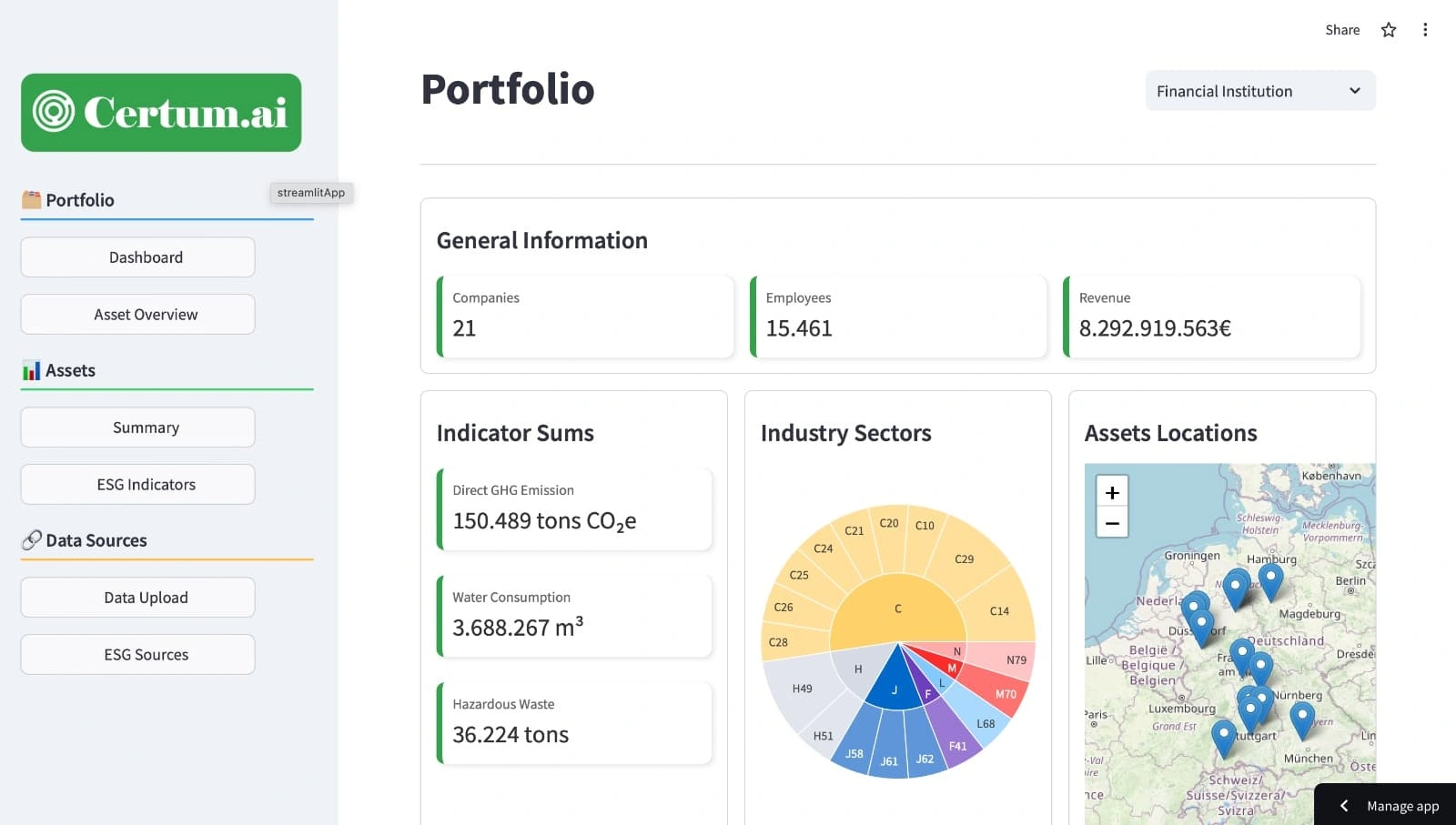
Certum AI OLD Dashboard Version
NEW Version:
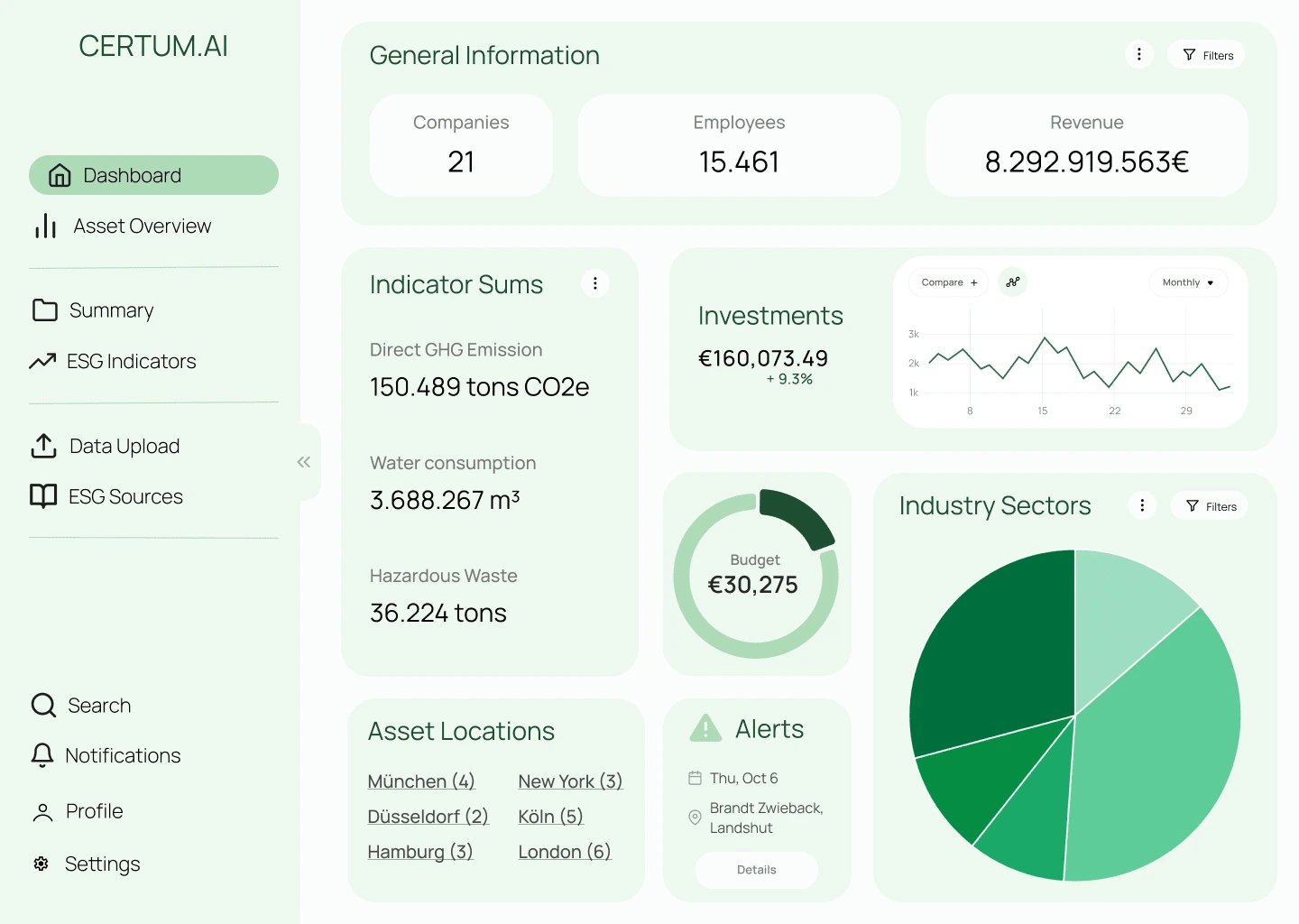
Certum AI NEW Dashboard Version
Key Improvements:
Streamlined UI: Replaced the cluttered, outdated layout with a clean, intuitive design that prioritizes essential information and improves overall usability.
Coherent Color Scheme: Developed a harmonious color palette that not only enhances visual appeal but also aids in data interpretation. Colors now consistently represent specific metrics or categories across the dashboard.
Typography Overhaul: Replaced outdated fonts with modern, highly legible typefaces. Implemented a clear typographic hierarchy to improve information scanning and readability.
Logo Overhaul: The old logo was given a modern and clean look to convey the Feeling of an AI financial Startup even better.
Enhanced Data Visualization: Redesigned charts and graphs to present complex environmental and financial data more clearly and engagingly, making it easier for banks to interpret and act on the information.
Intuitive Navigation: Restructured the dashboard layout to create a more logical flow of information, allowing users to access different sections and drill down into data effortlessly.
Responsive Design: Ensured the new dashboard is fully responsive, providing a consistent experience across various devices and screen sizes.
Customizable Widgets: Introduced customizable dashboard widgets, allowing users to personalize their view based on their most frequently used metrics or companies of interest.
Improved Accessibility: Incorporated accessibility features to ensure the dashboard is usable for individuals with various visual or motor impairments.
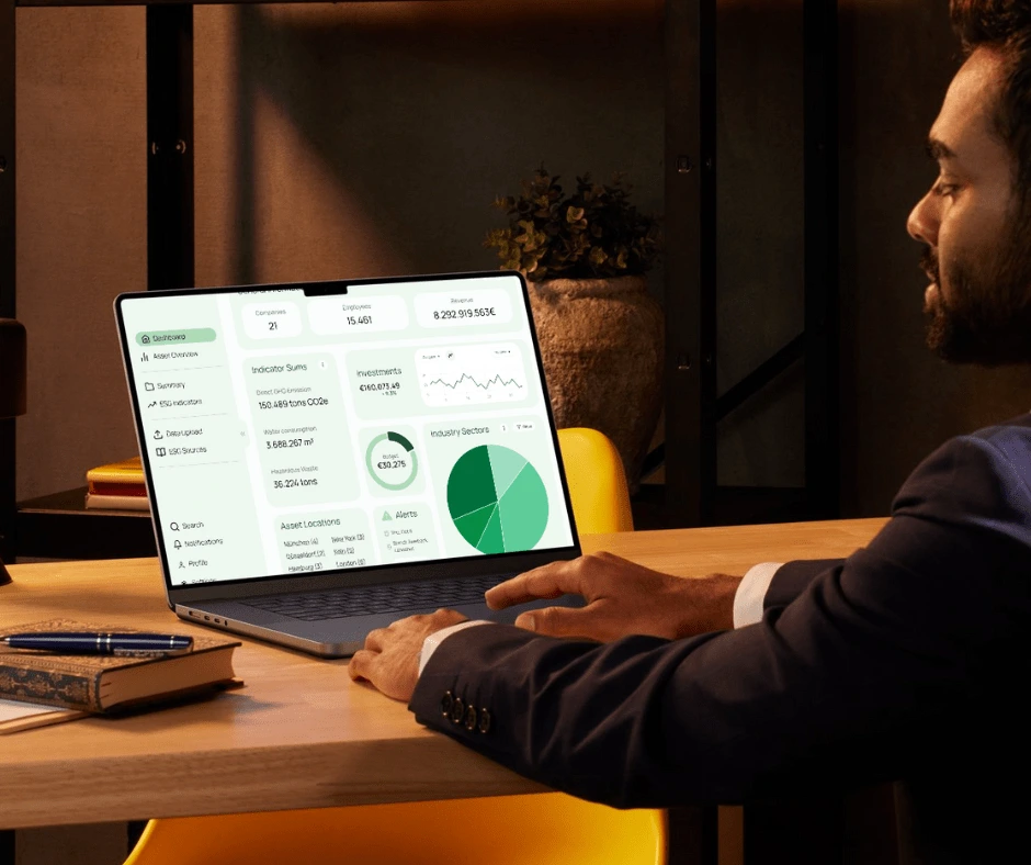
The redesigned dashboard not only modernizes Certum.AI's product aesthetically but also significantly enhances its functionality. The new interface allows banks to more efficiently assess the environmental impact of potential investments, supporting more informed and sustainable financial decisions.
Like this project
Posted Oct 15, 2024
Redesigned dashboard for Certum.AI, enhancing UI/UX for their AI-powered environmental scoring tool. Transformed outdated design into a clean coherent interface
Likes
0
Views
14

