Got Milk 2.0: Reimagining Dairy for the Digital Age
This fun side project challenged me to reimagine a everyday staple - milk - as a cutting-edge startup product. The goal was to create a website that would make milk feel fresh, exciting, and irresistibly shareable.
The design embraces a clean, modern aesthetic with a playful twist. A crisp white background serves as the canvas, reminiscent of milk itself, while splashes of color bring energy and excitement to the page. Typography is bold and contemporary, giving milk a voice that demands attention.
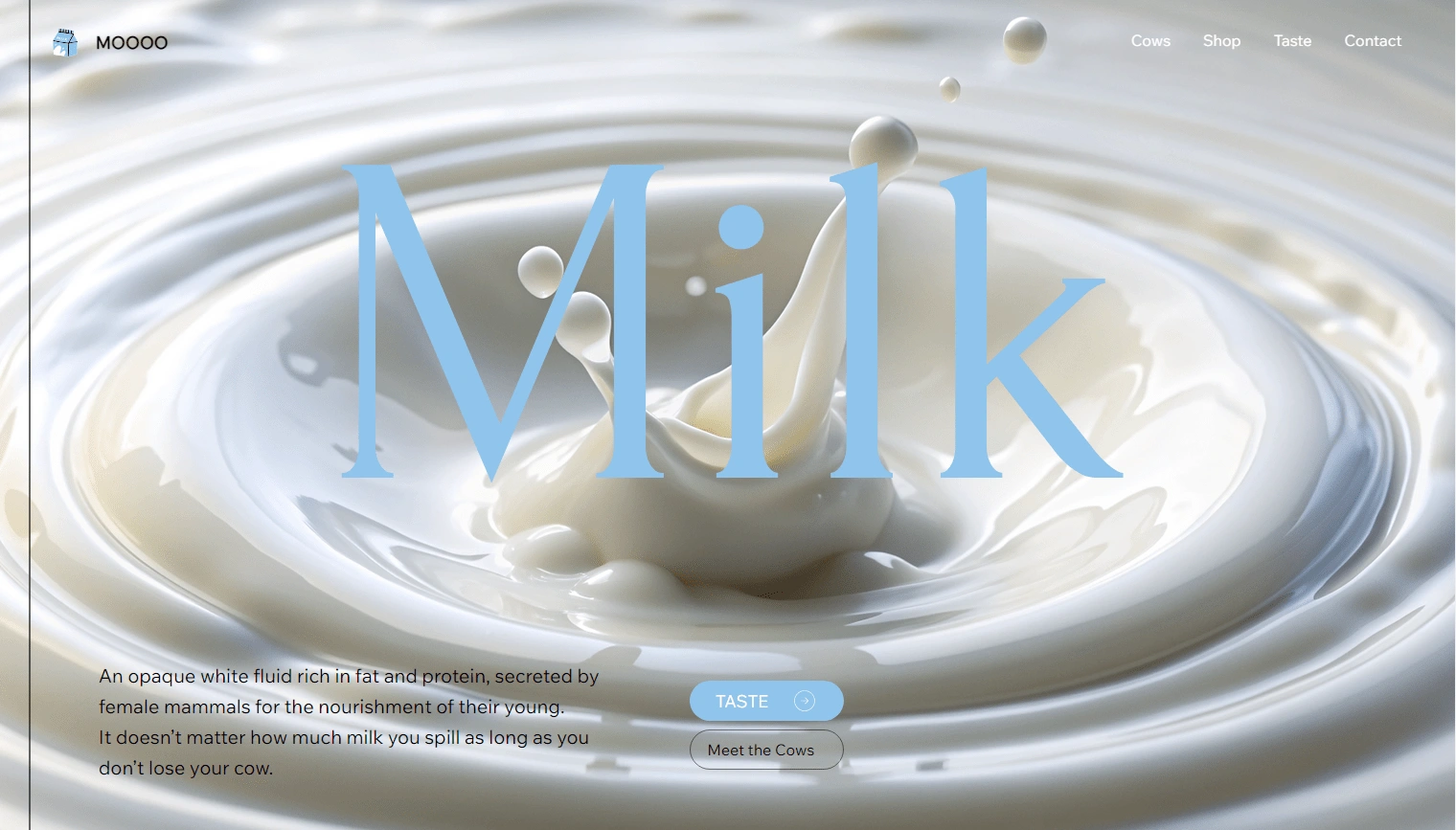
Milk Hero section
The star of the show is the interactive animations that bring the site to life. As users scroll, they're treated to a series of delightful micro-interactions.
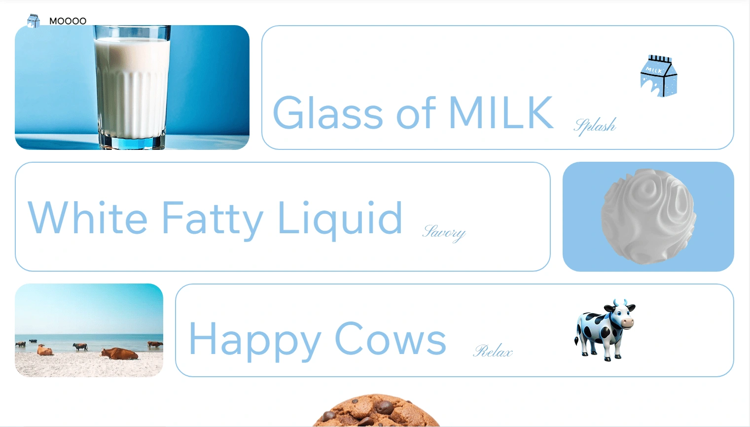
Milk Grid section
The piece de resistance is a scroll-triggered animation of a cookie dunking into a glass of milk. As users move down the page, the cookie descends, finally plunging into the milk with a satisfying "splash" effect. It's a nostalgic moment reimagined for the digital age.
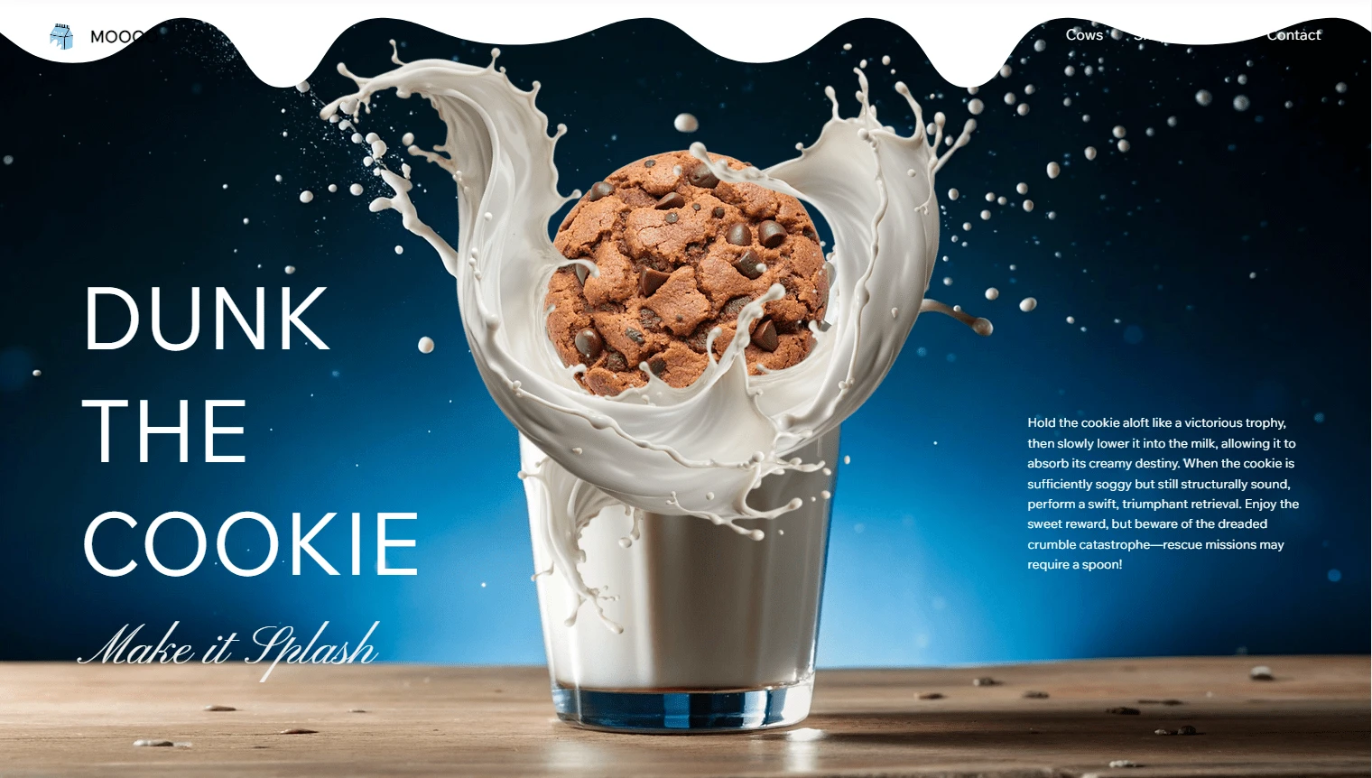
Cookie Dunk Section
Product features are presented as "milk products," each accompanied by quirky illustrations and subtle hover animations.
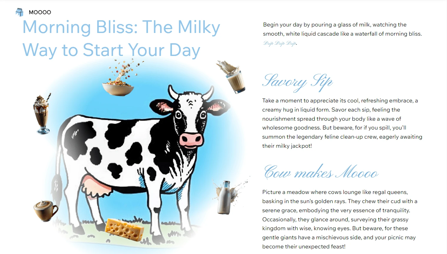
Milk Products Mouse Hover Section
This project was an exercise in creativity, challenging conventional web design norms and proving that with the right approach, even the most everyday products can be presented in an exciting, digital-first way. It showcases my ability to think outside the box and create engaging, memorable web experiences that capture attention and spark joy.
You want to see me build this website Live? Then checkout my Youtube Video
Like this project
Posted Aug 16, 2024
Created a playful website for milk as a startup product. Features modern design, exciting animations, and scroll-triggered interactions like a cookie dunk.
Likes
0
Views
14

