CLASS 247 Brand Identity Design
"We are a hub for creatives looking to explore, get inspired, realign their personal style, and/or connect with other creatives."
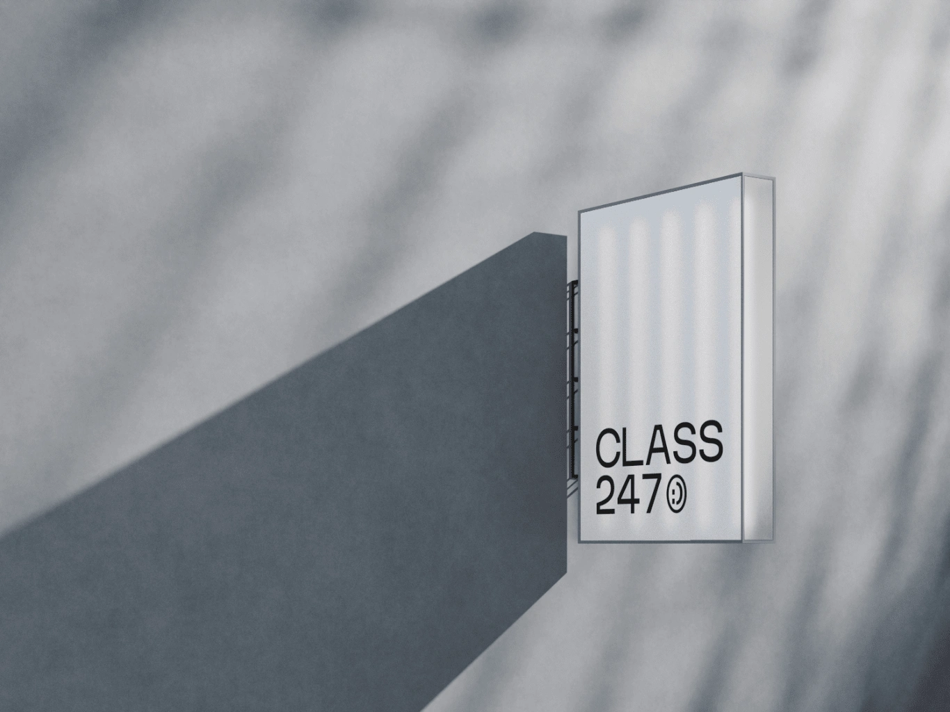
About the Brand
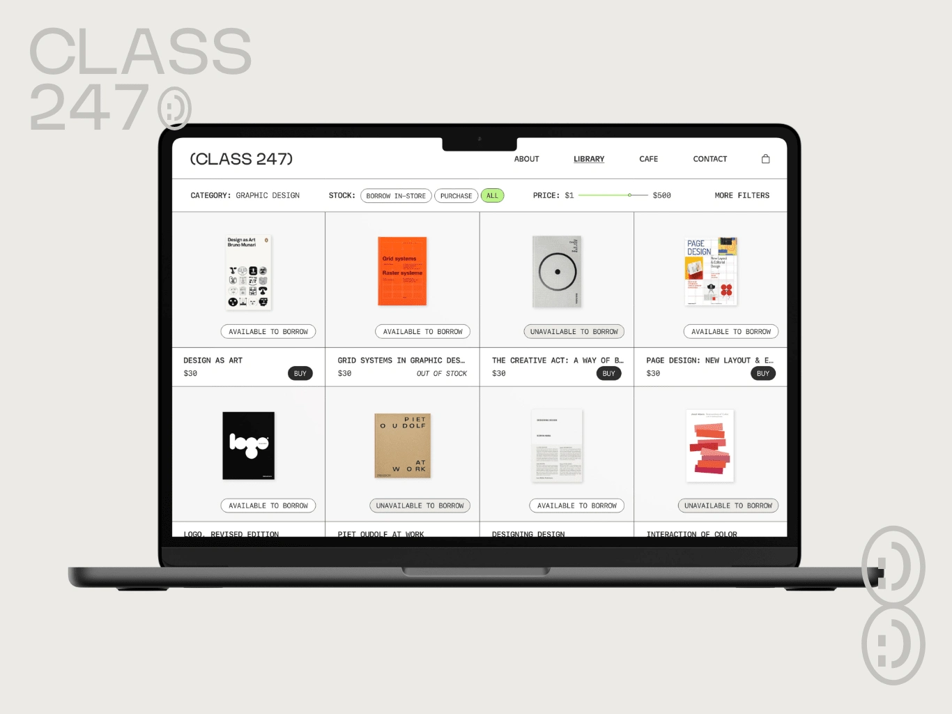
CLASS 247 is a library + coffee shop hybrid space curated by and made for the everyday creative. Sometimes, the best inspiration comes simply from sitting down with a good book and a cup of coffee. It is a hub for those looking to explore, get inspired, realign their personal style, and/or connect with other creatives.
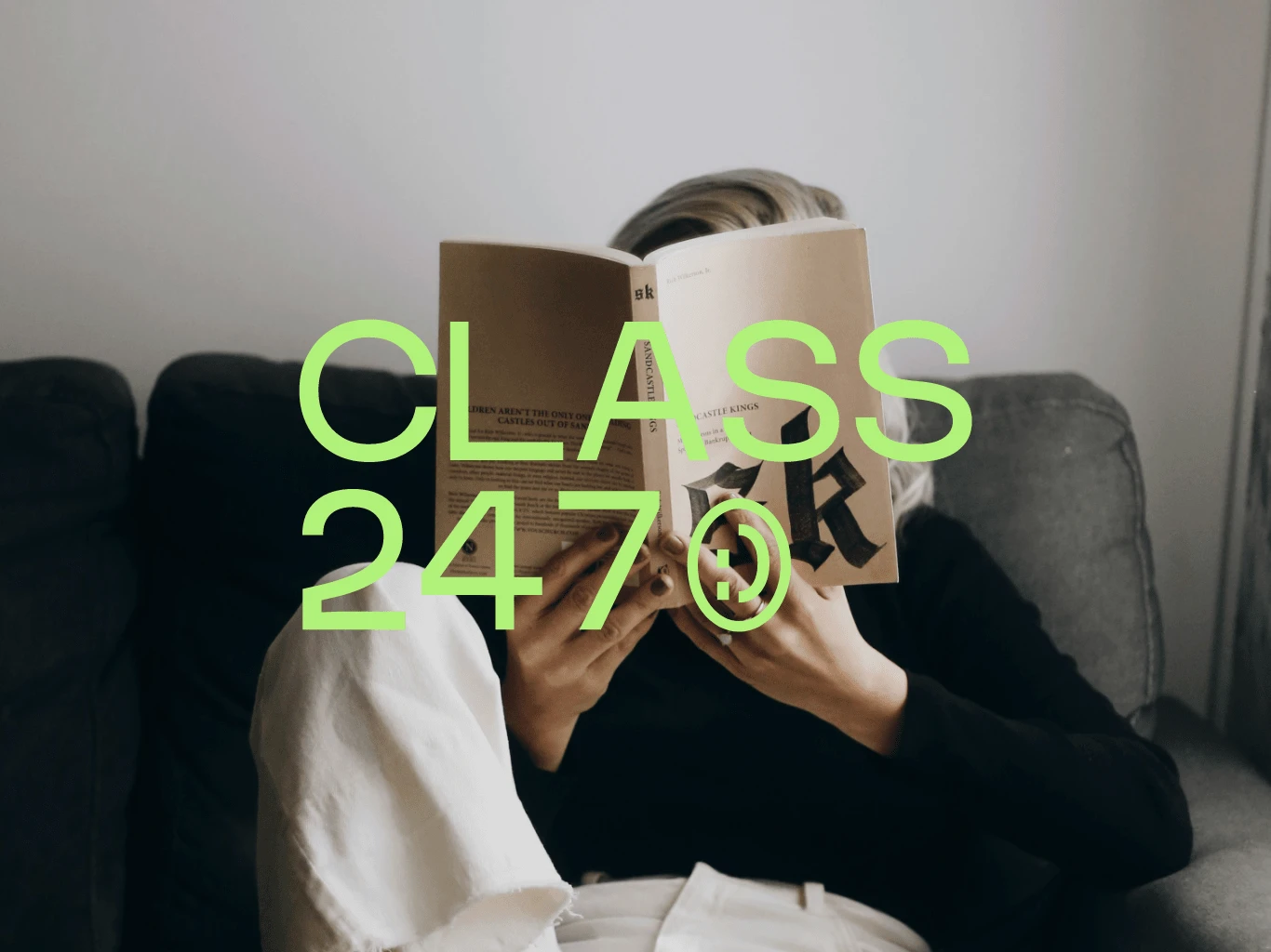
CLASS 247 is a passion project that was inspired by creative libraries I visited in Singapore and Taiwan.
Process
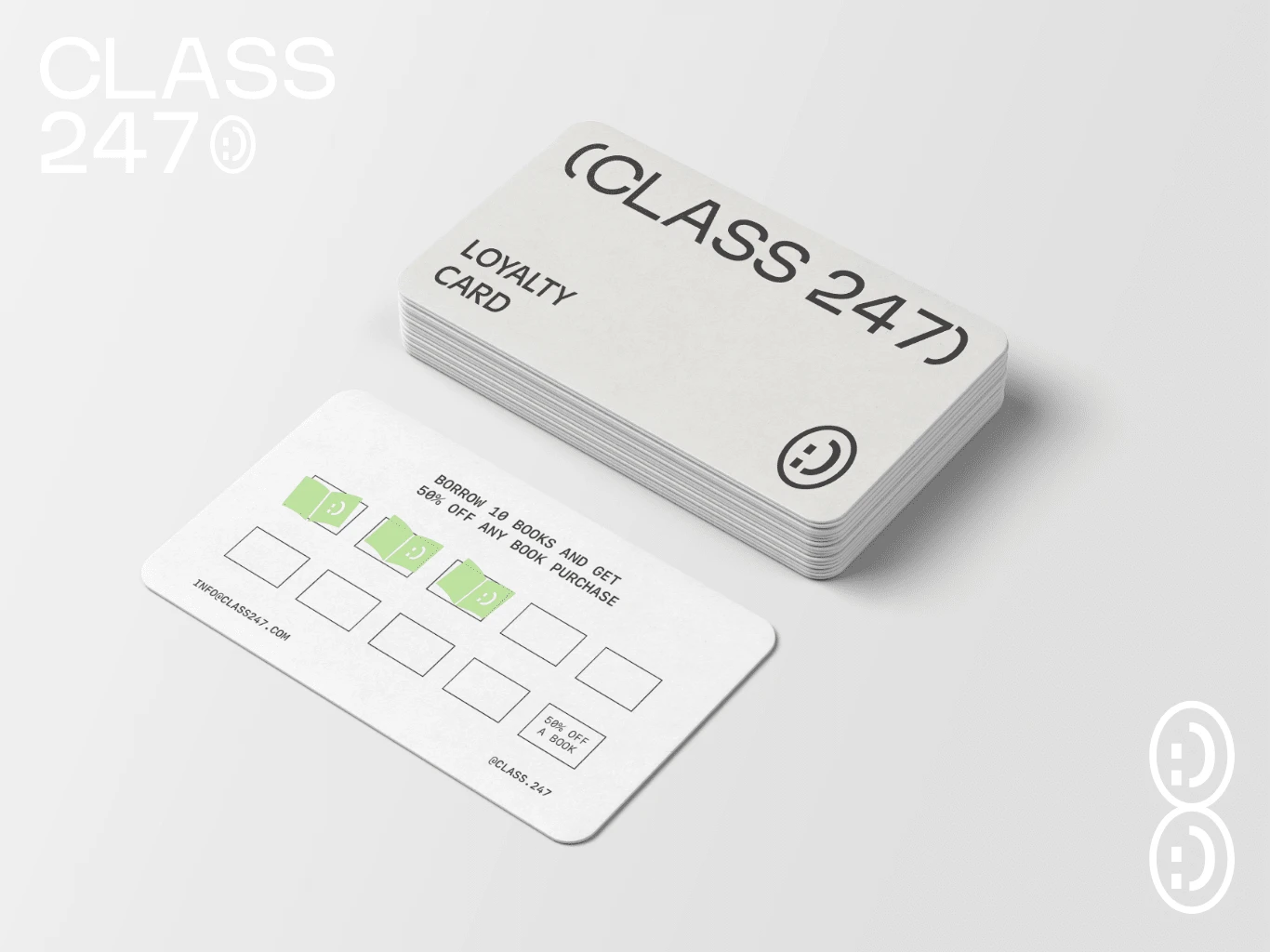
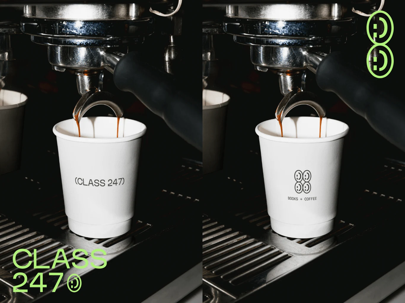
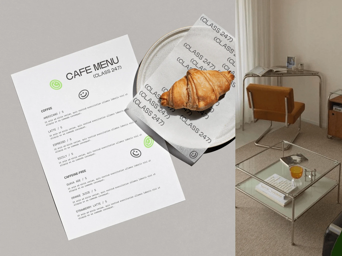
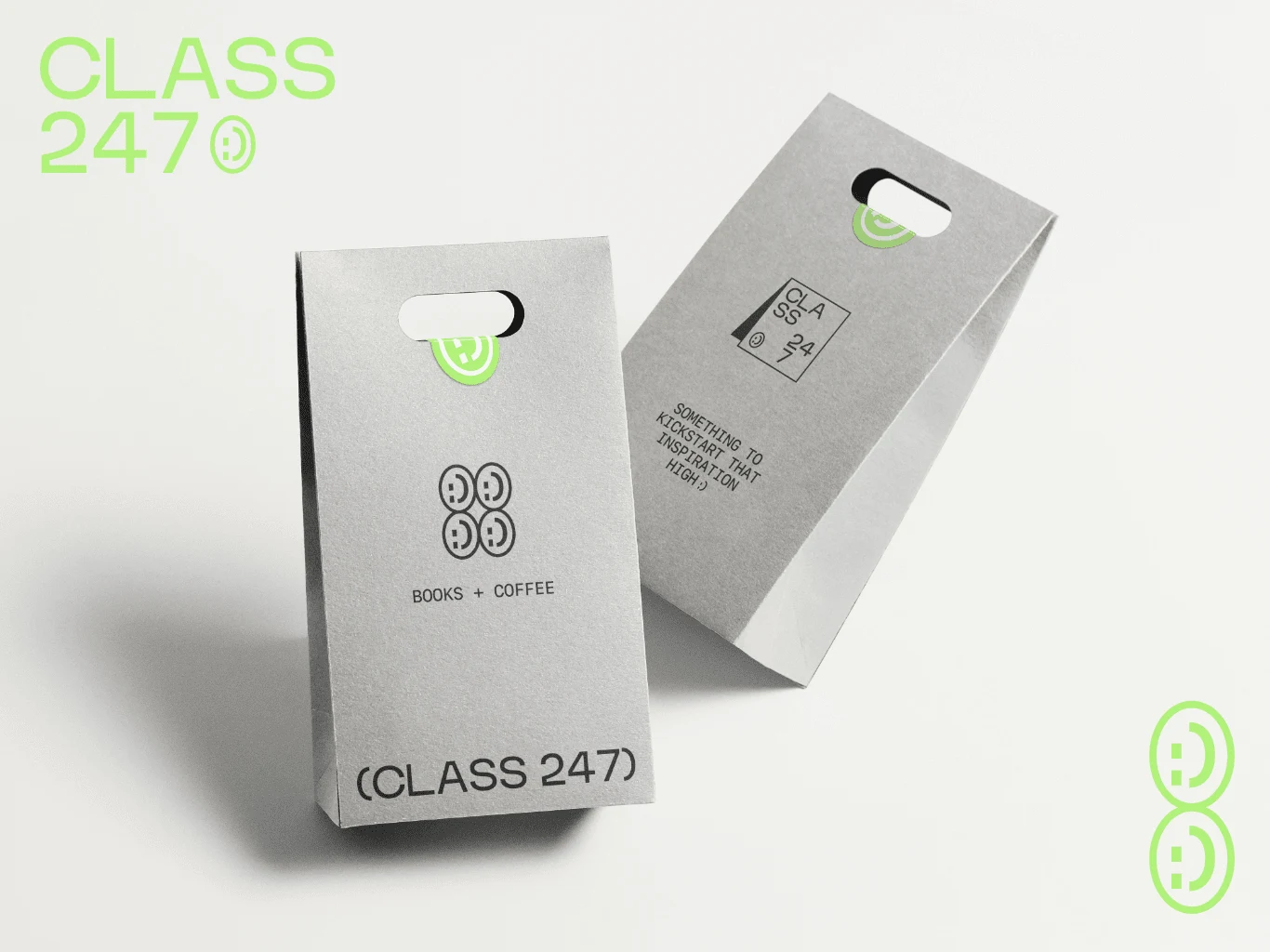
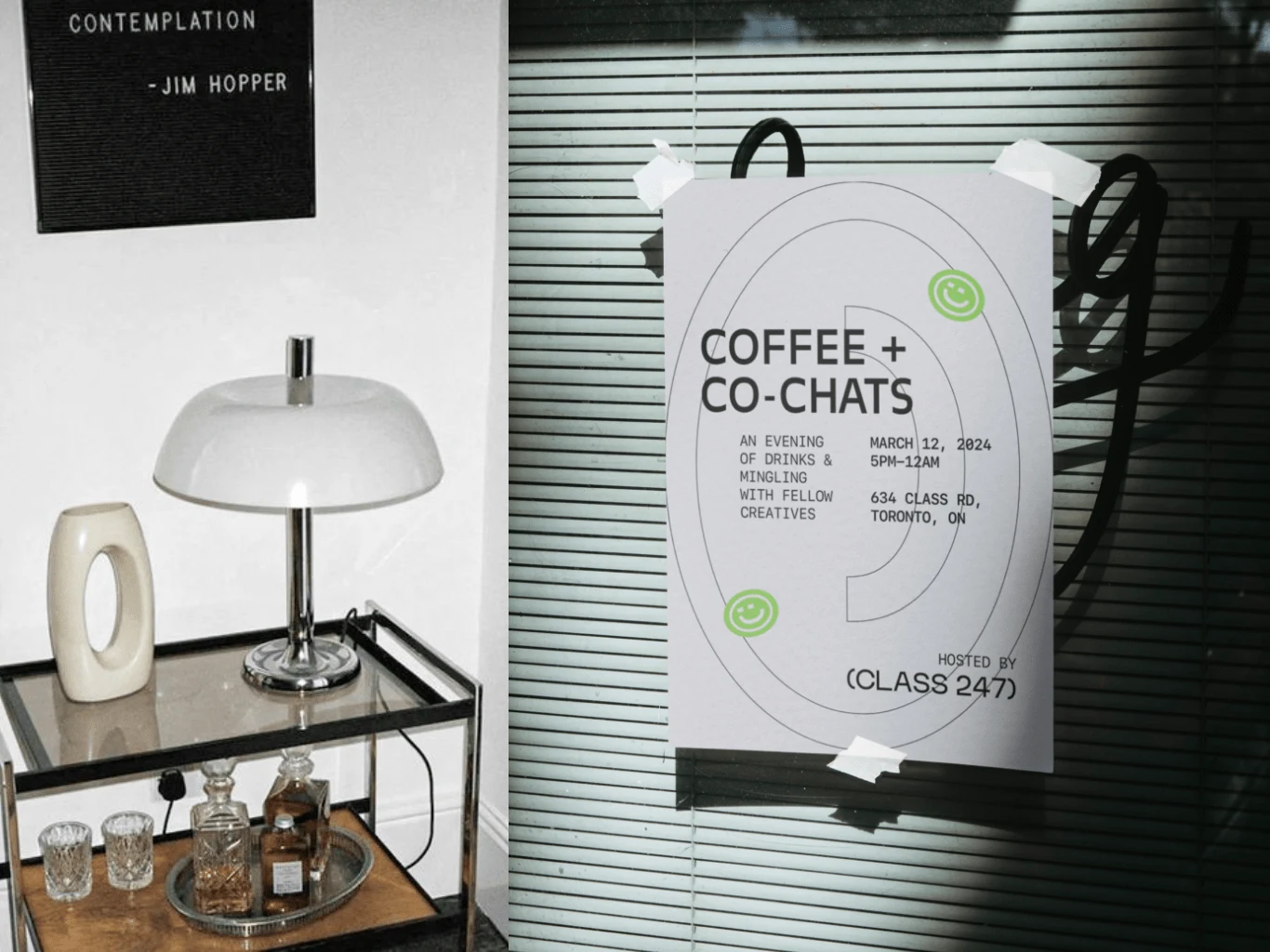
I aimed to create a structured and simplistic feel for CLASS 247's branding. I wanted it to look sleek and modern, yet approachable. Because the brand places an emphasis on offering a comforting and inviting space for creatives, while also portraying beautiful design through its modern interior, I wanted to design branding that wasn't too 'loud' and that when placed in its environment, allowed the interior of the space and the books to shine. For this reason, I opted for a simple primary wordmark logo that could be used in a variety of applications, with a secondary logo and brandmarks utilizing a smiley face icon to give more personality to the branding. The brandmarks also offer versatility in cases where spaces require a smaller logo.
I decided to use a monospaced typeface as the secondary font for the branding for a clean look, and as a nod to the traditional way in which books were written in the past—using typewriters. The colour palette uses a majority of neutral grayscale tones, with the addition of a bright green to highlight accented information and give the brand more personality.
Results
Like this project
Posted Jan 6, 2024
CLASS 247 is a library + coffee shop hybrid space curated by and made for the everyday creative.
