Komorebi Studio Brand Identity Design
Introduction
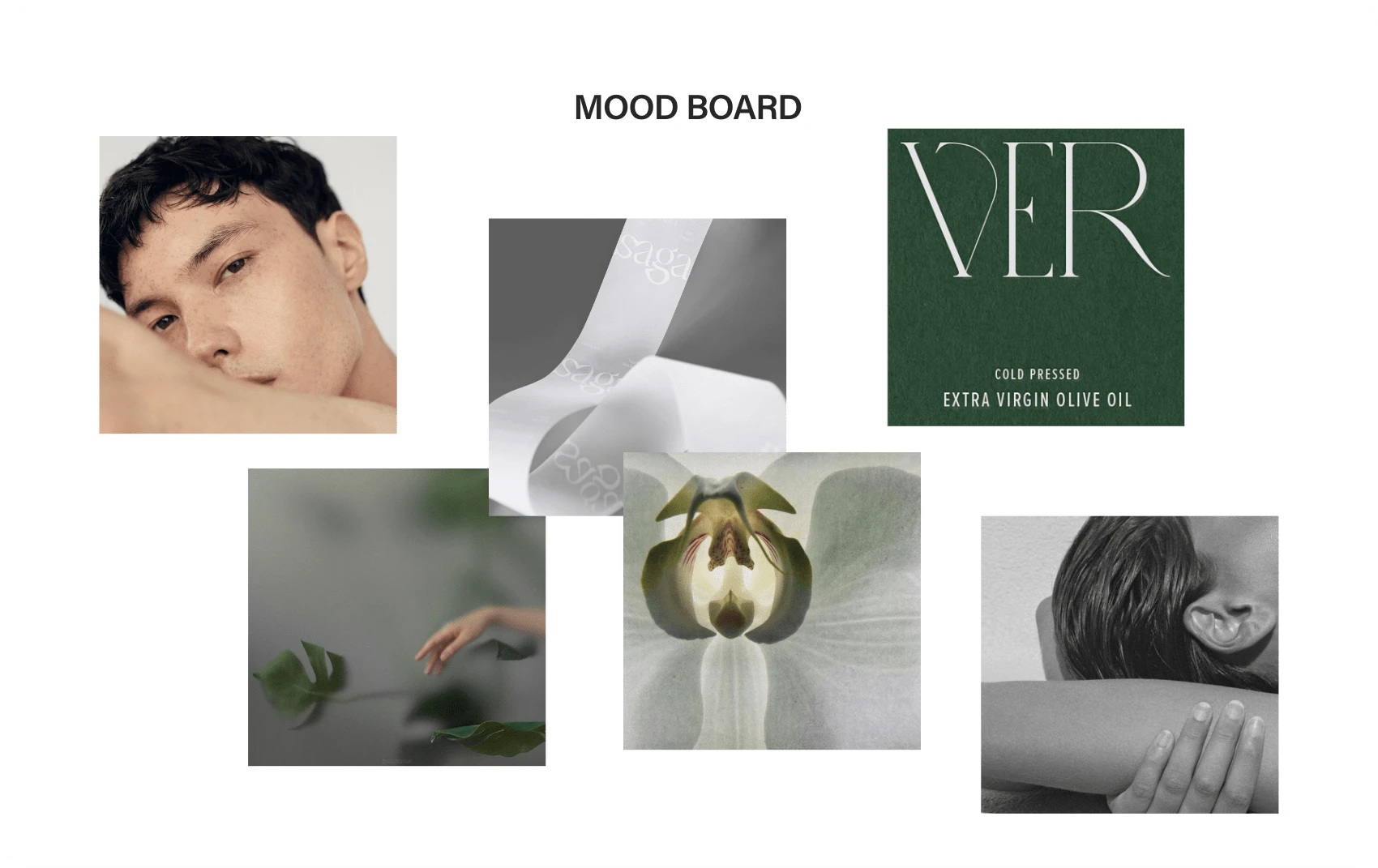
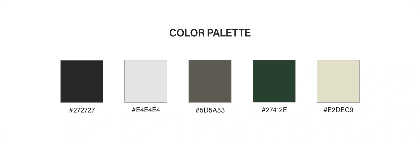
Komorebi Studio is a skincare brand inspired by Japanese skincare practices and the concept that "less is more". Intentionality is a core value that spans from the formulation of each of the skincare products, to how the products are intended to be used on the skin. Komorebi Studio's visual brand identity is classic and timeless, and is inspired by the organic textures of plants, textiles, and skin to give an ethereal ambiance to the brand.

Process
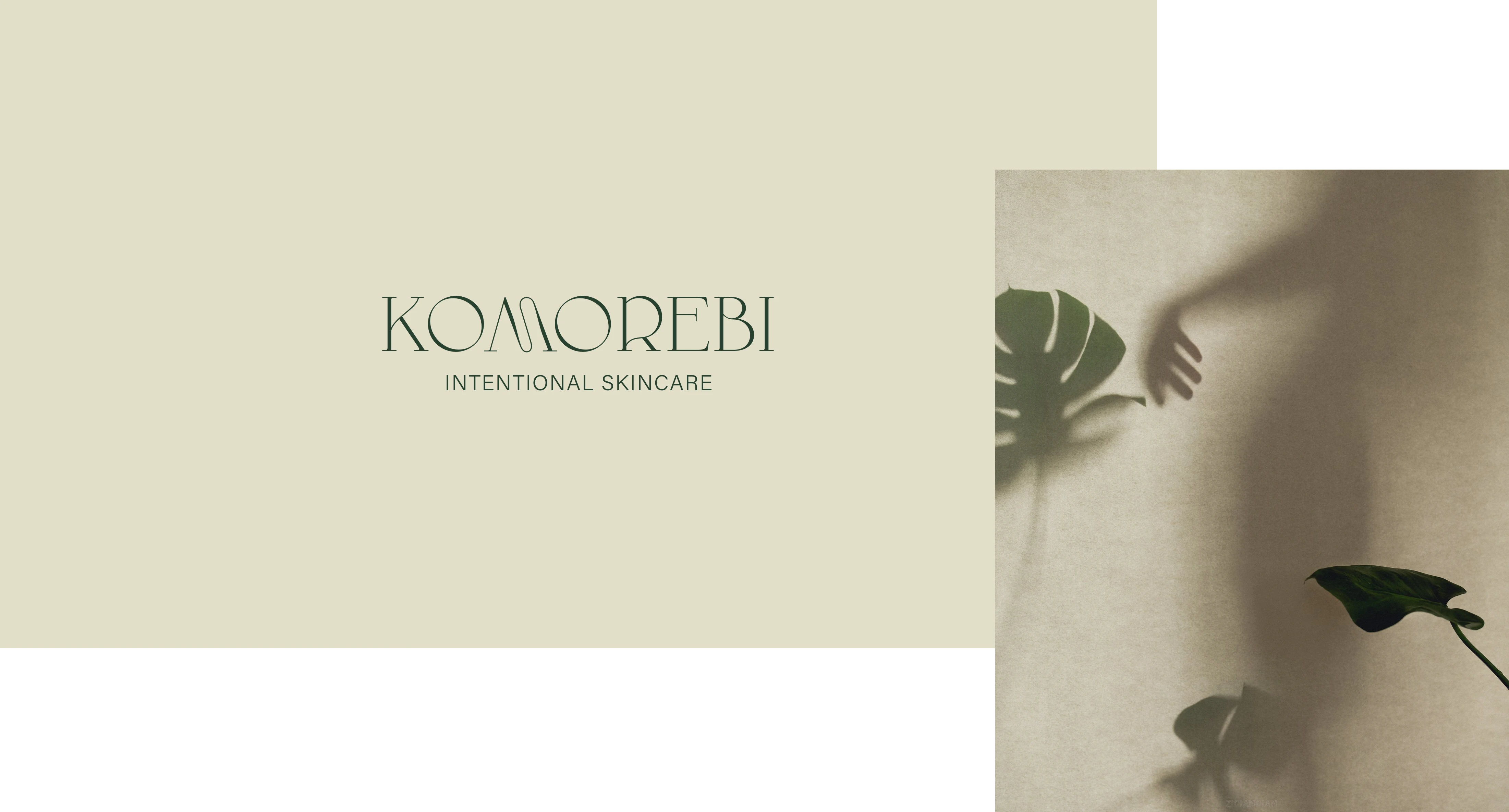
My goal with this project was to portray a certain image of elegance and class using a unique logo typeface paired with abstract and natural images. Focusing on delicate textures in nature helped to convey the naturalistic and organic personality of the brand. The Japanese word "komorebi" (木漏れ日) is a word that describes the 'sunlight shining through the trees'. I wanted to emulate the feeling that this situation describes through the brand's visual identity.
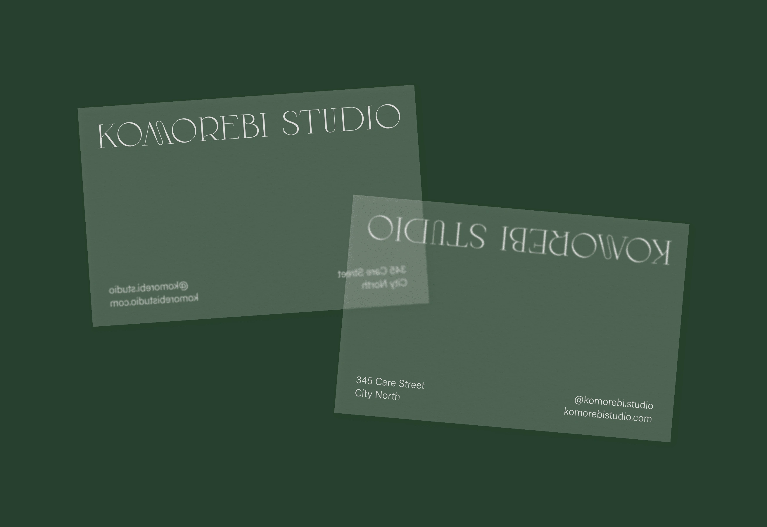
One way I did this was by utilizing frosted/semi-transparent elements in which things placed behind/underneath these elements would be somewhat identifiable, but not clear enough to distinguish details, much like how small rays of sunlight could escape through the gaps of tree branches and leaves, but yet not fully illuminate the shade under the tree.
Results
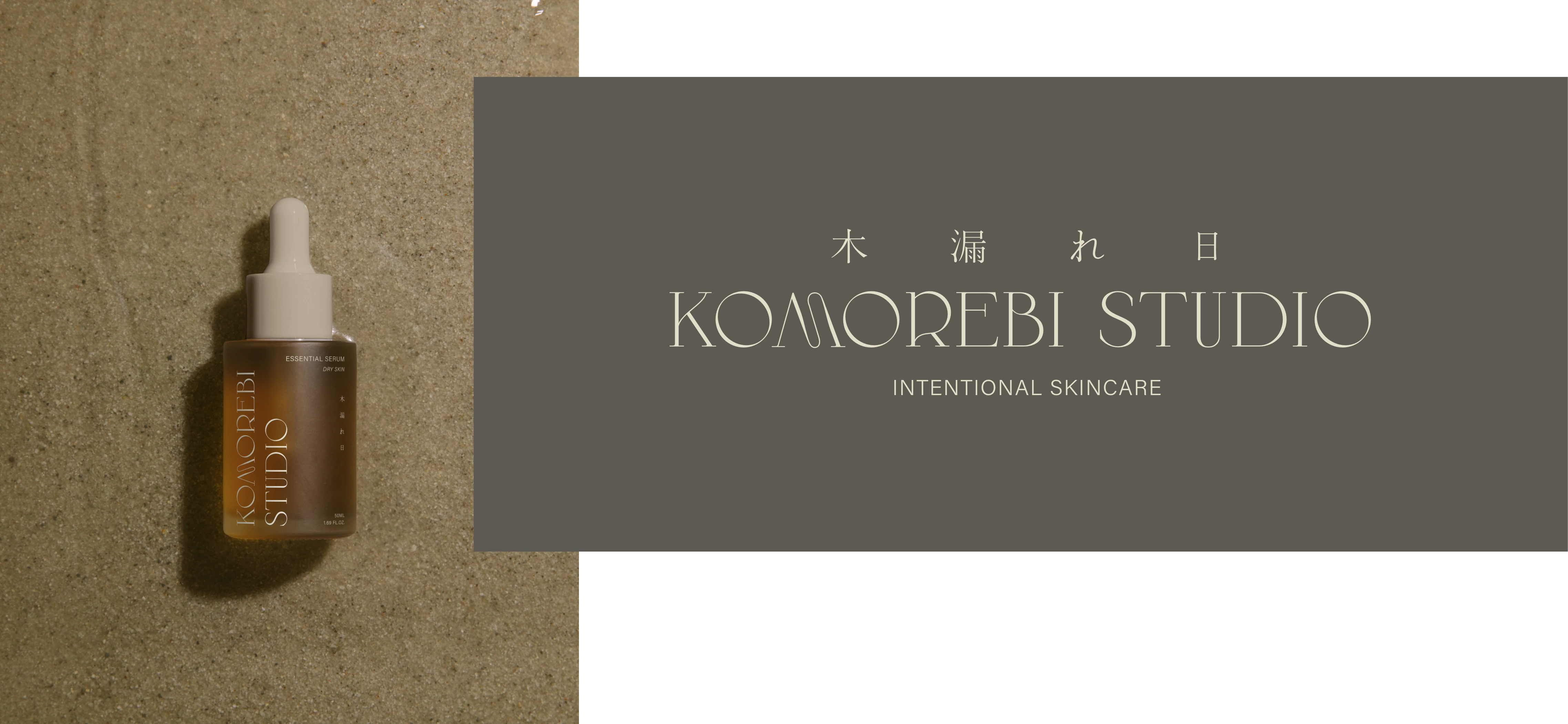
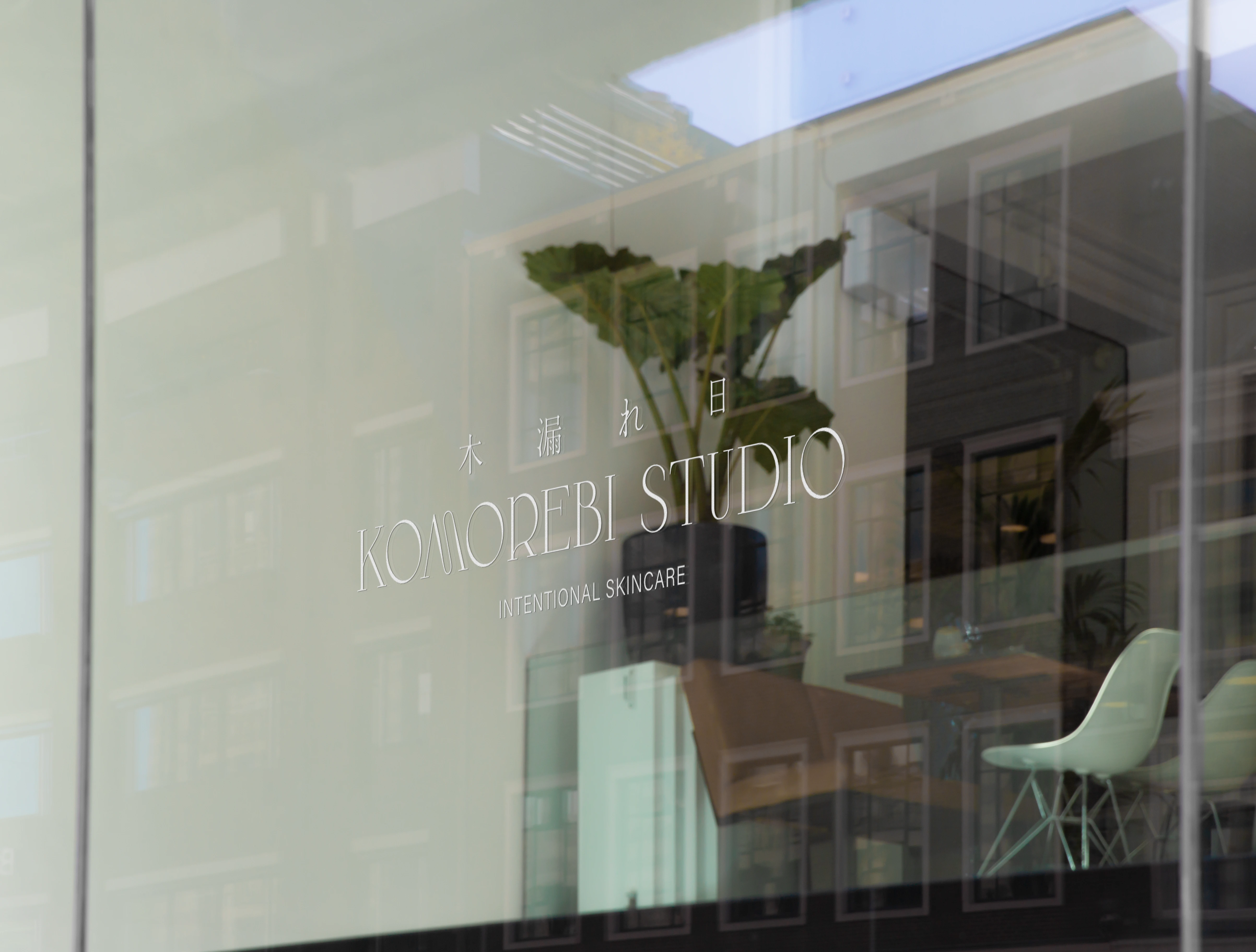
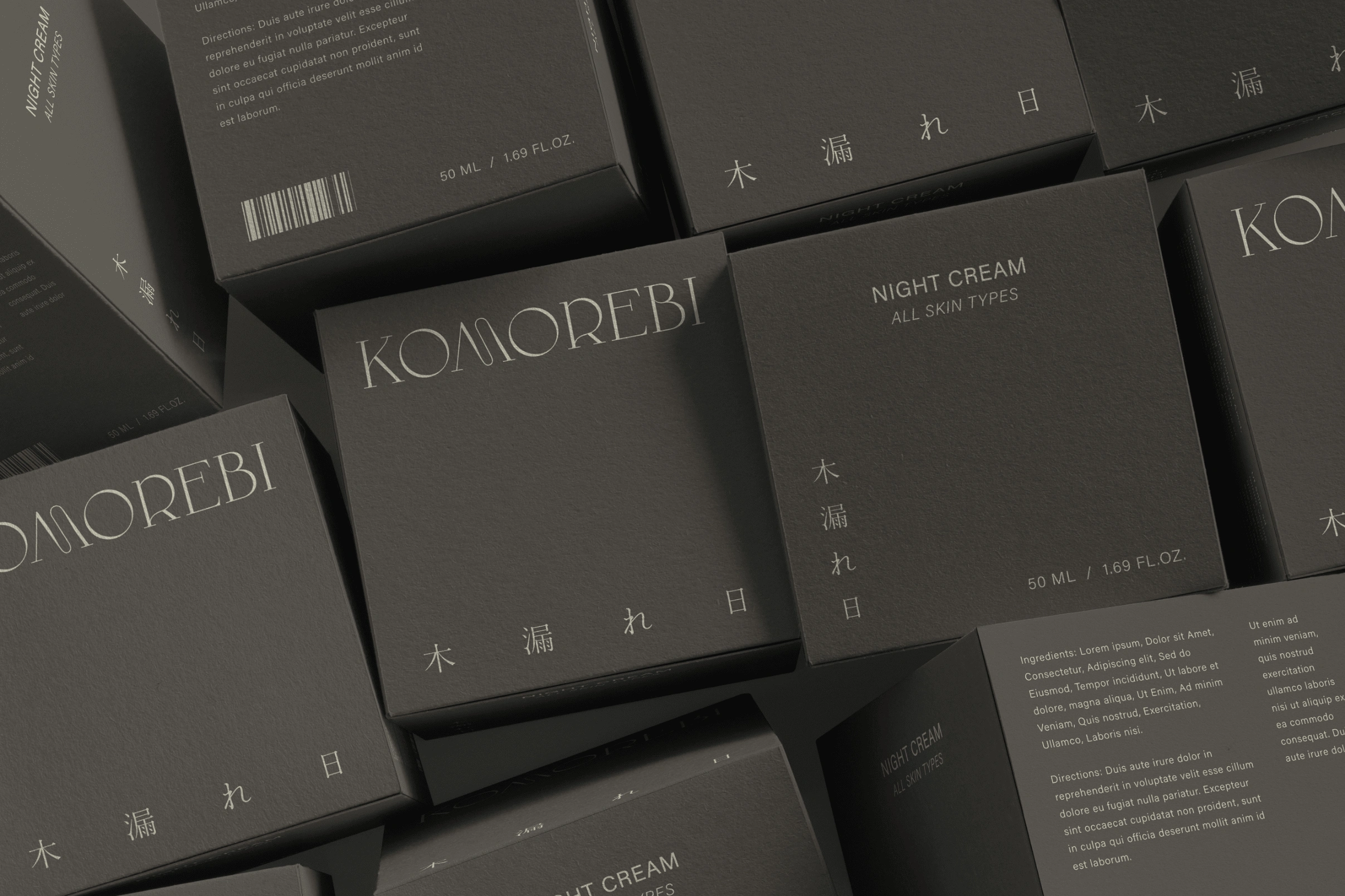
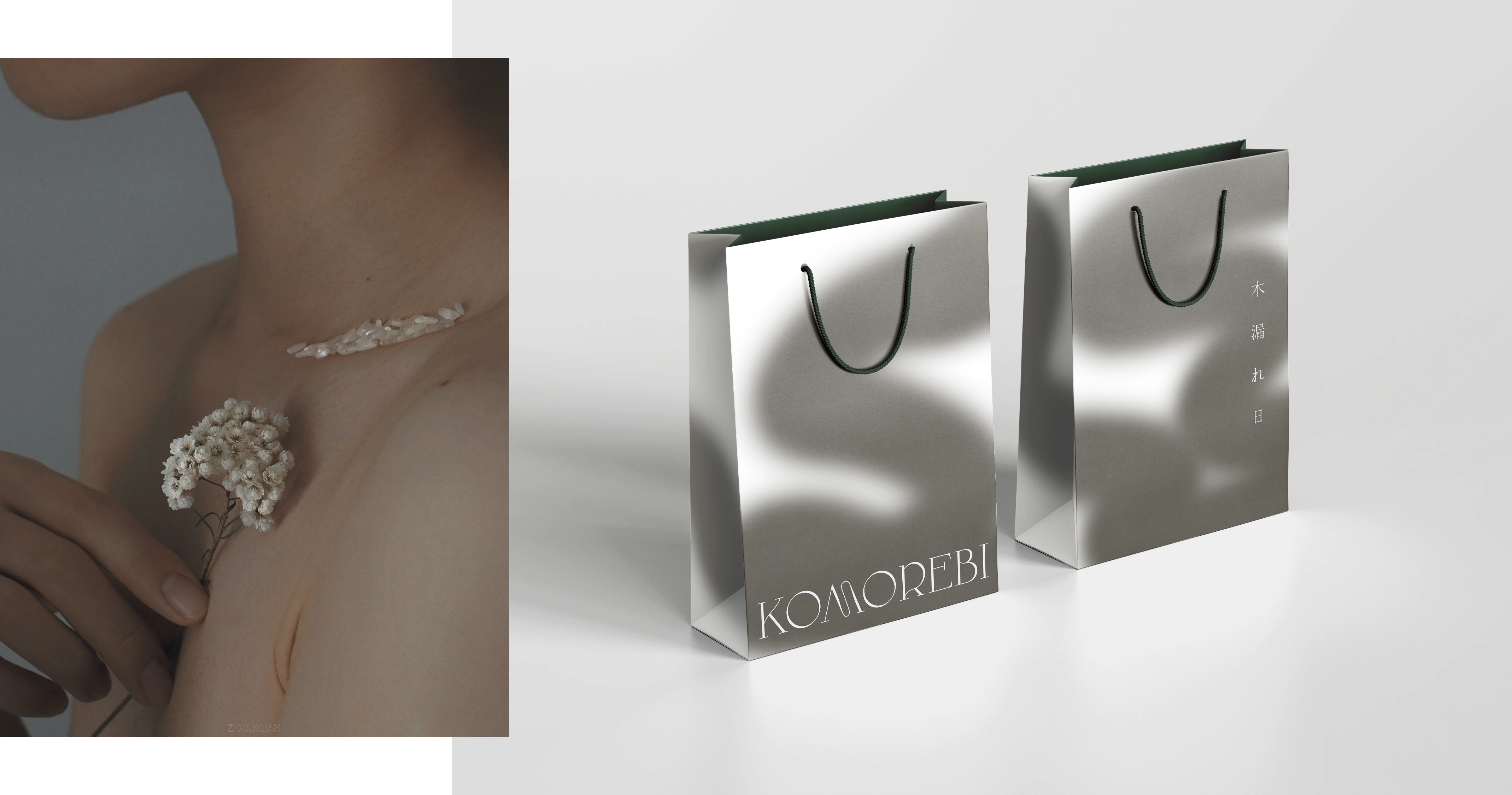
An elegant and organic, yet experimental serif typeface was used for the main logo, paired with a simple modern sans-serif typeface. Traditional Japanese characters were included in some iterations of the logo to add variability in the brand imagery and designs when necessary. In addition to the logos, mockups were designed for potential skincare bottle packaging, business cards, window displays, and shopping bags.
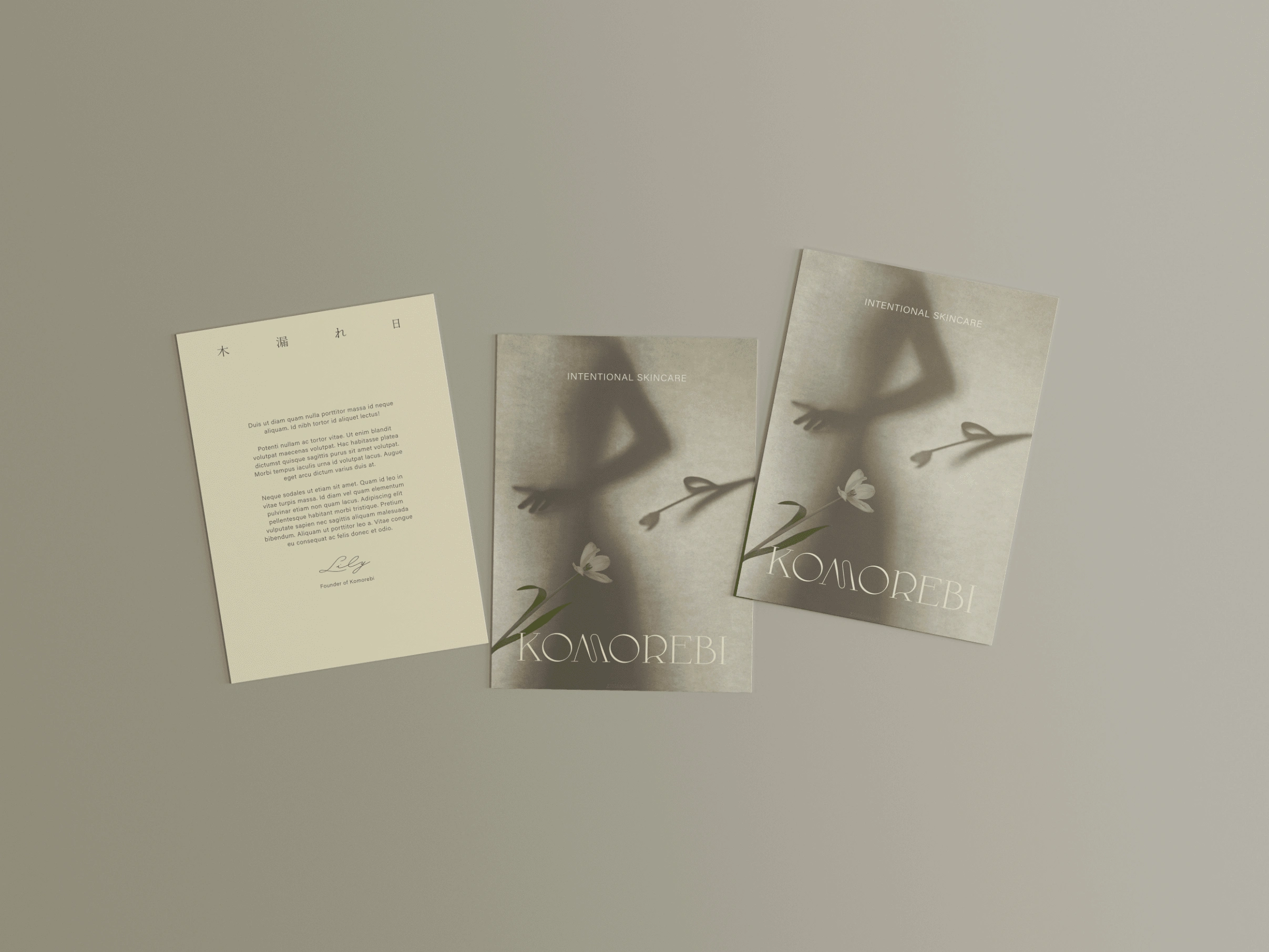
Photography imagery by ZiQianQian
Like this project
Posted Jan 16, 2023
Komorebi Studio is a skincare brand whose philosophy is centered around intentionality and simplicity. Textures from nature inspire this brand identity.
