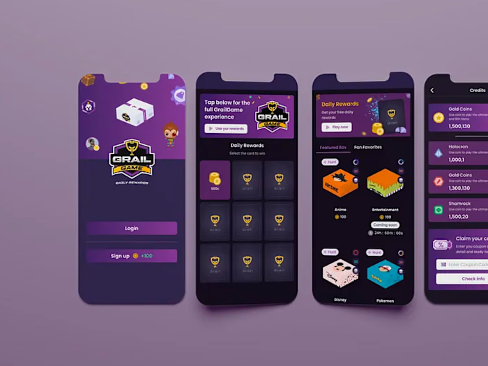
Grail Game Ratro | Game UI Design | Gamified Experience

Muhammad Ammar


The story
Grail Game’s vision was bold and full of potential, but their existing product experience didn’t do it justice. The concept of combining digital gaming with real-world collectibles was compelling; the mechanics were engaging, and the community was eager. Yet none of that energy came through in the platform’s UI or user journey.
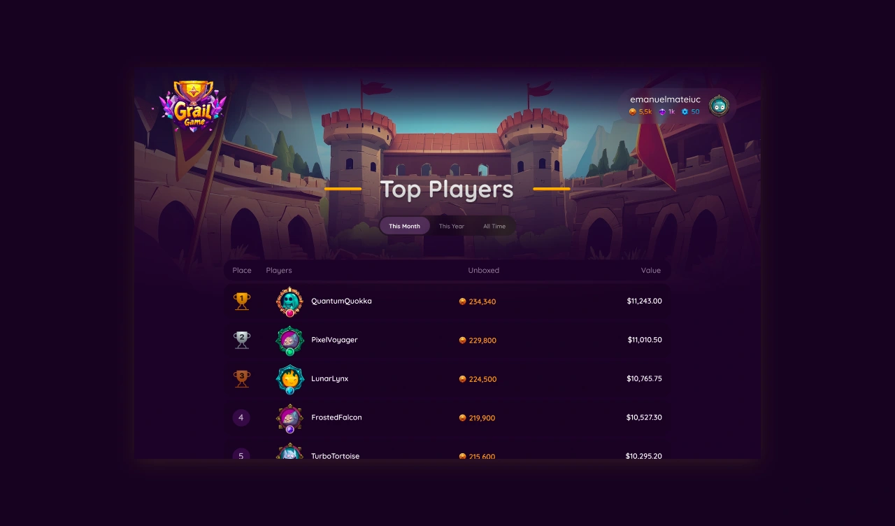
Leader board
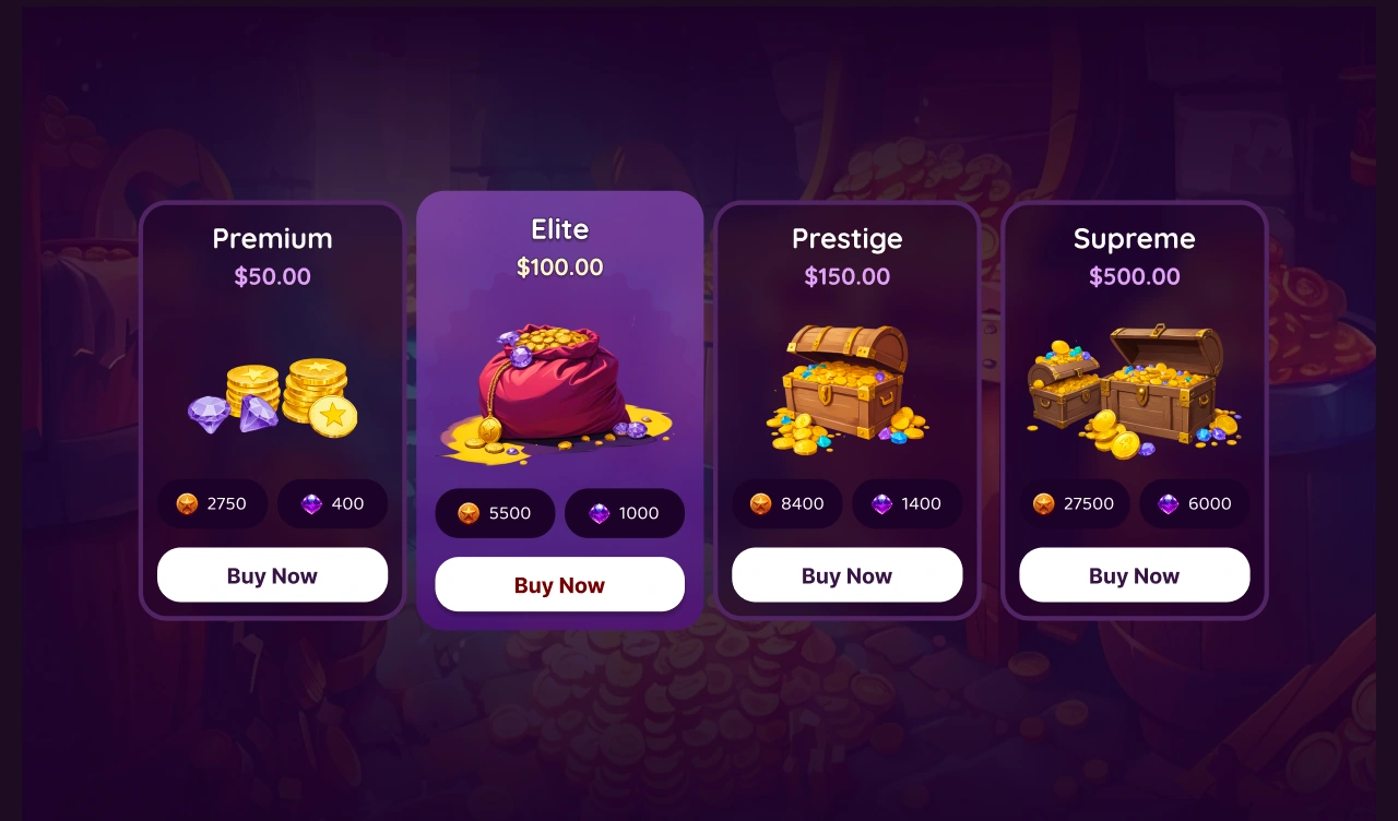
Coin Shop
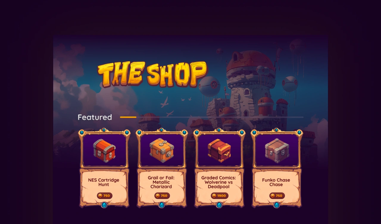
Gem Shop
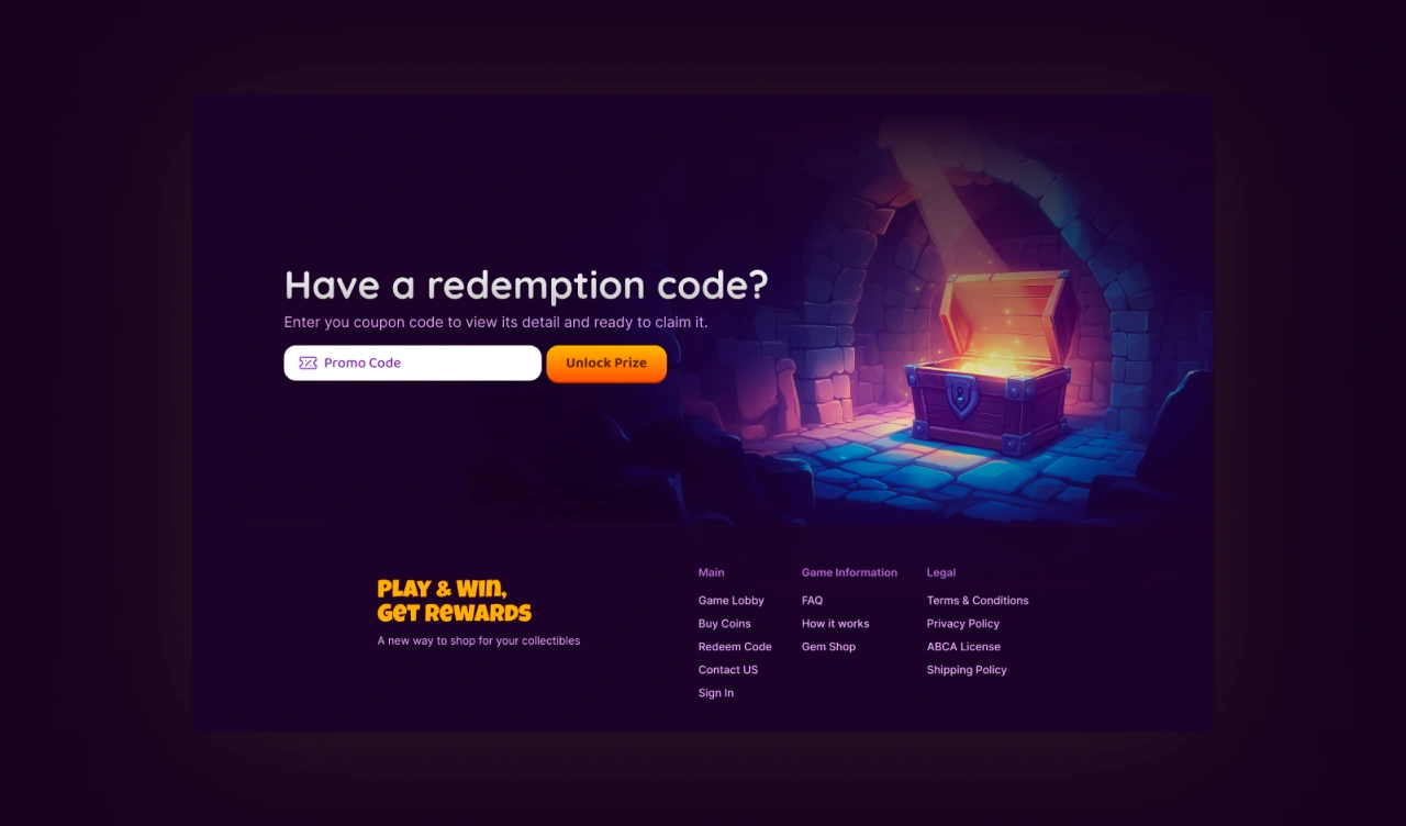
Redemption code
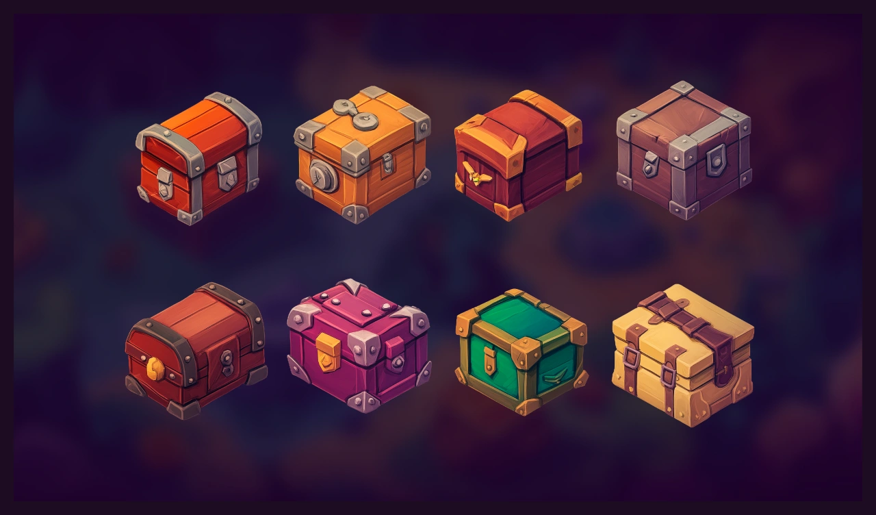
Treasure box
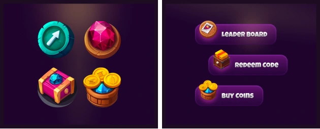
Icon
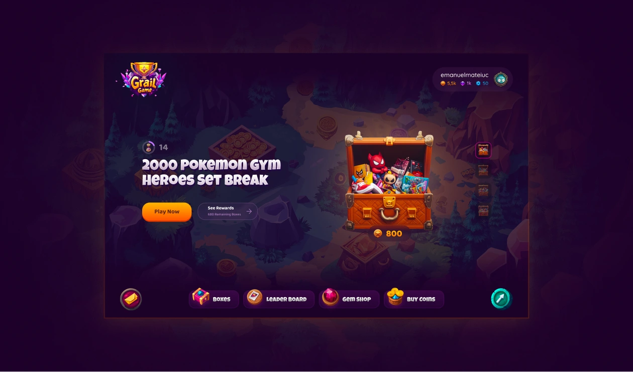
We refined the Grail Game color palette and visual identity, boosting a retro-inspired, gamified experience. Color was refined to communicate a nostalgic approach And created 150+ unique retro style visual – including custom icons, illustrations, and credit packages.
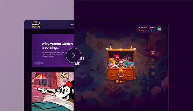
Before vs after
The Result
Massive Perception Shift – The new visual identity and gamified experience elevated the brand’s credibility. Even industry insiders assumed Grail Game had already scaled into a major player.
Trust & Engagement – A cohesive, arcade-inspired interface across web and mobile built user confidence and boosted time-on-platform.
Flawless Feature Launch – The redesign rolled out right on schedule, creating buzz around the app’s newest drop and solidifying community interest.
Like this project
Posted Sep 6, 2026
Grail Game Retro Edition reimagines the lobby with a dark nostalgic aesthetic — rich gradients, castle backdrops, and Prince of Persia-inspired visuals.