Cancellation Notification My Tamagotchi
0
UX Writer
UX Copywriter

Figma

Jasper
Project Overview:
My Tamagotchi brings the nostalgic 90s virtual pet experience to mobile devices, allowing players to nurture and grow their Tamagotchi companions. However, users often accidentally canceled in-app purchases without clear confirmation, leading to confusion and concern about potential charges. To address this, I developed a friendly yet informative cancellation notification to reassure players and improve their experience.
The Challenge:
User Uncertainty: Players lacked confidence that canceled transactions would not result in charges, leading to frustration and mistrust.
Retention Risks: Uncertainty about financial transactions created friction that could disrupt gameplay and decrease engagement.
Tone Consistency: The solution needed to align with the game’s lighthearted and friendly tone while providing clear, actionable information.
My Approach:
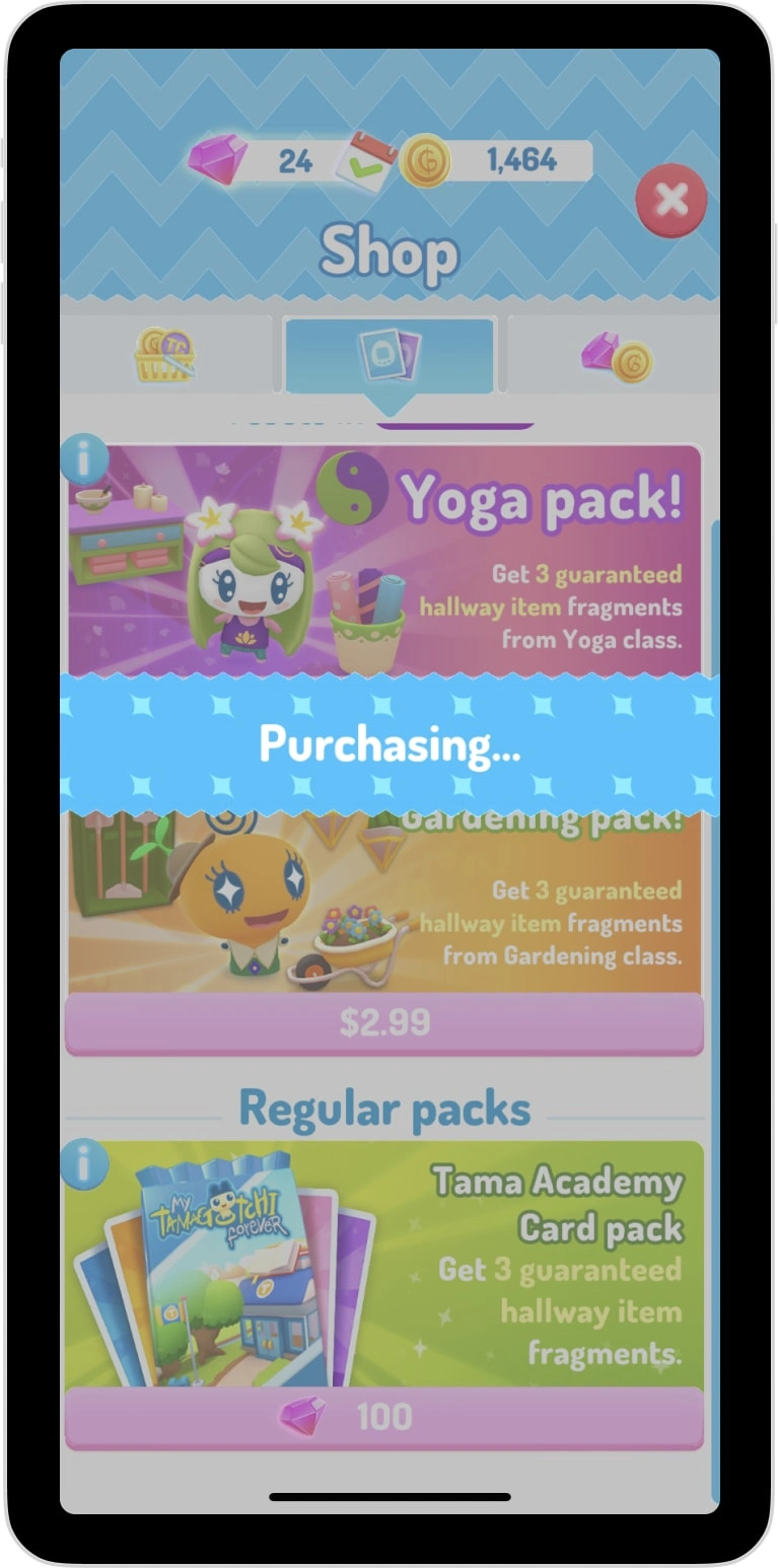
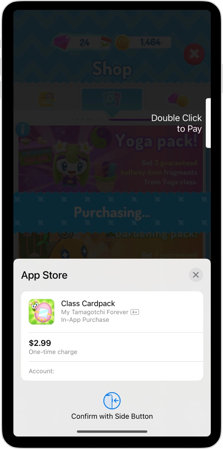
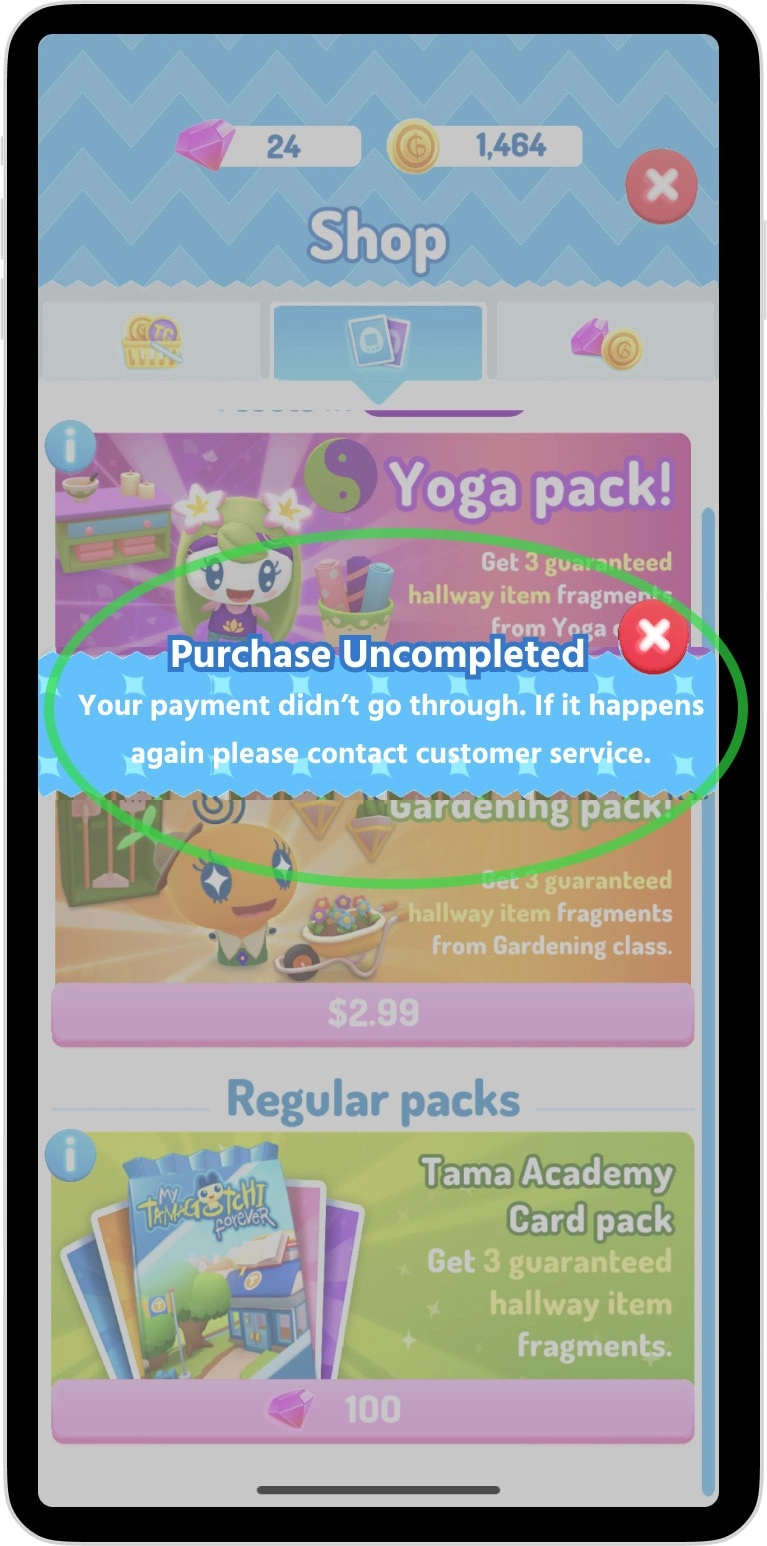
Clear and Reassuring Copy: Wrote a cancellation notification that explicitly stated the outcome of a canceled transaction in simple, friendly language, ensuring users felt informed and at ease.
Tone Alignment: Crafted microcopy to match the playful yet comforting style of the game, reinforcing the brand identity.
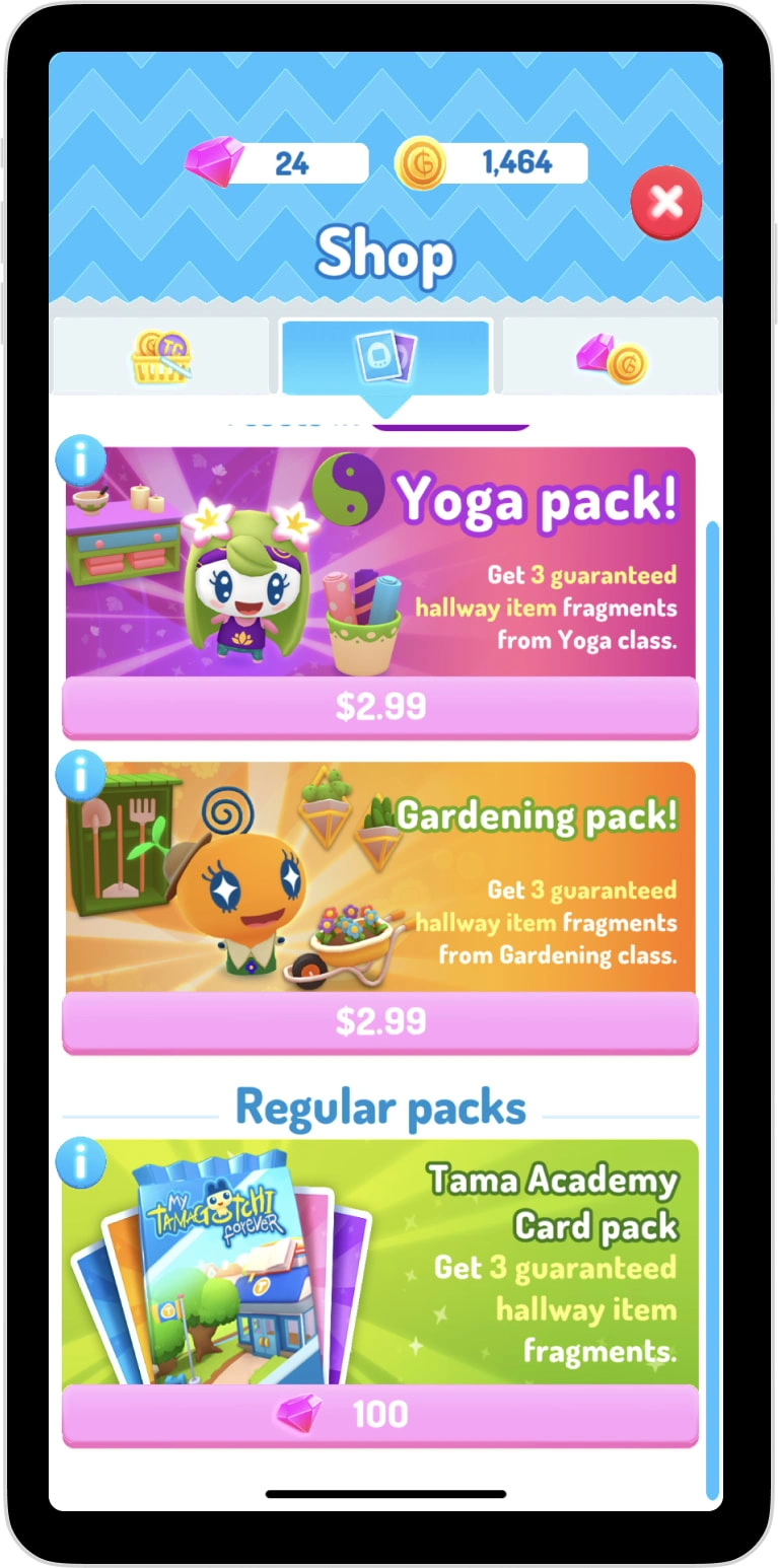
User-Centric Design: Collaborated with designers to integrate the notification seamlessly into the game’s interface, ensuring it was visually non-disruptive but easy to notice.
Results:
Reduced User Frustration: Players reported feeling more confident about canceled transactions, as reflected in qualitative feedback through support channels.
Improved Retention: The reassurance provided by the notification helped maintain player engagement by minimizing interruptions and concerns.
Tone Success: The playful, friendly tone of the notification resonated with users, maintaining the game’s overall experience while addressing a critical need.
Why It Matters:
This project demonstrates my ability to resolve user pain points with empathetic and brand-consistent UX writing. By addressing transaction-related concerns through clear and friendly notifications, I helped foster trust, reduce frustration, and enhance the overall player experience.
Like this project
0
My Tamagotchi app revives the 90s pet craze. I added cancellation notifications to prevent mistaken in-app purchase cancellations, ensuring a smooth experience
Likes
0
Views
1
Tags

UX Writer
UX Copywriter

Figma

Jasper


