Built with Jitter
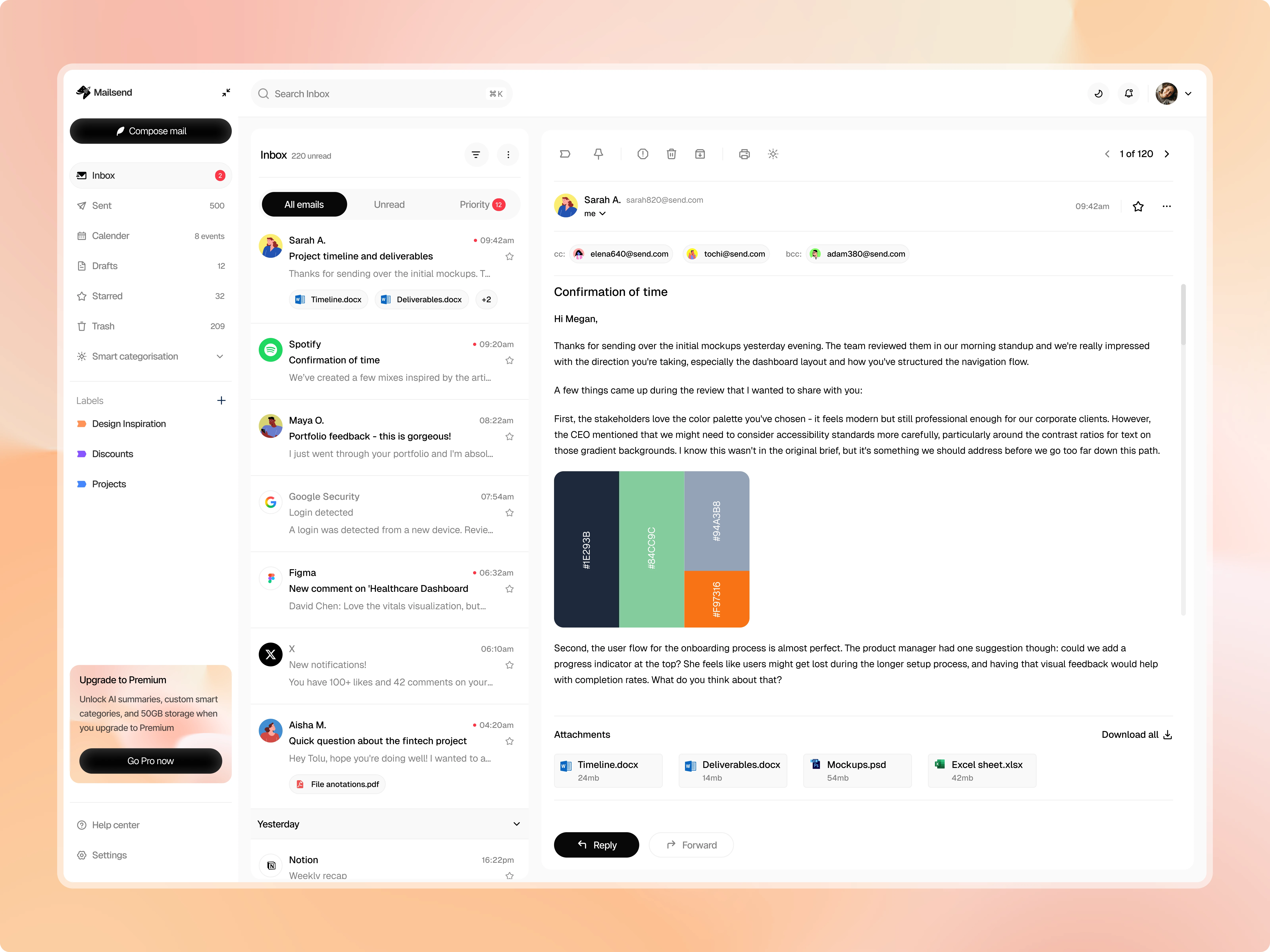
Mailsend - Smart Email Management
Wuraola Olaibi
The Problem:
Email apps fall into two camps: overly simple (missing features power users need) or overwhelming (cramming every feature into the interface). Most solutions also treat AI as the main attraction rather than a quiet helper. I wanted to design an email client that feels familiar but works smarter - where AI organization is optional, not forced.
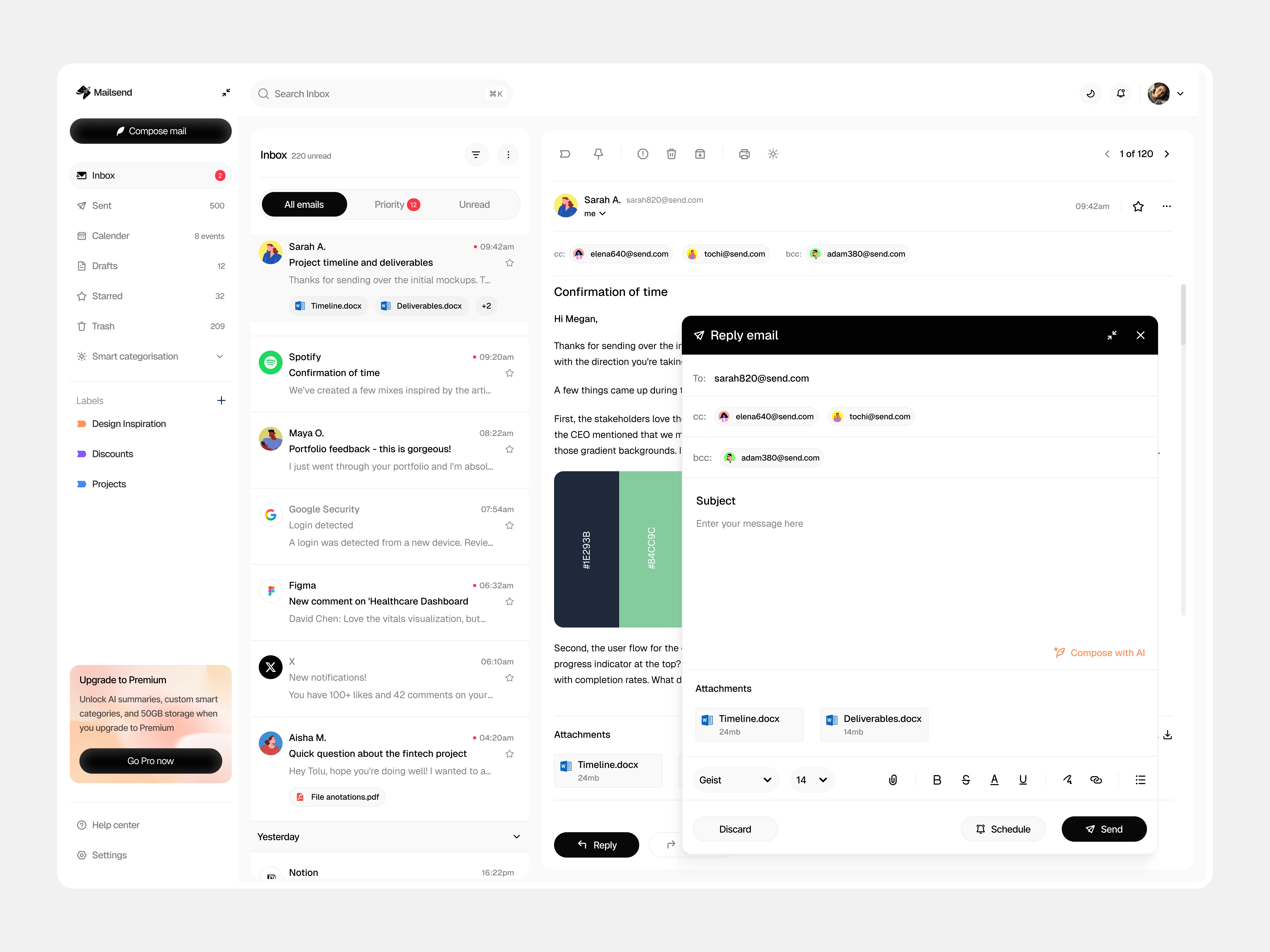
Reply email modal
Target User:
Remote professionals and freelancers managing multiple clients, projects, and time zones. People who live in their inbox but don't want to fight with it. They need quick access to both email and calendar without app-switching, and they want control over how their information is organized.
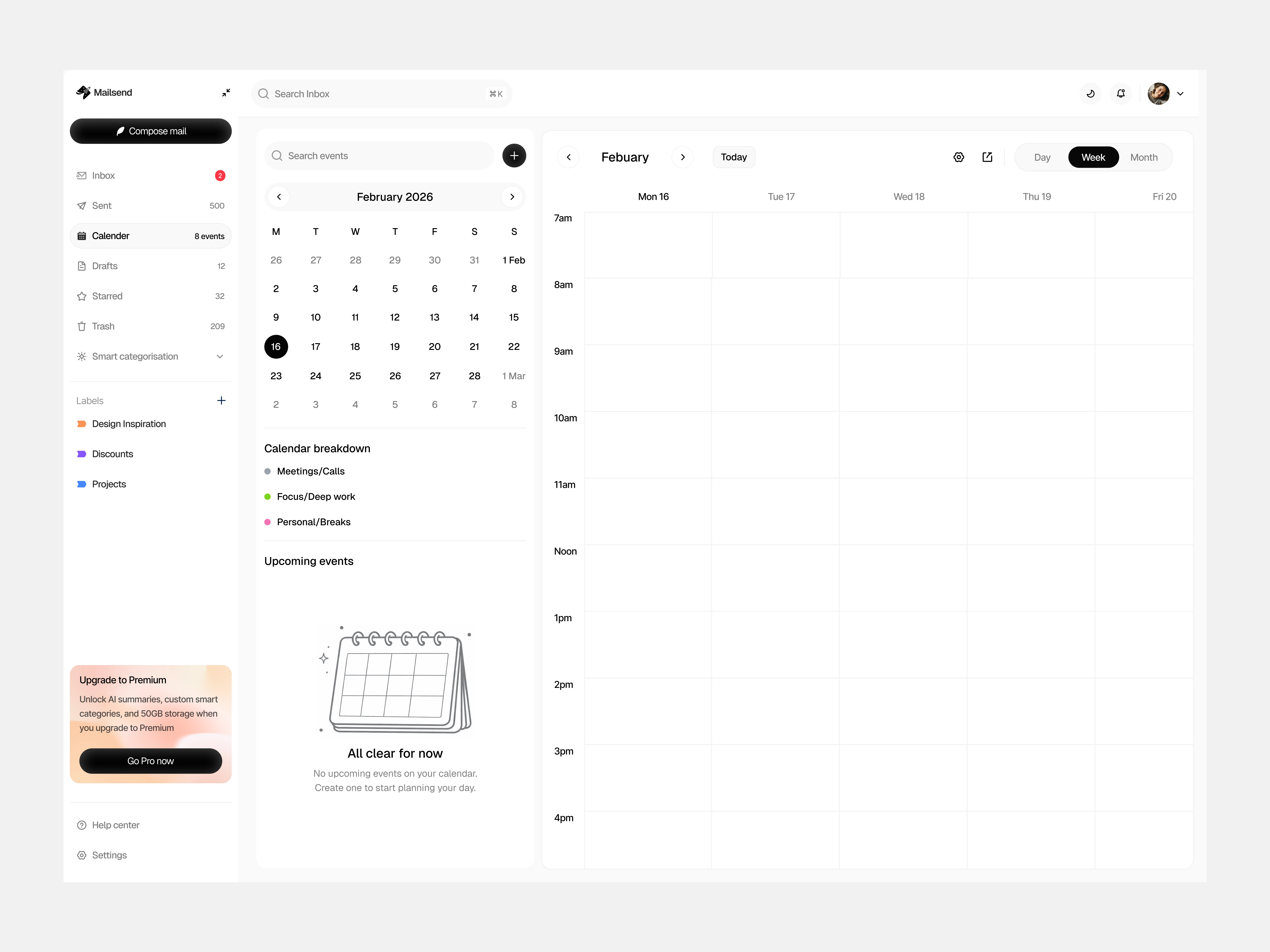
Calendar view - empty
My Approach:
1. Keep it familiar, add intelligence quietly
Traditional inbox layout so there's zero learning curve
Smart Categories (AI-powered sorting) lives in a collapsible section - use it if you want, ignore it if you don't
No aggressive AI features that interrupt workflow
2. Integrate calendar without cluttering
Built calendar into the sidebar so users can check availability while reading emails
Color-coded event types (Meetings, Focus time, Personal) for at-a-glance scheduling
"Upcoming events" list shows what's next without opening a separate app
3. Design for edge cases
Empty states guide users naturally ("Ready when you are" for email, "No events scheduled" for calendar)
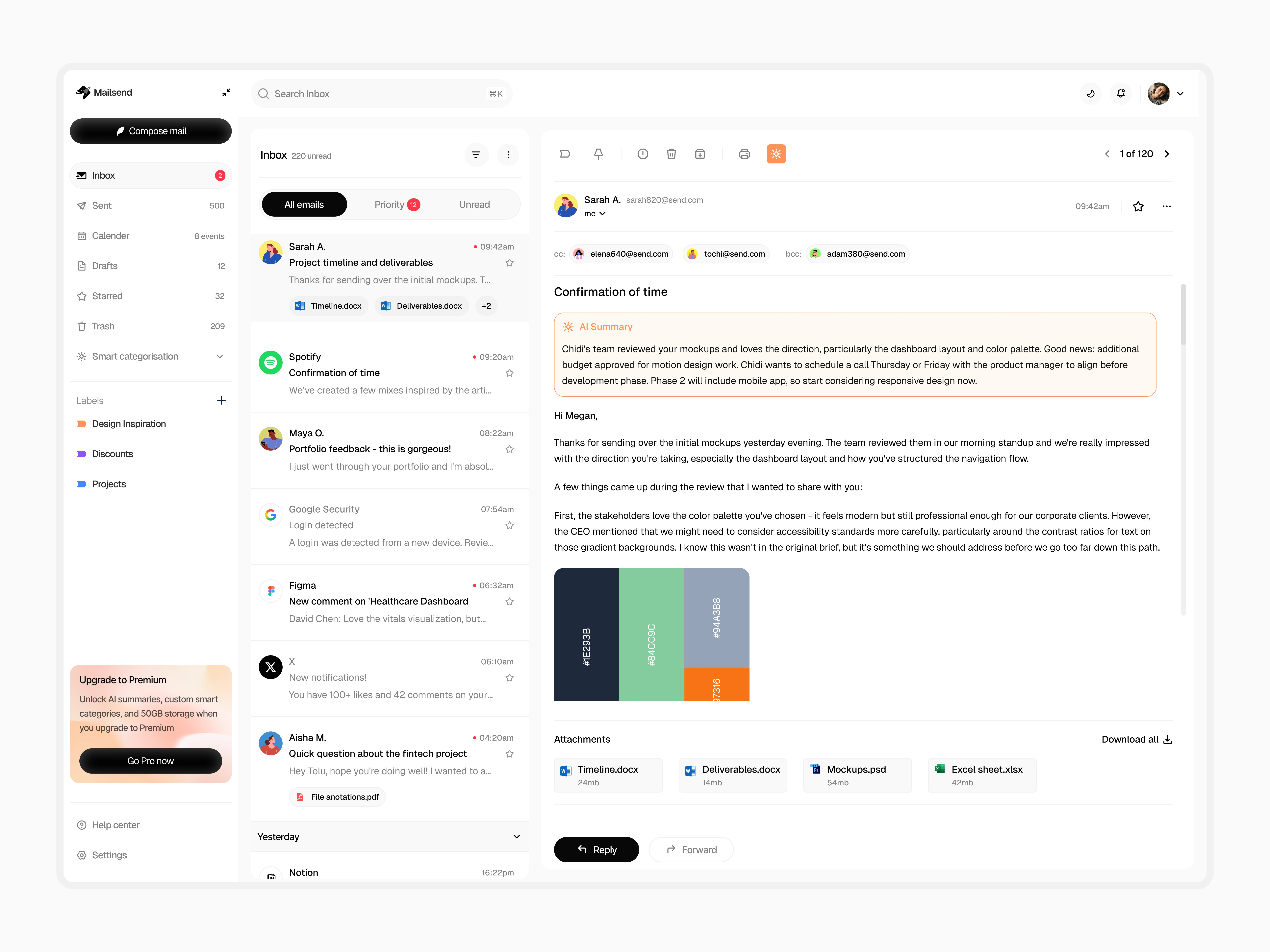
AI summary feature for long email threads (optional, not automatic)
Thoughtful hierarchy in email cards so information is scannable
4. Visual system
Black and white base keeps it clean and professional
Strategic use of color only for categorization and event types
Avoided the "tech bro" aesthetic of apps like Superhuman - wanted it approachable, not exclusive
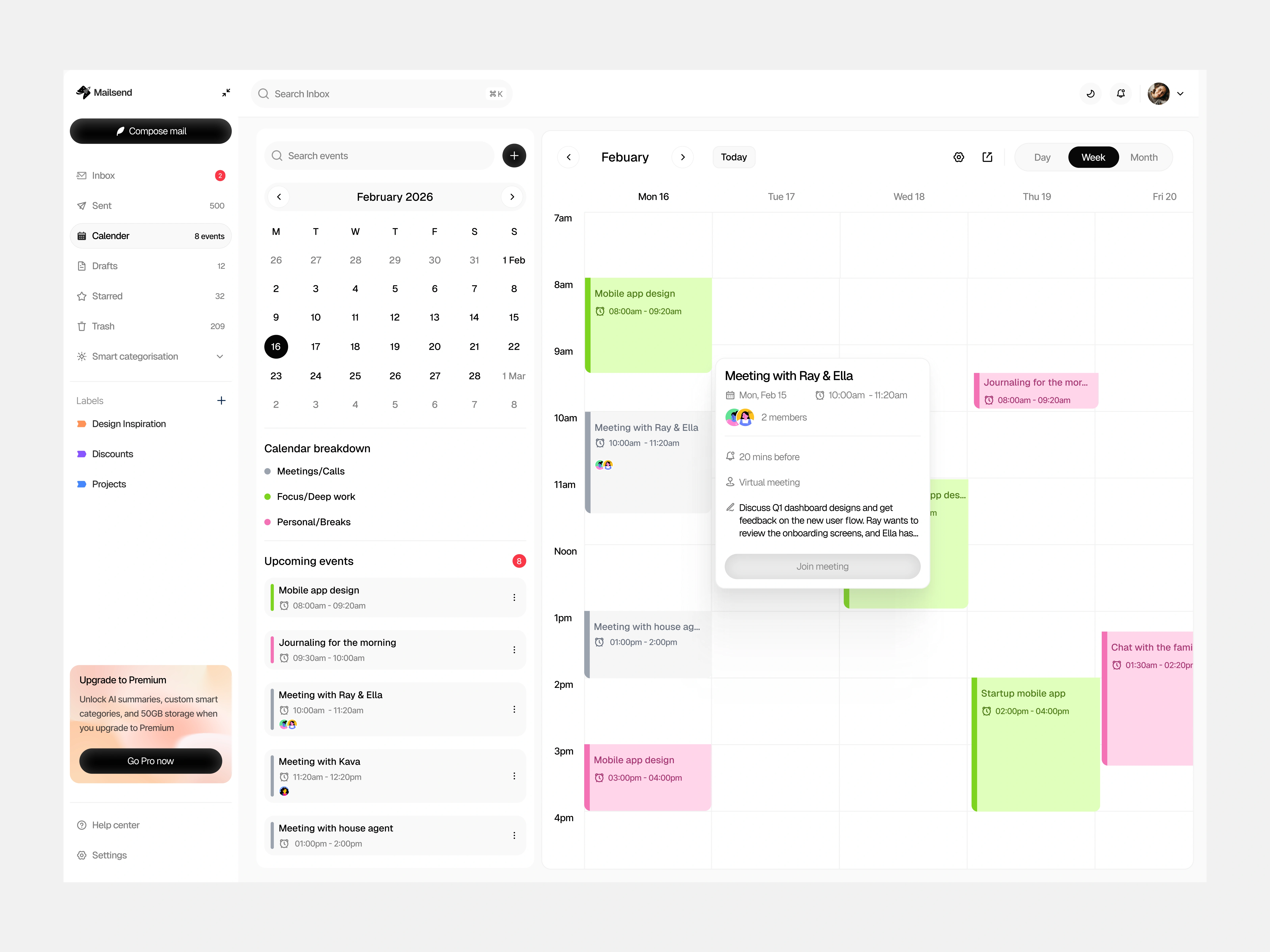
Calendar view populated
Design Decisions:
Why collapsible Smart Categories? I looked at how Gmail's auto-categories feel invasive - they're always there even if you don't use them. Making them collapsible gives users control. Power users expand it, traditionalists ignore it.
Why integrated calendar? After analyzing my own workflow, I realized I'm constantly switching between email and calendar to check availability before responding. Putting them side-by-side eliminates that friction.
Why only 2-3 color-coded event types? More categories = decision fatigue. Green (meetings), Pink (focus time), and optionally one more covers 90% of use cases without overwhelming the interface.
Dashboard elements
Key Takeaway:
Good design doesn't announce itself. The best tools feel invisible - they get out of your way and let you work. Mailsend prioritizes clarity, control, and quiet intelligence over flashy features.
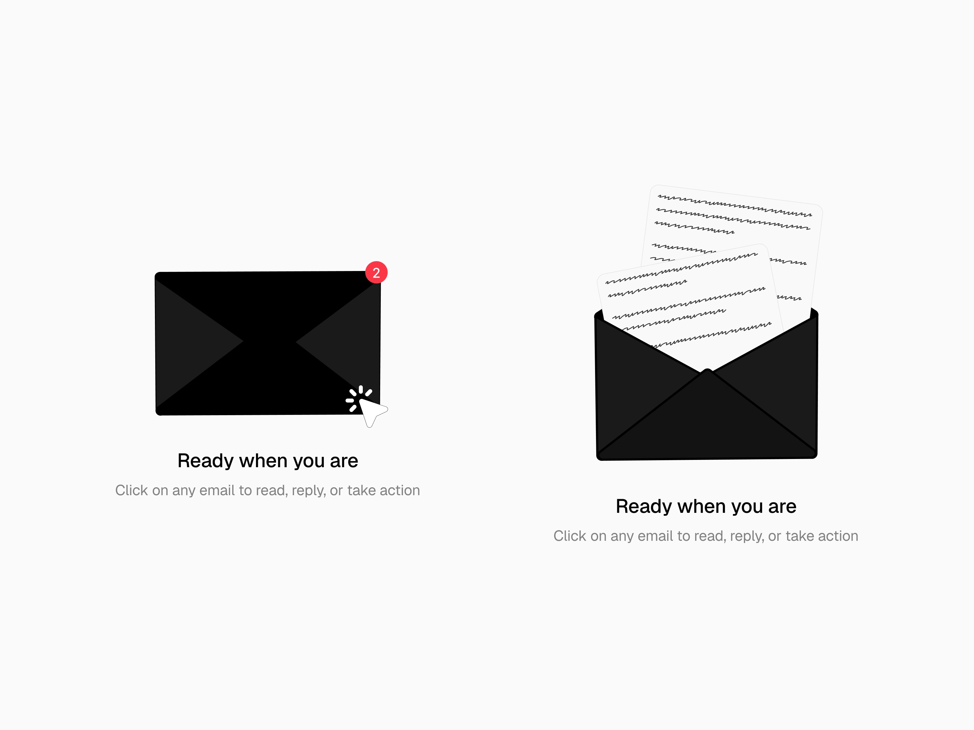
Empty state illustration
Like this project
Posted Apr 1, 2026
A modern email client with AI-powered categorization, integrated calendar, and clean interface. Designed to feel familiar while working smarter.
Likes
4
Views
34