Built with Jitter
Motion Design for Digital Products
Wuraola Olaibi
Case Study: Motion Design for Product Clarity and Storytelling
This project explores how motion can be used to communicate product value, guide users, and make interfaces feel intentional and easy to understand.
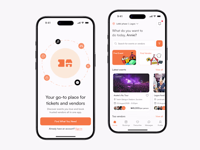
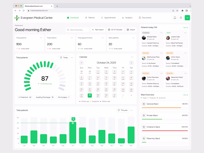
The work spans multiple touchpoints across web and mobile, including hero section animations, a bento grid feature showcase, splash screen onboarding, and a mobile app walkthrough. Each animation was designed to serve a specific purpose, whether introducing the product, explaining structure, or helping users understand key flows.
Rather than treating motion as decoration, the focus was on using timing, hierarchy, and transitions to support clarity and reduce cognitive load. The bento grid animation highlights features without overwhelming the user, the onboarding sequence sets tone and expectation, and the mobile walkthrough demonstrates real usage in a way that feels natural and intuitive.
This case study shows how thoughtful motion design can elevate product storytelling, improve usability, and create a more polished, cohesive experience across platforms.
Hero section animation
Hero section animation
Grid animation
Dashboard animation
Like this project
Posted Jan 1, 2026
Motion design across web and mobile, including hero animations, bento grids, onboarding, and app walkthroughs, focused on clarity and product storytelling.
Likes
6
Views
36