Built with Jitter
Bina - Events Vendor Booking App Design
Wuraola Olaibi
Project Details
Title
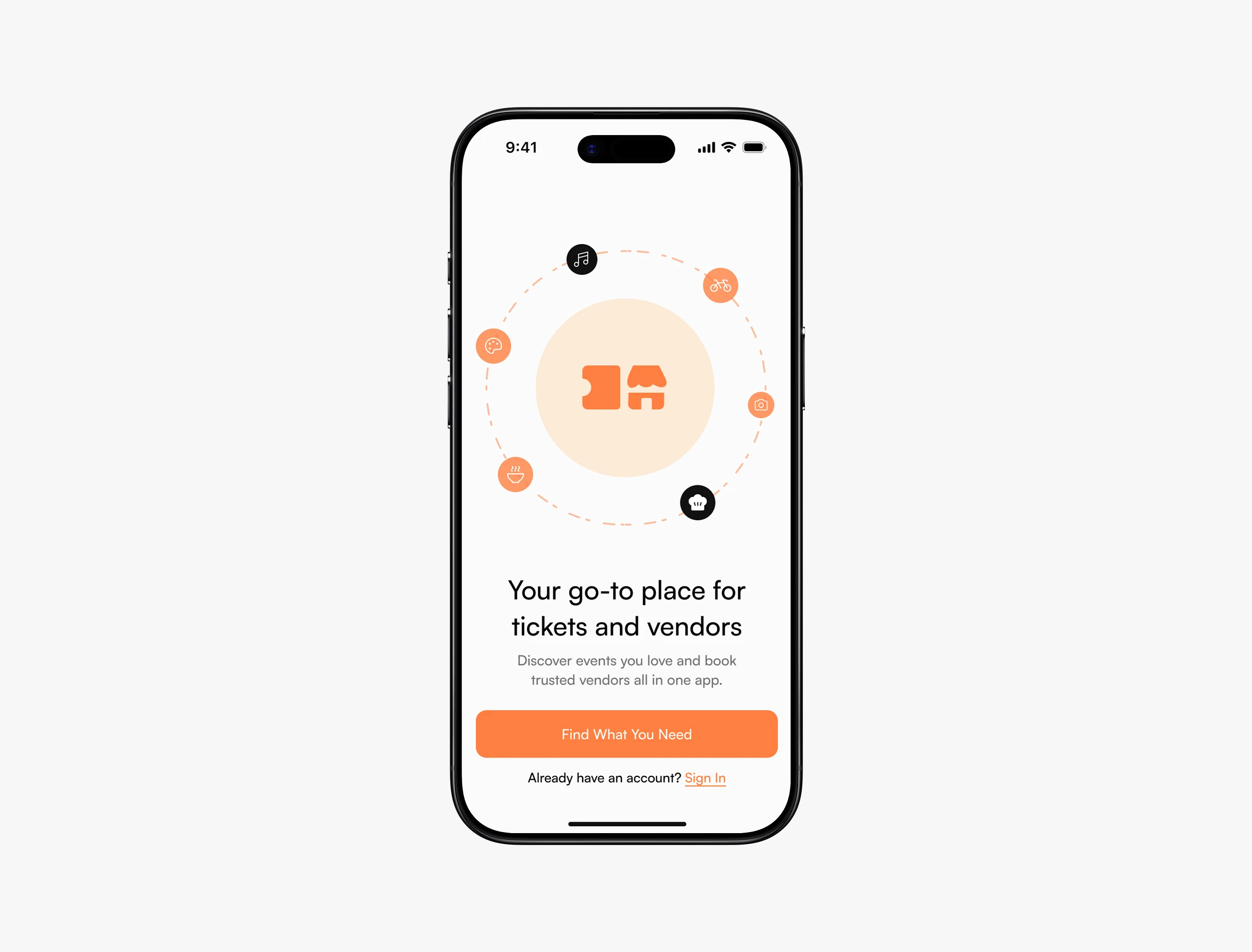
Bina - Event Discovery and Vendor Booking App
Short description
Bina is a mobile app that helps users discover events and book trusted vendors in one place. From buying event tickets to hiring caterers, DJs, photographers, and artists, the app simplifies planning without overwhelming users.
Your role
Product Designer
Responsibilities: UX research, user flows, interaction design, UI design, prototyping
Platform
Mobile iOS and Android
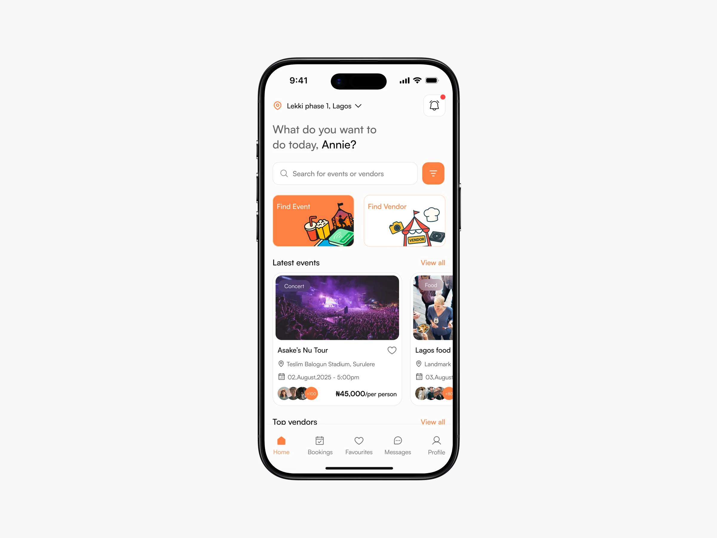
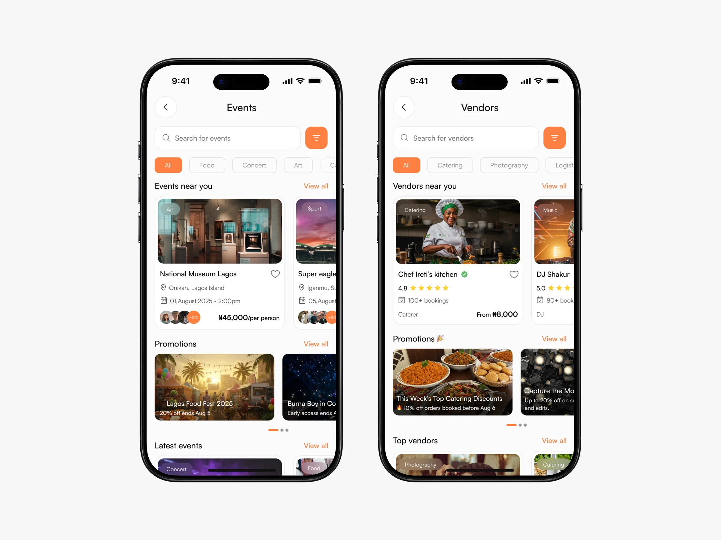
Home screen
2. The Problem
Problem statement
Planning events often means jumping between multiple platforms on,e for tickets, another for vendors, and endless back-and-forth messages to confirm details. This leads to confusion, wasted time, and uncertainty about pricing, availability, and expectations.
Key issues identified
Event discovery and vendor booking are fragmented
Vendor pricing and offerings are often unclear
Customization can easily become overwhelming
Users need clarity without feeling restricted
3. Project Goal
Goal
Design a seamless experience that allows users to:
Discover events
Book tickets easily
Find and book vetted vendors
Customize vendor services without confusion
Success meant
Fewer decisions at each step
Clear ownership of choices (vendor sets options, user selects)
A flow that feels guided, not rigid
Events and vendors details screen
4. Target Users
Primary users
People attending events
People planning small to medium events (birthdays, dinners, celebrations)
Users booking vendors for one-off events
Key needs
Trust in vendors
Clear pricing
Flexible but structured customization
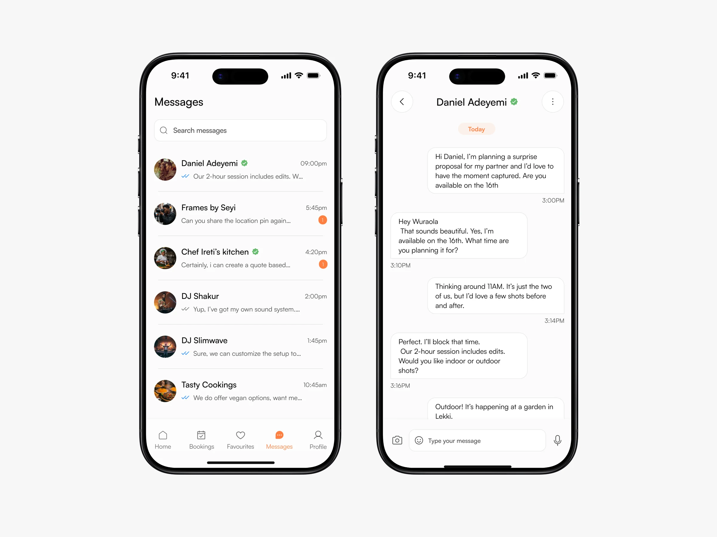
Fast booking without long chats
Vendor checkout flow
5. Key Design Challenge
The core challenge
How do you allow customization without turning the flow into chaos?
Let users feel in control, but:
Vendors must define what they offer
Users should only choose from available options
The flow should never feel heavy or technical
This decision influenced almost every screen that followed.
I had to decide how users should book services without overwhelming them or creating false expectations.
6. The solution
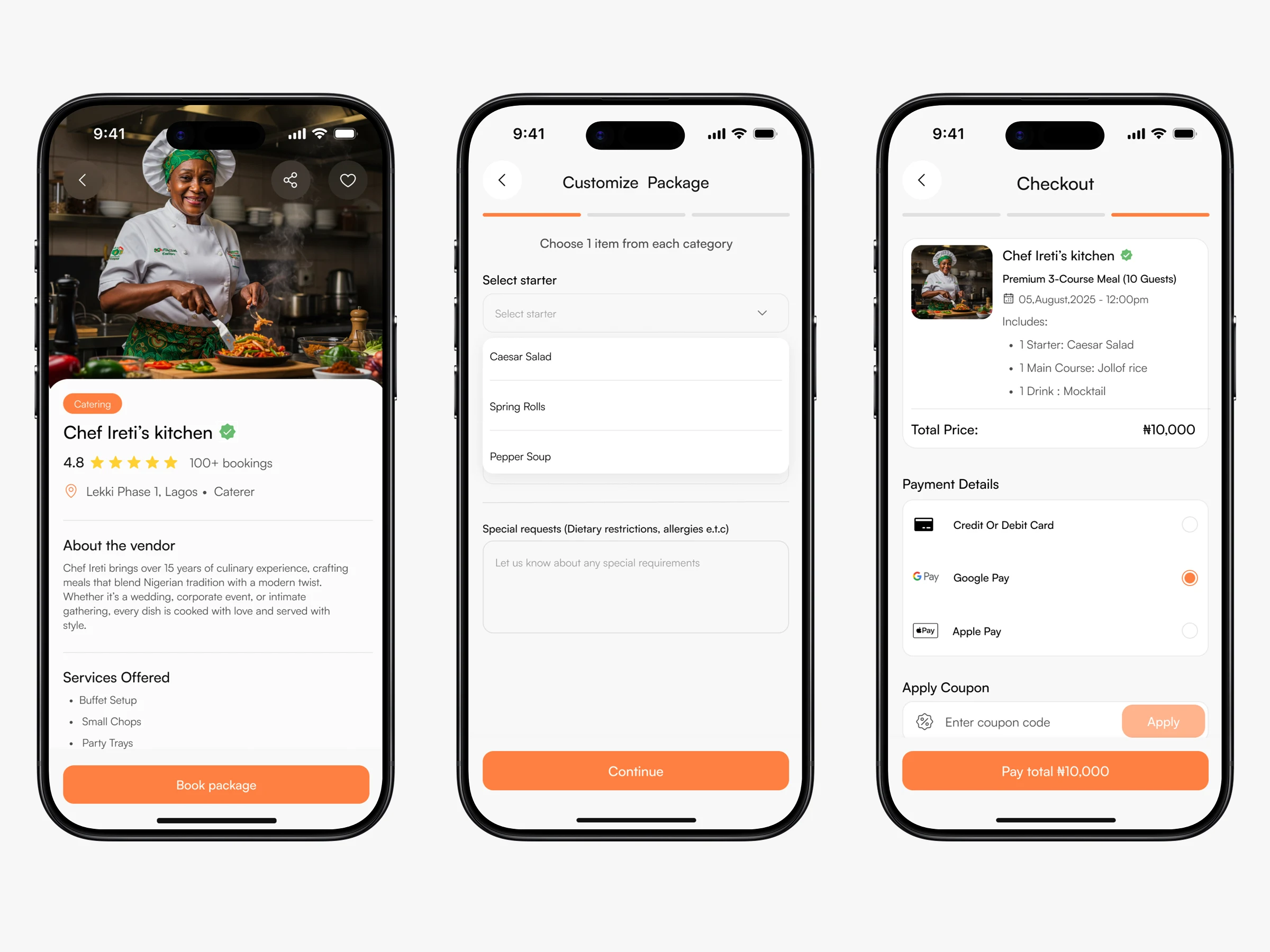
A. Packages First, Customization Second
Instead of letting users build meals or services from scratch:
Vendors create packages
Each package defines what’s included
Users customize within those boundaries
This keeps expectations clear on both sides.
B. Step-by-Step Booking Flow
To reduce cognitive load, the vendor booking flow was broken into steps:
Select a package
Customize items based on vendor-defined options
Add delivery details (date, time, location)
Review and pay
Each step answers one question only.
C. Events and Vendors as Parallel Experiences
Events and vendors share patterns but not identical flows:
Events focus on tickets and dates
Vendors focus on packages and service details
This avoids forcing one mental model onto everything.
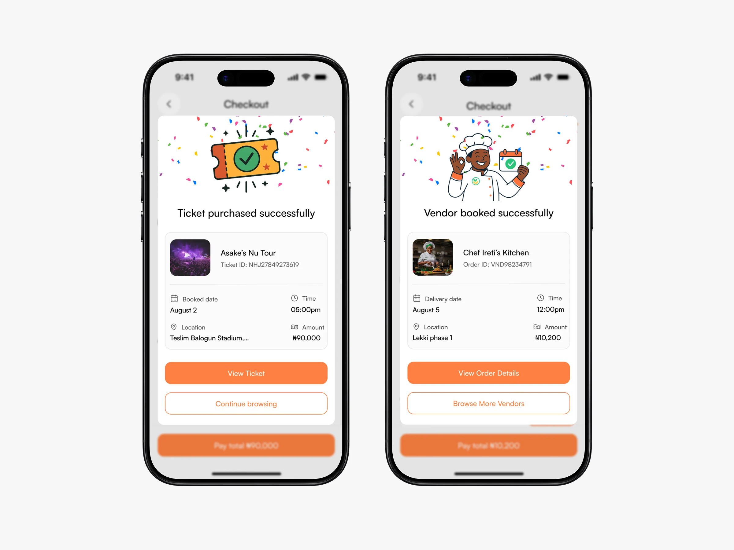
Success screens
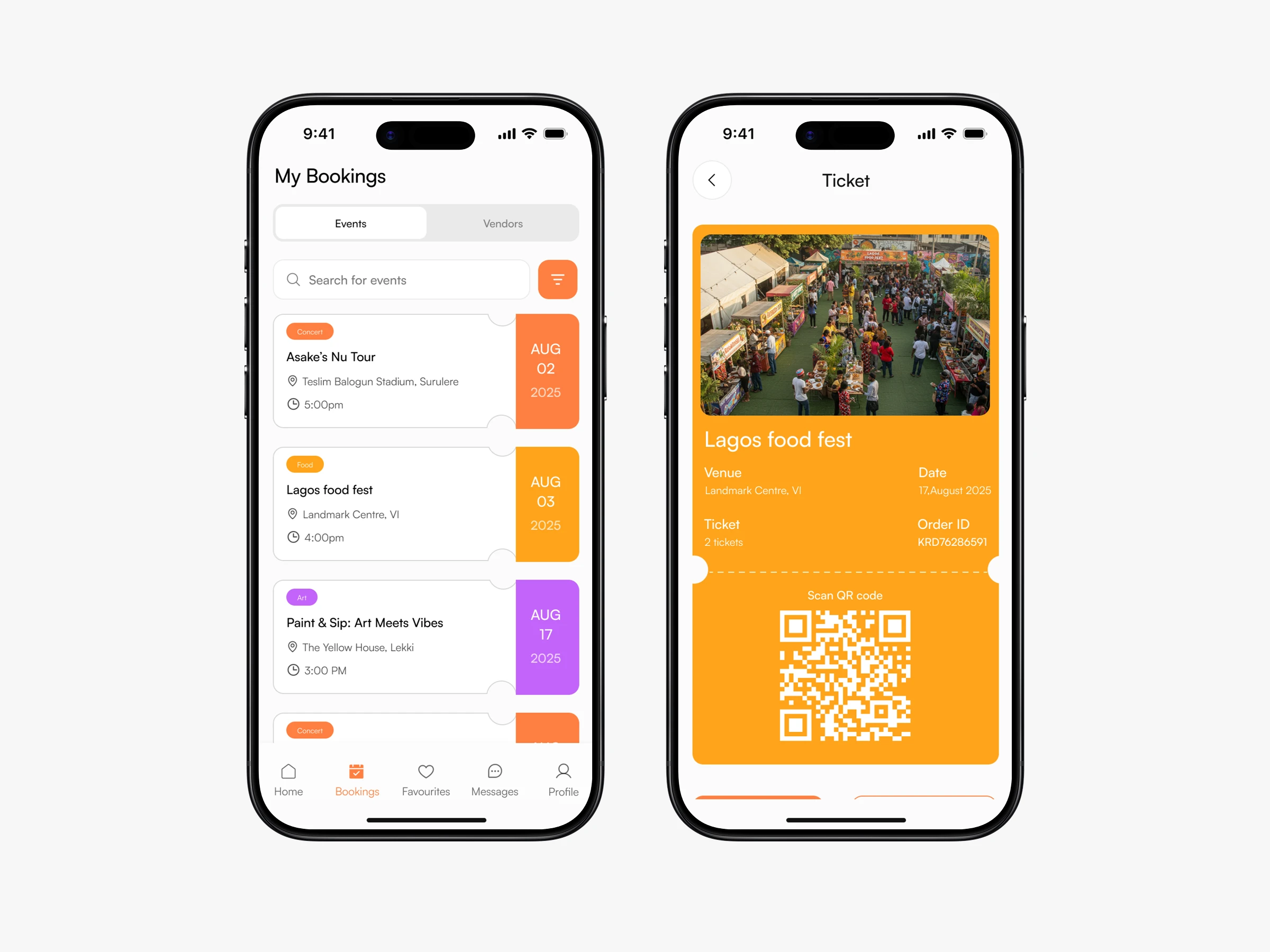
Booking tabs and booked event details
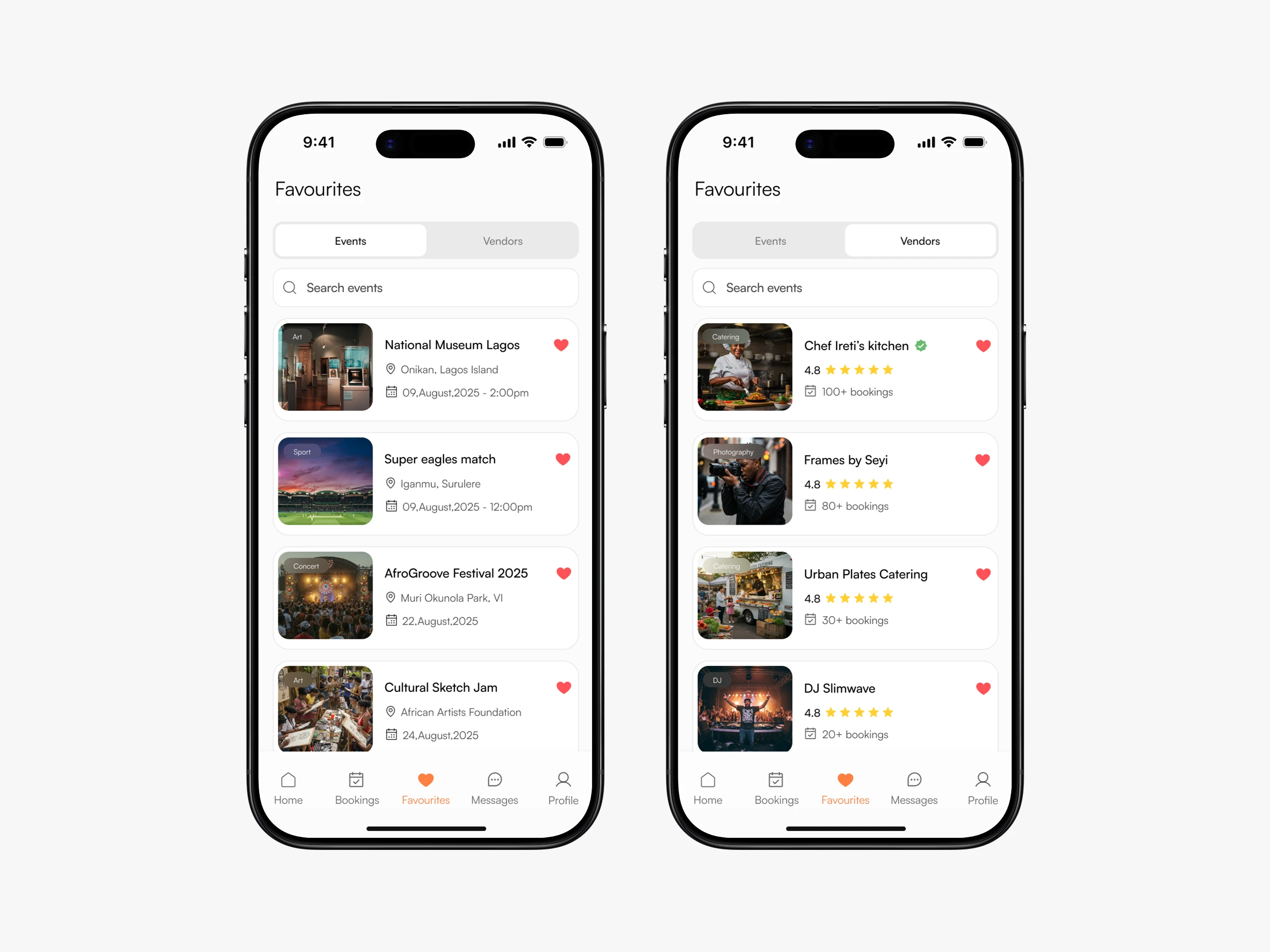
Favourites tab
10. What I Learned
Key learnings
Structure creates freedom, not limitation
Customization works best when boundaries are clear
Good UX often means saying “no” to complexity
Breaking flows into steps reduces anxiety
11. Final Note
This project challenged me to think beyond layouts and focus on how real people make decisions under pressure. Designing Bina was about creating clarity, not just screens.
Profile
Like this project
Posted Dec 17, 2025
Bina is a mobile app for discovering events and booking in one place. Users can explore events and then easily book vendors based on availability, and reviews
Likes
9
Views
80
Timeline
Aug 1, 2025 - Dec 14, 2025
Clients
Bina