Built with Jitter
MedBridge - Medical Landing Page Design
Wuraola Olaibi
1.Project Details
Role: UI/UX Designer
Duration: 1 week
Tools: Figma, Framer
Platform: Web (Responsive)
MedBridge is a healthcare booking platform designed to simplify the process of finding and booking verified doctors. The landing page focuses on building trust, reducing friction, and converting visitors into users through clear information architecture and strategic design decisions.
THE PROBLEM
Picture this: It's 9 AM on a Monday. You wake up feeling unwell and need to see a doctor. You start calling clinics, only to be put on hold for 15 minutes. When someone finally picks up, the earliest appointment is three weeks away. You try another clinic. Same story. By noon, you're frustrated, still sick, and no closer to getting help.
This is the reality for millions of people trying to access healthcare.
The pain points were clear:
Endless phone calls with long wait times
No way to compare doctors or see their credentials upfront
Uncertainty about pricing and insurance coverage
Limited visibility into doctor availability
Zero transparency around patient experiences
The question became: How might we remove these barriers and make healthcare access feel as simple as ordering food online?

THE GOAL
Design a landing page that immediately communicates trust and simplicity. A page where someone could land, understand the value within seconds, and feel confident enough to take the first step toward booking an appointment.
Success would look like:
Visitors understanding what MedBridge offers within 5 seconds
Users feeling confident about doctor quality and credentials
Clear path from "interested visitor" to "registered user"
Mobile experience as seamless as desktop
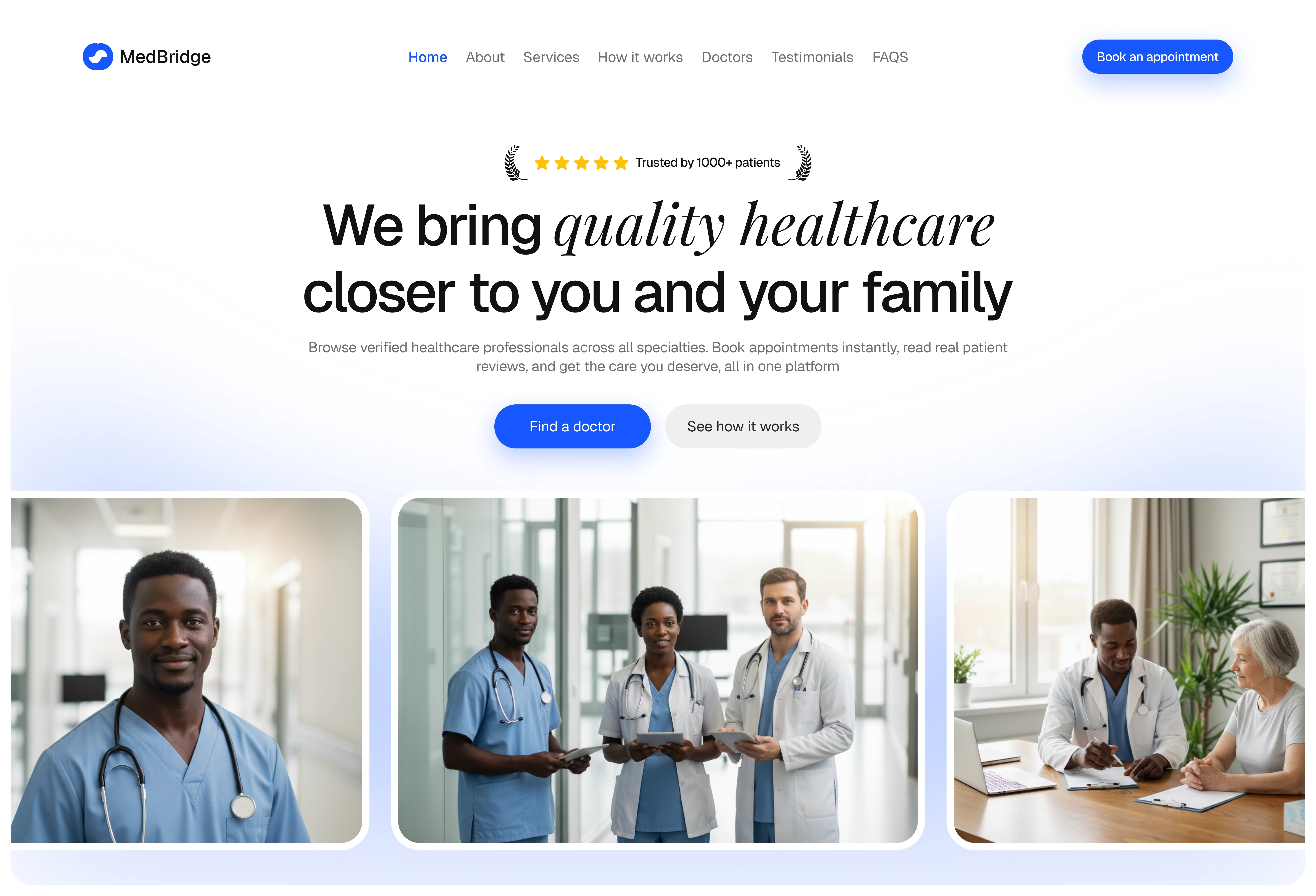
Hero section
THE DESIGN APPROACH
Building Trust from the First Second
When someone lands on the page, they're asking: "Is this for me? Can you solve my problem?"
The hero answers immediately with a simple promise: "We bring quality healthcare closer to you and your family." Not corporate. Not cold. Just reassurance.
The trust badge ("Trusted by 1000+ patients") sits right at the top, before you even scroll, you know others have used this successfully. The primary CTA is bold and impossible to miss.
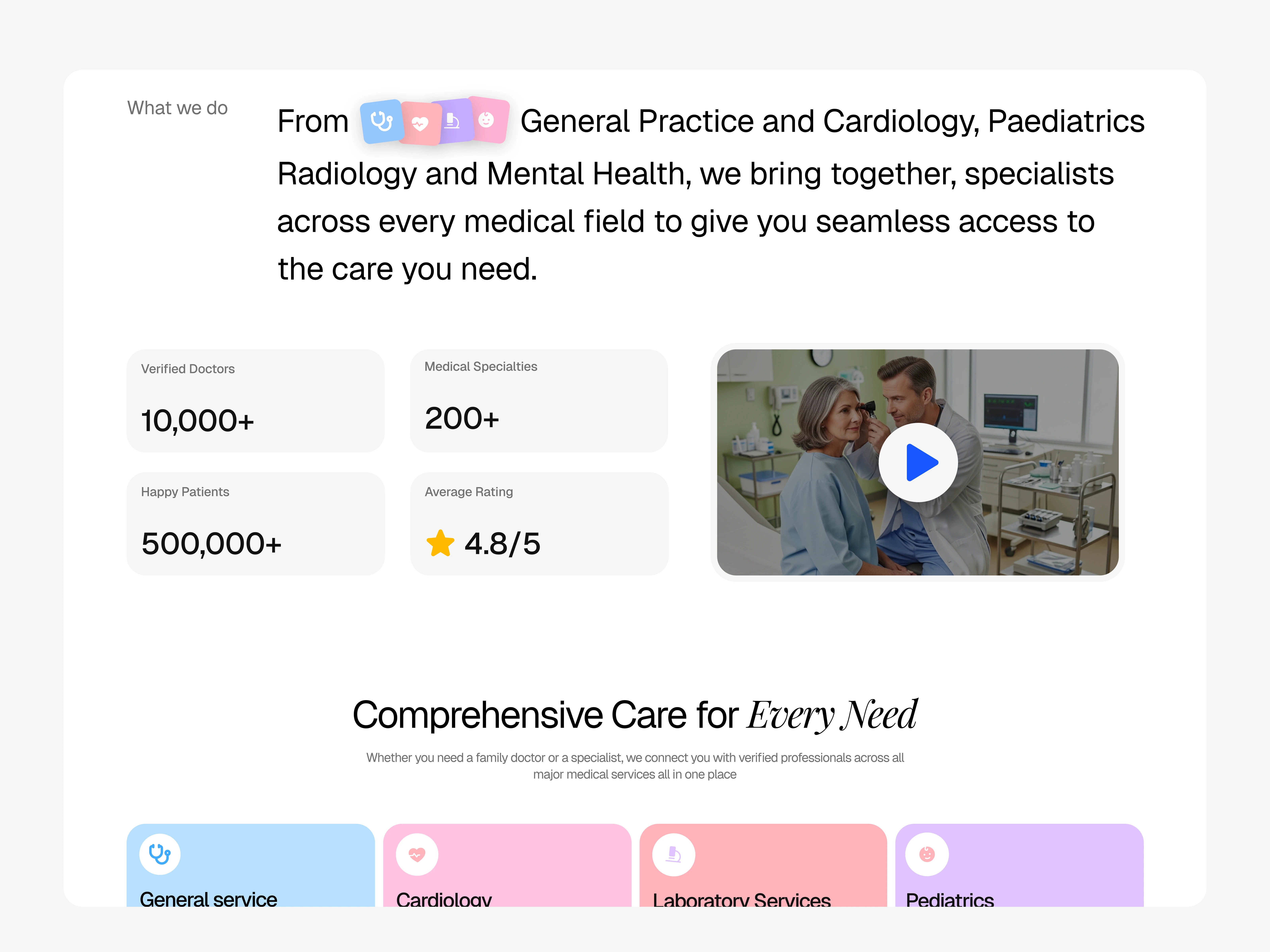
What we do section
Layering Social Proof
Right after the hero, stats compound the trust: "10,000+ Verified Doctors. 500,000+ Happy Patients. 4.8/5 Rating."
Why here? Because trust compounds. The hero makes a promise. The stats immediately back it up.
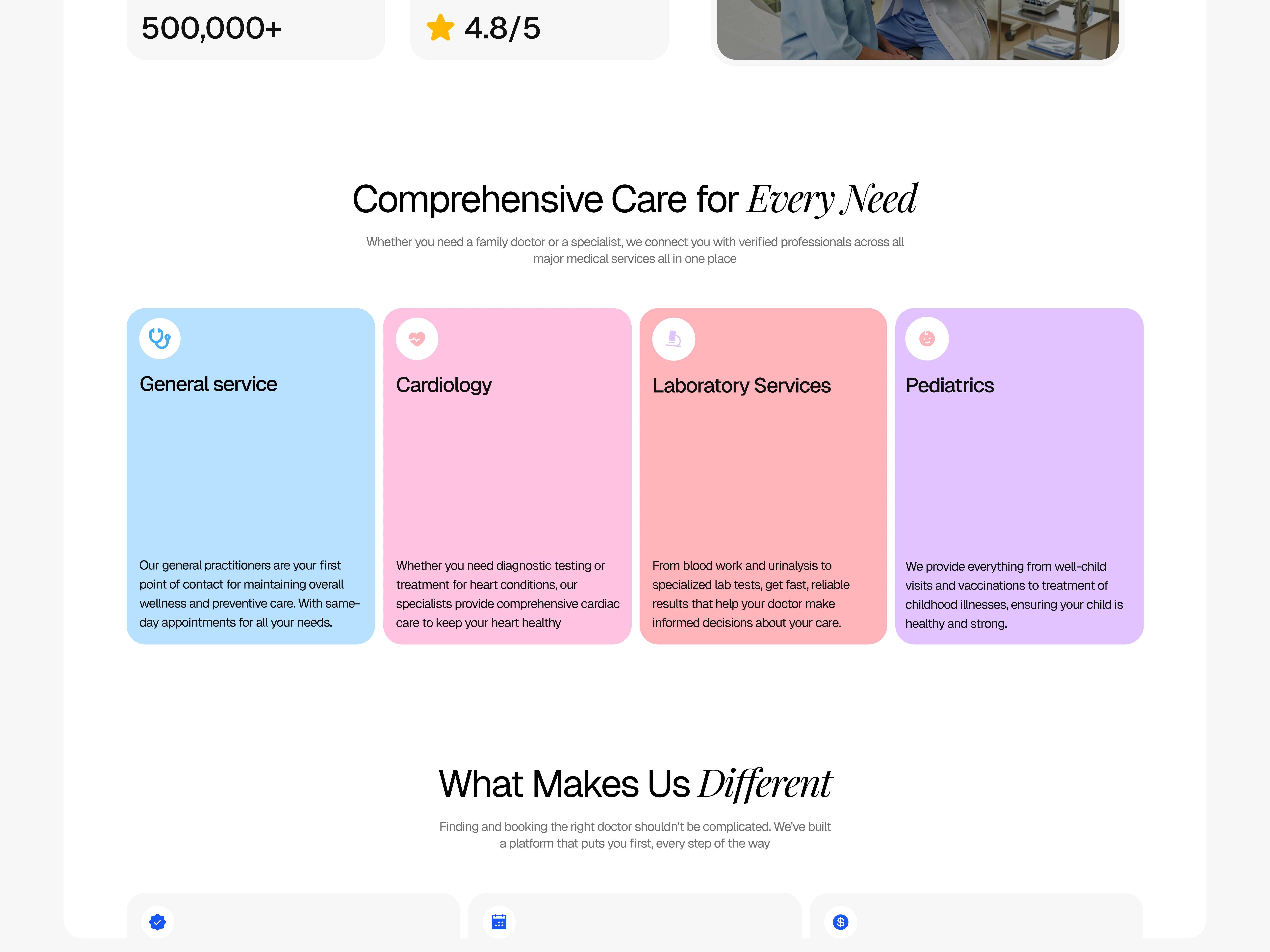
Our services section
Making Services Scannable
The services section uses color-coded icons for instant recognition:
General Practice (Blue)
Pediatrics (Pink)
Cardiology (Red)
Laboratory Services (Purple)
Each has a brief description focused on outcomes, not features. Users can glance and think, "They have what I need."
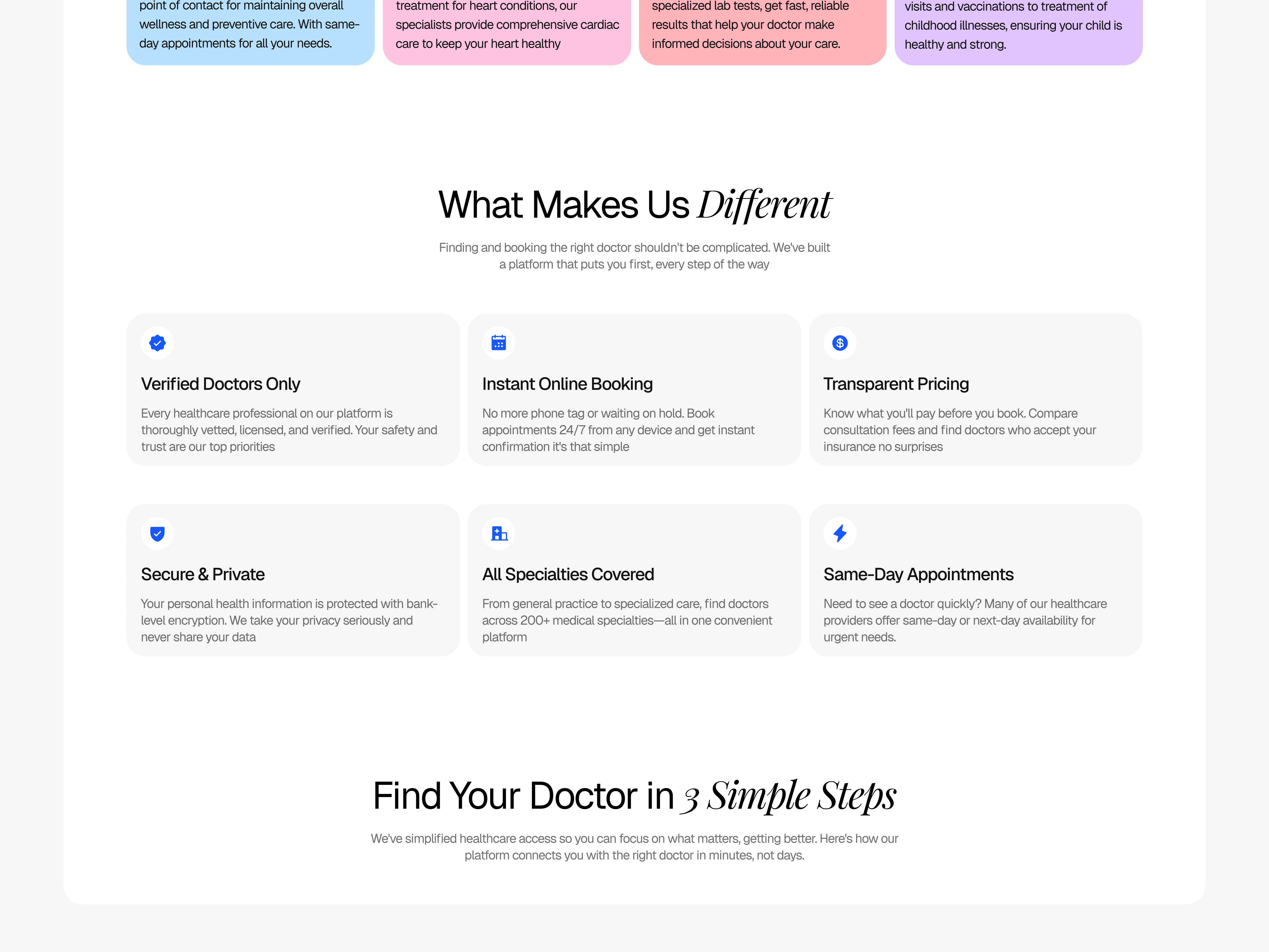
Why choose us section
Addressing Objections Head-On
The "Why Choose Us" section tackles concerns before users ask:
"How do I know doctors are good?" → Verified Doctors Only
"I hate phone tag." → Instant Online Booking
"What if reviews are fake?" → Real Patient Reviews
"How much will this cost?" → Transparent Pricing
"Is my data safe?" → Secure & Private
"Do they have specialists?" → All Specialties Covered
Each benefit is paired with an icon for quick scanning. The copy is conversational—a friend reassuring you, not a company pitching.
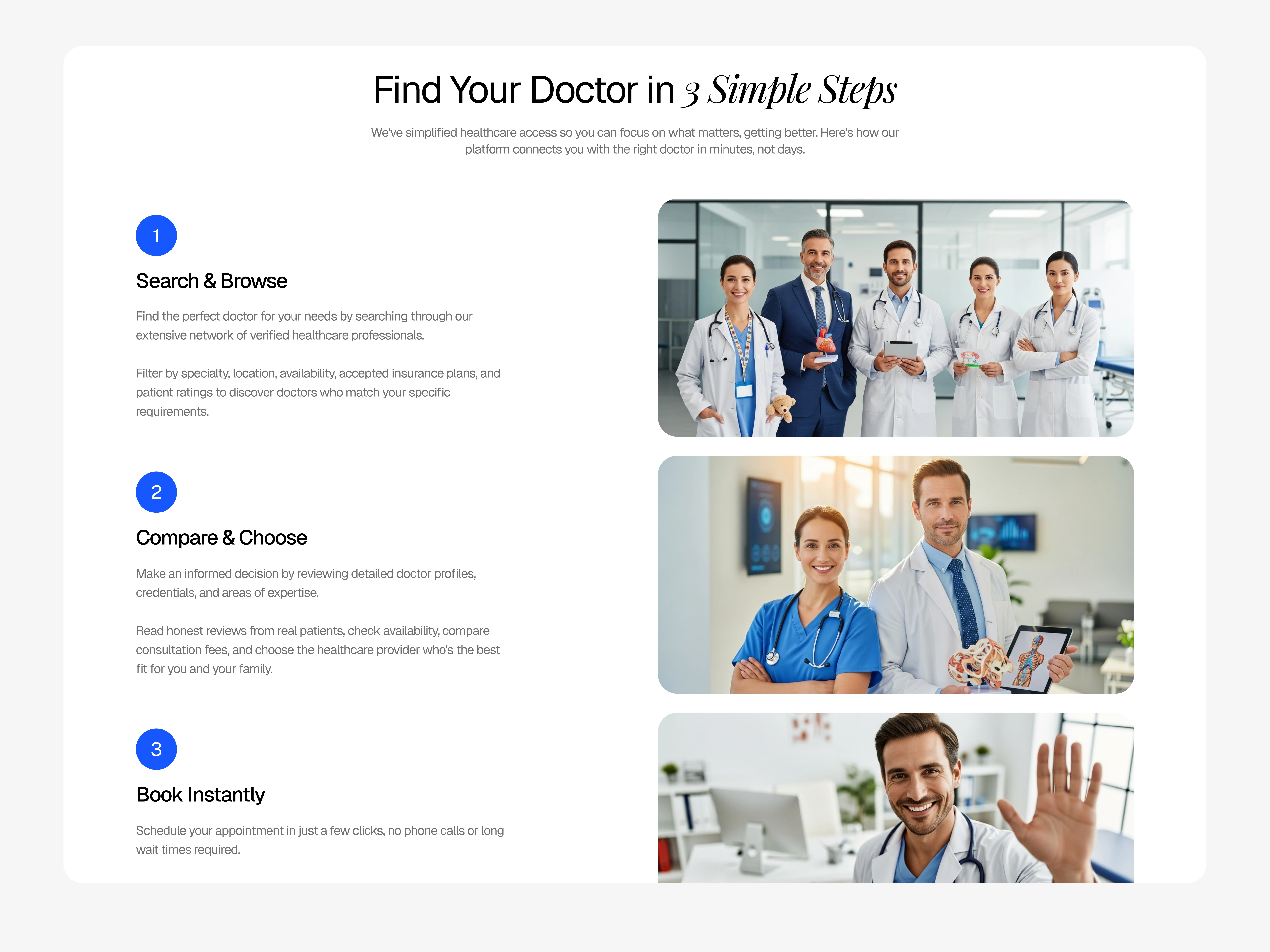
How it works section
Simplifying the Complex
The "How It Works" section breaks booking into three easy steps:
Step 1: Search & Browse - Choice and control
Step 2: Compare & Choose - Confidence through information
Step 3: Book Instantly - Accomplished in seconds
The progression tells a story: From overwhelmed → empowered → accomplished.
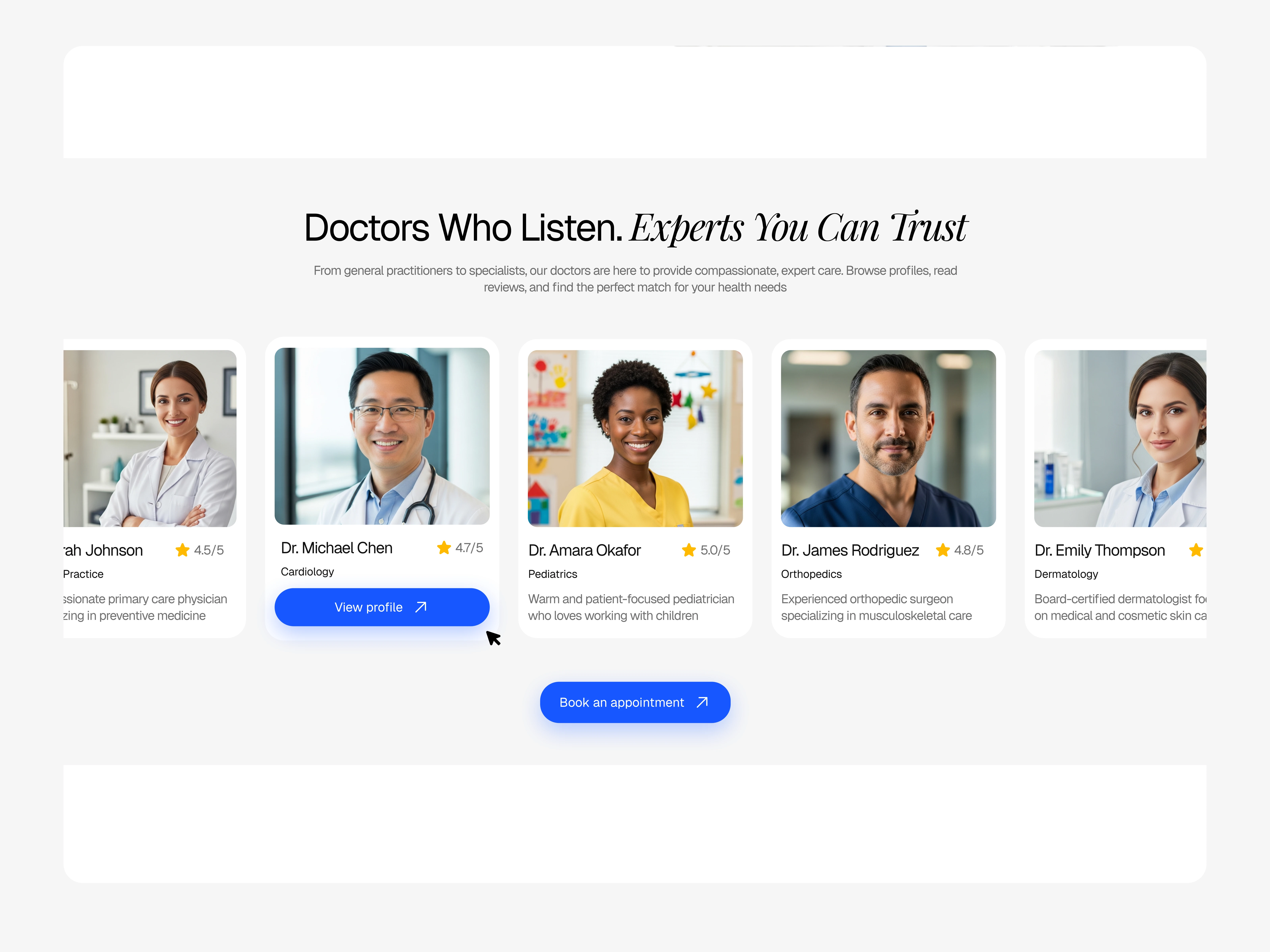
Featured doctors section
Humanizing the Platform
Featured doctors put real faces to the service. Six doctors across different specialties, genders, ages, and backgrounds so users can see themselves reflected.
Each card shows a professional photo, name, specialty, years of experience, rating, and a brief bio that adds personality: "Compassionate primary care physician dedicated to building lasting relationships with patients and their families."
That's someone you'd want as your doctor.
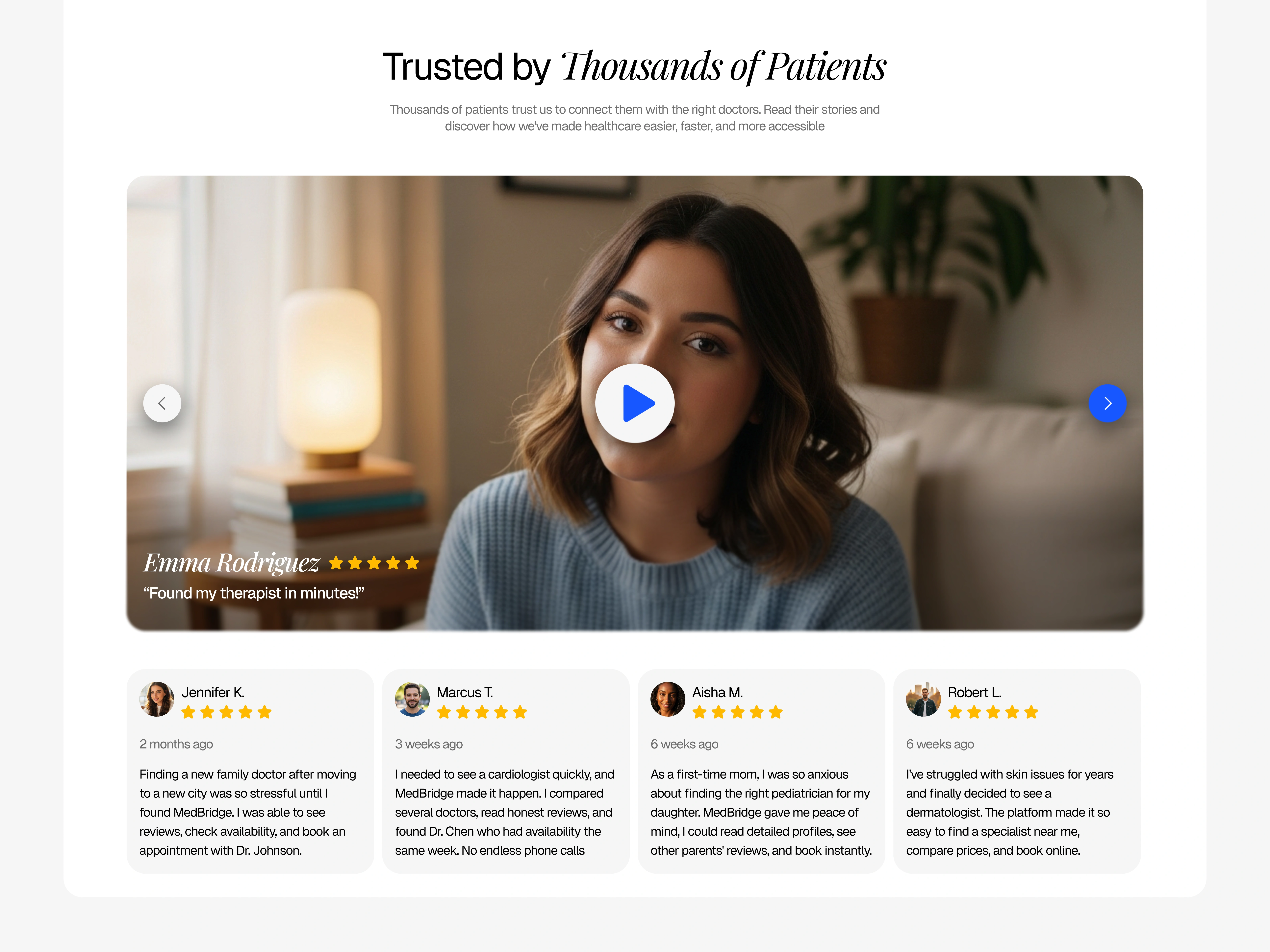
Testimonial section
Letting Users Speak
Testimonials answer the final question: "Will this work for me?"
I mixed text and video testimonials (4 text, 2 video) because different users trust different formats. Each includes the patient's name, photo, star rating, which doctor they booked, and a specific outcome.
The specificity matters. Generic praise doesn't convert. Specific stories do.
KEY TAKEAWAYS
Trust compounds - One trust signal isn't enough. Layer them, verification + reviews + credentials + testimonials and you build real confidence.
Transparency removes anxiety - Users don't want surprises. Show them everything upfront.
Simplicity wins - The simpler the process appears, the more likely users are to start it.
Social proof is non-negotiable - Real stories from real people are more persuasive than any marketing copy.
Design for mobile first - If it works beautifully on a phone, it'll work everywhere.
VIEW THE LIVE DESIGN

Like this project
Posted Dec 17, 2025
Landing page for medical booking platform. Clean design focused on user trust and seamless appointment booking experience.