Built with Jitter
Horizon - Task management dashboard
Wuraola Olaibi
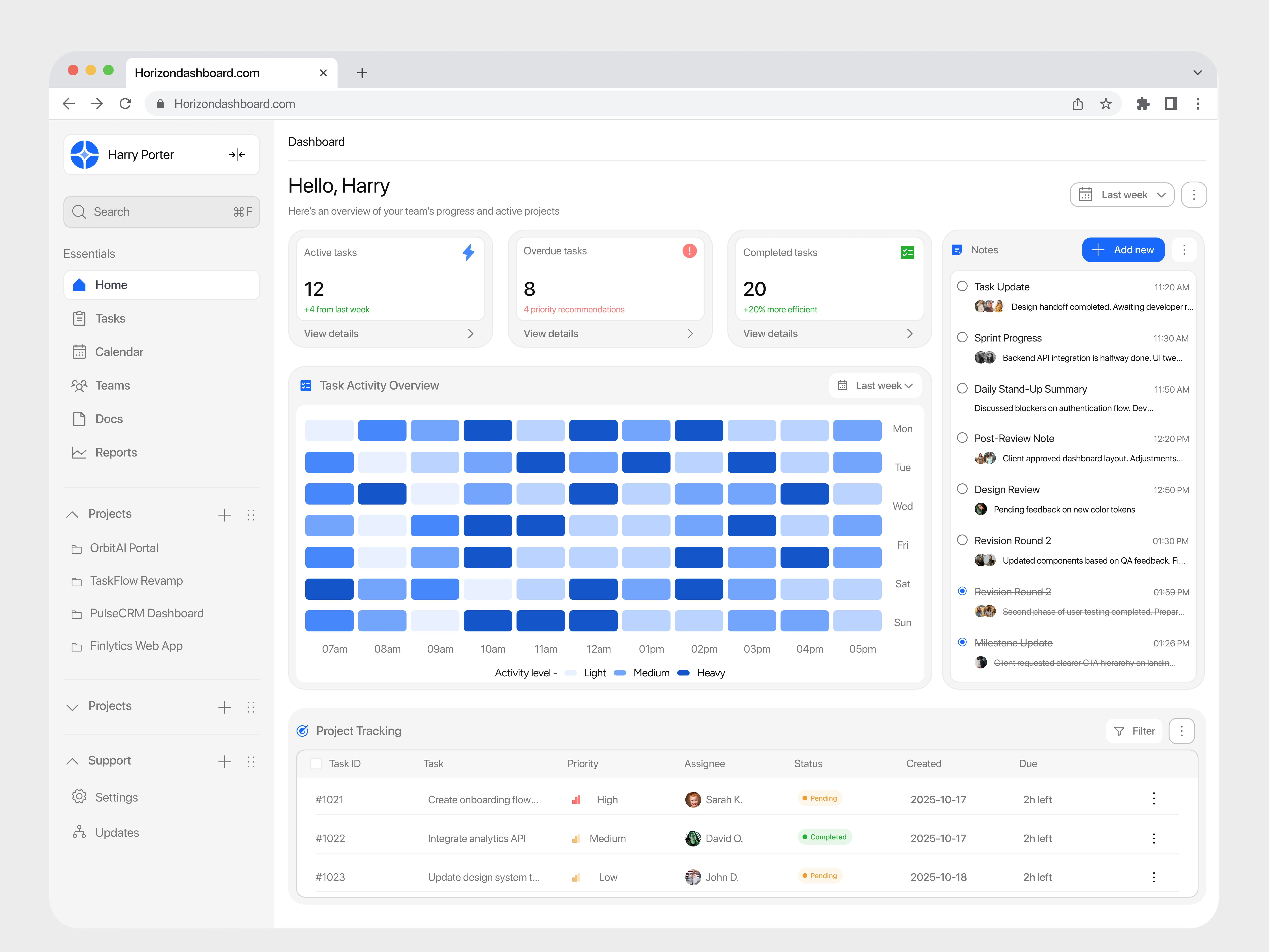
This dashboard was designed to help teams understand progress and priorities at a glance. The layout is intended to reduce the time needed to understand team status by surfacing key information within the first 5–10 seconds of viewing.
By consolidating task data into a single overview, the interface is designed to reduce navigation steps by 30–40 percent, allowing users to quickly identify active, overdue, and completed tasks without switching screens.
The clear separation of task states is intended to improve prioritization and help teams address blockers earlier, potentially reducing delayed tasks by 20 percent in active workflows. Limited high-priority metrics on the overview are designed to lower cognitive load and make decision making faster.
Recent updates and notes are intended to reduce the need for frequent status check ins, while week over week indicators support quick assessment of momentum and performance trends.
Overall, the dashboard is designed to improve clarity, focus, and alignment for teams managing multiple projects simultaneously.
Like this project
Posted Dec 17, 2025
The dashboard highlights priorities, reduces cognitive load, and helps users track progress, spot risks, and take action faster without digging through data.
Likes
3
Views
31