Brand, Product & Website for an AI Sustainability Platform

Leena | Product Design, UX/UI & Web


METIS is an AI-powered sustainability platform built to help businesses navigate ESG risk, compliance, and complex sustainability data.
METIS helps businesses make sense of ESG, the dense, high-stakes world of environmental, social, and governance data. But when I started, the entire brand fit in three colors and a few rough sketches.
The client showed up with three colors, one for each ESG pillar, and hand-drawn screens of the product they imagined. No logo, no website, no product UI.
That meant I wasn’t just designing screens. I had to turn a rough idea into a complete visual system. I used those three ESG colors as the foundation, then built the brand language, website, and product UI around them so everything felt like one coherent platform.
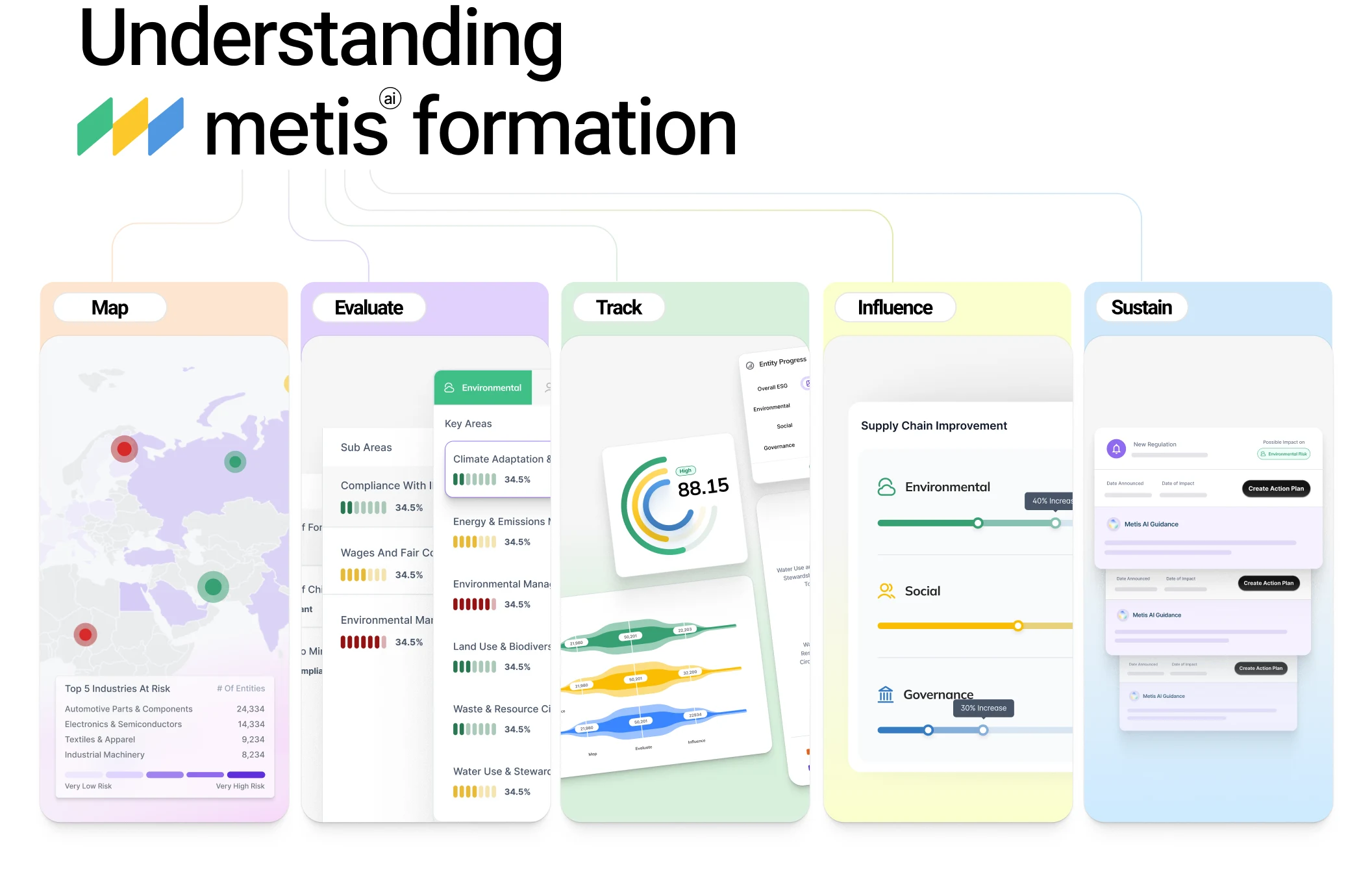
METIS breakdown
The client defined METIS as: Too much data, too overwhelming, and too boring. They wanted a modern UI that made the complexity feel manageable instead of like a wall of words.
That reframed the whole problem. This wasn't just "make it prettier." It was holding two things at once, cutting through the density without cutting the credibility an enterprise B2B product needs. Every screen had to ask less reading and more understanding from the user.
Since METIS had no visual anchor, the logo became the first step.
I brought the three ESG pillars into one simple, connected mark. Green for Environment, yellow for Social, blue for Governance. The color system carried that same logic everywhere. Green, yellow, and blue became the visual shorthand for each pillar across the product, website, and social. Same language in every touchpoint, so a dashboard chart, a landing page, and an Instagram post all speak the same way.
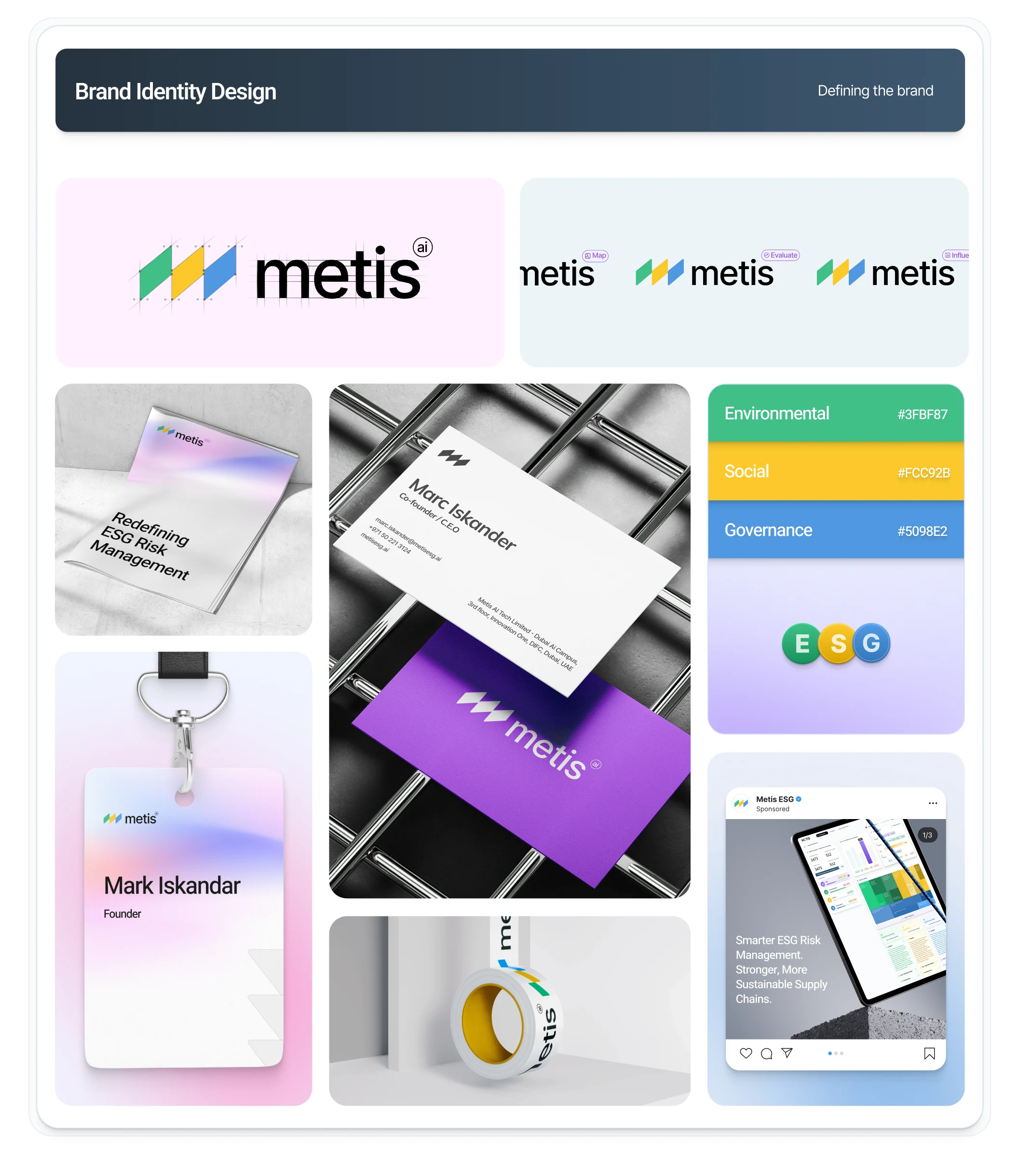
Branding
The wireframes: turning rough sketches into real structure.
The client provided a list of screens with what each one should show, plus a few generic hand-drawn sketches.
I used the screen list as the source of truth. Every screen had to exist, every requirement had to be covered. Then I refined each one into clean wireframes, which is where the hierarchy started: what's the primary action, what's supporting data, what does the eye land on first.
This is also where I did the data visualization research. ESG data comes in different shapes (trends, scores, risk levels, comparisons) and each shape deserves the right visual treatment.
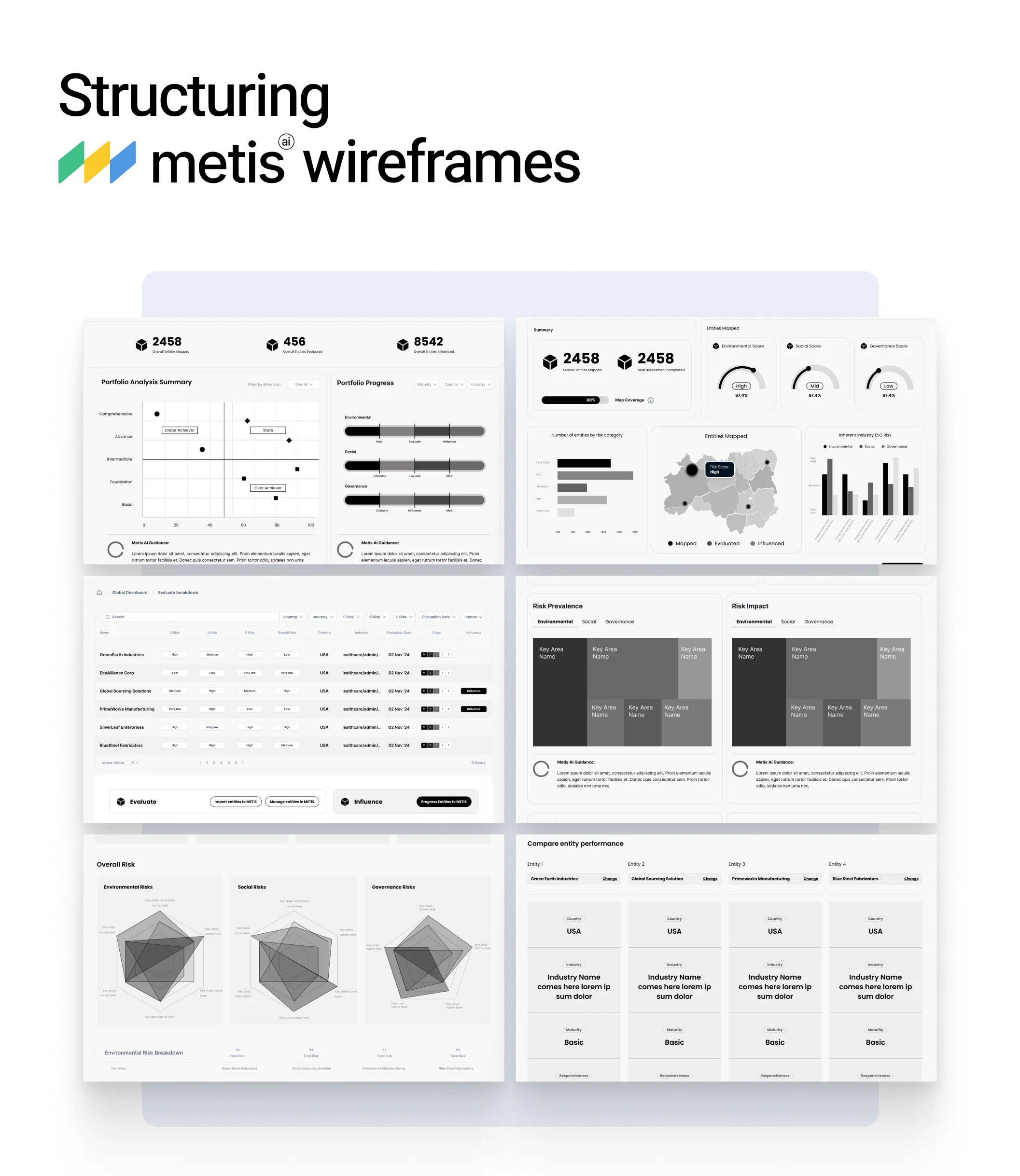
Wireframes
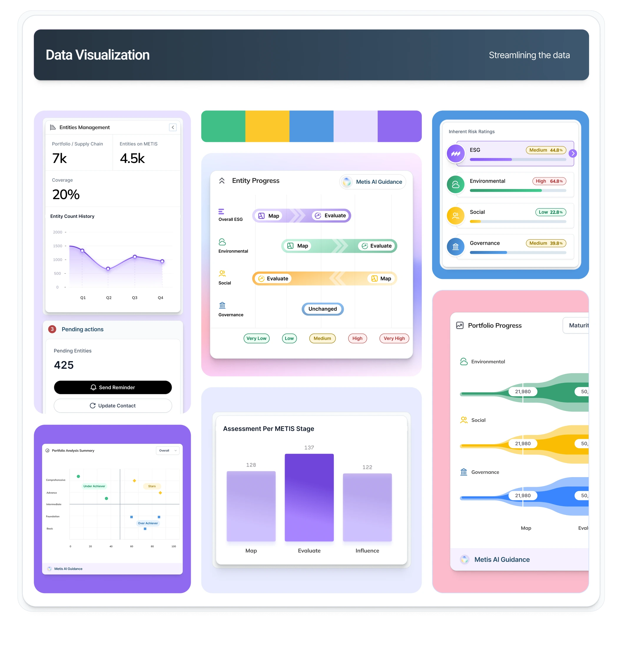
data visualization
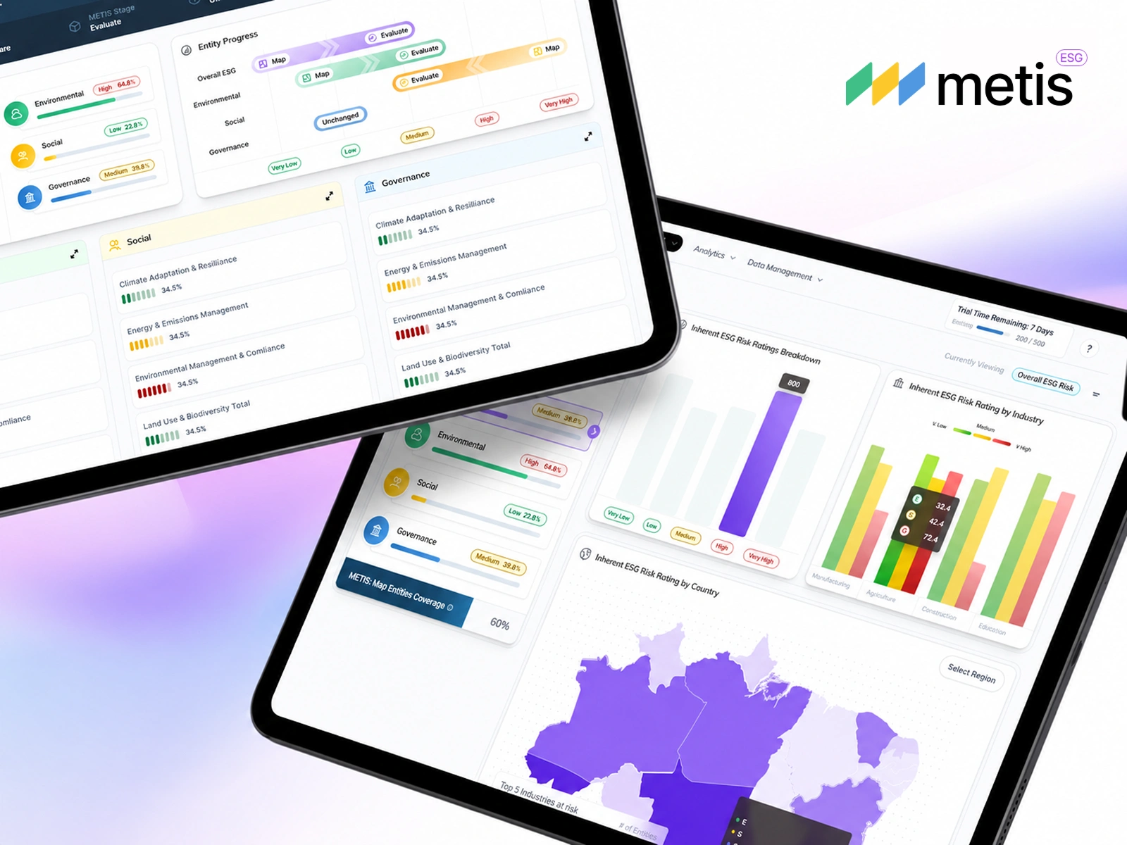
And the final product UI. Complex data, finally easy to look at.
The finished product is modern by design, because that was the requirement from day one. No walls of gray text, no dated enterprise dashboards. The data visualizations had to be interesting, the type of charts people actually want to open.
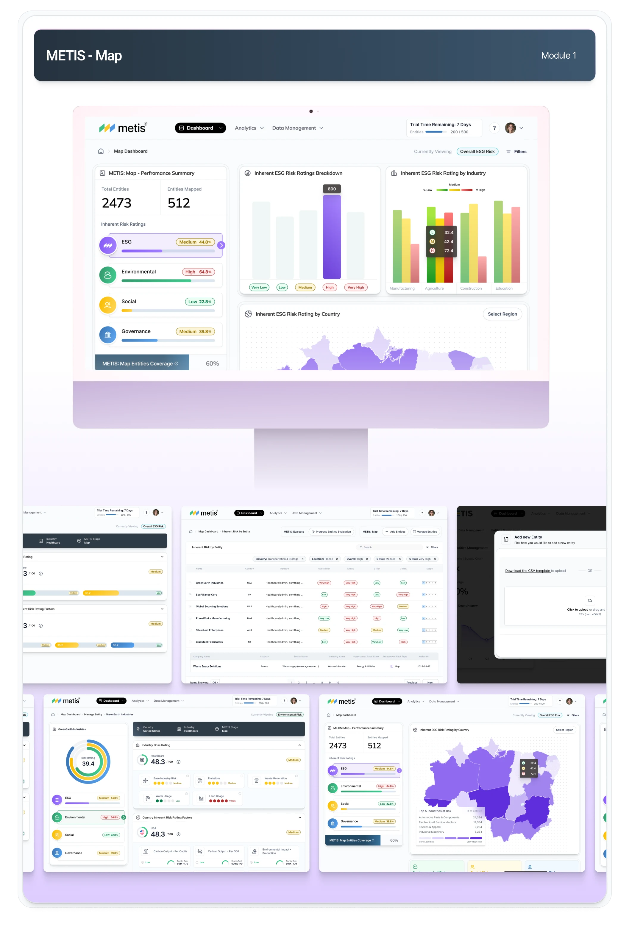
MAP screens
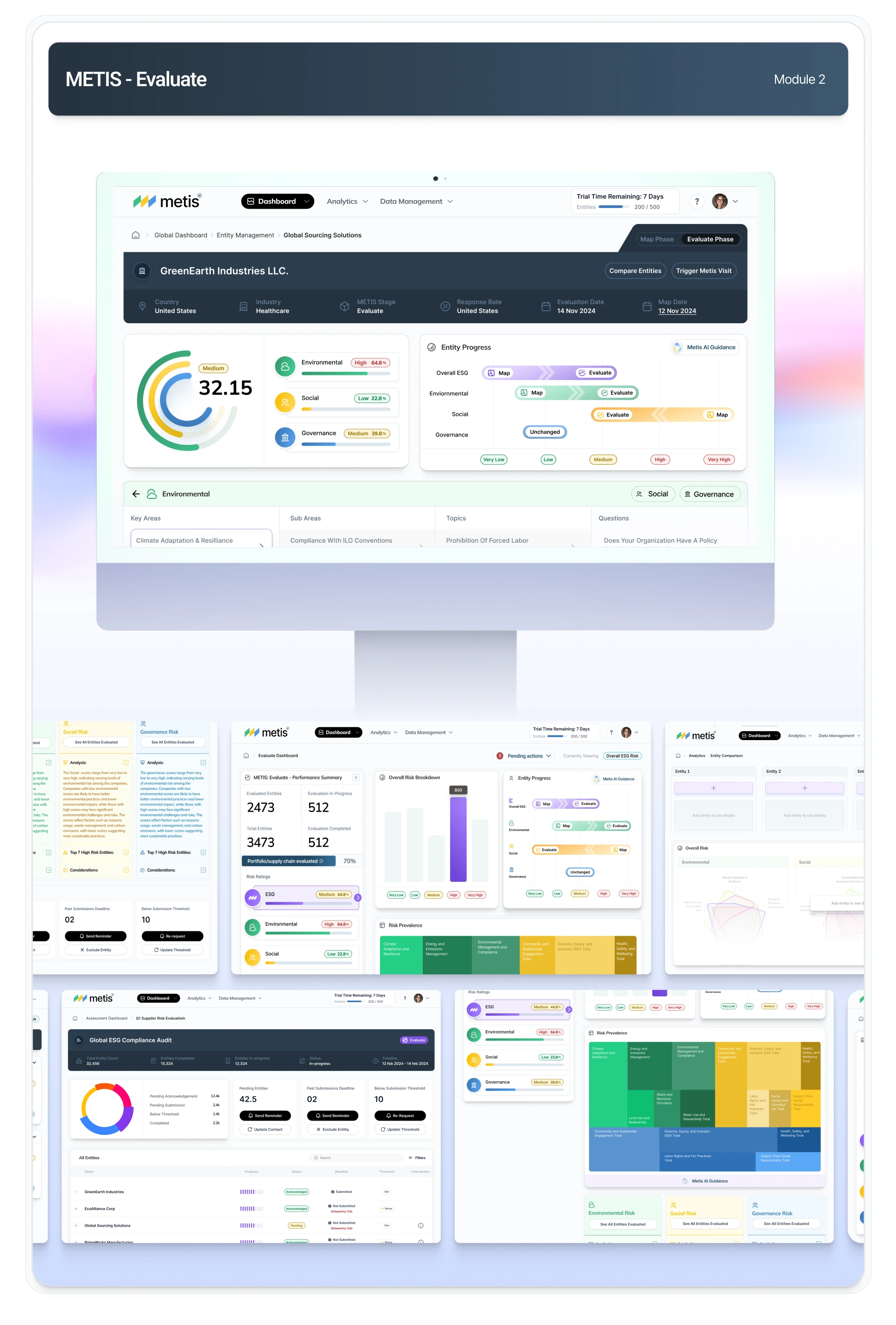
EVALUATE Screens
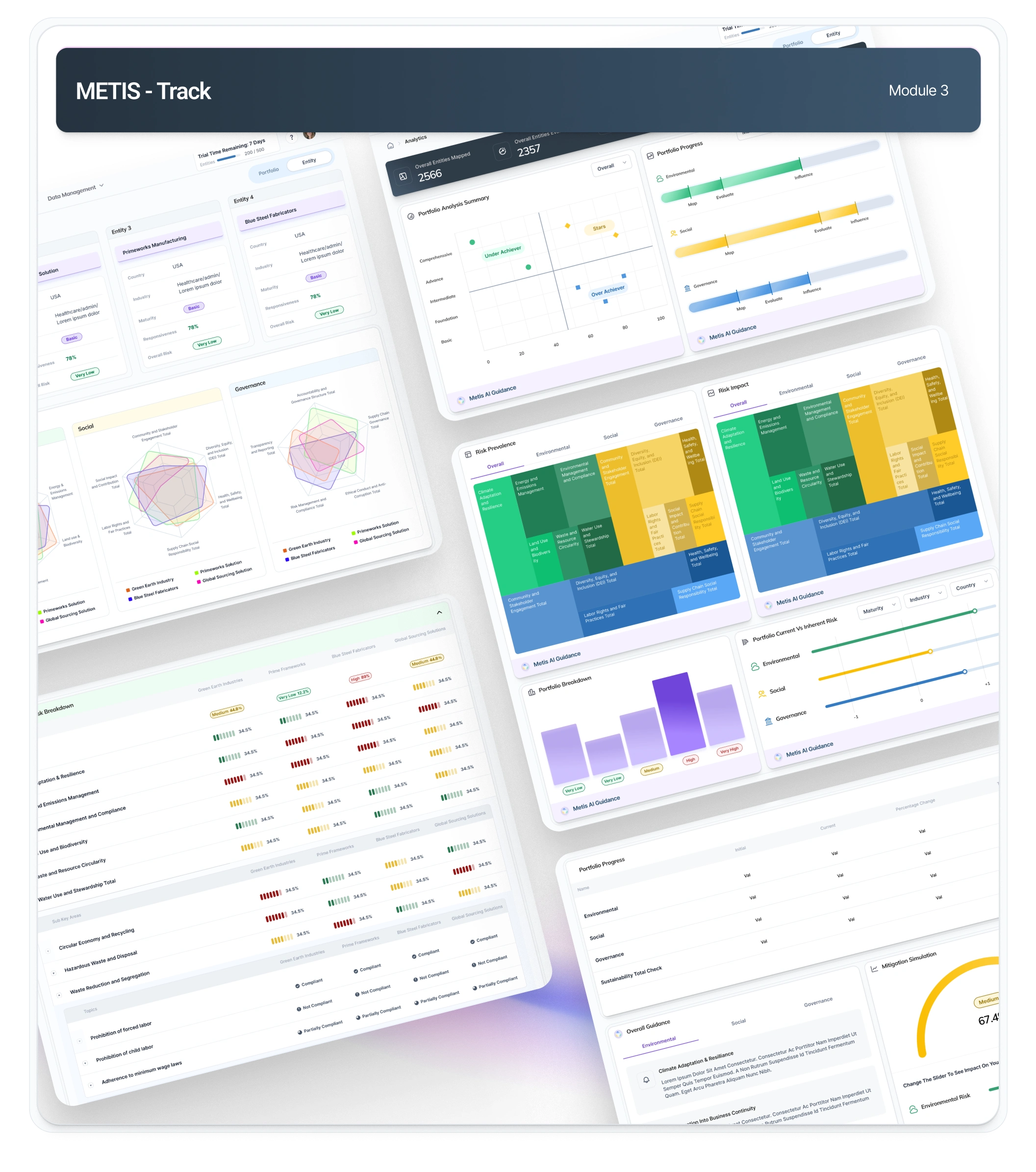
TRACK Screens
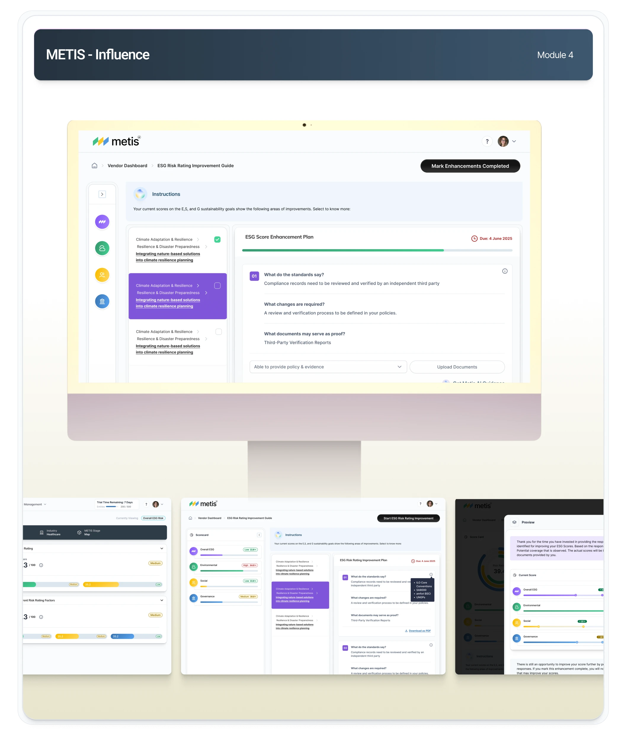
INFLUENCE Screens
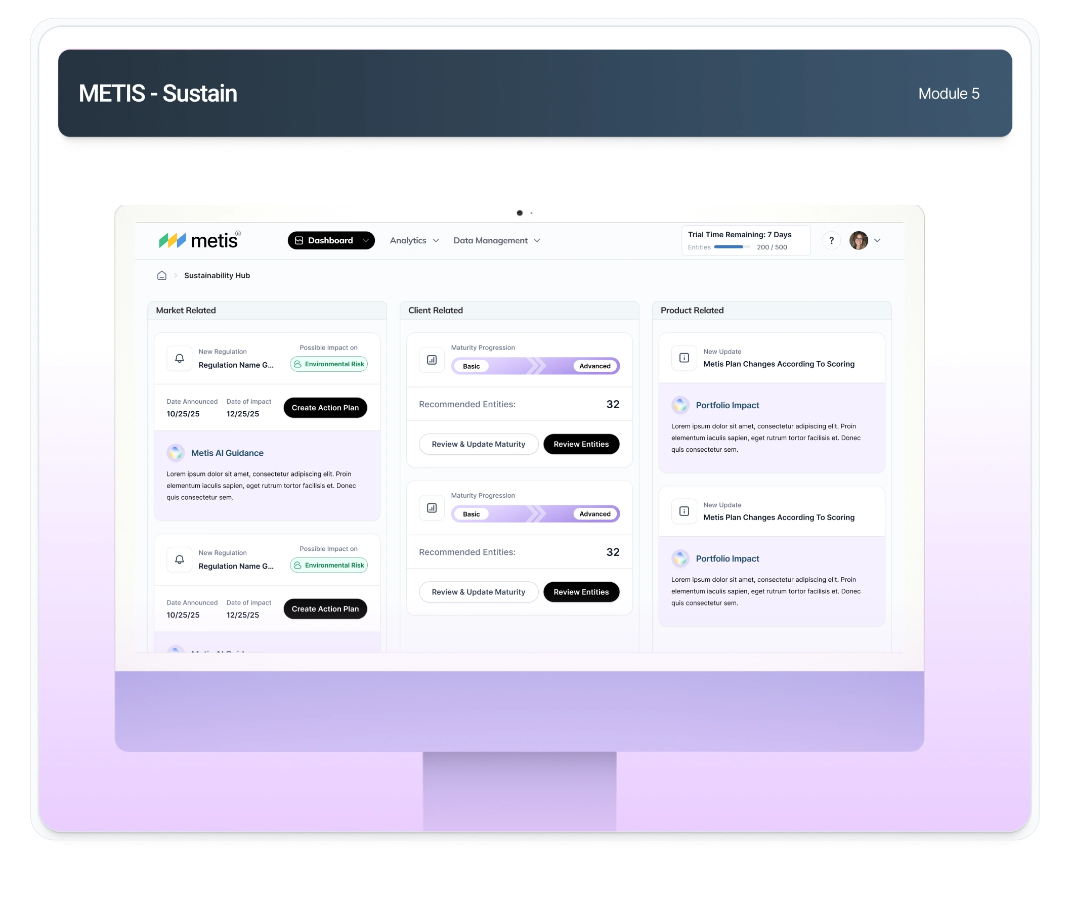
SUSTAIN Screens
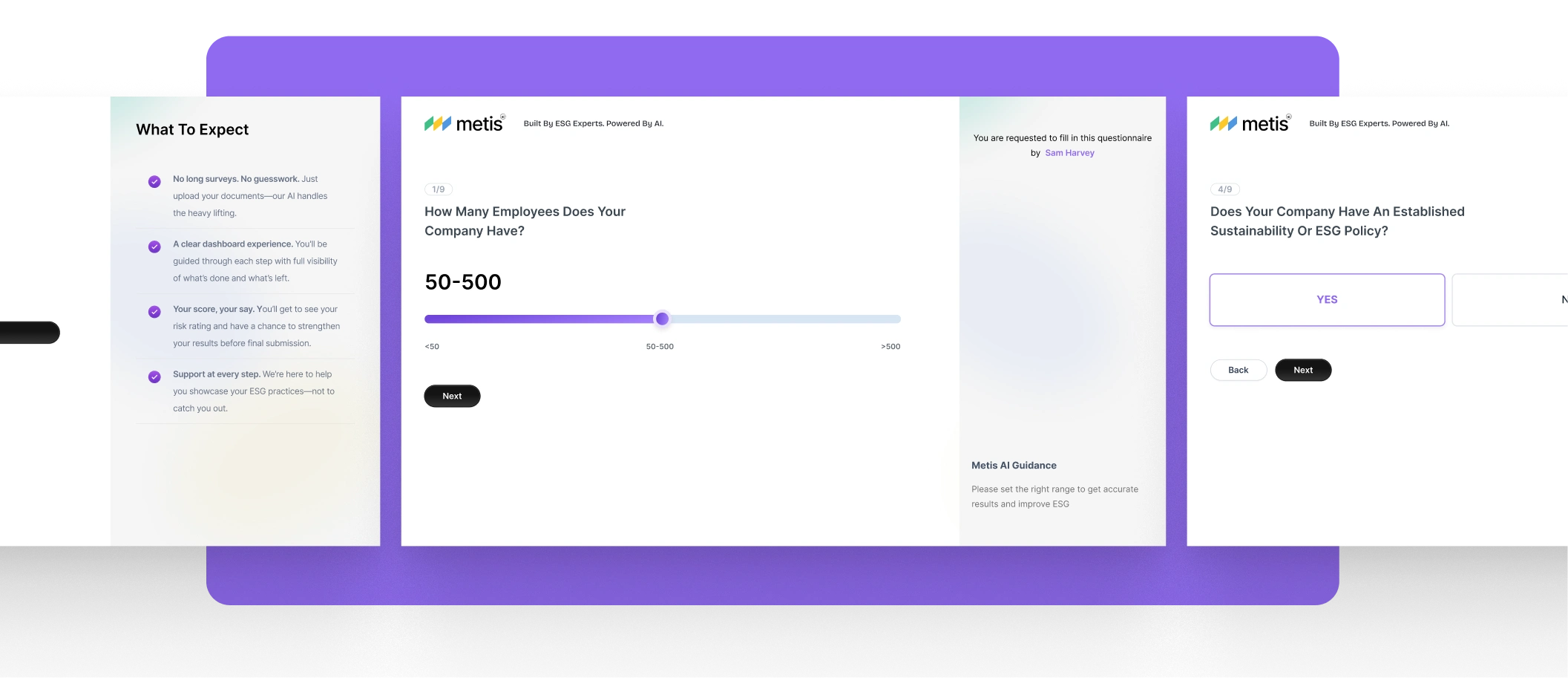
Onboarding for vendor side
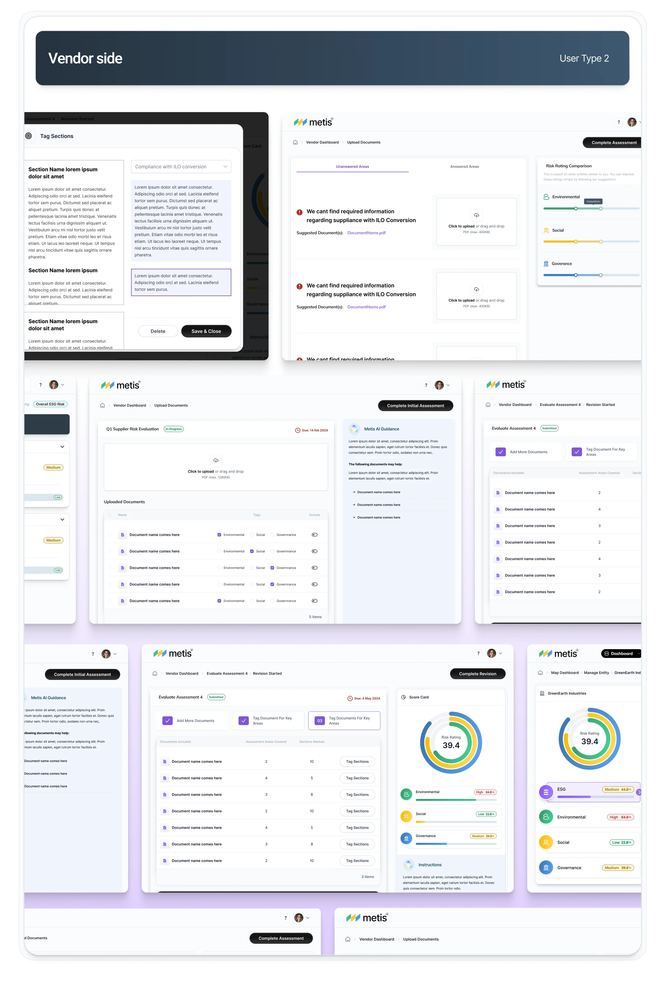
Vendor screens
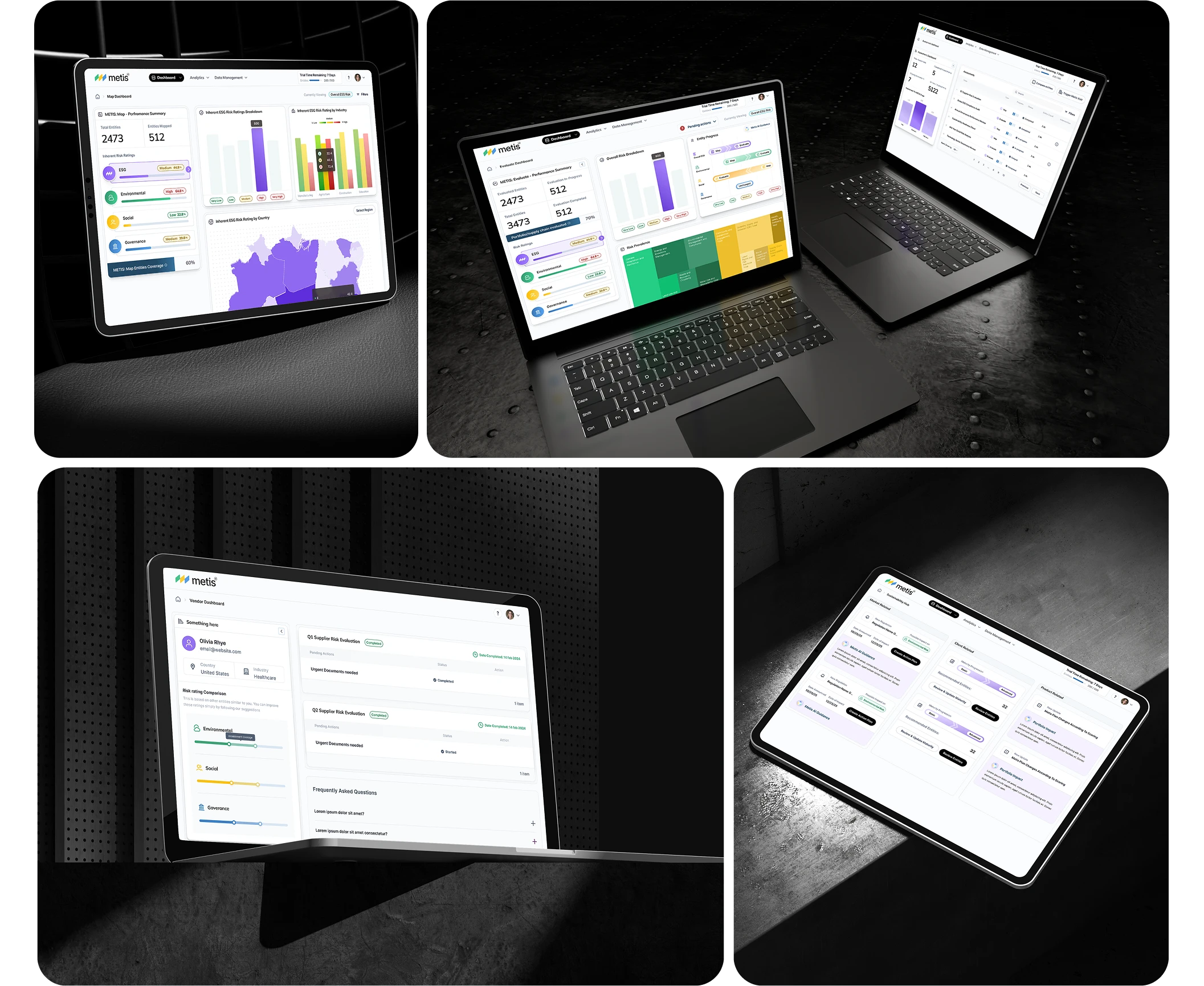
Product in mockups
The marketing website
The client's brief for the site was short: "communicate the product as simply as possible, don't let it be boring, and animate the features so people can see them in action."
That shaped the whole approach. The site doesn't sell METIS with walls of text, it shows the product. Every section has one job, explain what the platform does in plain language, then let an animation demonstrate a feature doing its thing.
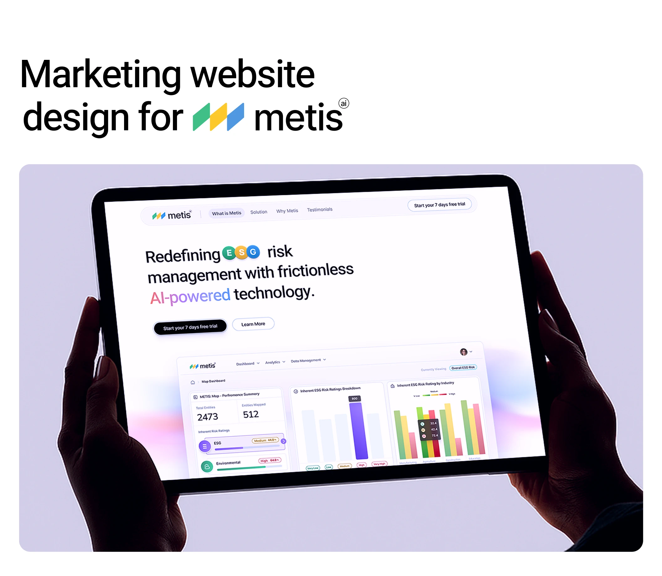
hero section of the website

the homepage
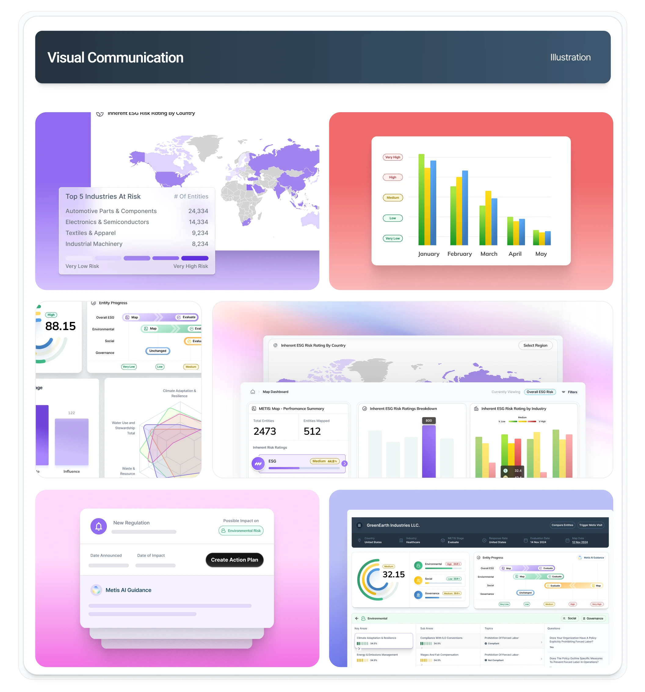
The visualizatio used on the website
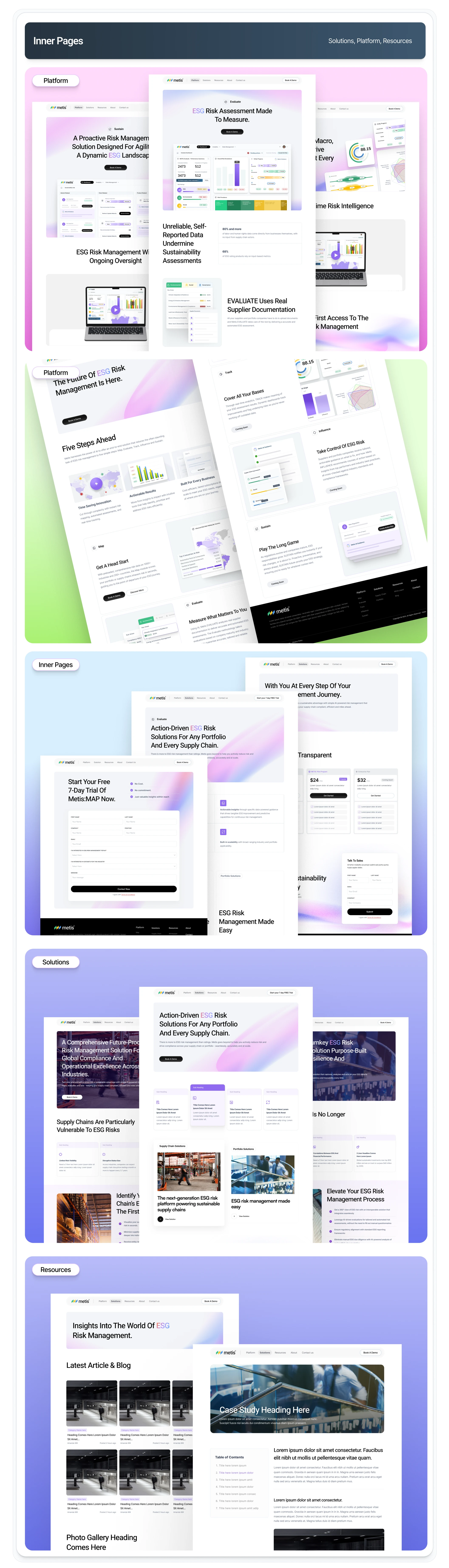
Inner pages
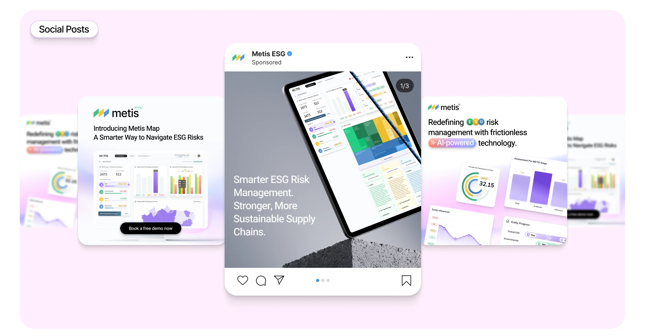
social posts

Thank you for watching
Like this project
Posted Aug 20, 2026
Logo, brand identity, product UI, website & social design for an AI ESG platform built to make complex sustainability data feel clear & easy to navigate.