Stratify - FP&A Website Redesign for Enhanced User Experience

Leena | Product Design, UX/UI & Web

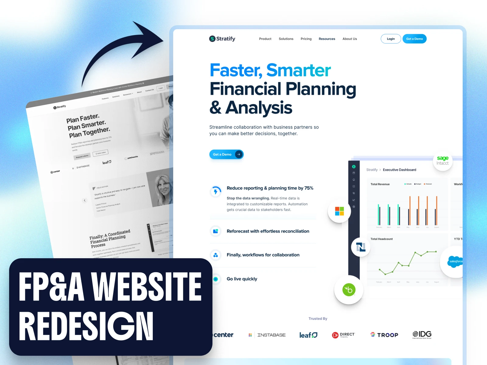
Stratify is an FP&A platform that helps finance teams solve complex planning problems. The problem wasn't the product, it was the story.
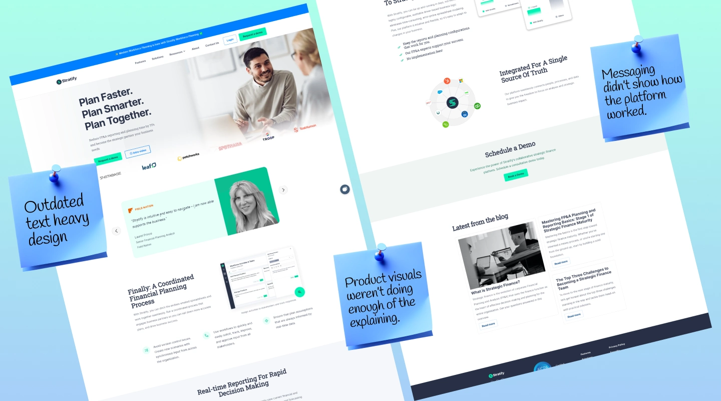
The website read as outdated, leaned on text and stock-style human faces, and buried the platform's features under dense financial language. The client wanted a modern SaaS look that made a genuinely complex product feel approachable.
My Client: “People land, get confused, and leave.”
Two things had to happen at once. The site needed to communicate everything Stratify's platform actually does, without drowning visitors in finance-heavy content. And it needed to feel interesting, not like another dry fintech page. The client was explicit: the platform is powerful but "boring," and the website had to change that perception through illustrations, product visuals, animation, and thoughtful storytelling.
My client again: “Just give it a SaaSy look, remove stock human feel, explain our product, improve the bounce rate!!”
On it, sir!
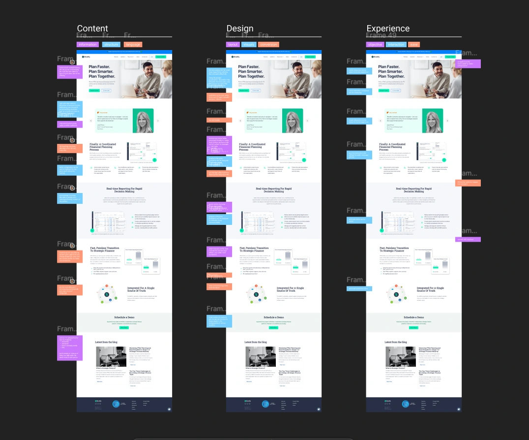
I started with a proper audit of the current site across three lenses: content, design, and experience.
Content. The copy led with dense, finance-heavy paragraphs that buried what the platform actually does. The most important features took too long to surface.
Design. The visuals felt dated, leaning on stock-style photos of people and text blocks rather than anything that reflected how Stratify actually works.
Experience. The pages were static and overwhelming, with little guiding the visitor from one idea to the next.
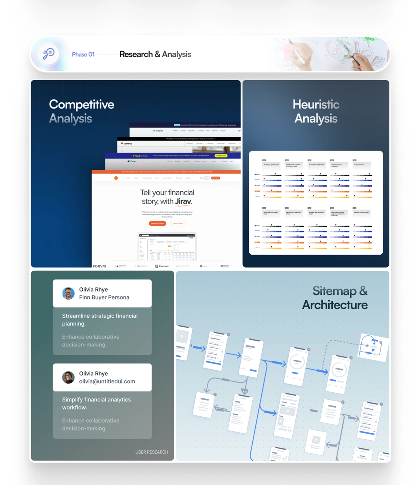
After the audit, I ran a competitive analysis to see how similar SaaS and fintech products handled complex features, plus a heuristic evaluation to flag concrete usability issues in the existing UX. I mapped the core personas and reworked the site map.
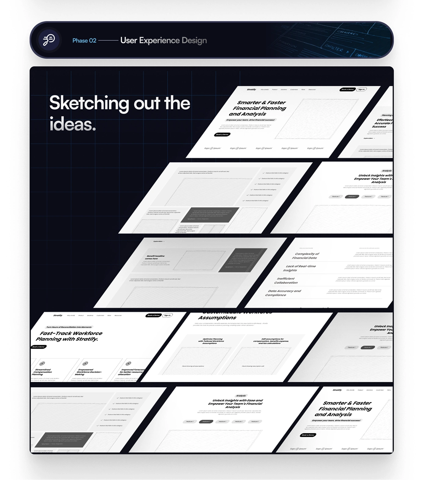
I started by restructuring the experience around visual storytelling instead of feature lists.
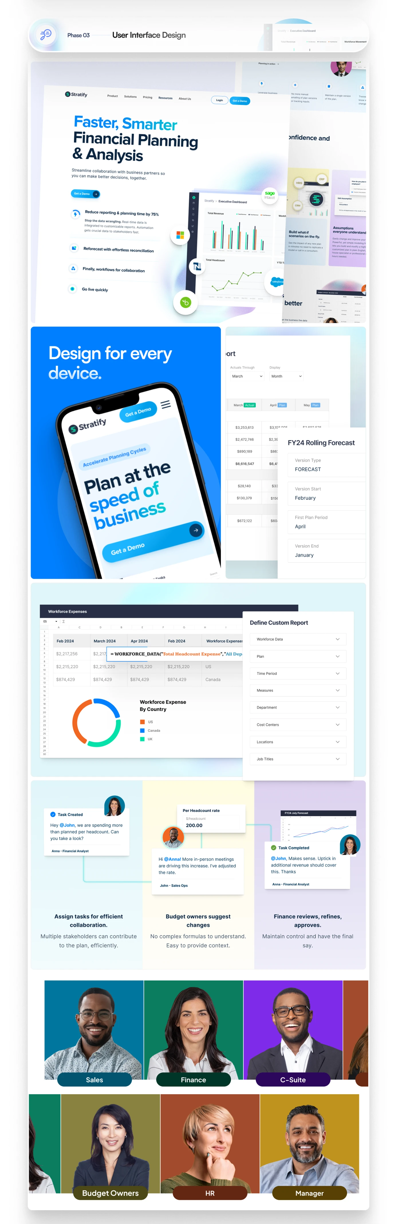
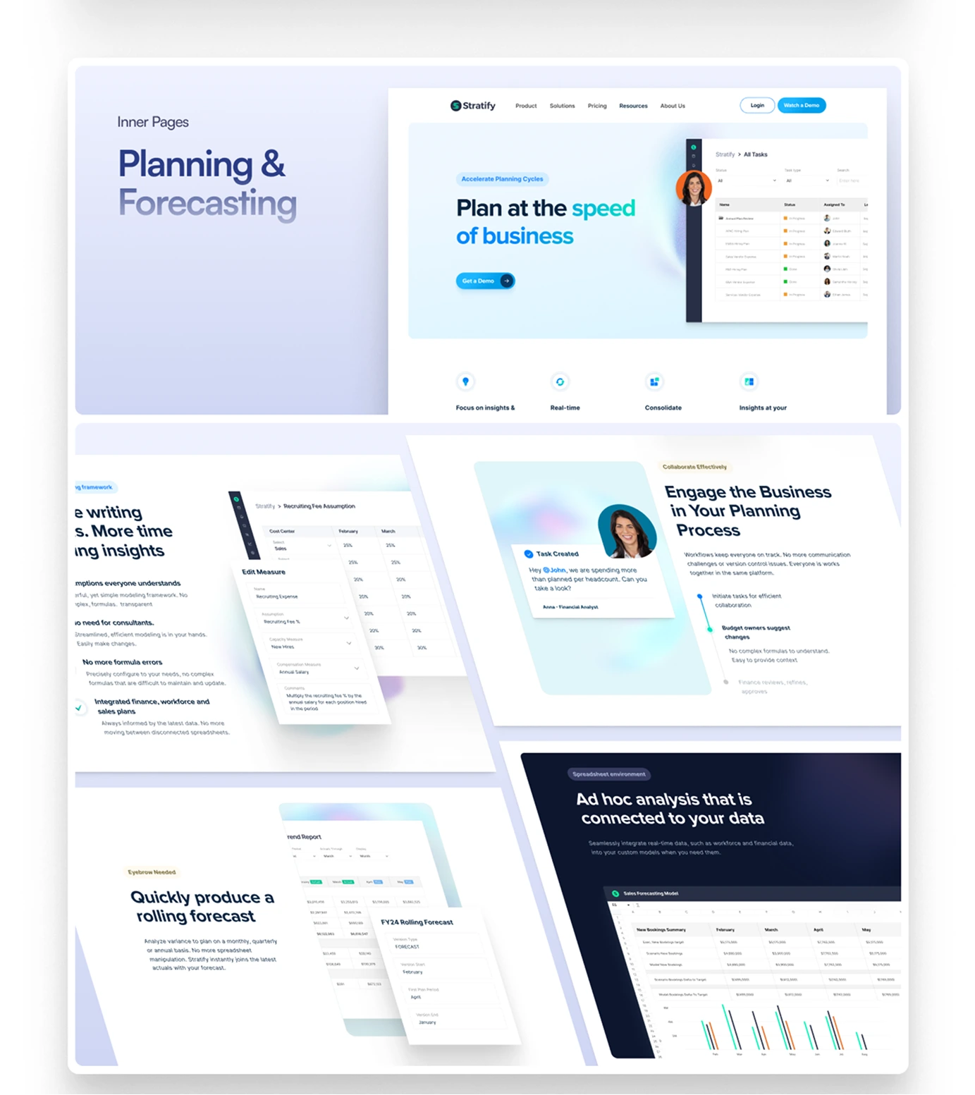
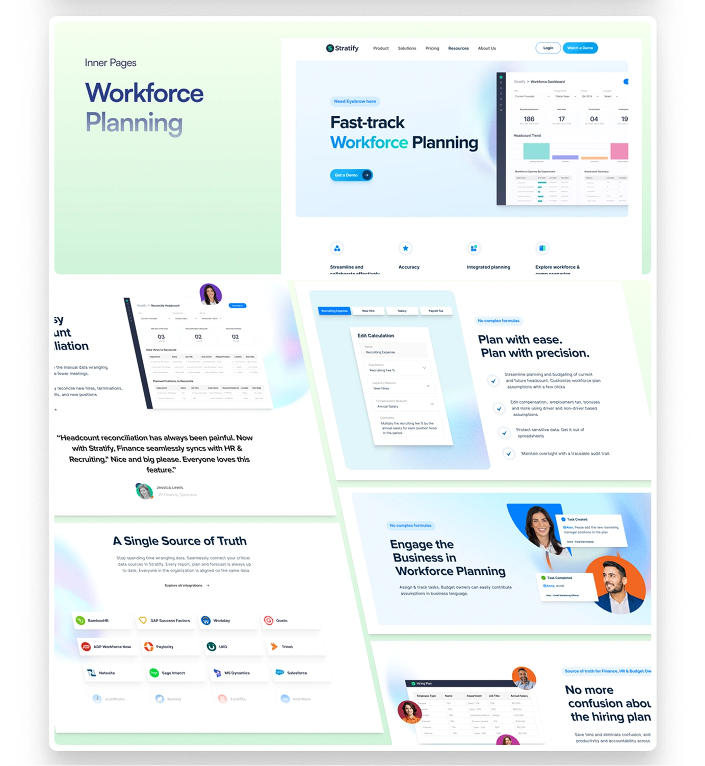
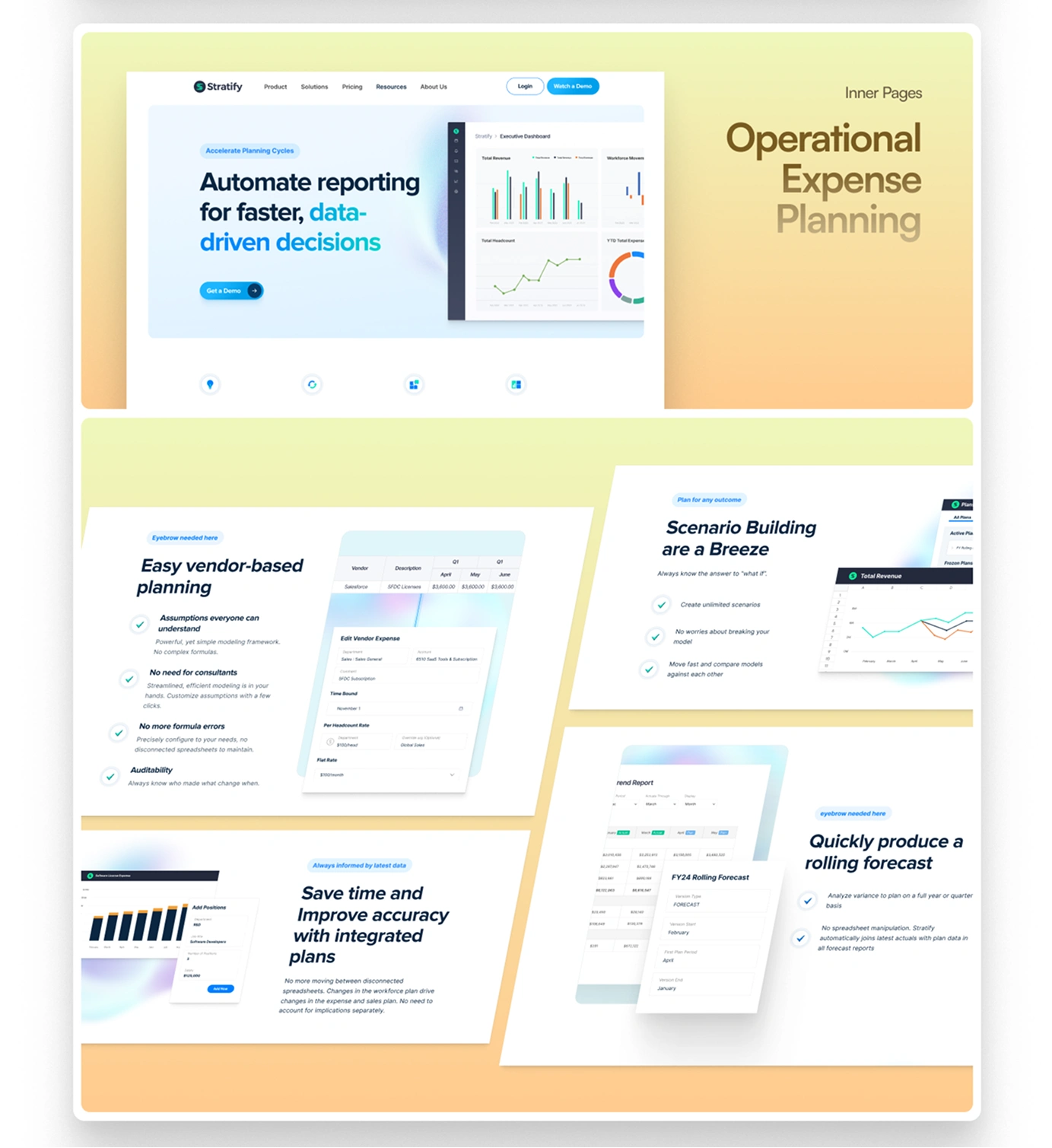
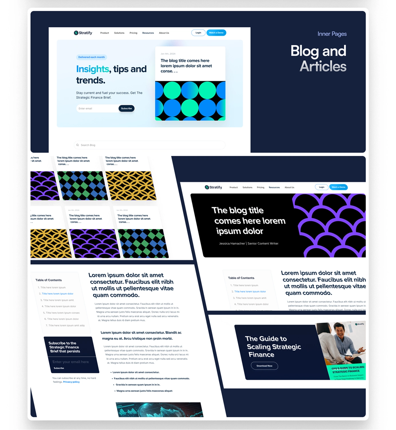
Complex capabilities were broken into smaller, digestible stories, each supported by custom illustrations, product UI, and clear messaging.
The client wanted to remove human feel from the website entirely but I didnt. WHY?
The key decision was around the human element. Stratify's core differentiator is collaborative work, so I didn't strip the human feel out of the visuals the way a typical SaaS refresh might. Instead, I created custom illustrations of people actively collaborating on financial tasks, showing the product's real value: teams working through planning together, not just a dashboard sitting alone.
I used movement and interaction intentionally throughout, guiding attention and revealing information progressively so long pages never felt static or overwhelming. Everything was designed to feel cohesive with the brand from first interaction through conversion.
The outcome
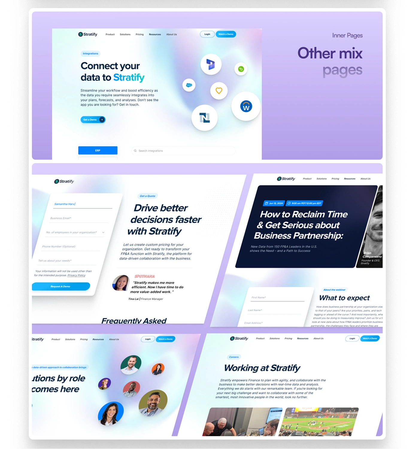
The redesign gave Stratify the modern SaaS look they asked for, while turning their most complex features into something visitors could actually understand.

Like this project
Posted Aug 21, 2026
Redesigned Stratify's website to simplify and visually communicate complex financial features.