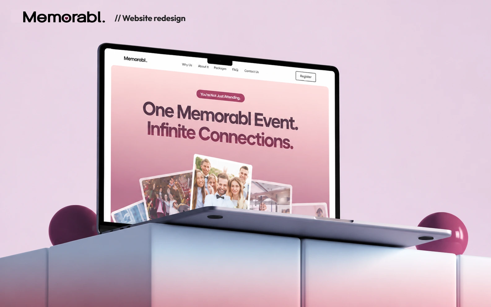
Website Redesign & Brand Refresh for an Event Memory Platform

Leena | Product Design, UX/UI & Web


Understanding Memorabl.
Never miss any event with Memorabl. Yes, YOU HEARD IT RIGHT.
Memorabl lets guests share live photos from an event so family members who can't be there can follow along in real time, or revisit the board later to relive the moment
The Audience
Memorabl is built for people who can't attend an event in person with 70% of the audience being old family members.
Memorabl is built for people who can't attend an event in person, and a big part of that audience is older family members. Around 70% of users fall into that range. Many aren't comfortable with complex technology, so the experience had to be simple, visual, and instantly easy to understand.
The Goal
Client: “Existing site sucks! Just make the website easy enough for your grandma to understand and buy Memorabl without needing any help.”
I understood the assignment pretty simply: remove anything that could make someone stop and think, “What do I do next?” So I focused on clear messaging, familiar navigation, fewer choices, and a straightforward path from understanding Memorabl. to buying a board. No unnecessary animations or clever interactions just an experience that felt obvious from the first scroll.
The two directions
Different moods, same rule: keep the experience simple and the path to purchase obvious.
The playful direction reflected what photo sharing actually feels like fun, spontaneous, and social so it could appeal to the people using the board during an event. The simpler direction was aimed more at older family members who just wanted to understand Memorable quickly, buy a board, and gift it.
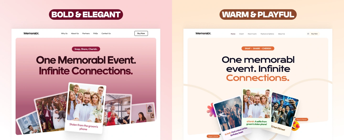
And the client loved the 'BOLD & ELEGANT' version.
But why didnt the existing site work?
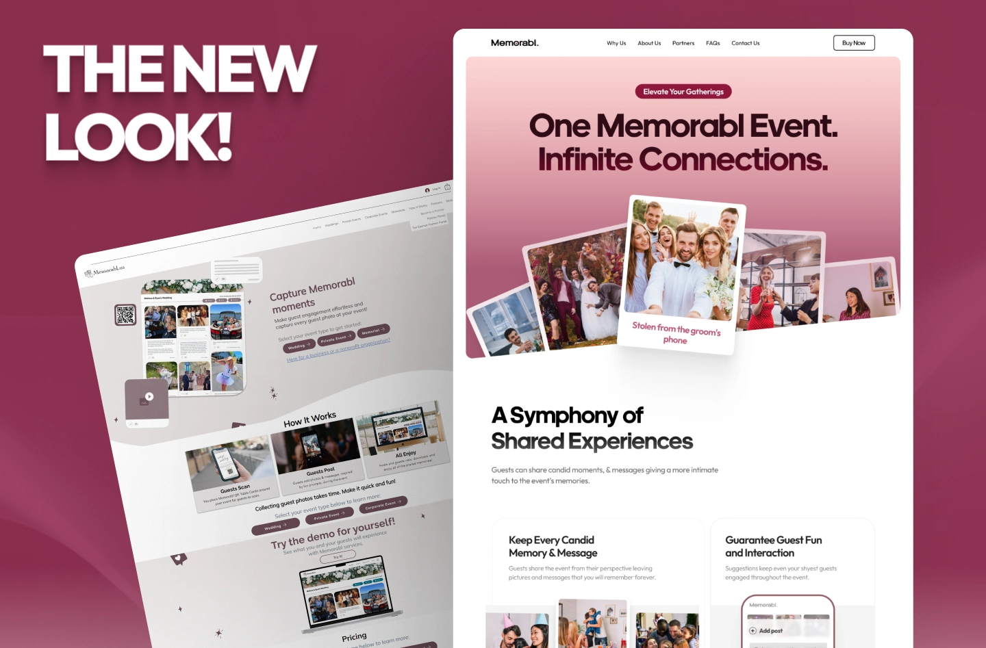
The old site felt dull, text-heavy, and unclear. It took too much effort to understand what Memorabl actually did, especially for less tech-savvy users.
I simplified the experience, clarified the messaging, and built a stronger visual hierarchy so users could understand Memorabl almost instantly, while keeping the interface approachable for older audiences.
Hmm, but the logo ...
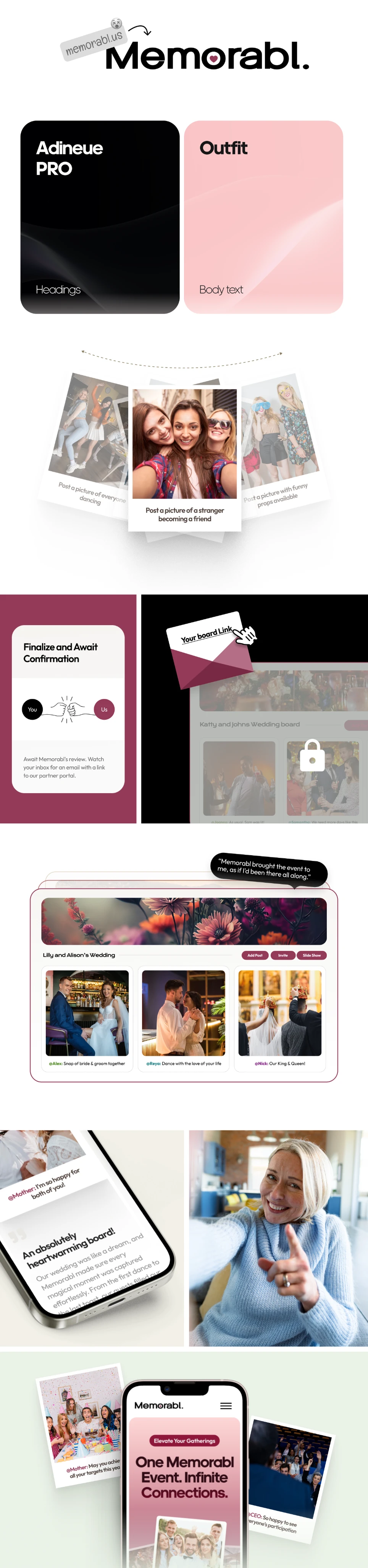
Memorabl needed an identity that felt warmer, simpler, and much more like the experience itself.
SOOO.. I replaced the dated, generic wordmark with a bolder, cleaner identity using stronger typography and a heart detail to make the brand feel warmer and more distinctive.

Like this project
Posted Aug 22, 2026
Redesigned Memorabl’s website and refreshed the brand to make the product easier to understand and purchase, especially for older users.
Likes
6
Views
36