Intimate Rose Menopause Landing Page Design

Leena | Product Design, UX/UI & Web


Intimate Rose is a women’s health and wellness brand focused on helping women navigate intimate health concerns through expert-led education, products, and personalized care.
For their menopause offering, they needed a dedicated landing page that could introduce women to their solutions, build trust around a highly personal topic, and guide them toward taking a free menopause assessment.
The goal was to make the experience feel supportive and credible without becoming overly clinical while still giving visitors a clear reason to take the next step.
The Client: “We need women to feel understood before asking them to take an assessment.”
Okayyy! Instead of pushing the assessment and products straight away, I focused on making the first part of the page feel reassuring and familiar, something that says, “we understand what you’re going through.”
From there, I started layering in expert guidance, trust signals, and a clear next step so the page could move people forward without feeling pushy.
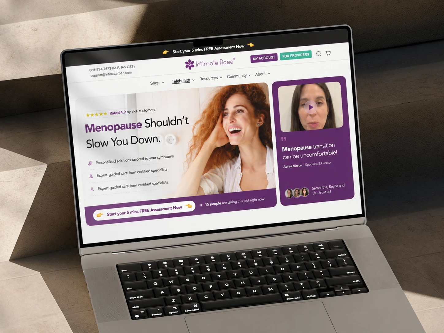
hero section
Before asking people to trust the solution, I wanted them to see themselves in the problem first.
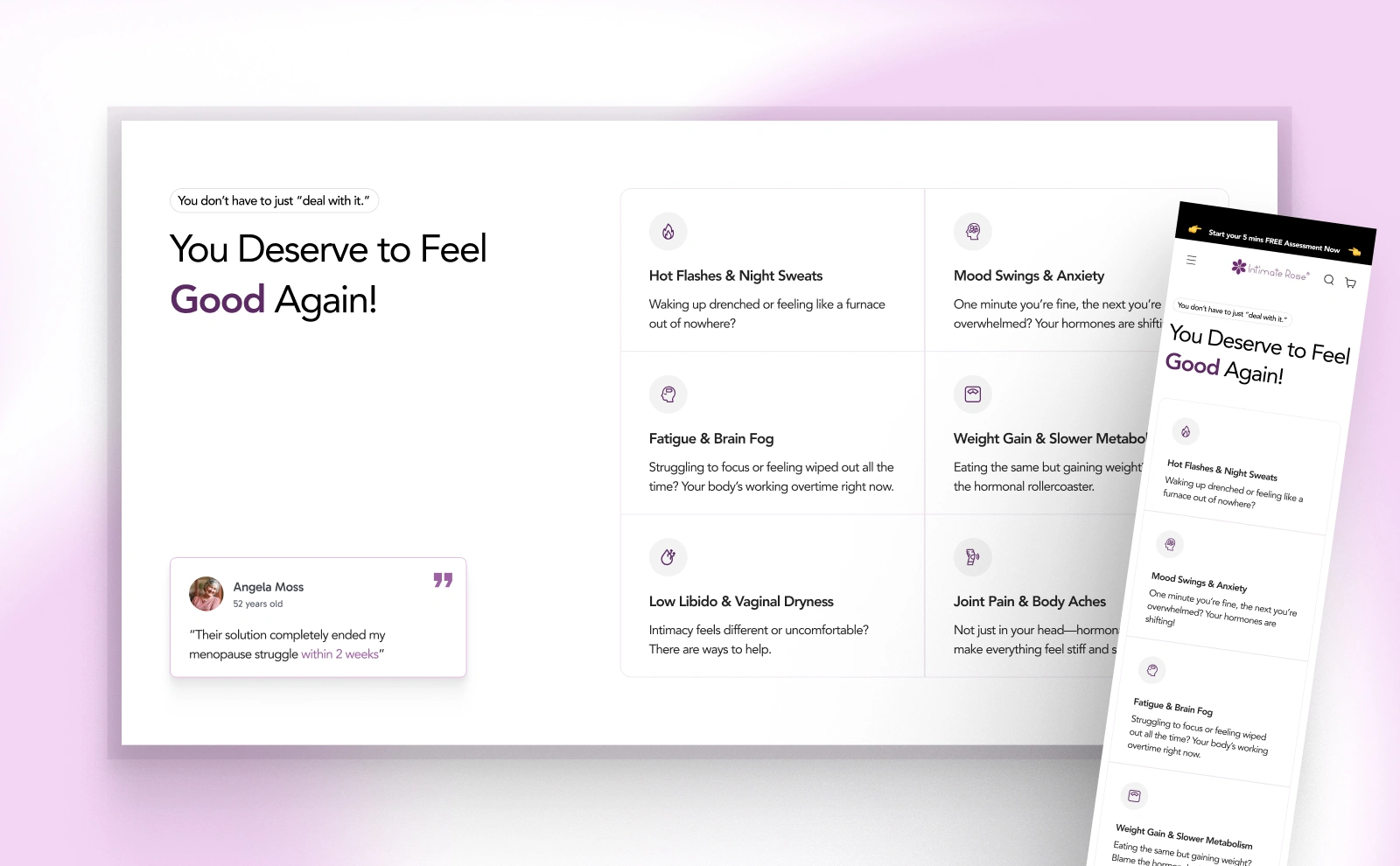
So right after the hero, I used the symptoms section to make the experience feel more personal and relatable.
Instead of talking at women about menopause, the page starts reflecting back what they may already be dealing with like hot flashes, mood changes, sleep issues, joint pain and the rest.
That recognition helps the page feel less like a sales page and more like, “Okay, this was actually made for me.”
I also placed a customer review in this section so the reassurance isn’t only coming from the brand. It gives visitors a small piece of real-world proof at the exact moment they’re recognising their own symptoms.
That mix of recognition + social proof helps build trust before the page starts asking for anything.
And once that connection is there, the rest of the page has a much better chance of earning attention and trust.
we understand you, and people trust us
One thing I was careful about was not letting the imagery narrow the audience.
Menopause doesn’t look like one woman, one age, or one background — so I avoided filling the page with the same type of model over and over.
I intentionally mixed women of different ethnicities and across the midlife-to-older age range, so more visitors could look at the page and feel, “this is speaking to someone like me.”
For this project, that mattered because relatability was part of the conversion strategy. The page needed to feel personal before it could feel persuasive.

care for every women.
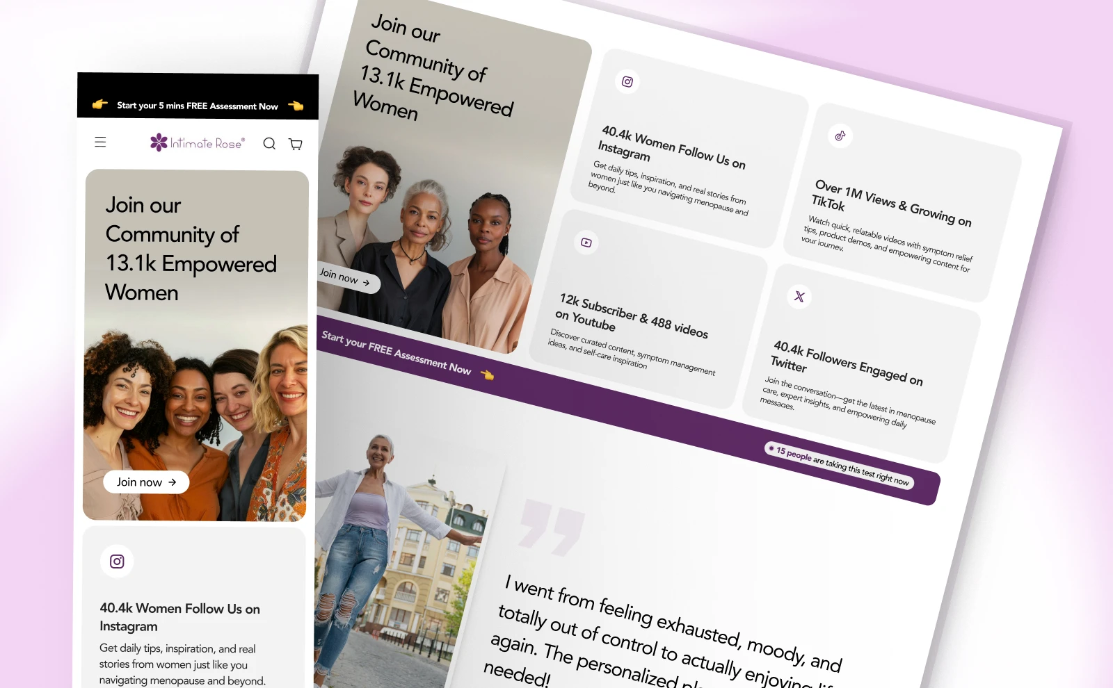
Once the page had made the problem feel familiar, I wanted to show that Intimate Rose wasn’t just saying the right things, infact there were real women behind it.
So I brought in community size, platform engagement, a strong customer story, and outcome-based stats to make the brand feel established, active, and credible.
The idea was simple: make the trust visible.
Building credibility
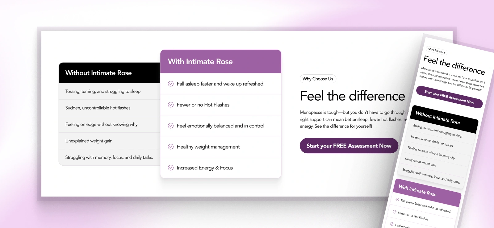
At this point, the page had already built trust. Now I needed to make the value of Intimate Rose feel obvious.
So I used a clear side-by-side contrast between the problems women are dealing with now and the outcomes they actually want.
That shifts the conversation from “here’s what we offer” to “here’s what changes for you.”
with or without us
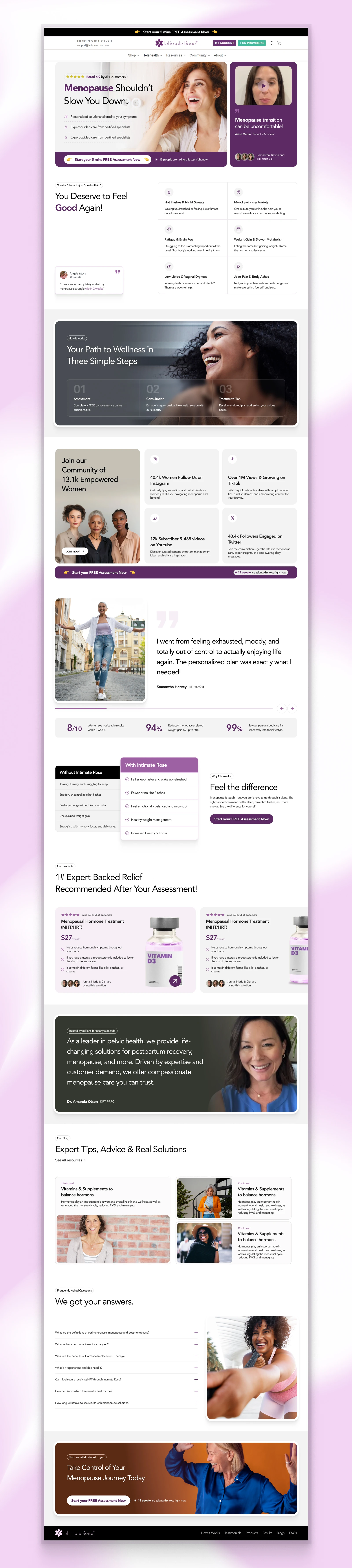
Take a look at the full page, built to do more than look good. Every section had a job to do.
the full page
I focused on making the journey feel clear from the first scroll. Starting with recognition, building trust early, making the value easy to understand, and giving visitors a reason to move towards the assessment.
The biggest decisions were around reducing hesitation using relatable symptoms, real customer proof, clear outcomes, expert credibility, and stronger CTA placement instead of relying on one big sales push.
From “I relate to this” to “I’m ready to take the next step”, intimate rose observed a 34% increase in assessment starts within 6 weeks of going live.
Need a landing page that does more than look good?
I design conversion-focused landing pages that turn complex offers into clear, credible experiences people feel confident acting on.
Let’s connect!
Like this project
Posted Oct 7, 2026
Designed a landing page for menopause solutions, boosting assessment starts by 34%.