Lucy Shaw Jewellery - Brand Identity Design
✨ The Brand:
Lucy Shaw Jewellery is a brand identity for a powerful, female-led jewellery business based in London.
🔎 The Design:
The dark moody tones echo the empowerment and strength the customer should feel when wearing the jewellery. The colours ensure the femininity of the brand is not lost and give off a passionate, determined feel. A mix of strong but feminine fonts in alignment with the target demographic and the overall tone of the brand. I created simple, fun sub-mark logos that subtly resemble jewellery or parts of jewellery from the chain of a bracelet to an elegant pendant.
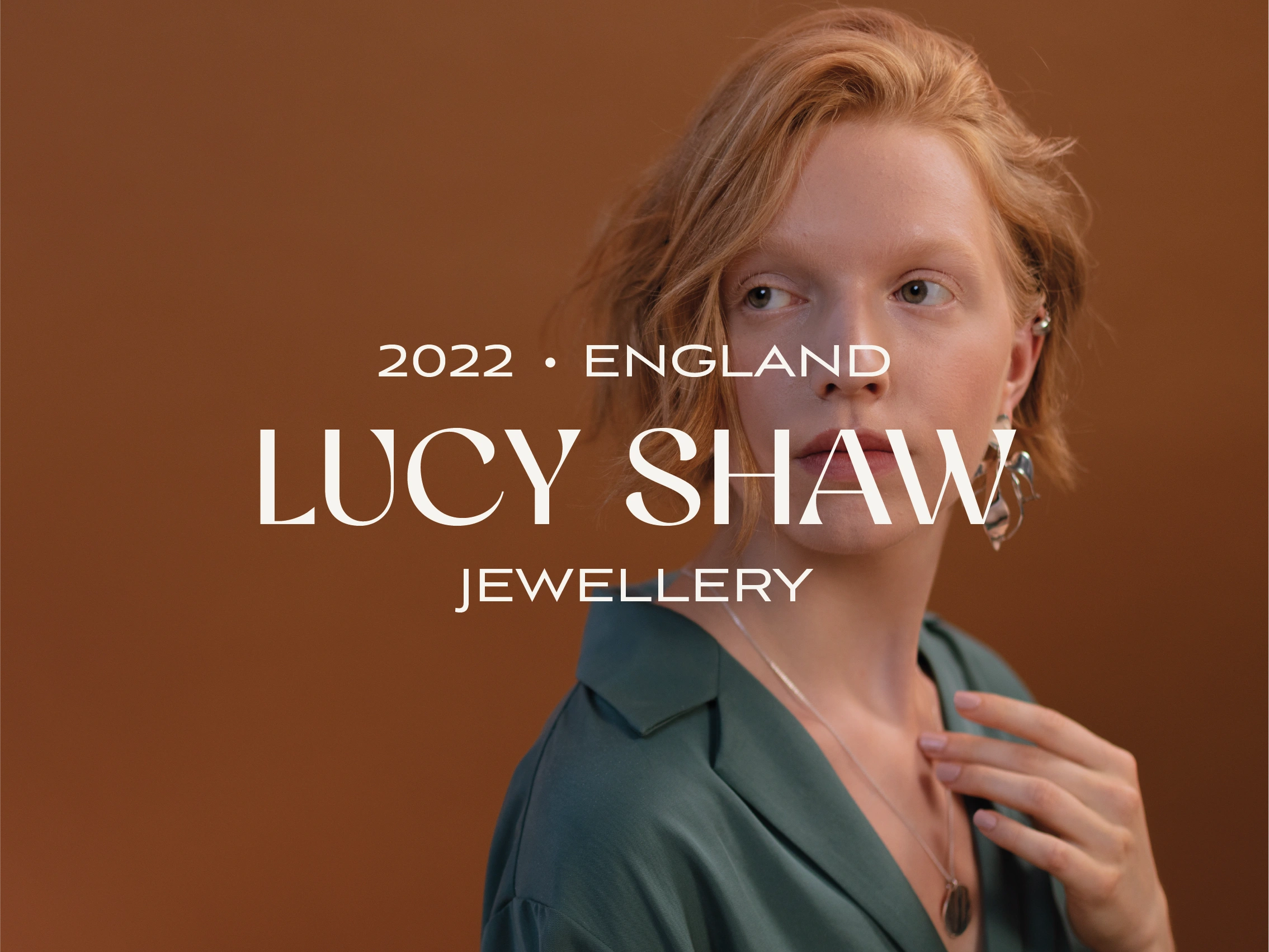
Lucy Shaw Jewellery - Main logo
The Deliverables:
+ Main logo & Alternate files
+ Secondary logo & Alternate files
+ Submark logo & Alternate files
+ Colour palette and brand fonts
+ TOV
+ ‘File types & how to use them’ document
+ Full Brand Guidelines document
+ Business cards & thank you cards
+ Social media templates
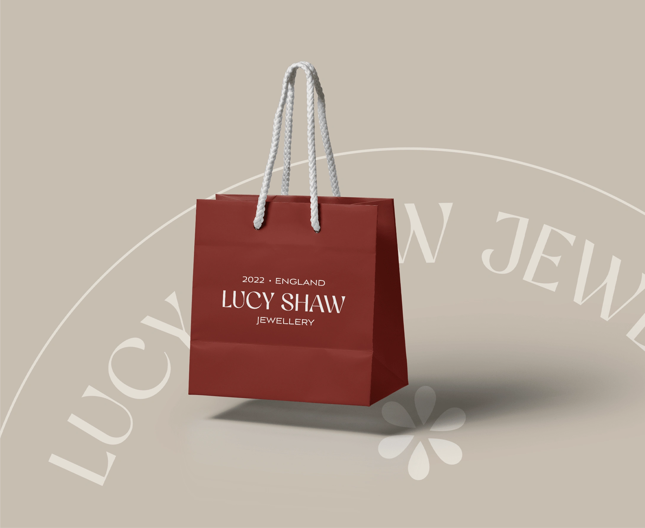
Lucy Shaw Jewellery - Product bag
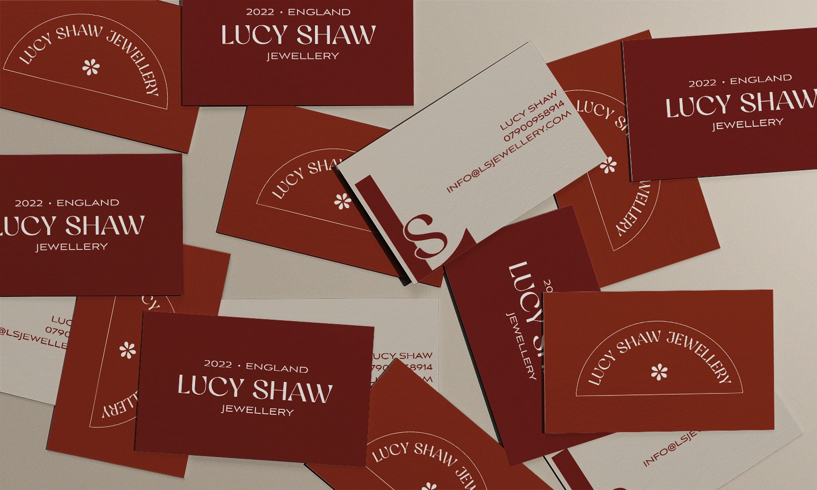
Lucy Shaw Jewellery - Business cards
📽️ Brand Video:
Here is a quick, 20-second video to show off some of the beautiful assets I created for this brand!
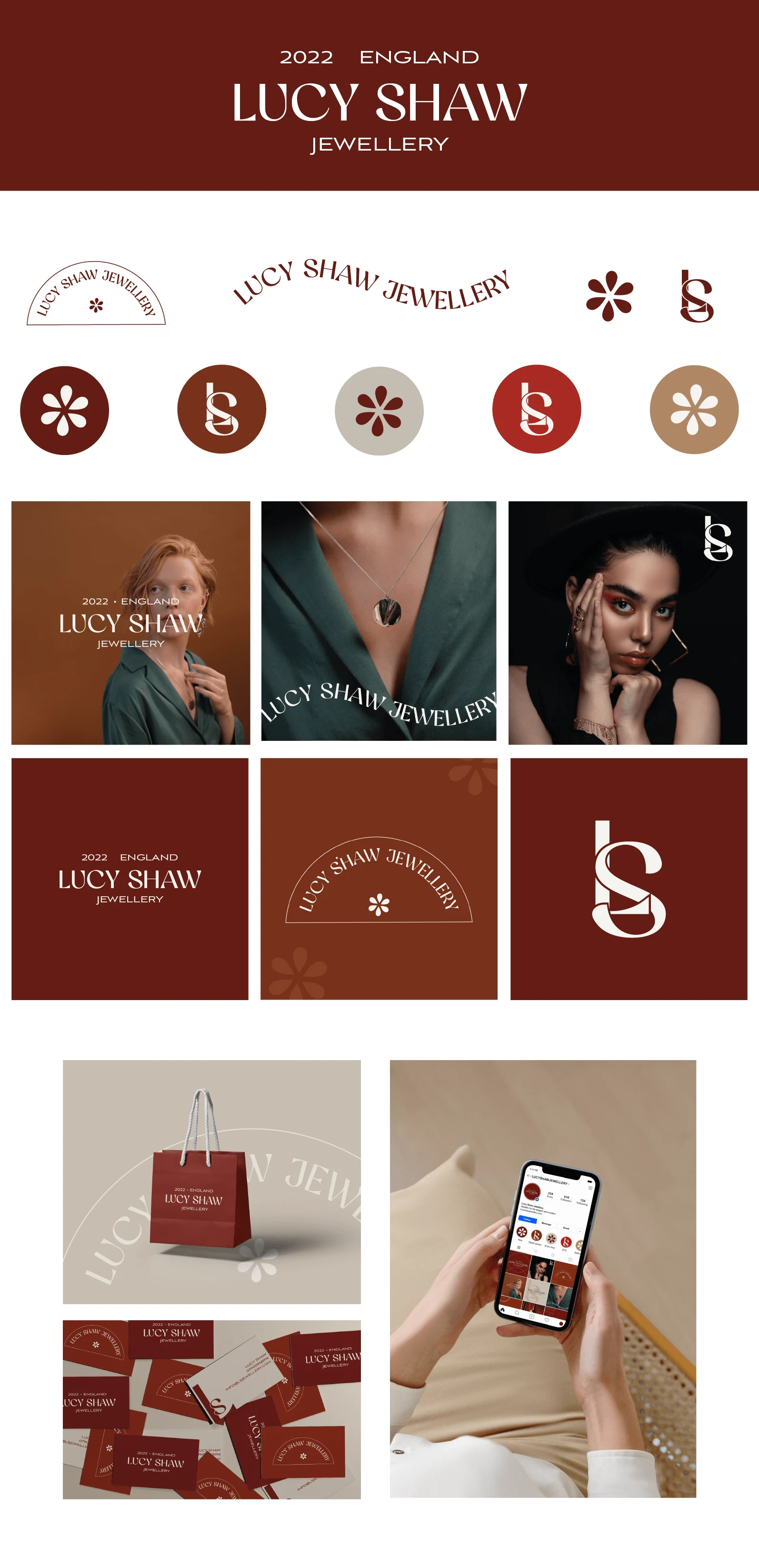
Lucy Shaw Jewellery - Brand Board
Like this project
Posted Mar 24, 2022
Lucy Shaw Jewellery, a brand identity for a powerful, female-led jewellery business based in London. The dark moody tones echo the empowerment and strength the


