Board My Horse Brand Identity Design

Artur Mikhov


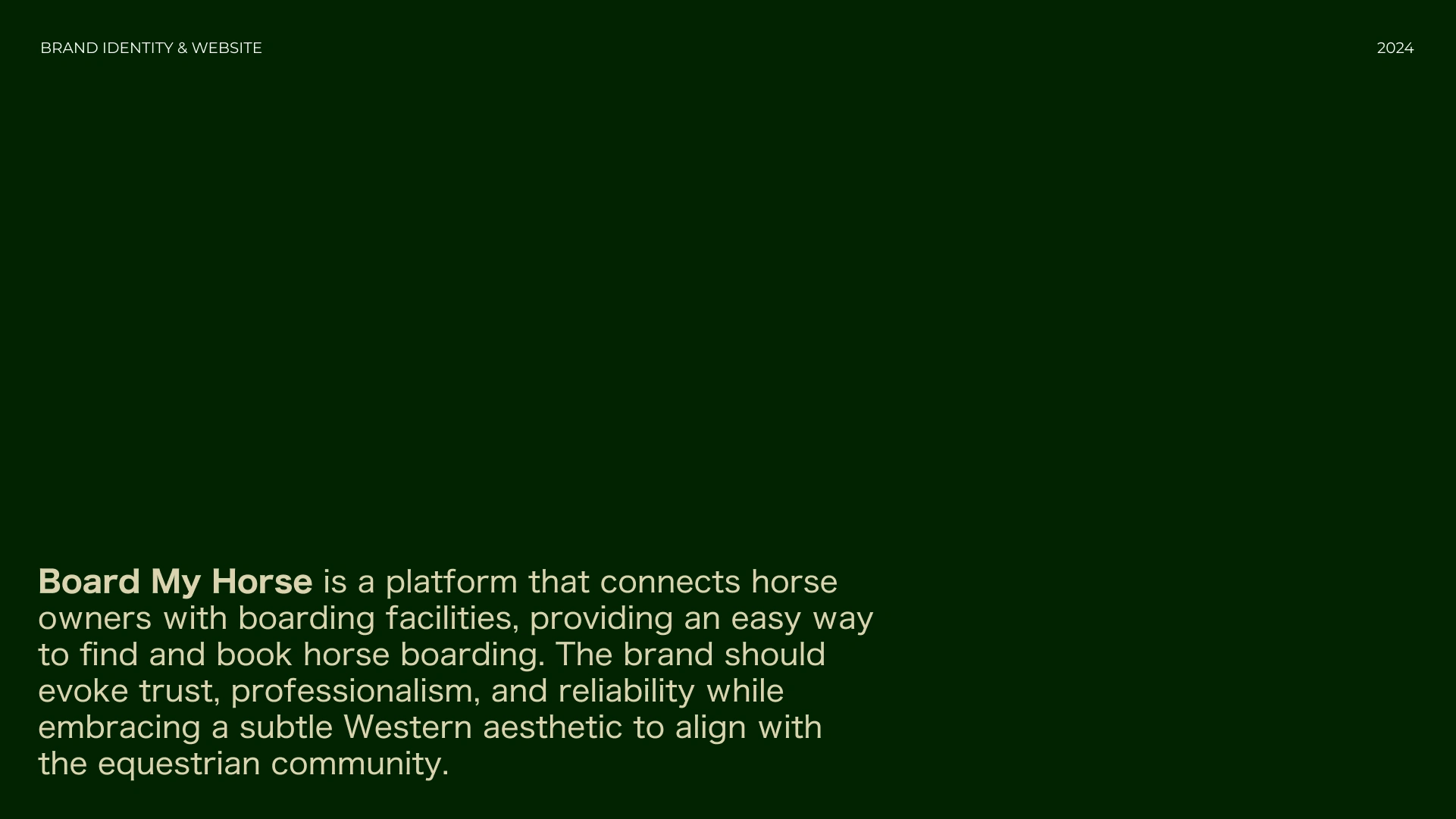
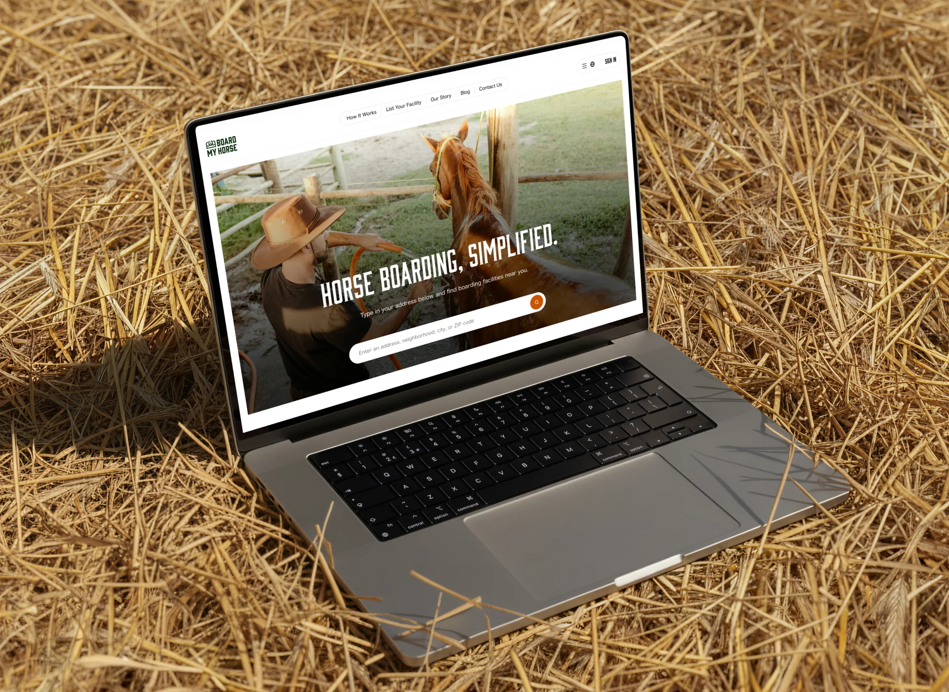
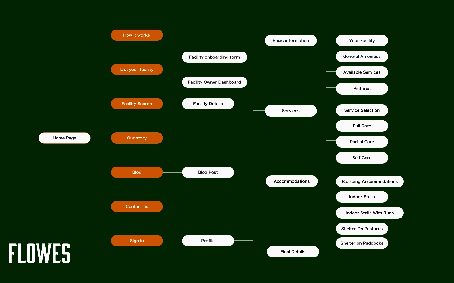
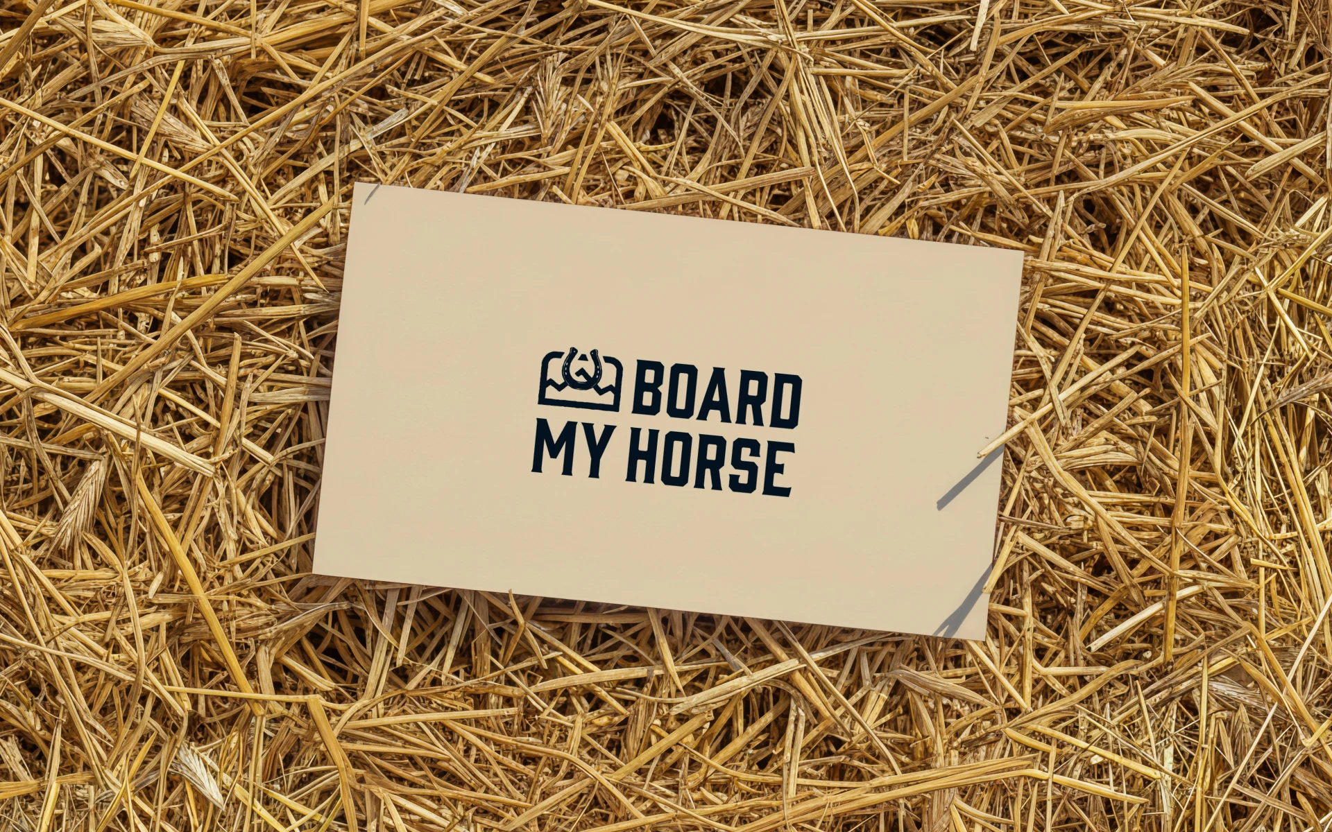
Board My Horse is a digital platform connecting horse owners with trusted boarding facilities, making it easier to discover, compare, and book horse boarding services online.
The goal was to create a brand identity that feels professional and reliable while still belonging naturally to the equestrian world.
The result is a warm, trustworthy visual identity and branding system with a subtle Western influence and a custom icon language designed specifically for navigating horse care services.
Brand strategy. Logo design. Brand identity. Visual identity. Equestrian branding. Digital branding. Icon design. UX/UI design. Graphic design. Art direction.
The Tension
Finding the right boarding facility is a high-trust decision.
Horse owners aren't simply choosing a location. They're choosing someone to care for an animal that requires specific attention, routines, facilities, and expertise.
Board My Horse needed to make that decision feel clear, safe, and trustworthy.
At the same time, the brand had to feel authentic to the equestrian community without becoming overly rustic or relying on predictable Western clichés.
The challenge was finding the balance between digital convenience and equestrian authenticity.
The System
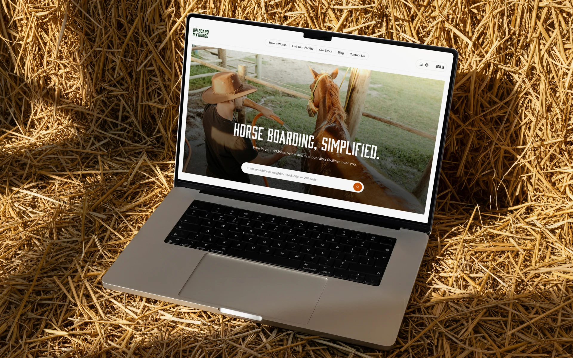
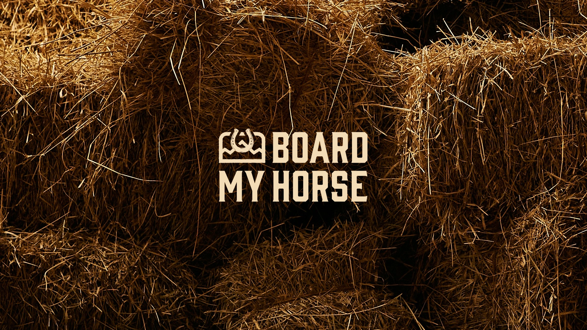
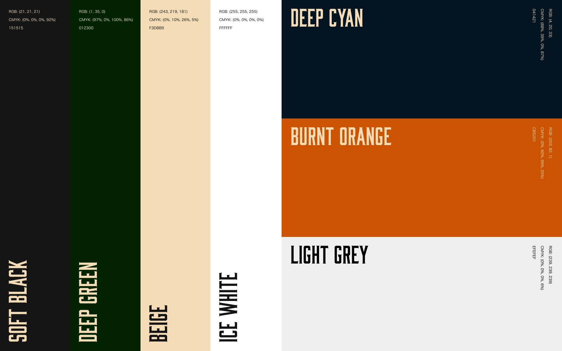
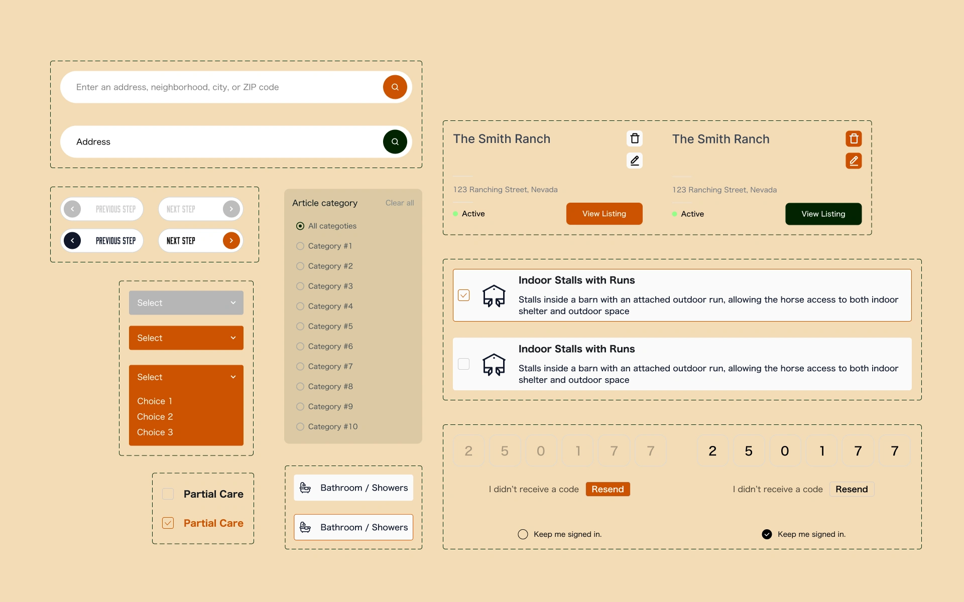
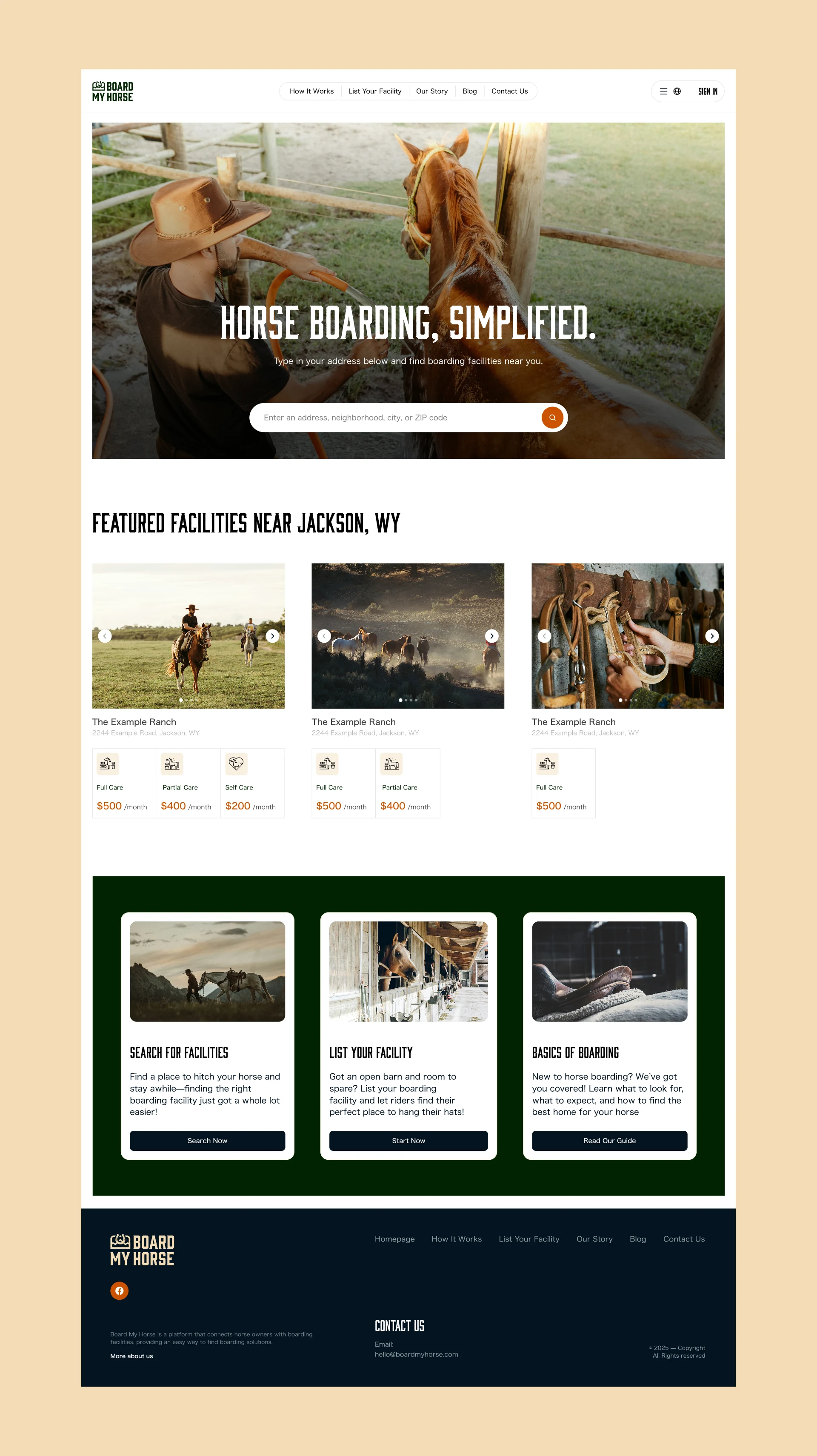
The Board My Horse visual identity is supported by a clear and flexible graphic system.
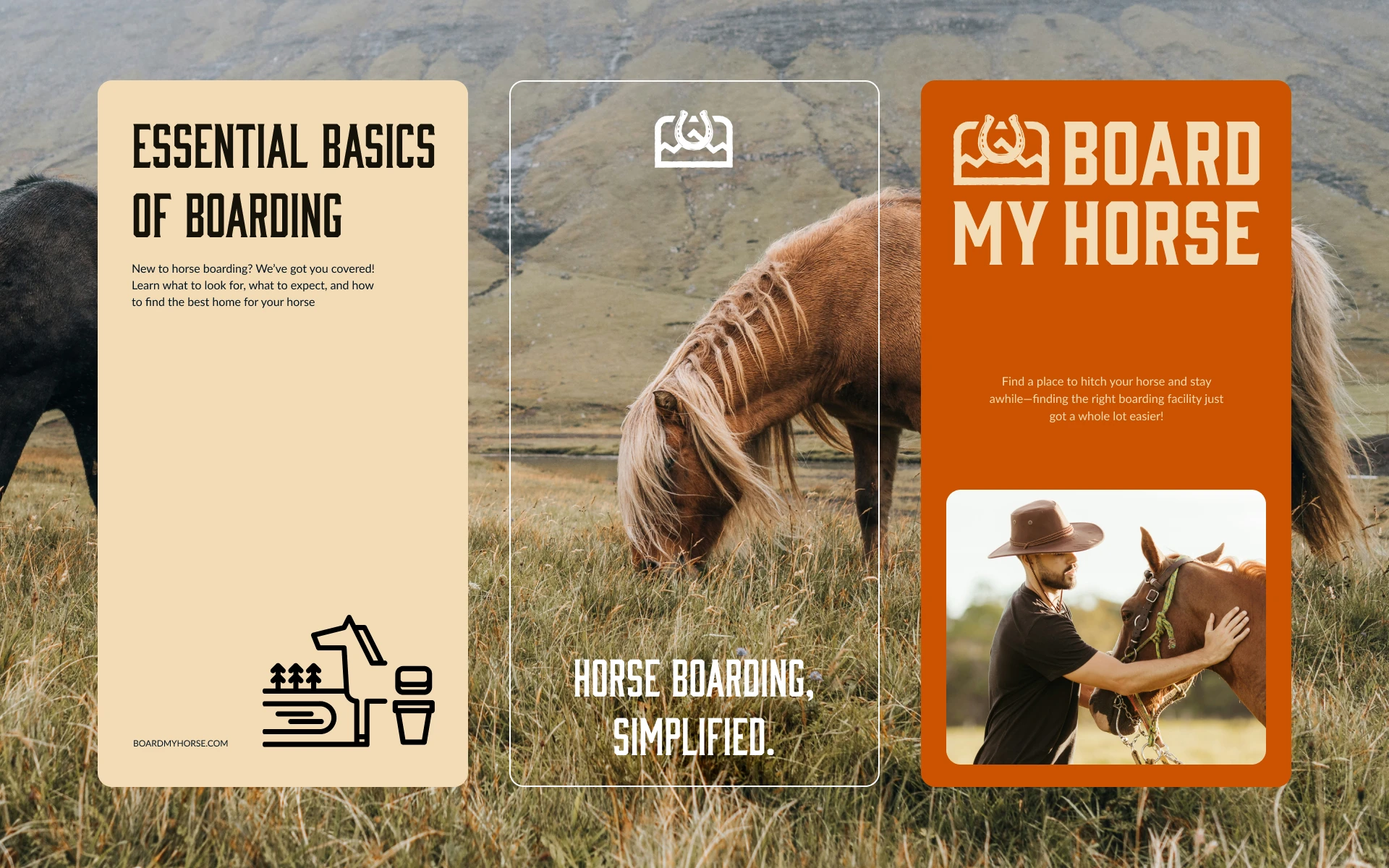
Typography and layouts prioritize readability and usability, while Western-inspired details add personality and reinforce the connection to the equestrian world.
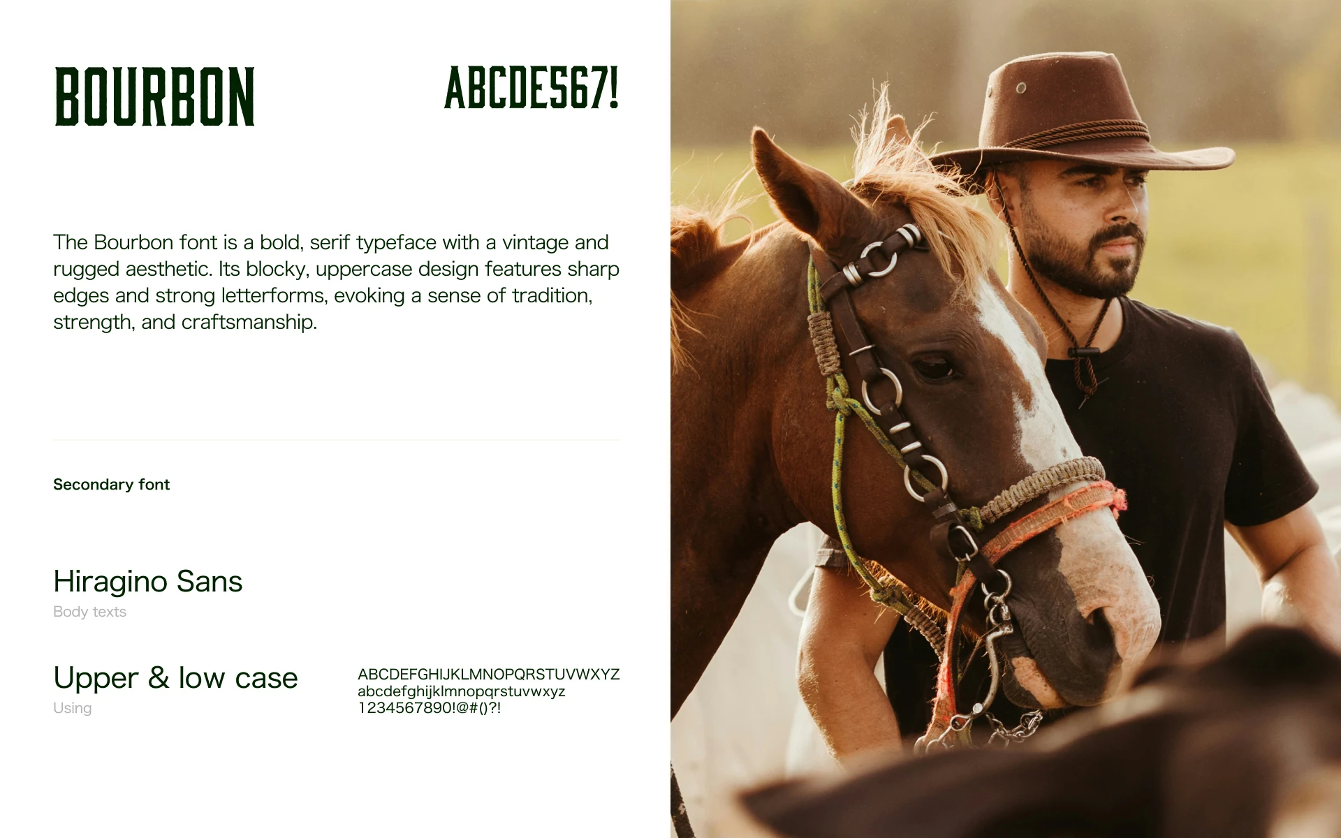
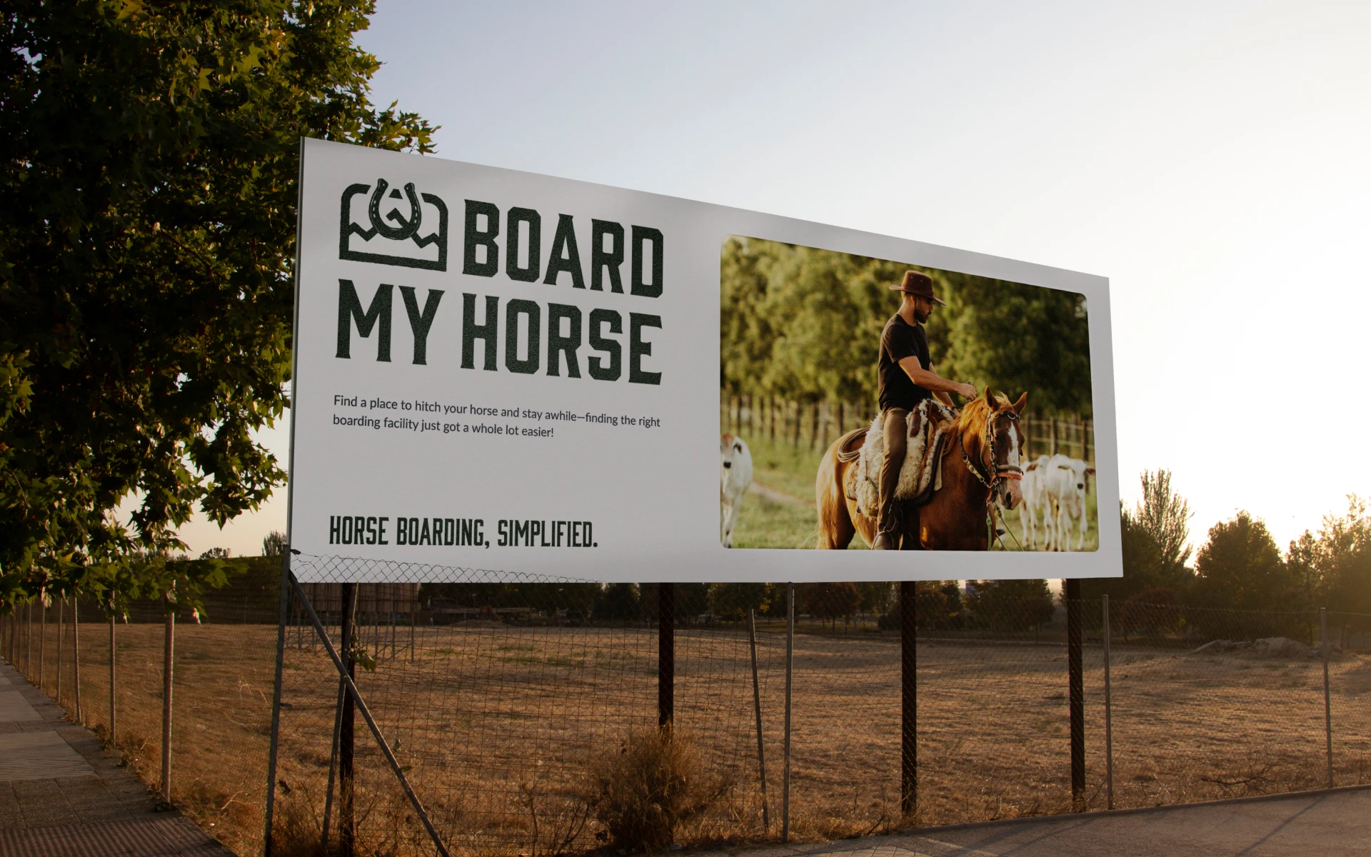
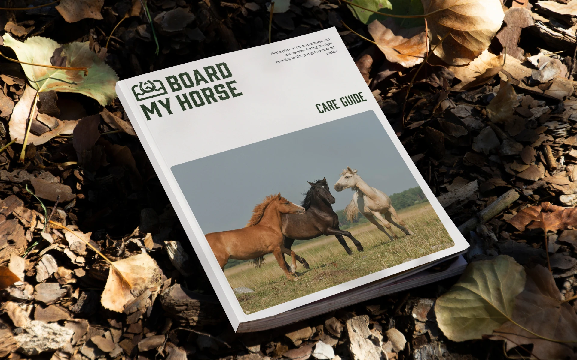
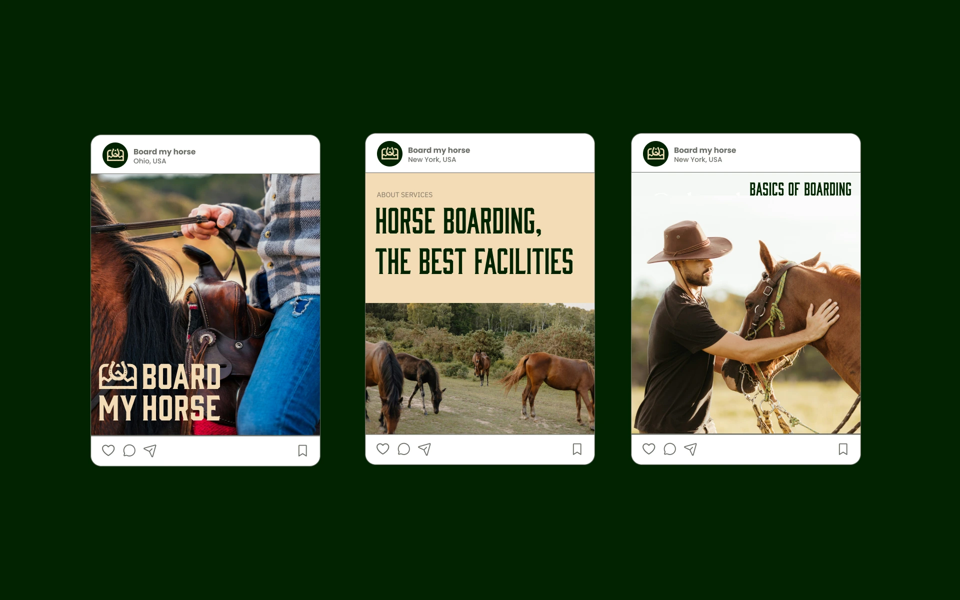
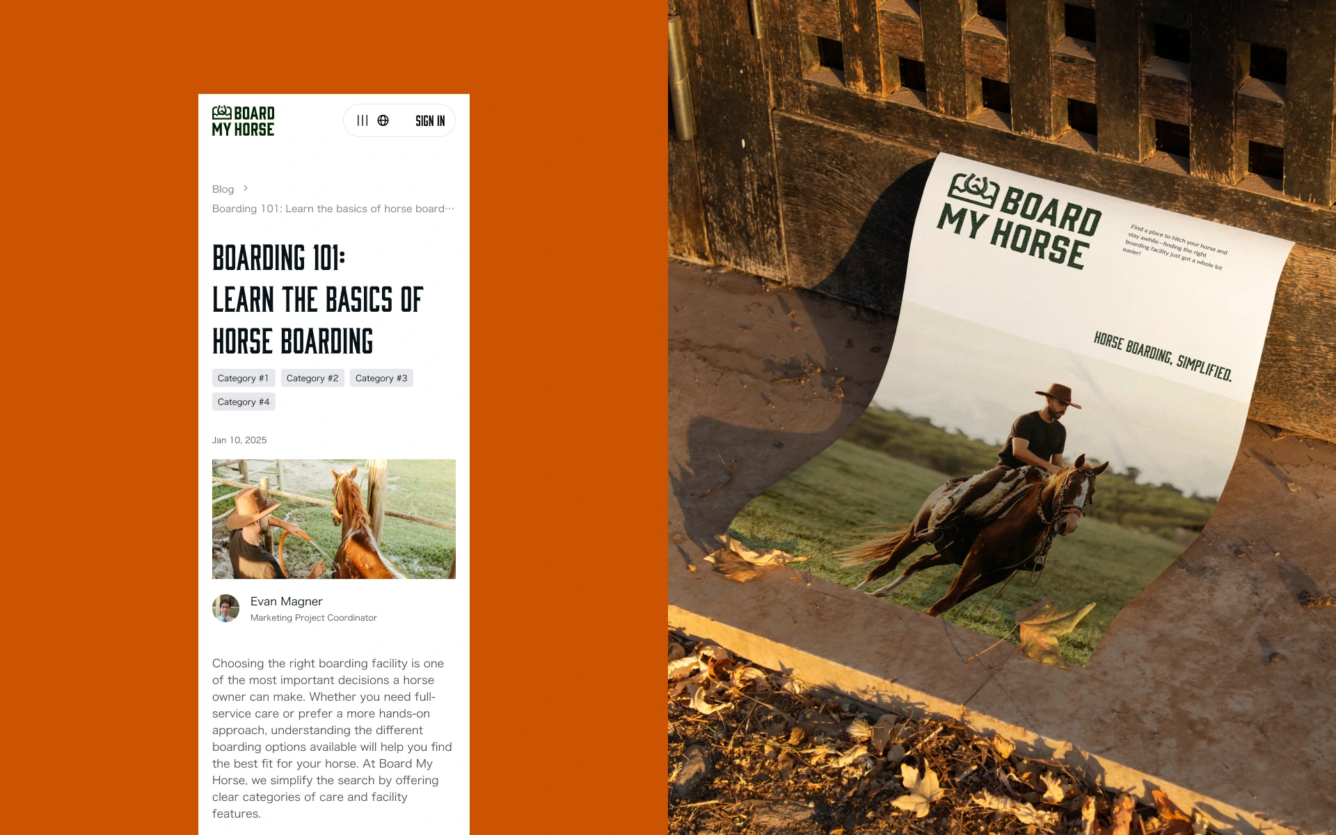
The identity was designed to work across the platform, marketing materials, social media, listings, and digital communication.
The result is a brand design system that communicates reliability without losing warmth.
The Decision
The identity was built around trust first.
The visual language combines clean, contemporary design with subtle Western references, creating a brand that feels established and approachable rather than overly corporate.
Instead of making the equestrian aesthetic the entire identity, we used it as an accent.
This allowed Board My Horse to feel native to the horse community while still behaving like a modern digital marketplace and booking platform.
Branding Meets UX
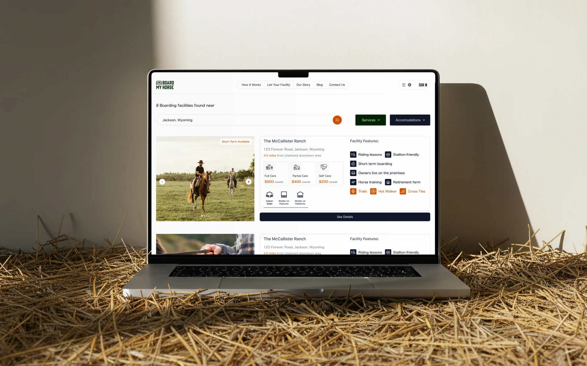
For Board My Horse, the brand identity had to perform inside a digital product.
That meant designing beyond the logo.
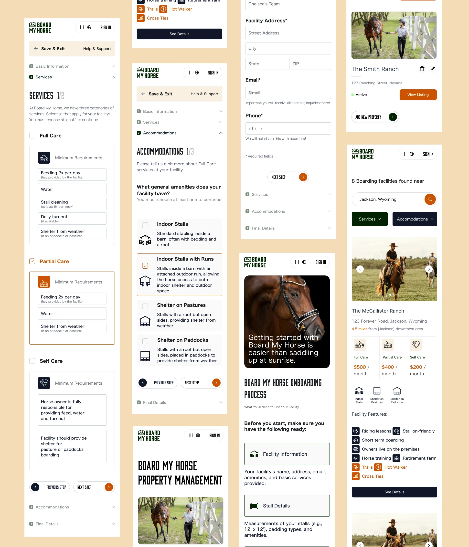
The visual identity, iconography, interface elements, and information hierarchy needed to work together so that the platform felt trustworthy from the first interaction.
The icon system creates a bridge between branding and product design: a visual language that makes complex service information easier to scan and understand.
The Icon System
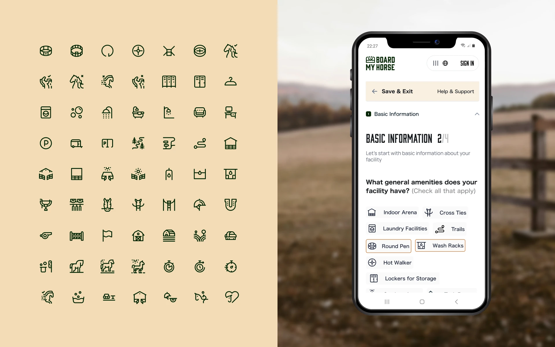
The custom brand icon design became one of the most important parts of the project.
Different levels of horse care require different services and expectations. We translated these into a series of simple line-art icons that allow users to understand service categories quickly.
The icons represent different levels of care while maintaining one consistent visual language.
They aren't simply decorative UI elements.
They function as a core branding and UX tool — helping users navigate the platform, understand services, compare options, and make decisions with greater confidence.
Like this project
Posted Aug 14, 2026
Equestrian brand identity and icon design for a horse boarding platform, combining branding, visual identity, custom line-art icons, and digital UX.
Likes
0
Views
20