IC Labs — engineering clarity into a scalable brand identity

Artur Mikhov


IC Labs is a technology company building automation systems designed around clarity, precision, and structured growth.
The challenge was to create a technology brand identity that could communicate engineering expertise without becoming cold or overly technical — a visual system that feels intelligent, confident, and built for scale.
The result is a bold brand identity and logo design centered around geometry, movement, and system logic.
Brand strategy. Logo design. Branding. Visual identity. Art direction. Typography. Graphic design. Technology branding. SaaS branding. Digital brand identity.
The Tension
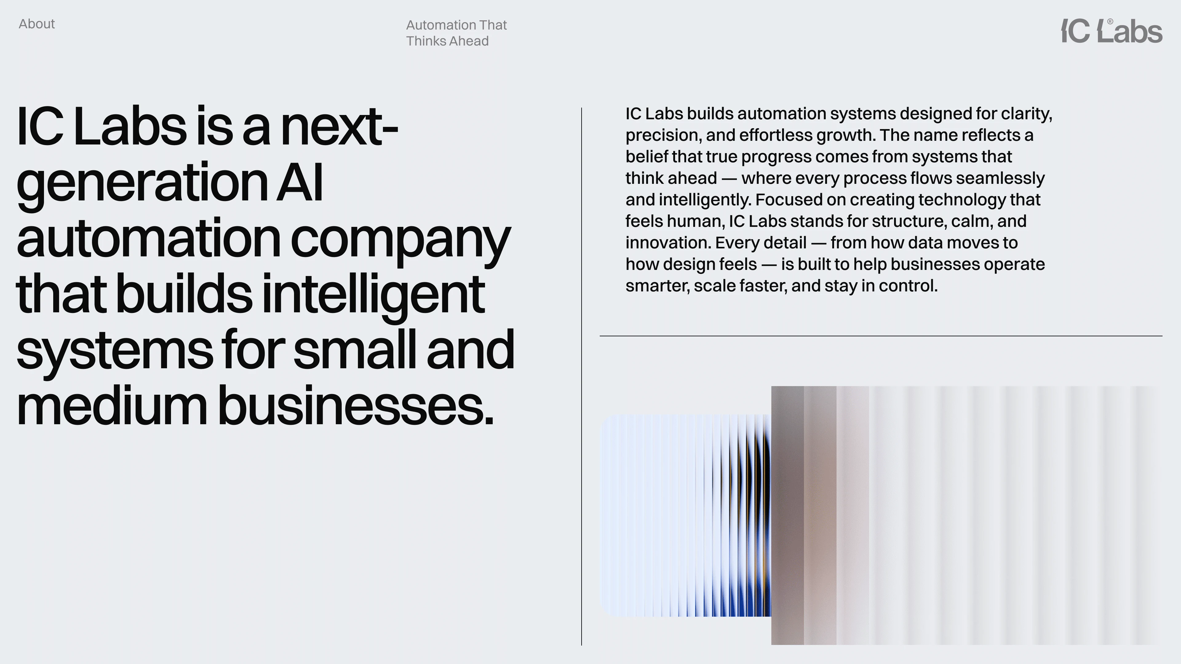
Automation is about making complex systems work with less friction.
But technology brands often communicate that complexity through overly technical visuals, generic gradients, or predictable SaaS aesthetics.
IC Labs needed a different approach.
The identity had to communicate precision, automation, engineering, scalability, and forward-thinking technology while remaining simple enough to work across digital products and communication.
The goal was to make the complexity feel organized.
The Decision
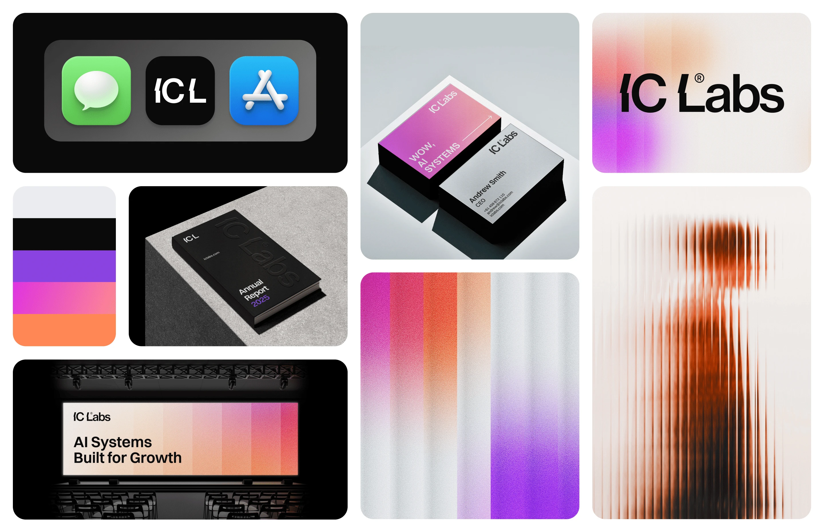
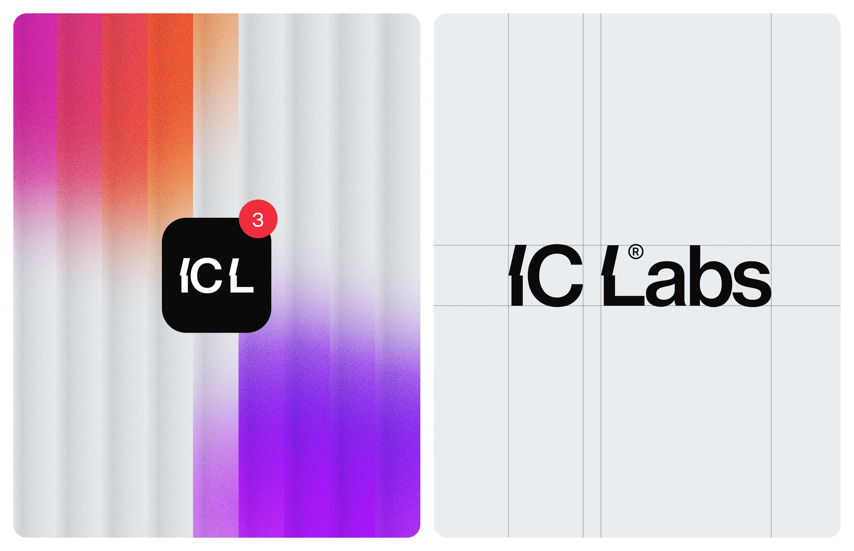
The visual direction starts with a bold geometric wordmark.
Sharp angled cuts introduce movement into the typography, creating a sense of direction and continuous progression.
The cuts aren't purely decorative. They reference the logic behind automation systems — inputs, transitions, data flow, and processes moving from one state to another.
The result is a logo that feels engineered rather than illustrated.
Simple geometry. Precise execution. Clear direction.
The System
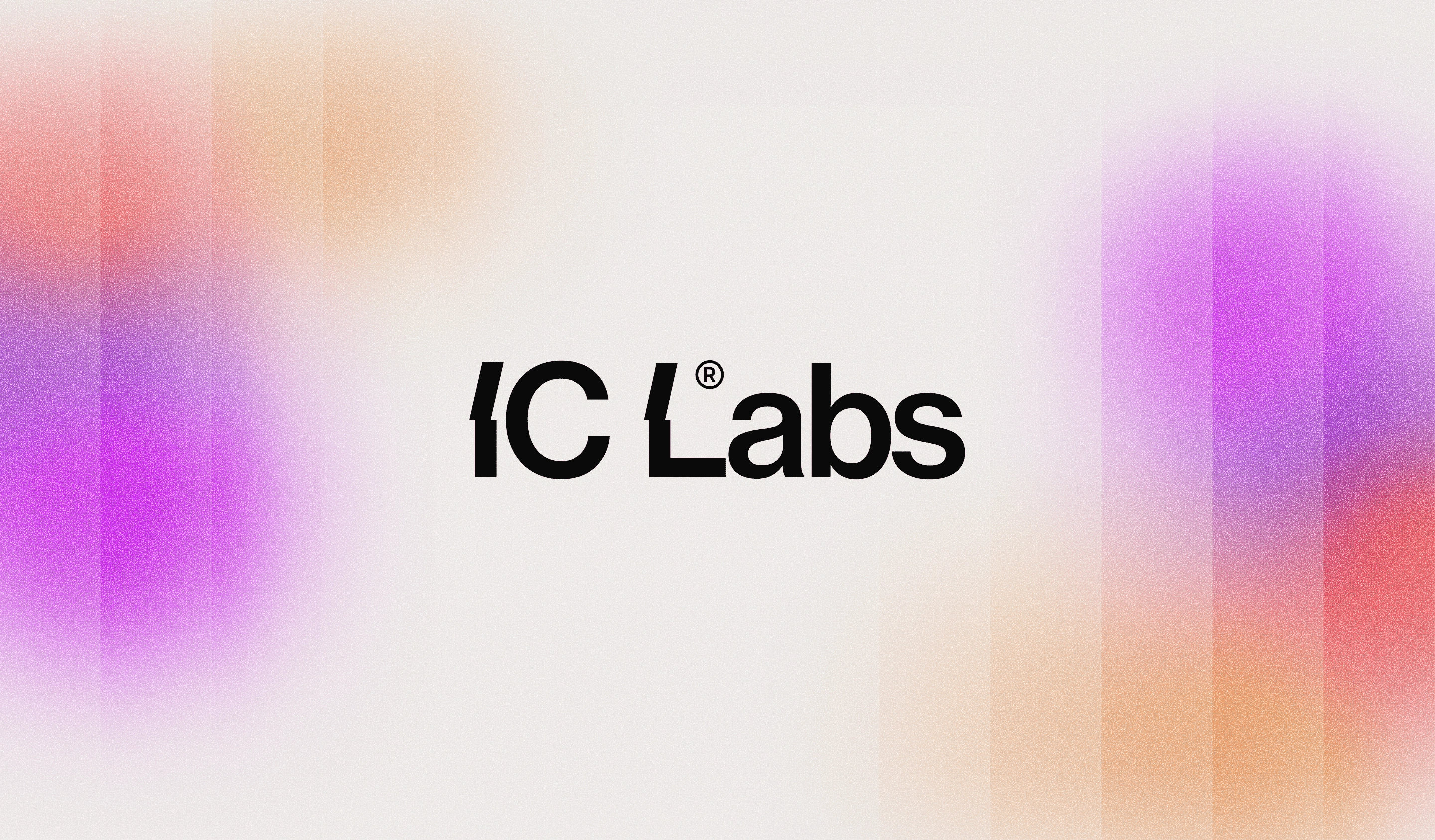
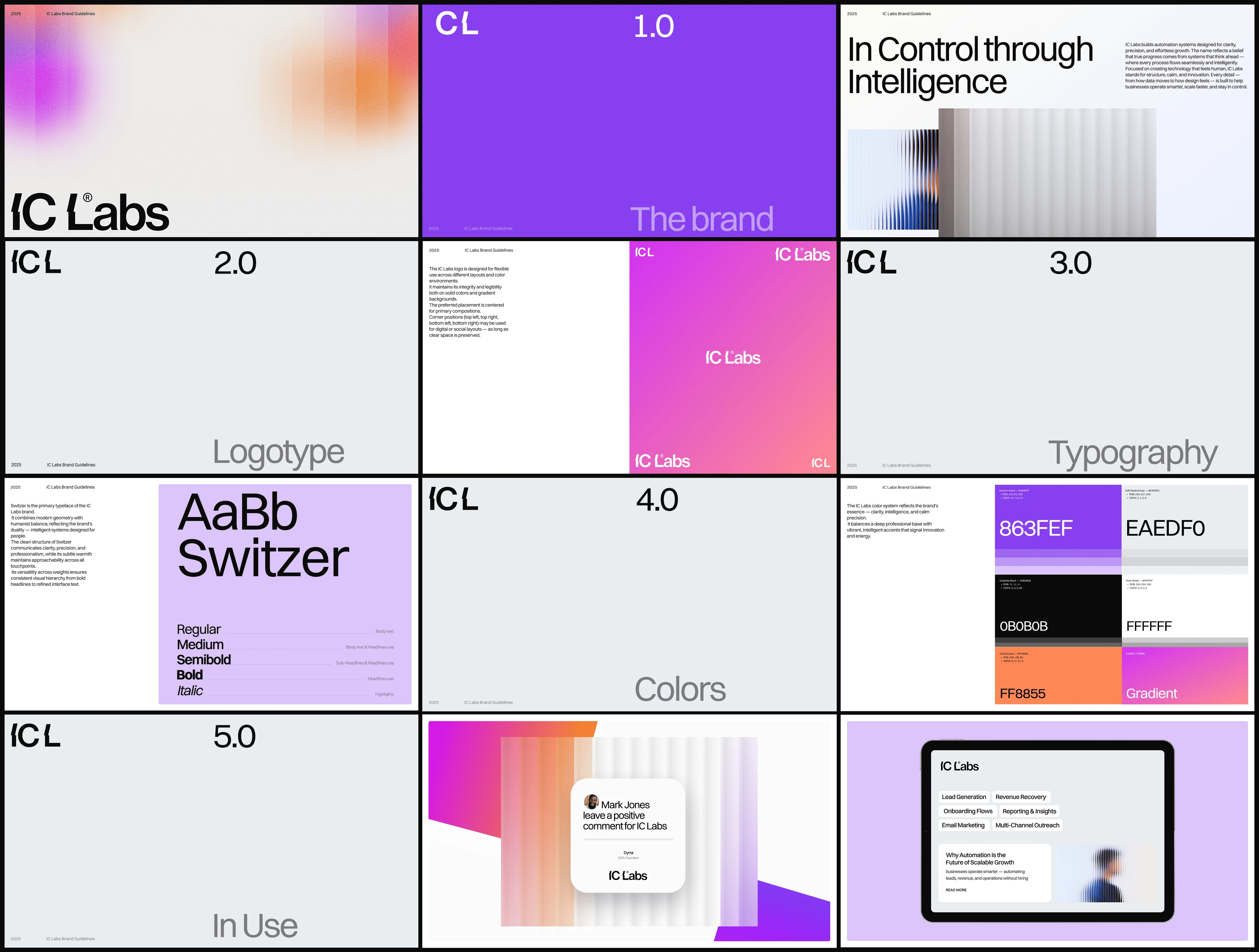
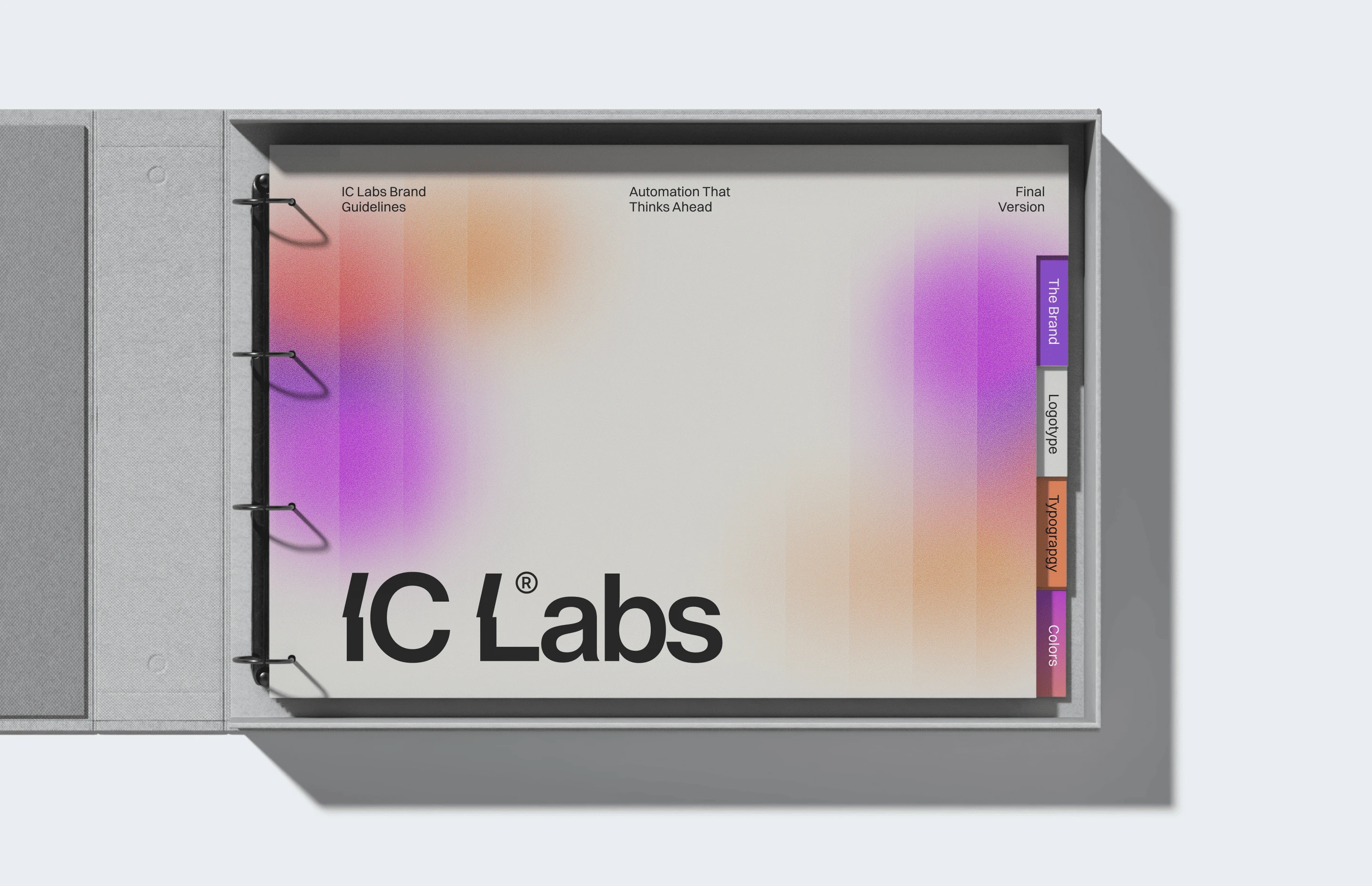
The IC Labs visual identity is built around structured geometry and confident typography.
The wordmark acts as the primary visual asset, while the typography system reinforces the same qualities: clean, technical, modern, and highly legible.
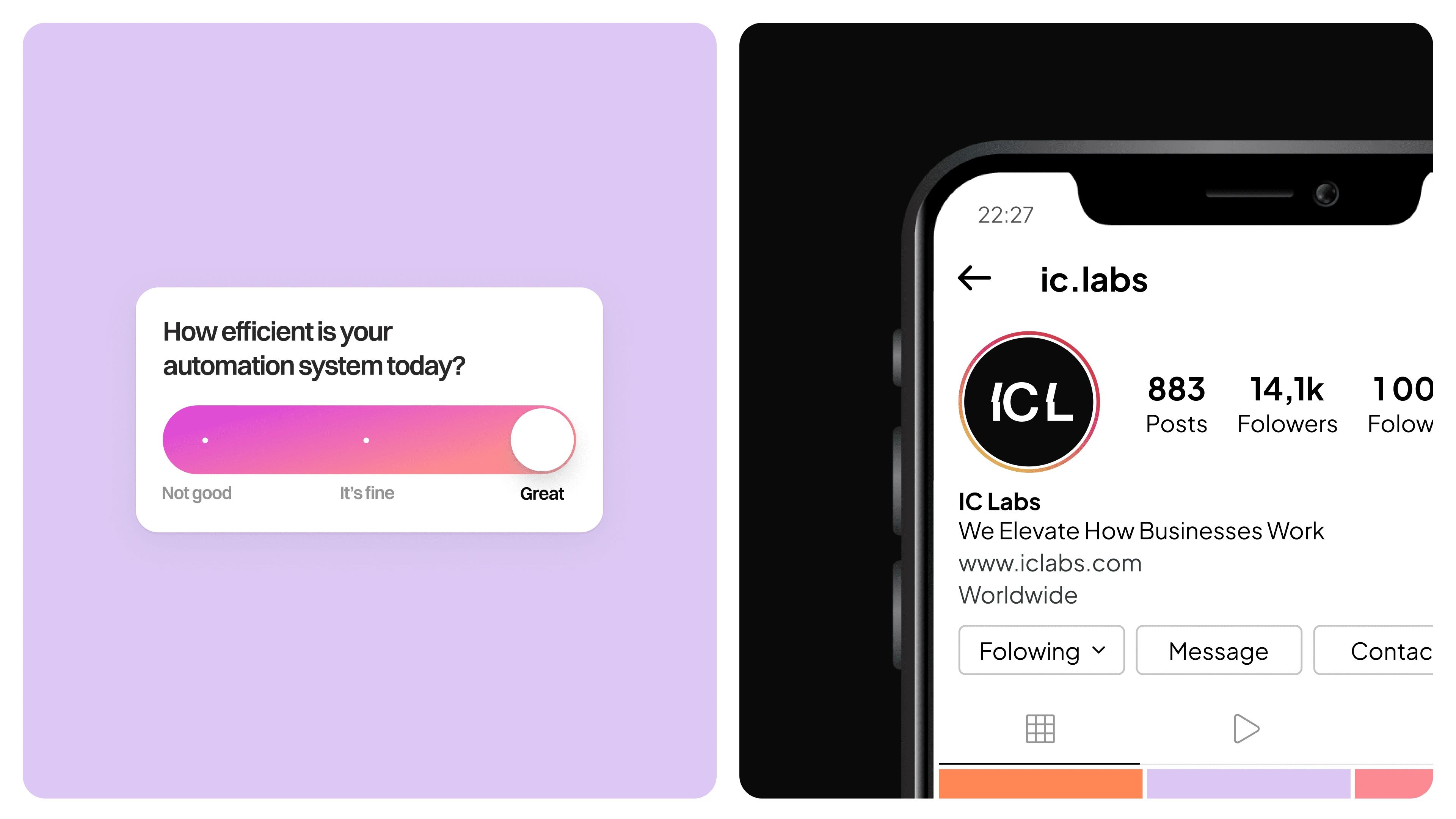
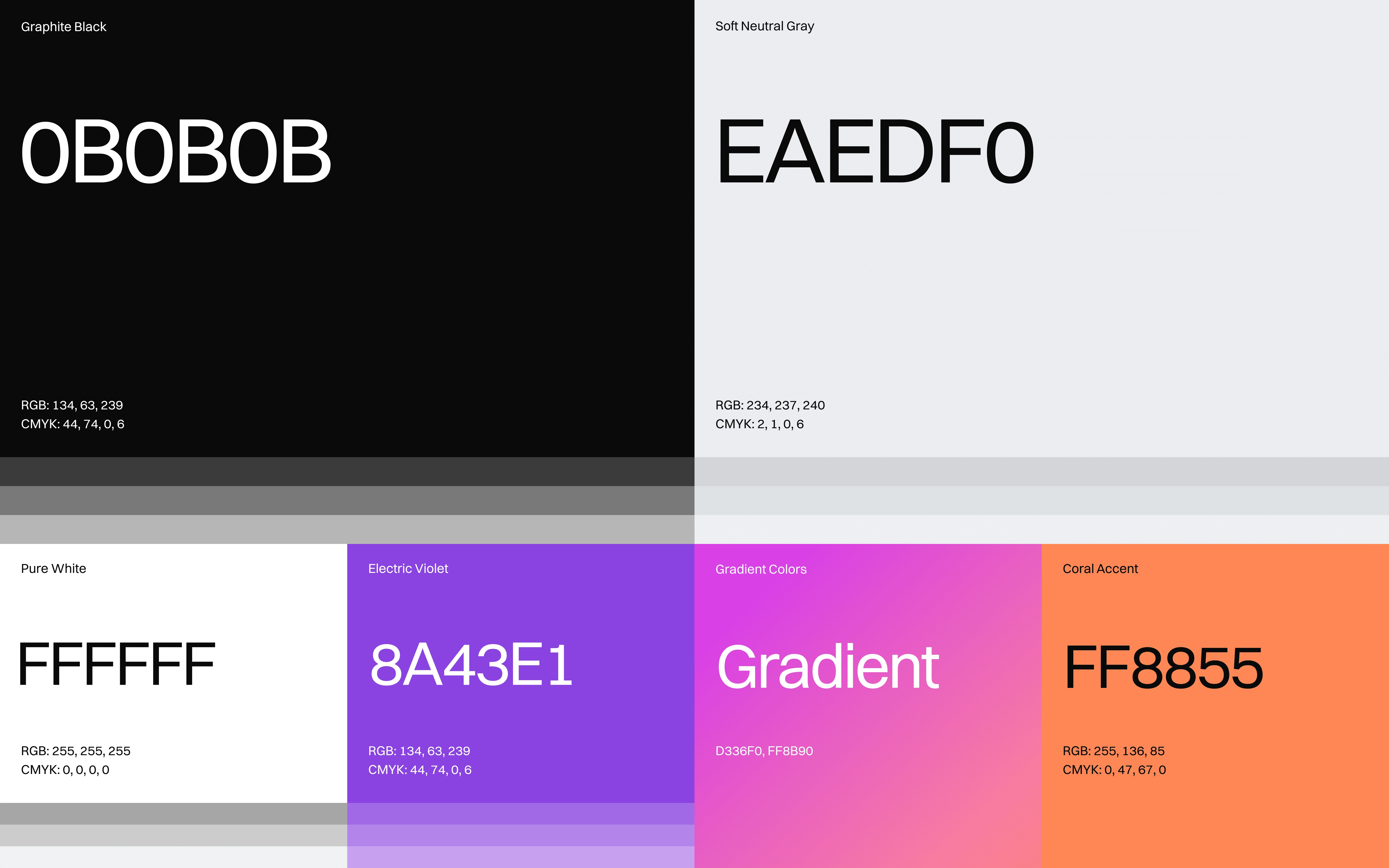
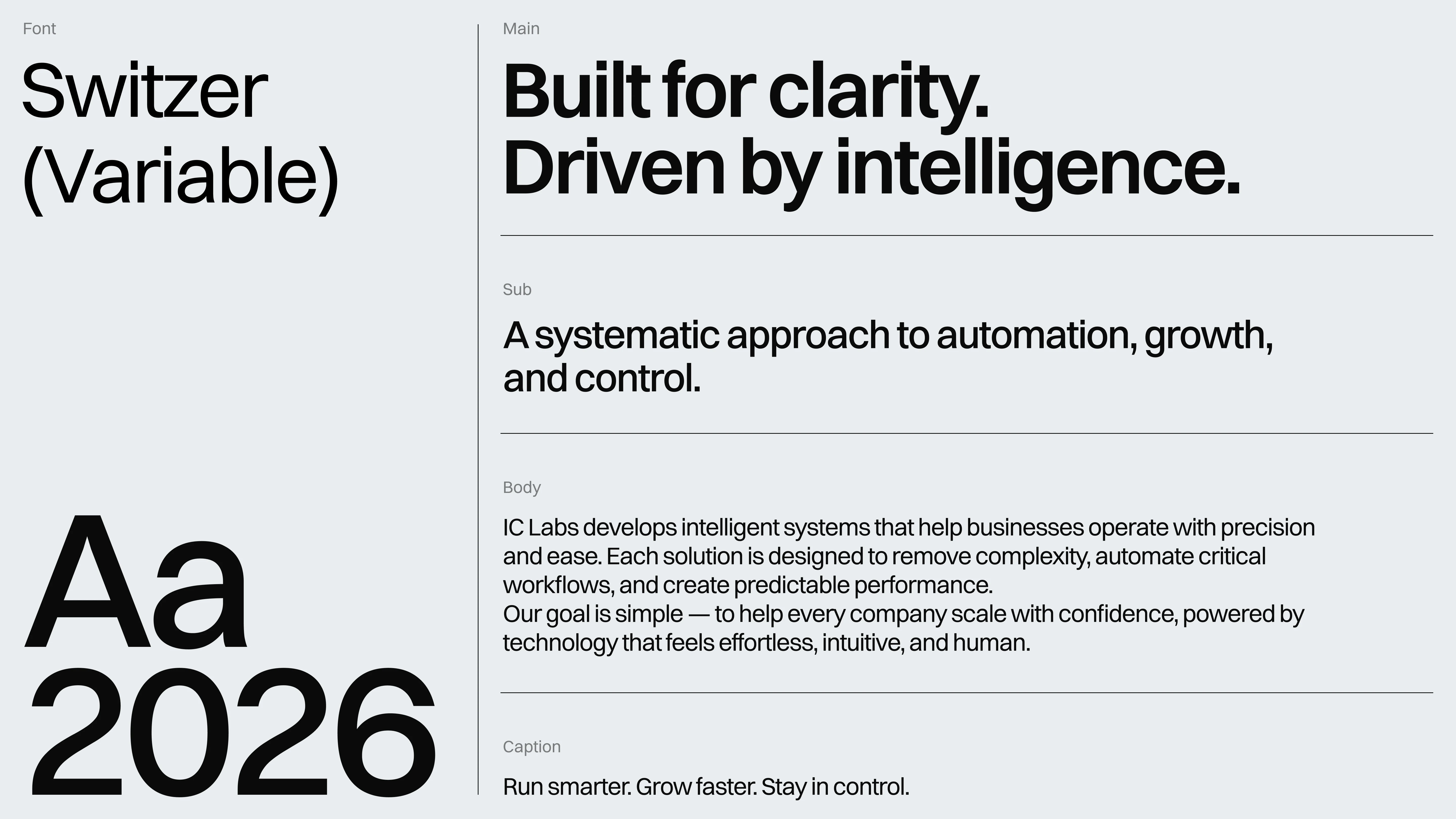
Geometric forms can extend beyond the logo to create supporting graphic elements, layouts, and digital compositions.
This creates a flexible brand design system rather than a logo that exists independently from the rest of the identity.
Every element follows the same principle:
structure creates clarity.
Technology Built to Scale
IC Labs operates in a world where systems need to work across products, platforms, teams, and increasingly complex workflows.
The brand identity was designed with the same scalability in mind.
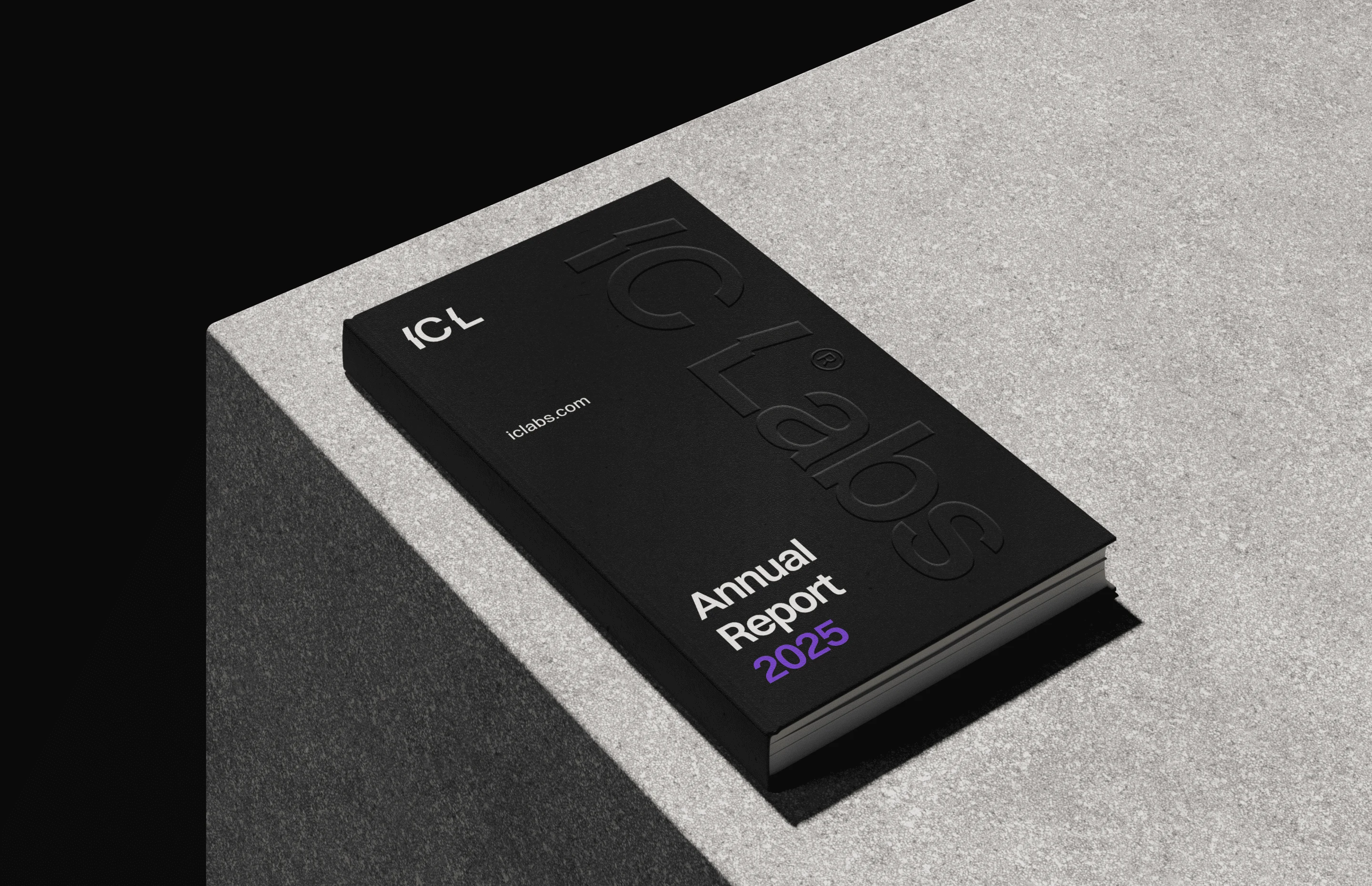
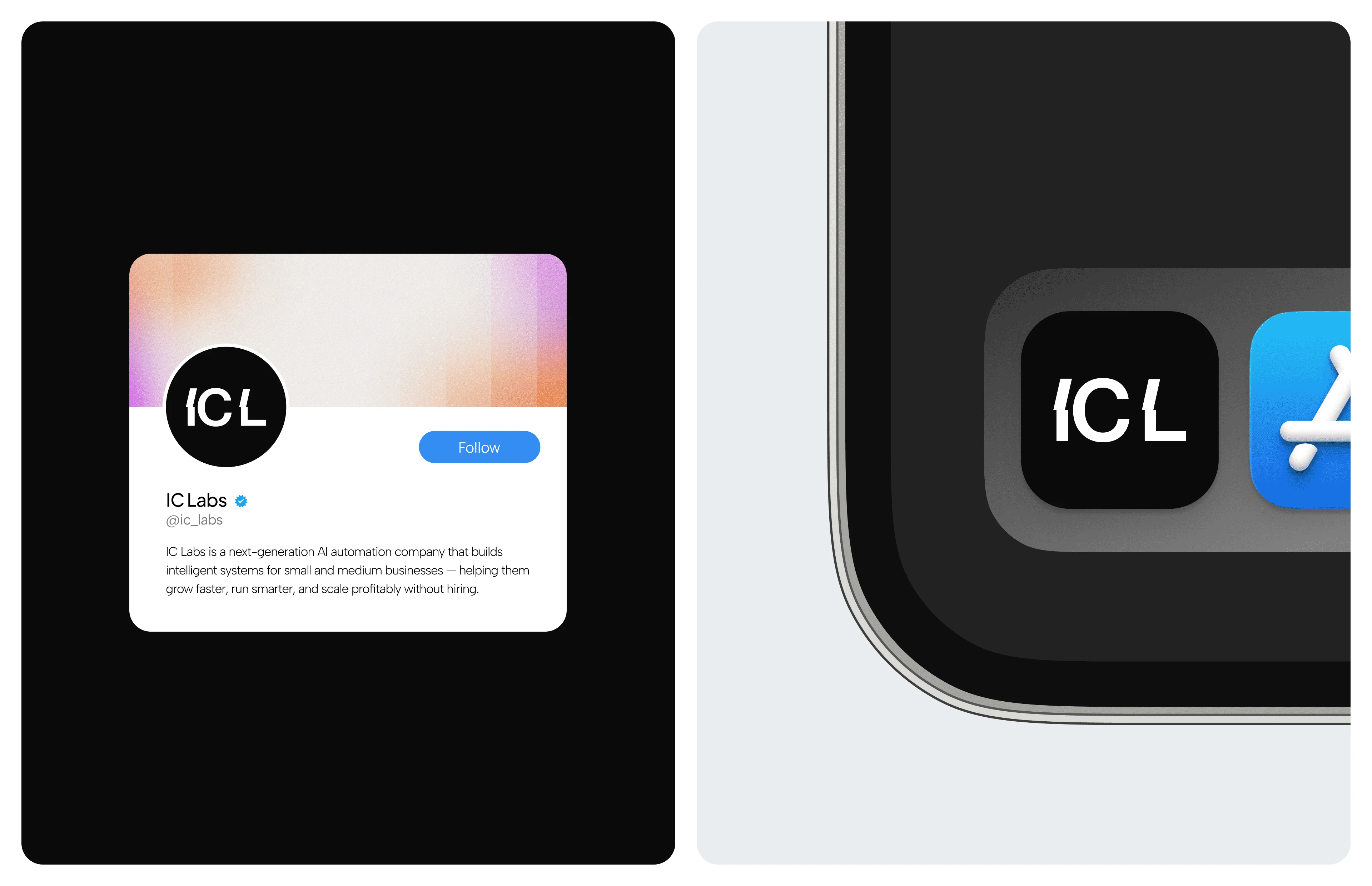
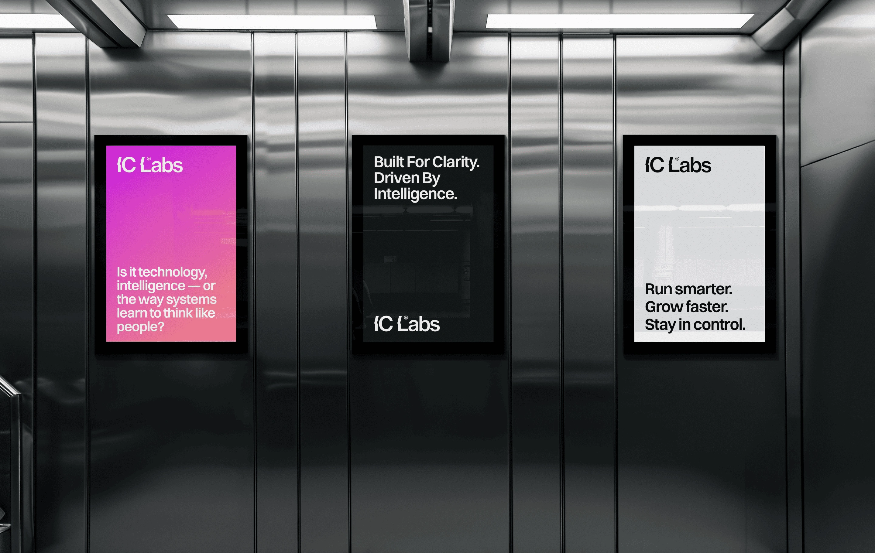
The logo and visual language can translate across websites, SaaS interfaces, dashboards, presentations, social media, digital products, and technology marketing without losing recognition.
The identity feels technical without being inaccessible and modern without depending on short-lived visual trends.
The Digital Experience
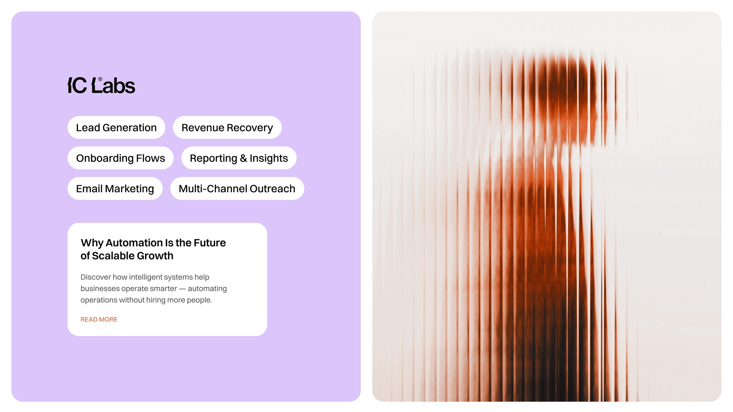
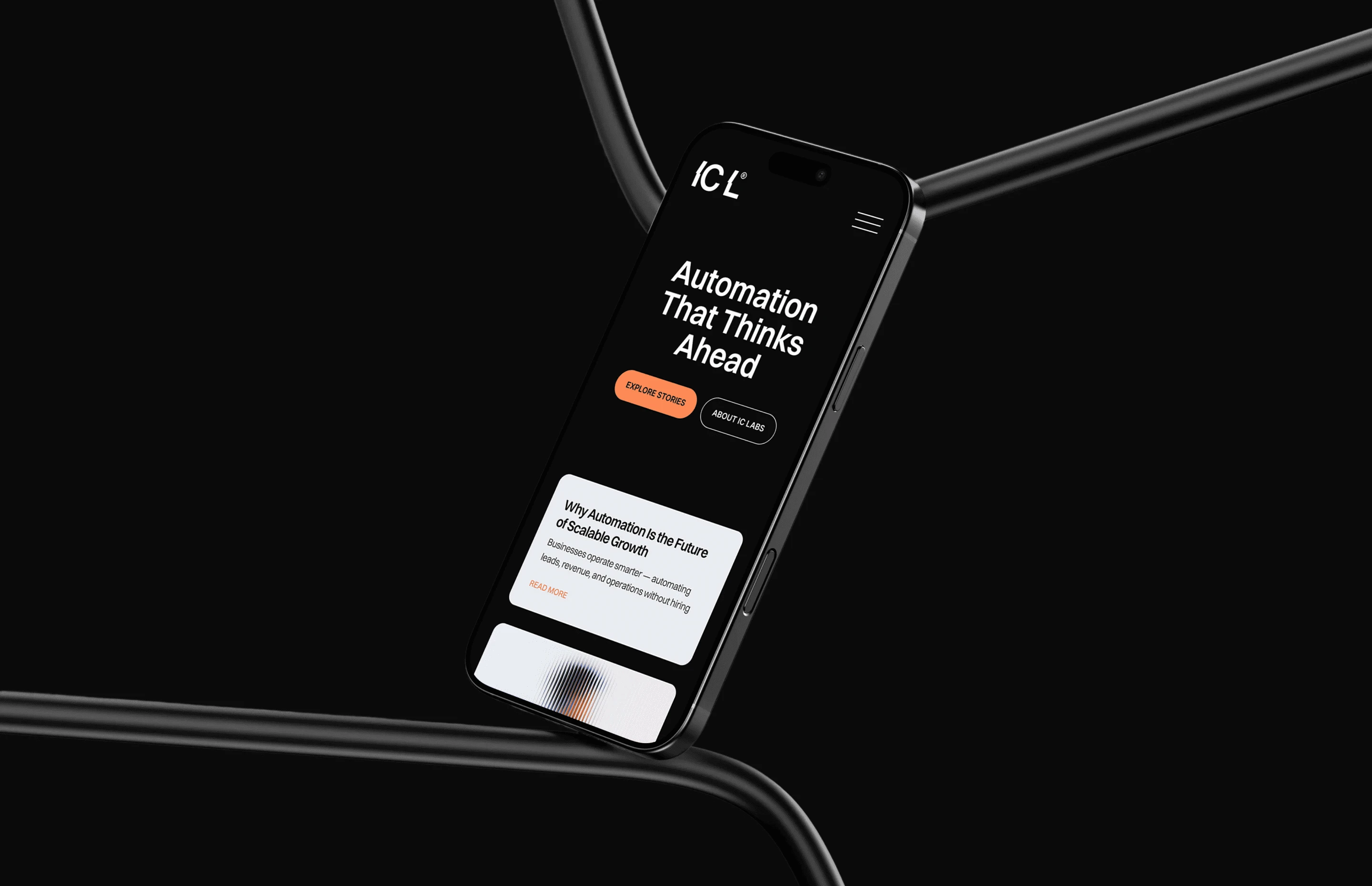
Because IC Labs is fundamentally a technology company, the identity needed to perform particularly well in digital environments.
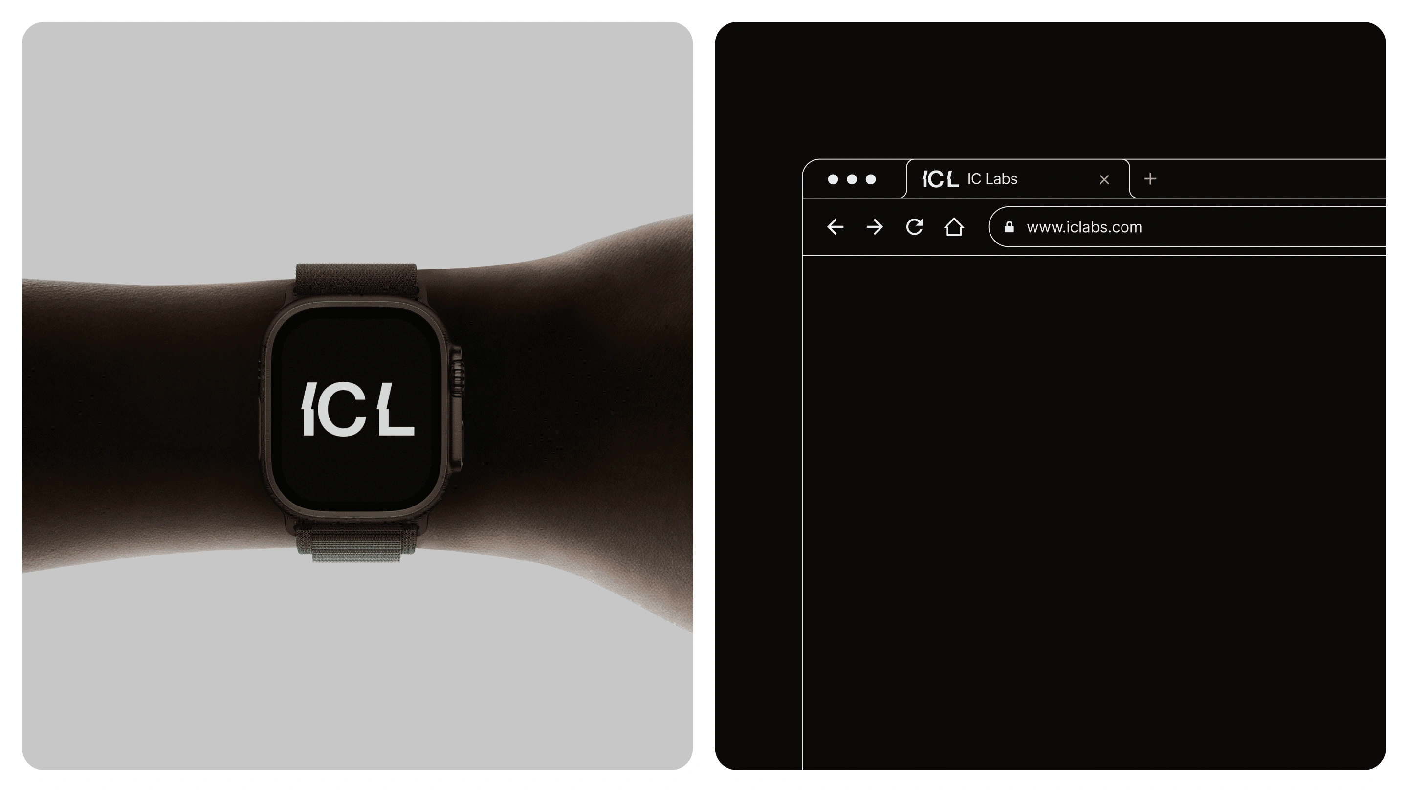
The geometric wordmark provides a strong anchor for responsive layouts, while the structured typography creates hierarchy across product and marketing touchpoints.
The system is intentionally modular — allowing the same visual logic to move from a website header to a product interface, presentation, or marketing asset.
The brand behaves like the systems it represents.
Structured. Precise. Scalable.
The Impact
IC Labs now has a distinctive technology brand identity built around automation, engineering, precision, and structured growth.
The project combines branding, logo design, visual identity, graphic design, typography, art direction, and digital brand design into a scalable identity system.
A brand identity designed to make advanced technology feel clear, confident, and ready for what comes next.
The Takeaway.
When the system is clear, complexity becomes an advantage.


Thank you for watching!
Our Website
whales.design
Email:
Like this project
Posted Aug 13, 2026
Technology brand identity and logo design for an automation company, combining visual identity, geometric branding, SaaS design, and digital systems.
Likes
0
Views
12