Brand Refresh & Website Design for Ottune

Artur Mikhov


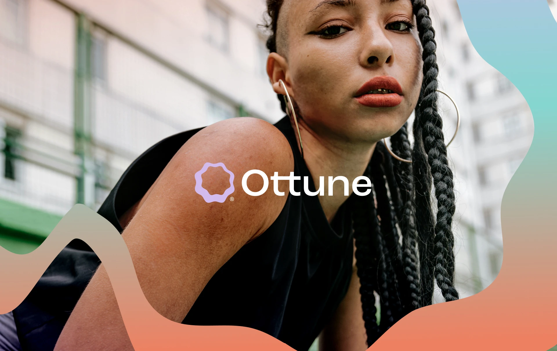
Ottune is a digital media and royalties agency helping content creators unlock new ways to monetize their work through music. The challenge was to build a modern brand identity that could sit between technology, music, and the creator economy: professional enough for a digital platform, but expressive enough to feel connected to sound.
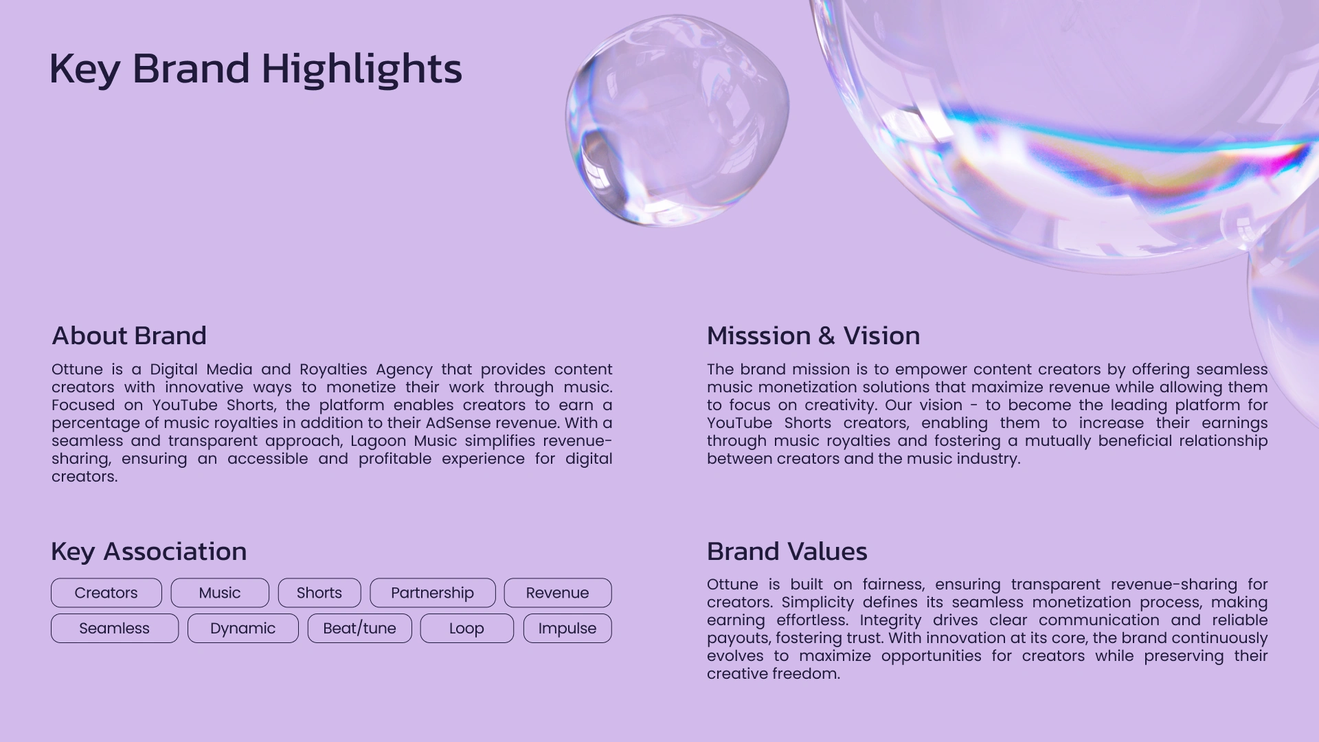
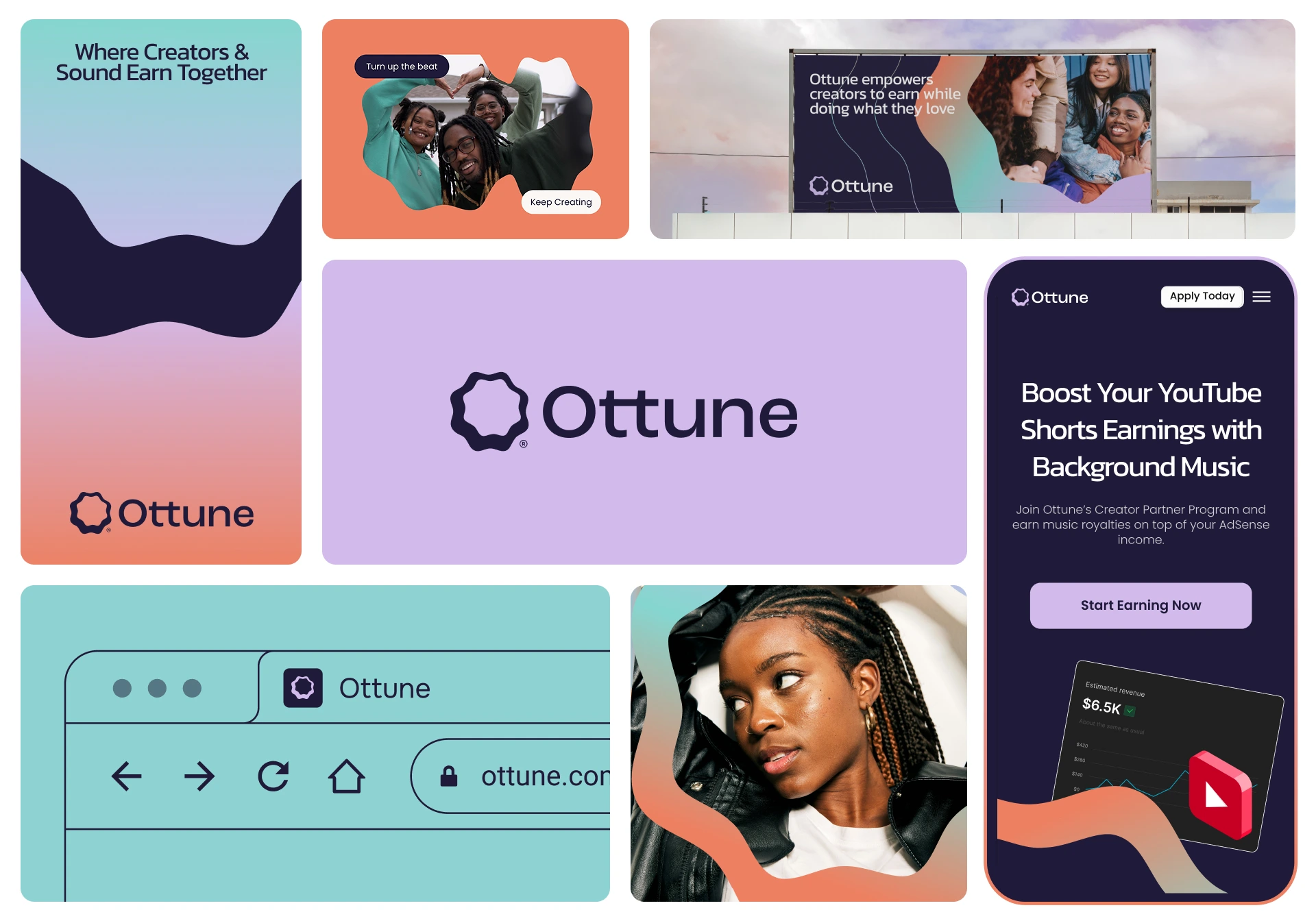
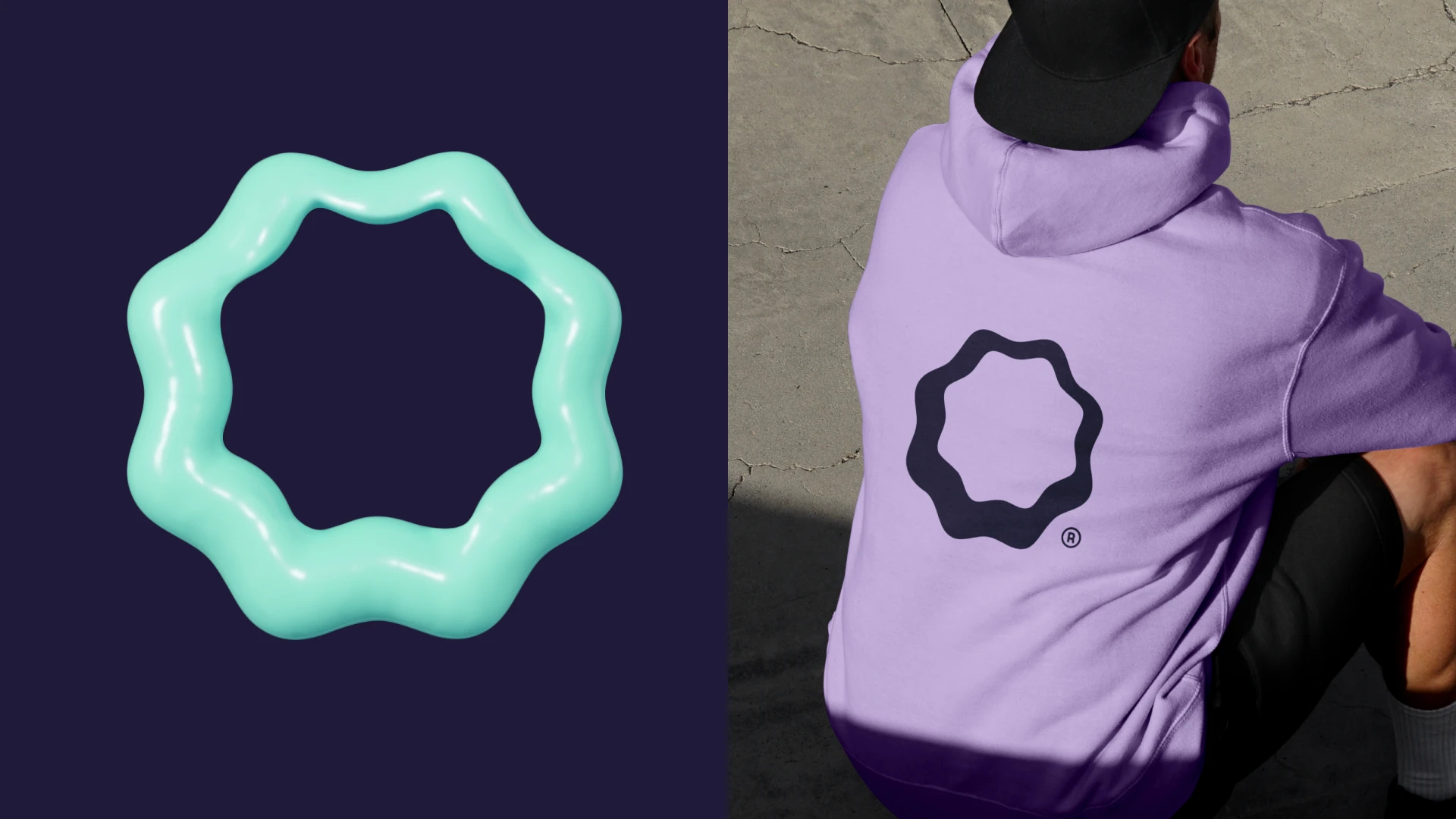
The result is a complete brand identity and visual identity system built around rhythm, flow, and precision. Logo design, typography, graphic language, color, UI, advertising, and outdoor applications all speak the same visual language.
The Tension
Music monetization can feel complicated, technical, and corporate. Ottune needed to communicate the opposite.
The brand had to feel clear, approachable, innovative, and creator-focused, while still carrying enough sophistication to operate in the digital media and royalties space.
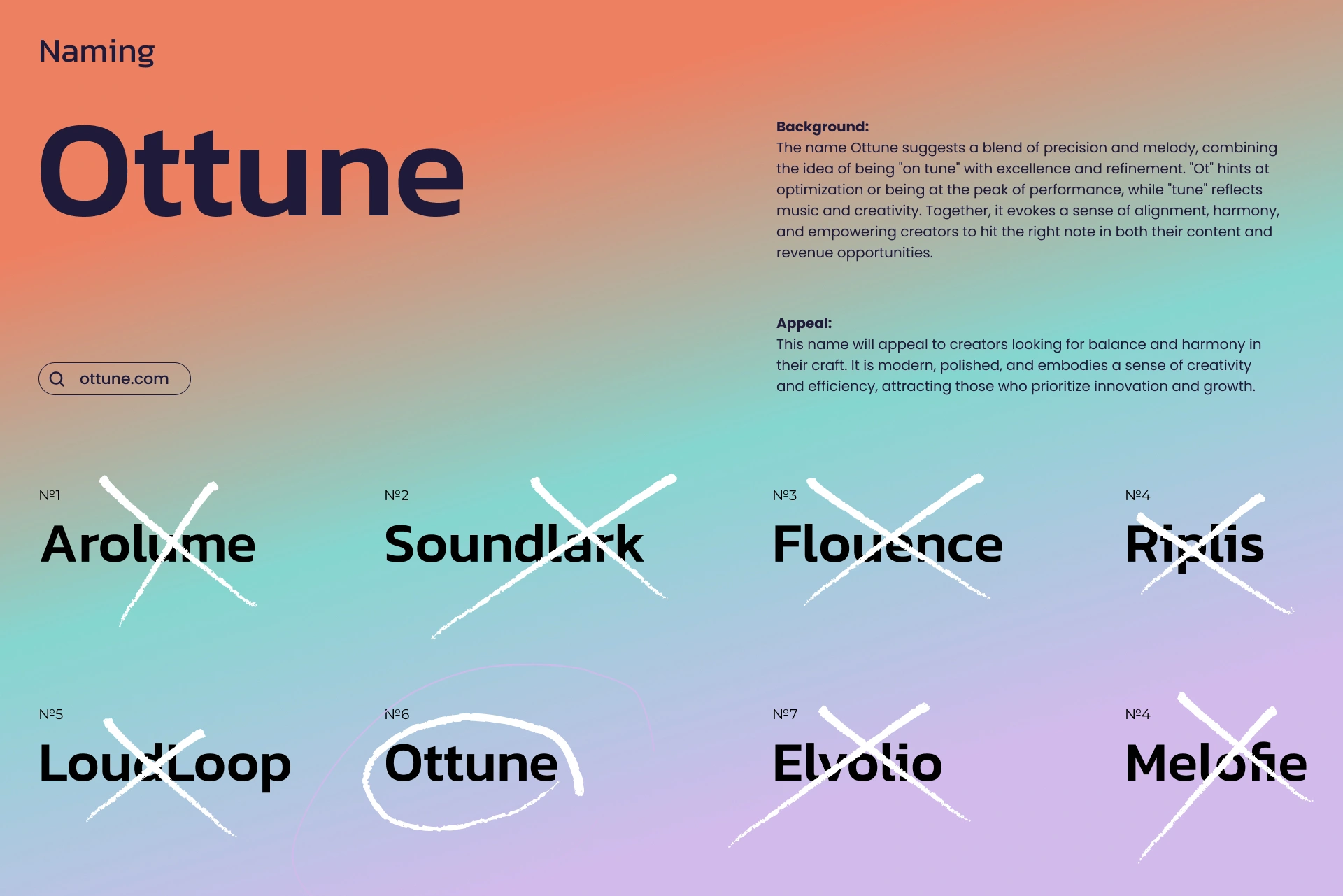
The name itself gave us the starting point: Ottune sits somewhere between "on tune" and optimization. Precision meets melody. Performance meets creativity.
The identity needed to make that relationship visible.
The Decision
Instead of relying on obvious music clichés, I built the visual direction around movement and rhythm.
No headphones. No generic equalizers. No literal music notes.
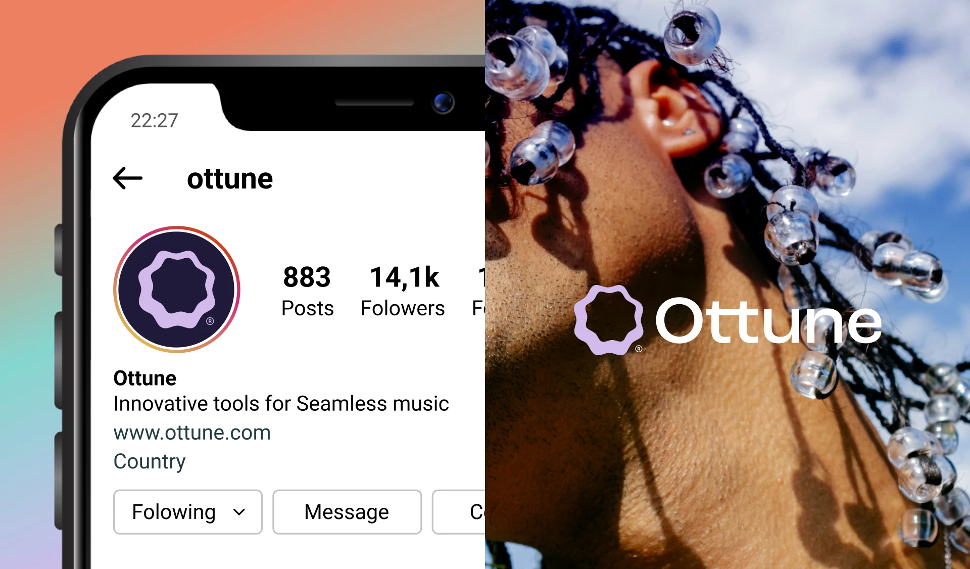
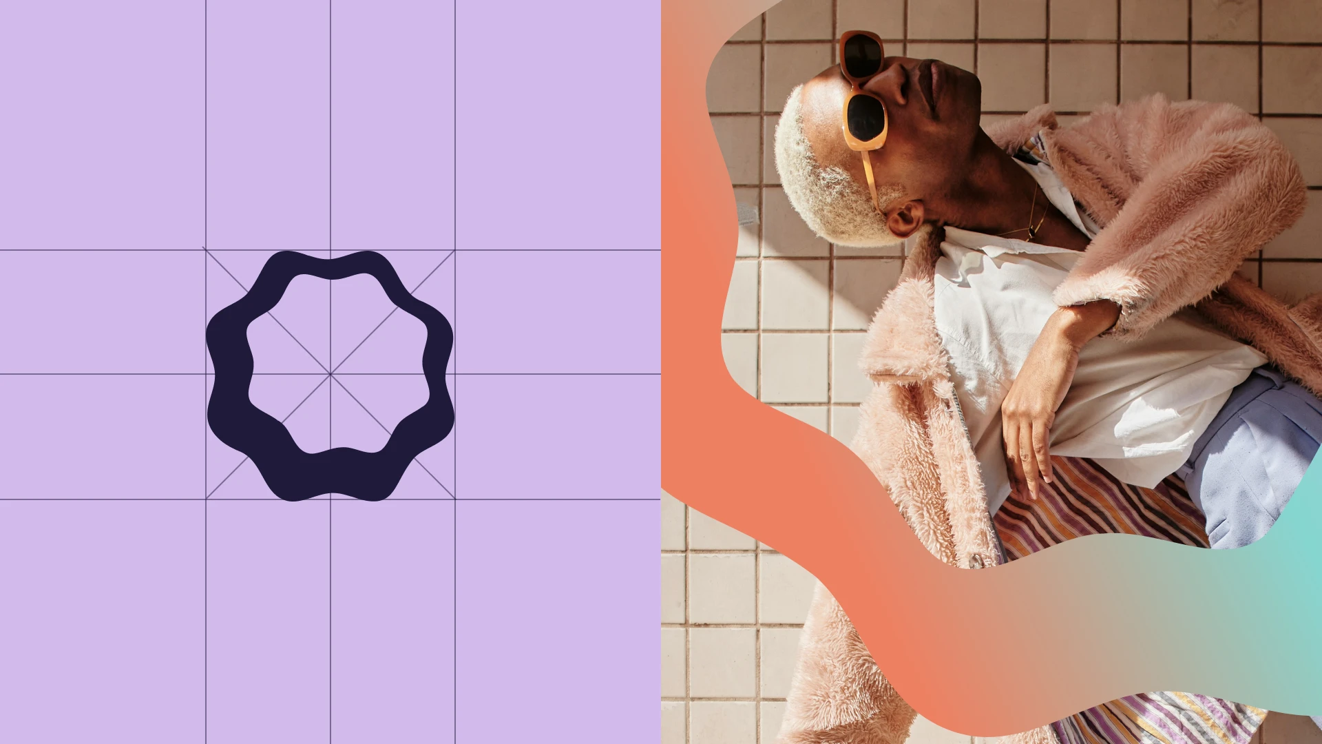
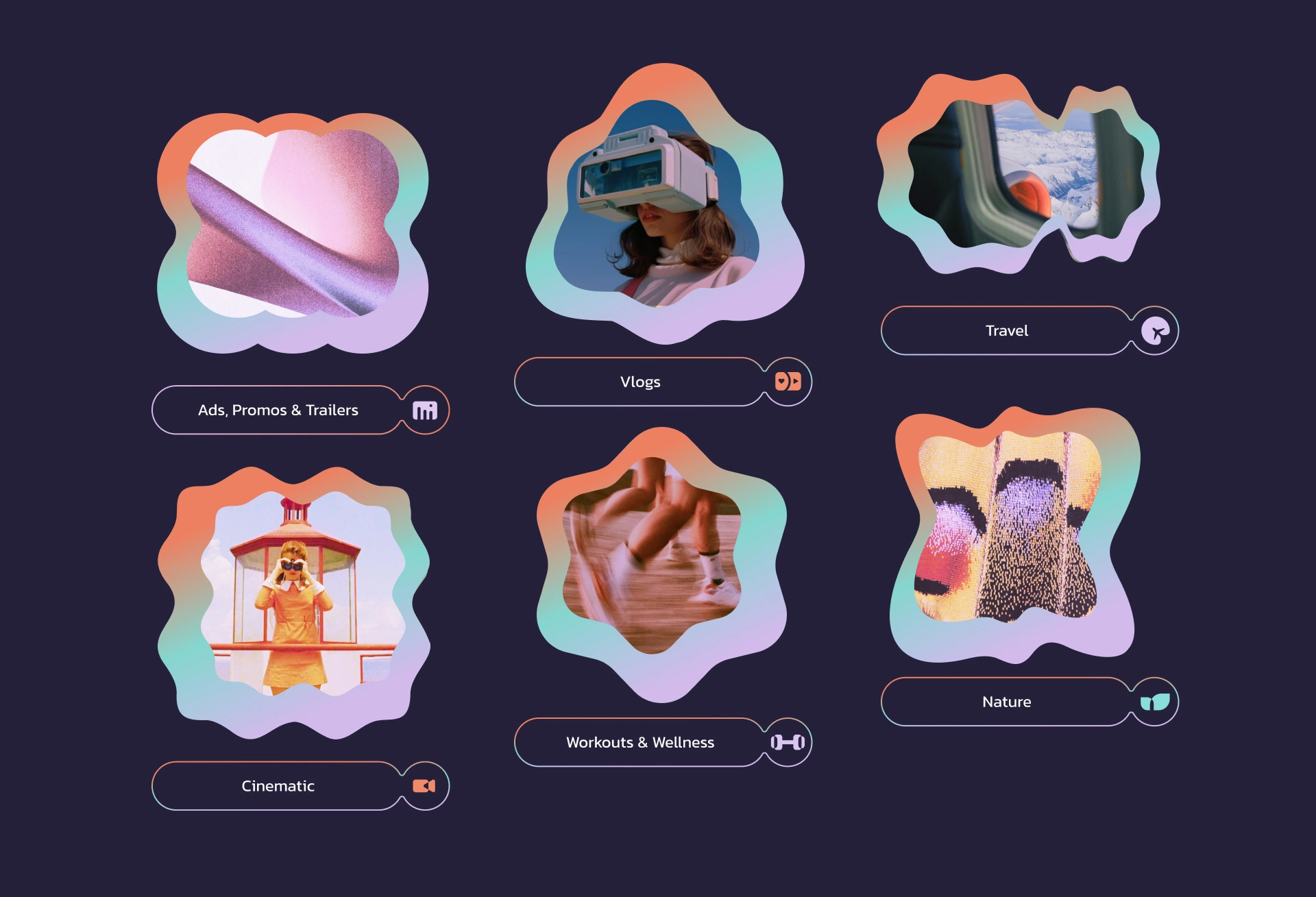
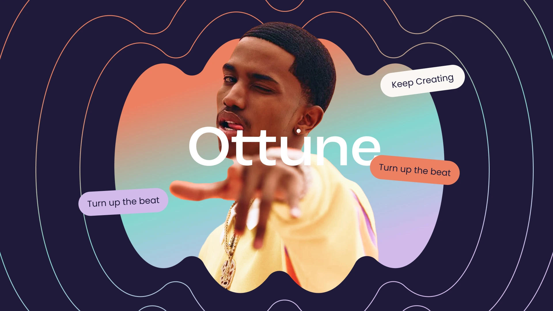
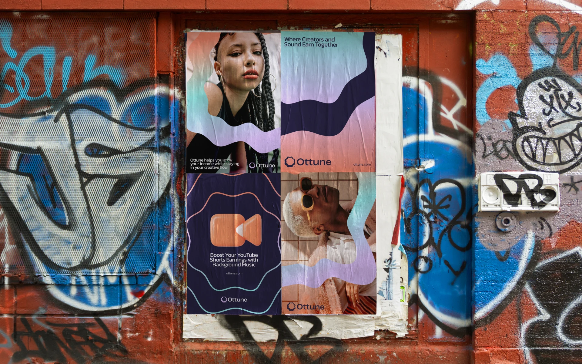
The core visual language comes from organic wave-like forms that behave like sound — expanding, overlapping, bending, and moving across different surfaces. These shapes became a flexible graphic device that could work across brand identity, social media, posters, digital advertising, outdoor campaigns, and product UI.
The result is a visual system that feels connected to music without looking like a traditional music brand.
The System
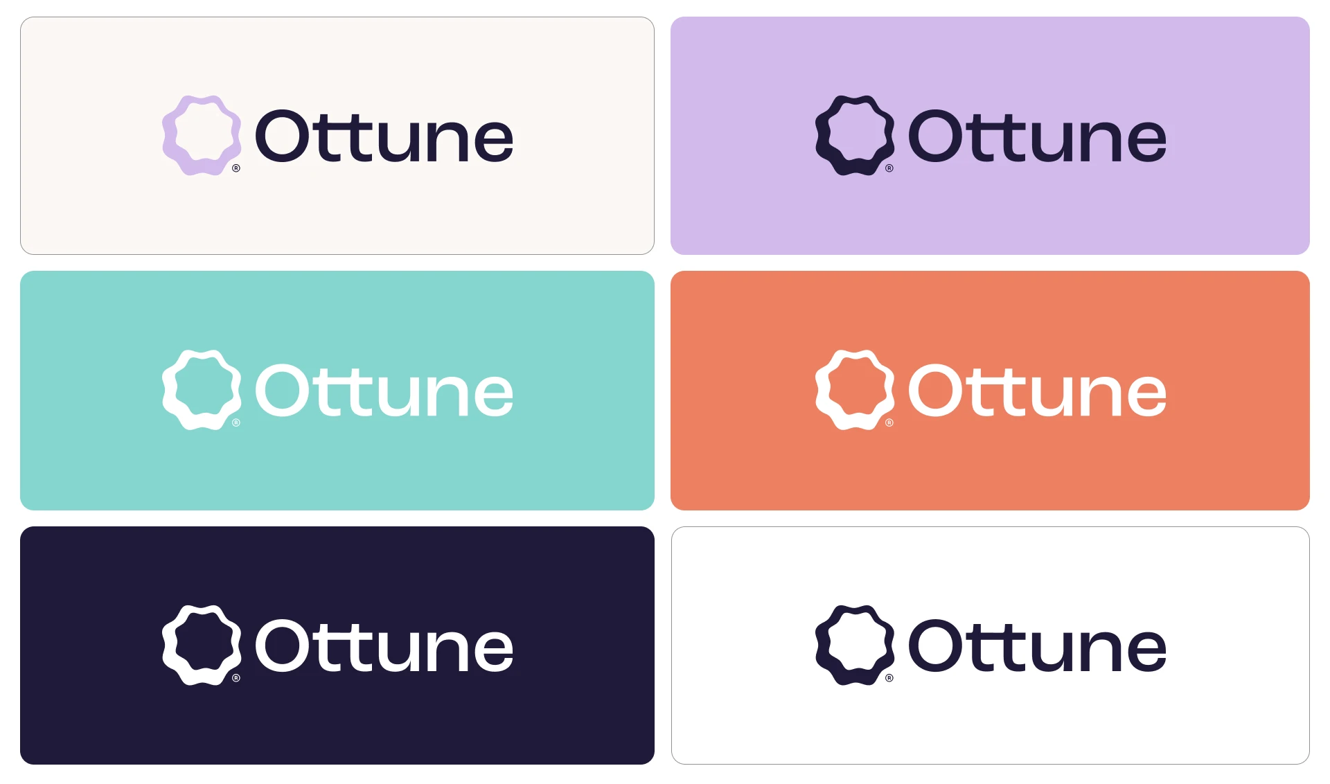
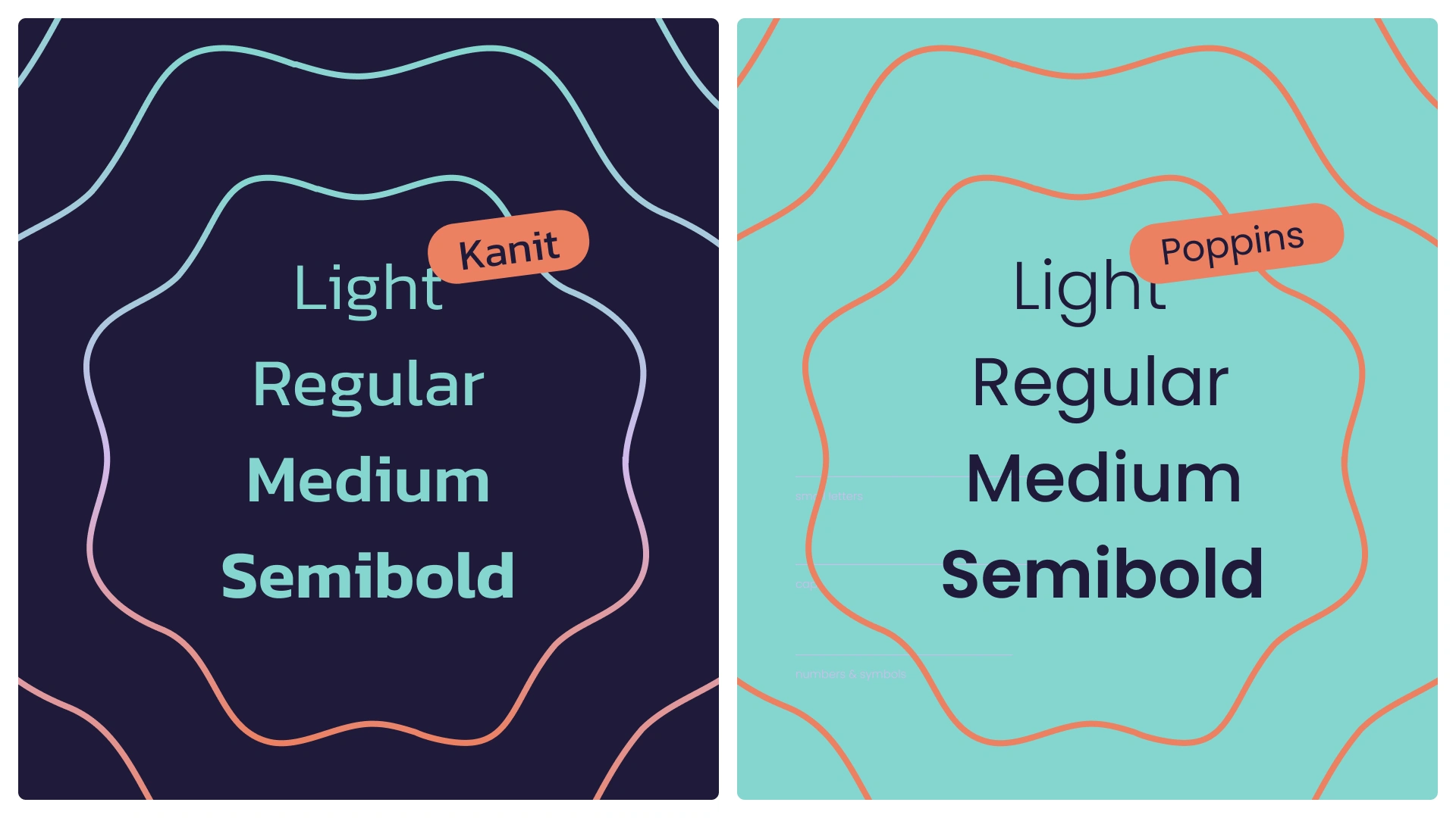
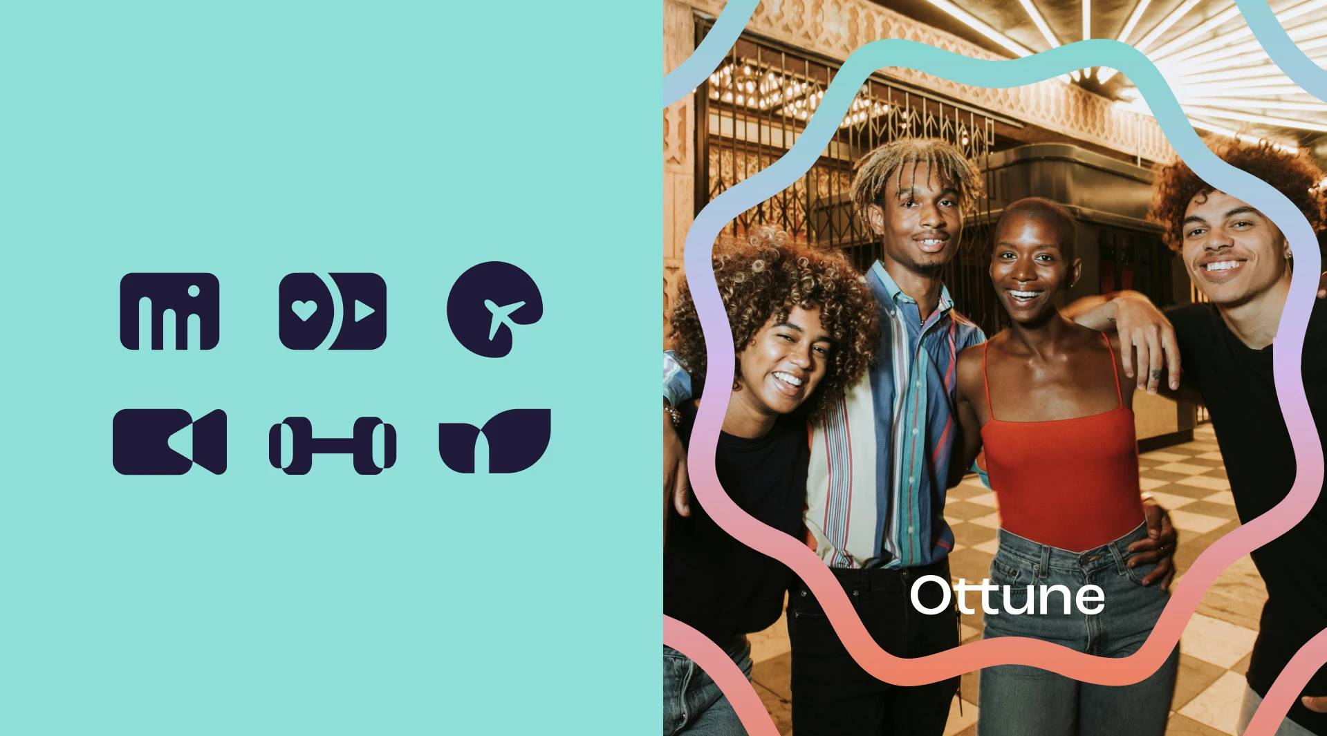
The Ottune logo design combines clean, contemporary typography with a visual personality that feels precise without becoming overly corporate.
A restrained sans-serif foundation keeps the identity professional and highly usable, while organic graphic shapes introduce rhythm and emotion.
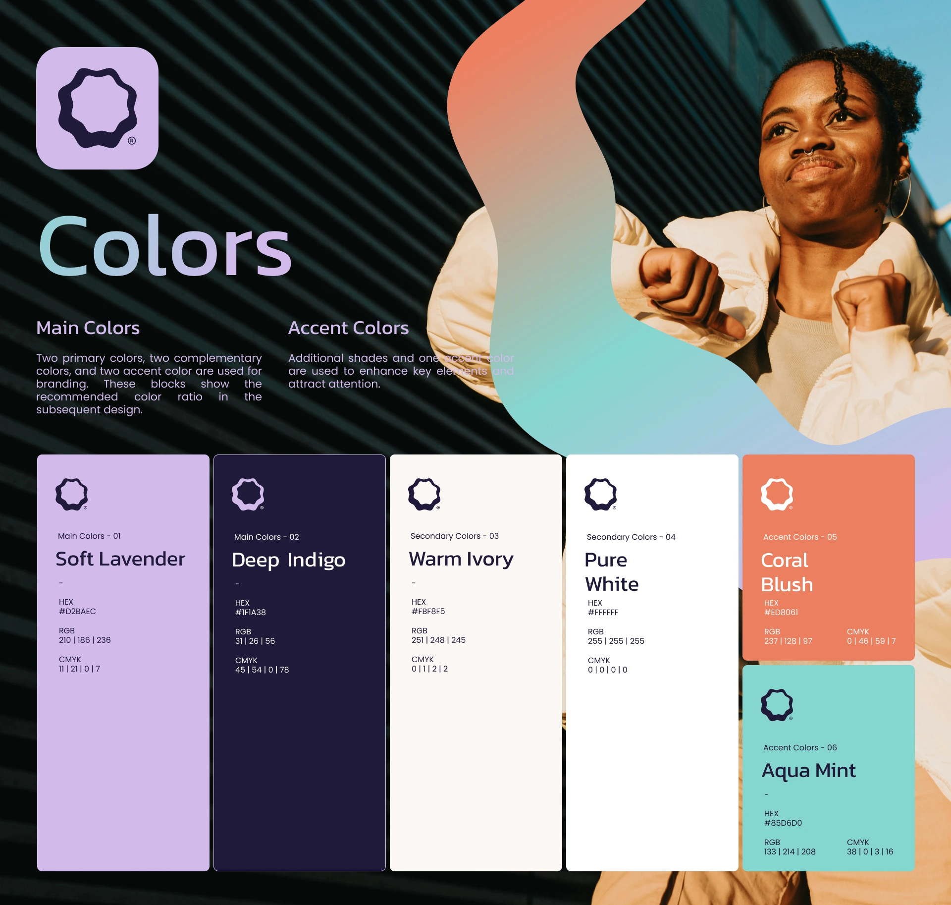
The color system follows the same principle. Deep navy and purple create a premium digital foundation, while gradients of peach, coral, mint, and lilac introduce energy and contrast.
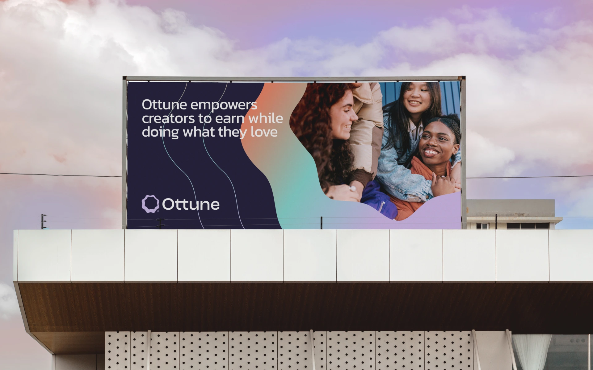
The wave system is the connective tissue.
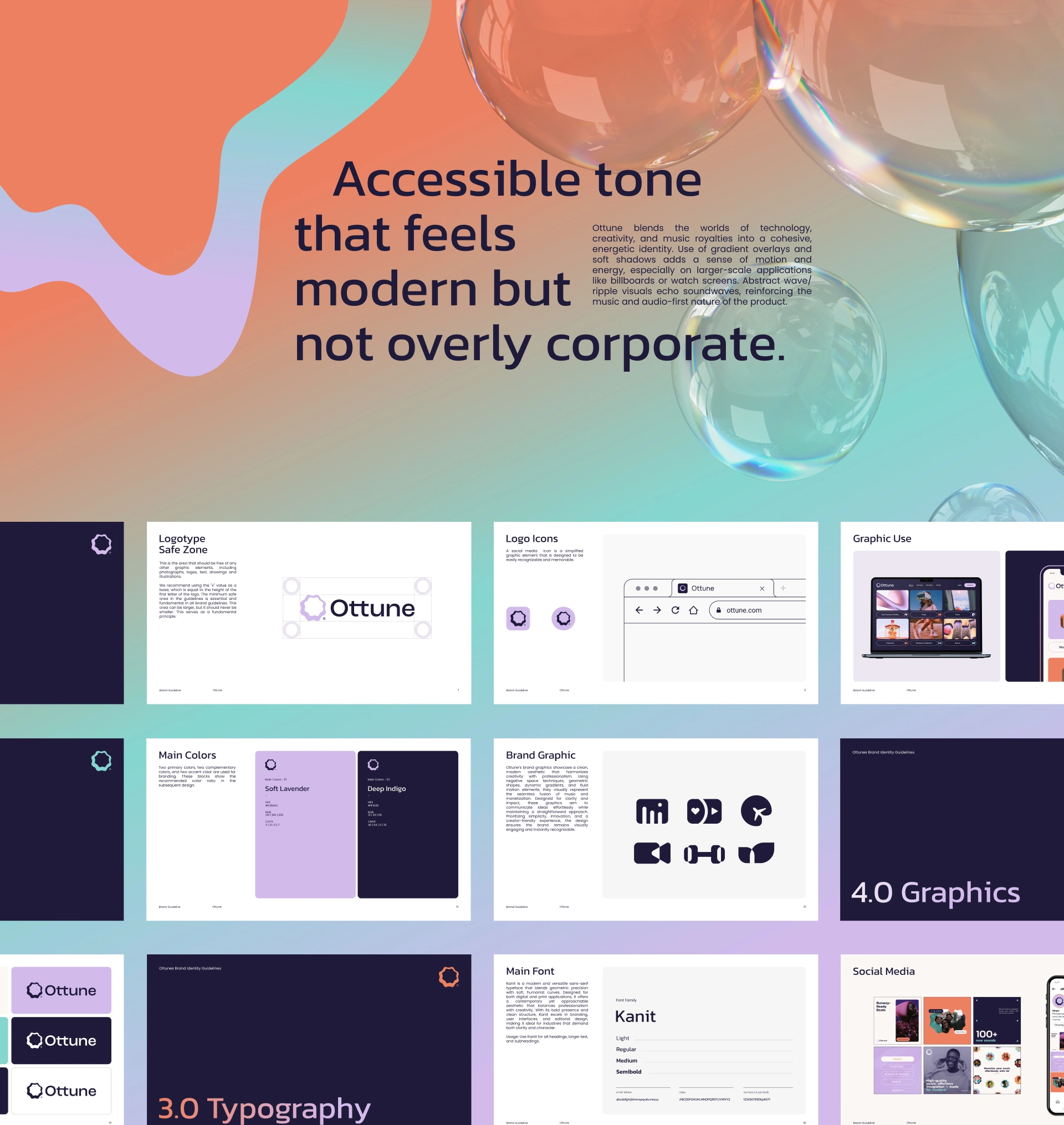
The same visual language appears in posters, outdoor advertising, social content, and UI — creating a recognizable brand system rather than a collection of disconnected assets.
Typography stays clean. Shapes stay fluid. Color provides the energy.
The Digital Experience
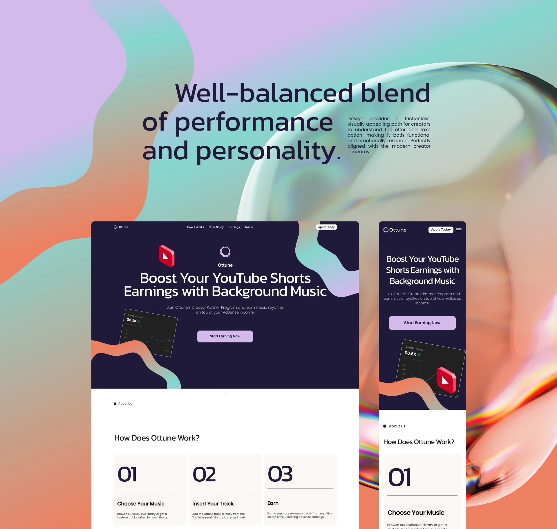
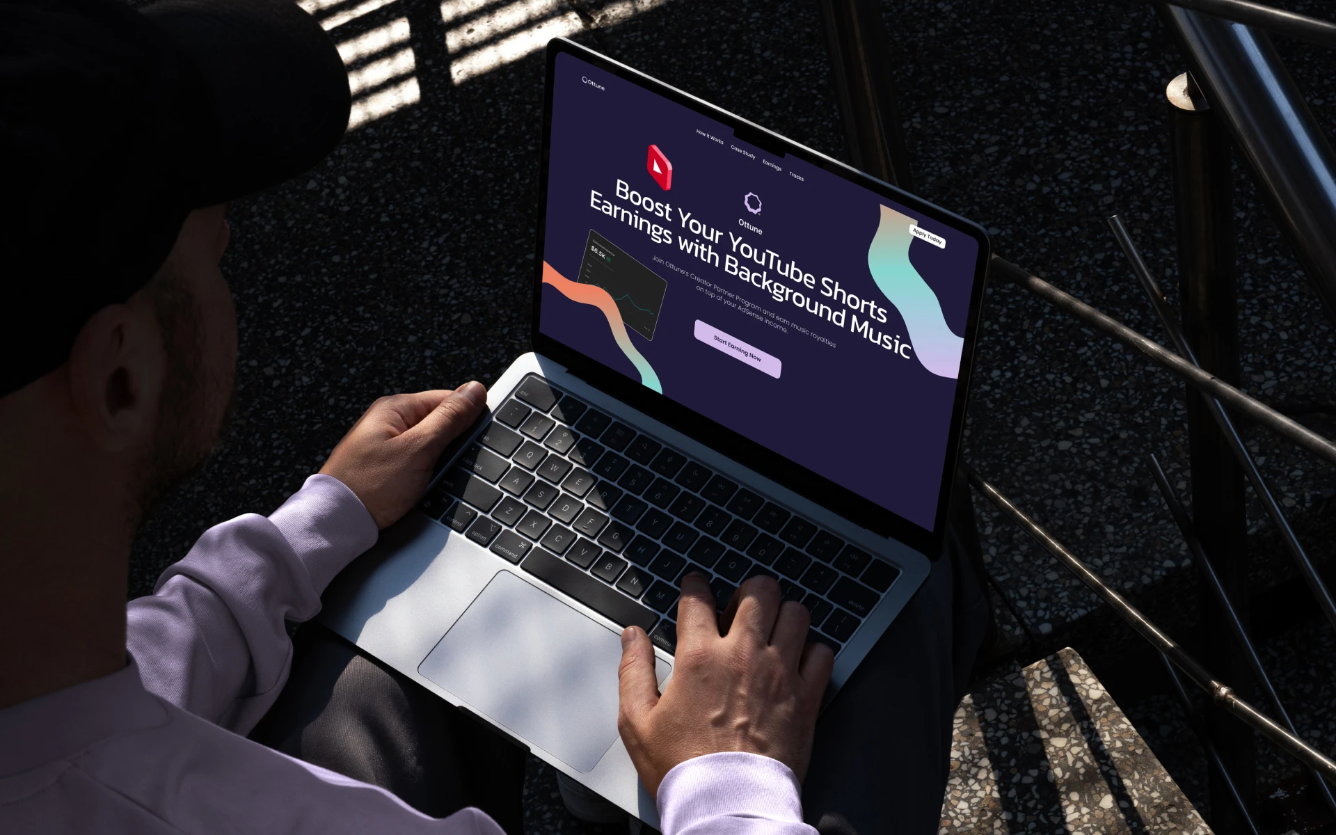
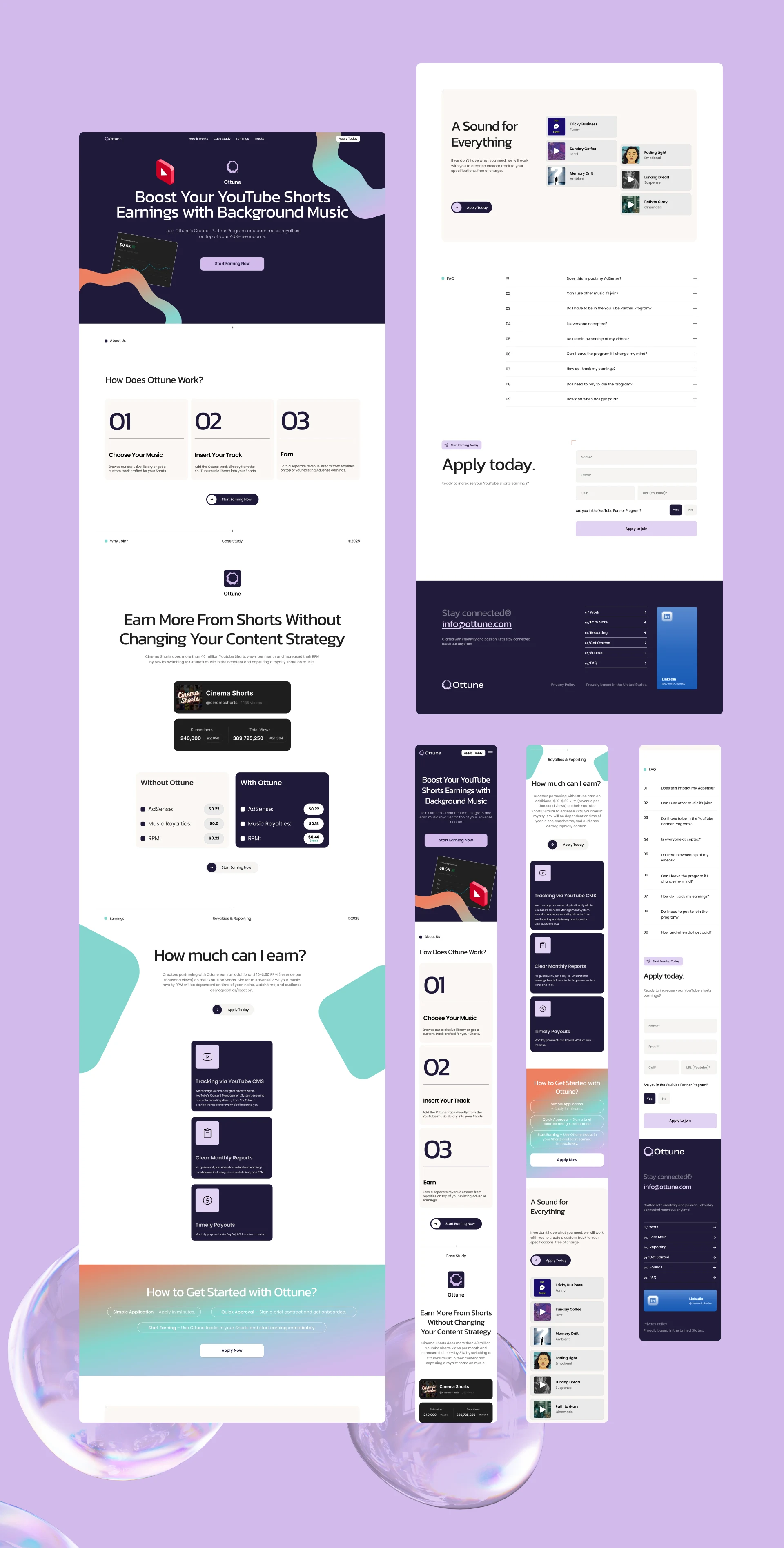
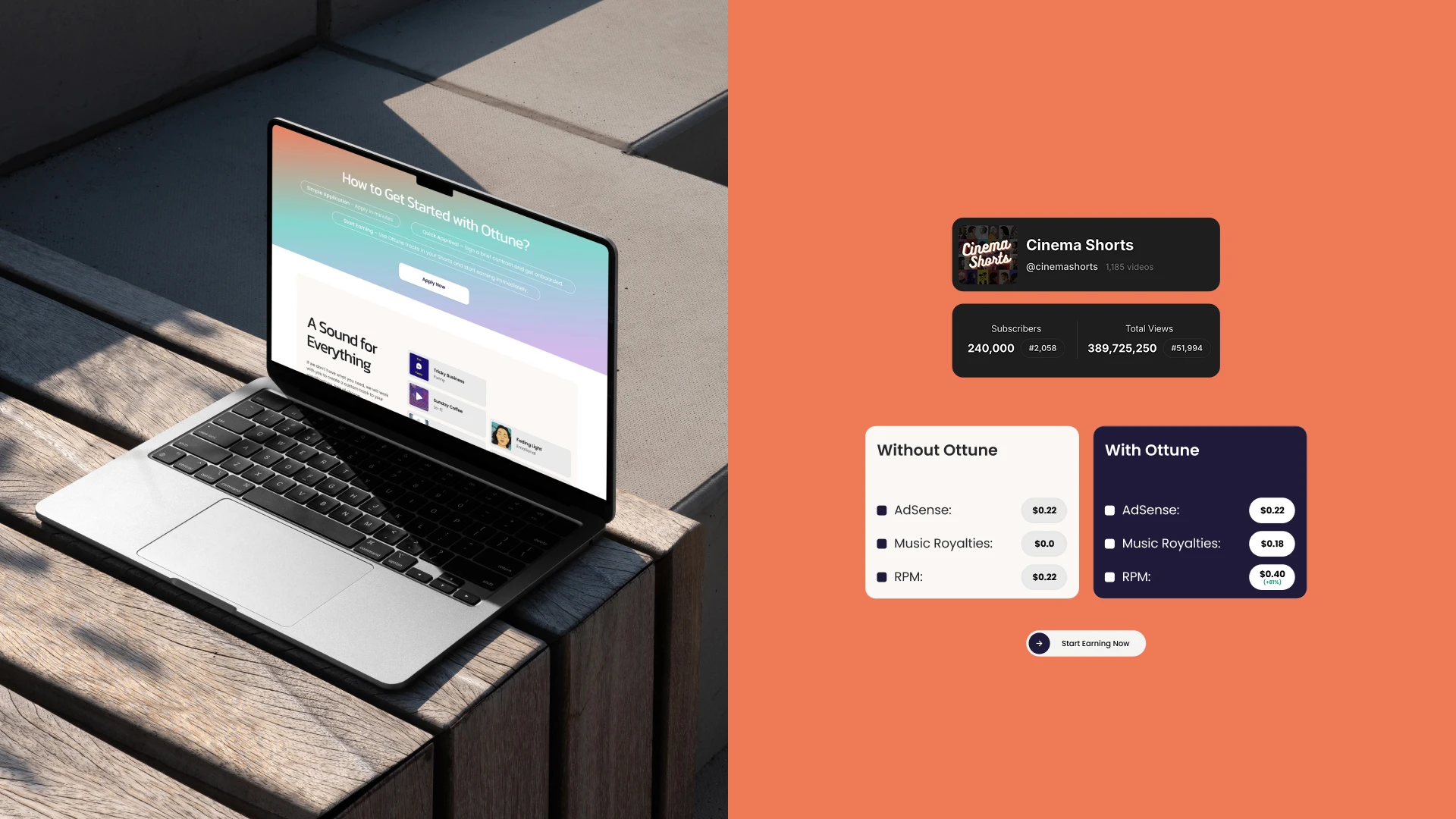
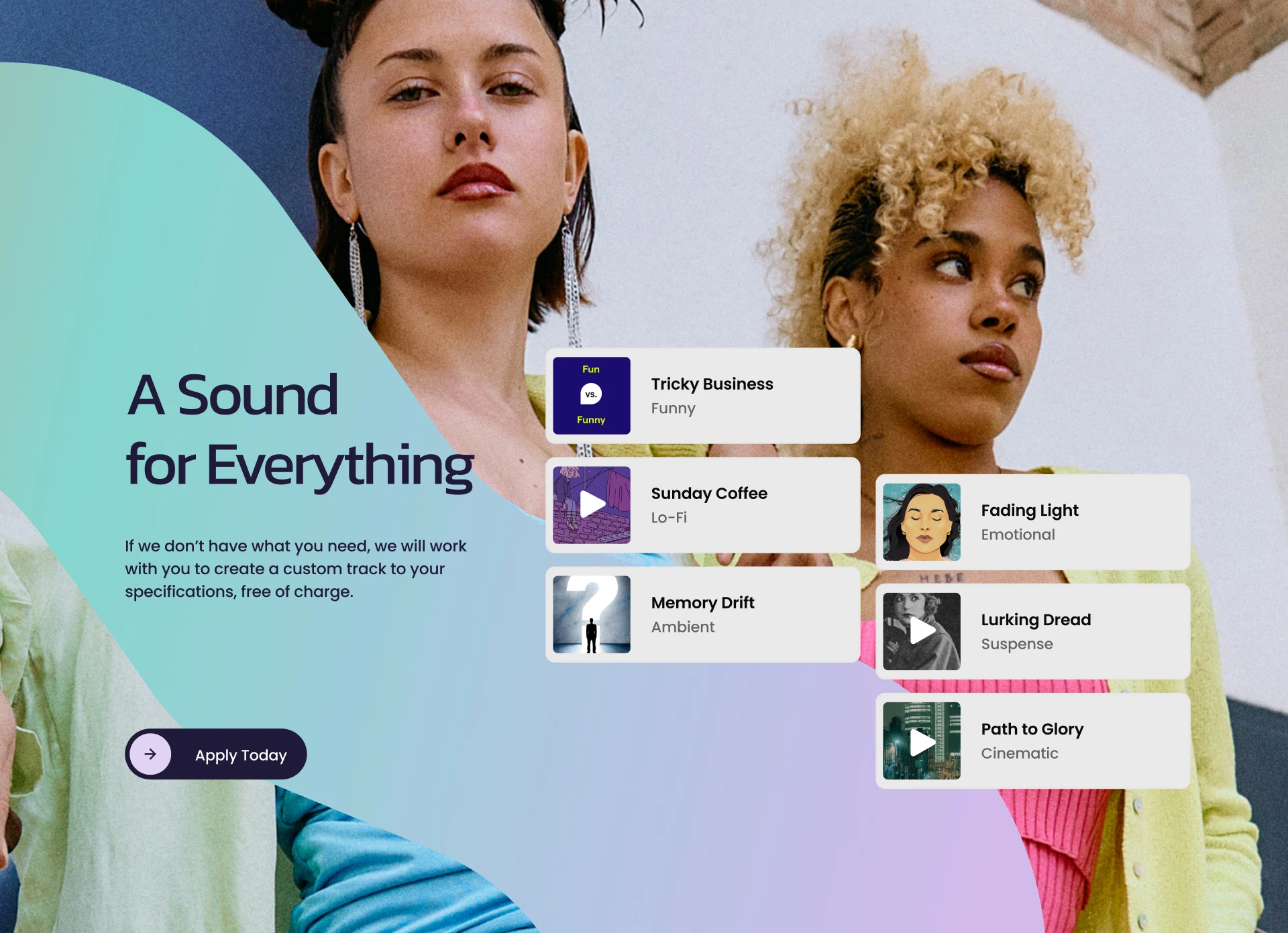
The Ottune UI design extends the brand identity directly into the digital product.
Dark interfaces create depth and focus, while bright gradient accents help important actions, data, and content stand out. The interface feels modern and premium without sacrificing accessibility or clarity.
This was important for Ottune: the brand shouldn't stop at the logo.
The visual identity, UI design, and communication system needed to feel like one ecosystem.
The Impact
Ottune became a complete brand identity system for a digital media and music platform — from logo design and typography to graphic language, color, advertising, and UI.
The identity gives Ottune a distinctive position between music, technology, and the creator economy: approachable enough for creators, sophisticated enough for the business behind them.
The Takeaway.
Music is movement. Ottune turns that movement into a brand system.
Like this project
Posted Aug 7, 2026
Rebranding and website design for Ottune, a digital media platform helping YouTube Shorts creators monetize music royalties.
Likes
1
Views
23