NUDA Beauty Brand Identity Development

Artur Mikhov


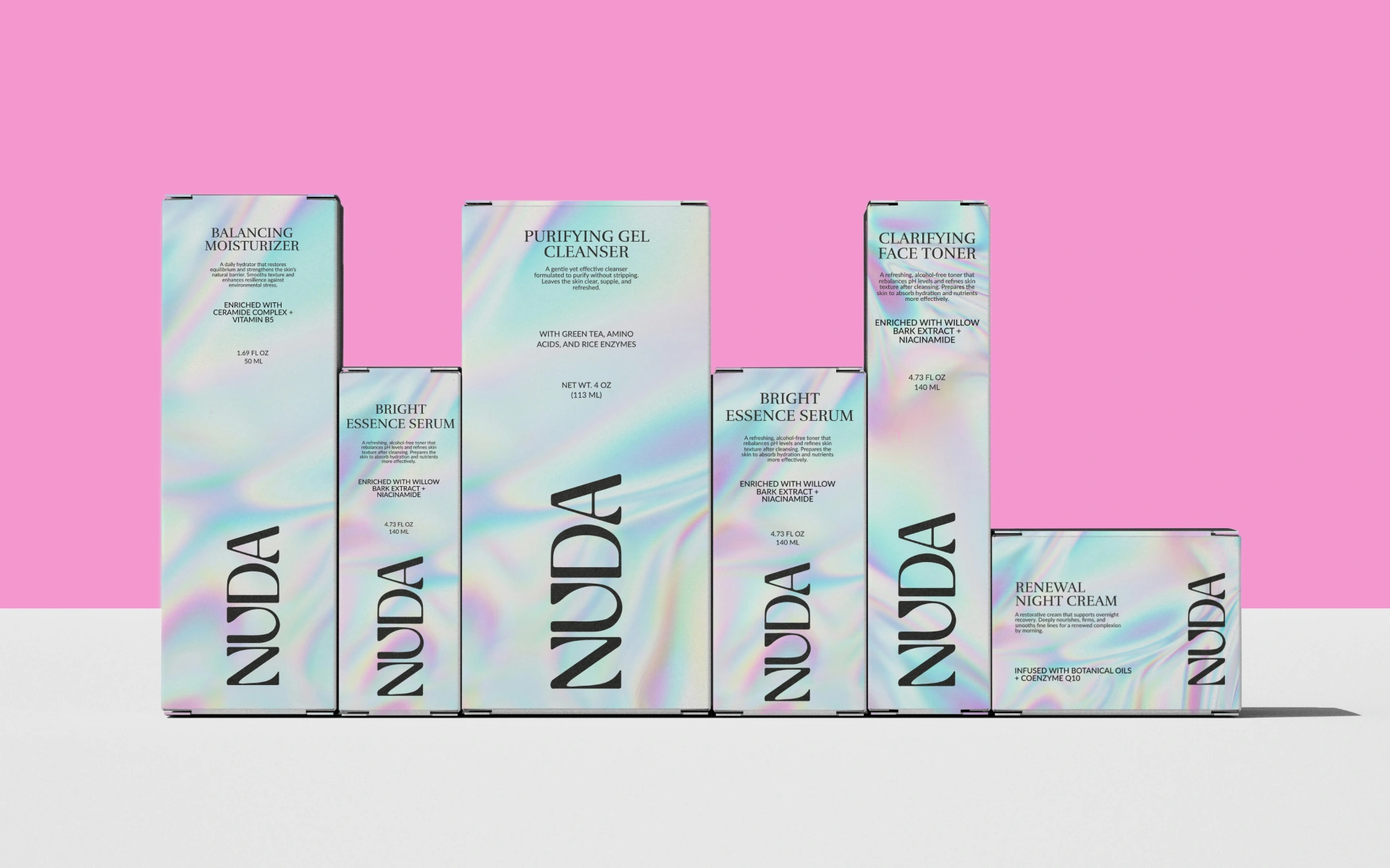
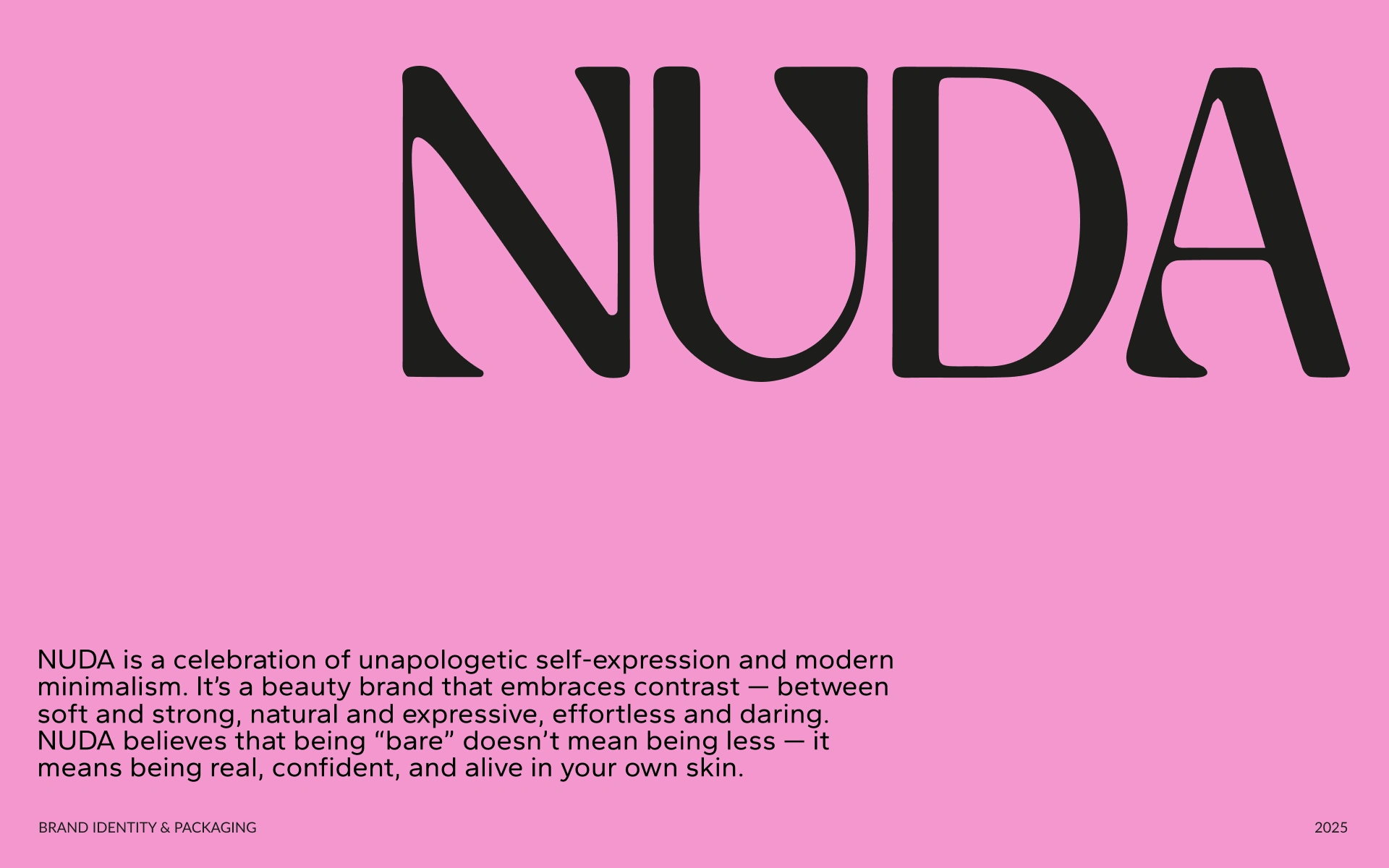
NUDA is a beauty brand built around unapologetic self-expression and modern minimalism.
The concept explores the contrast between soft and strong, natural and expressive, effortless and daring — creating a beauty identity that feels confident without being overly polished or conventional.
The project combines brand strategy, visual identity, logo design, and packaging design into a distinctive beauty branding system built around the idea that being “bare” doesn't mean being less.
Brand strategy. Logo design. Brand identity. Visual identity. Beauty branding. Cosmetic branding. Packaging design. Product branding. Art direction. Typography. Graphic design.
The Tension
Beauty branding often falls into familiar territory.
Soft colors. Perfect skin. Delicate typography. Minimal packaging that feels interchangeable.
NUDA needed minimalism with more attitude.
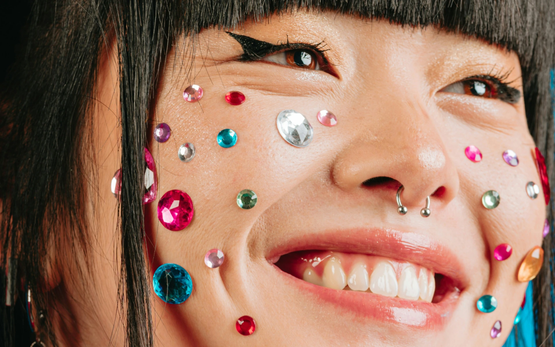
The brand had to communicate natural beauty and confidence, while embracing the tension between vulnerability and strength.
The idea wasn't to hide behind perfection.
It was to make being real feel powerful.
The Decision
The identity was built around contrast.
Softness meets boldness.
Minimalism meets expression.
Natural meets daring.
Instead of treating “nude” as simply a color or aesthetic, the brand interprets it as a state of mind — being comfortable enough in your own identity to be unapologetically yourself.
That philosophy became the foundation for the NUDA brand identity and packaging design.
The System
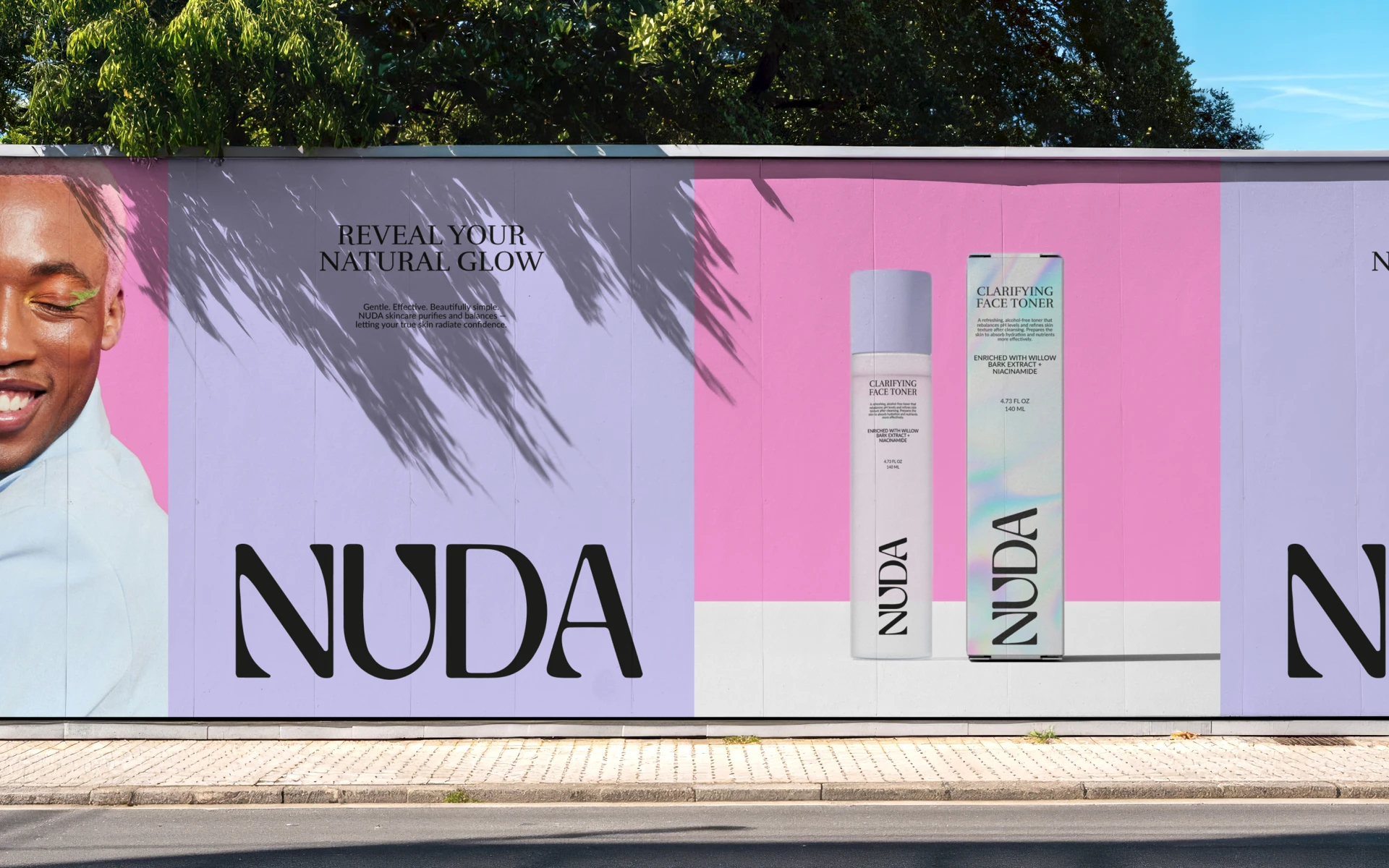
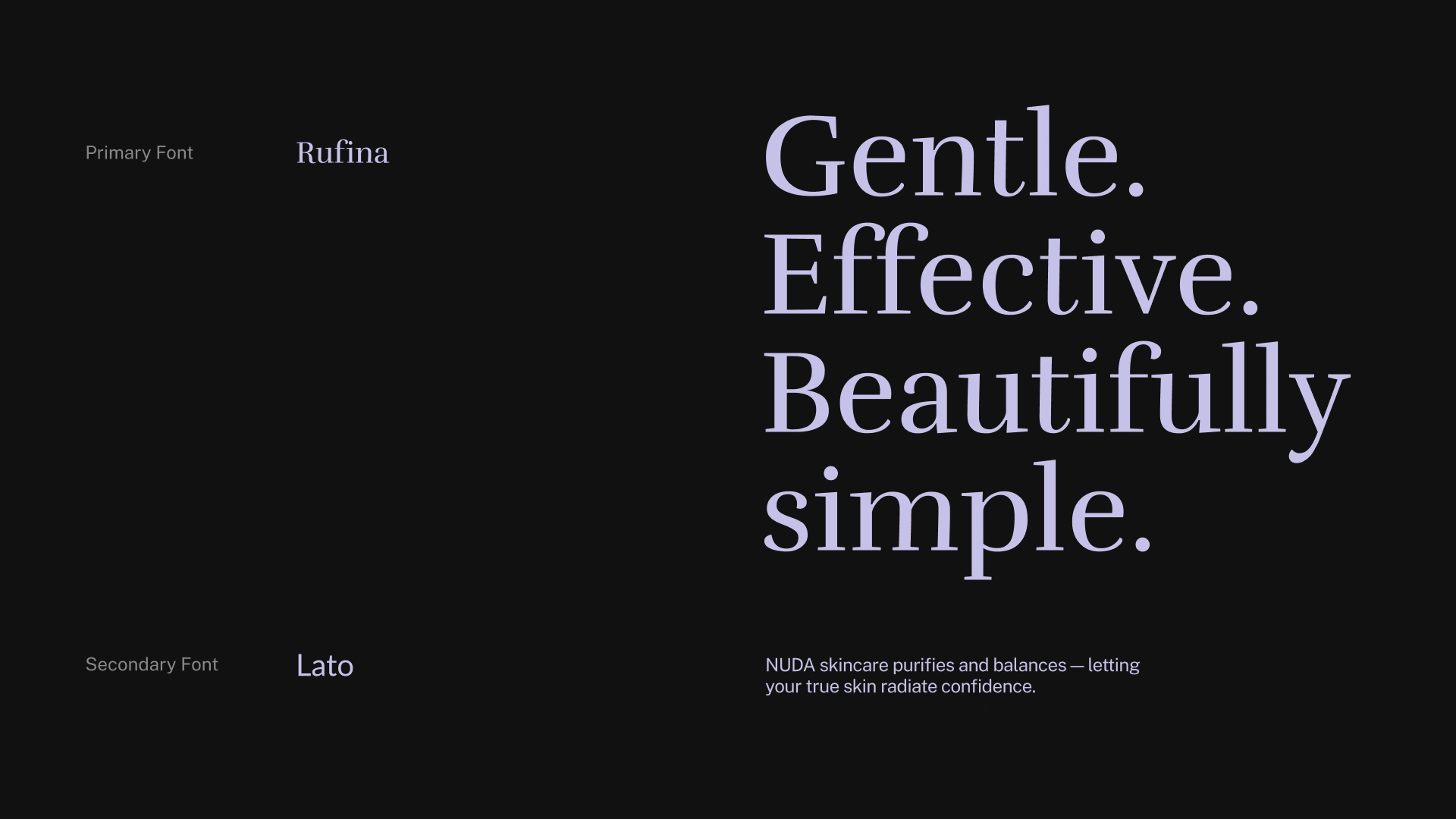
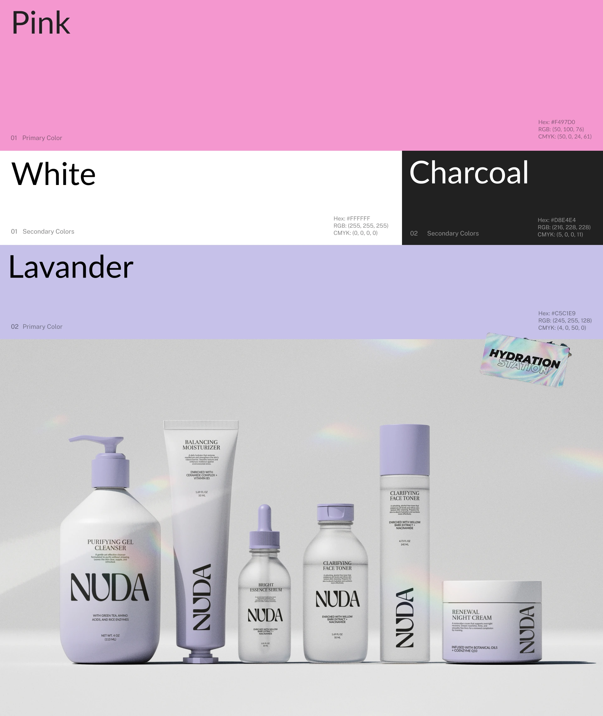
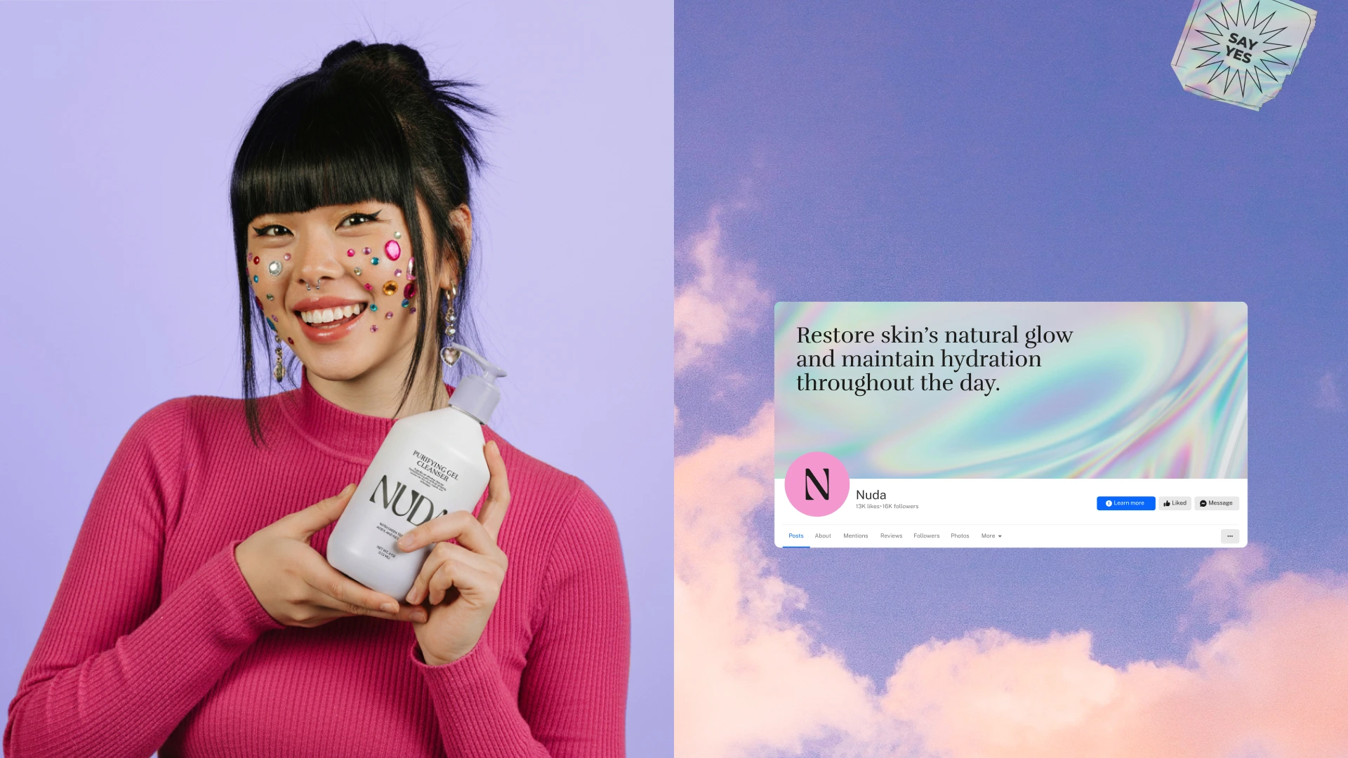
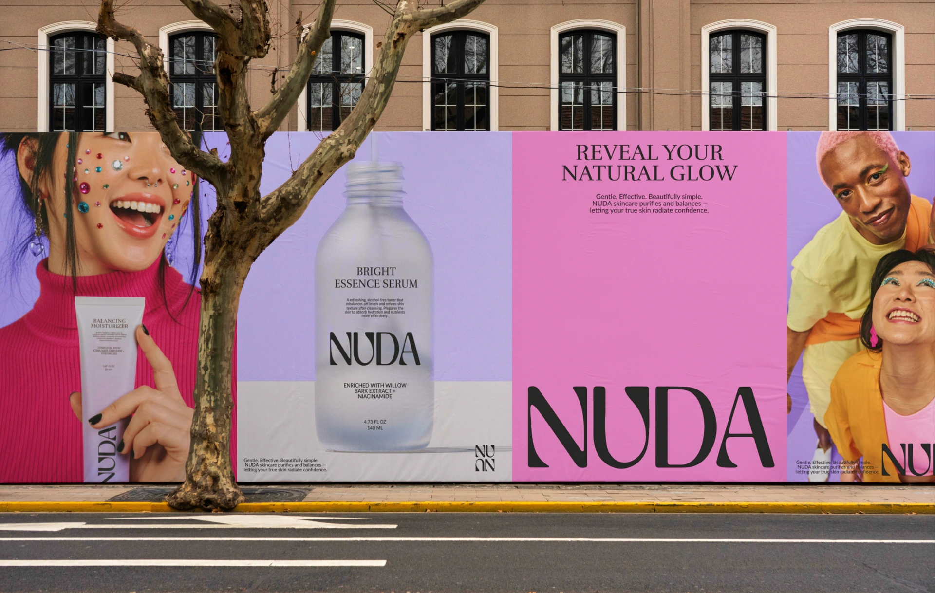
The NUDA visual identity uses a restrained, contemporary design language designed to feel premium without becoming overly luxurious.
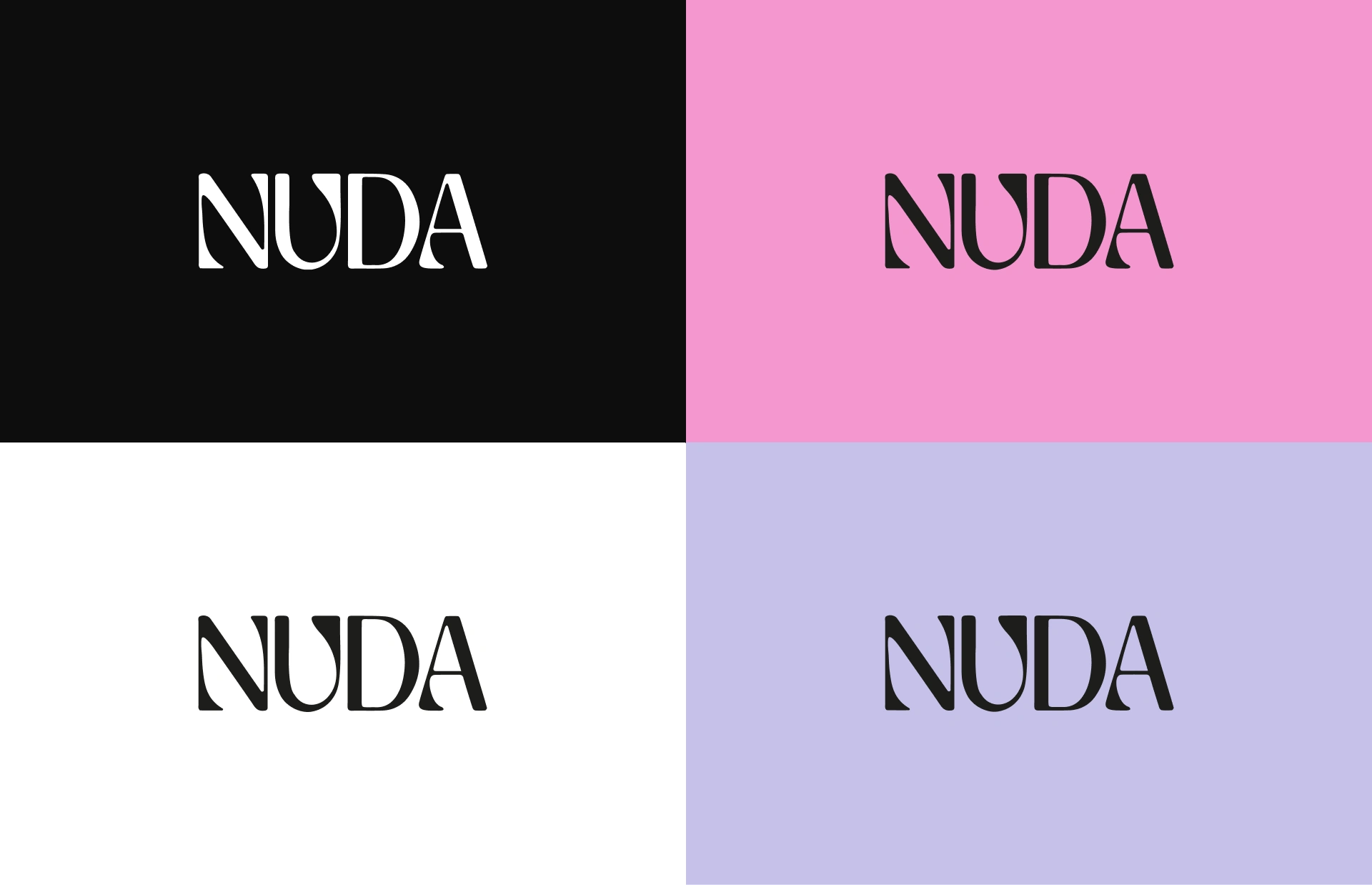
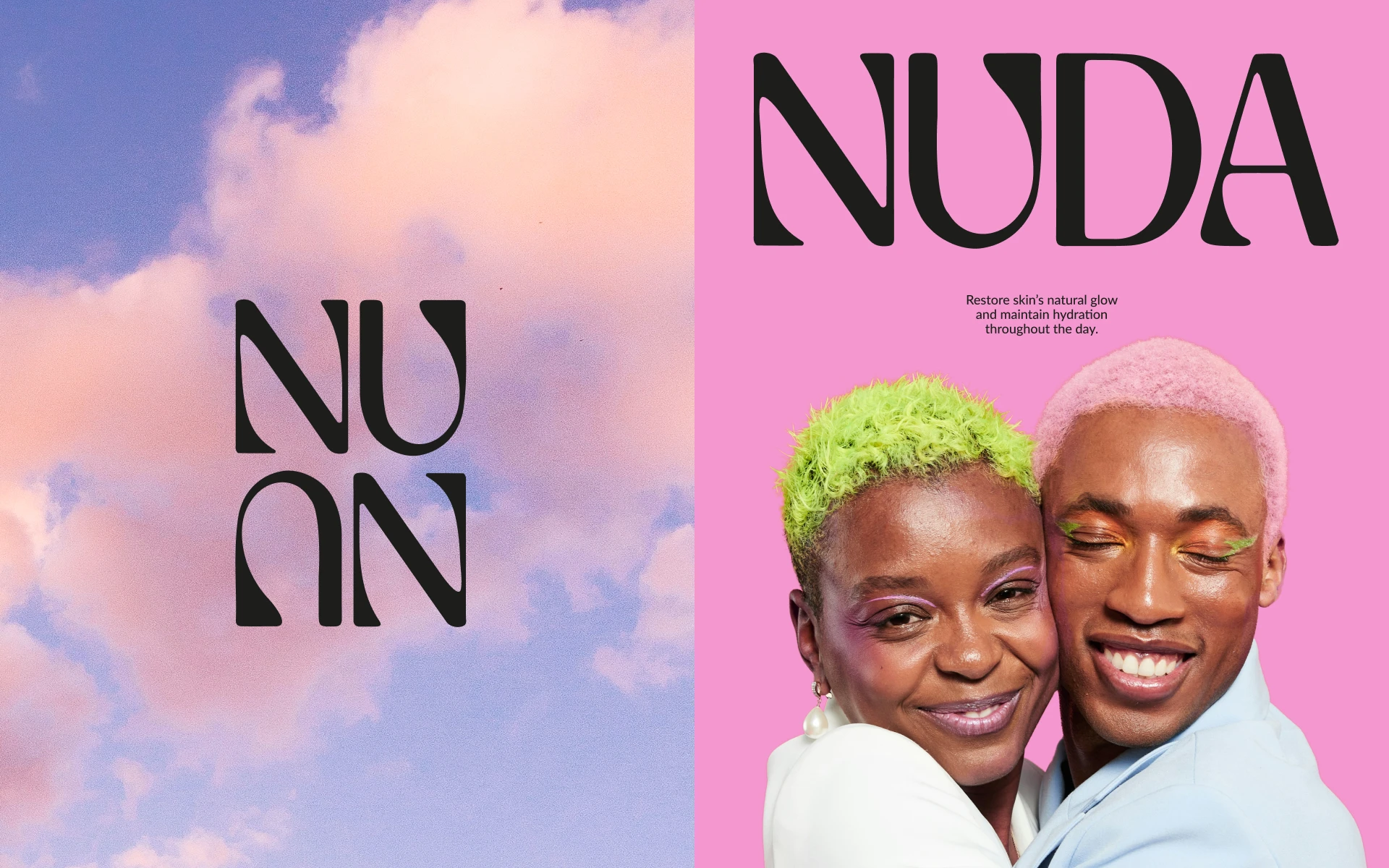
Typography provides the strongest expressive element, creating a confident editorial character while maintaining the simplicity associated with modern beauty brands.
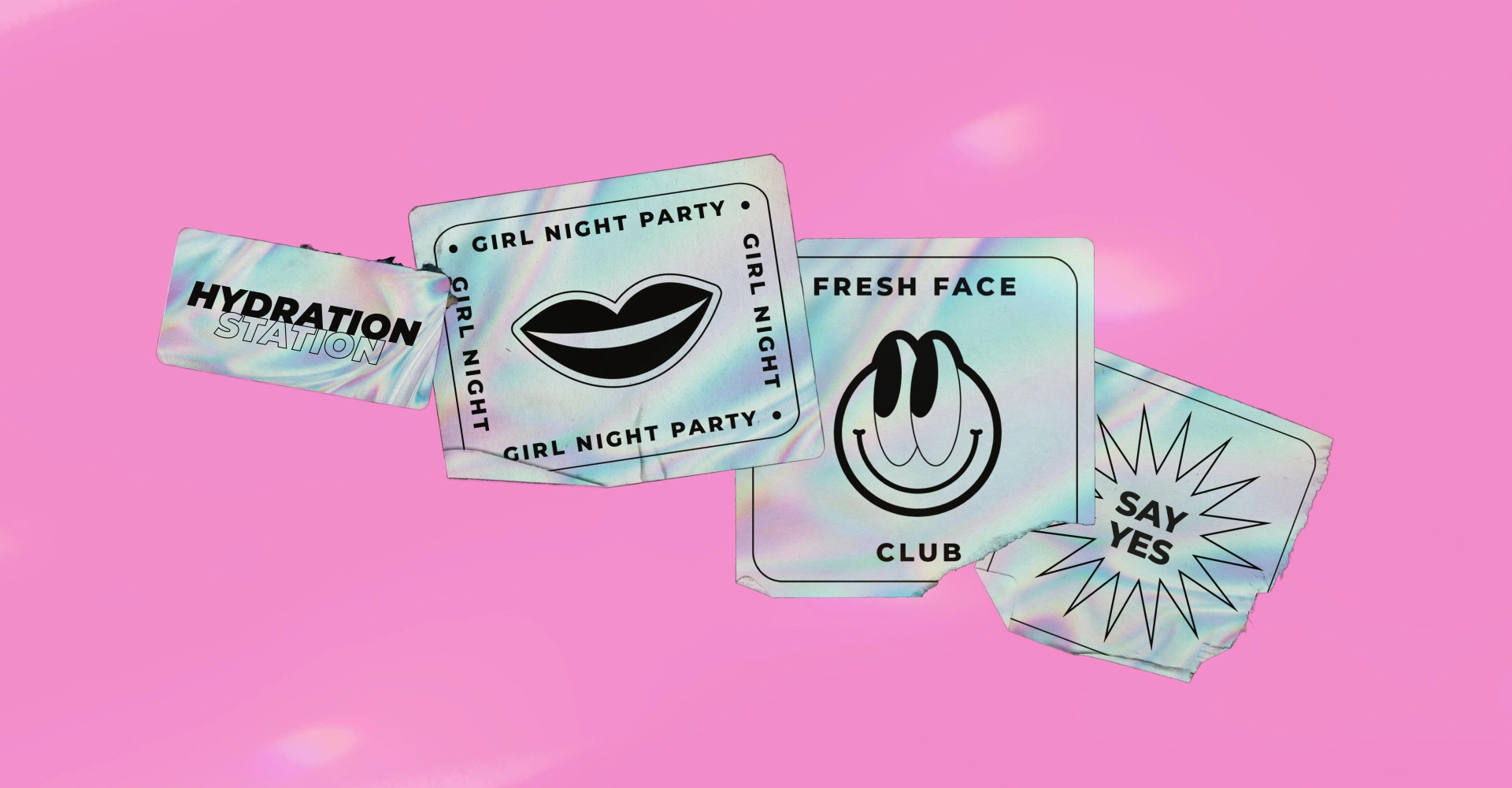
The graphic system is intentionally minimal, allowing the products themselves to become the focal point.
Every element works toward the same balance:
quiet enough to feel refined, bold enough to be remembered.
The Packaging
Packaging was designed as an extension of the brand rather than a separate application.
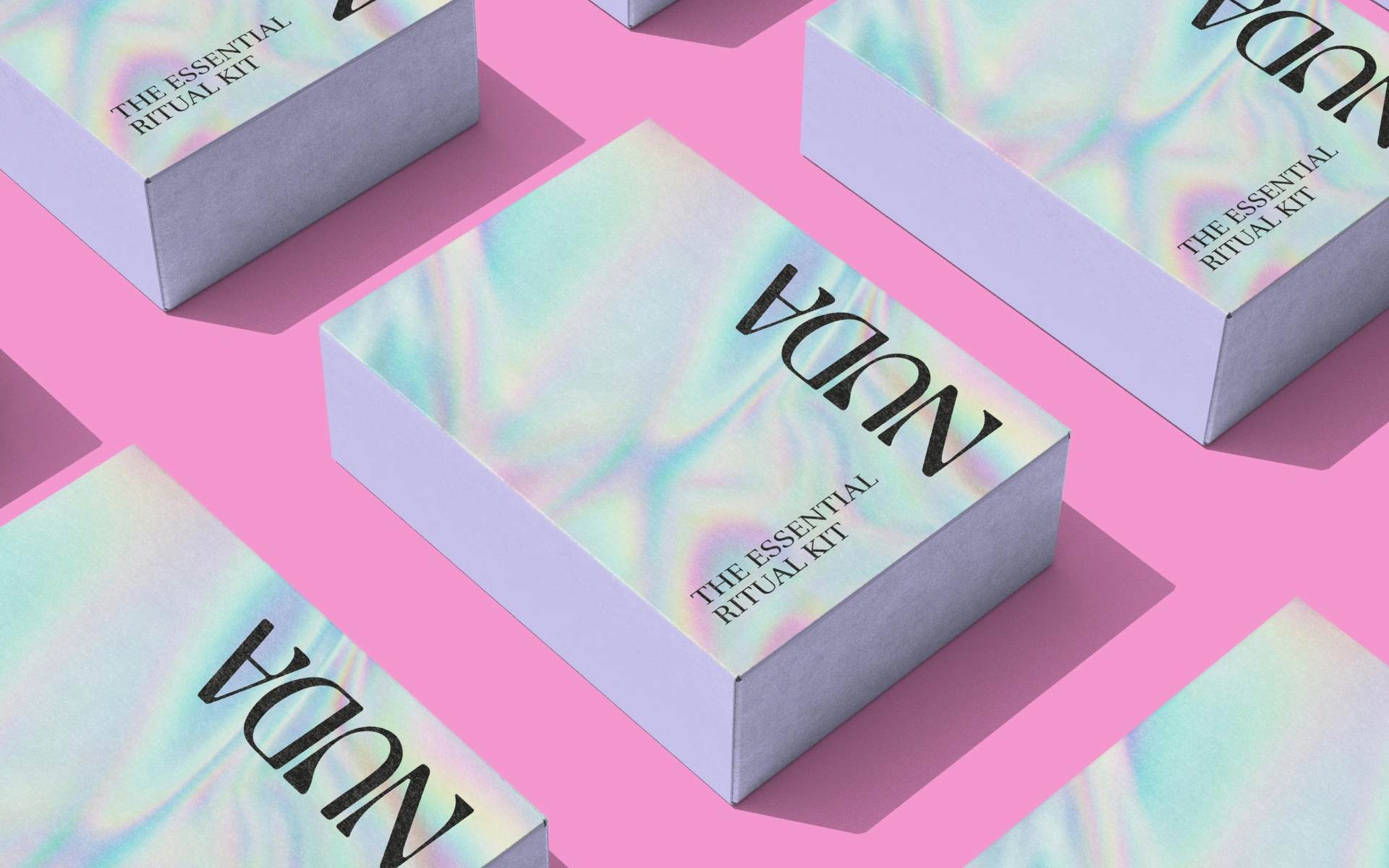
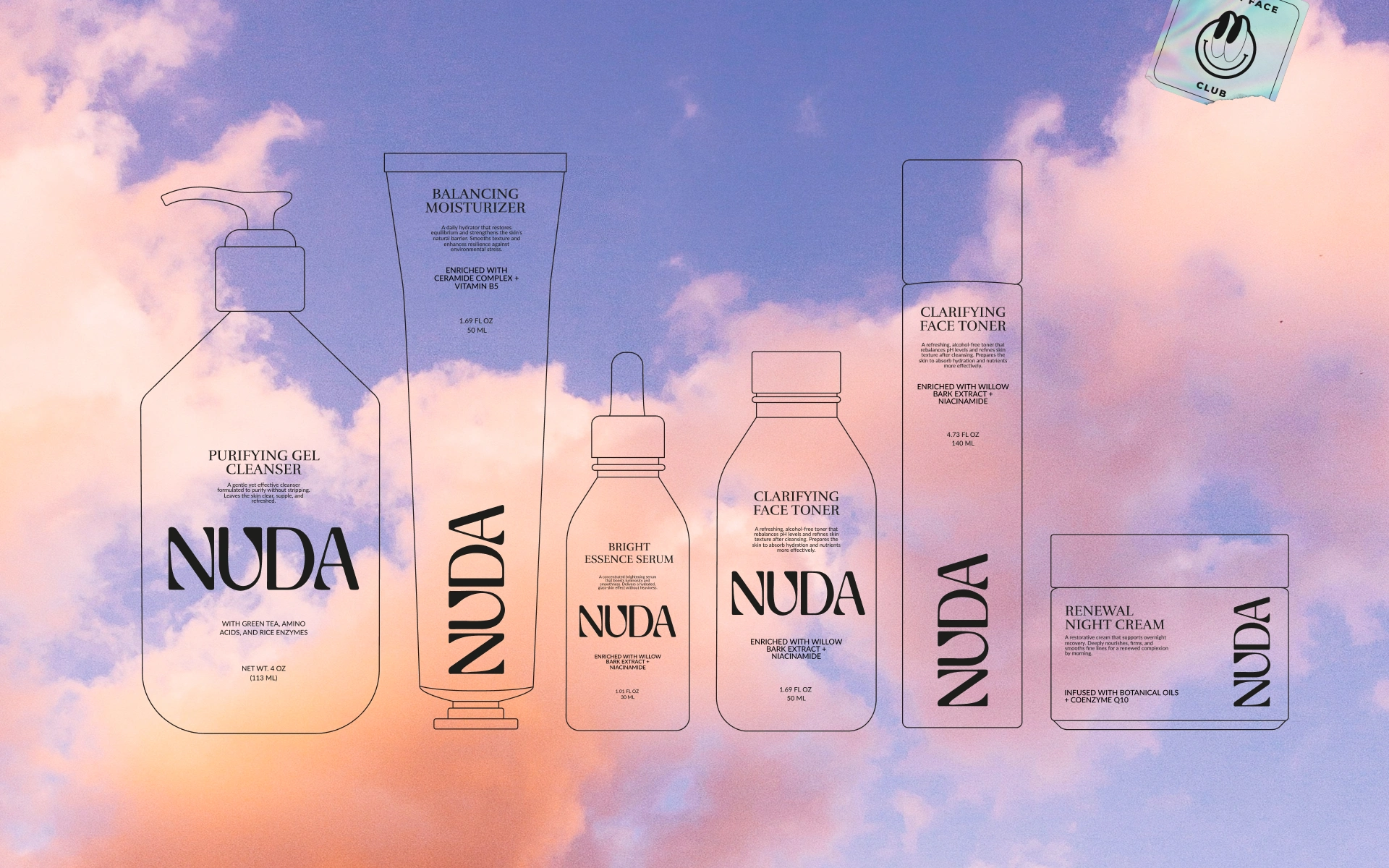
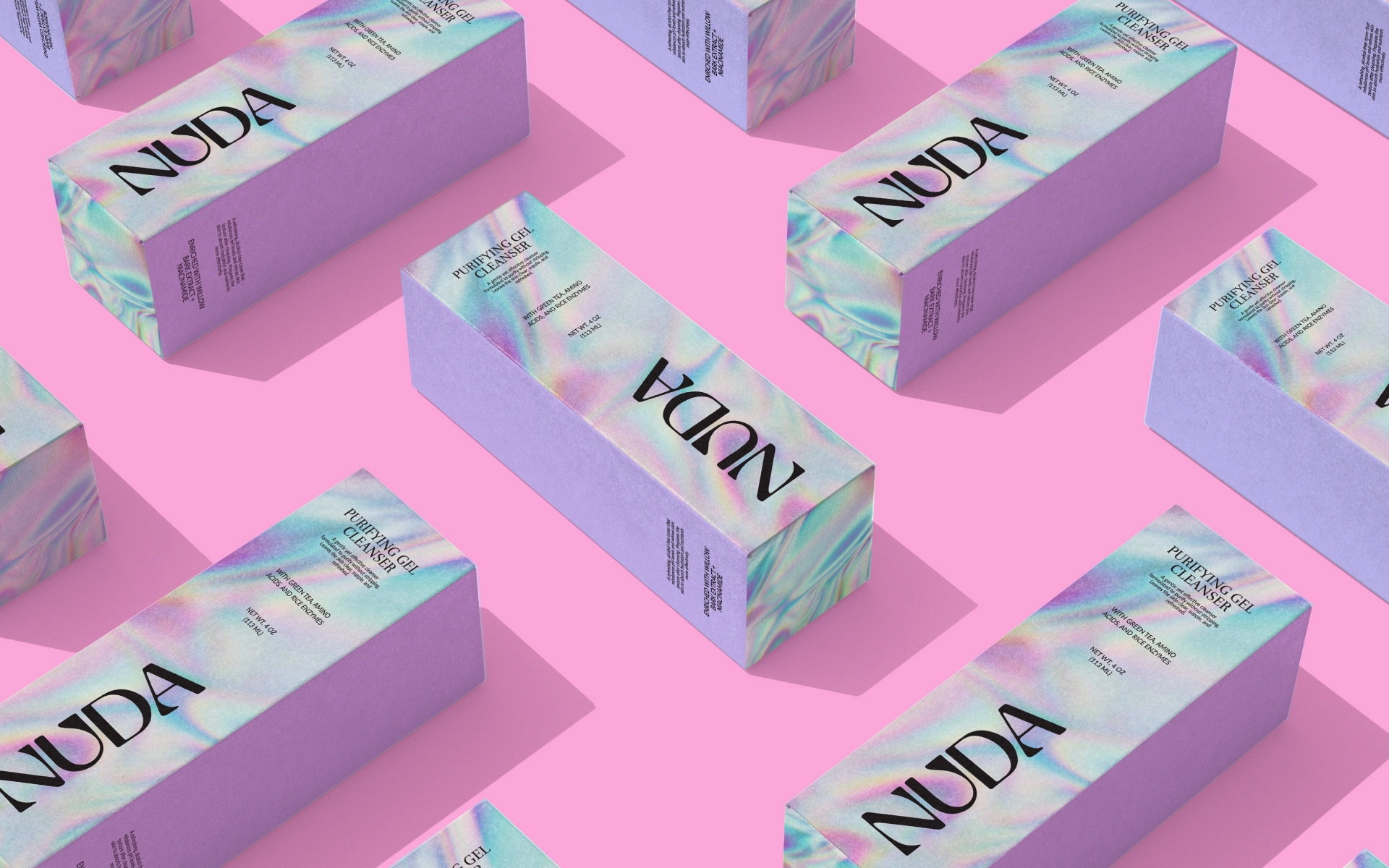
The cosmetic packaging design uses clean compositions, refined typography, and a controlled visual hierarchy to create a strong presence on shelf and in digital environments.
The system is flexible enough to extend across different products, formats, and future collections while maintaining a recognizable NUDA signature.
The packaging doesn't try to compete for attention.
It creates attention through restraint.

Beauty Without the Performance
NUDA challenges the idea that beauty needs to look perfect to feel desirable.
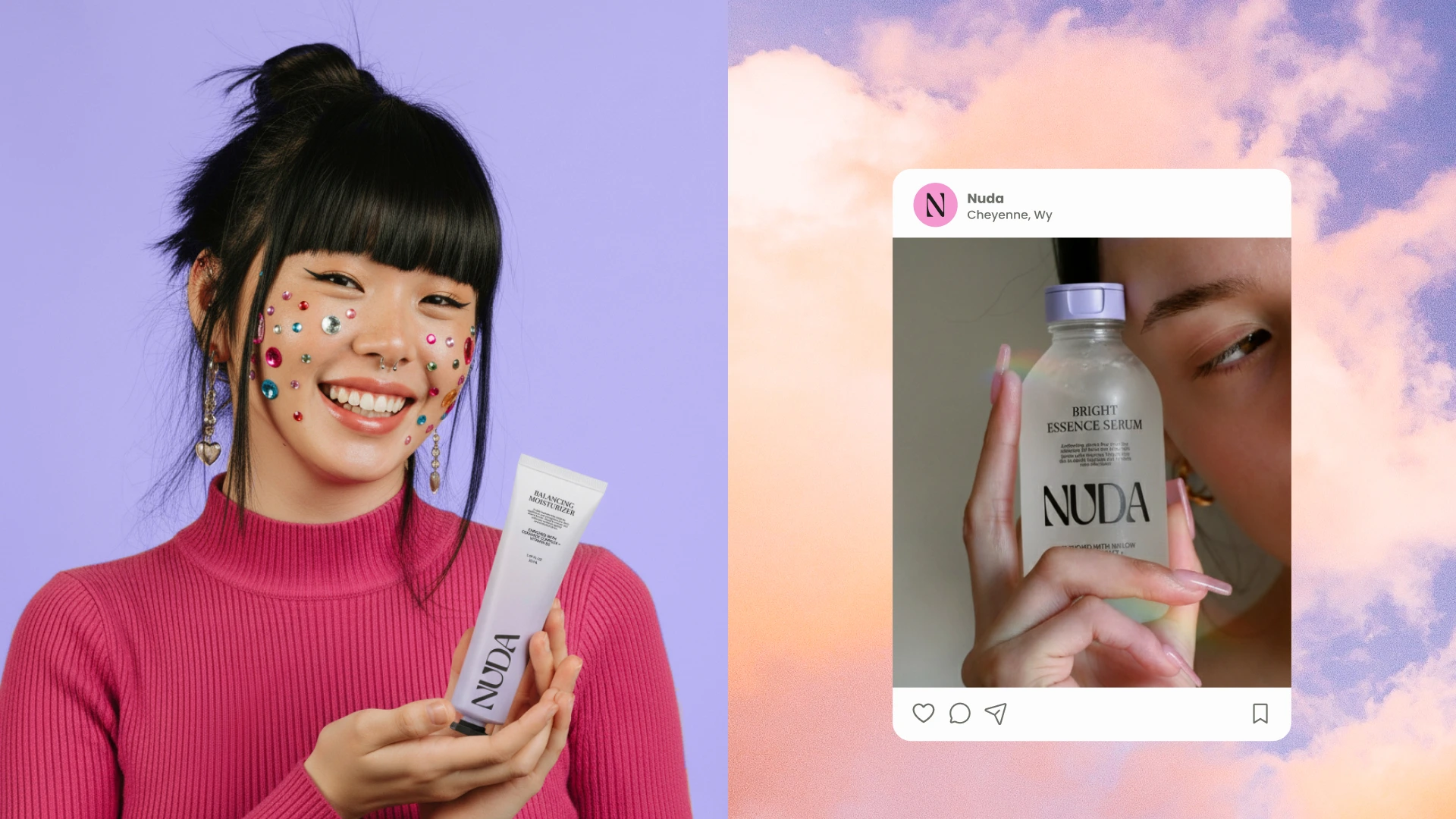
The brand embraces the space between polished and real — creating an identity that feels modern, confident, expressive, and human.
This positioning gives NUDA a distinctive place within the contemporary beauty market: less about transformation, more about owning what is already there.
The visual identity reinforces that message without needing to explain it.
The Impact
NUDA becomes a complete beauty brand identity and packaging design system built around self-expression, confidence, and modern minimalism.
The project combines branding, logo design, visual identity, beauty branding, cosmetic branding, packaging design, product branding, typography, graphic design, and art direction into one cohesive system.
A beauty brand designed to celebrate what happens when you stop trying to be someone else.
The Takeaway.
Being bare isn't being less. It's being completely yourself.
Like this project
Posted Aug 17, 2026
Beauty brand identity and packaging design for NUDA, combining modern branding, logo design, visual identity, cosmetic packaging, typography, and art direction.