TSI Brand Identity Redesign and Digital Rebrand

Artur Mikhov


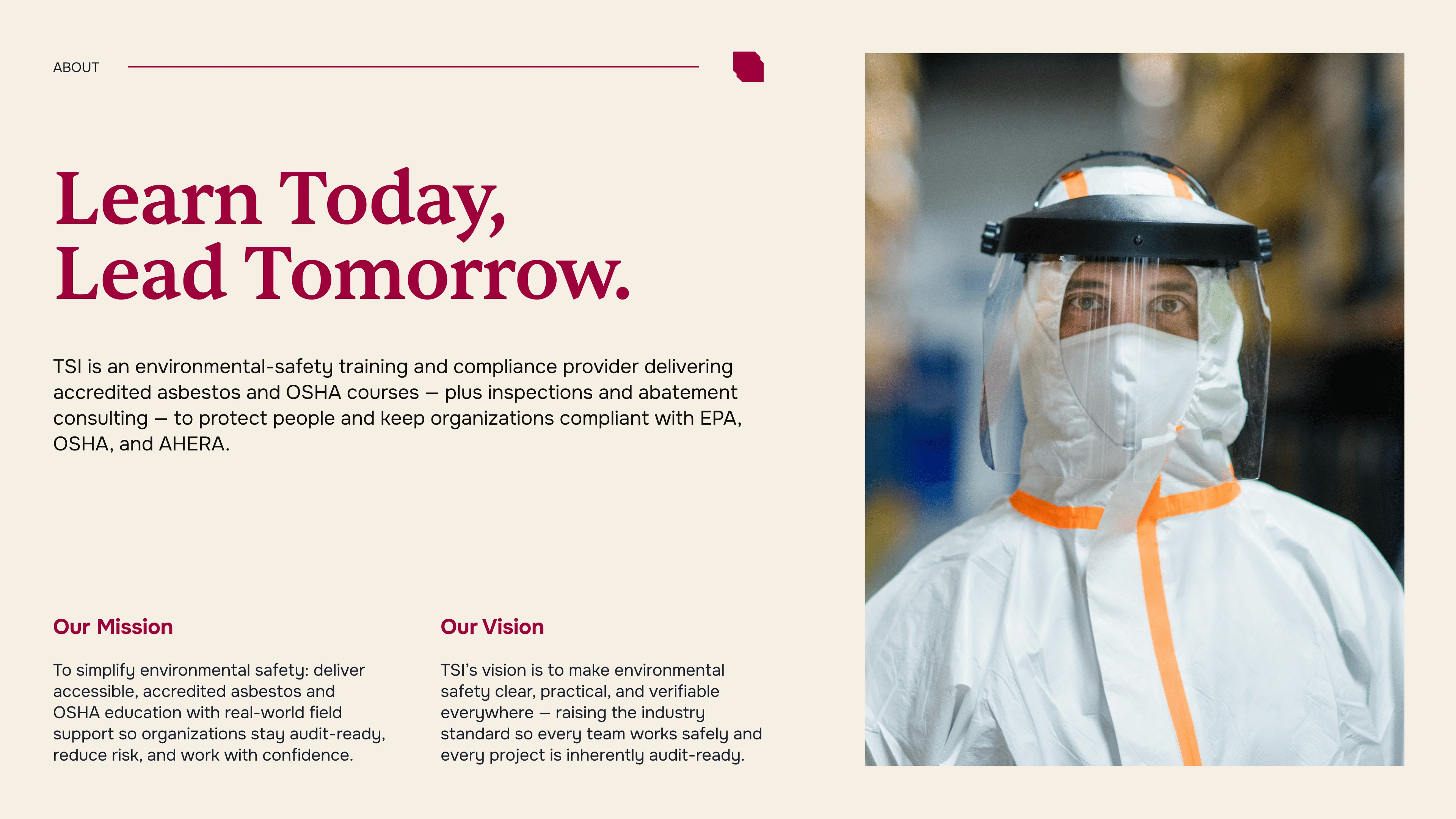
TSI is an environmental safety training and compliance provider delivering accredited asbestos and OSHA courses, inspections, and abatement consulting. The company helps organizations protect people, reduce risk, and stay compliant with EPA, OSHA, and AHERA requirements.
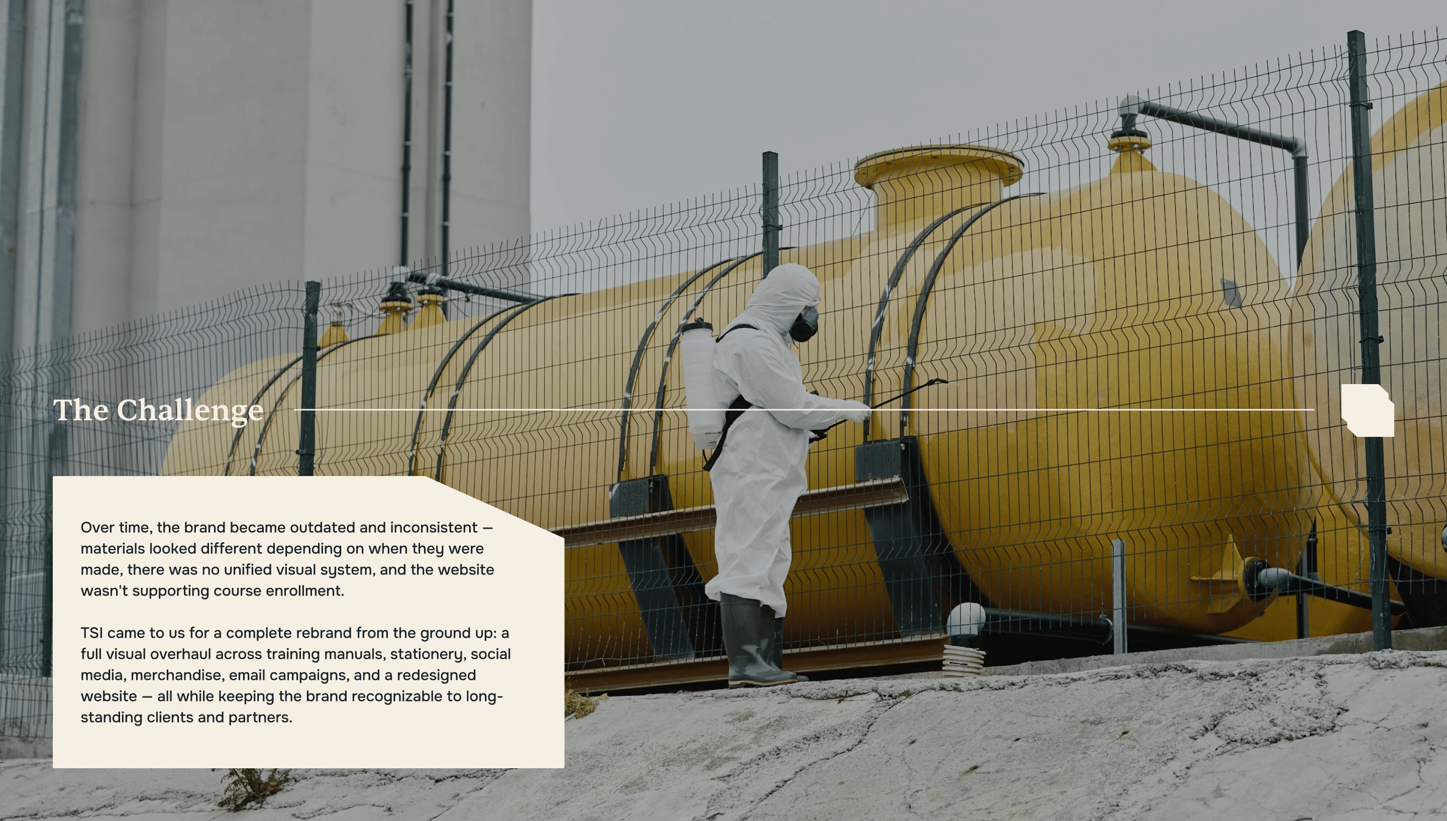
Over time, the brand had become outdated and inconsistent. Different materials looked disconnected, there was no unified visual system, and the website wasn't effectively supporting course enrollment.
We created a complete brand identity redesign and digital rebrand — refreshing the existing brand while keeping it recognizable to long-standing clients and partners.
Brand strategy. Logo redesign. Brand identity. Visual identity. Rebranding. Graphic design. Typography. Art direction. Website redesign. Digital branding. Environmental safety branding. Training & compliance branding.
The Challenge
TSI had built a strong reputation over time, but its visual identity hadn't evolved at the same pace.
Marketing materials varied depending on when they were created. Training manuals, stationery, social media, merchandise, email campaigns, and the website lacked a consistent visual language.
The challenge wasn't to completely reinvent the company.
It was to modernize the brand without losing the recognition and trust it had built over years.
The new identity needed to feel professional, confident, practical, and credible — qualities essential to a company working in environmental safety and regulatory compliance.
The Decision
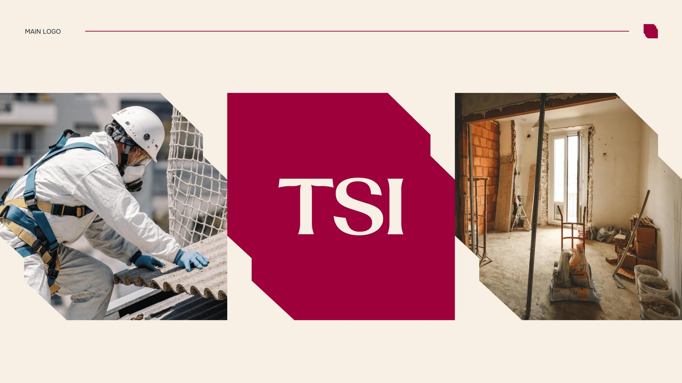
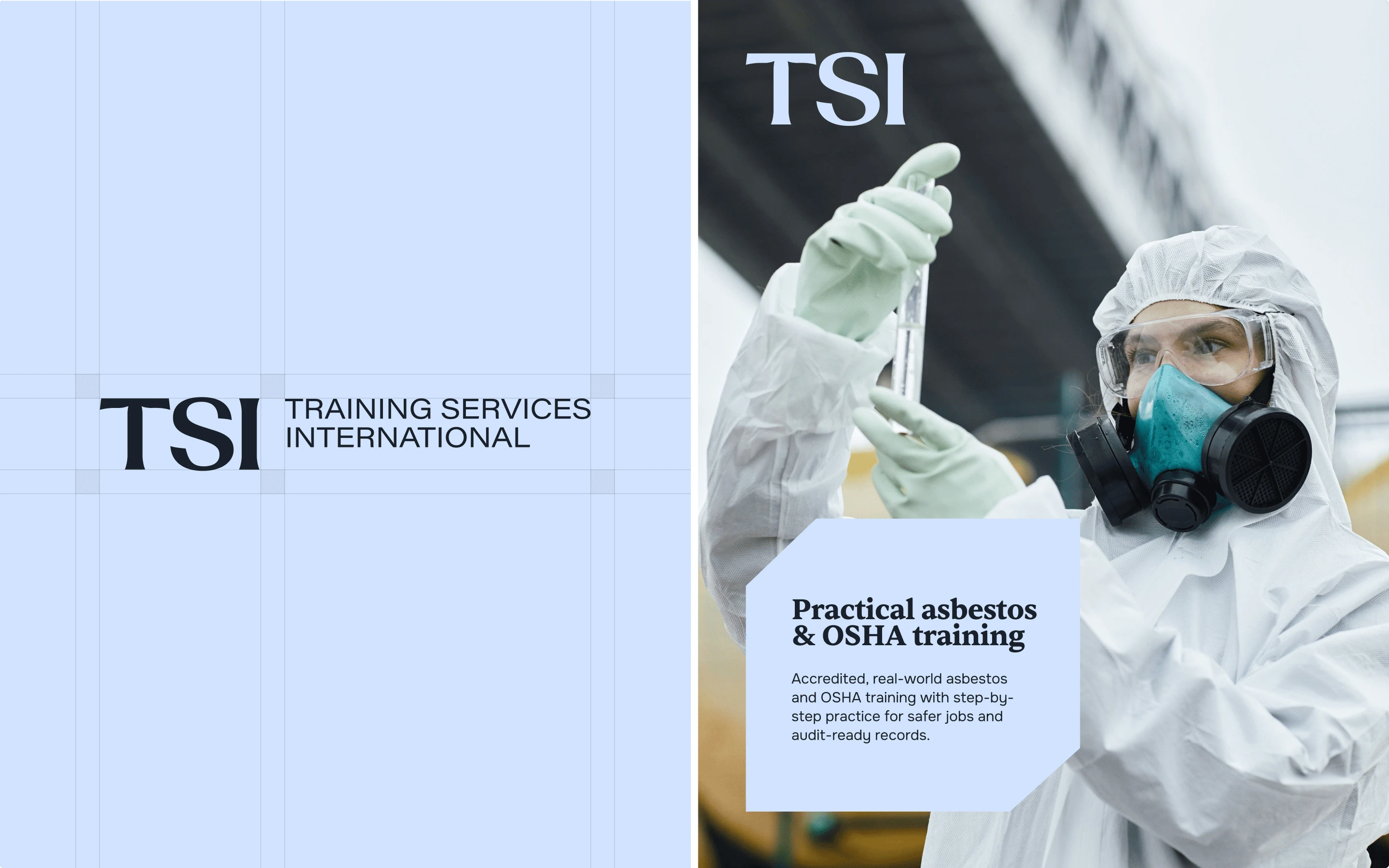
We kept the familiar wordmark approach but redesigned it with a sharper, more confident typographic treatment.
Cleaner letterforms, improved proportions, and refined spacing gave the logo a more contemporary and professional presence while preserving its existing brand recognition.
From there, we expanded the logo into a complete visual identity system.
The goal was not simply to create a better logo.
It was to create a system that could make every TSI touchpoint feel like it came from the same organization.

The Identity System
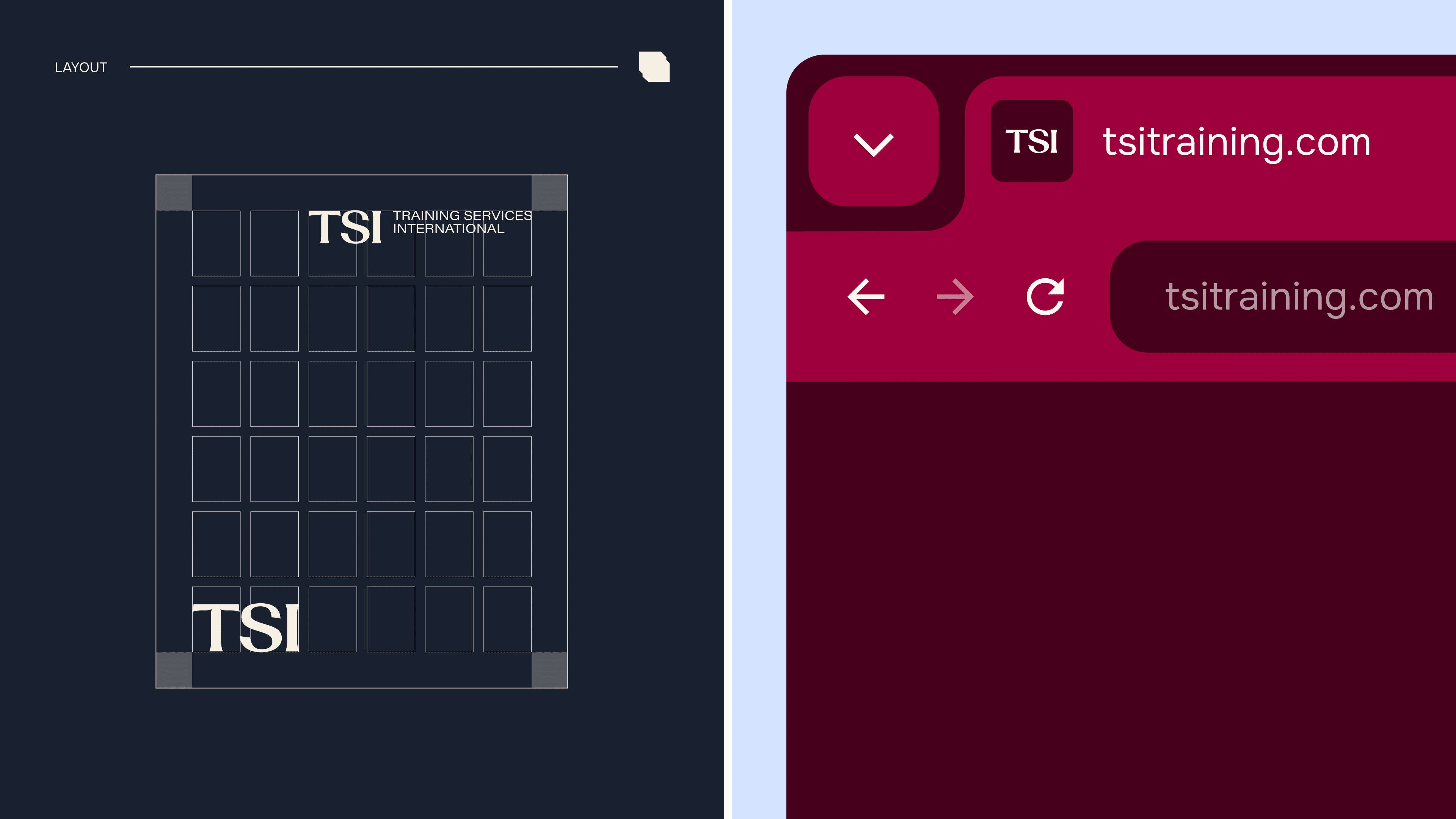
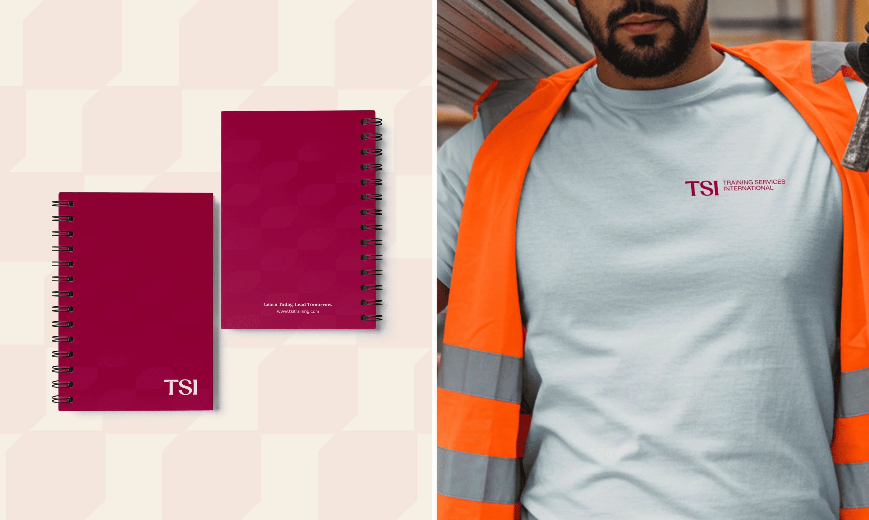
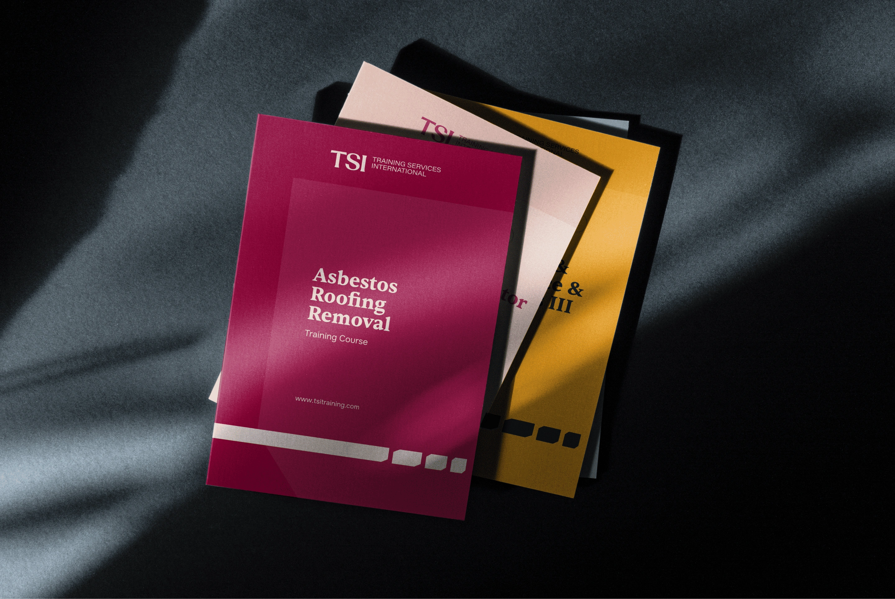
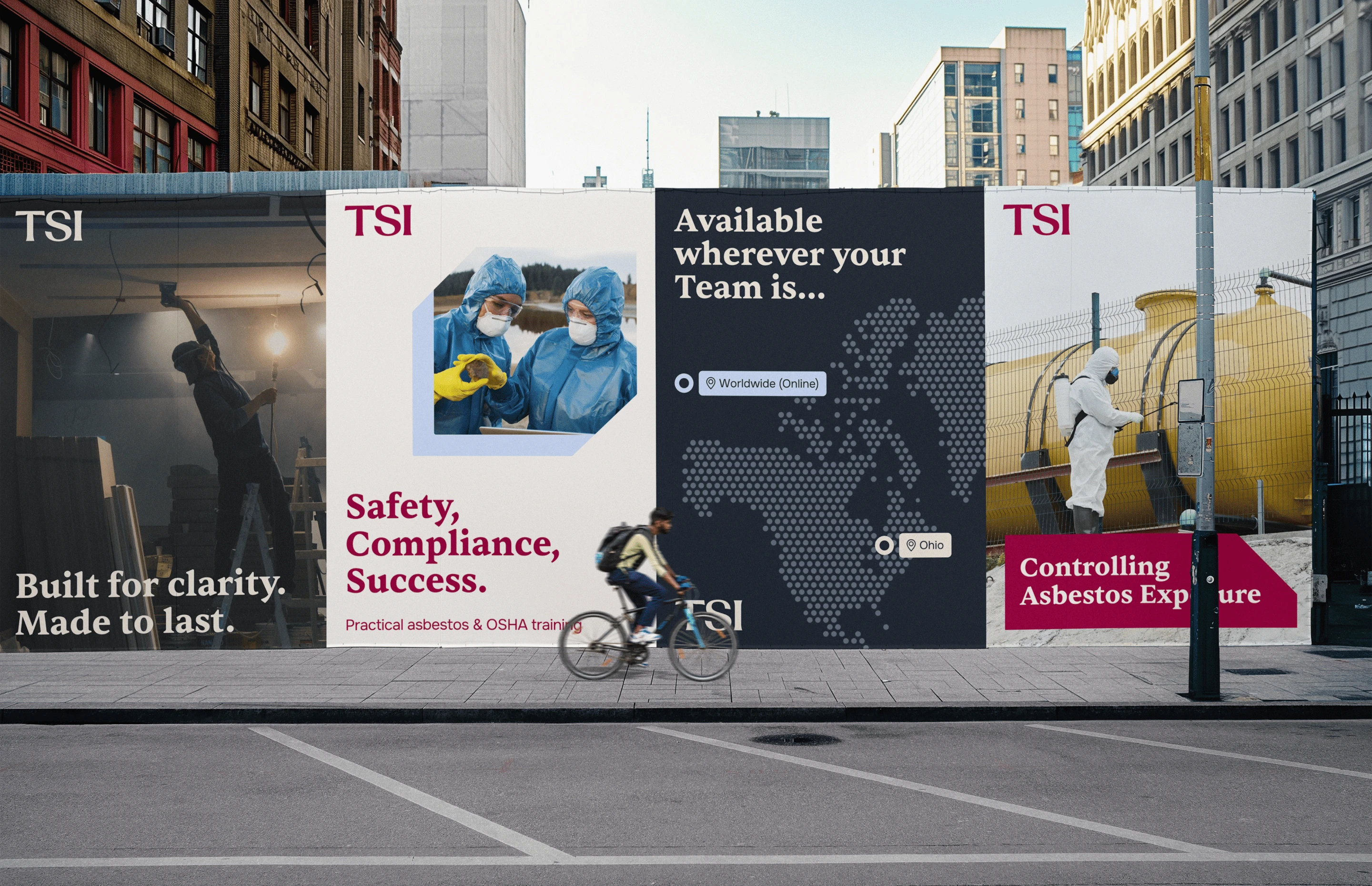
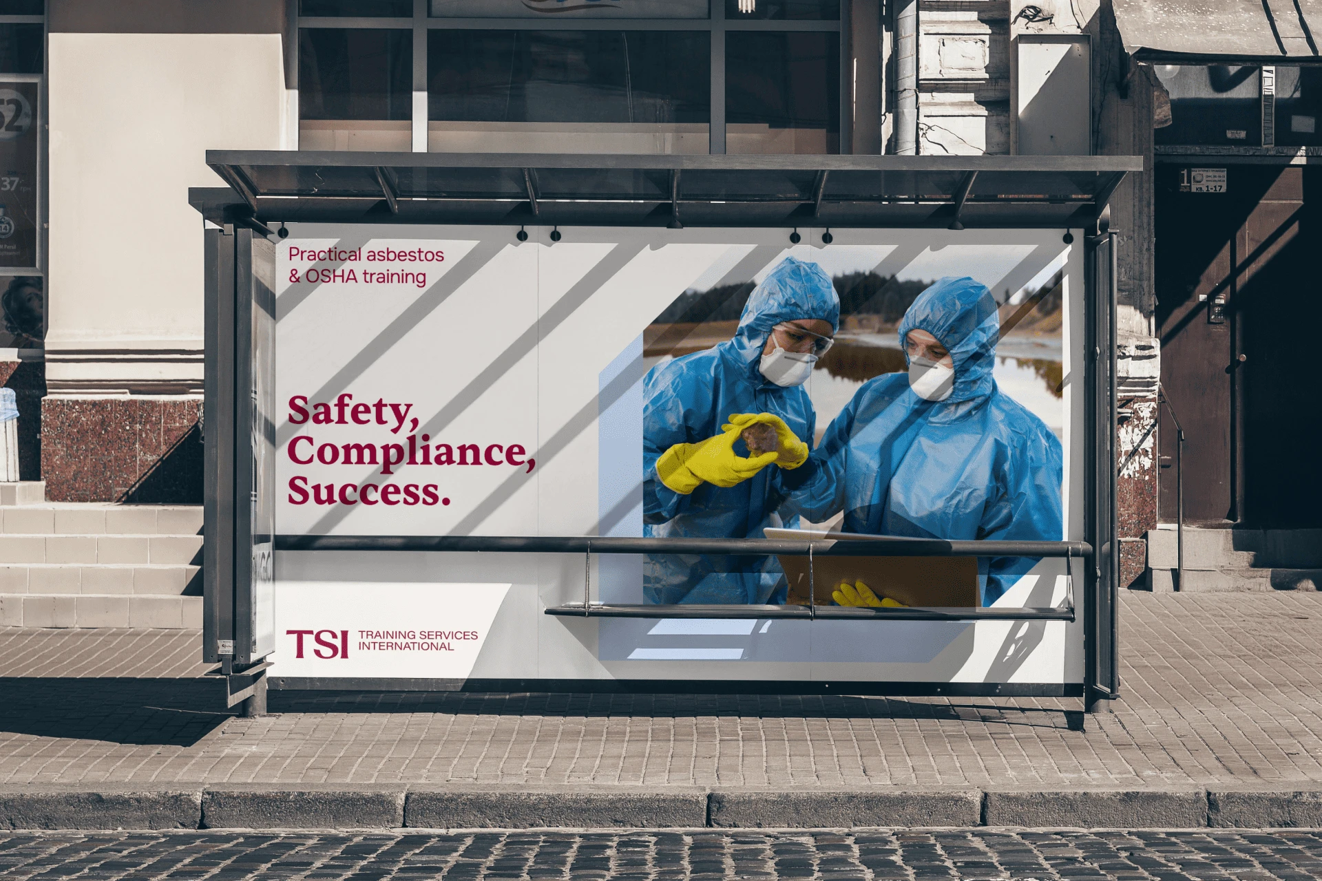
The new TSI brand identity includes primary and secondary logo lockups, a standalone icon mark, monochrome versions, reversed versions, and clear application rules.
Every variation was tested across real-world applications including:
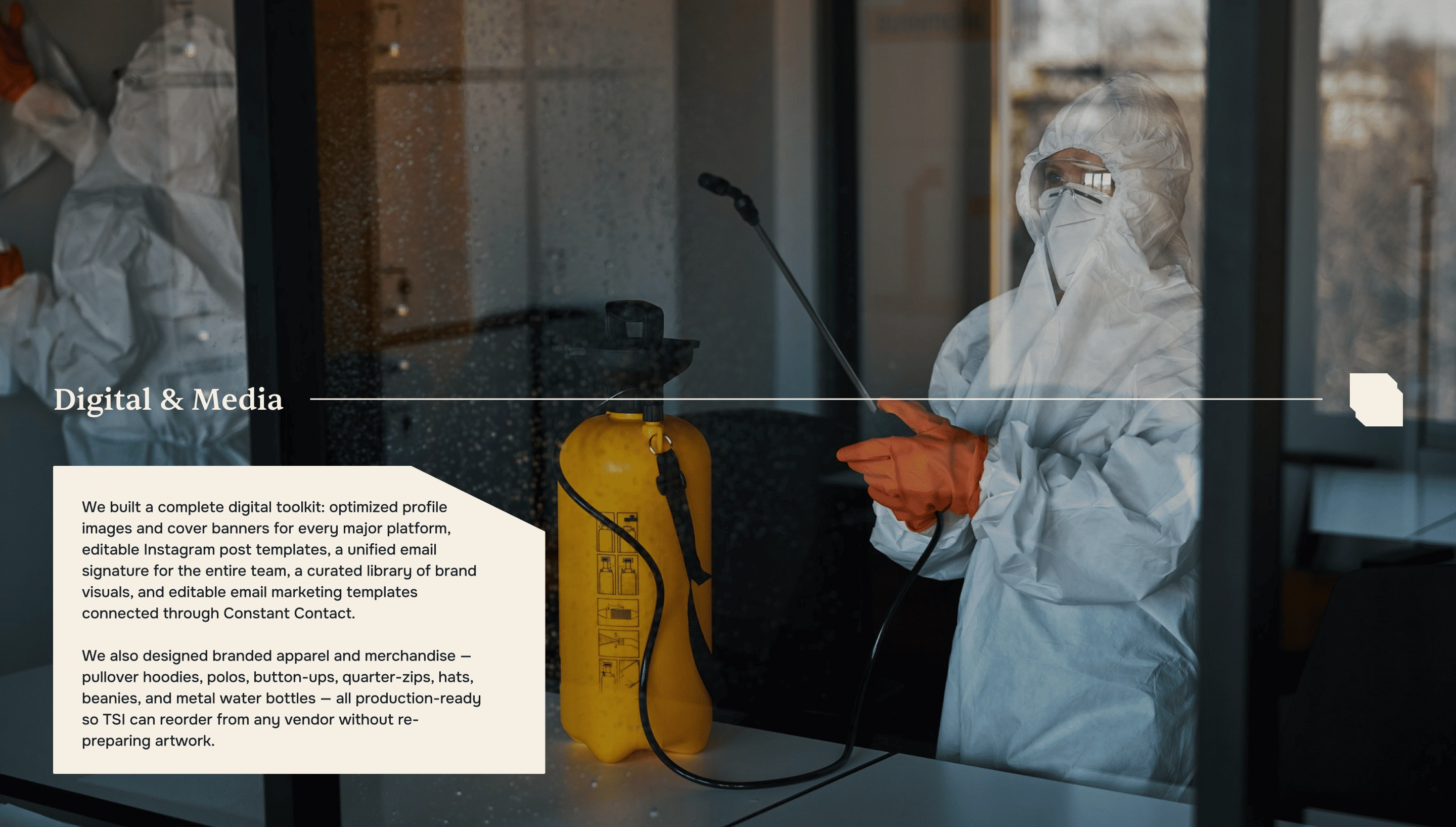
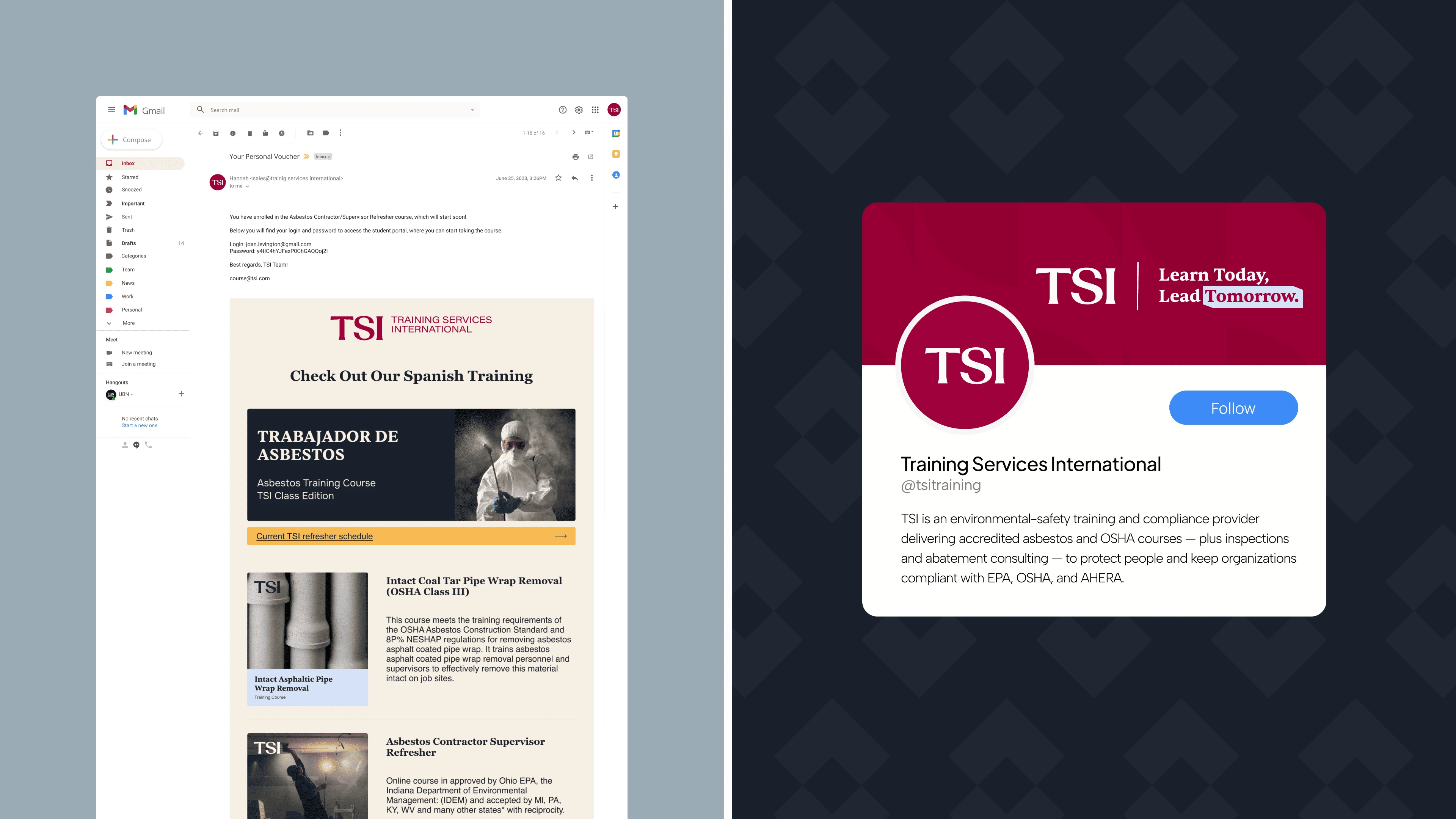
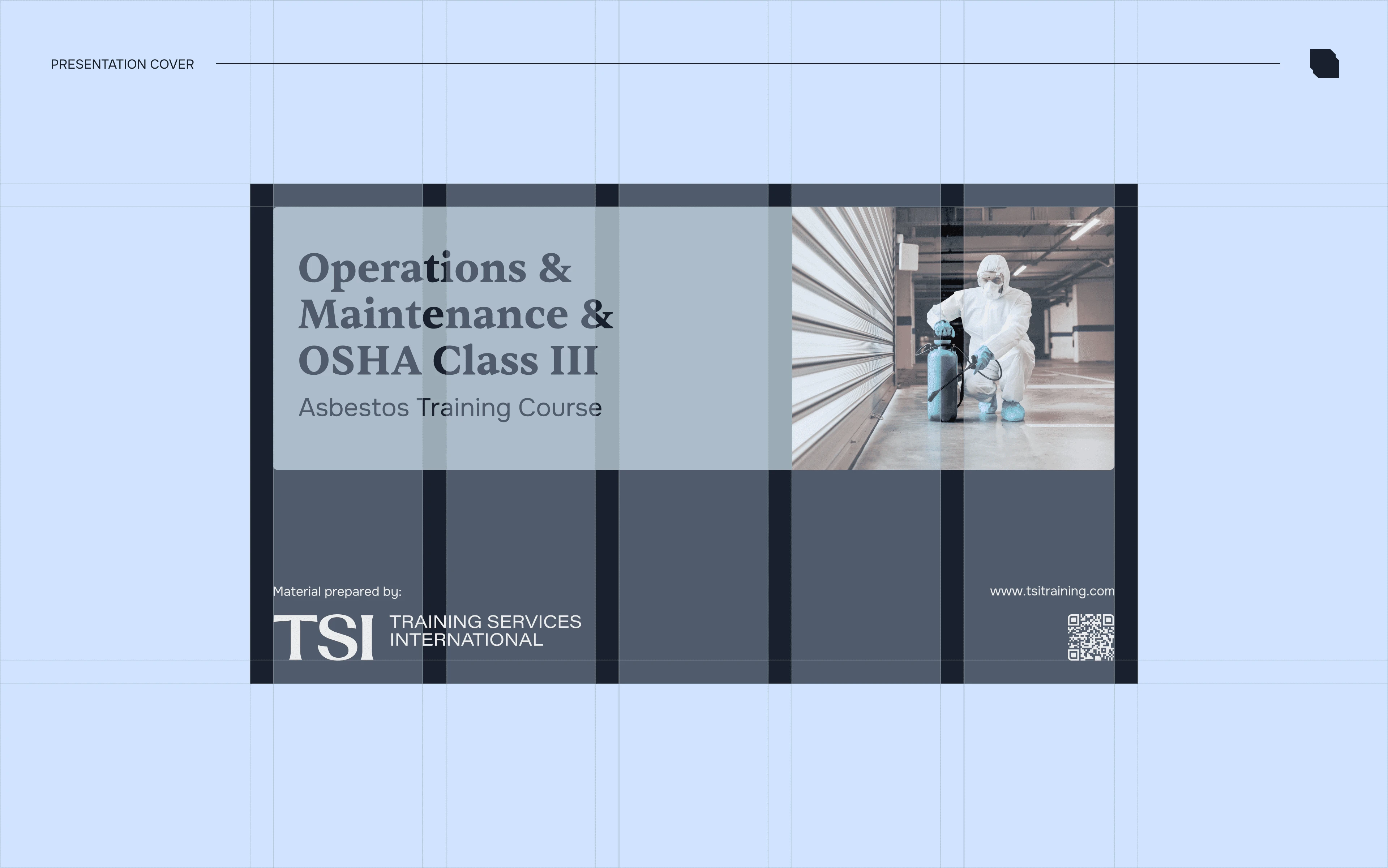
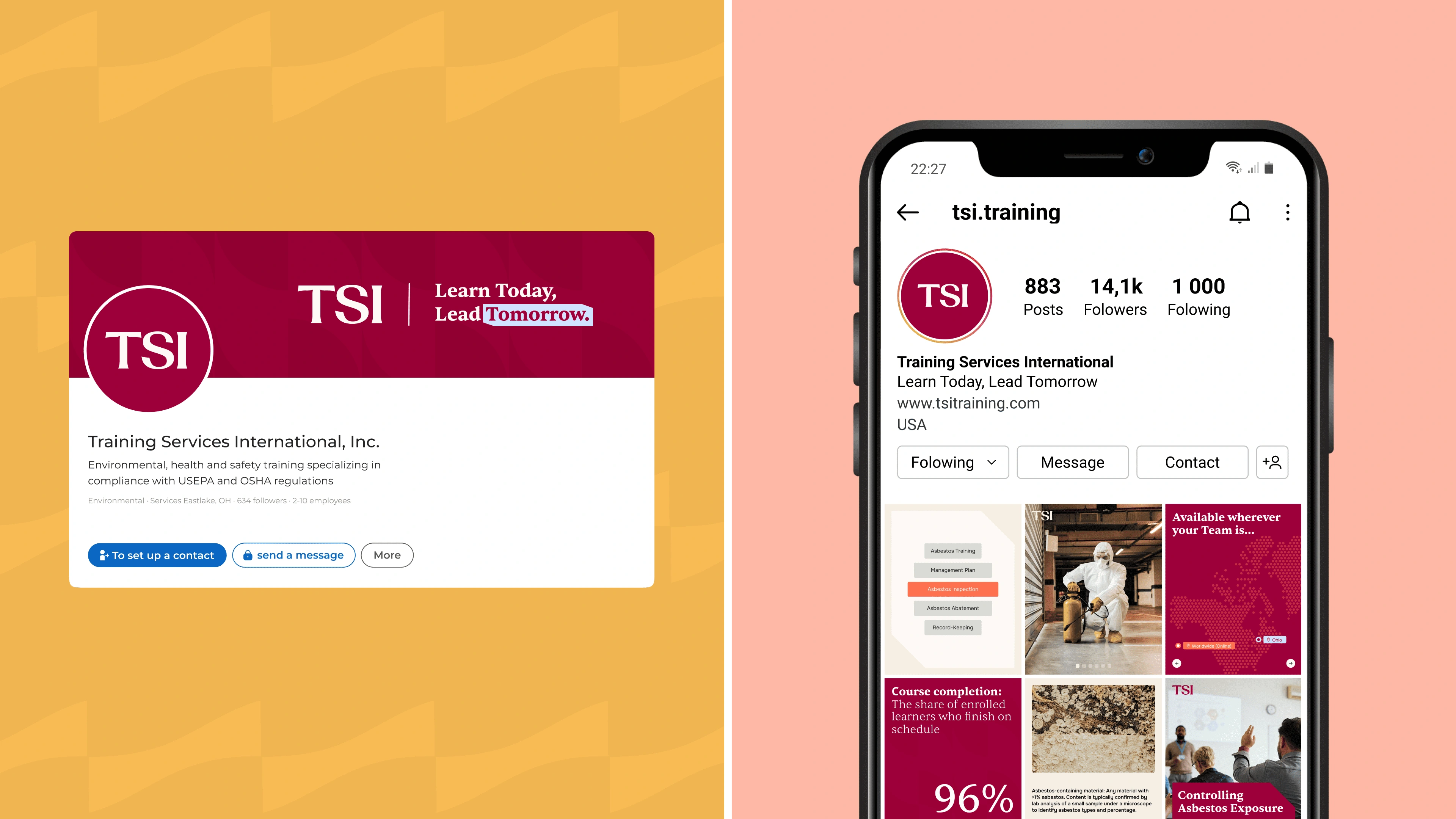
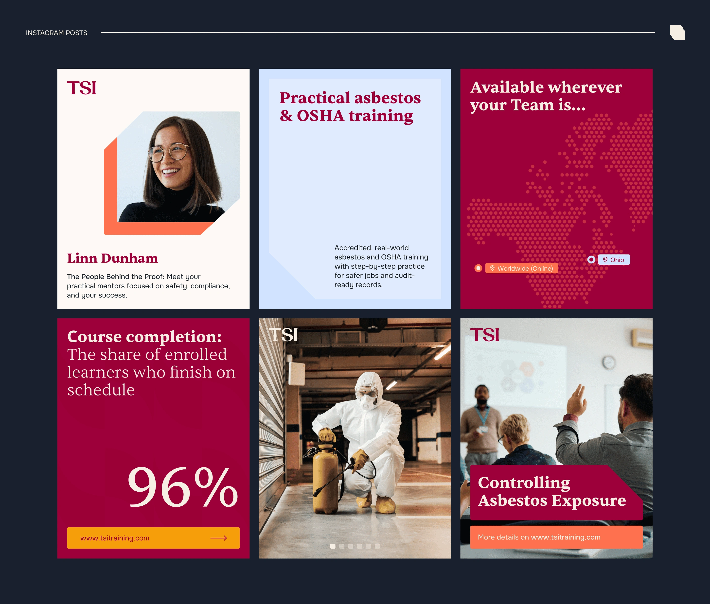
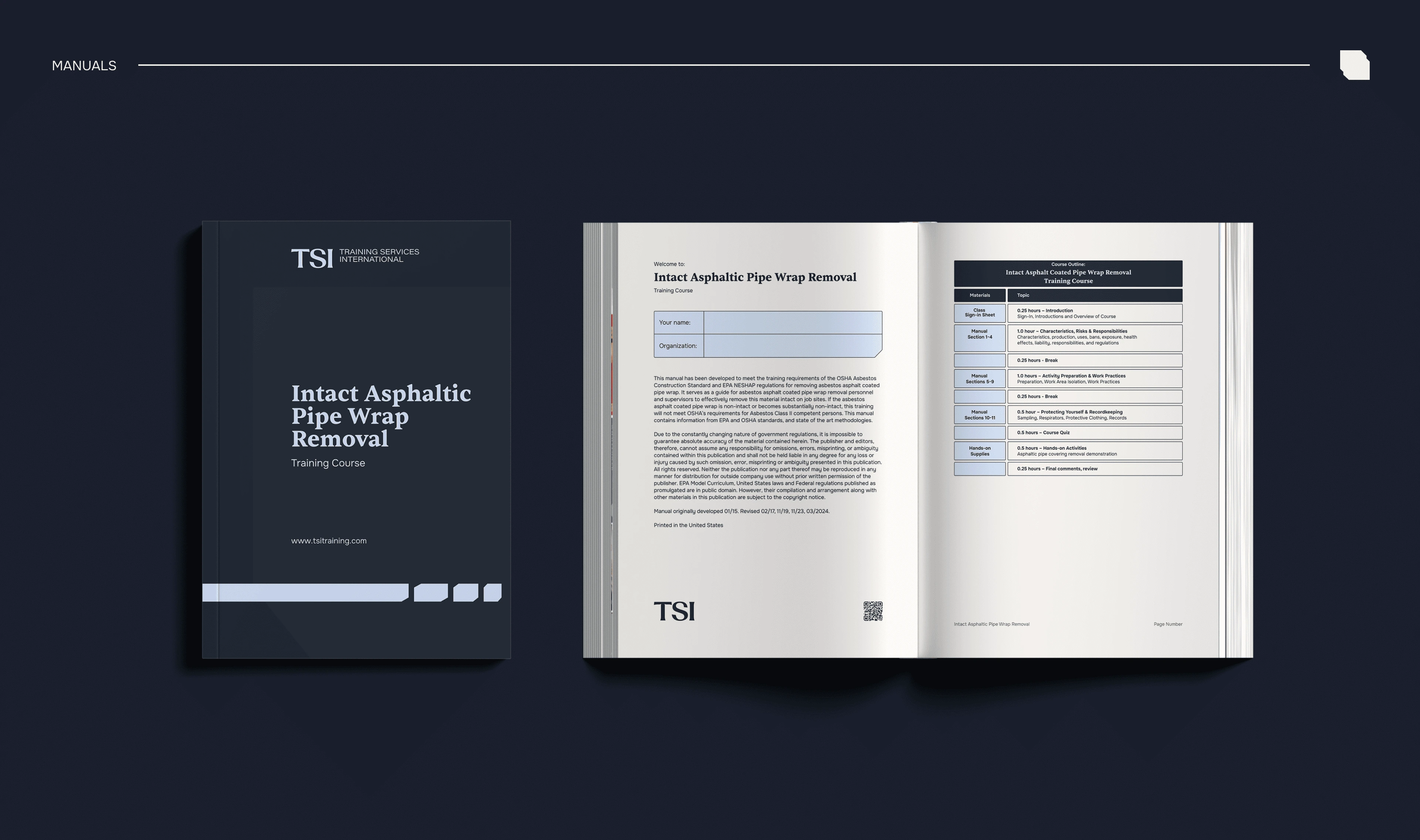
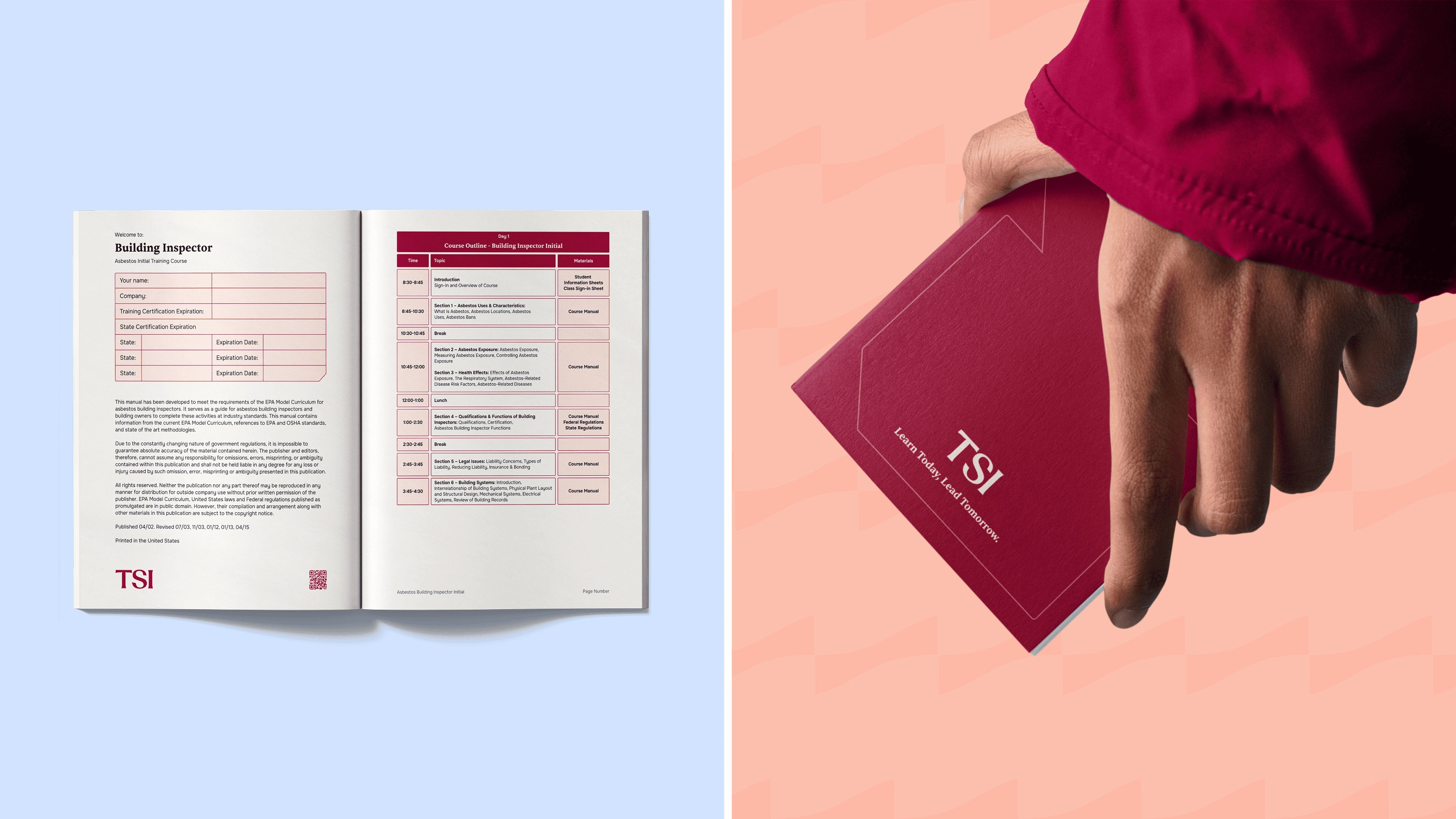
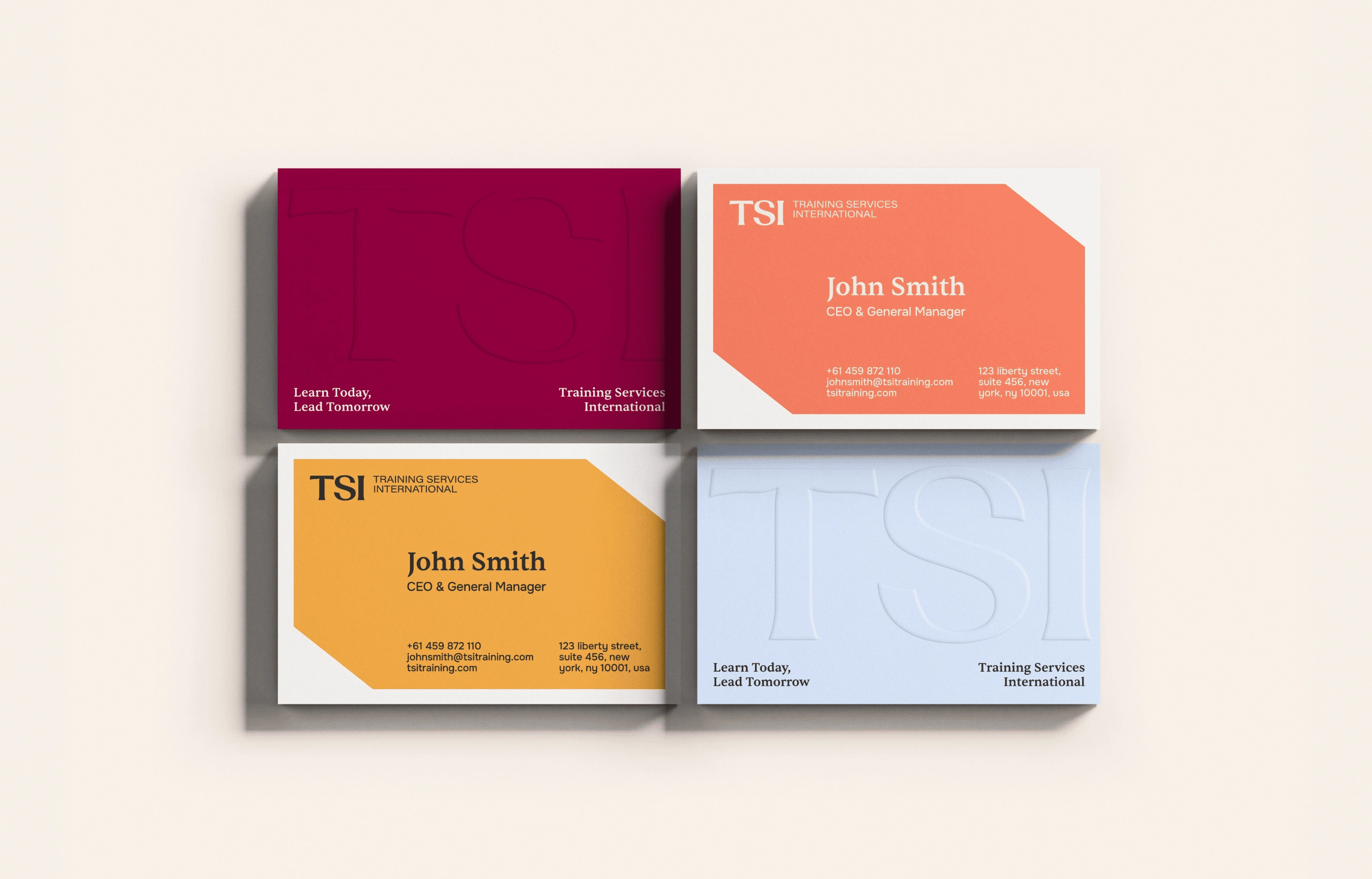
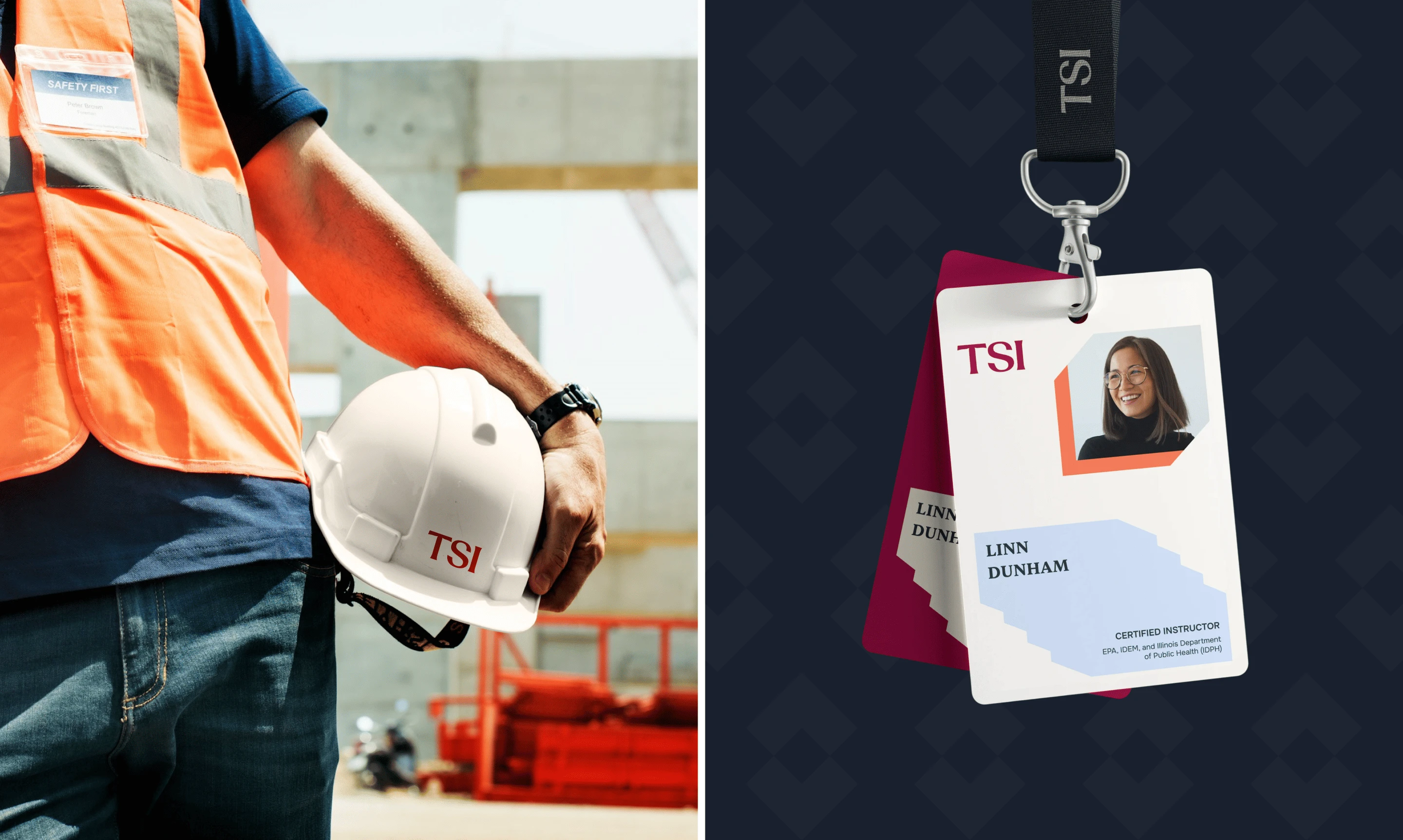
business cards, training manual covers, website headers, social media, stationery, merchandise, email campaigns, and embroidered apparel.
This practical approach ensured the identity wasn't just visually strong in a presentation — it worked in the environments where TSI actually operates.
The Visual Language
The identity balances professional authority with approachability.
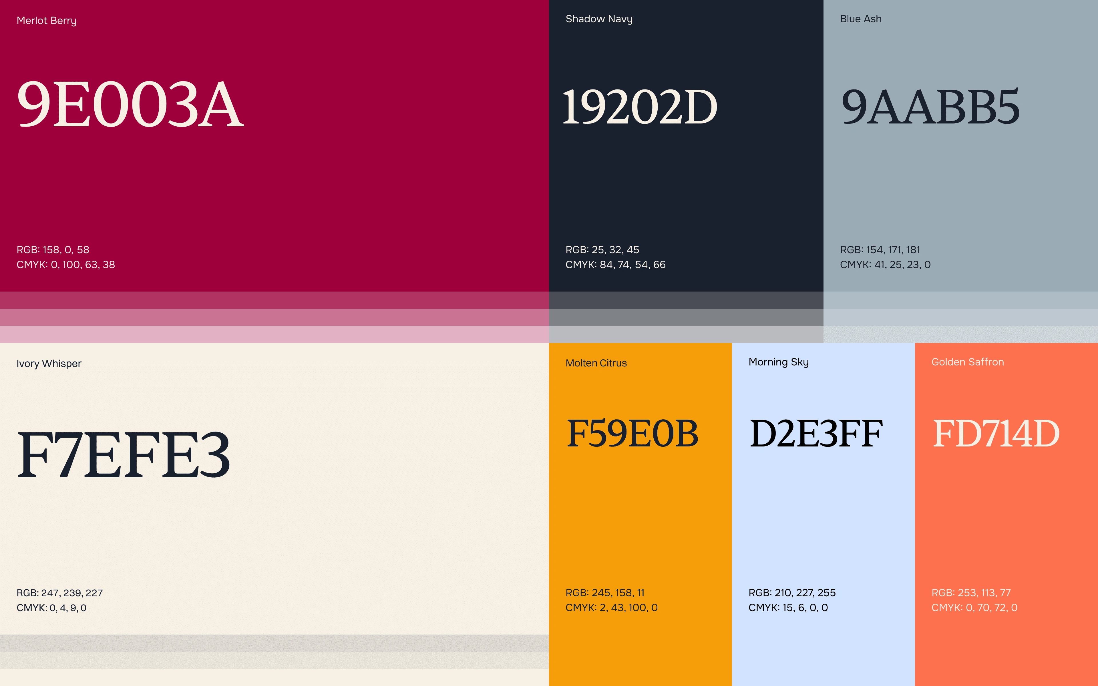
A strong editorial typographic hierarchy creates clarity across educational and compliance materials, while the refined color and graphic system gives the brand a more contemporary presence.
This was particularly important for TSI's audience.
Environmental safety and OSHA compliance can be complex subjects. The brand needed to make the information feel clear, practical, and accessible rather than intimidating.
The visual system supports that communication strategy at every level

From Brand to Digital Experience
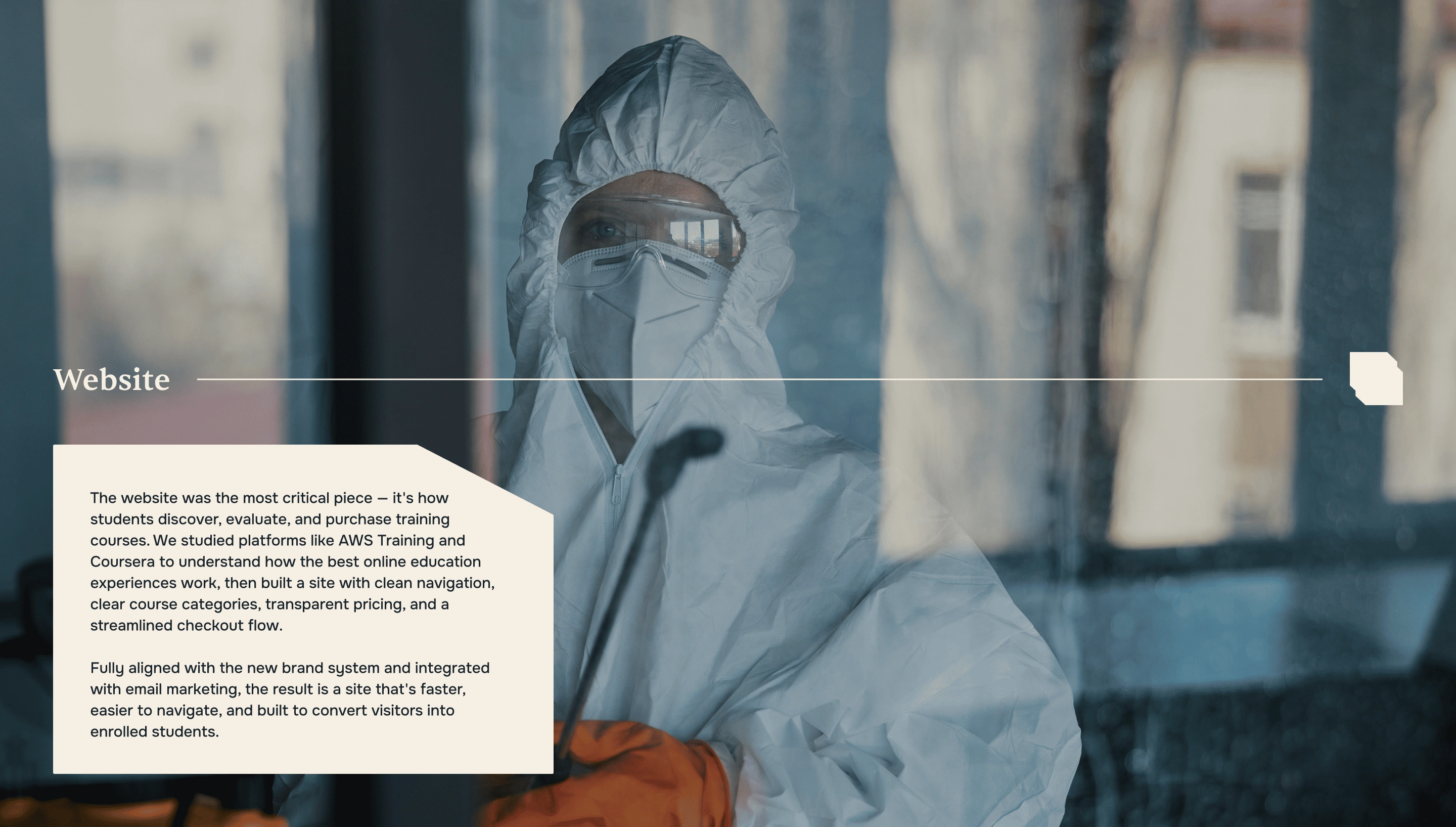
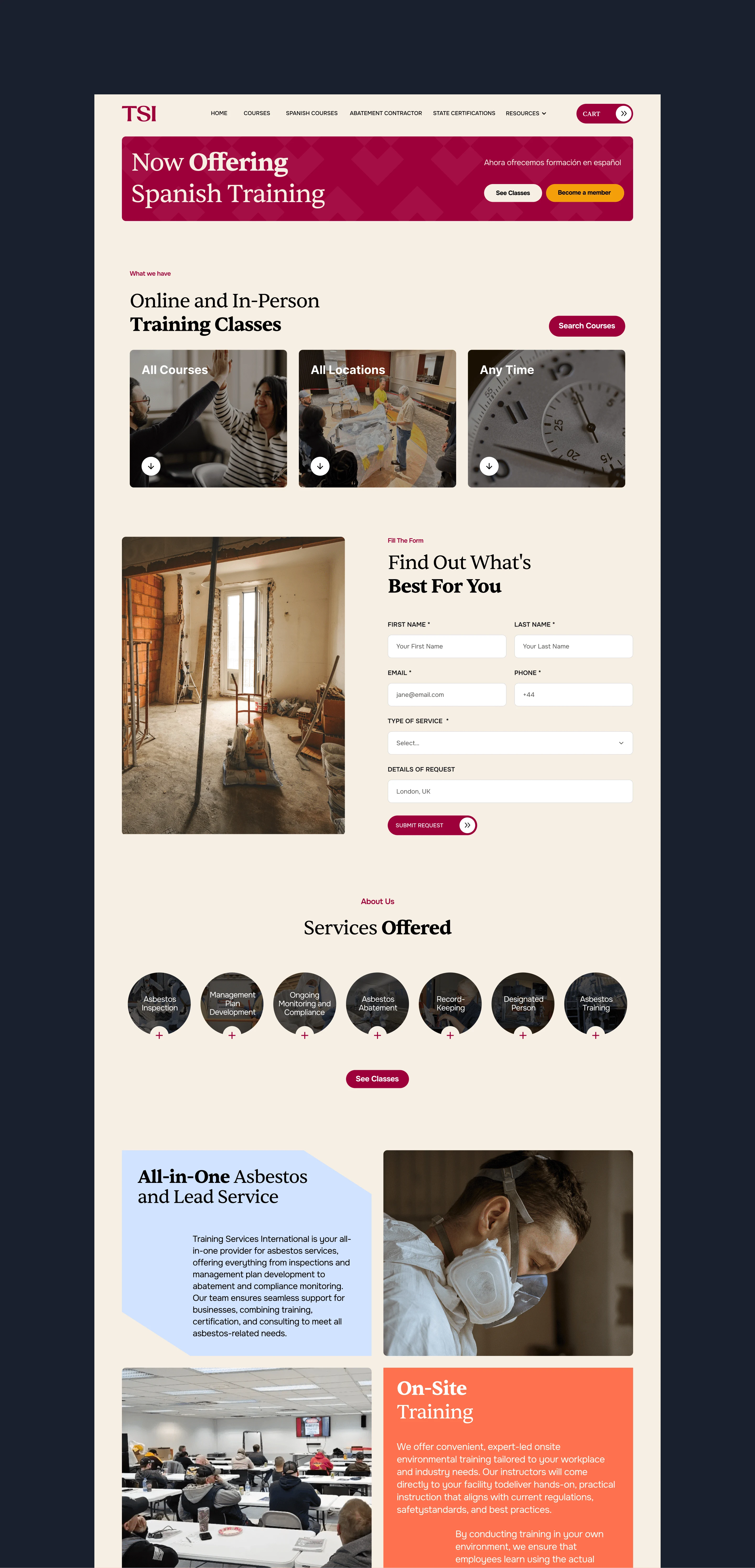
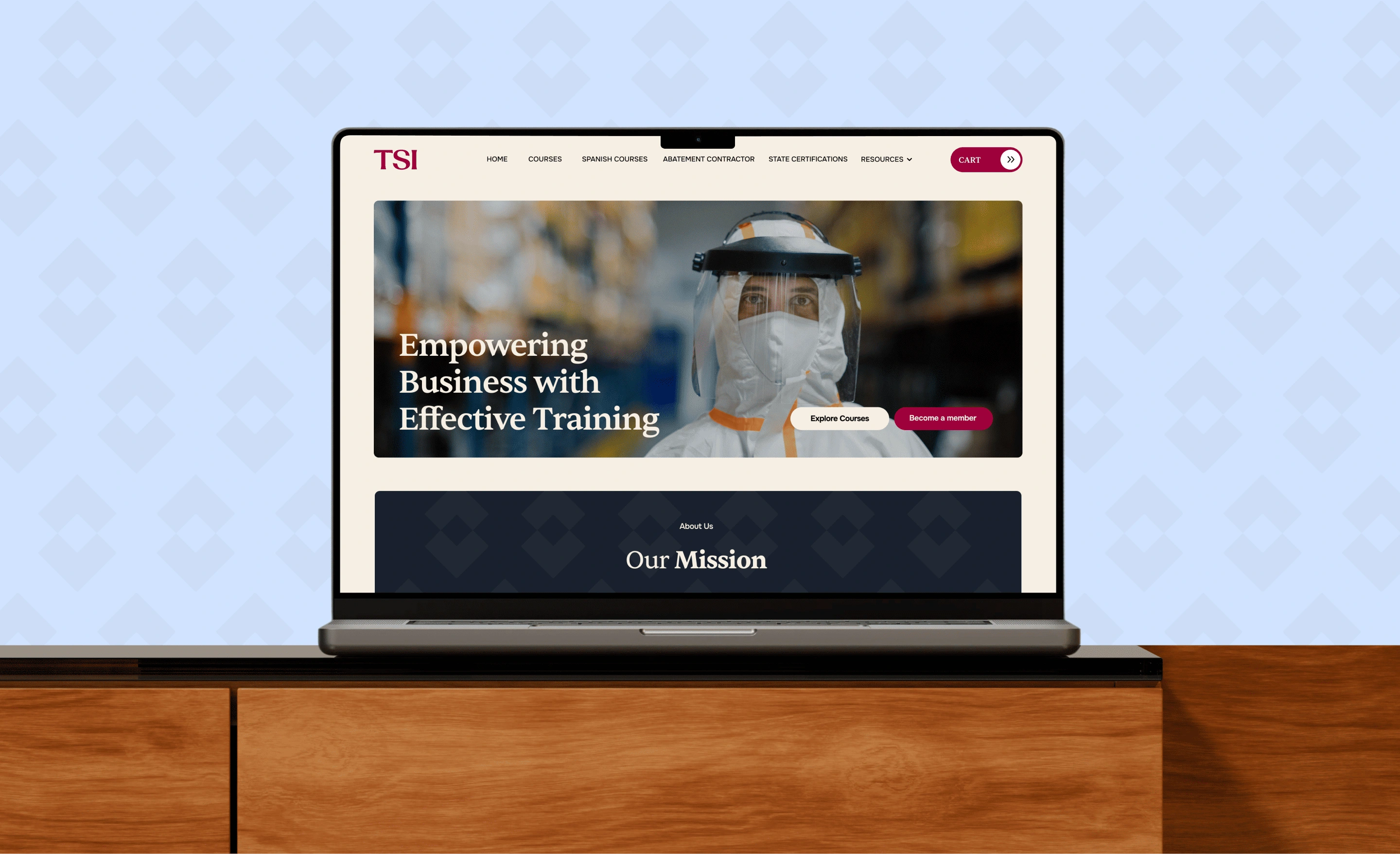
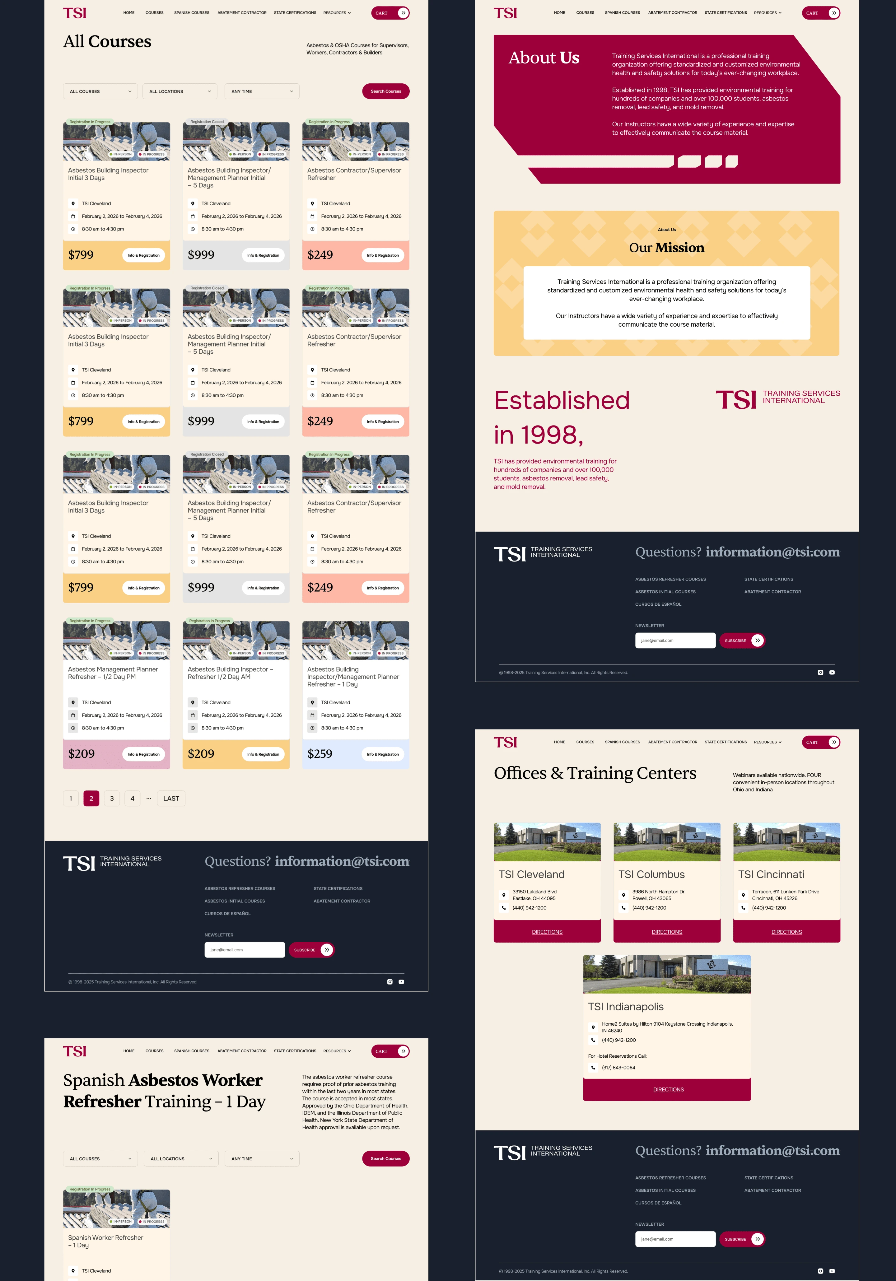
The rebrand extended into the digital experience with a redesigned website built to better support course discovery and enrollment.
The website uses the new visual identity consistently while improving the hierarchy and presentation of training programs, certifications, and company information.
The digital experience became an extension of the brand rather than a separate touchpoint.
Brand identity and website design now work as one system.
A Brand Built for Compliance
TSI's mission is to make environmental safety clearer, more practical, and verifiable — helping organizations stay audit-ready and work with confidence.
The new identity reflects that mission.
It communicates expertise without unnecessary complexity and gives the company a scalable foundation for future training programs, services, digital products, and communications.
The result is a modern compliance brand identity that feels established enough for a long-standing industry provider while being contemporary enough for its next stage of growth.
The Impact
TSI moved from an inconsistent legacy identity to a cohesive brand identity system and digital experience.
The project combines rebranding, logo design, visual identity, graphic design, typography, art direction, website redesign, digital branding, and environmental safety branding into one unified system.
A refreshed identity that respects where TSI came from — while giving the brand a much clearer direction for where it's going.
The Takeaway.
A successful rebrand doesn't erase recognition. It gives recognition a stronger system to live in.


Art-Director/Designer - Anna Striukova
Our Website
whales.design
Like this project
Posted Aug 14, 2026
Brand identity redesign and rebranding for an environmental safety and OSHA training company, including logo design, visual identity, and website redesign.