Paths of Purpose Podcast (Visual Identity)
Brand Overview
Paths of Purpose is a podcast by Kara Hawkins, a change mentor and a community builder for purpose-led women. It was created for passionate people with a mission to express their creativity, embrace their strengths, and do good for people and the planet. It provides a look into the many, many ways that people create meaning and impact through work and life through inside access to founders, intrapreneurs, creatives, and boat-rockers from across the world.
Check out Paths of Purpose here.
Project Scope
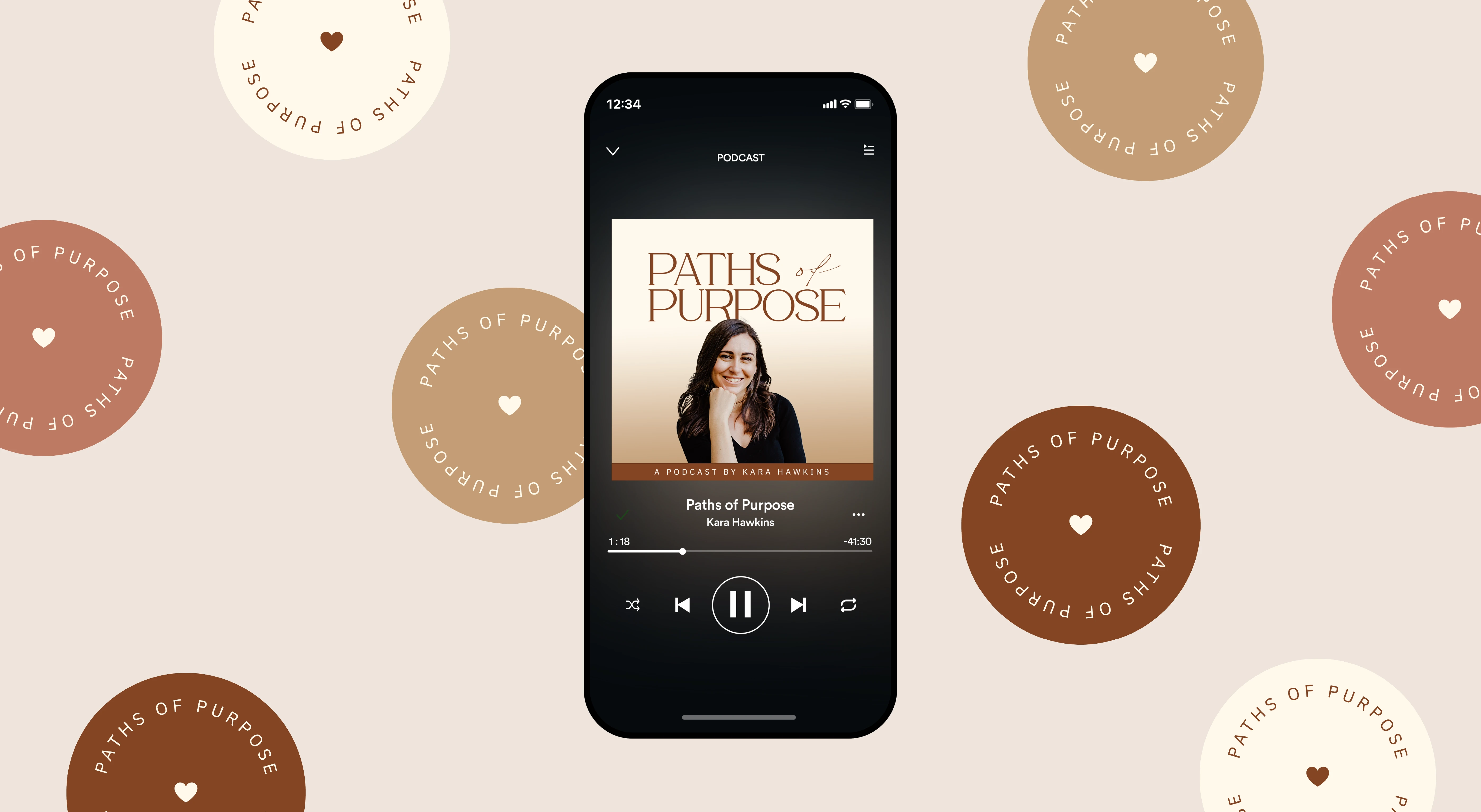
Visual Brand Identity (including podcast logo, color palette, and font selection)
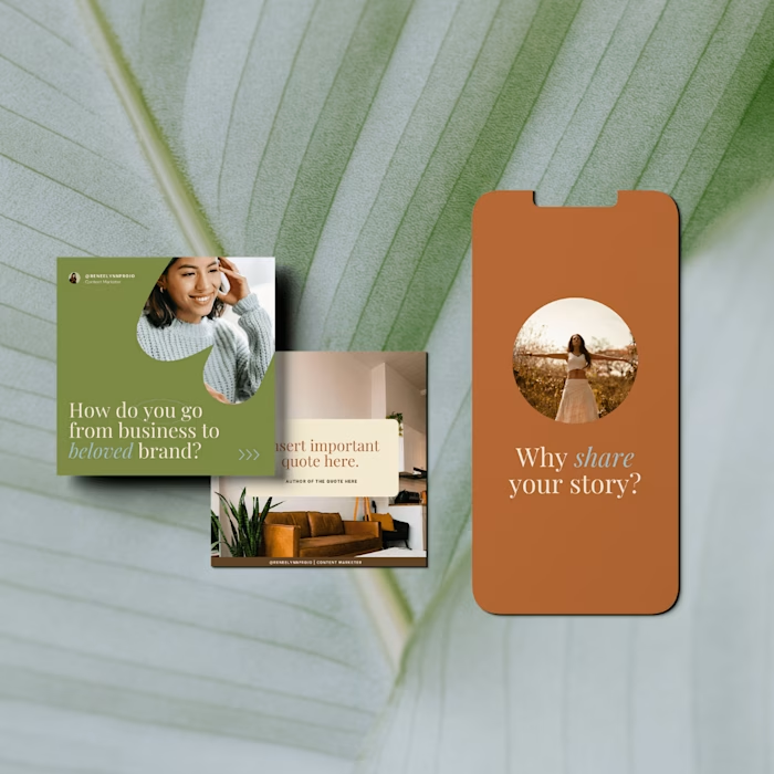
Social Media Styling & Template Creation
Process
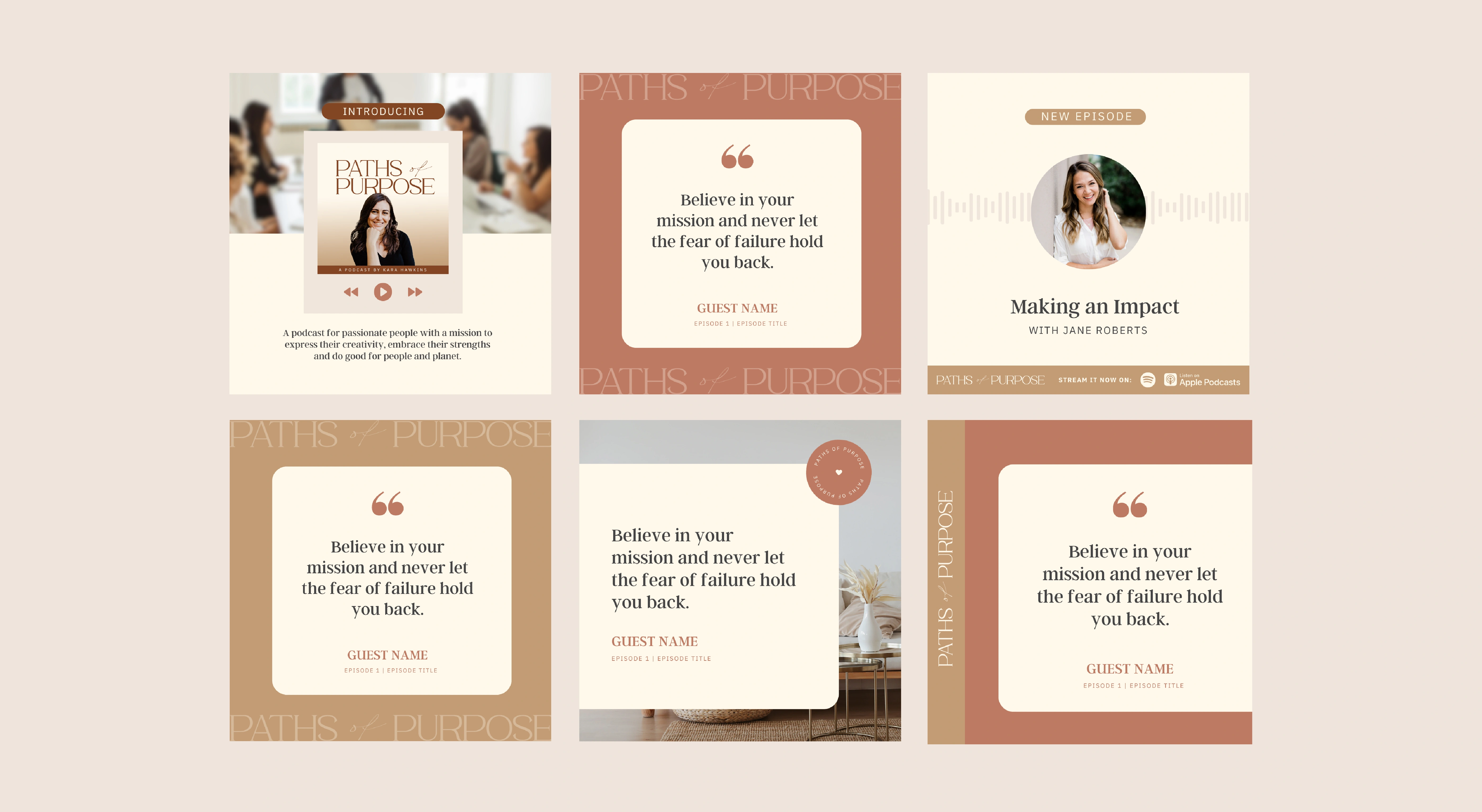
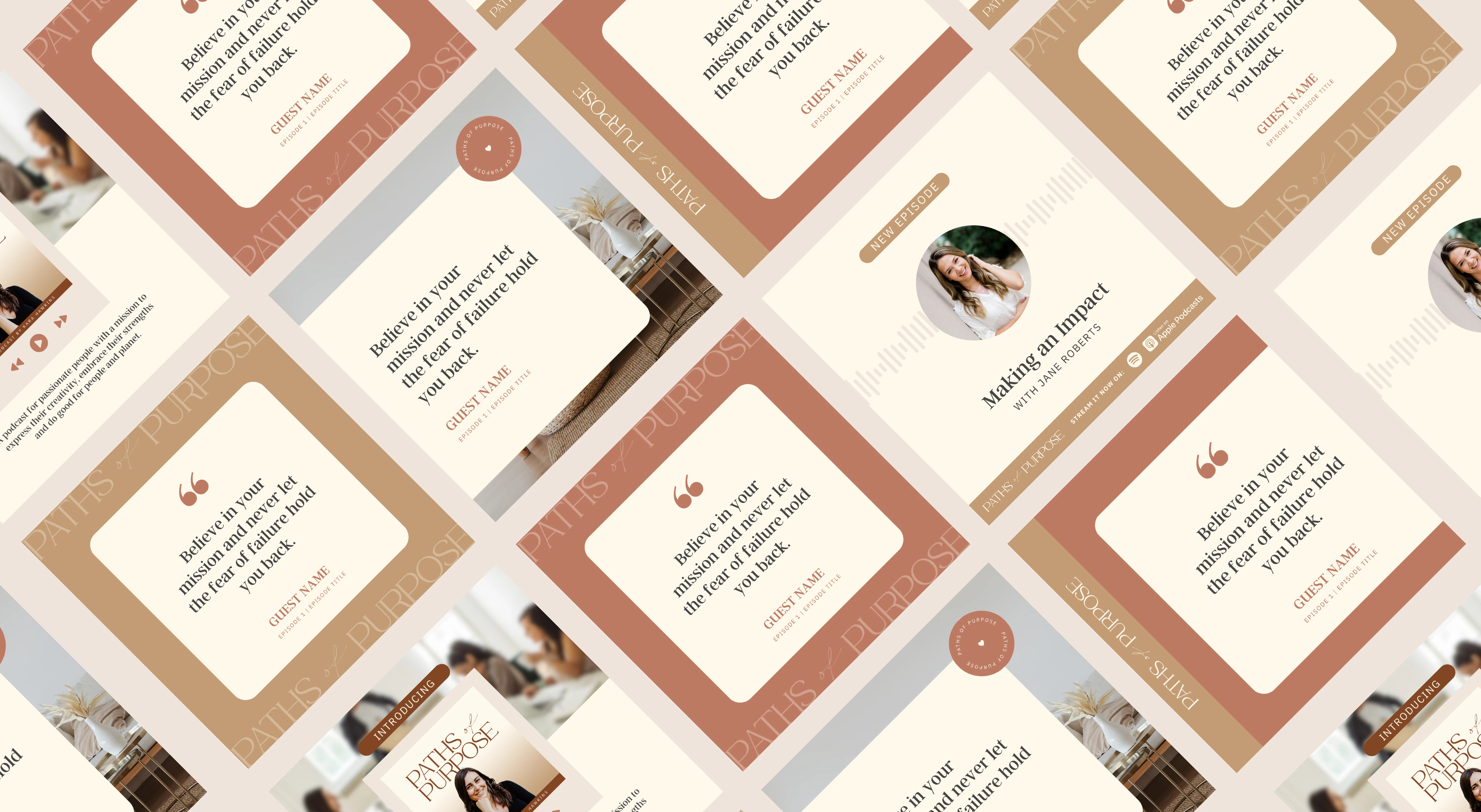
In the creation of the 'Paths of Purpose' podcast's brand identity, our process at Laya Design Studio was deeply collaborative and intentional. We started with a thorough understanding of Kara Hawkins' mission, ensuring that every aspect of the visual identity - from the podcast logo to the color palette and font selection - resonated with her vision as a change mentor and community builder. This approach led to the development of a distinct visual language that not only aligned with Kara's personal brand but also appealed to her audience of purpose-led women. The result was a cohesive and inspiring visual identity, extending seamlessly into social media styling and template creation, crafted to reflect the podcast's essence of creativity, strength, and positive impact.
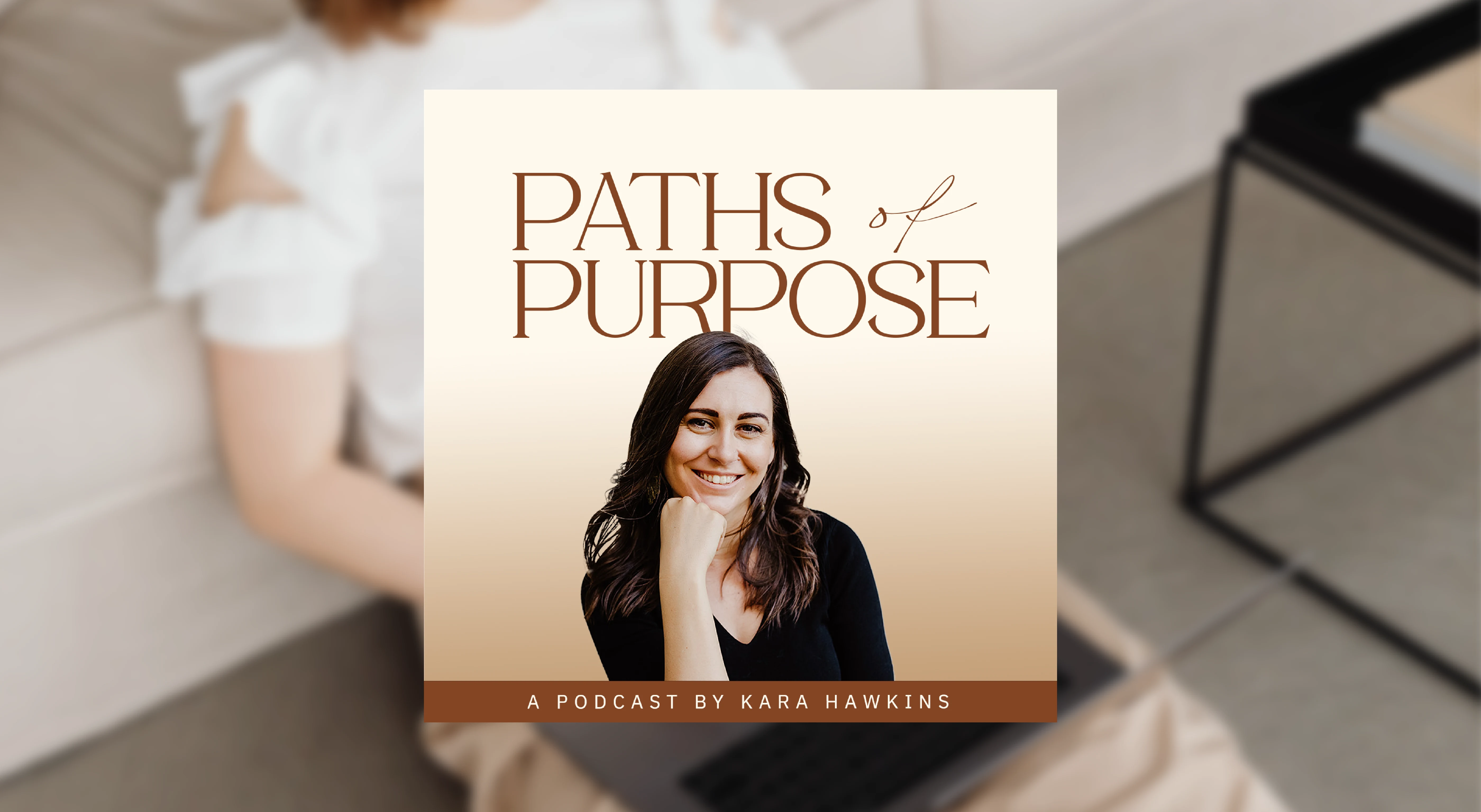
The serif font used for the podcast title exudes a sense of refinement and wisdom, mirroring Kara's nurturing and wise approach. Meanwhile, the handwritten script font brings a dash of creativity, lightheartedness, and femininity, resonating with her target audience who are predominantly womxn.
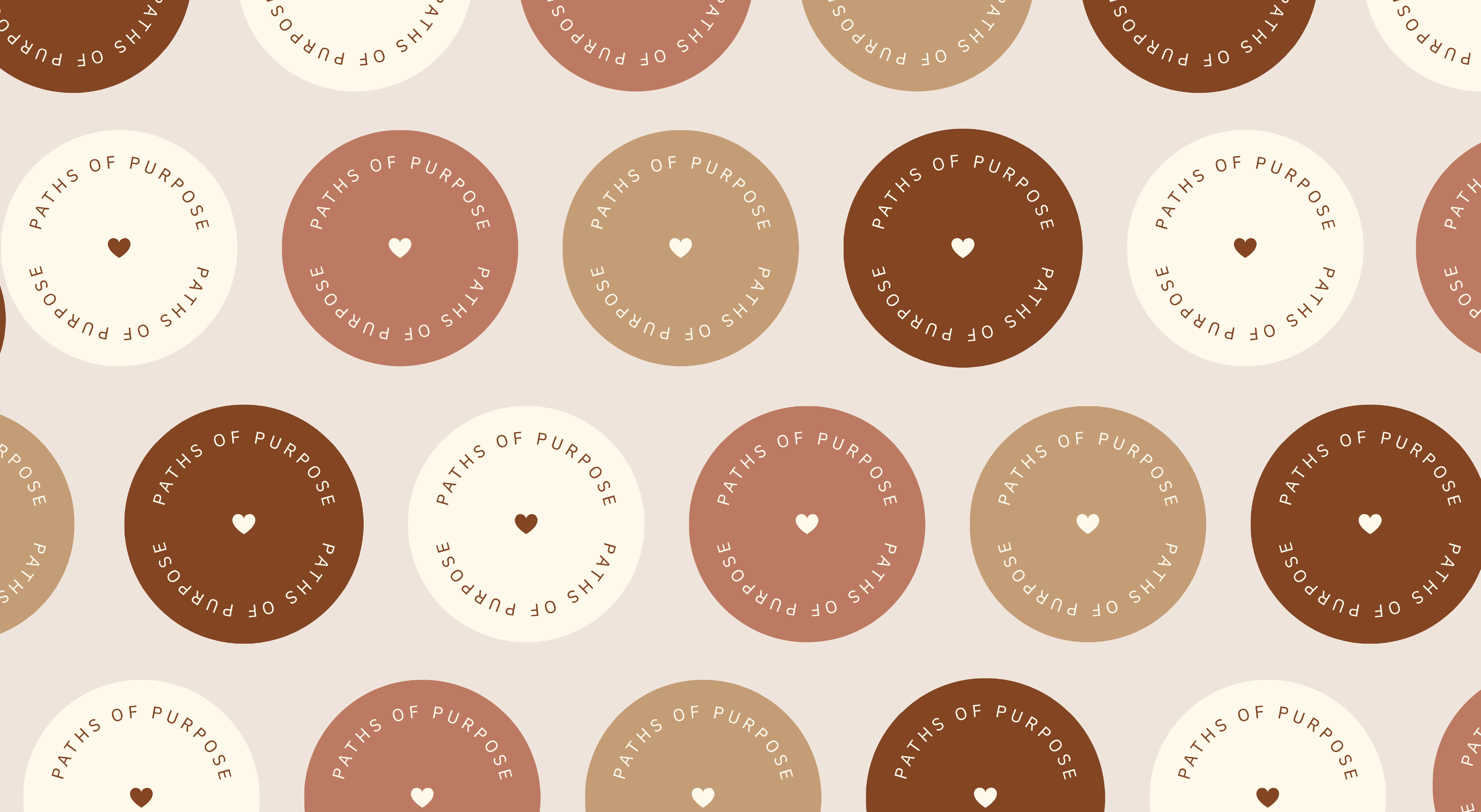
The color palette leverages her existing brand colors but introduces a gradient, not just for its visual appeal and standout effect in a podcast cover, but also for its symbolism. Gradients are dynamic, signifying transitions and transformations, which is highly relevant to Kara's role as a change and embodiment coach. This design decision also resonates with her brand message that paths to purpose are not linear, reinforcing the idea of transitions and transformations.
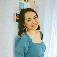
Including a clear, front-facing headshot of Kara in the podcast cover design was another intentional choice to foster a direct and personal connection with her audience. It humanizes the brand and presents Kara as approachable, inviting listeners into her space.
Overall, the design is deeply aligned with Kara's brand, delivering a cohesive experience for her audience.

Client Testimonial
"I absolutely love the brands that Joy has created for my business and podcast! Not only is the brand visually stunning, but what Joy created perfectly reflects my written vision (and adds to it even more!) Her detailed approach made sure that she understood the values, intentions and 'feel' of the business, and translated it into a unique, creative visual brand identity that is even better than I could have imagined.
The final brand identity has helped me further clarify my vision, communicate what I offer to my audience, made my brand much more professional and increased my confidence in taking it forward as a result.
On top of that, Joy is a pleasure to work with, and I always felt seen and heard as a client. She gave me space and guidance to articulate my vision as well as the ability to lean on and learn from her expertise to make the brand identity more comprehensive. I also felt very supported through her professional, clear processes and communications.
I would work with Joy again in a heartbeat! I highly recommend her for anyone looking for a talented, purpose-led brand designer who can clarify and transform your vision into a brand identity that accurately reflects your business and attracts the right clients for you."
— Kara Hawkins, Change Mentor, Mind-Body Coach and Founder of the Co.here Network
Like this project
Posted Nov 13, 2023
Visual identity design & social media styling for Paths of Purpose, a podcast for purpose-led changemakers
