Pathline — Trading Brand Identity (Concept)

Shakil Hosen



PATHLINE — A CLEARER VISUAL DIRECTION FOR A TRADING CONCEPT
Pathline is a self-initiated identity concept for a trading-indicator brand. Its brief centres on guidance: giving a technical product a recognisable presence without turning the identity into a complicated market chart.
THE DESIGN CHALLENGE
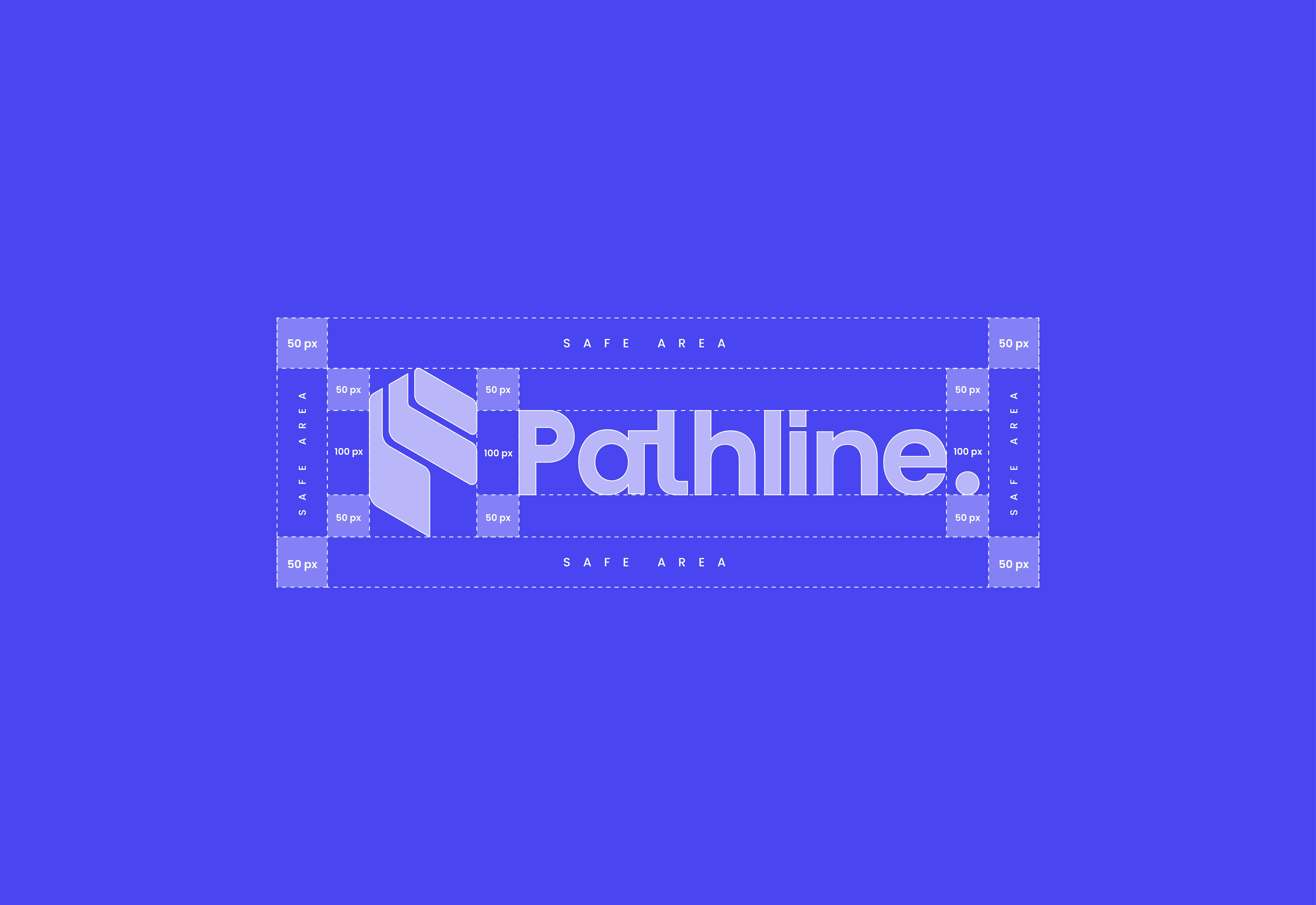
Trading tools operate in visually dense environments. The identity needs a concise signature that can identify the product in a profile image, on a screen or across a wider presentation.
FORM, COLOUR AND TYPE
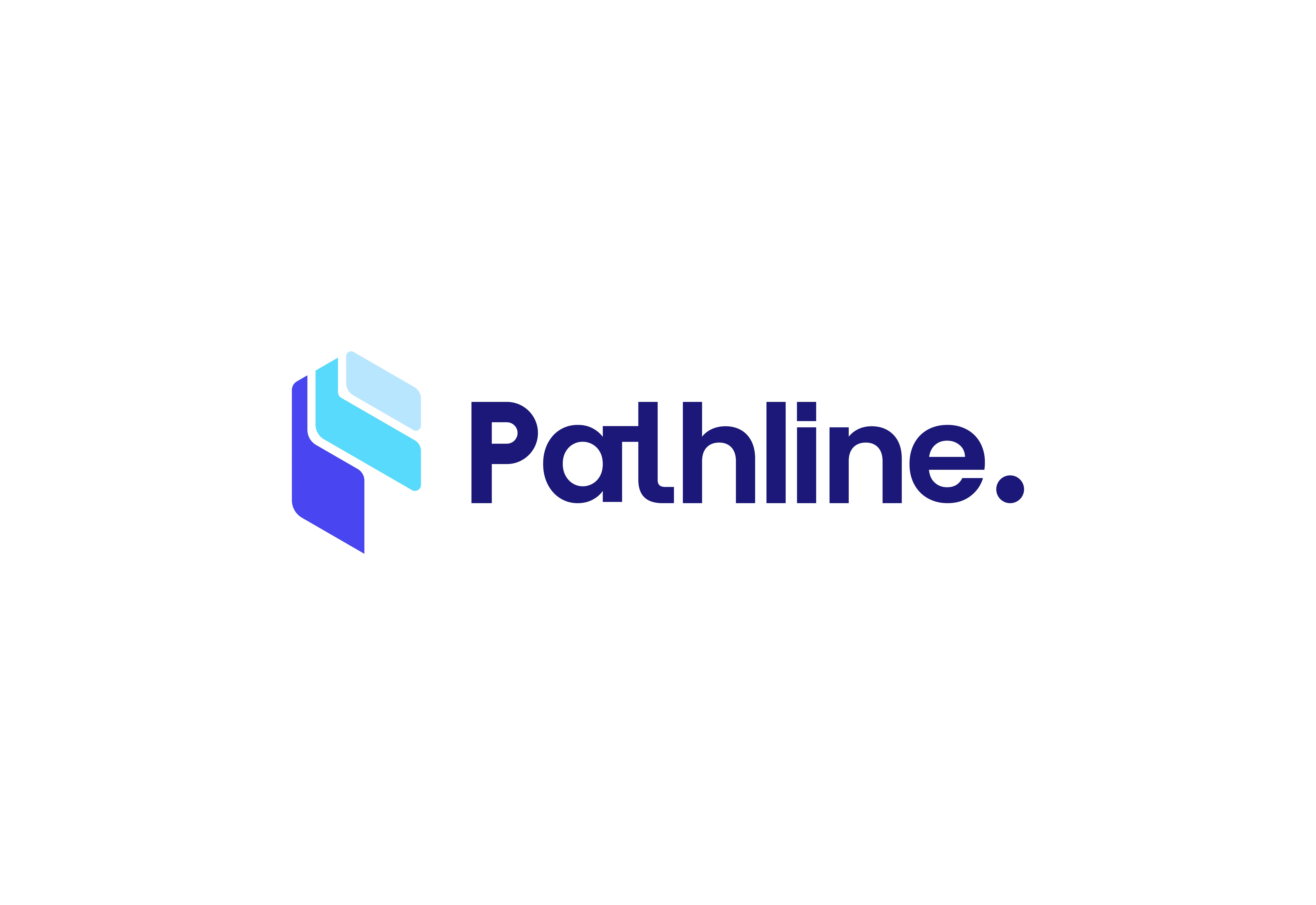
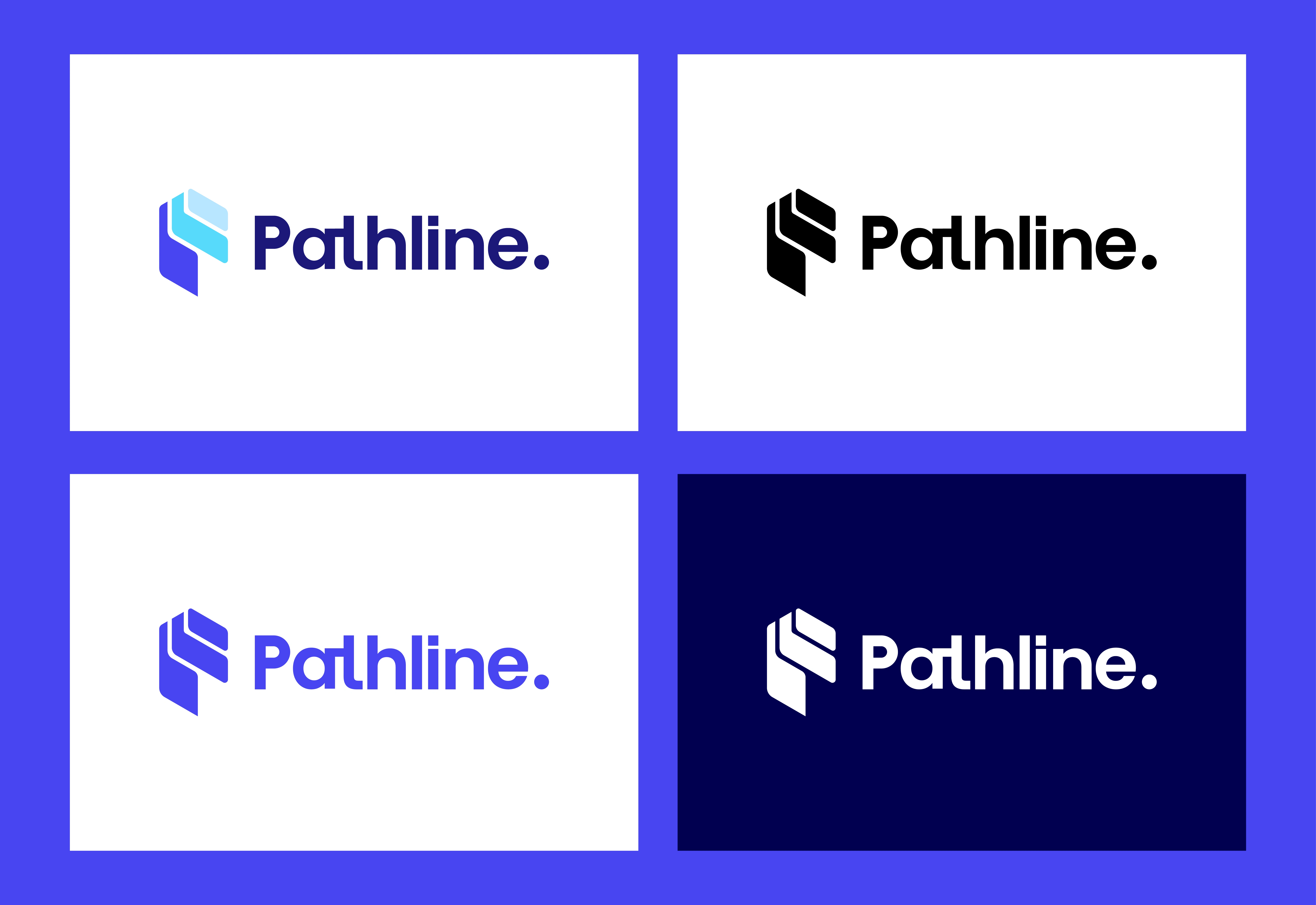
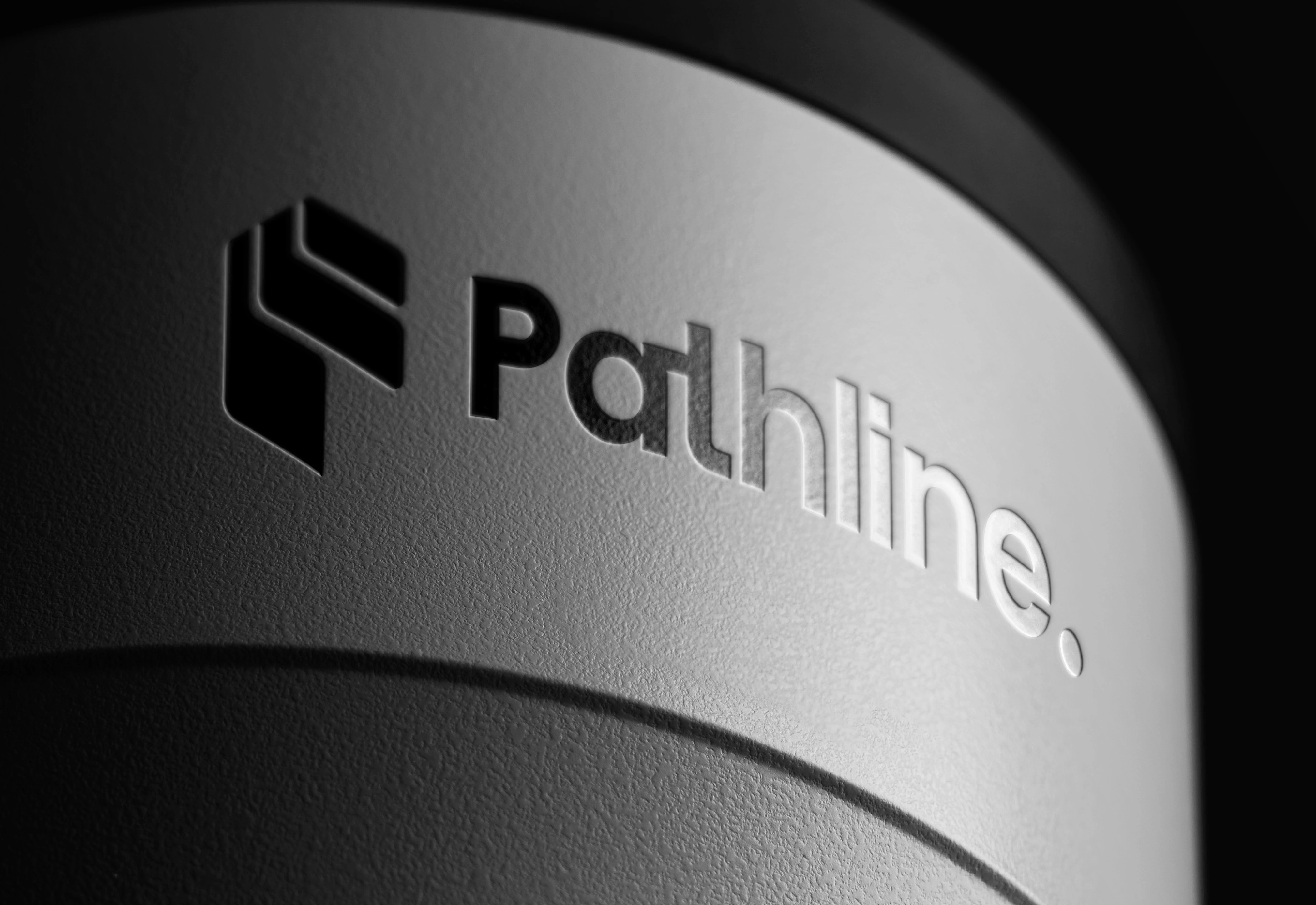
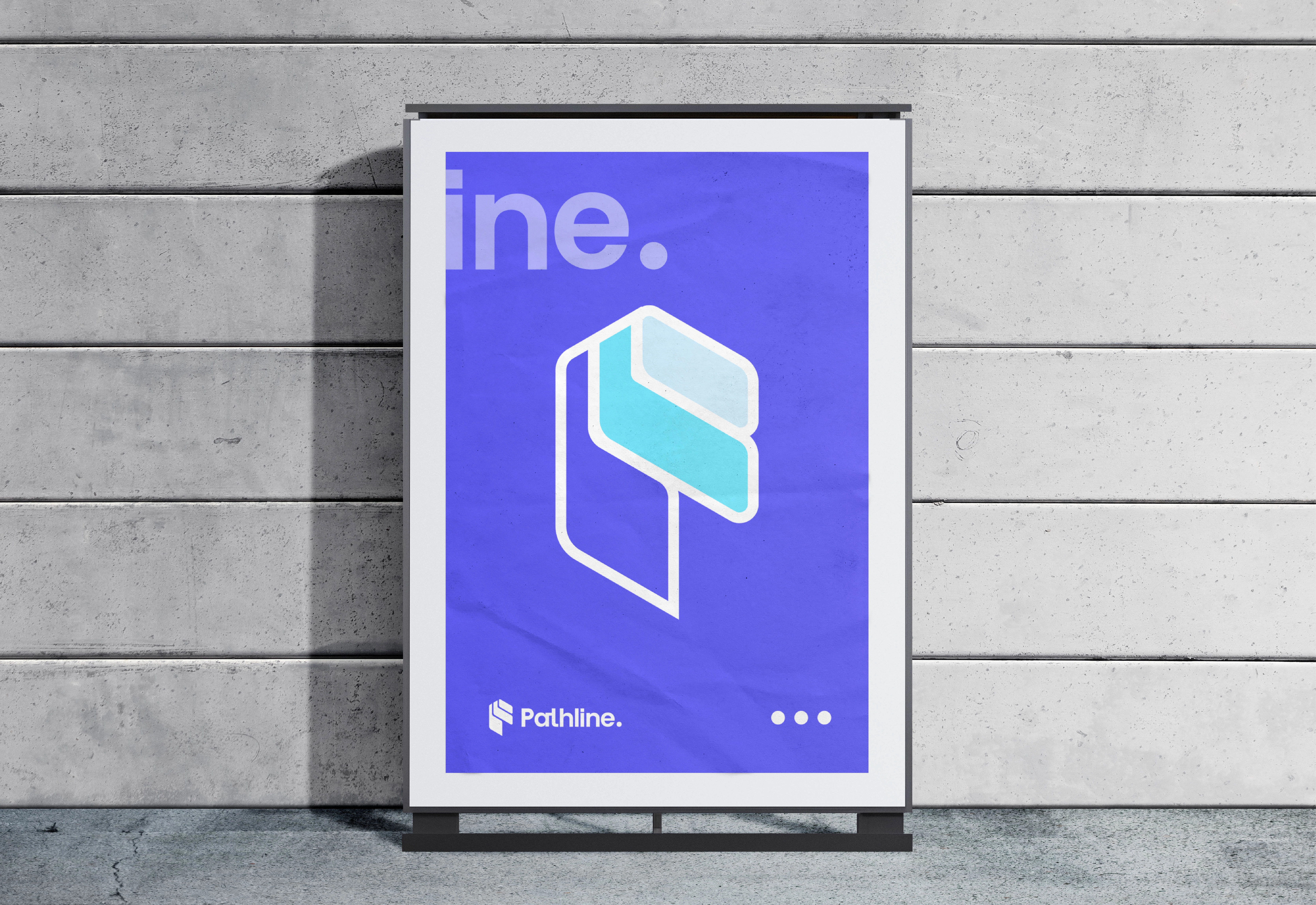
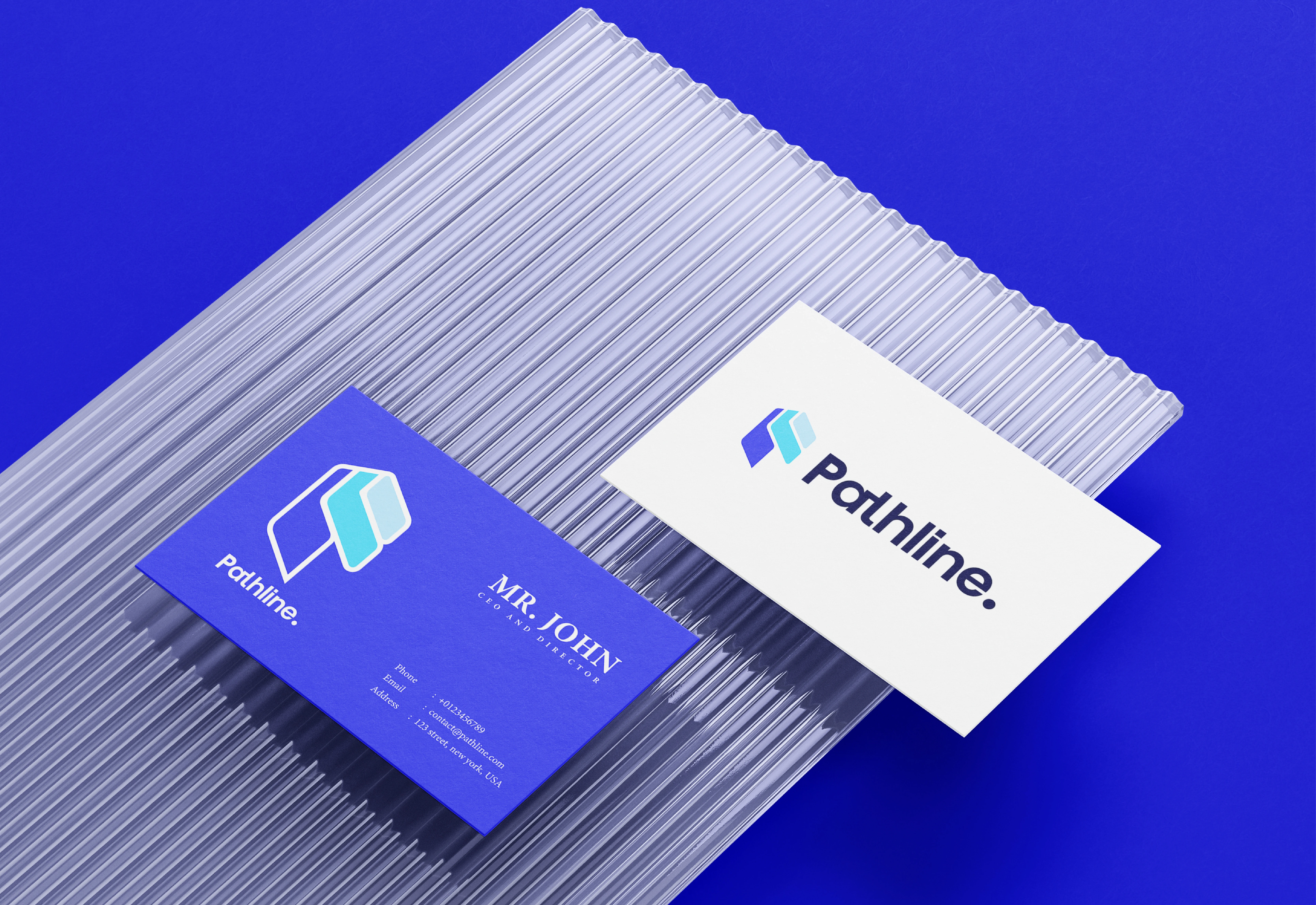
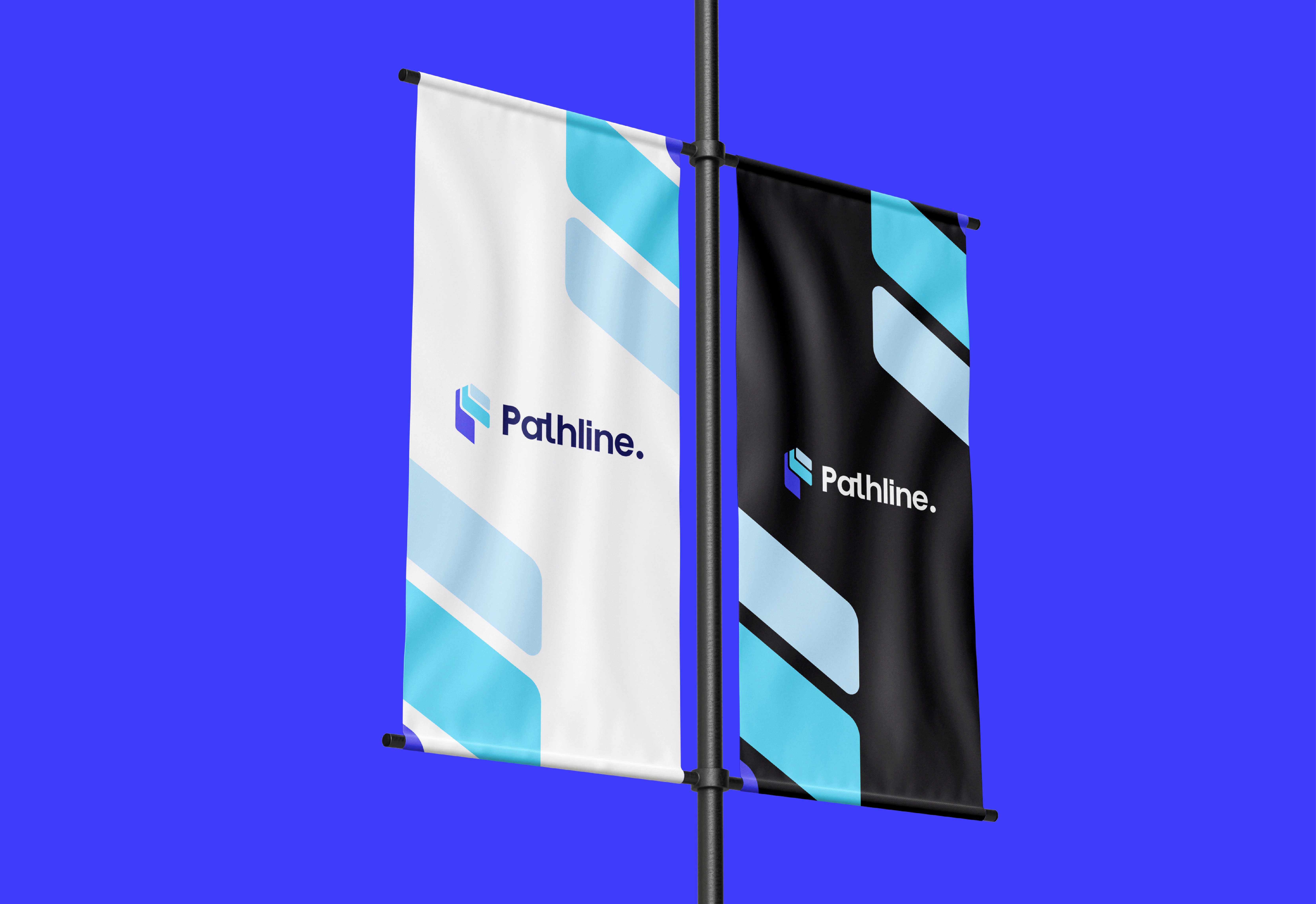
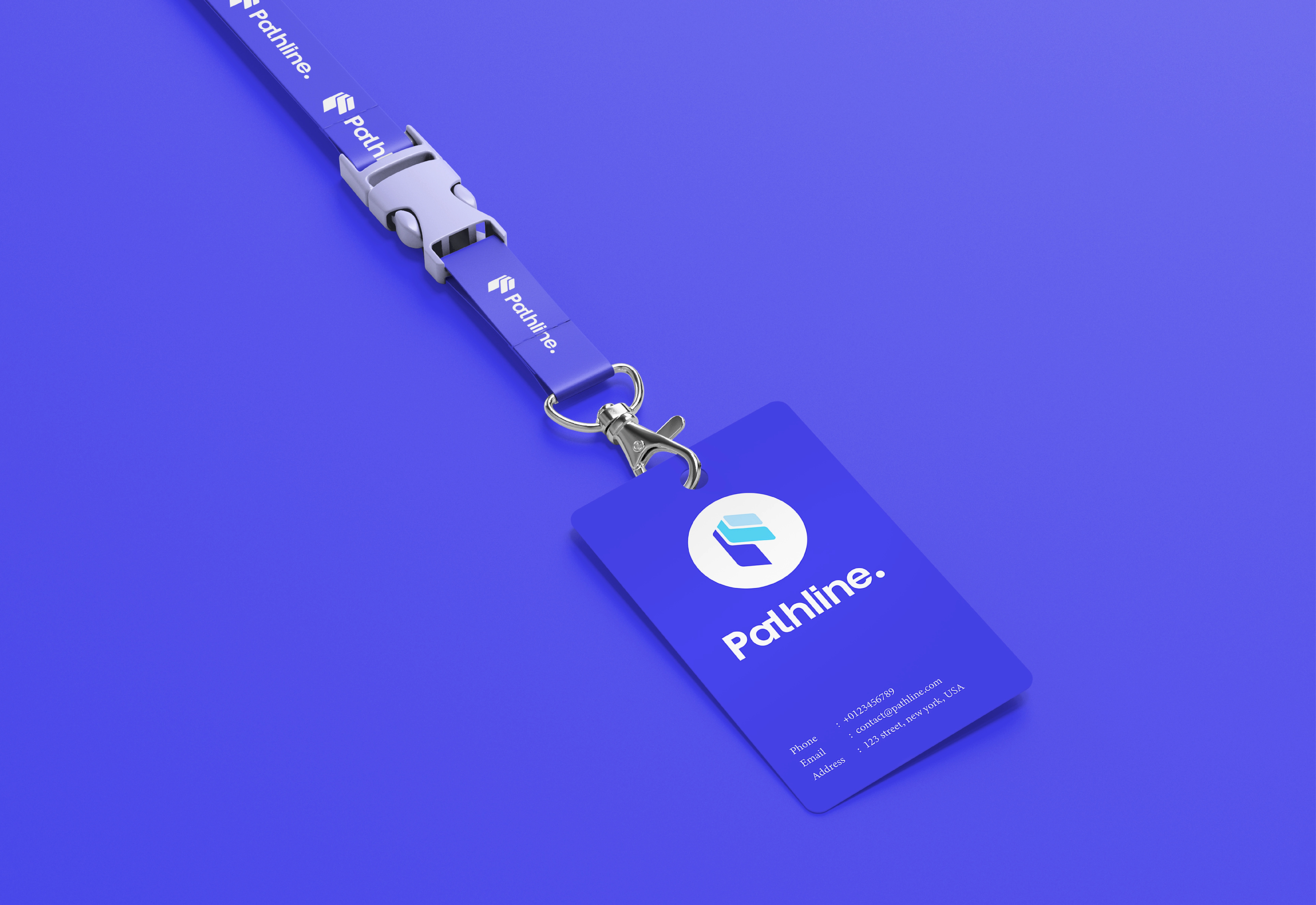
The symbol combines outlined and filled geometric sections in a compact, folded construction. Pale blue shapes contrast with a saturated violet field, giving the mark a layered appearance while retaining a clear outer silhouette. Rounded, substantial letterforms provide a softer counterpoint to the angular symbol.
APPLICATION AND CONSISTENCY
The social-profile mockups give icon and wordmark different jobs: the symbol identifies a small avatar, while the name occupies the header. Repeating violet connects these surfaces visually. Figures inside the mockups are illustrative content, not evidence of an audience or trading performance.
The outcome is a coherent visual direction for a trading product concept.
For a branding project, message me on Contra with your business overview, scope and preferred timeline.











Like this project
Posted Oct 16, 2026
A trading-brand concept pairing a folded geometric mark, pale blue accents and violet with a rounded wordmark across digital applications.