King Crumb — Logo & Brand Identity (Concept)

Shakil Hosen


King Crumb – Branding & Packaging Design.
King Crumb is a self-initiated fast-food branding and packaging concept. The challenge is to turn a playful name into a complete personality that can work on a cup, wrapper, box and storefront communication.
A NAME WITH A VISUAL STORY
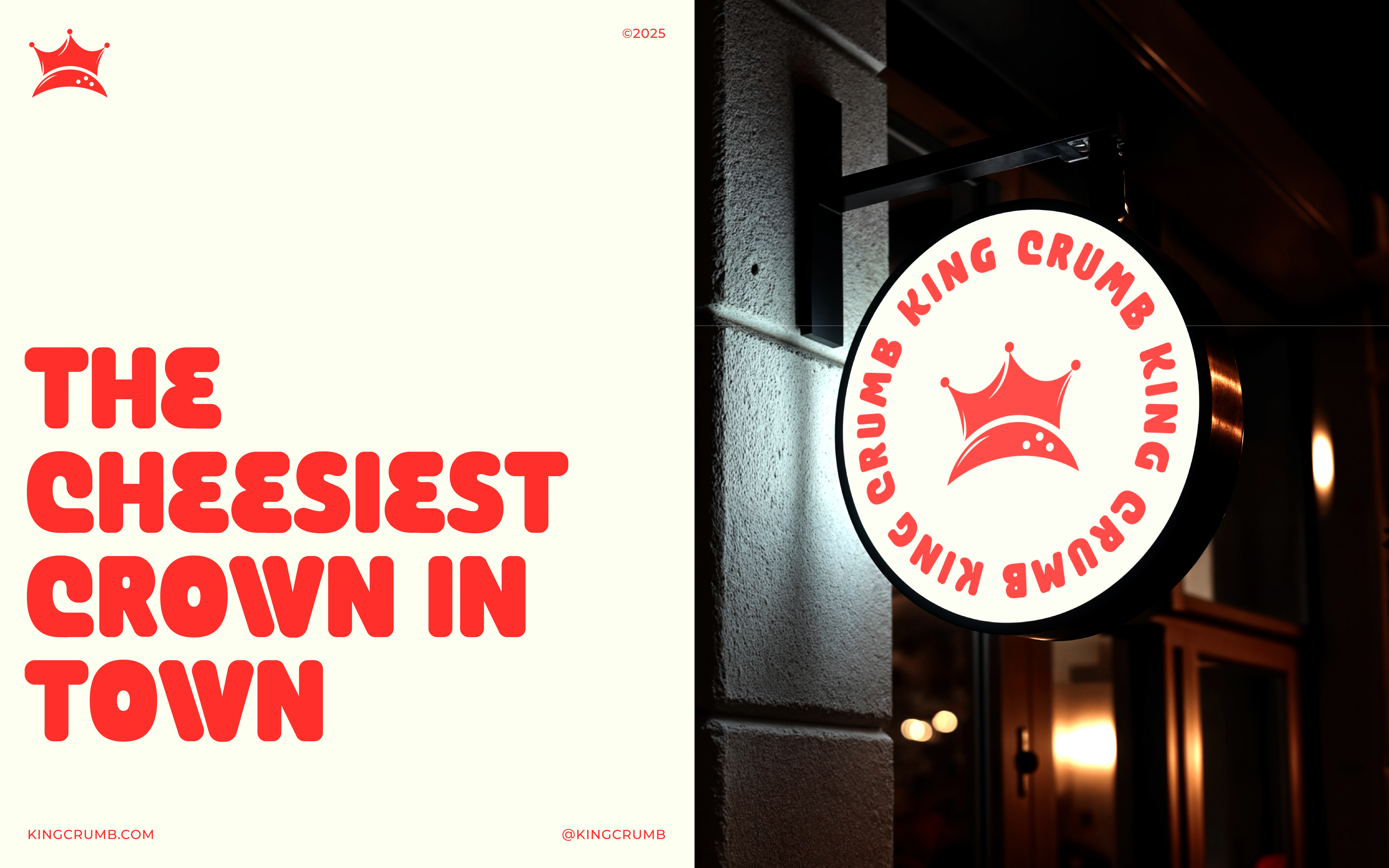
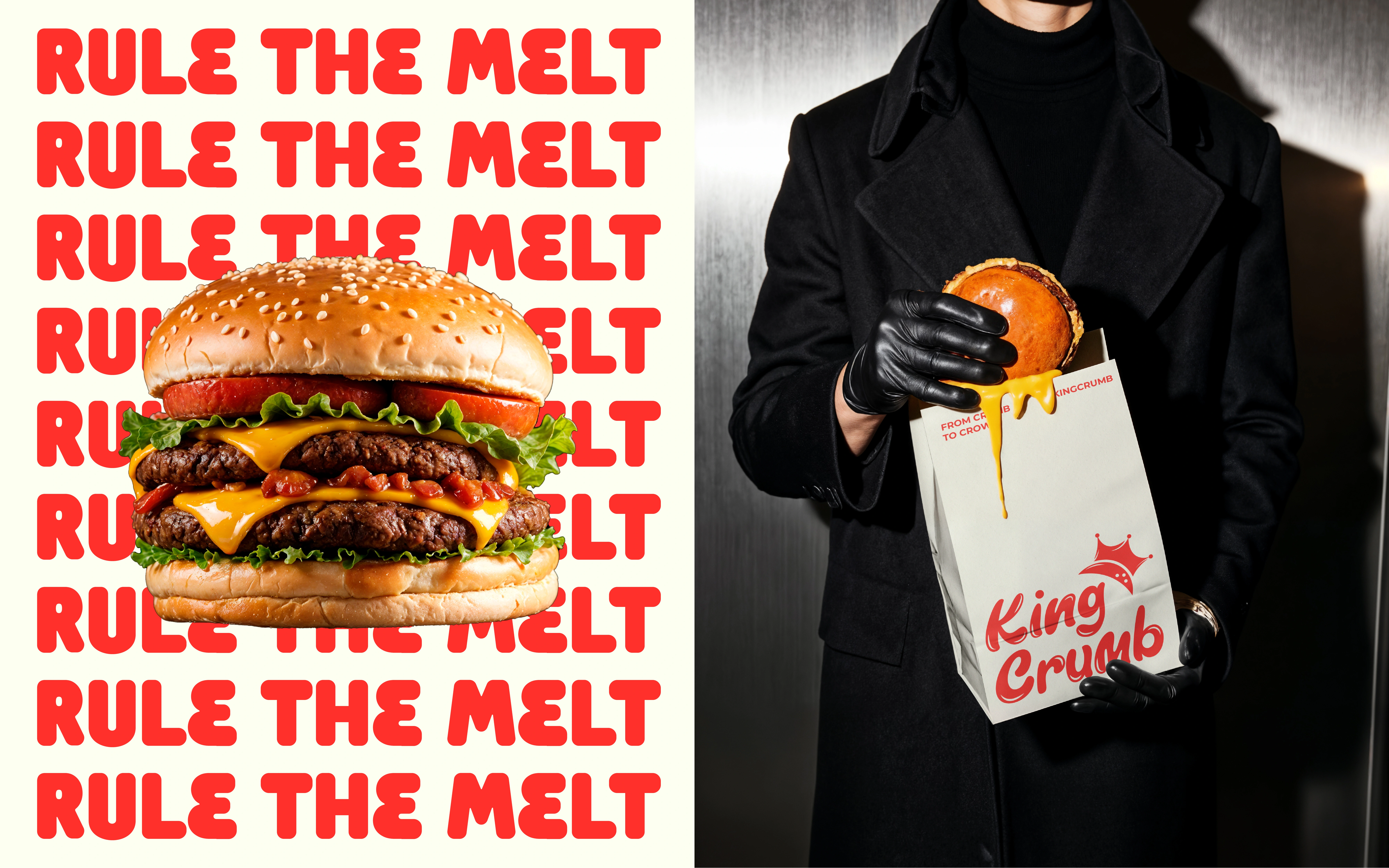
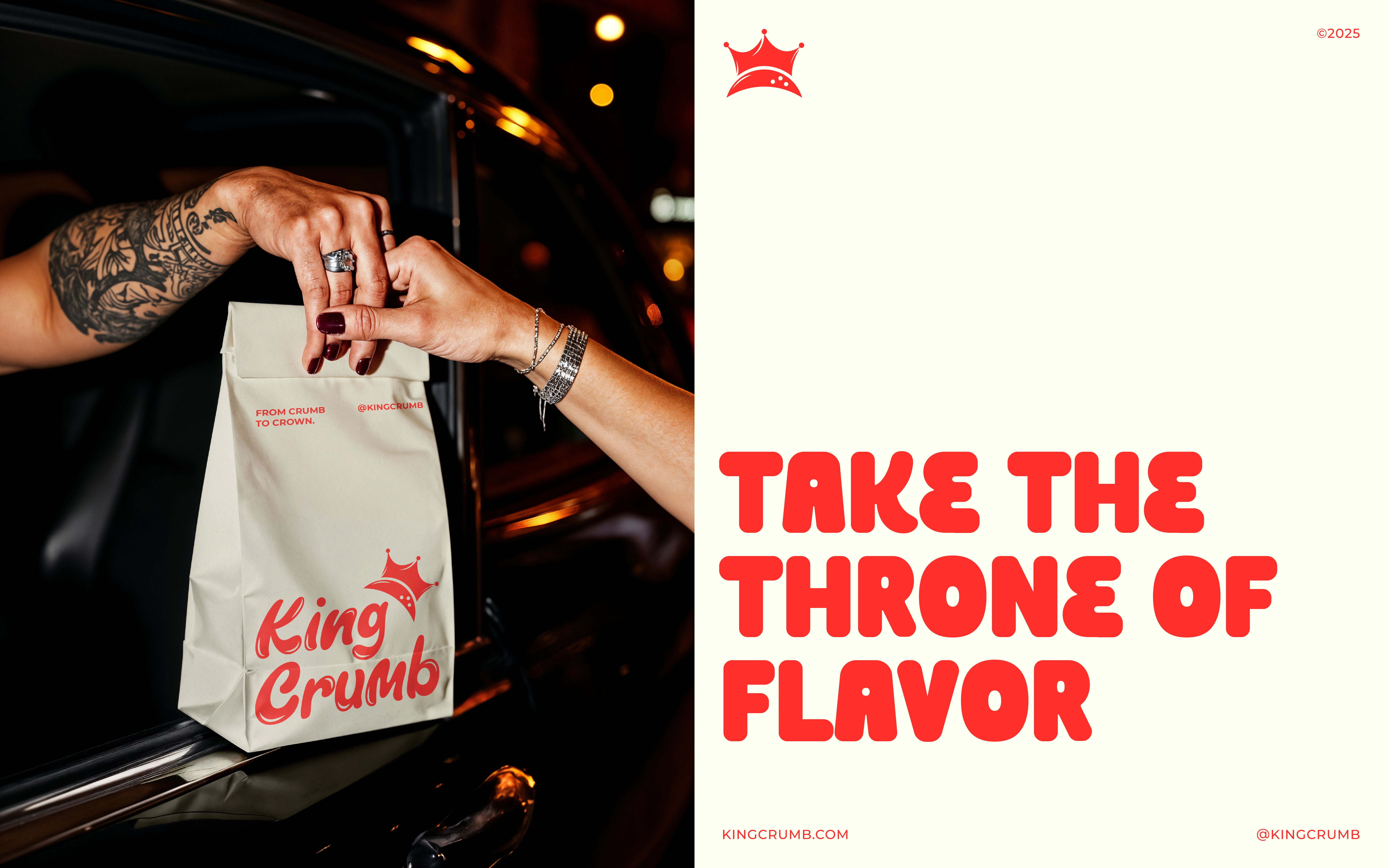
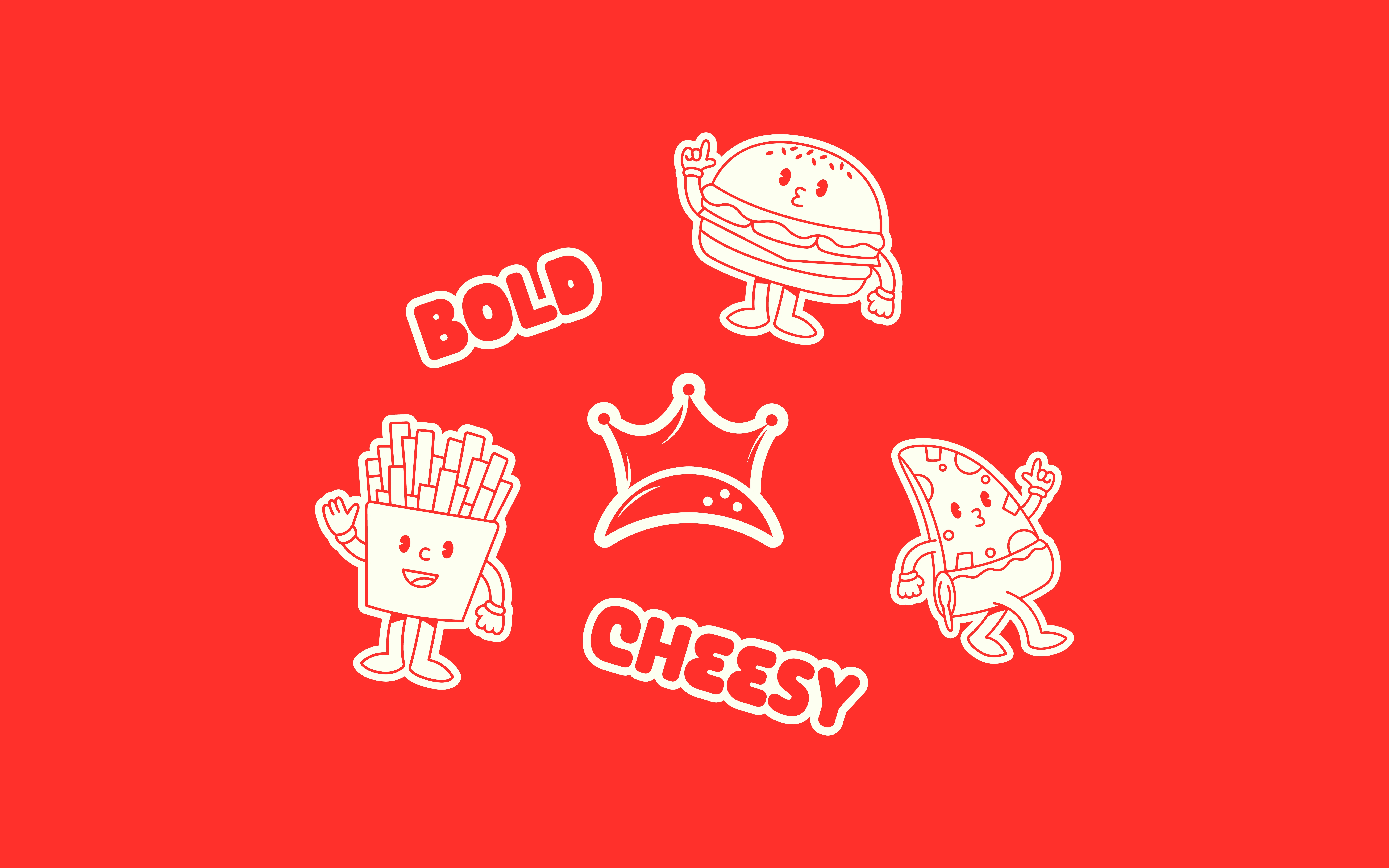
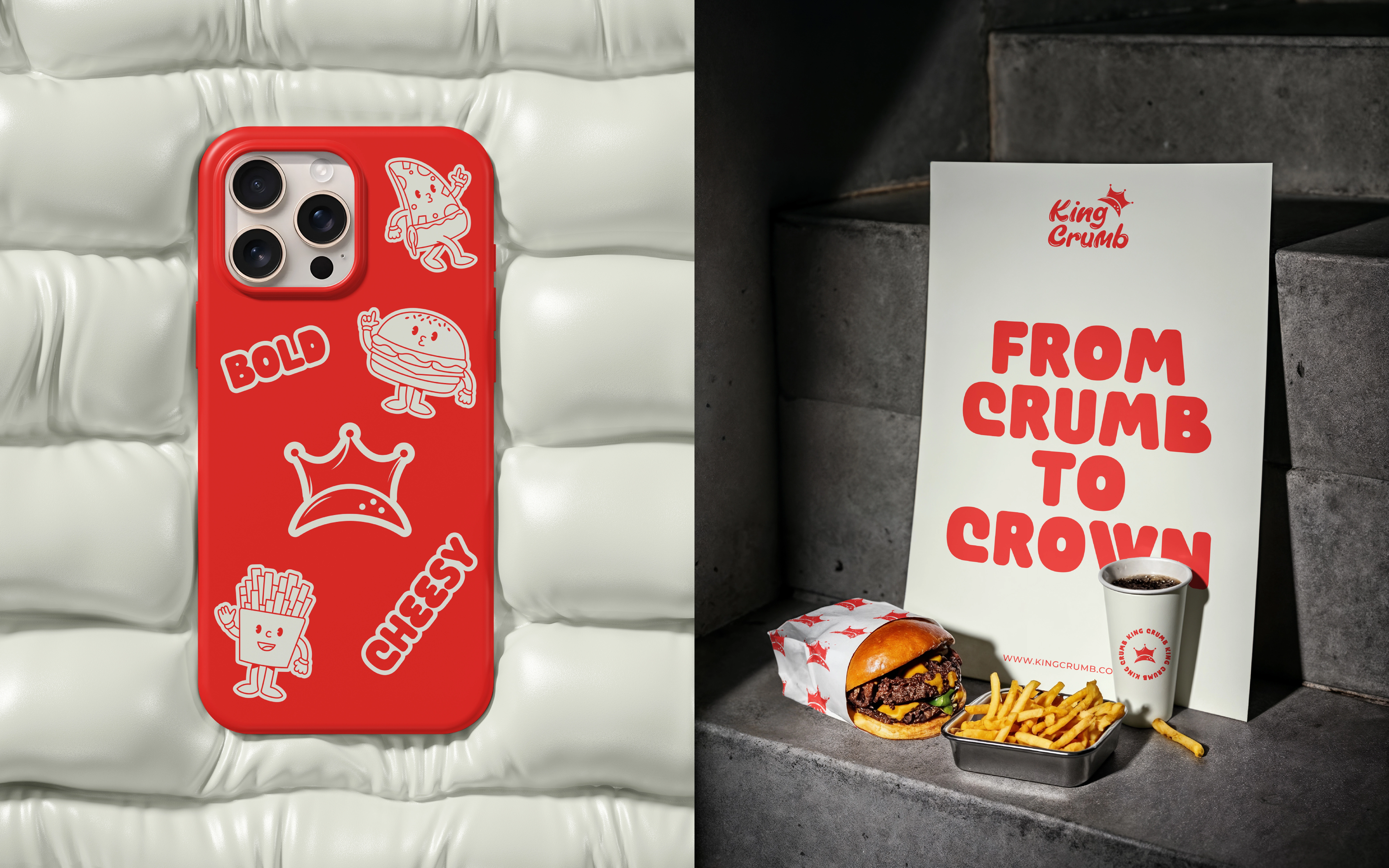
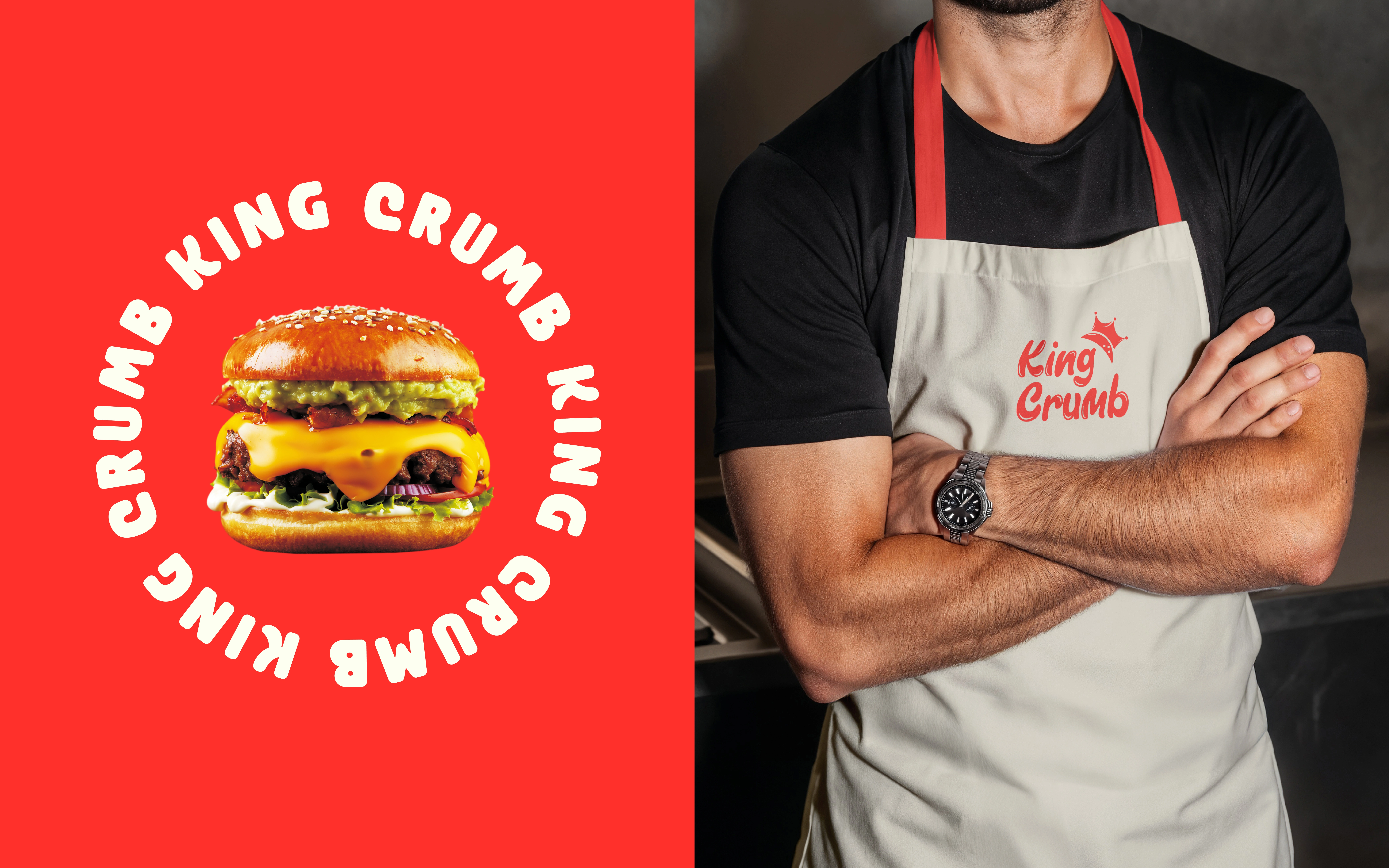
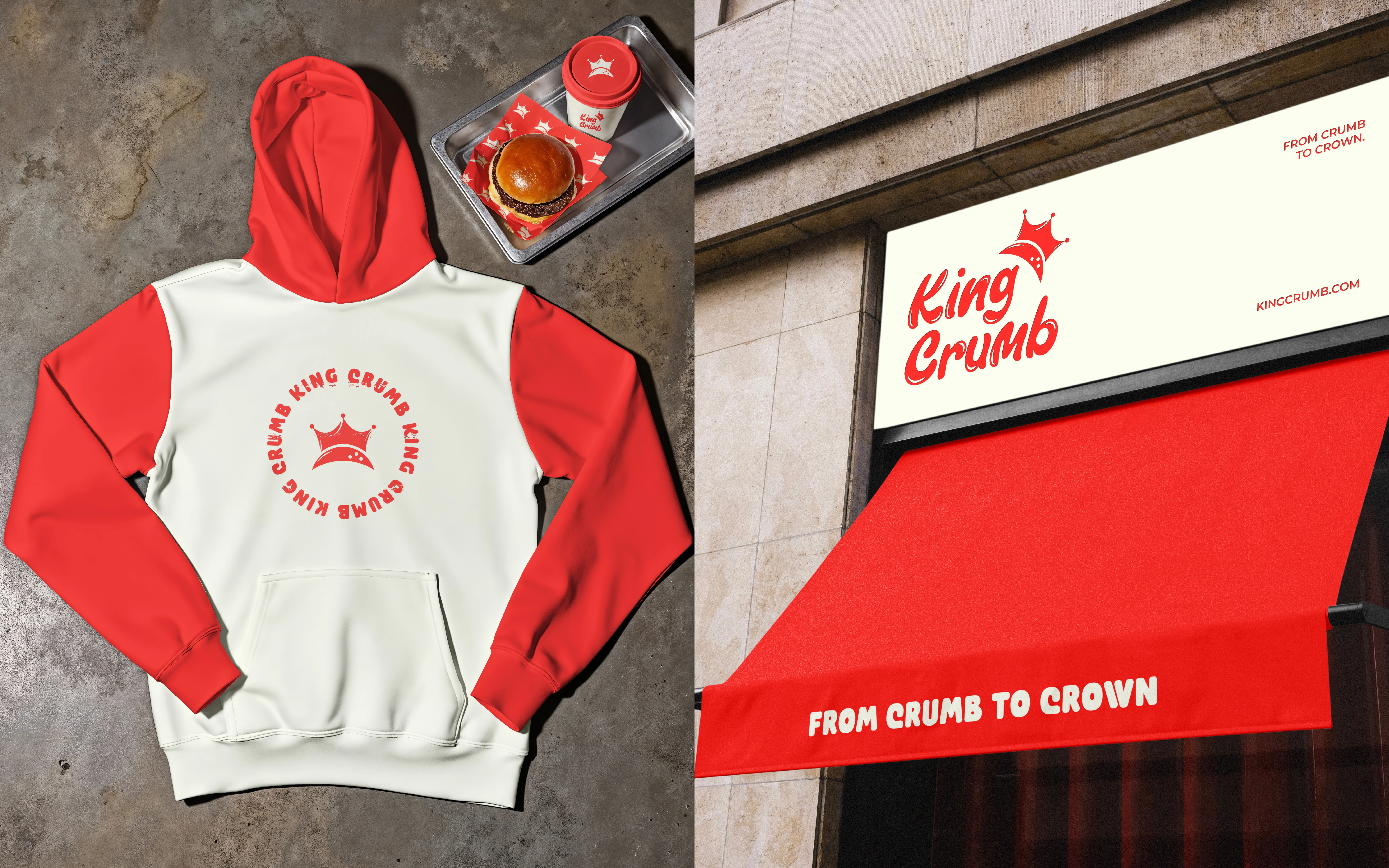
The expressive wordmark and crown device connect directly to the “King” part of the name. The phrase “From Crumb to Crown” extends that idea into the brand voice. These elements give the identity a shared narrative instead of leaving the logo, copy and packaging to work independently.
TYPOGRAPHY AND CHARACTER
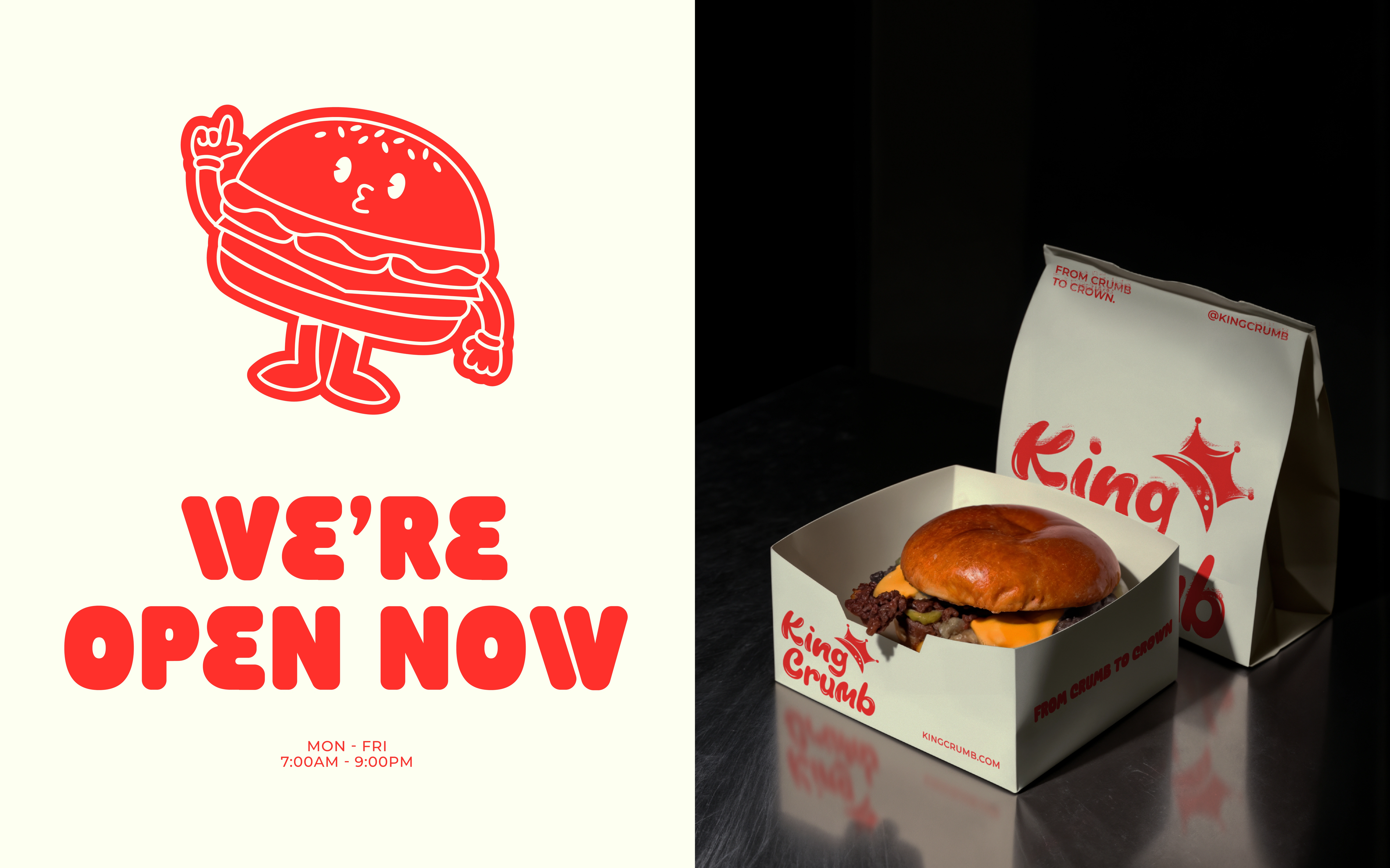
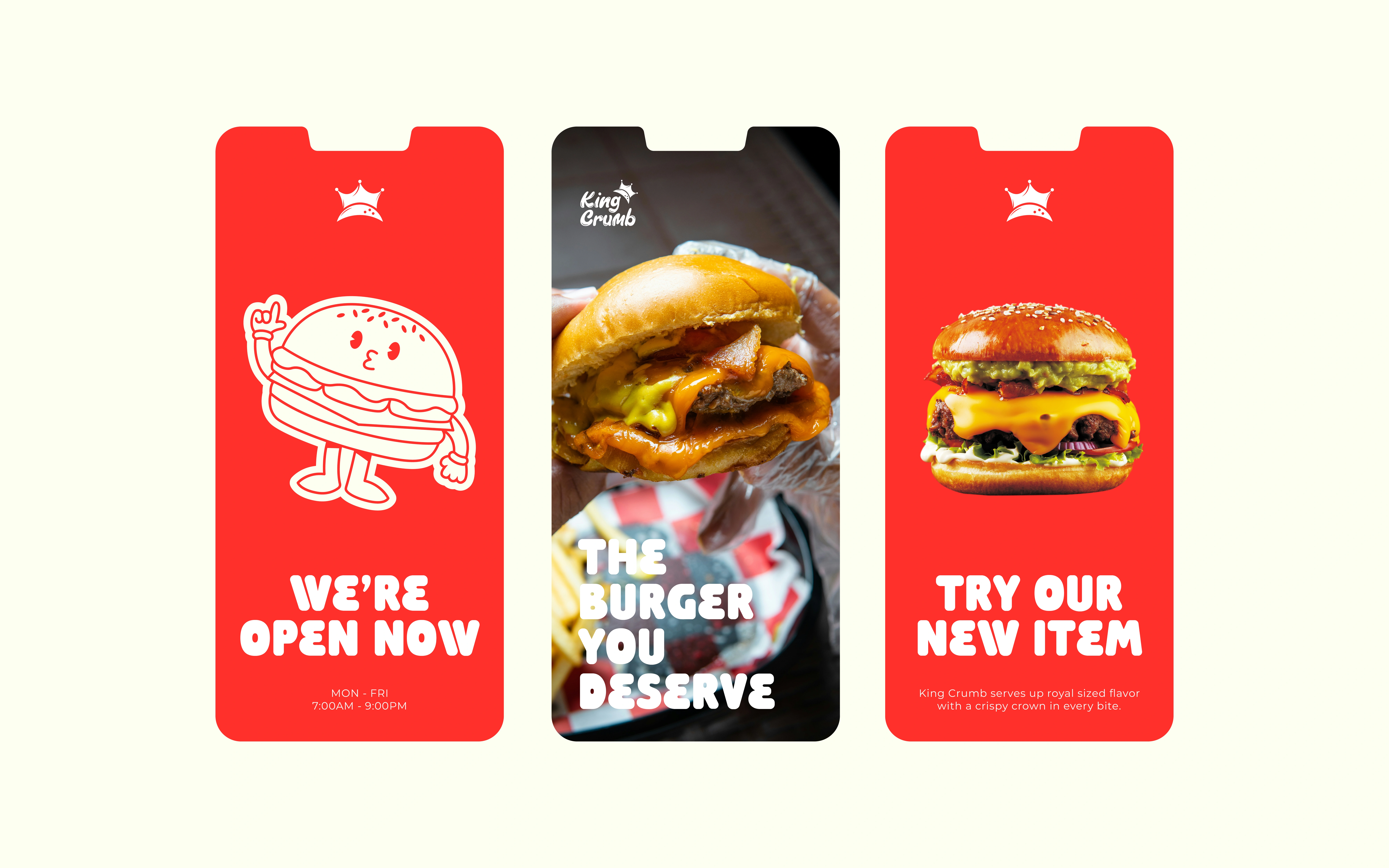
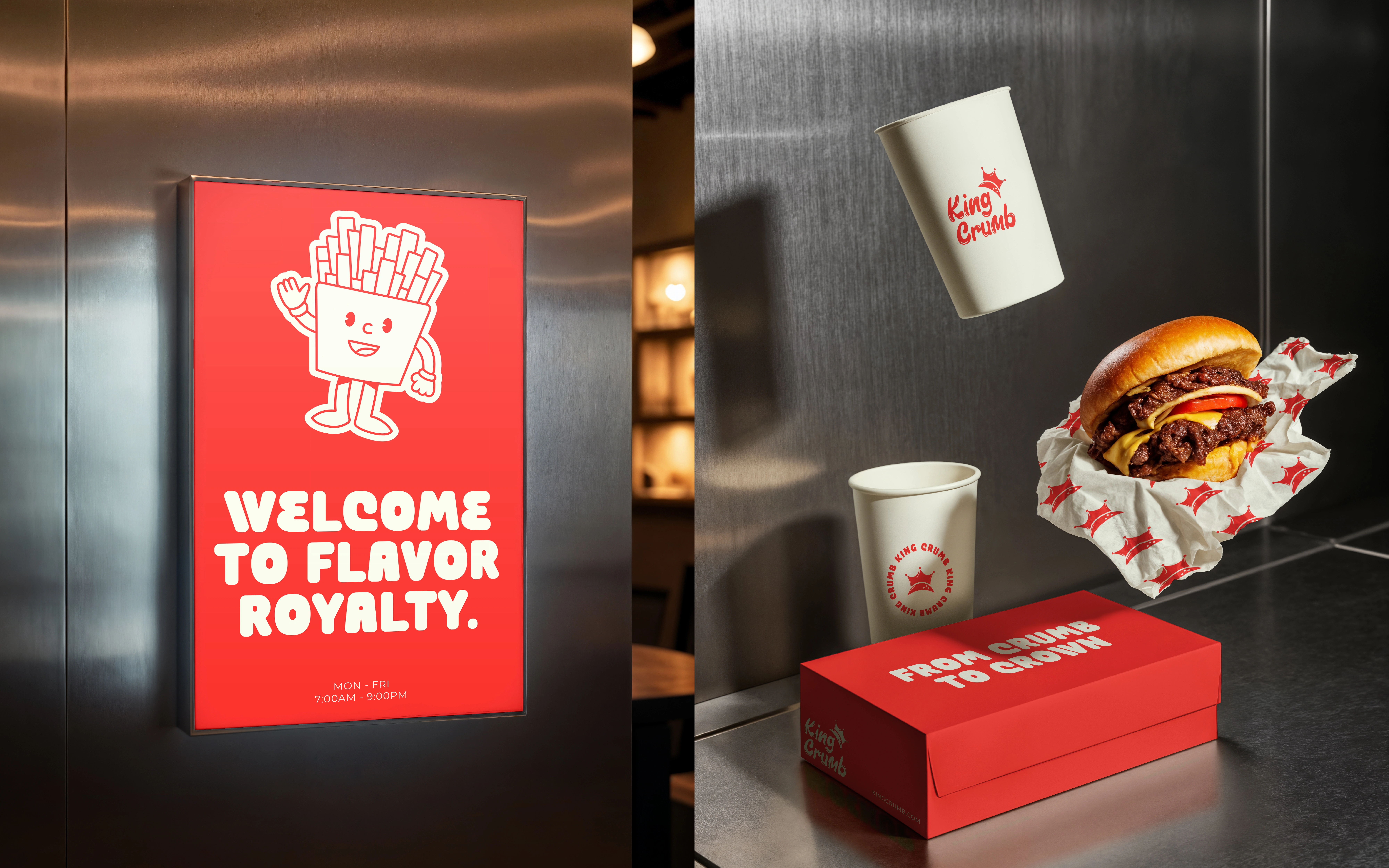
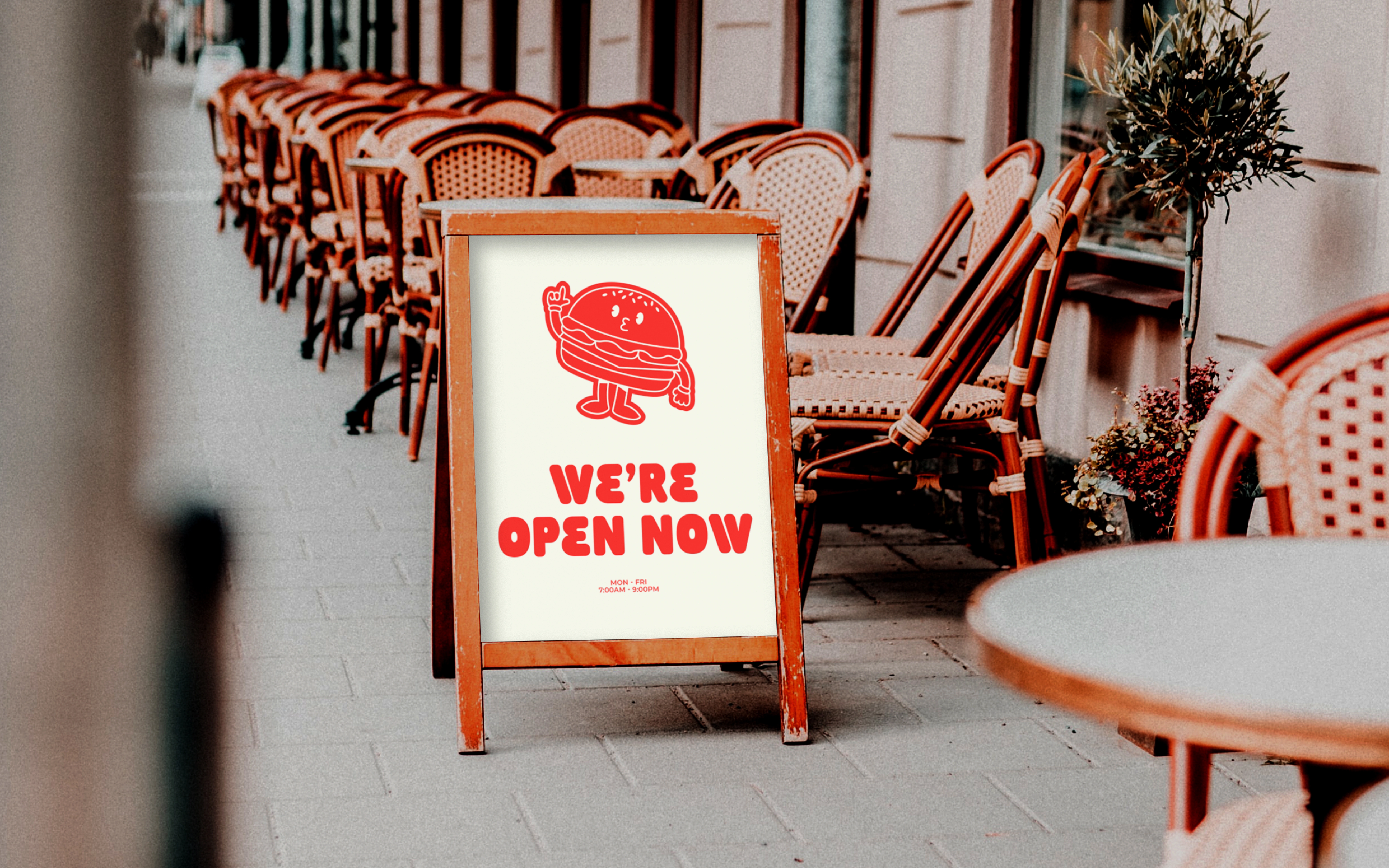
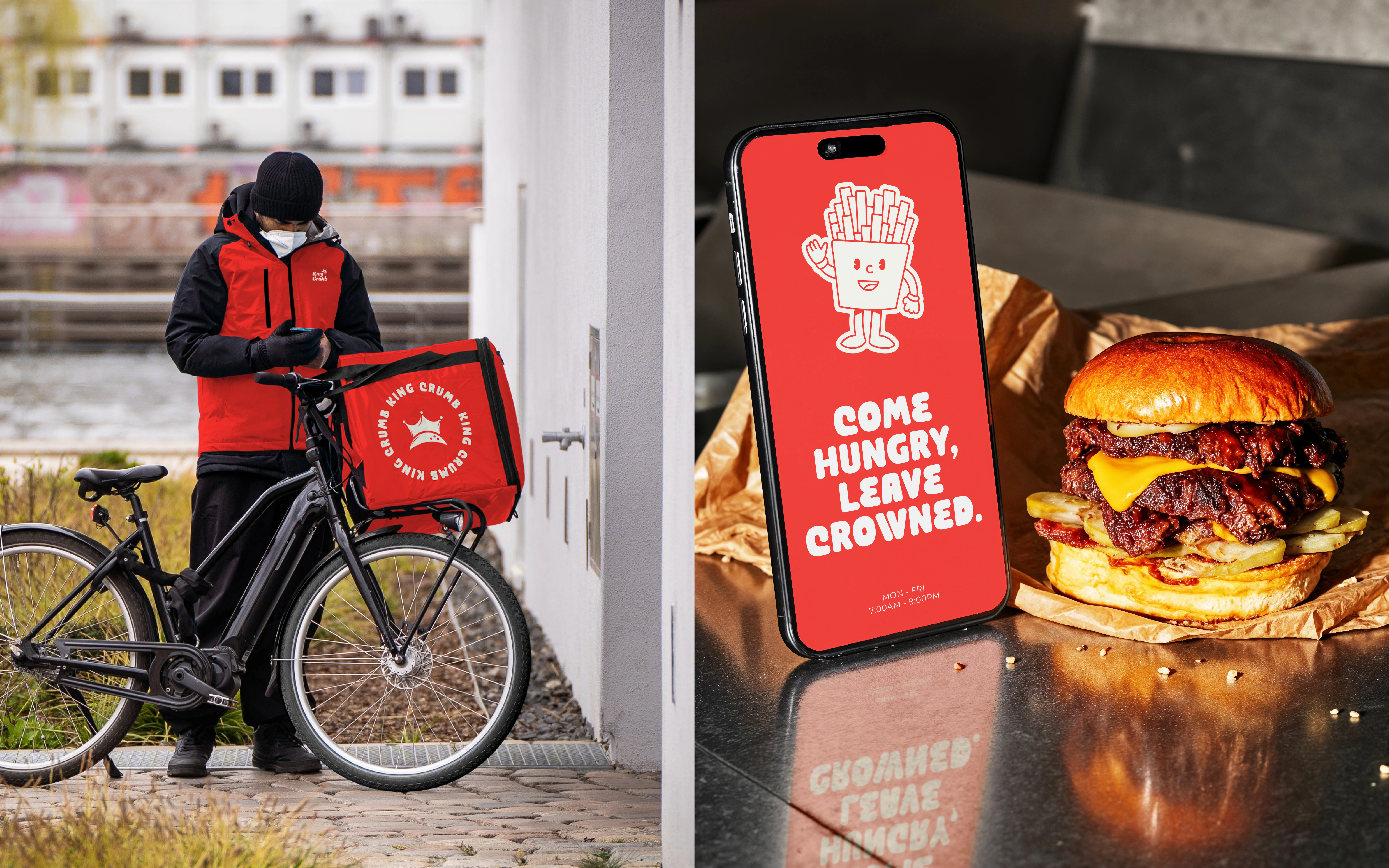
Rounded, substantial headline lettering makes short statements prominent, while the more expressive signature gives the name its own rhythm. The illustrated fries character adds another way to communicate the playful tone without repeating the complete logo. On the poster, the character and headline form a simple two-part hierarchy.
COLOUR ACROSS TOUCHPOINTS
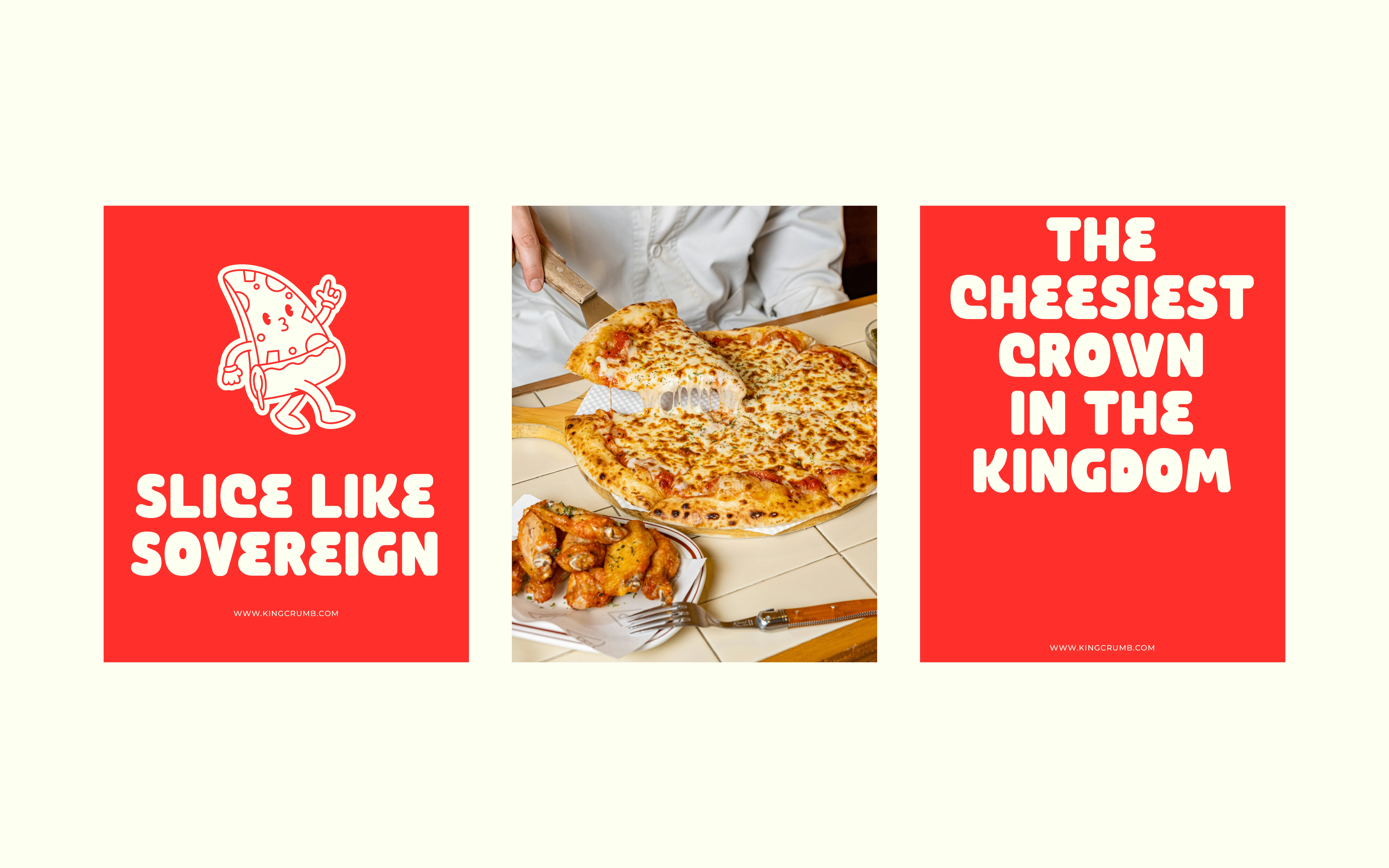
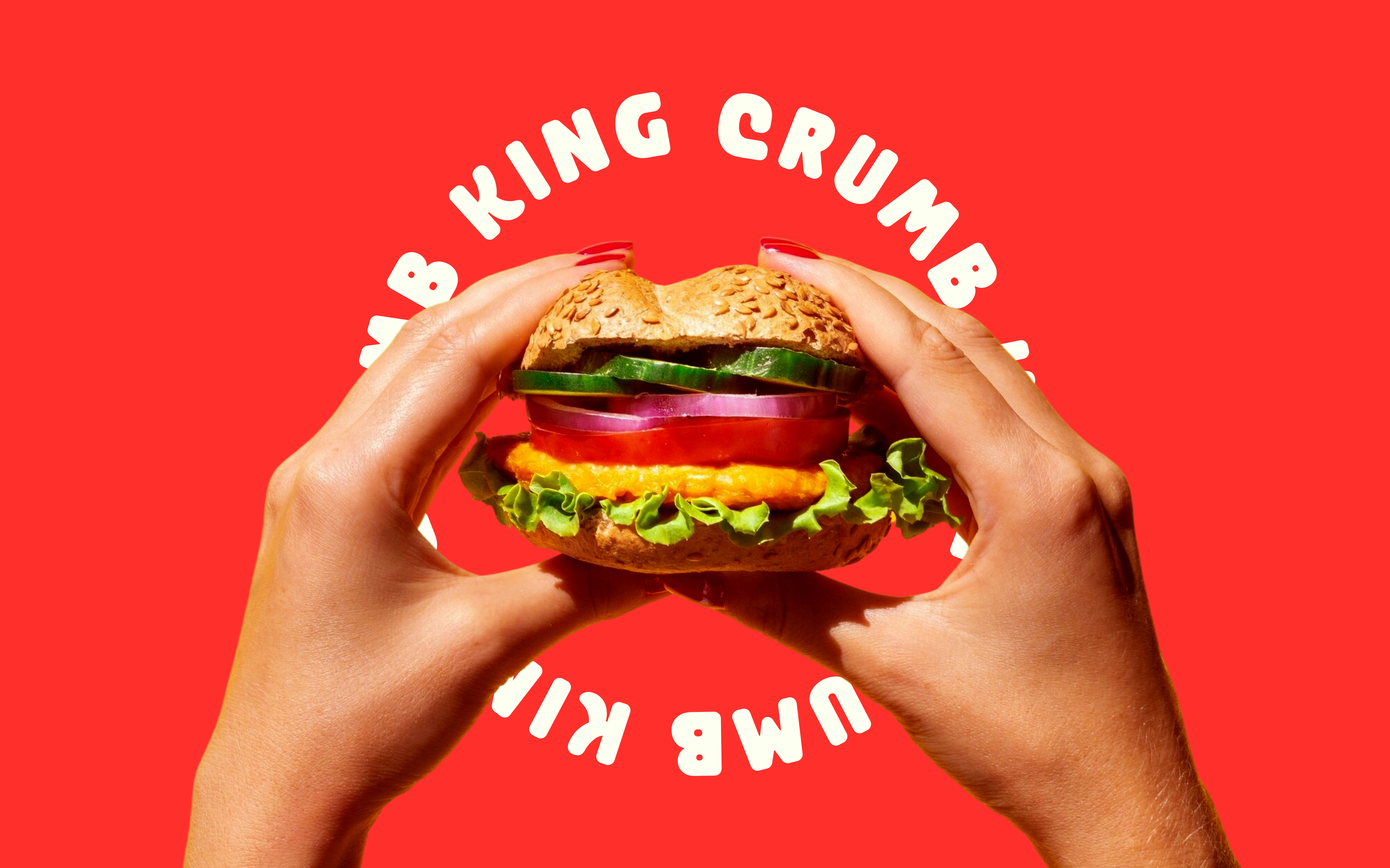
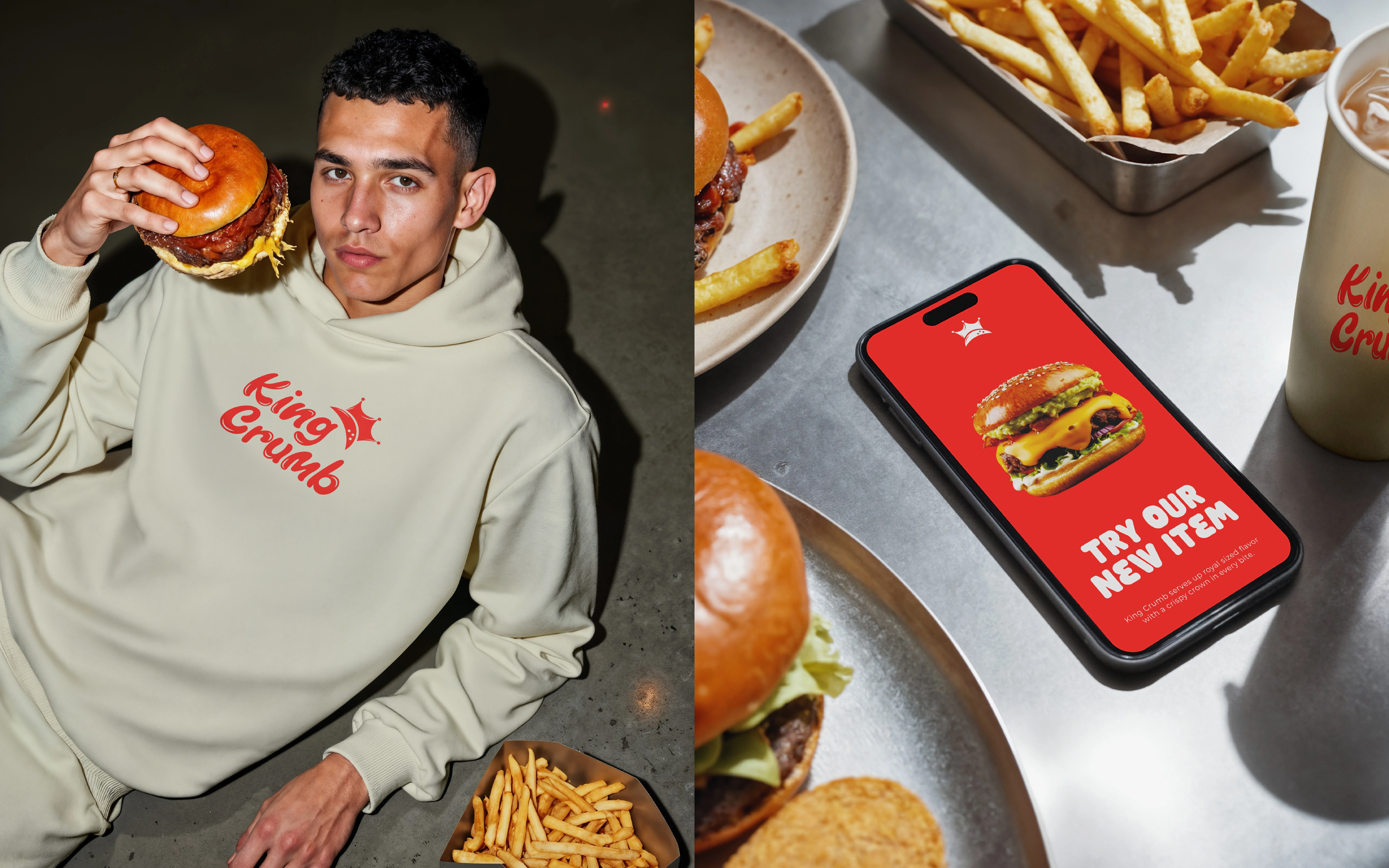
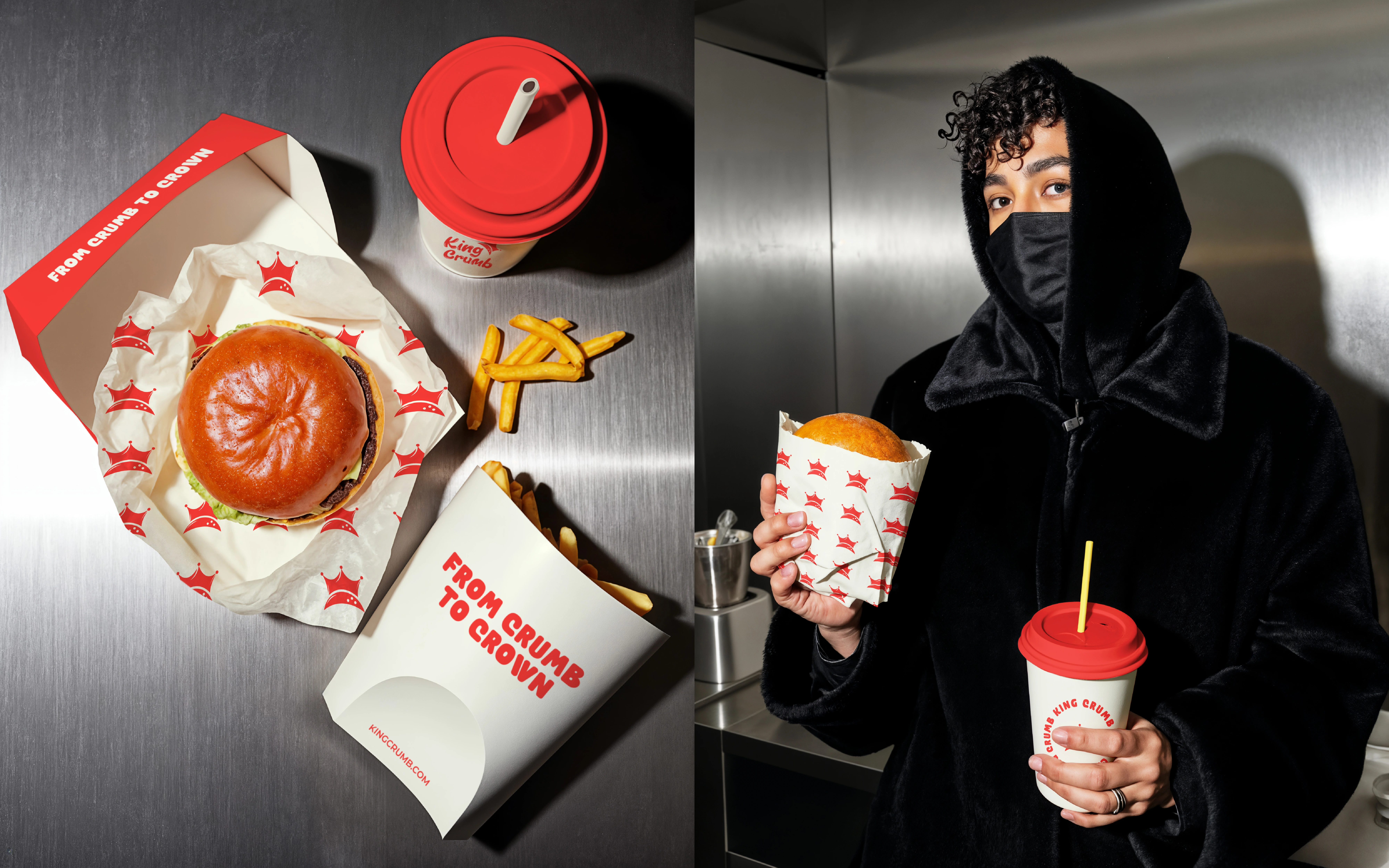
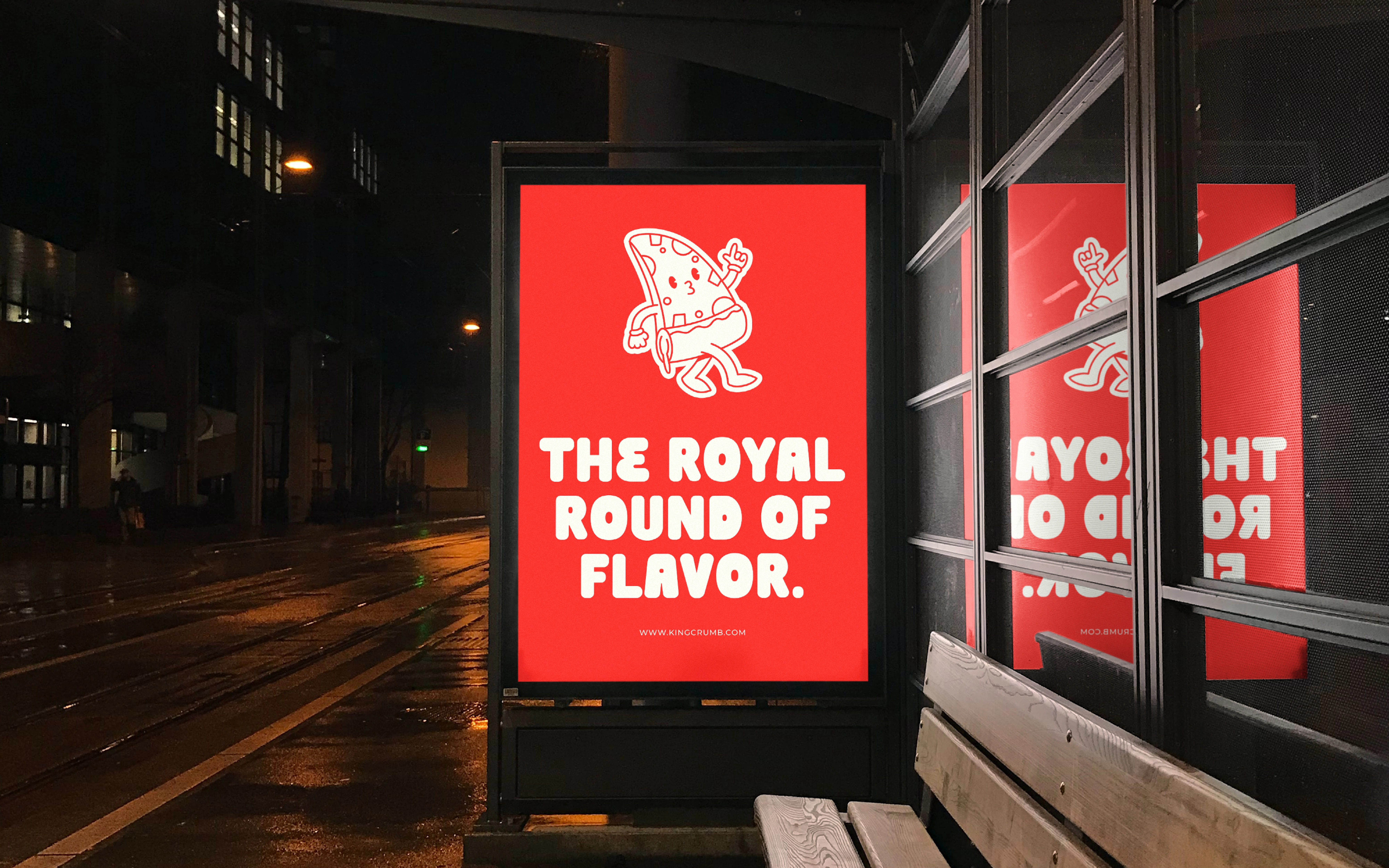
Red and cream are repeated through signage, cups, wrappers and boxes. Reversing their roles changes the emphasis without changing the identity: a red poster creates a strong colour field, while a light cup gives the smaller logo breathing room.
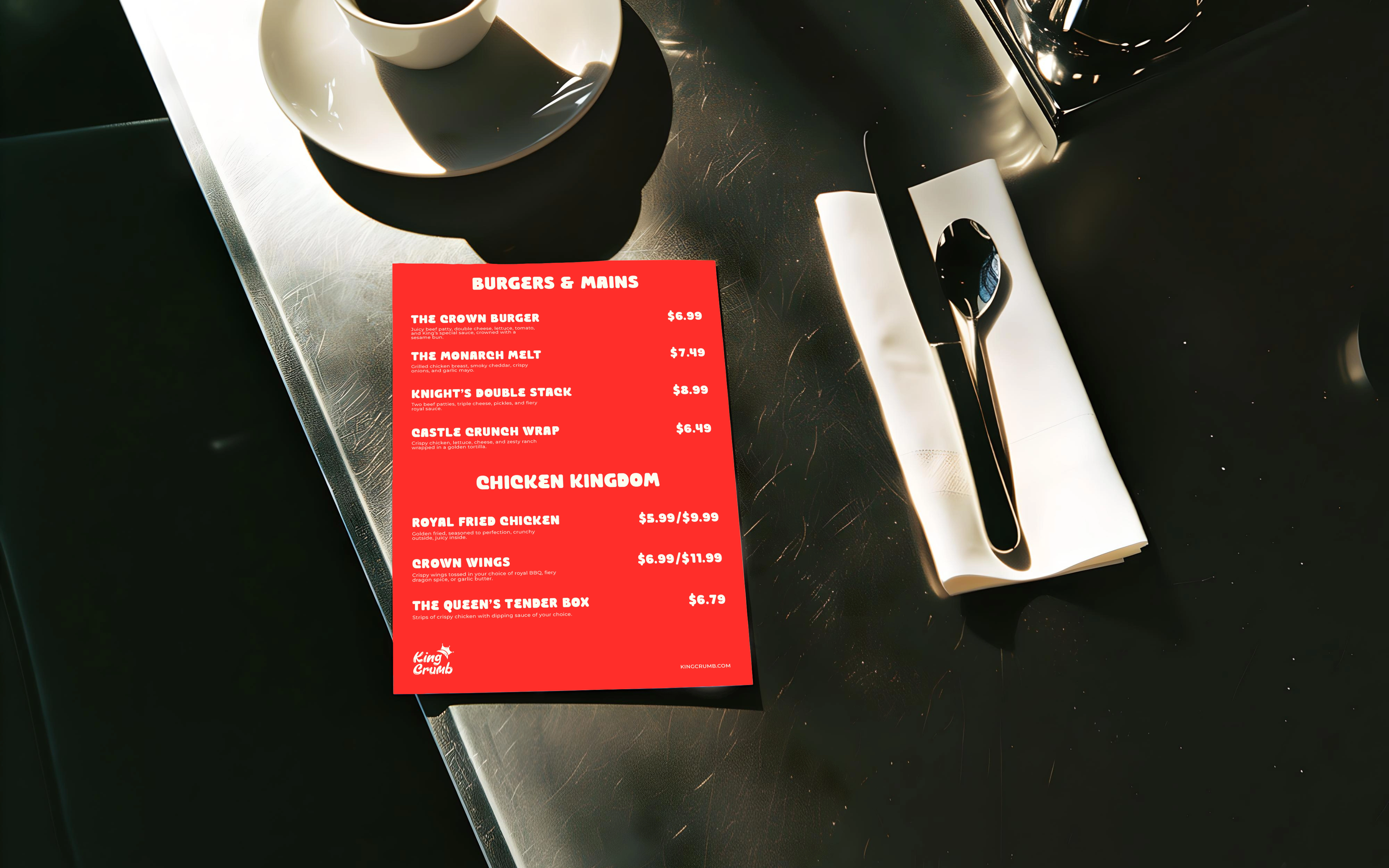
The mockups demonstrate how a shared palette, lettering style and illustration can connect the takeaway experience with the surrounding brand communication.
The outcome is a fast-food identity concept with a connected verbal and visual system. The applications illustrate a proposed brand experience rather than a live restaurant rollout or measured customer response.
DESIGNED BY - FIEONART © 2026
Like this project
Posted Oct 16, 2026
A fast-food concept connecting expressive lettering, a crown device and playful illustration across red-and-cream packaging and signage.