Orbio — Logo & Brand Guidelines (Concept)

Shakil Hosen
















ORBIO — A COMPACT SYMBOL ACROSS DIFFERENT SCALES
Orbio is a self-initiated logo and brand-guidelines concept. The central design challenge is continuity: giving a small printed signature and a large architectural sign the same recognisable visual character.
ROUNDED FORMS AND NEGATIVE SPACE
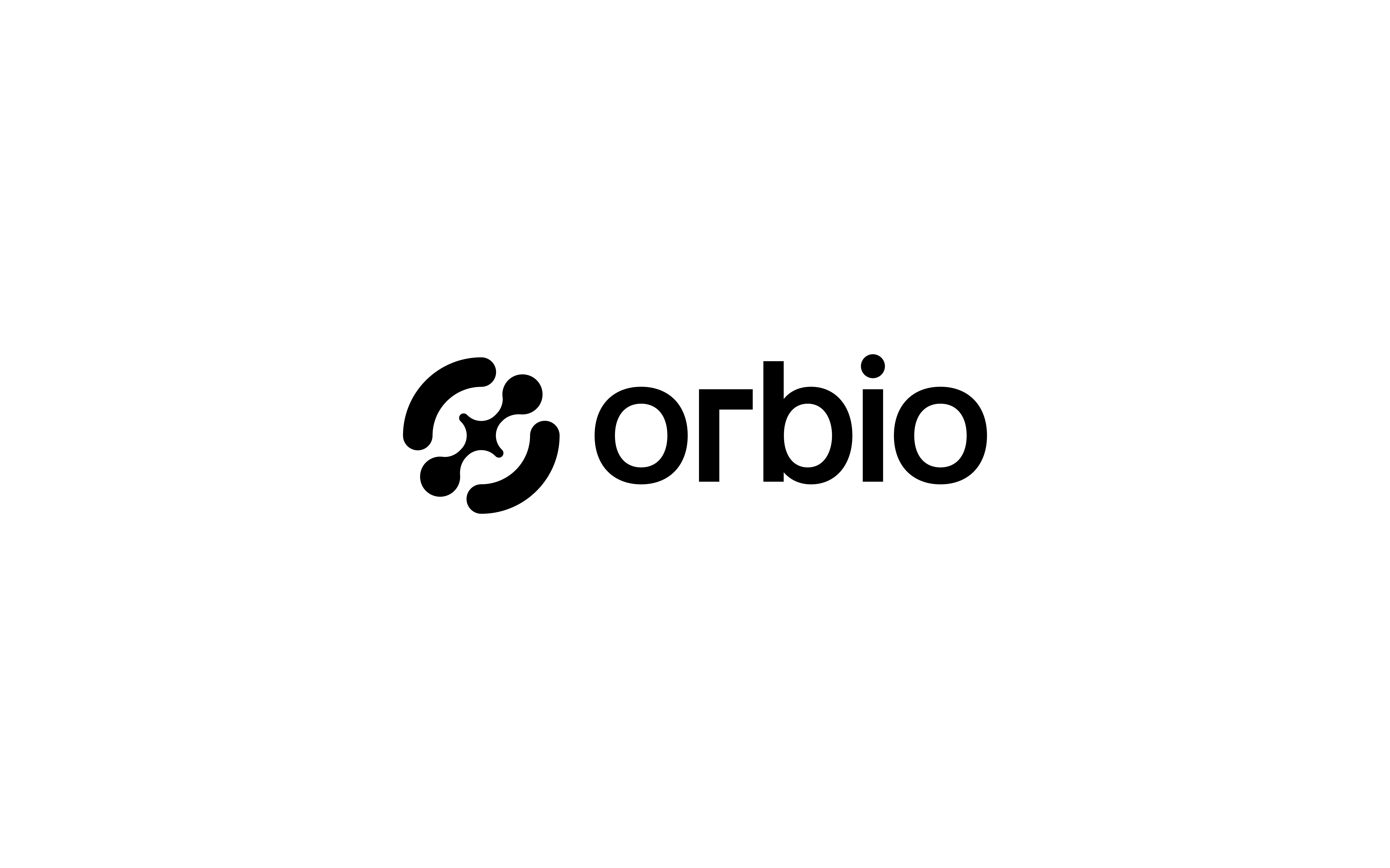
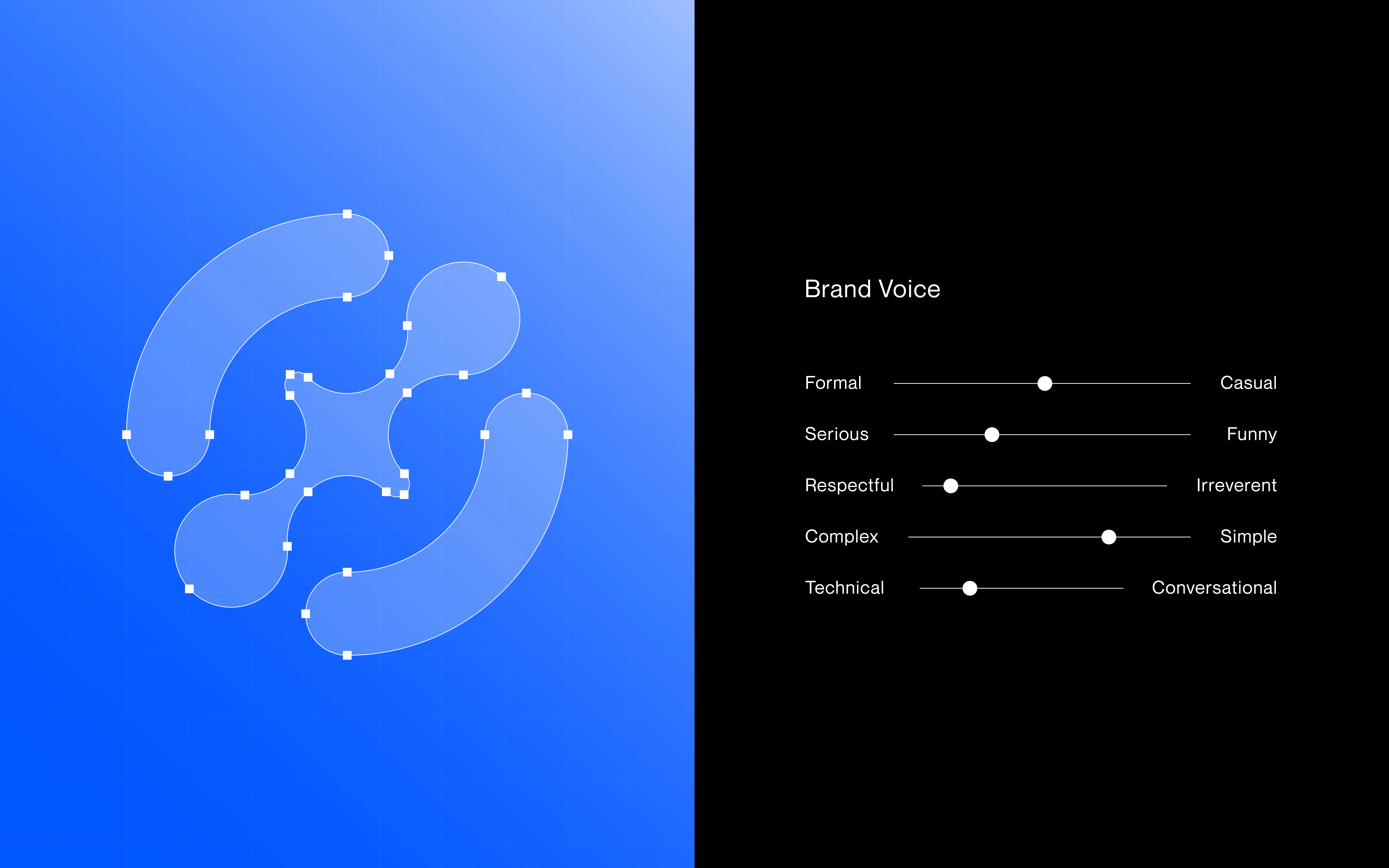
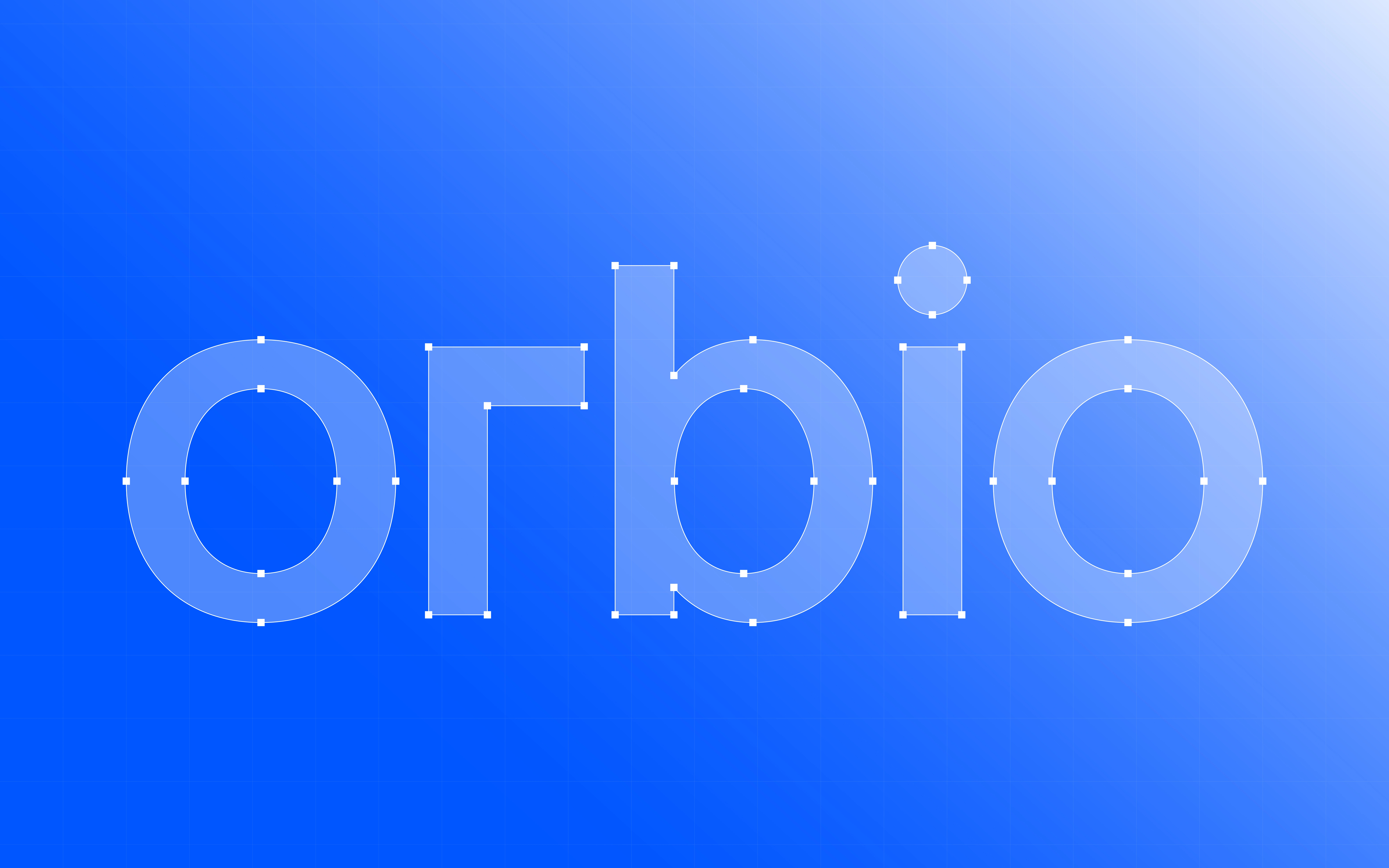
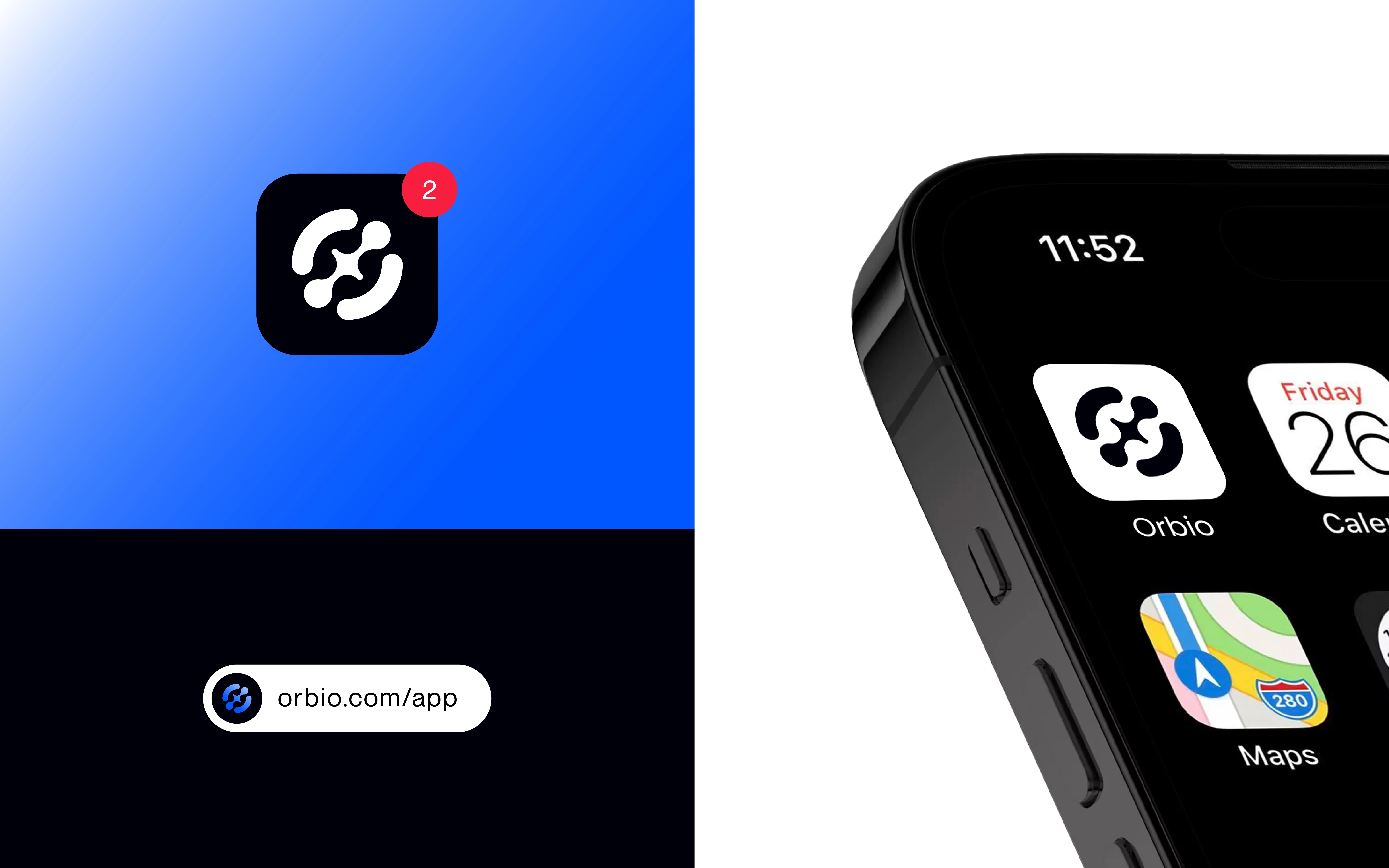
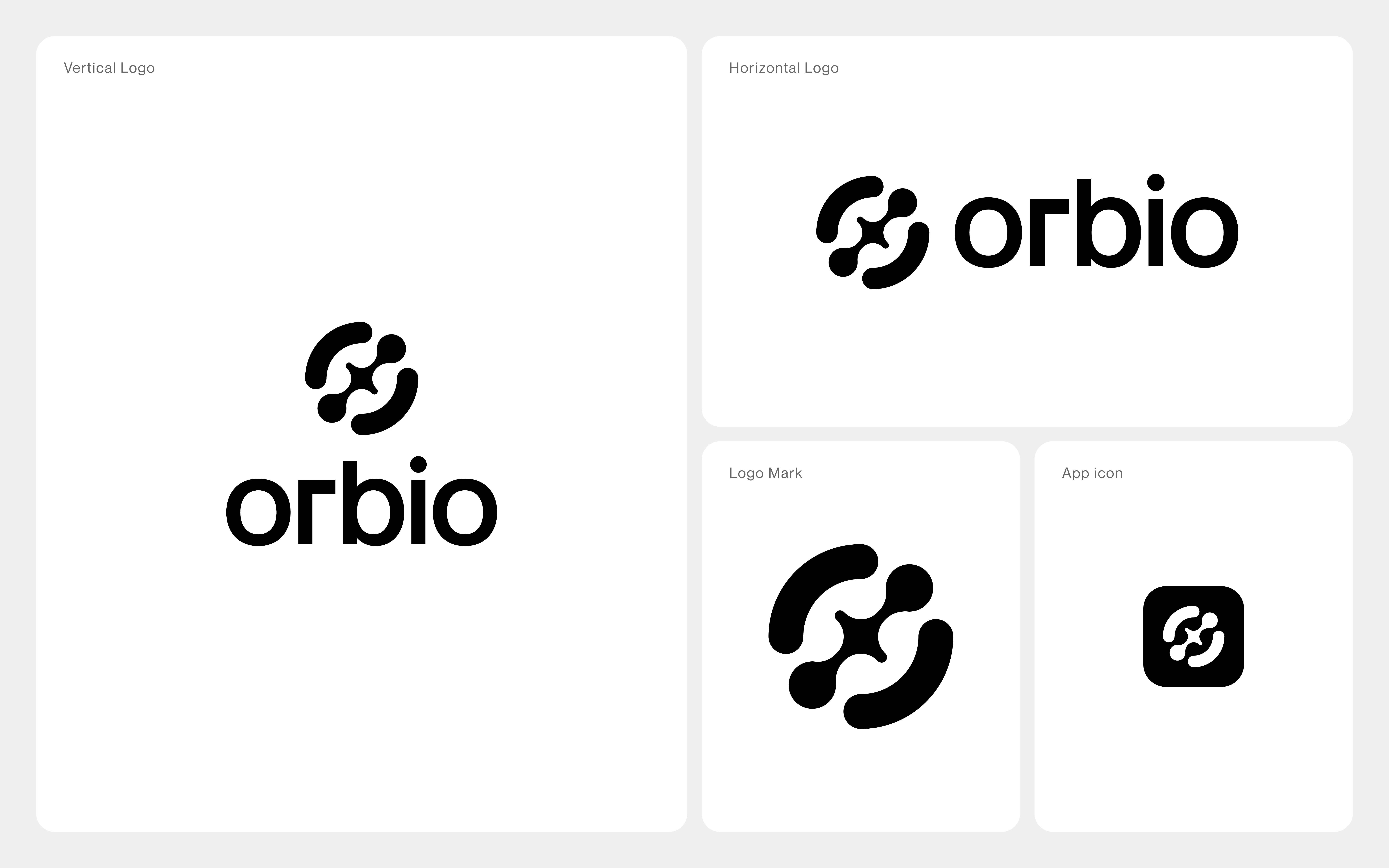
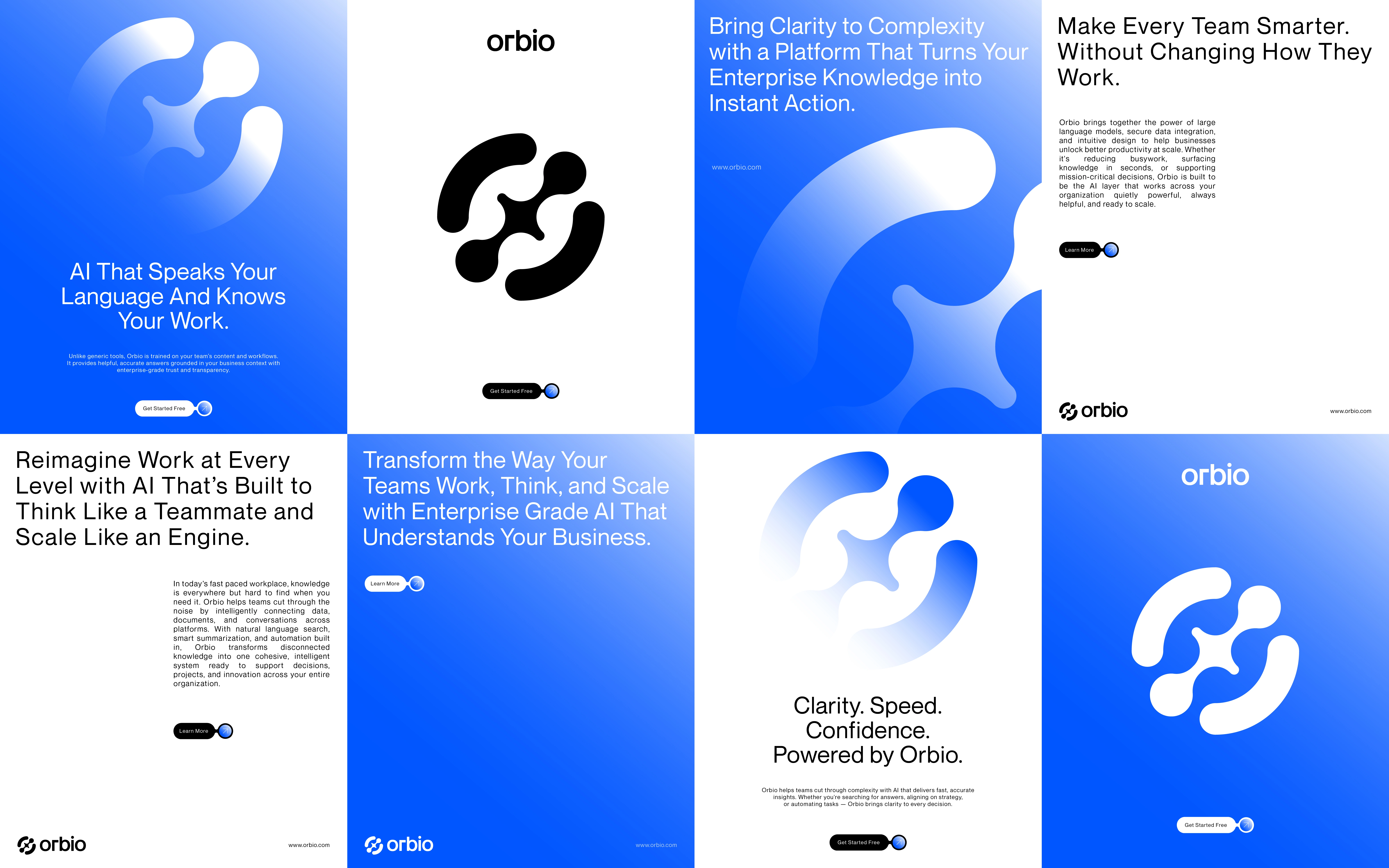
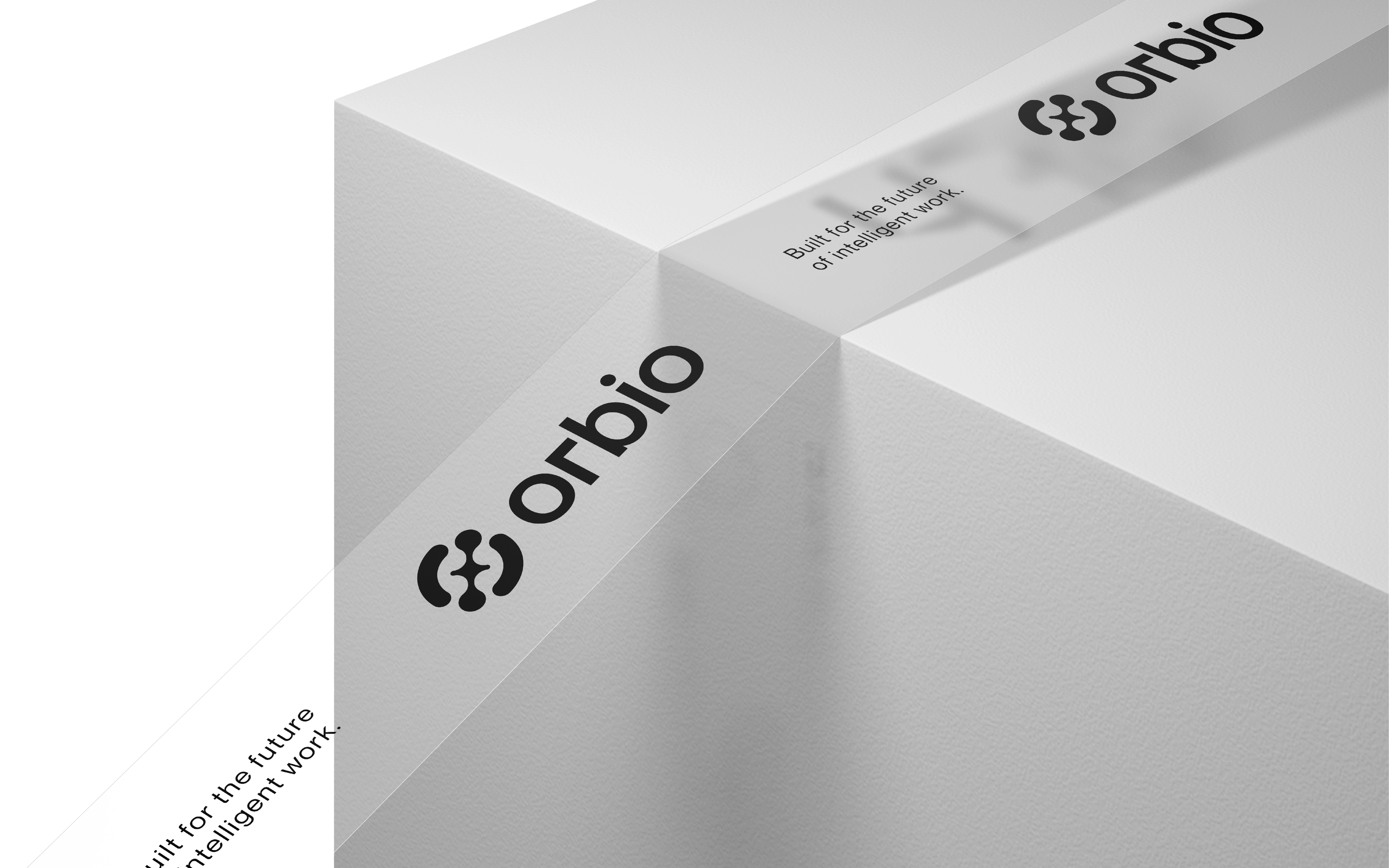
The emblem uses rounded, separated elements arranged around an open centre. Its construction creates a compact silhouette without filling the whole shape. Beside it, a lowercase wordmark gives the name a calm horizontal presence. The combination lets the emblem function as a short signature while the full lockup introduces the brand.
CONTRAST BEFORE DECORATION
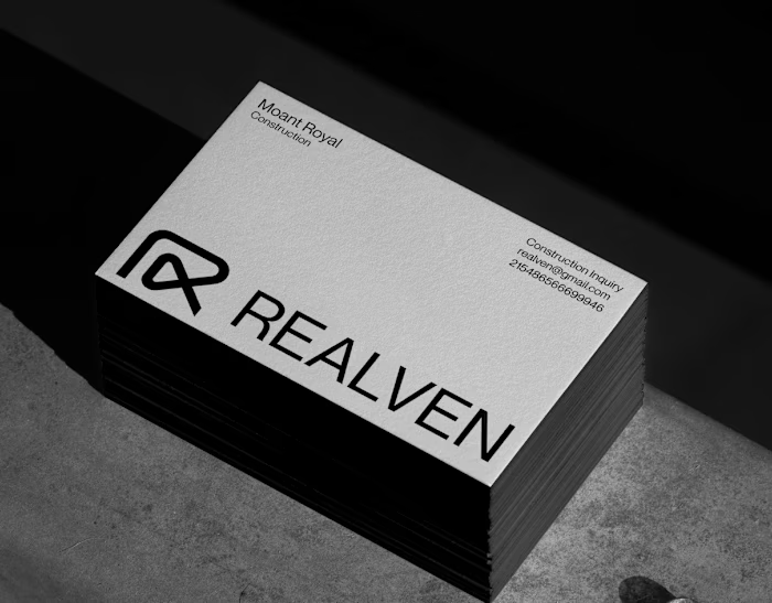
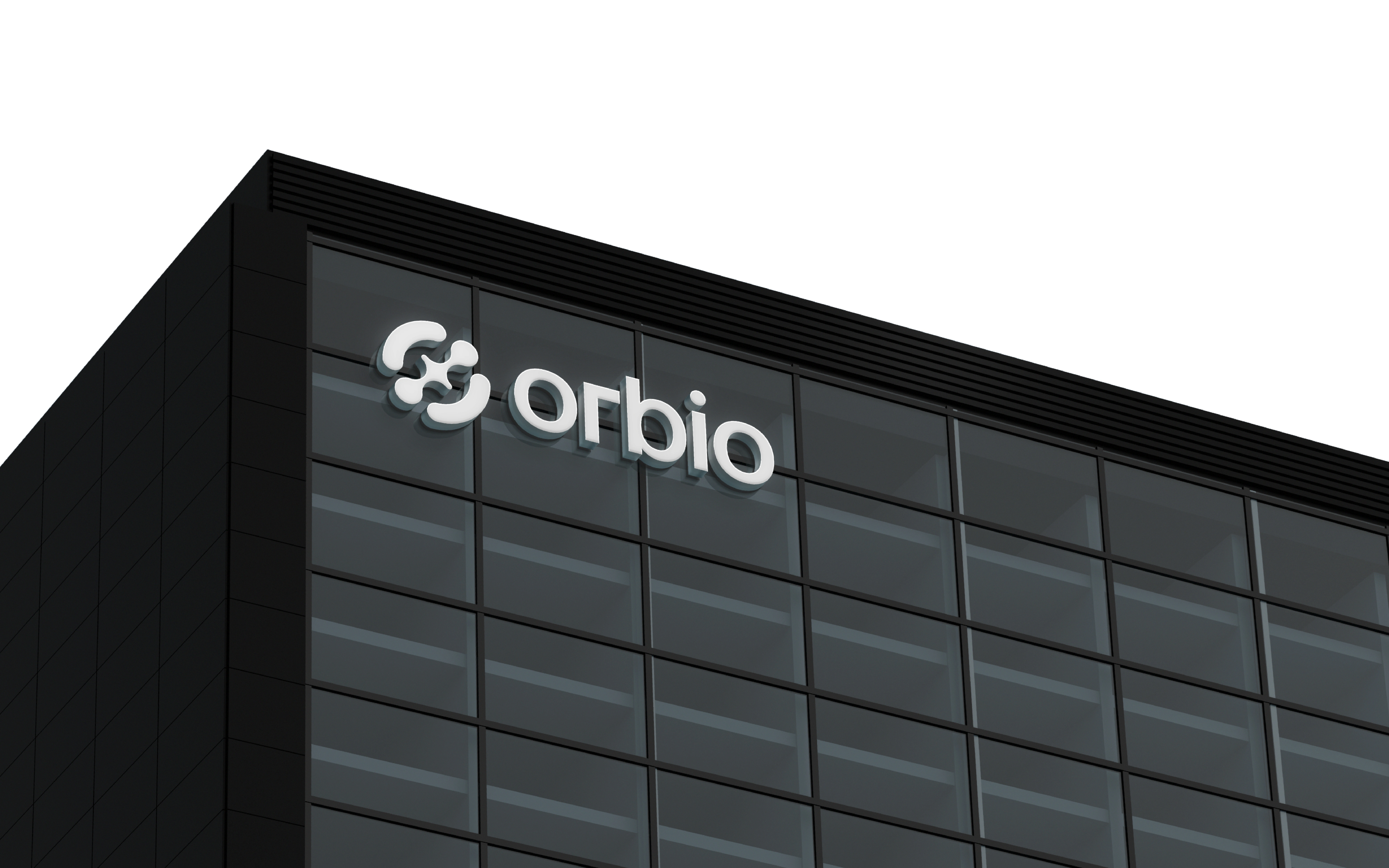
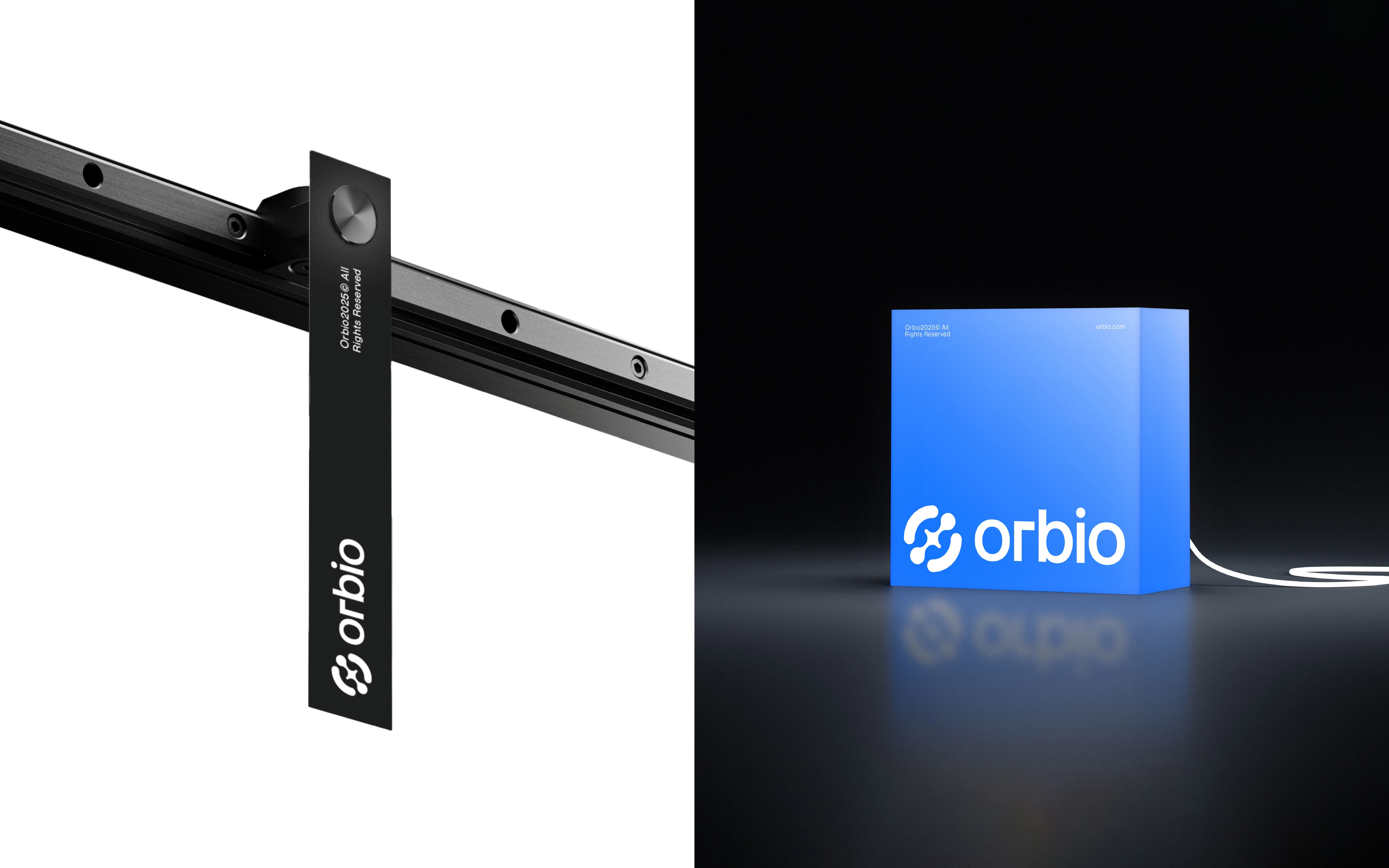
The building sign uses a light mark against dark glazing, while the business card repeats the same light-on-dark relationship at a much smaller size. This visual comparison illustrates why a simple monochrome treatment matters: recognition does not have to depend on an elaborate background.
A FLEXIBLE PRESENTATION SYSTEM
Blue-violet linear textures add movement and depth around the identity, but the card itself remains restrained. Separating expressive backgrounds from essential contact information gives each a different role. The concept therefore explores both brand character and practical information hierarchy.
The outcome is an identity presentation connecting symbol, wordmark and application—not a claim of an implemented company rebrand.
For a branding project, message Shakil Hosen on Contra with your business overview, scope and preferred timeline.
Like this project
Posted Oct 16, 2026
A concept identity exploring rounded geometry, negative space and light-on-dark contrast from compact stationery to architectural signage.