CAFFORA — Logo & Brand Identity (Concept)

Shakil Hosen


Visual Brand Identity & Packaging
© September 2025
CAFFORA — A CAFÉ IDENTITY BUILT FOR EVERYDAY RITUALS
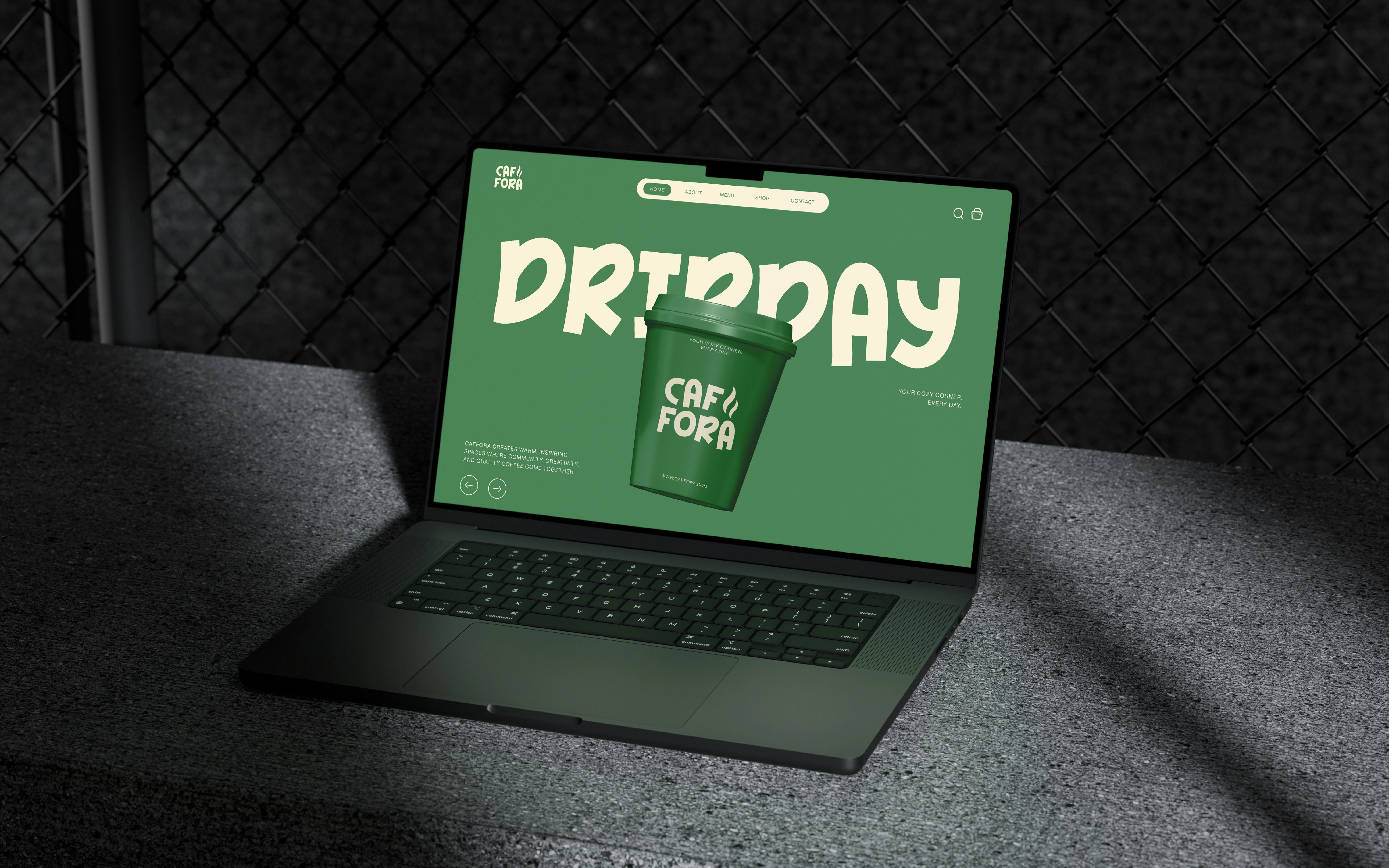
CAFFORA is a self-initiated lifestyle-café branding and packaging concept. Its brief centres on comfort and connection. The design challenge is to express that atmosphere through a small set of recognisable assets that work on takeaway cups as well as broader brand imagery.
A SIMPLE MOTIF WITH ROOM TO BREATHE
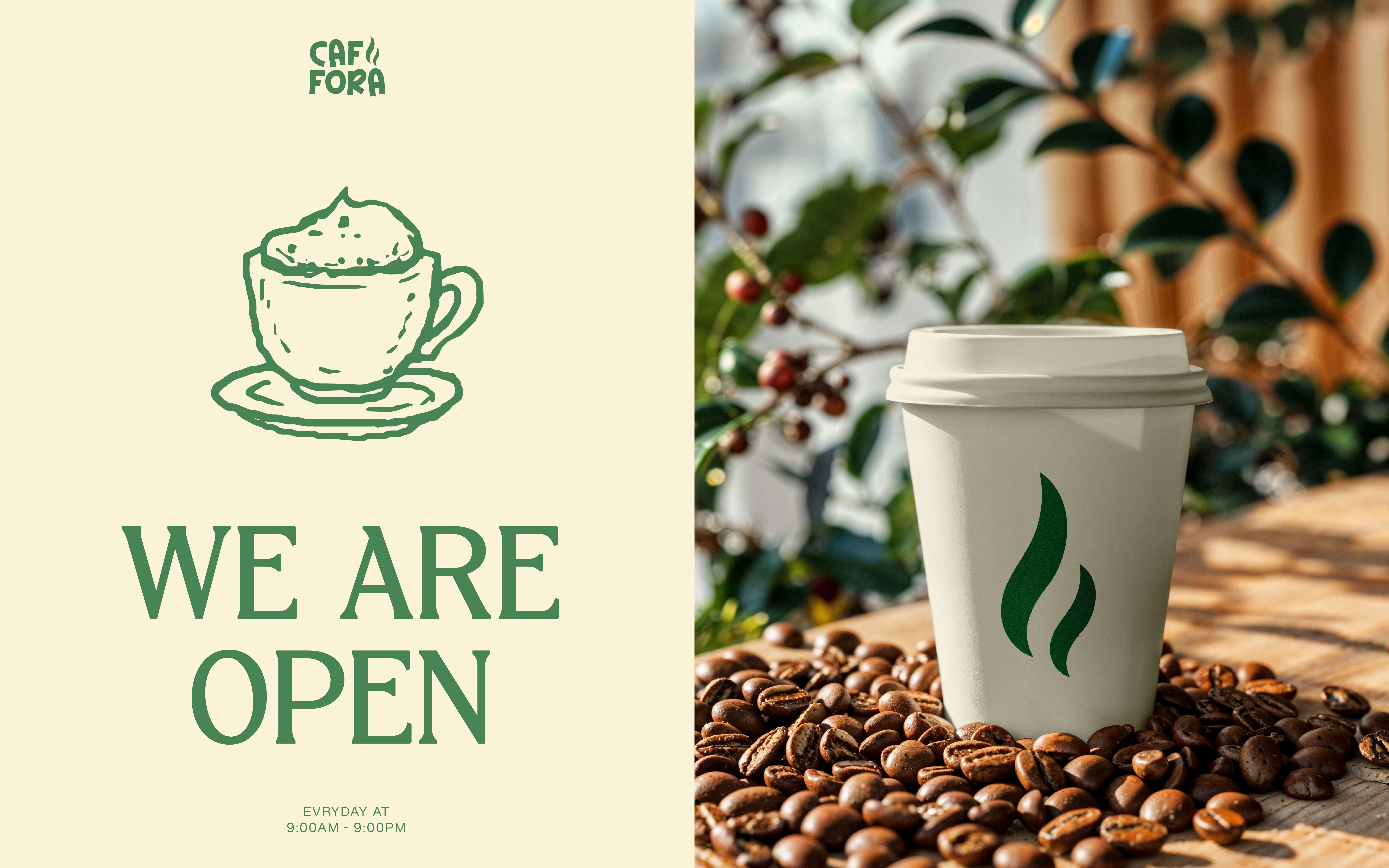
Two flowing, tapered shapes form a steam-like emblem. Their upward rhythm gives the identity a direct visual connection to a warm drink without drawing a literal cup. The motif can appear on its own at a large scale, creating a different emphasis from the full name.
TYPE THAT WORKS ON A CUP
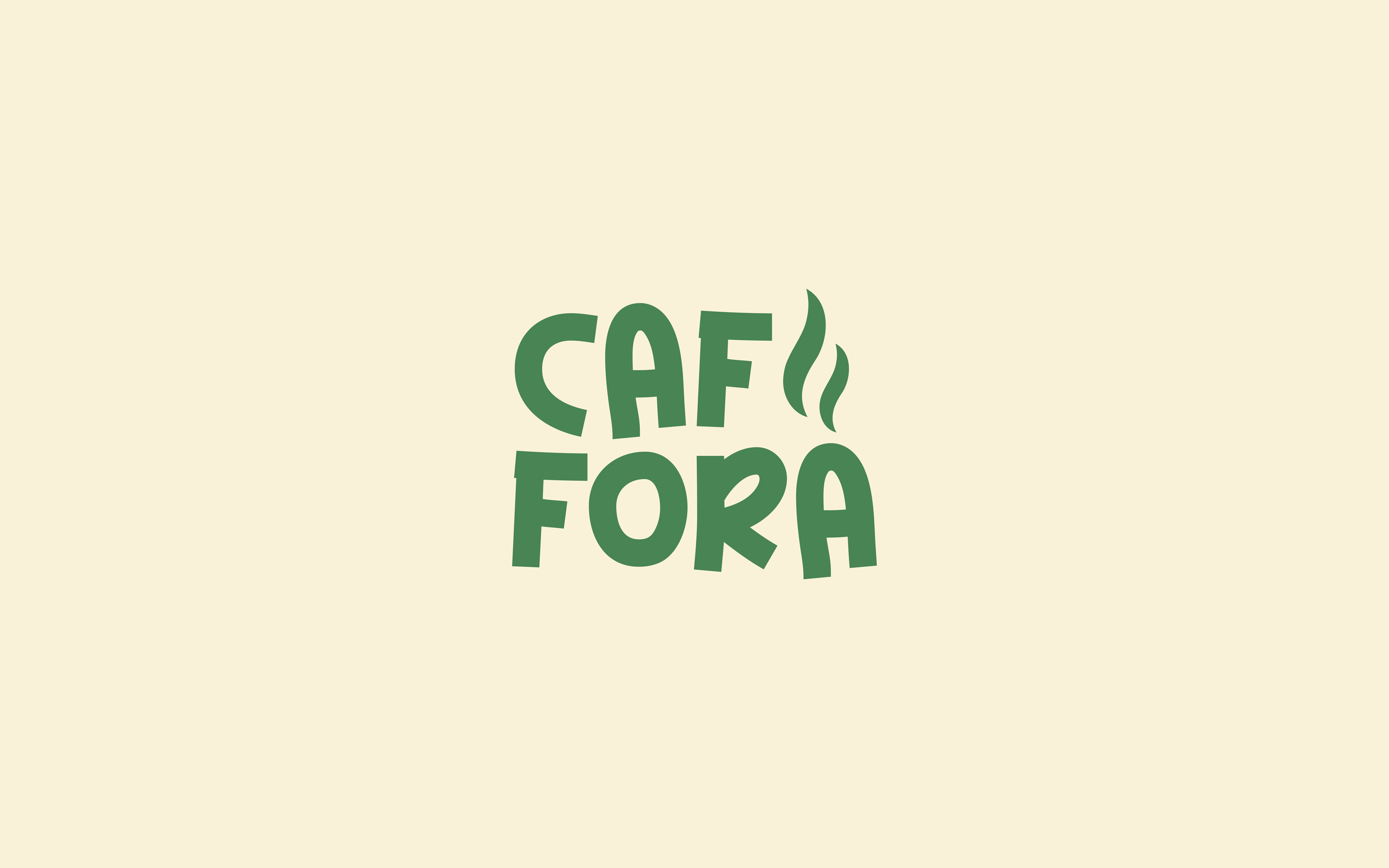
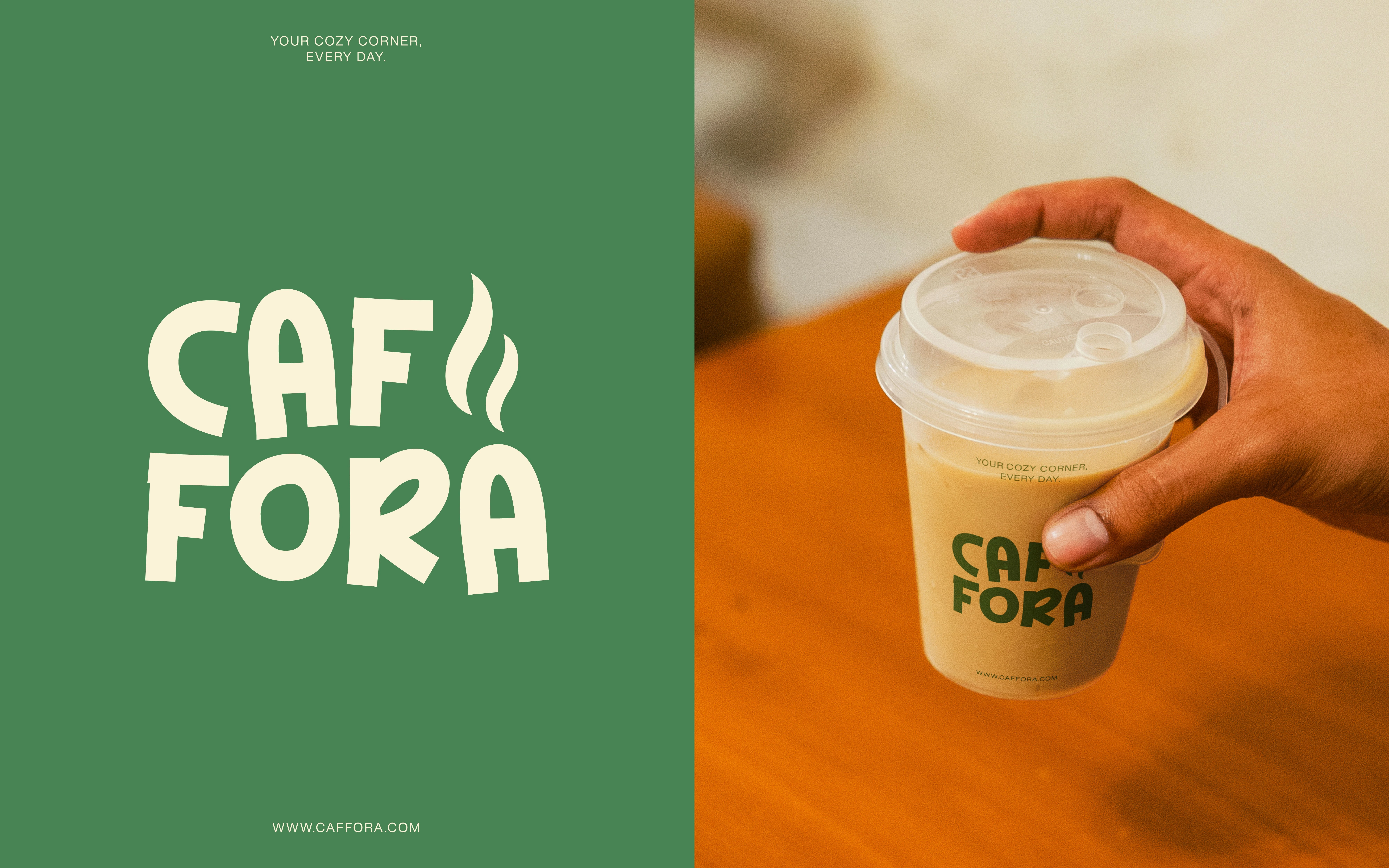
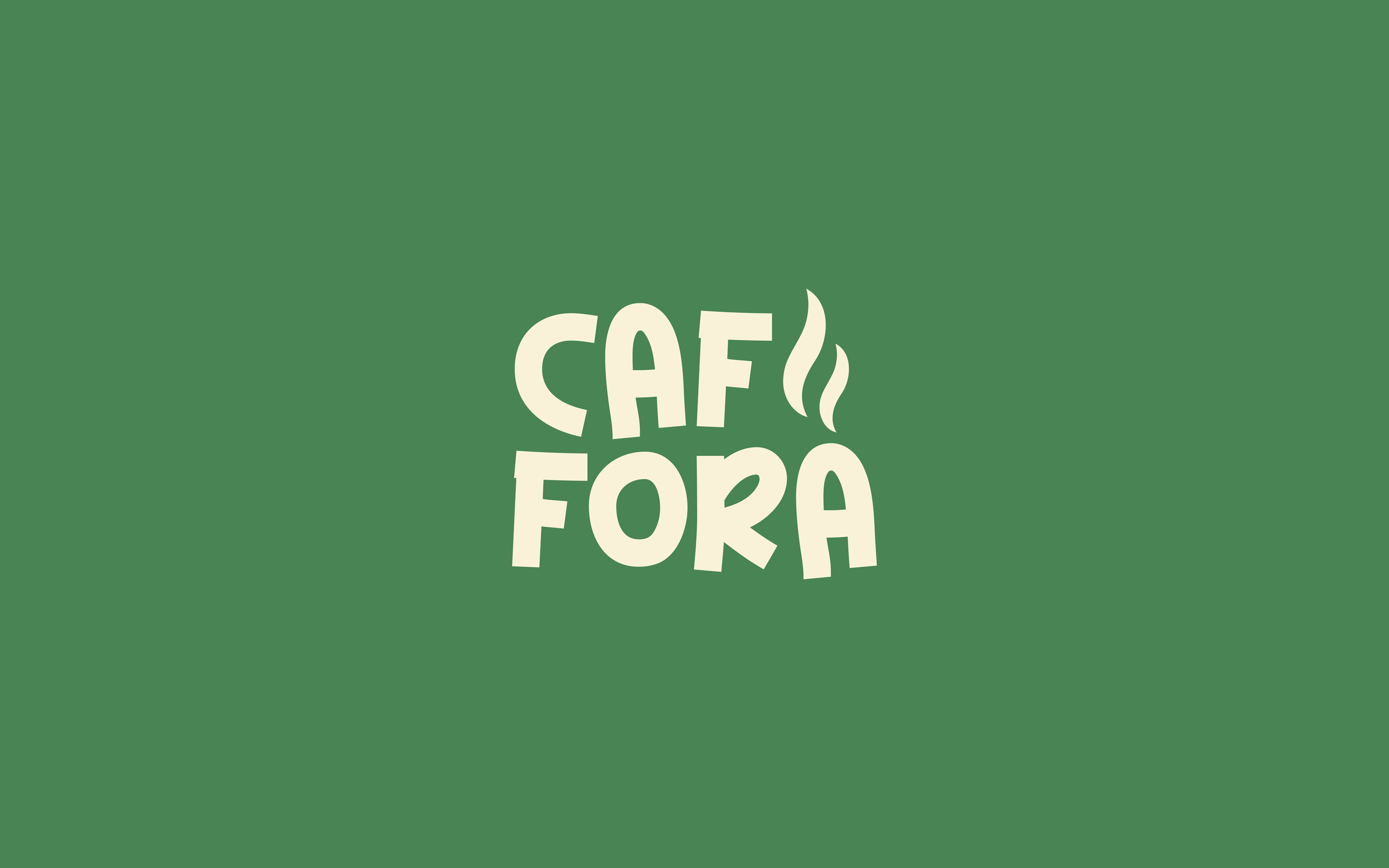
The stacked wordmark forms a compact block with rounded, substantial letters. That arrangement uses the cup face efficiently and gives the name a stronger presence than a long, thin horizontal signature. The small steam-like detail connects the lettering with the standalone graphic.
COLOUR AND APPLICATION
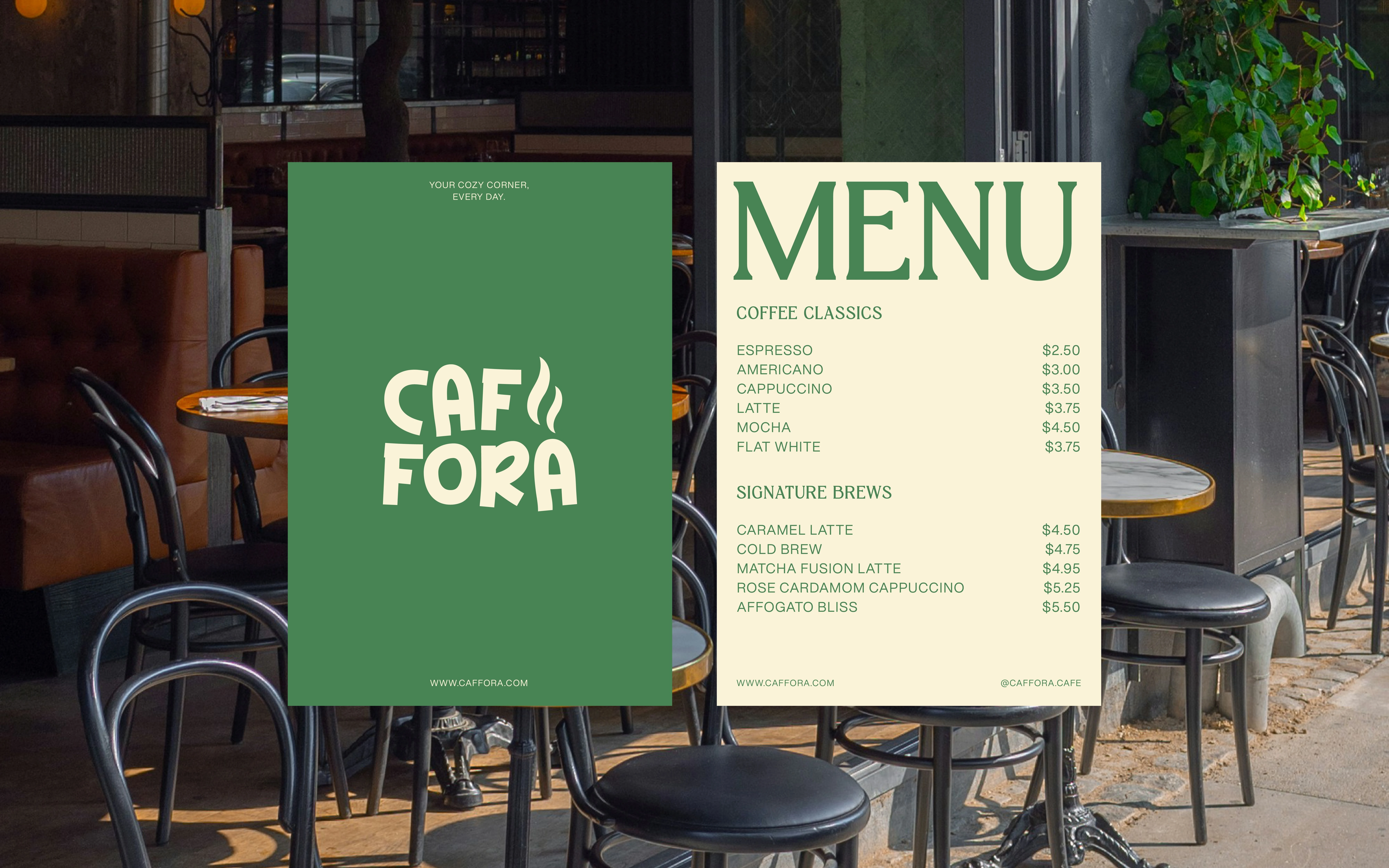
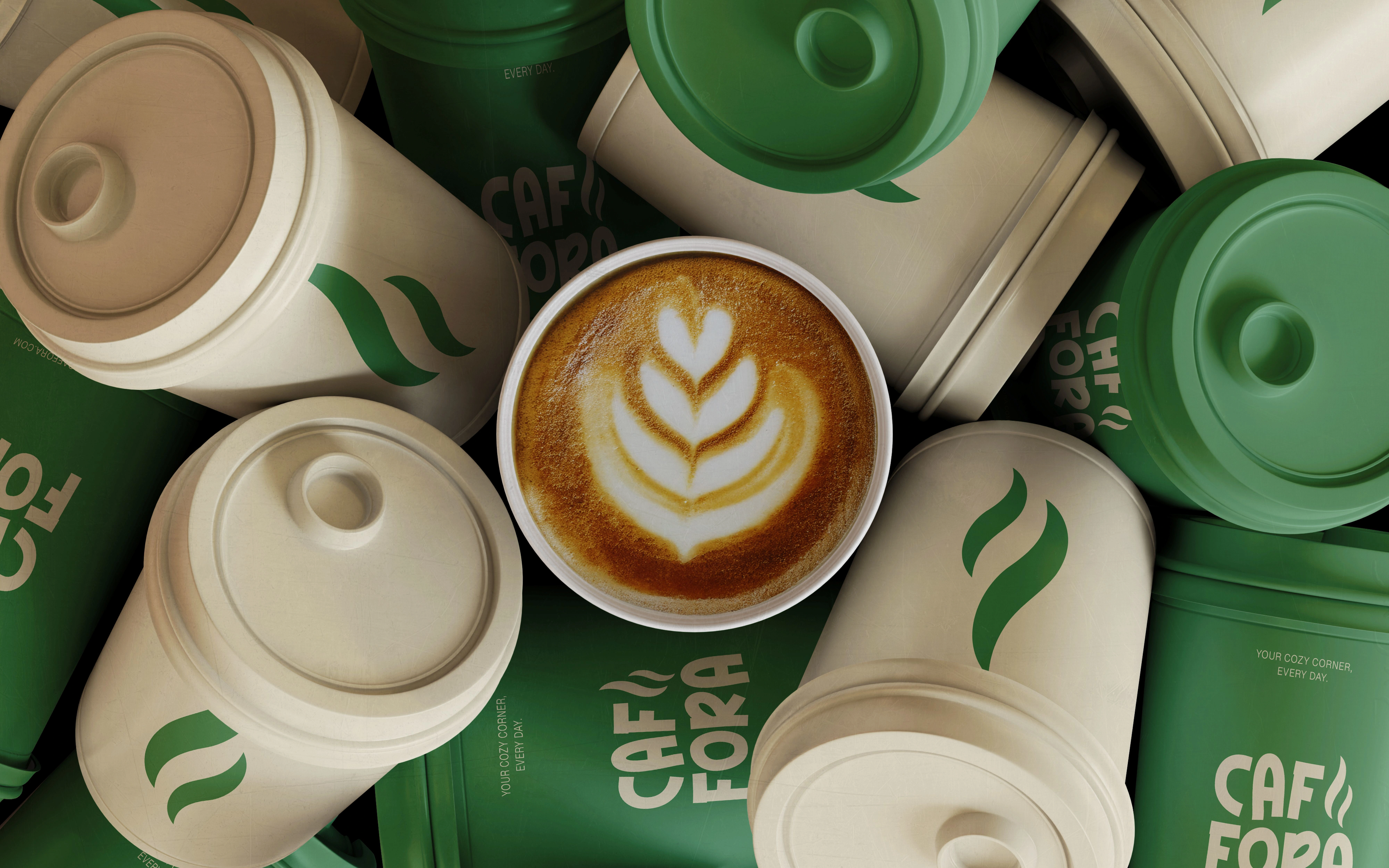
Green and warm cream create a restrained, consistent palette across cups and lids. Reversing the colours allows variety while retaining the same brand language. Some cups carry the name, others the larger motif, showing how separate assets can belong to the same family.
CONCEPT OUTCOME
A café identity concept linking an inviting visual tone with practical packaging applications. The presentation explores a proposed brand experience; it does not establish sustainability credentials or represent a launched café chain.


© 2025
Copyright ©. All rights reserved.
Like this project
Posted Oct 16, 2026
A café identity concept connecting a steam-like motif, compact rounded lettering and green/cream colour reversals across takeaway packaging.