Fluxor — Brand Identity (Concept)

Shakil Hosen


Fluxor – Brand Identity Design
© February 2026
FLUXOR — MOTION AND CONNECTION IN A STATIC IDENTITY
Fluxor is a self-initiated technology identity concept exploring motion, connection and adaptability. The design challenge is to express those ideas through a recognisable visual system, rather than relying on a complex futuristic illustration for every application.
AN OPEN, DIRECTIONAL SYMBOL
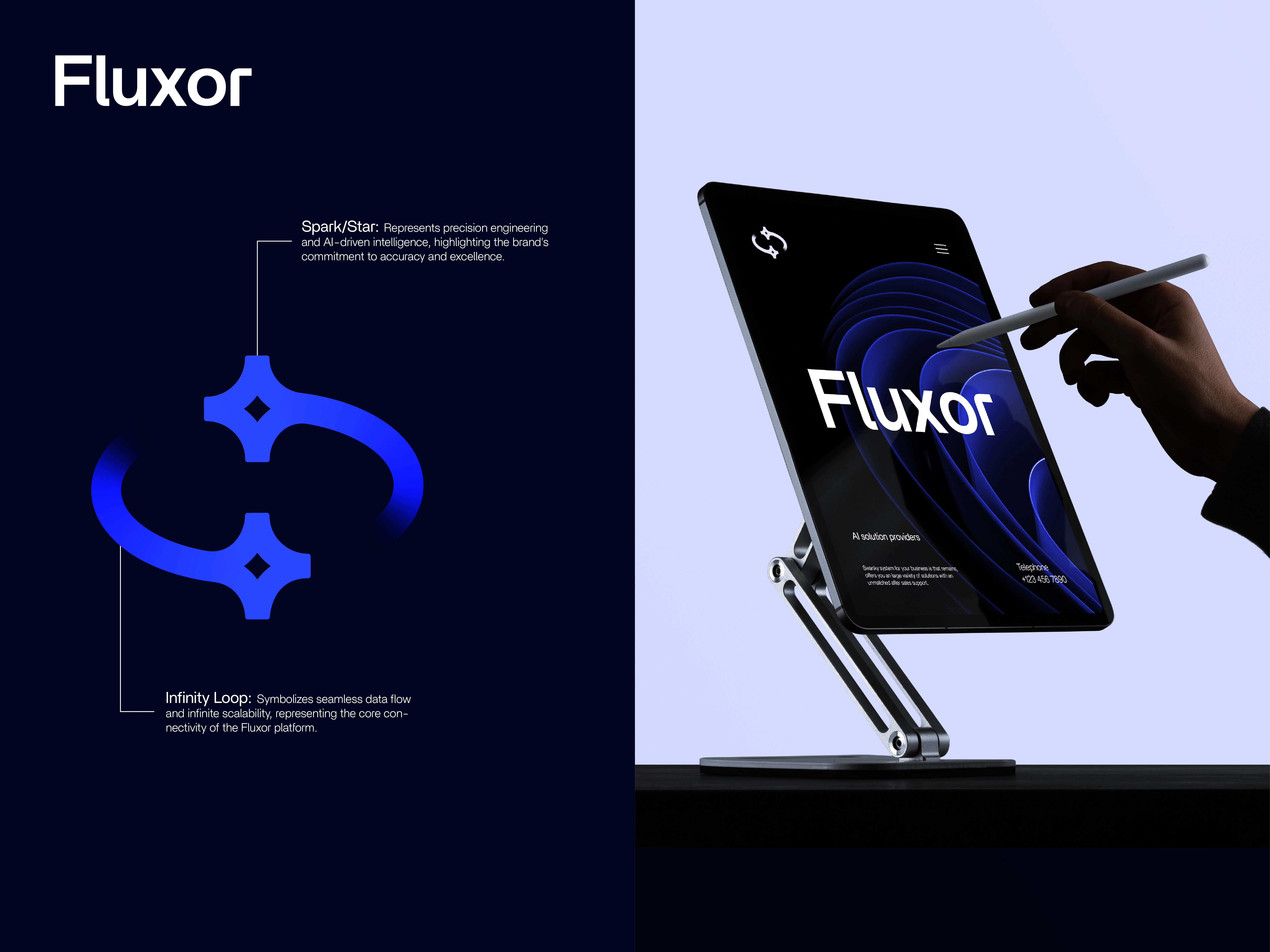
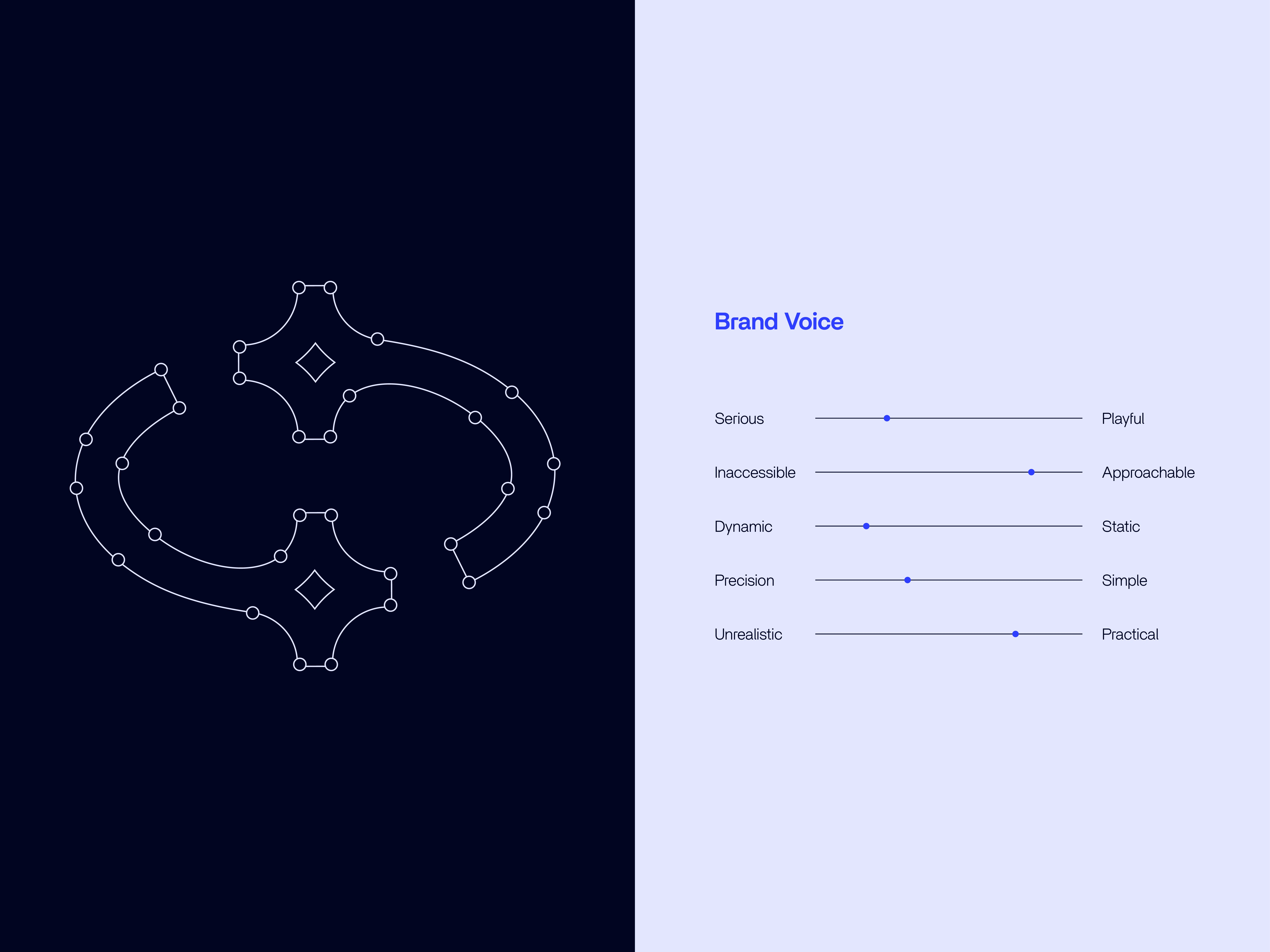
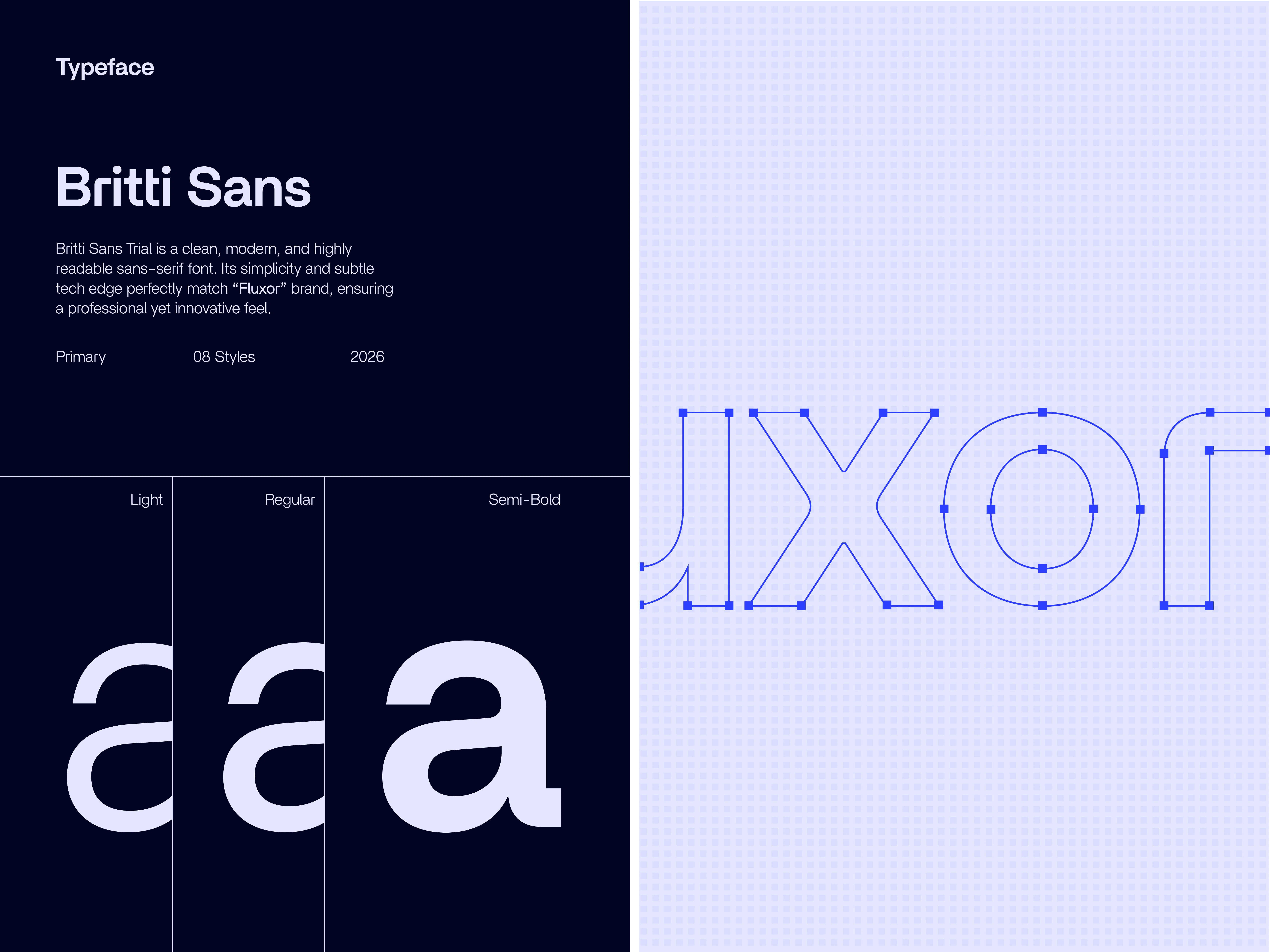
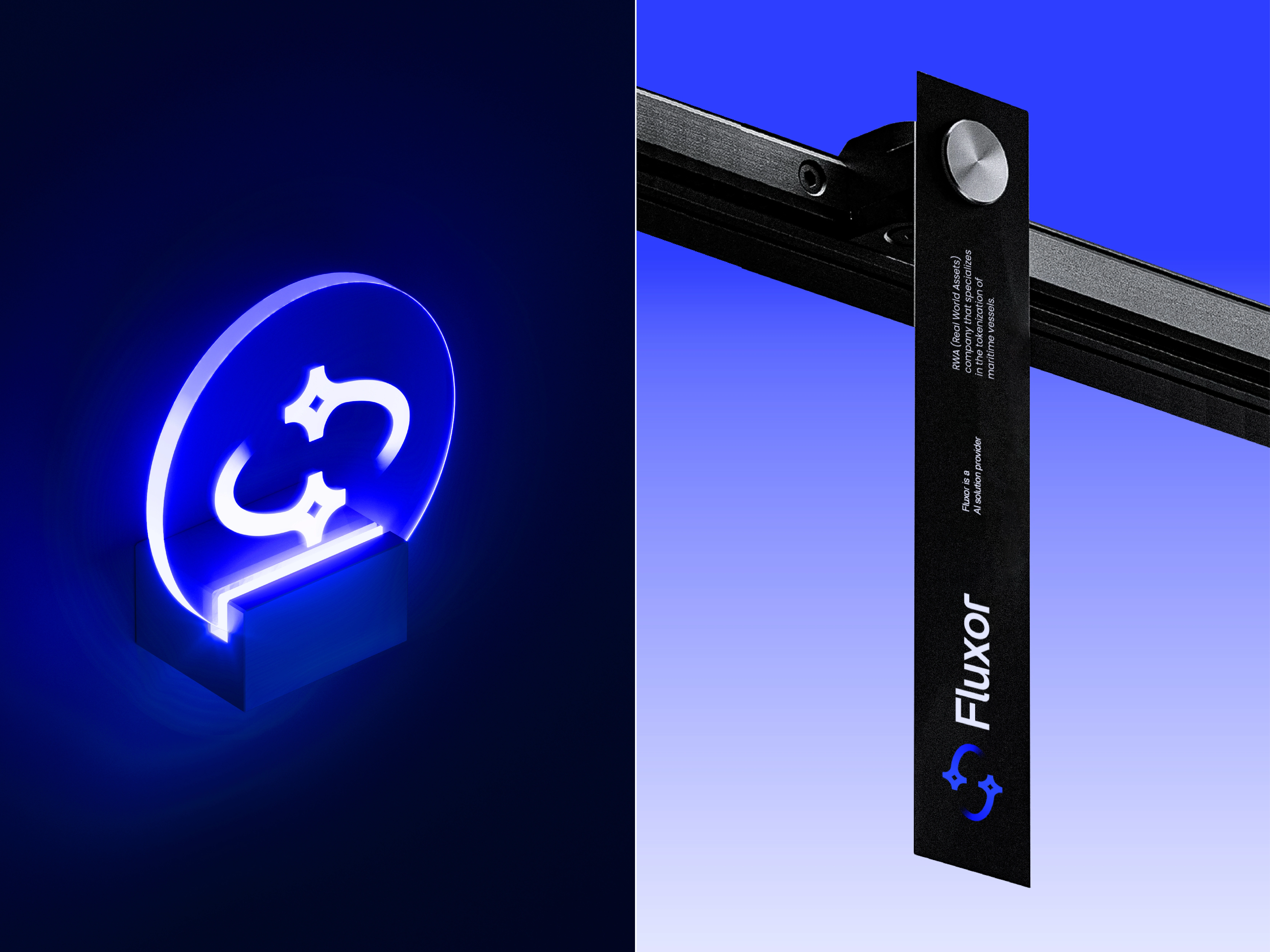
Curved segments and four-point forms create a mark that appears to move around an open centre. Its interrupted outline gives the composition rhythm, while the relatively straightforward wordmark provides a stable reading point alongside it.
COLOUR AND IMAGE TREATMENT
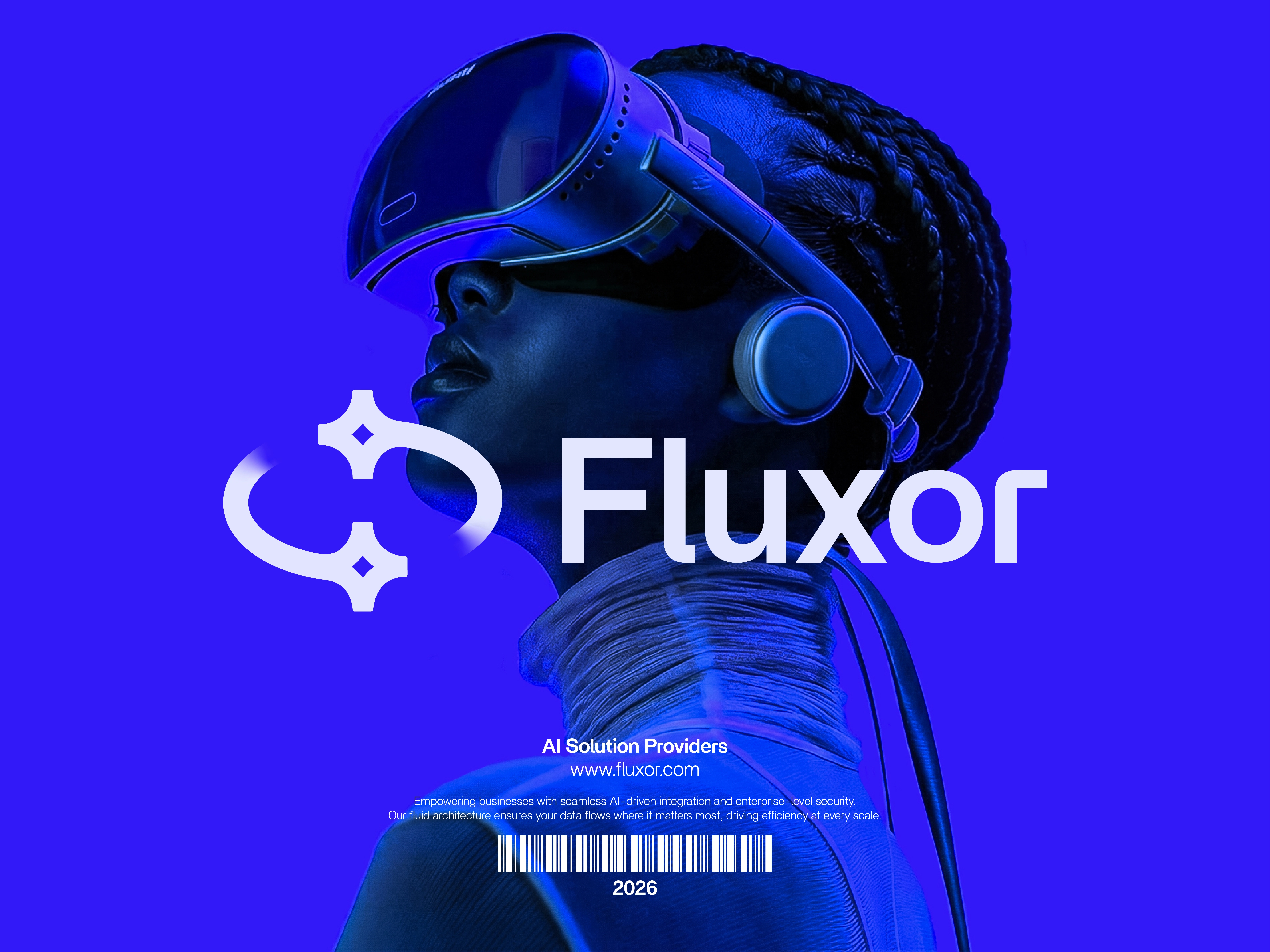
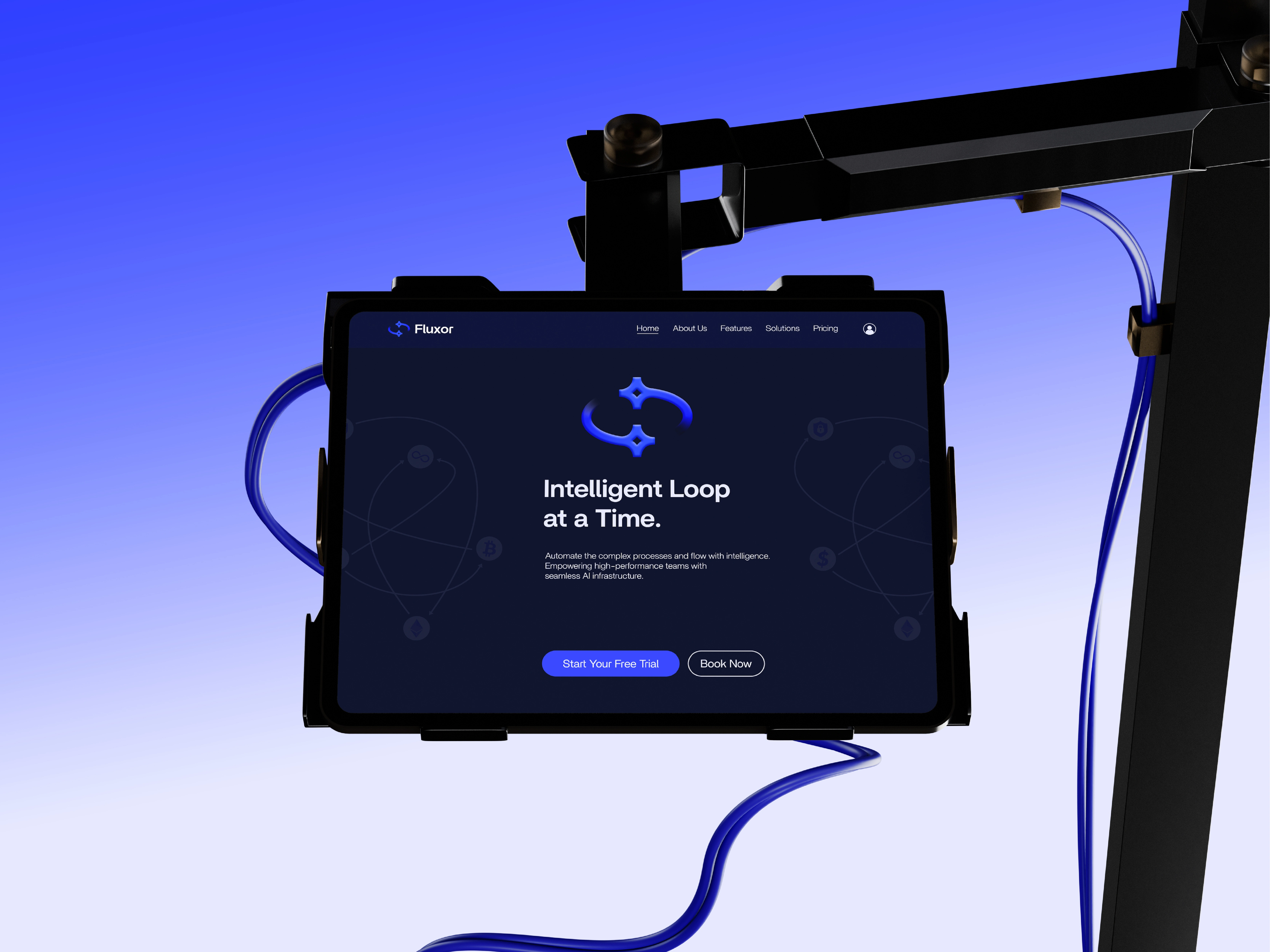
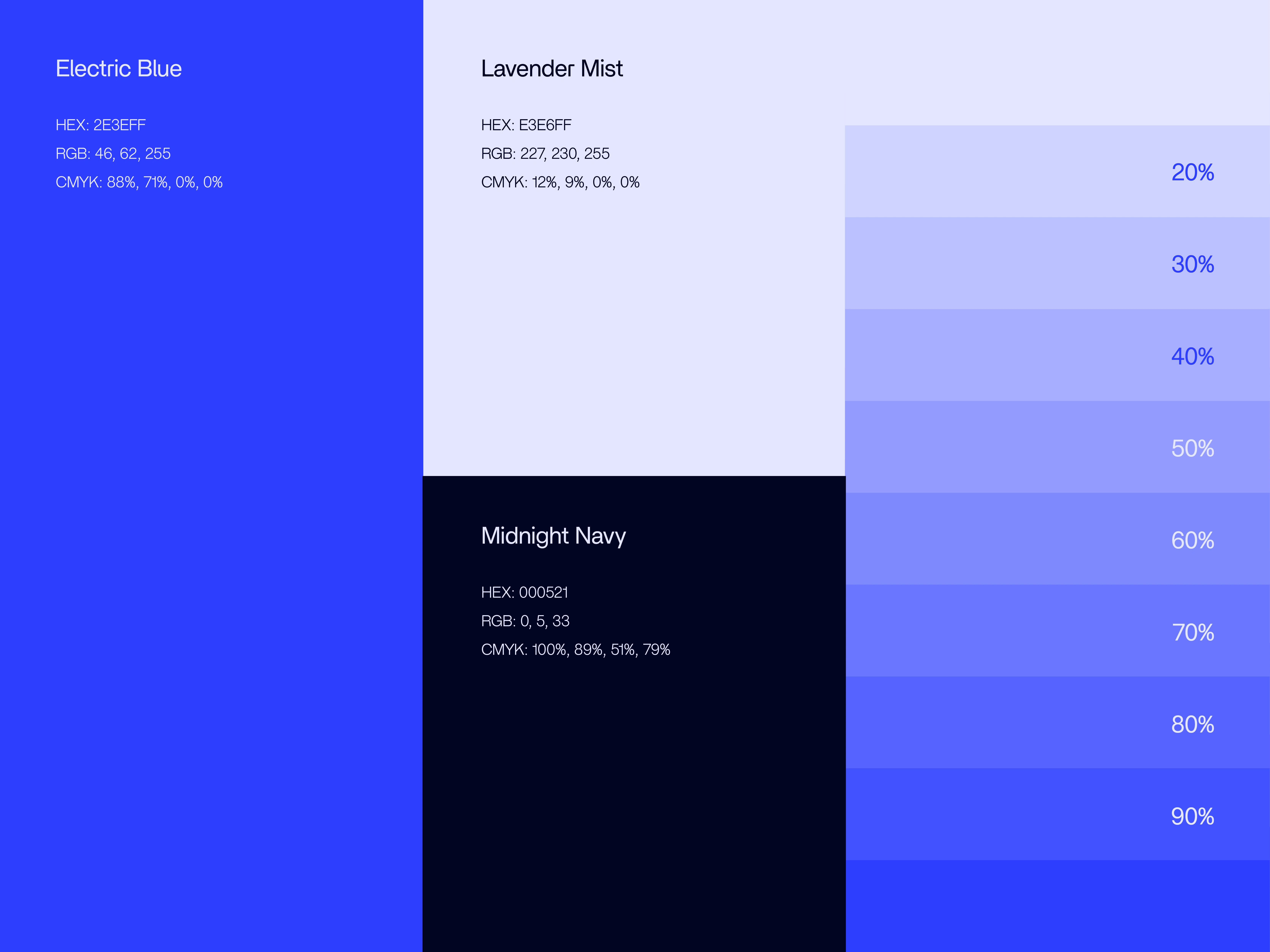
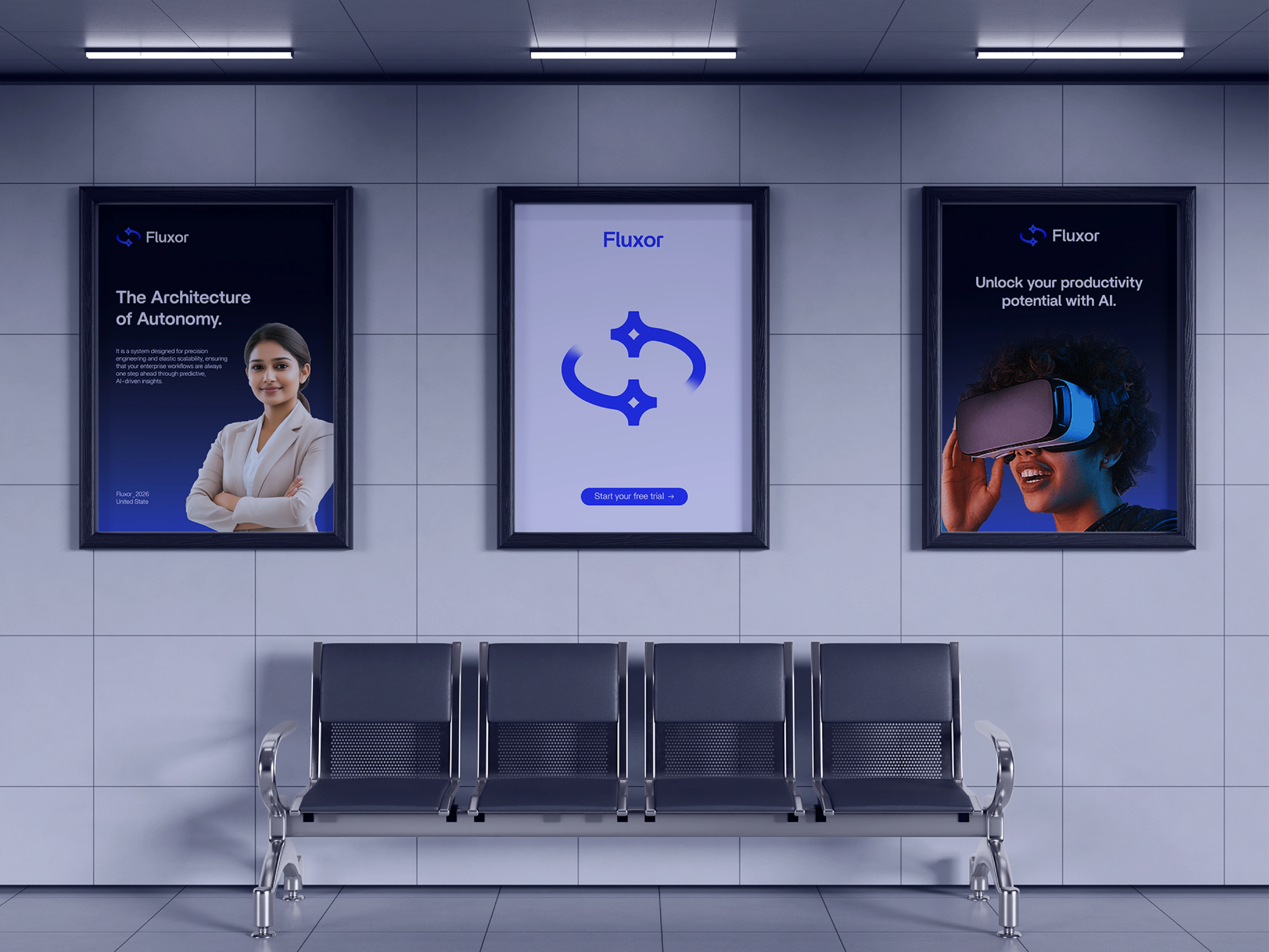
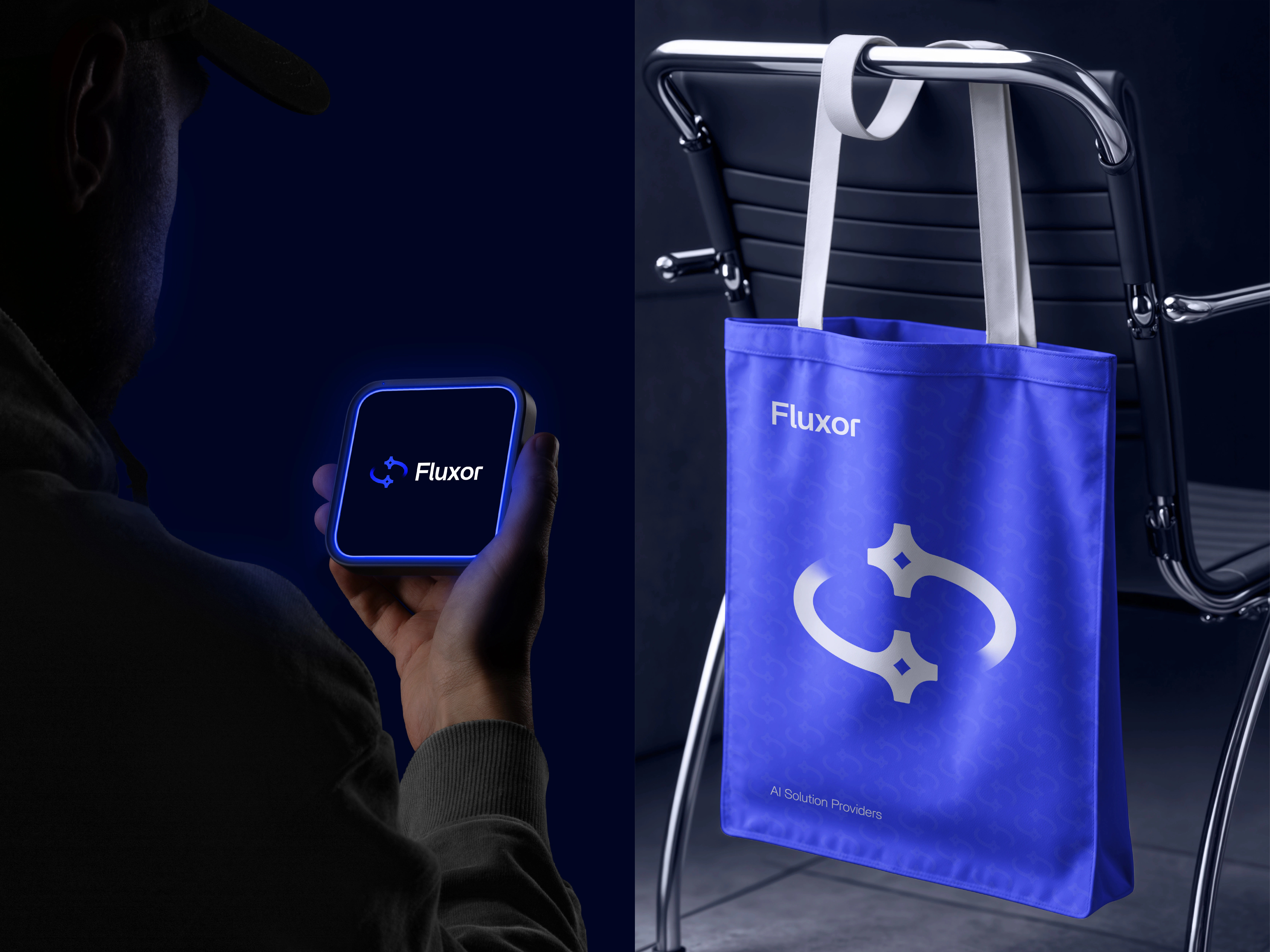
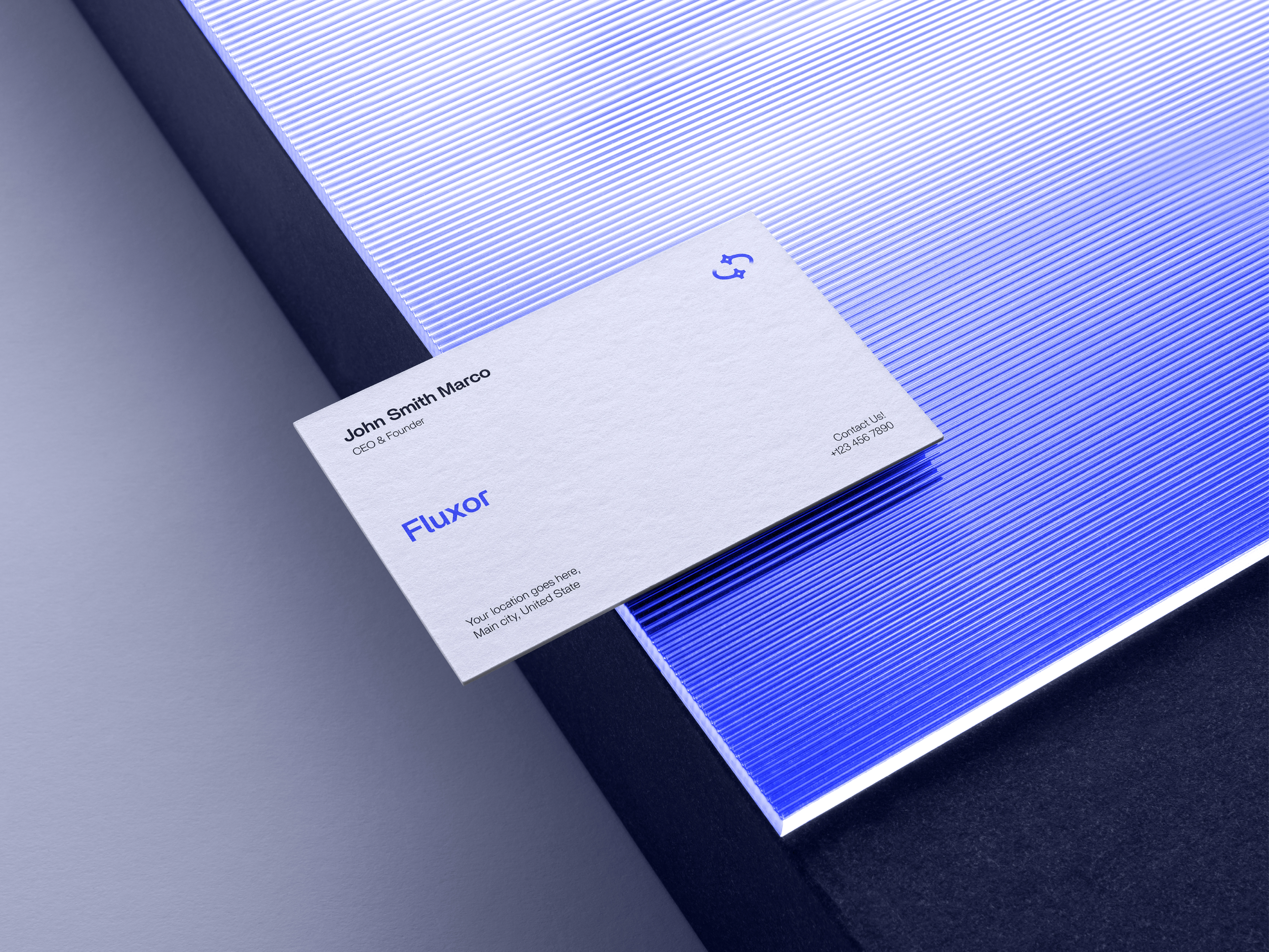
Electric violet, near-black and pale lettering establish a high-contrast visual language. The violet treatment connects photographic subjects with the graphic identity, making imagery part of the same system rather than an unrelated backdrop.
A SYSTEM THAT CAN CHANGE EMPHASIS
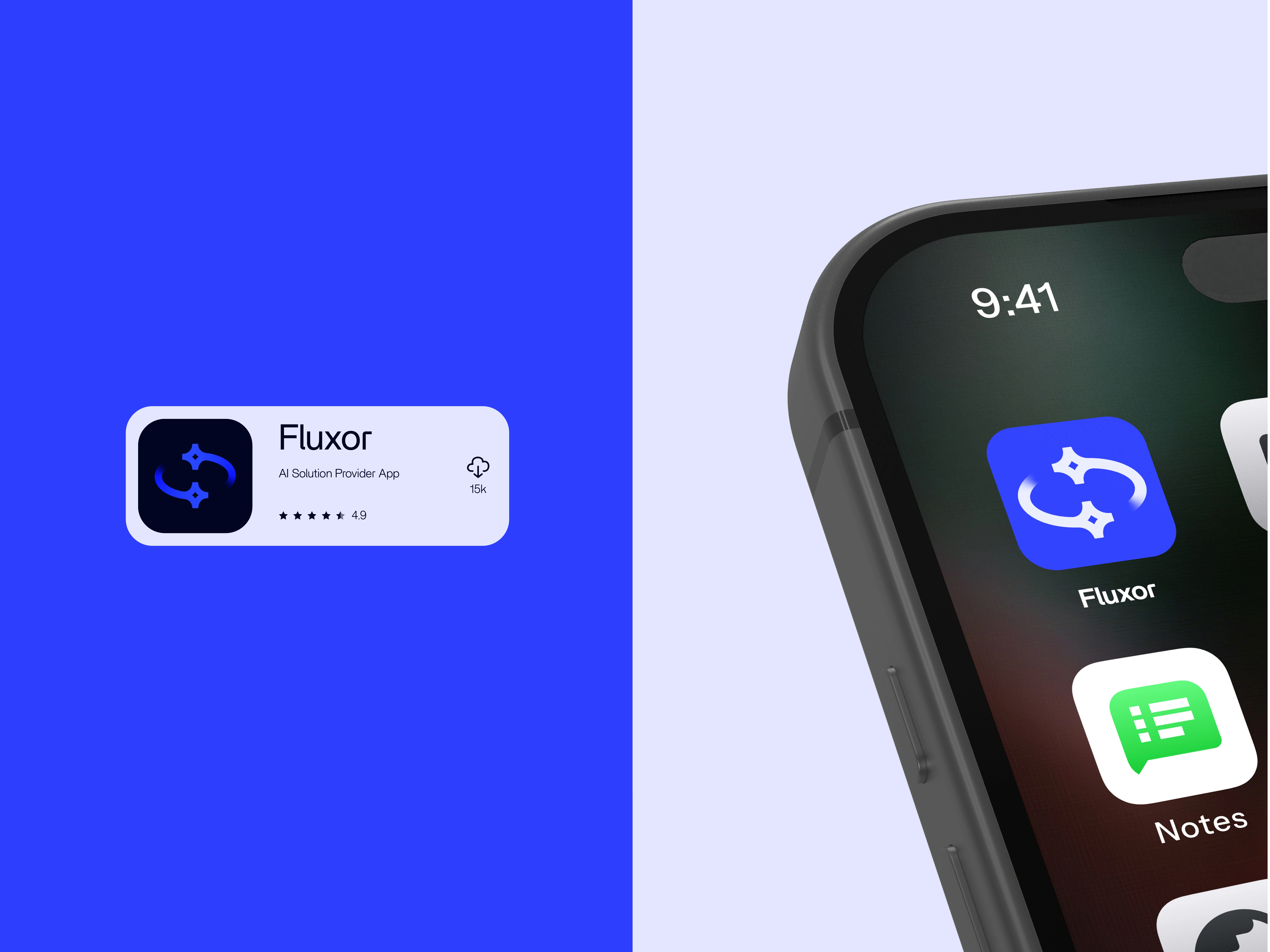
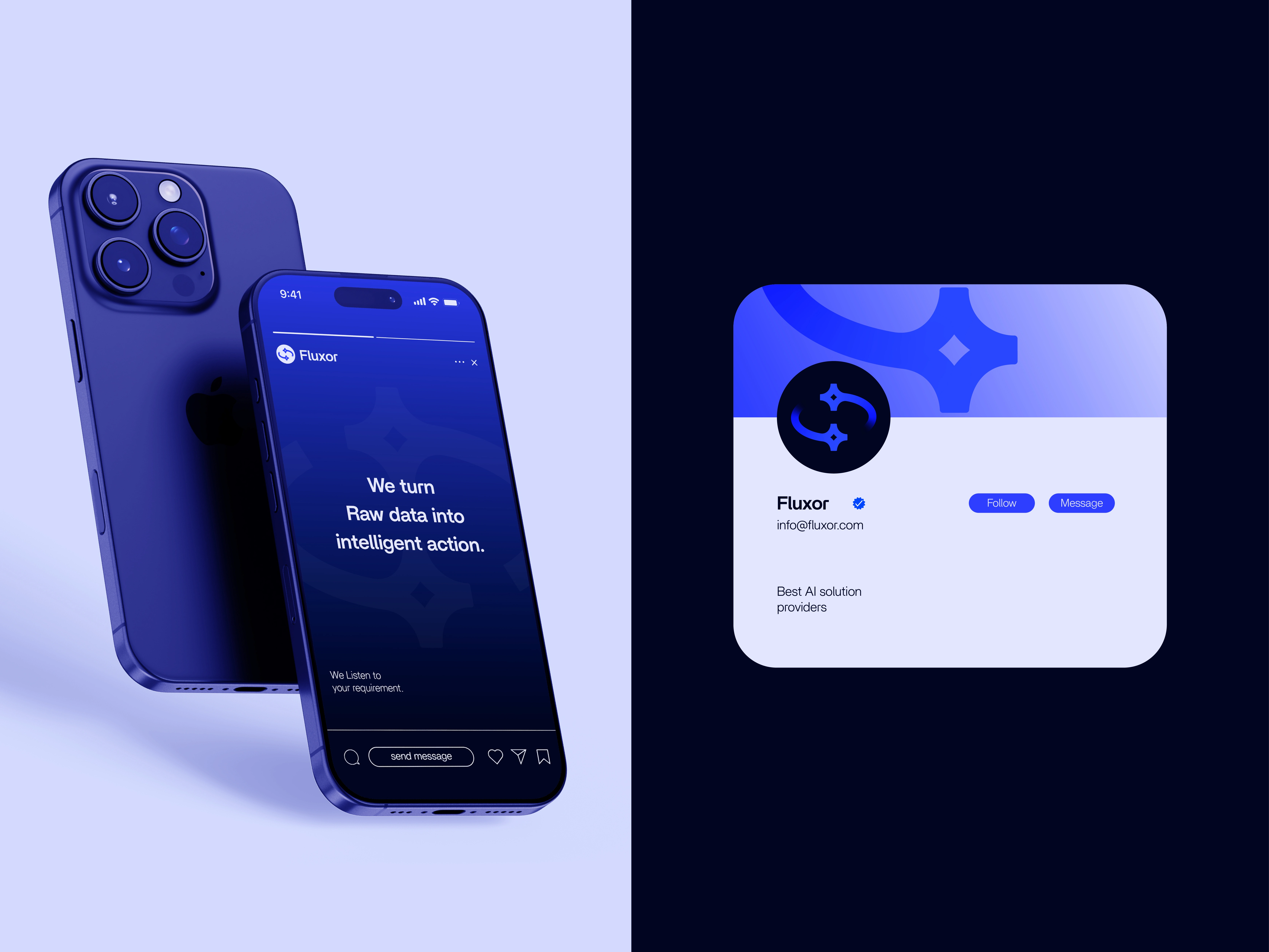
The presentation moves from a large hero lockup to smaller signatures, interface-style elements and poster layouts. In some applications, the symbol becomes a larger graphic feature; in others, it steps back so the message can lead. This range explores how a brand can remain recognisable without using an identical composition everywhere.
The outcome is a technology-brand concept balancing expressive shape and colour with a more restrained typographic anchor. The mockups demonstrate visual possibilities, not a deployed platform or verified team, product or performance claims.













Like this project
Posted Oct 16, 2026
A technology identity concept combining open curved geometry, electric violet imagery and restrained typography across varied brand layouts.