Raflow — Brand Identity (Concept)

Shakil Hosen


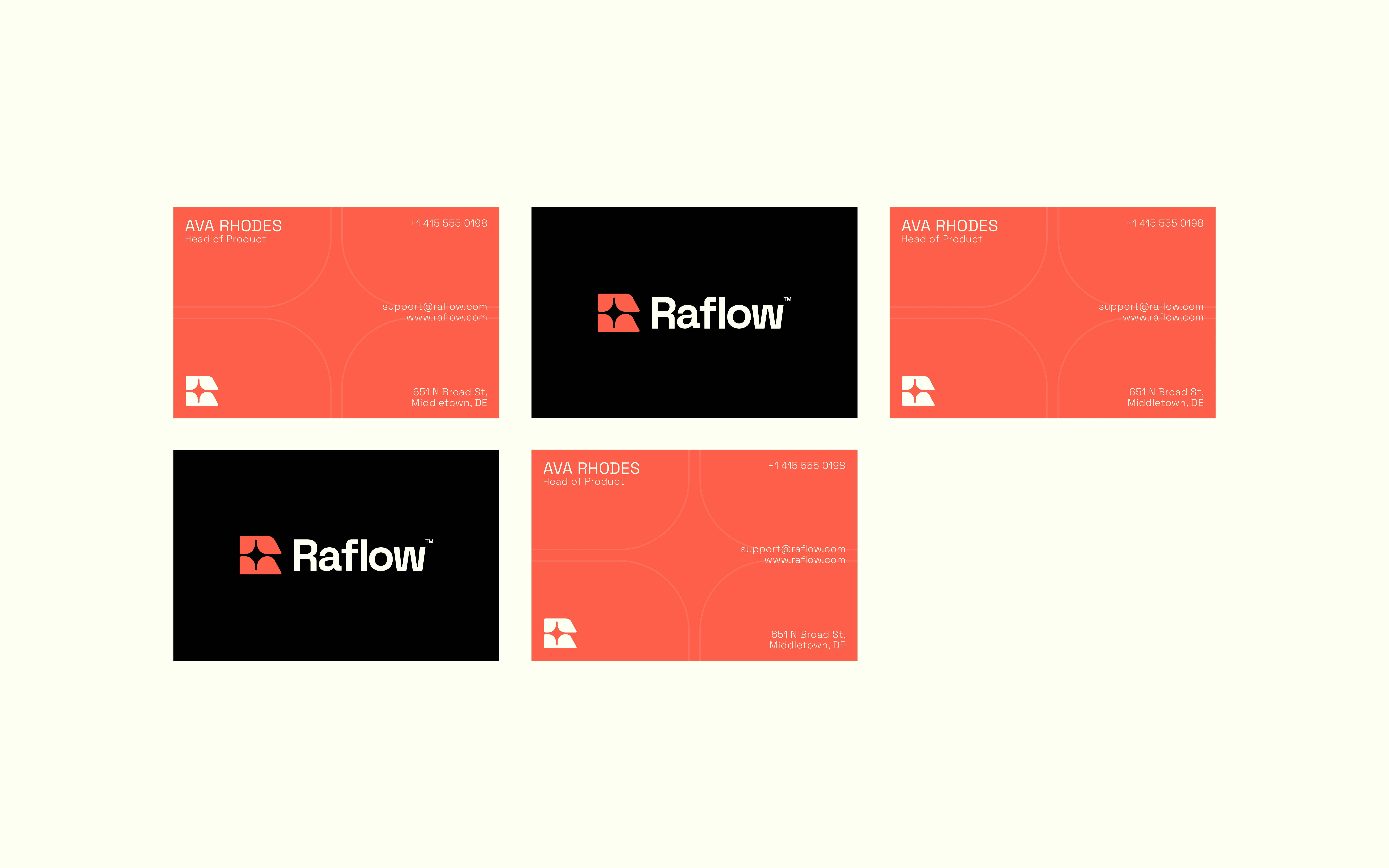
RAFLOW — MAKING AUTOMATION FEEL APPROACHABLE
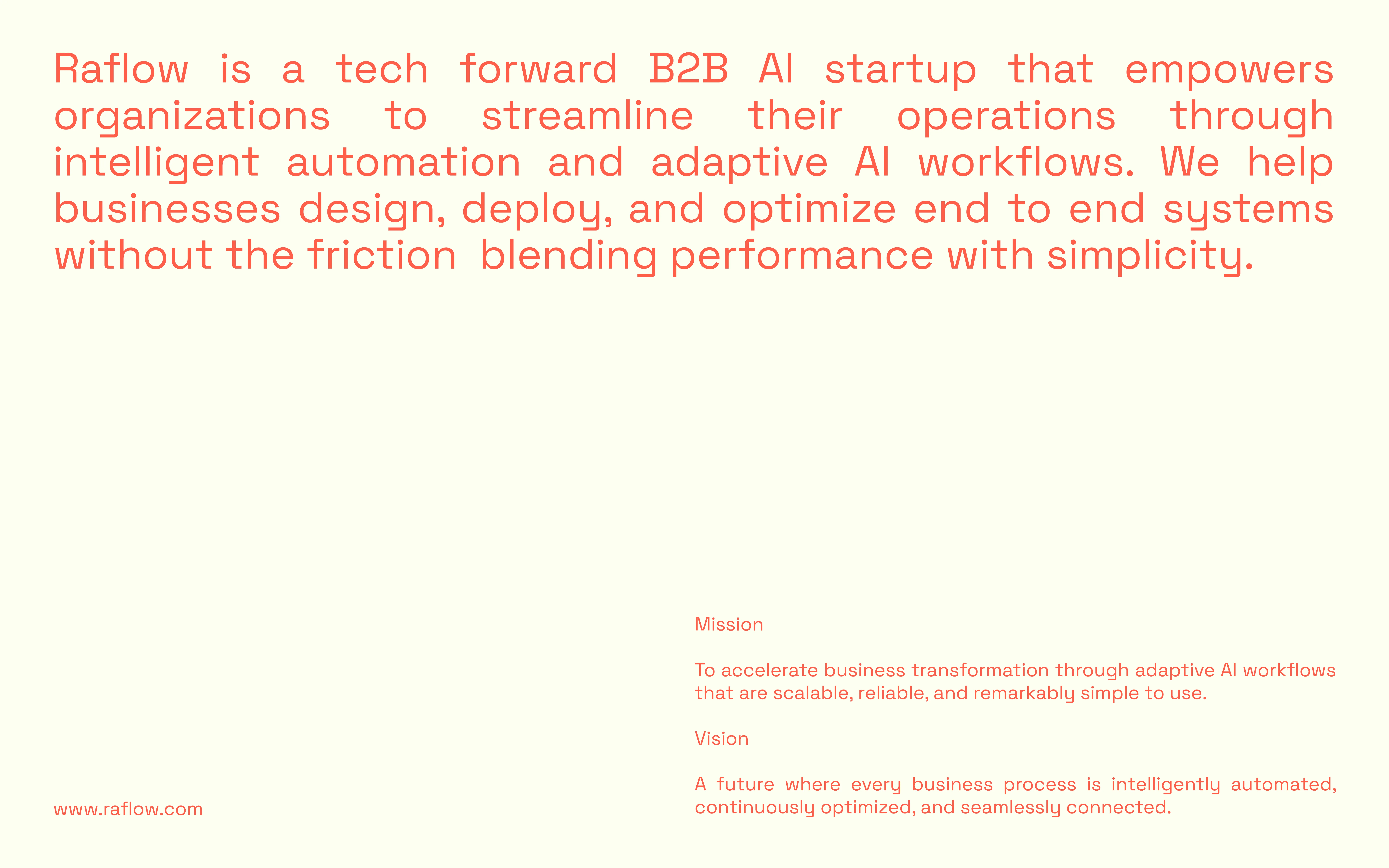
Raflow is a self-initiated brand identity concept presented around AI-powered business workflows. The design challenge is to give an abstract automation offer a recognisable and approachable visual language.
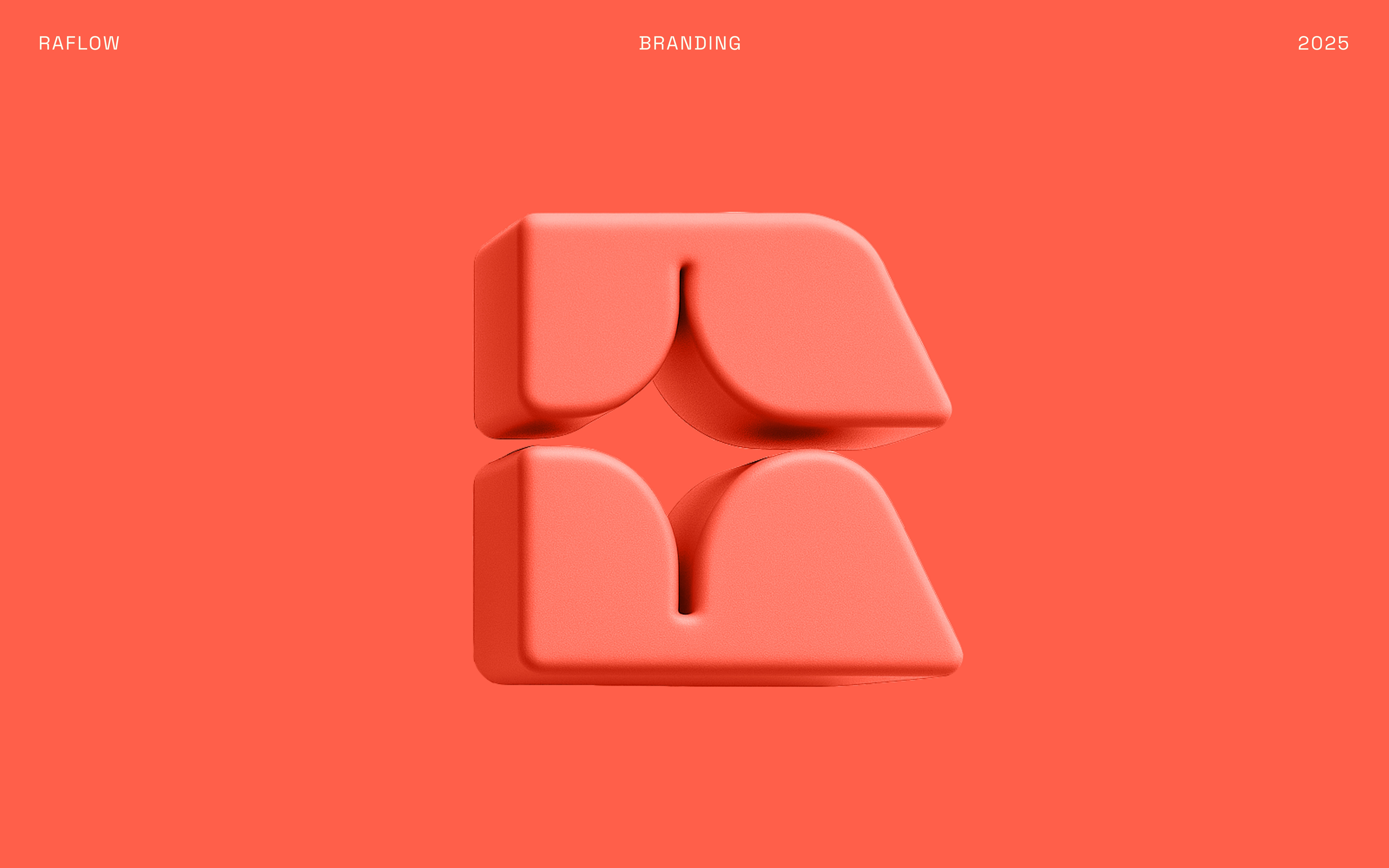
A MODULAR SYMBOL
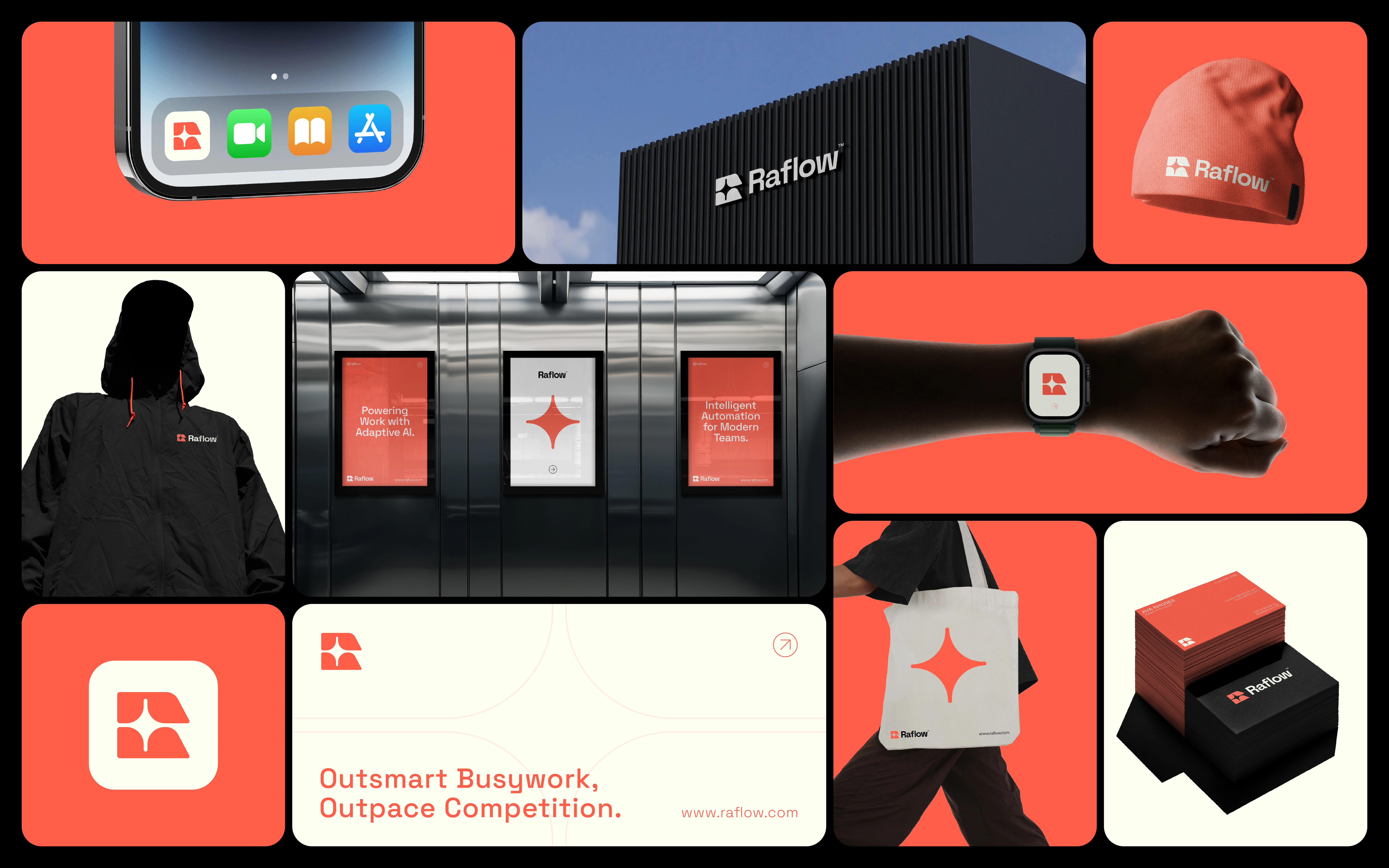
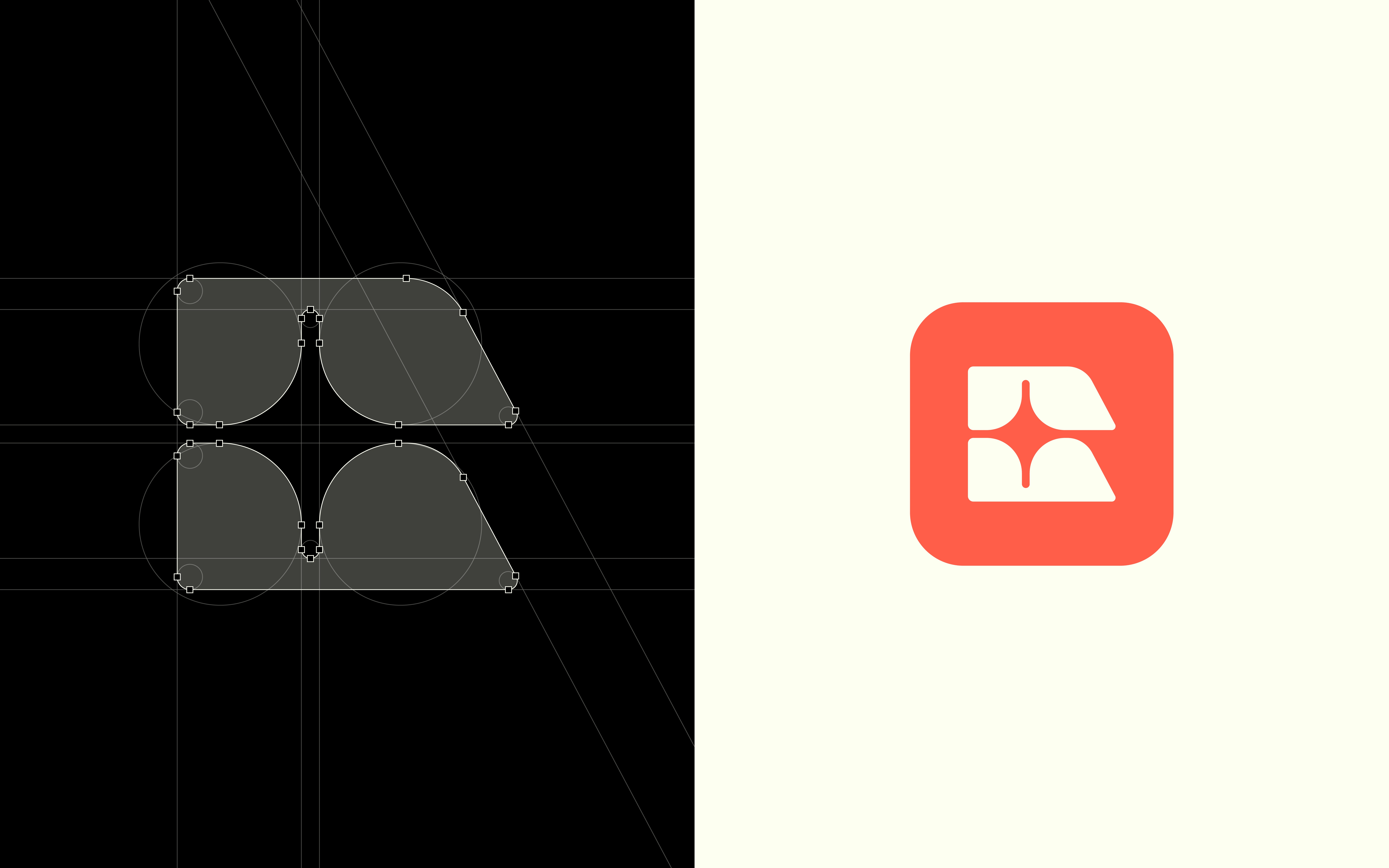
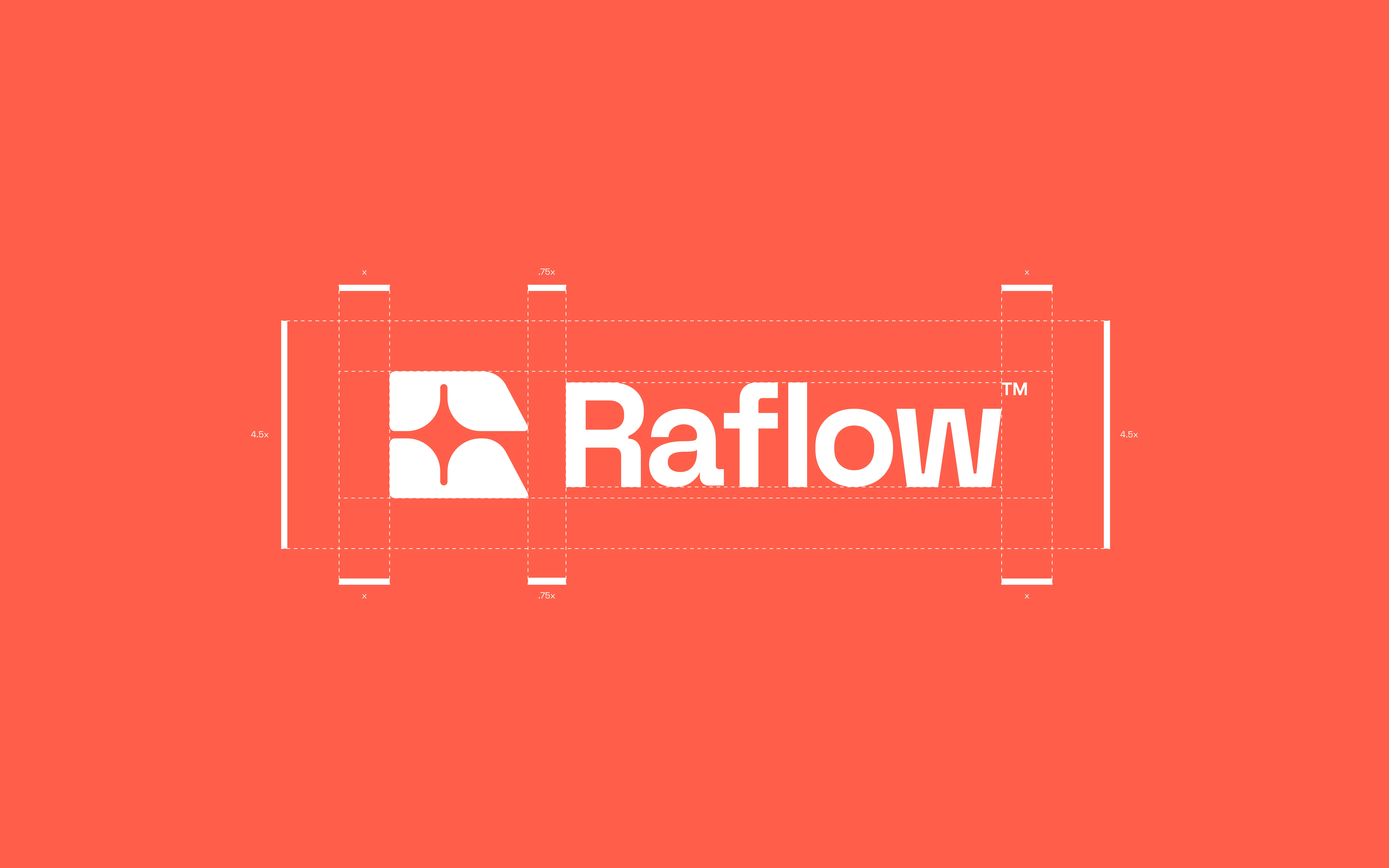
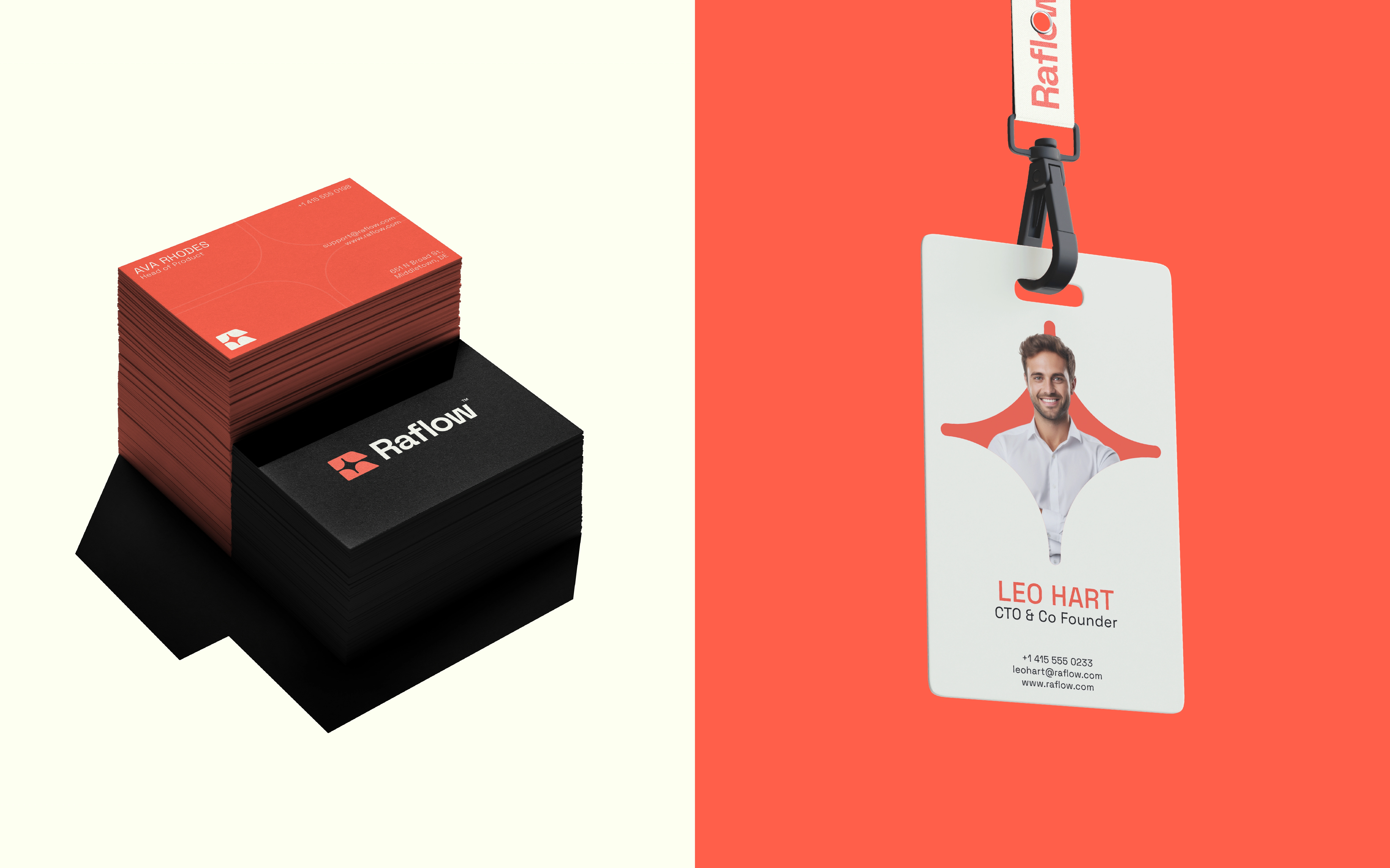
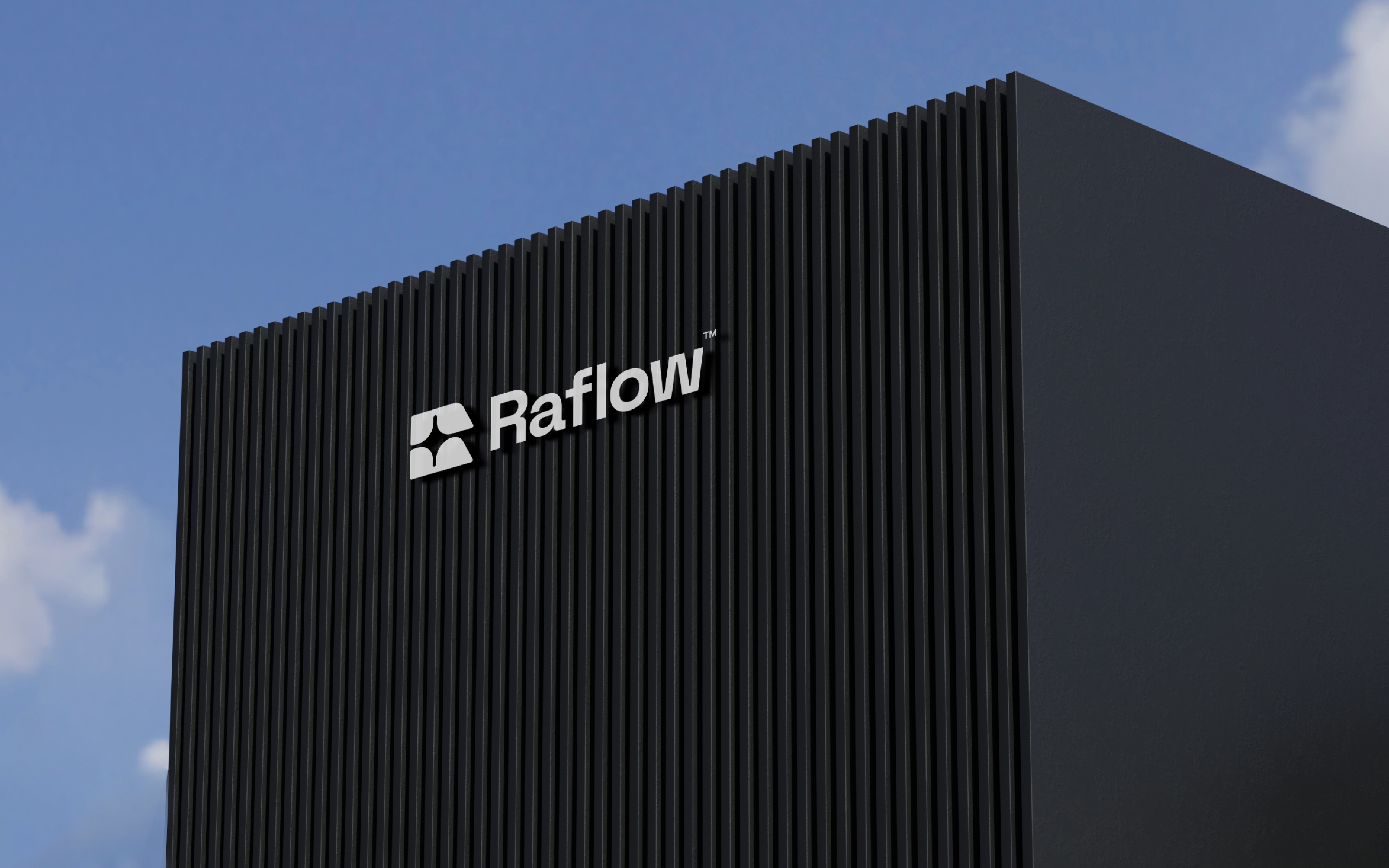
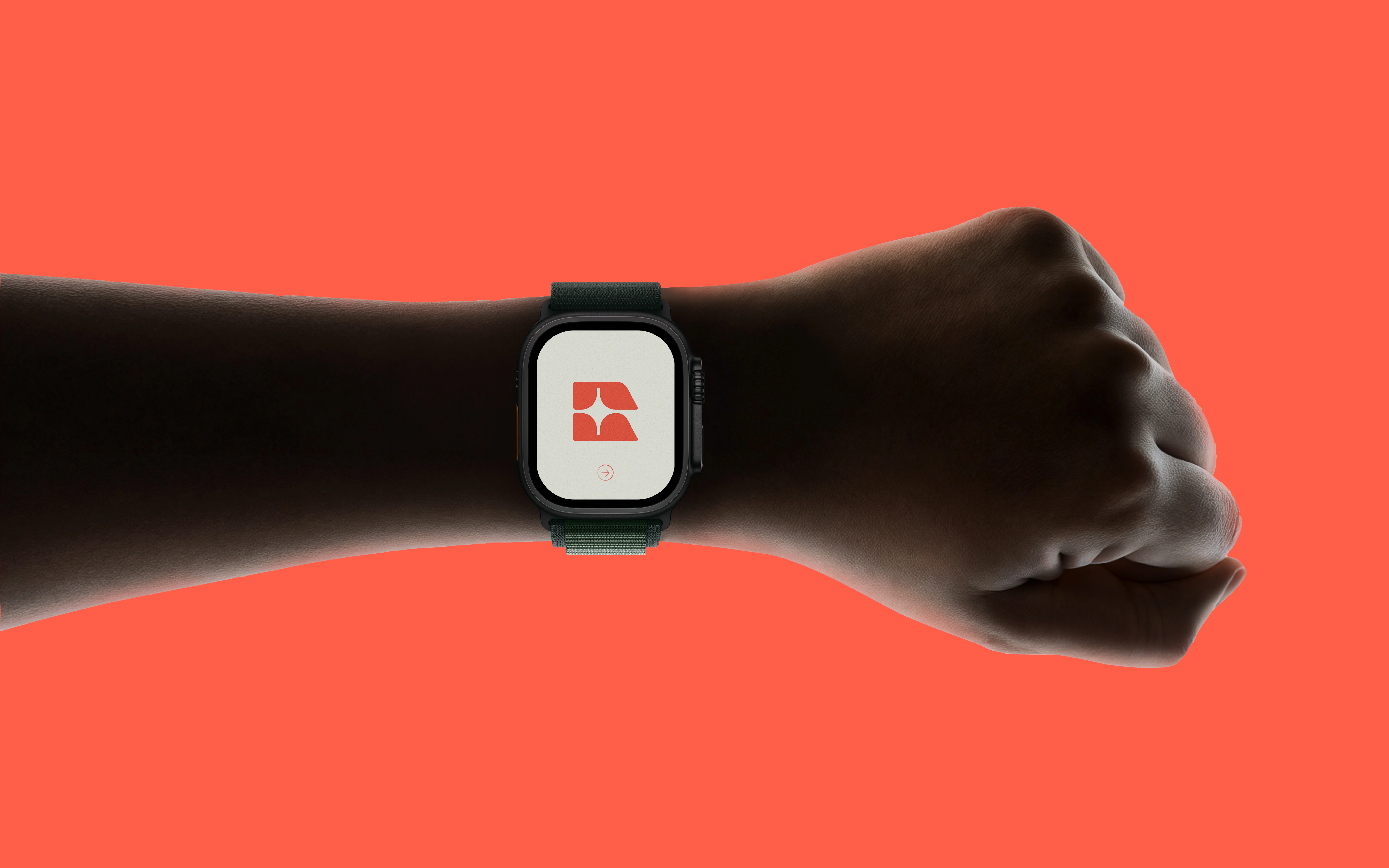
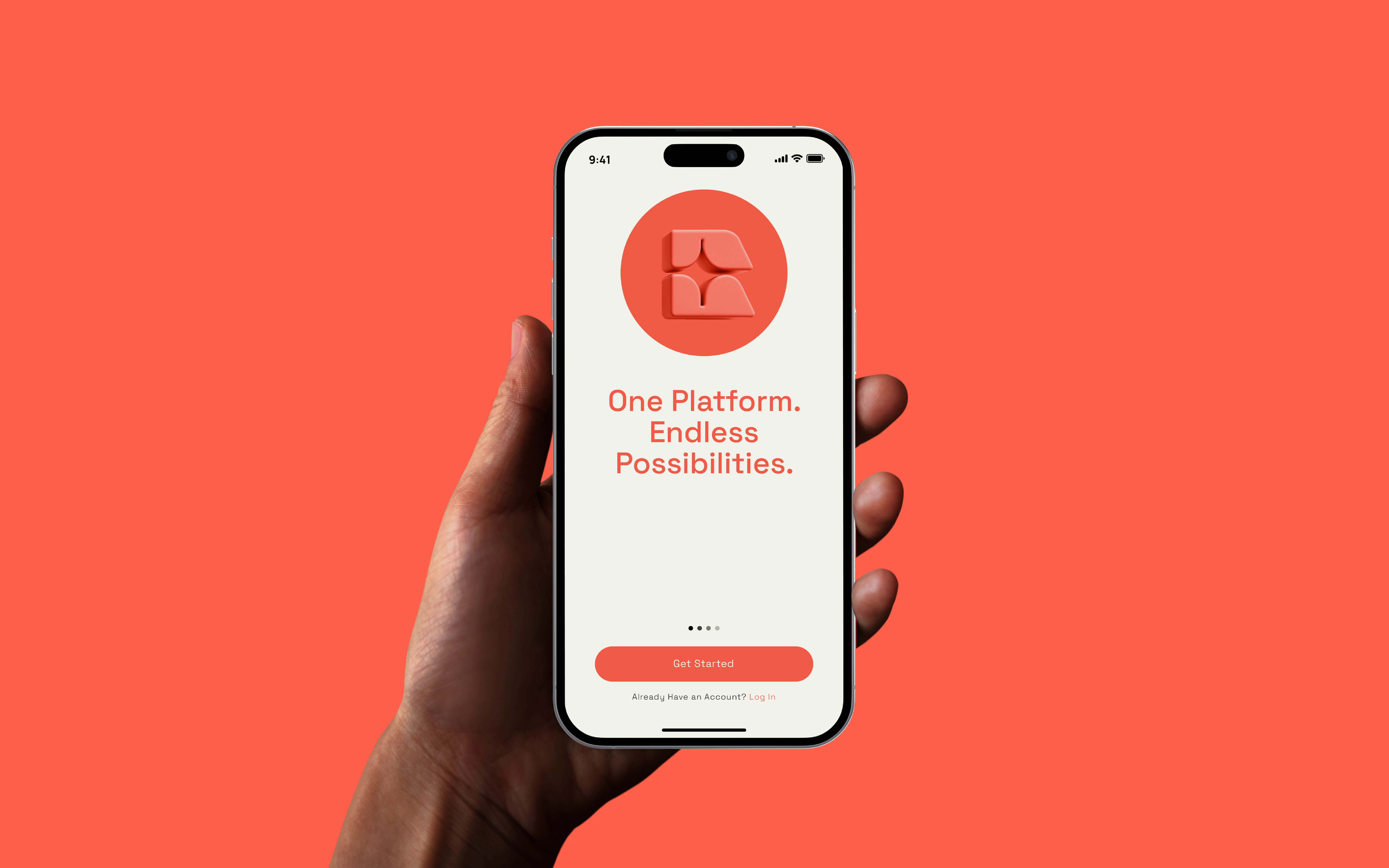
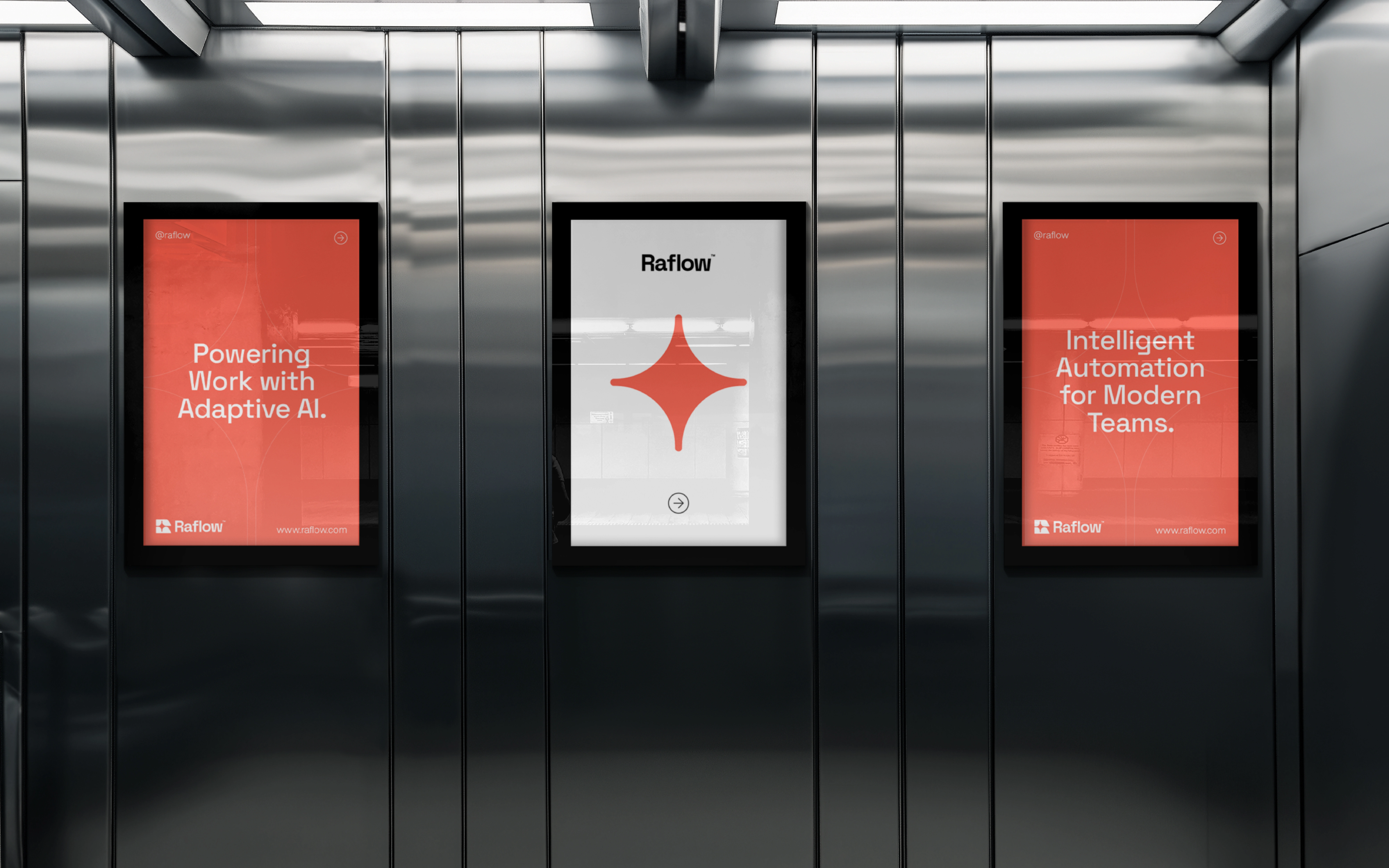
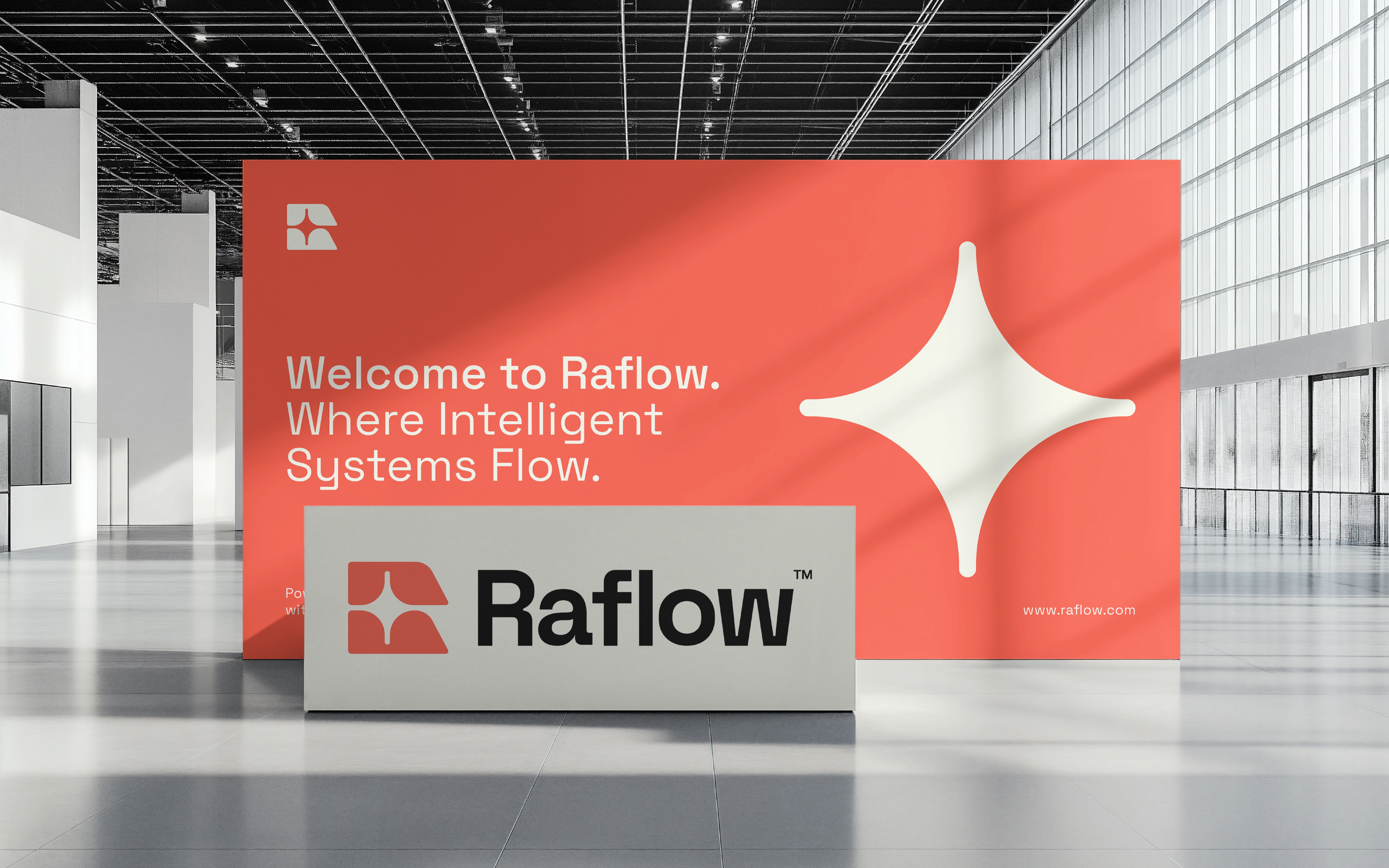
The emblem is composed of soft-edged sections arranged around an open central shape. That central negative space also appears as a standalone, four-point graphic on the tote-bag application. This creates two related visual assets from the same construction: a compact brand mark and a larger supporting motif.
WARMTH AND CLARITY
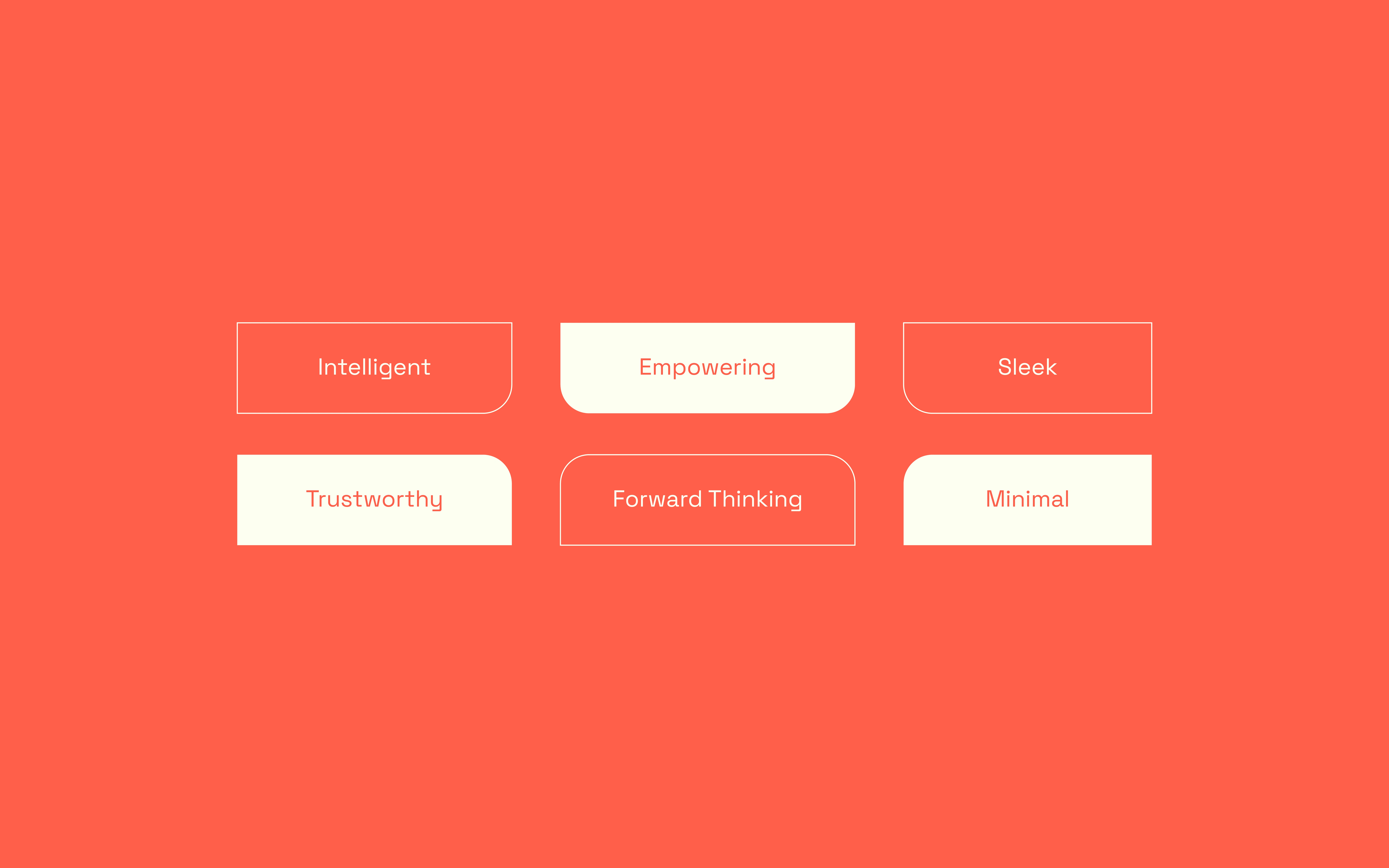
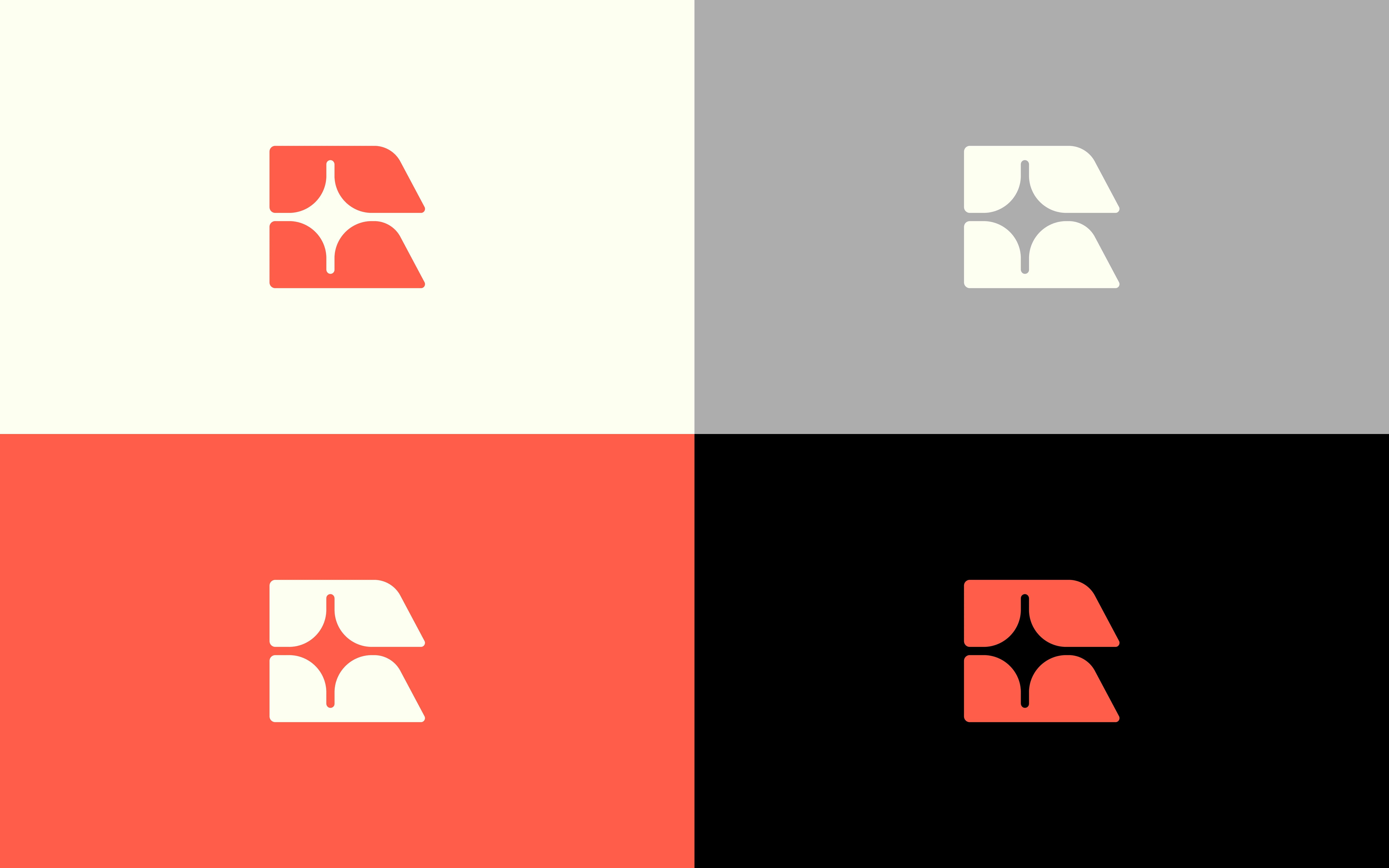
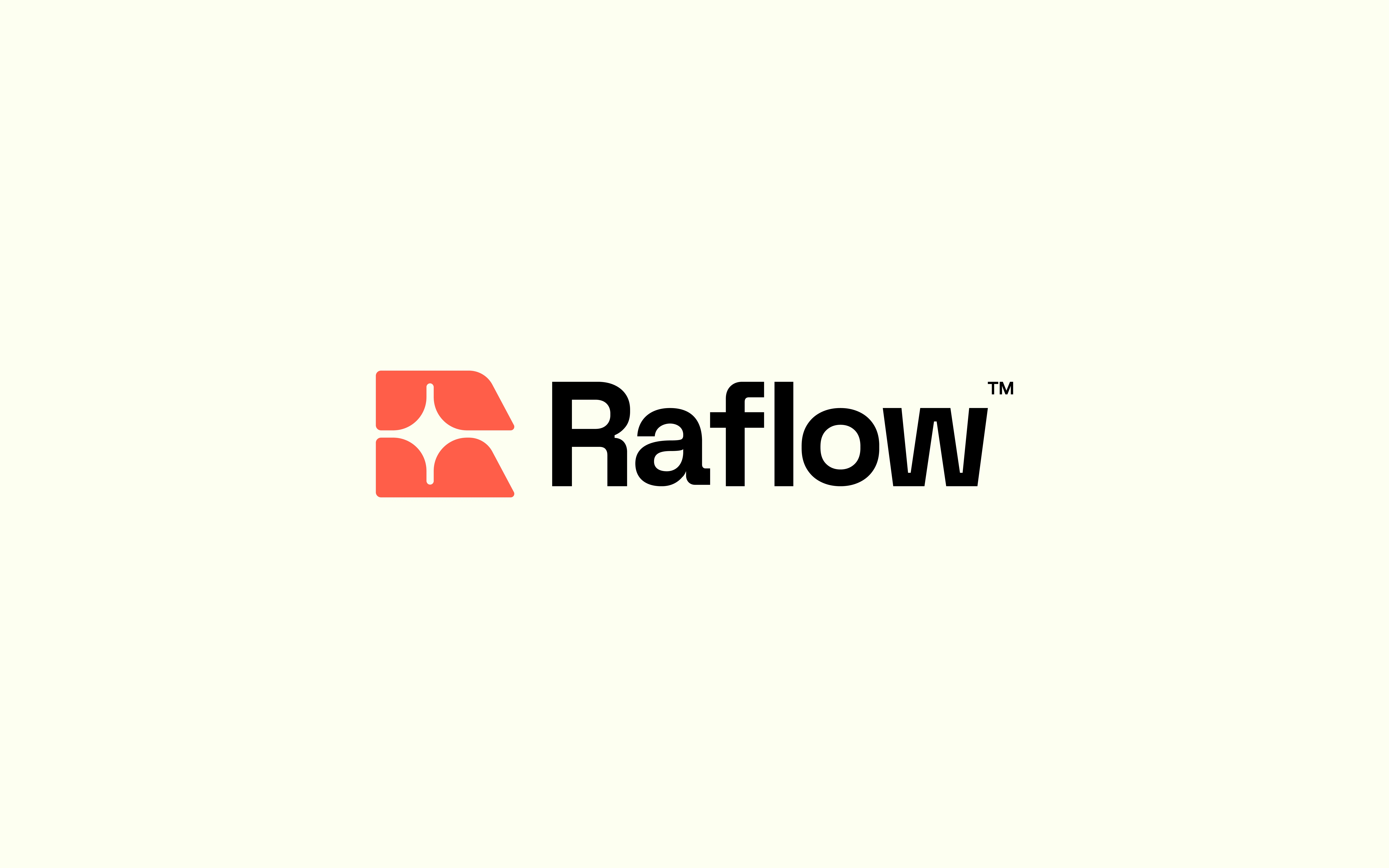
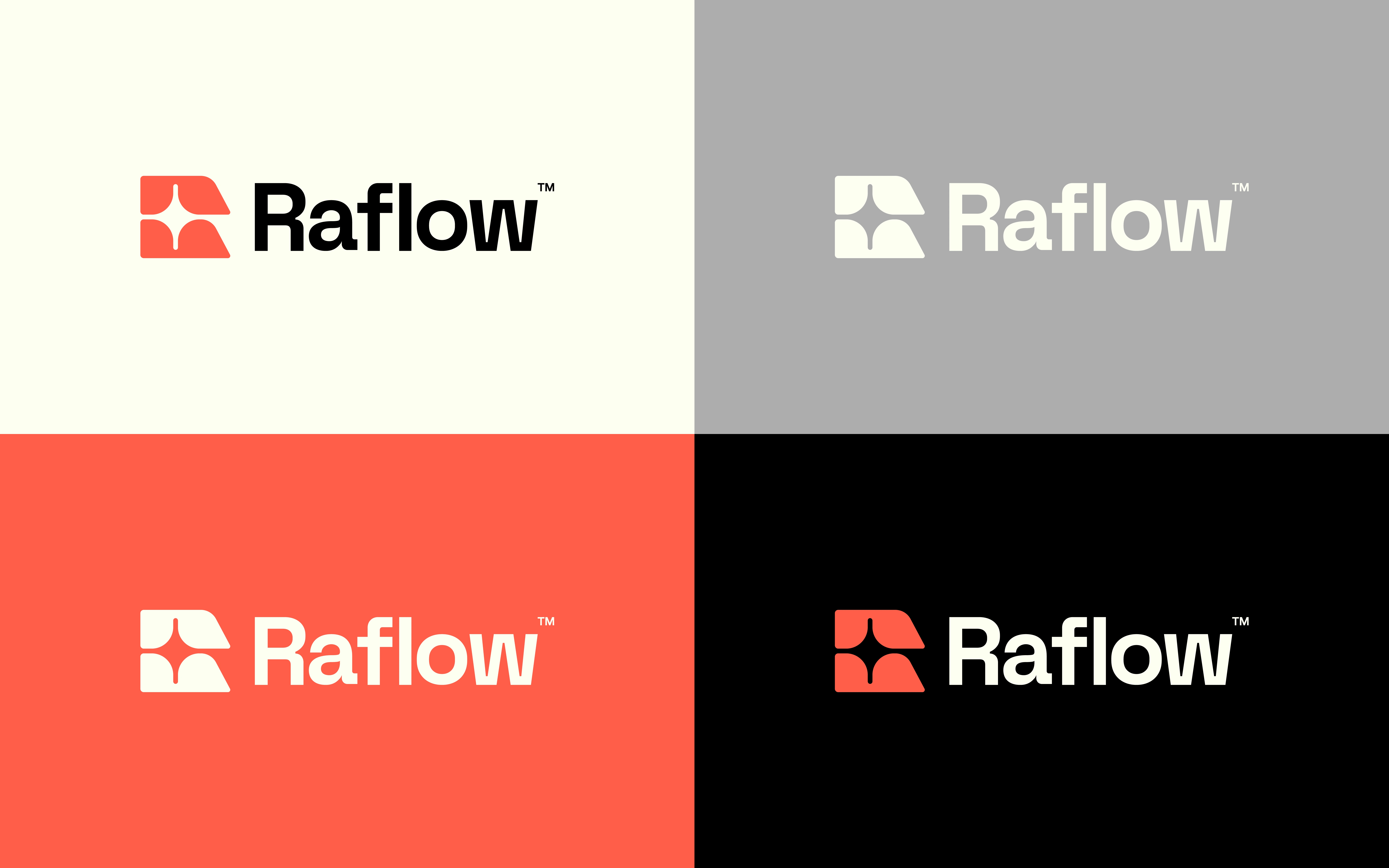
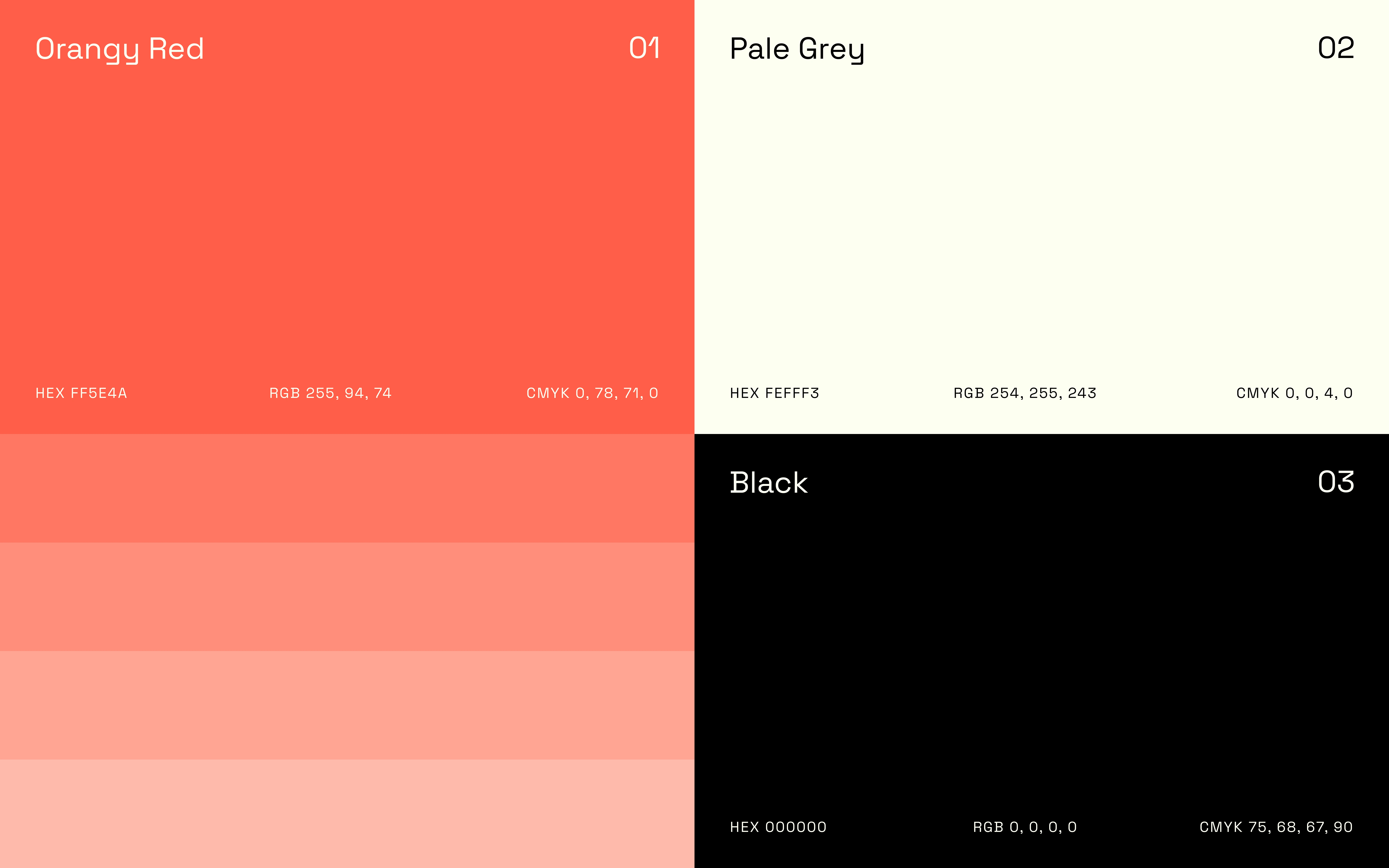
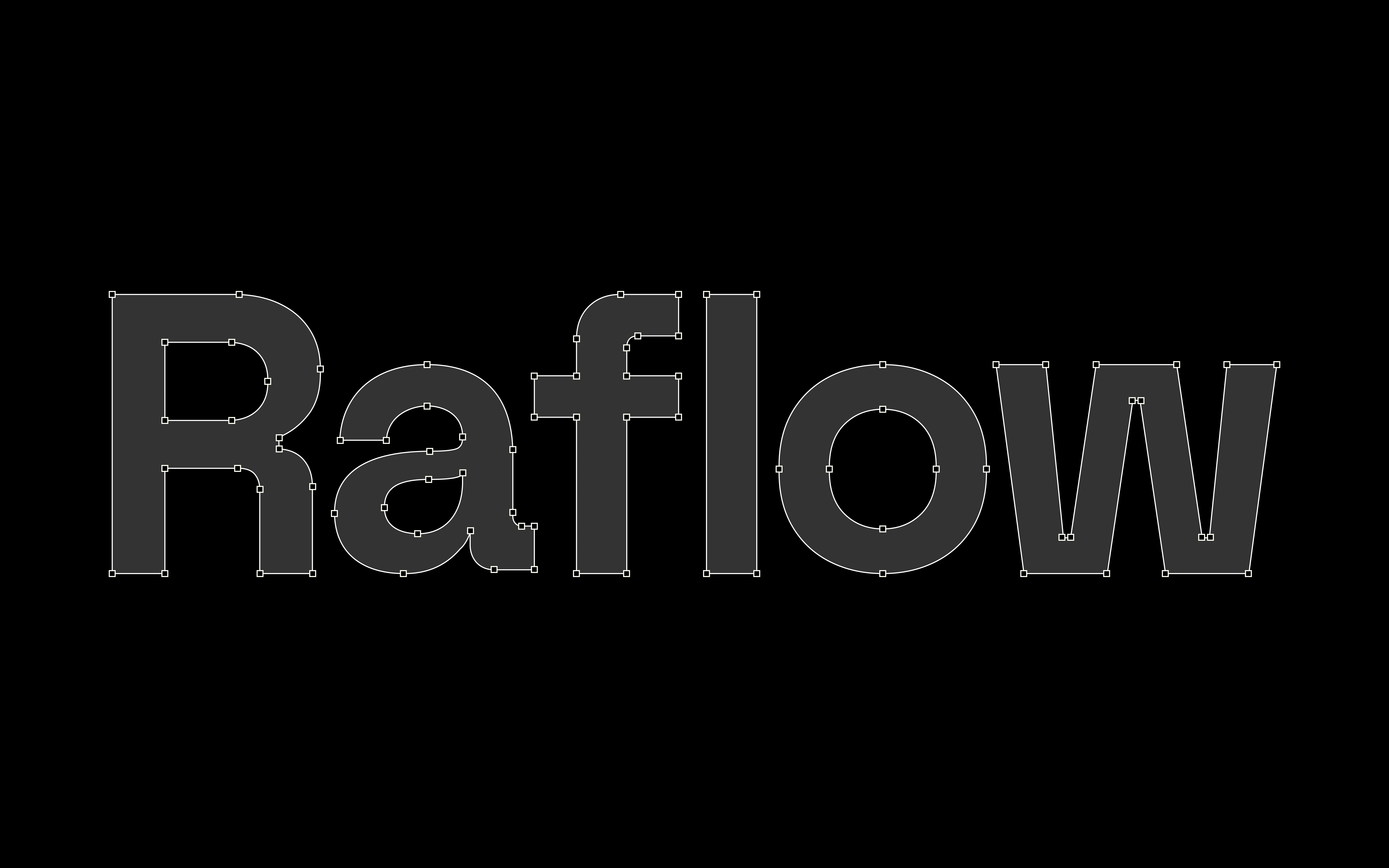
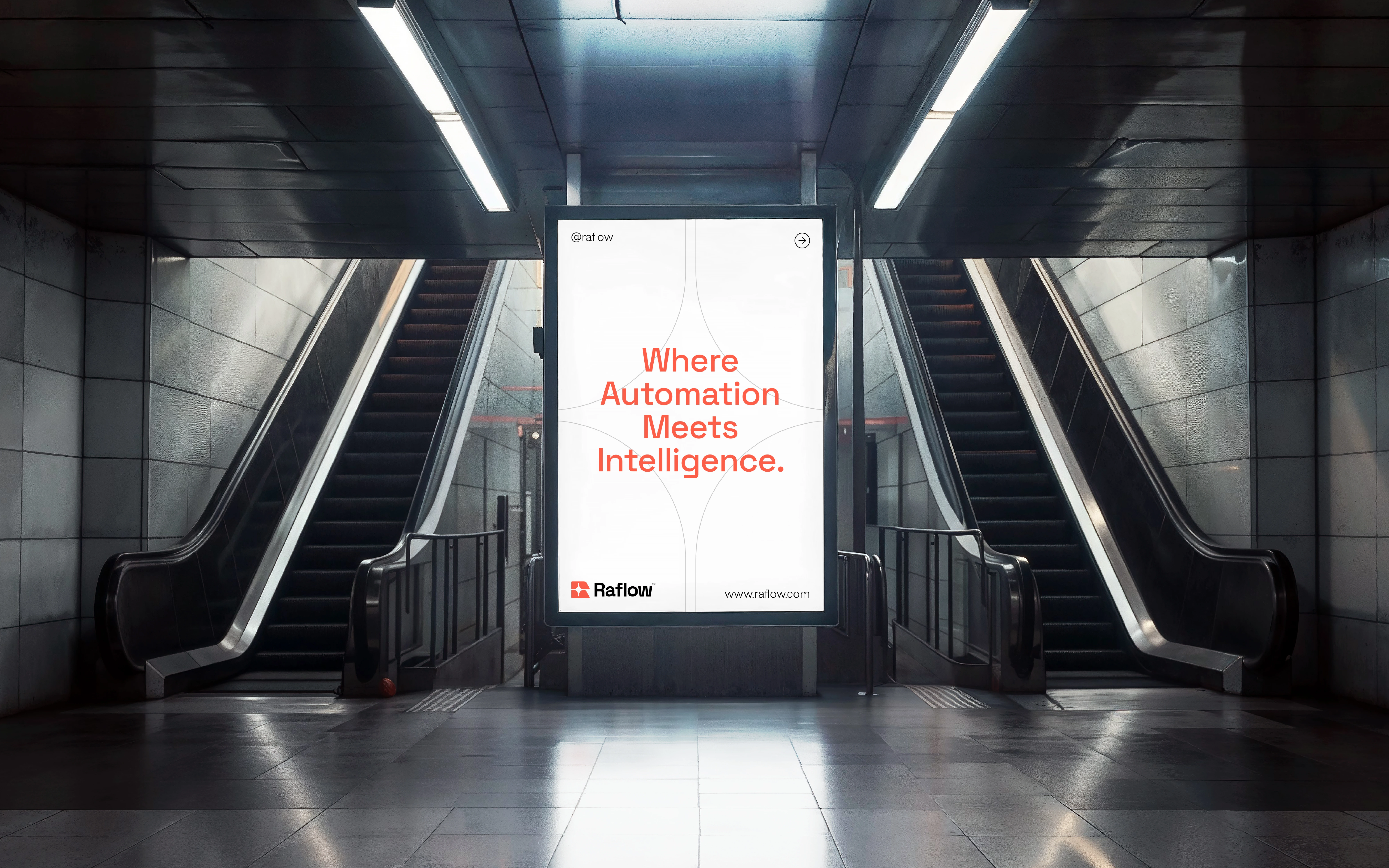
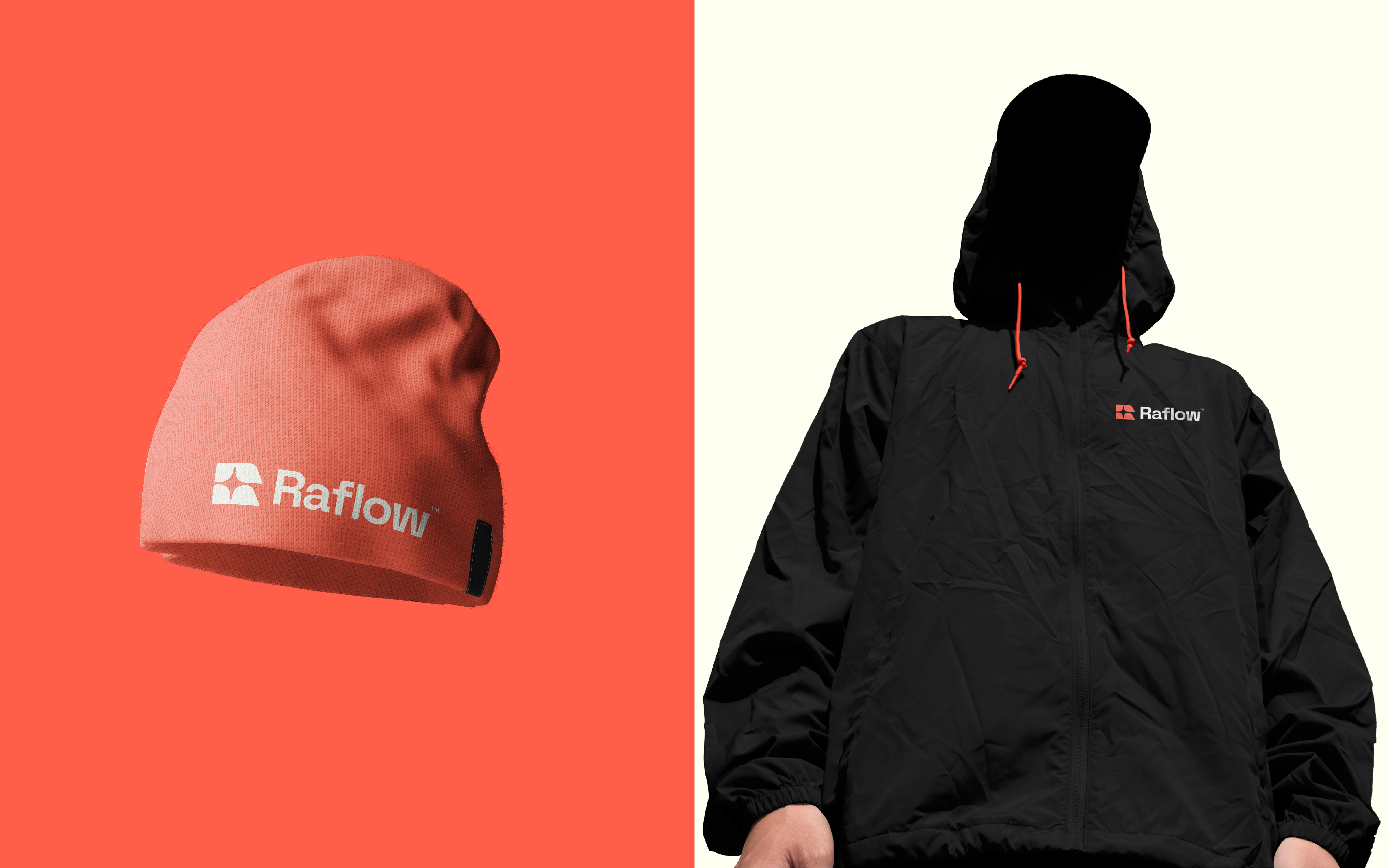
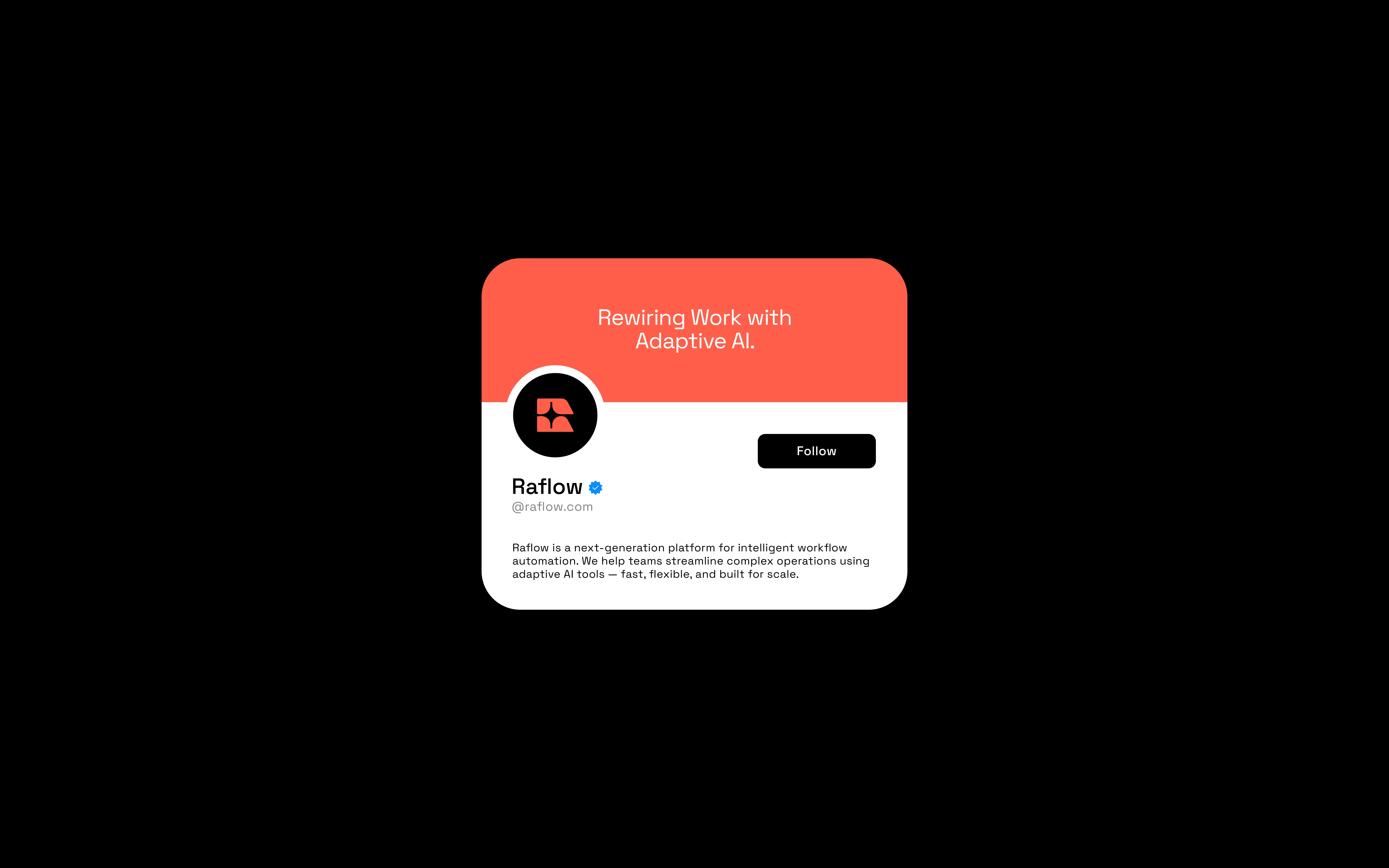
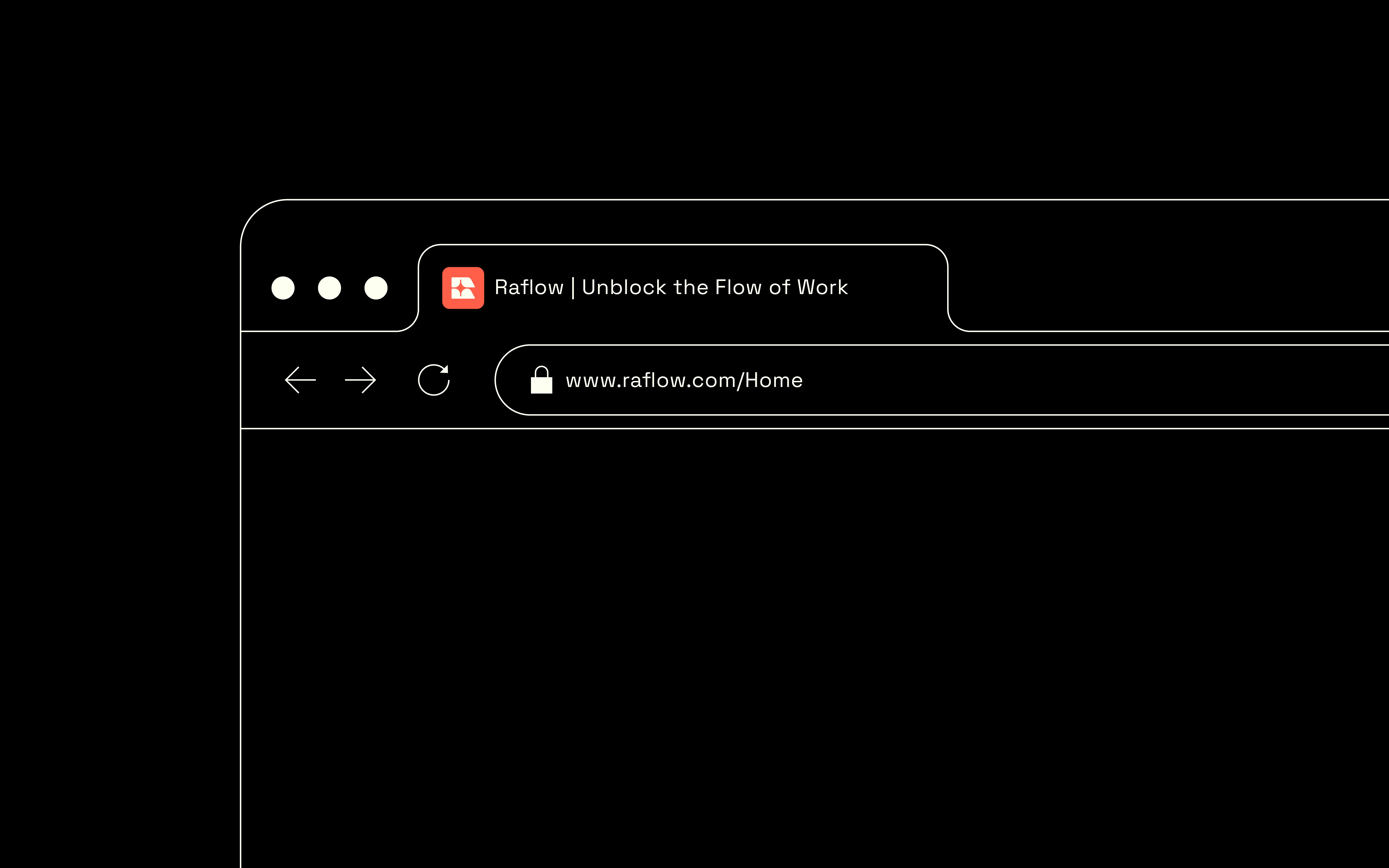
The coral palette gives the identity a warmer tone, while black text and light backgrounds provide a clear setting for the business message. Rounded forms connect the emblem with the wordmark’s softer character. The design does not need a literal robot or circuit illustration to signal its technology context.
FROM MARK TO MESSAGE
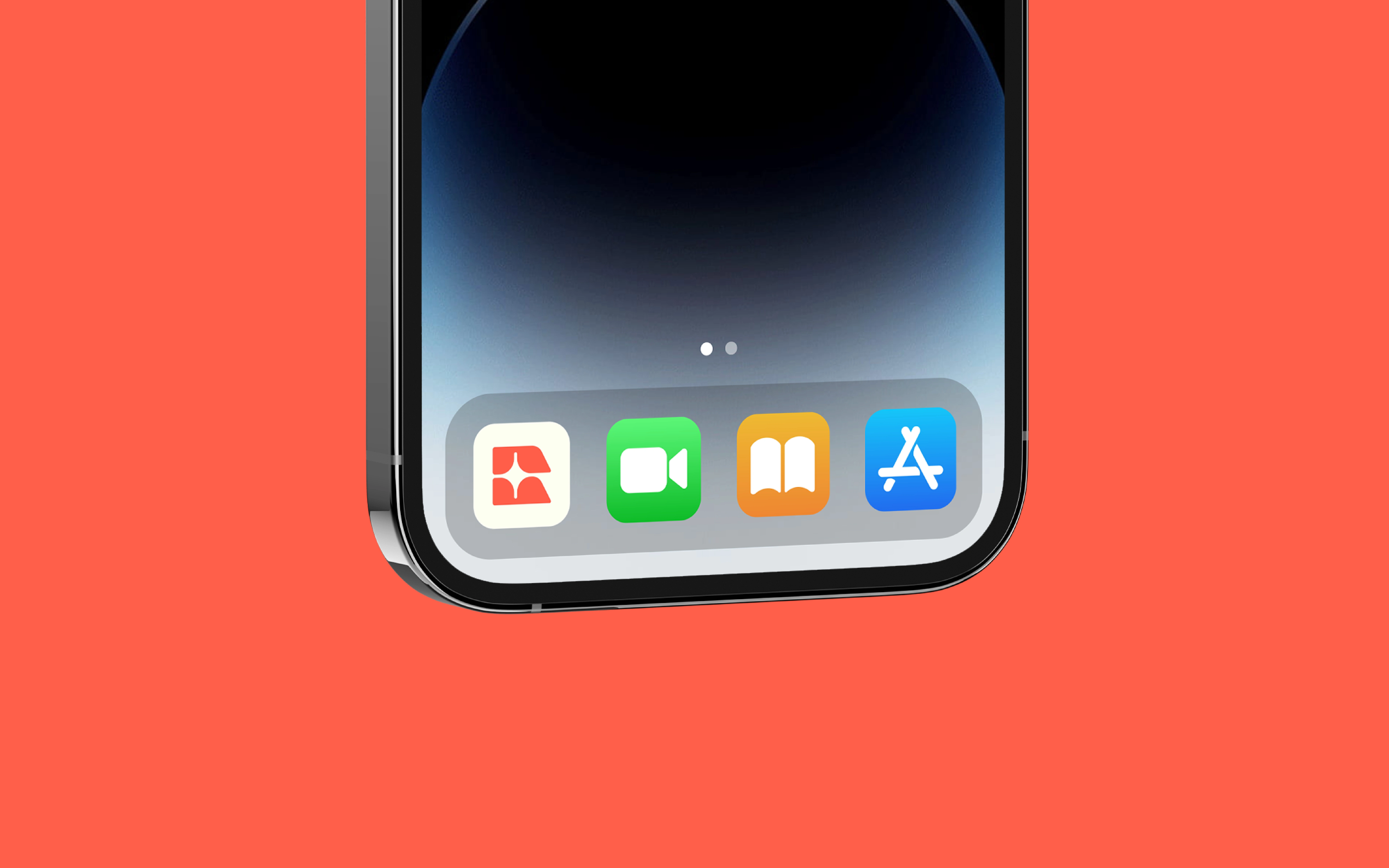
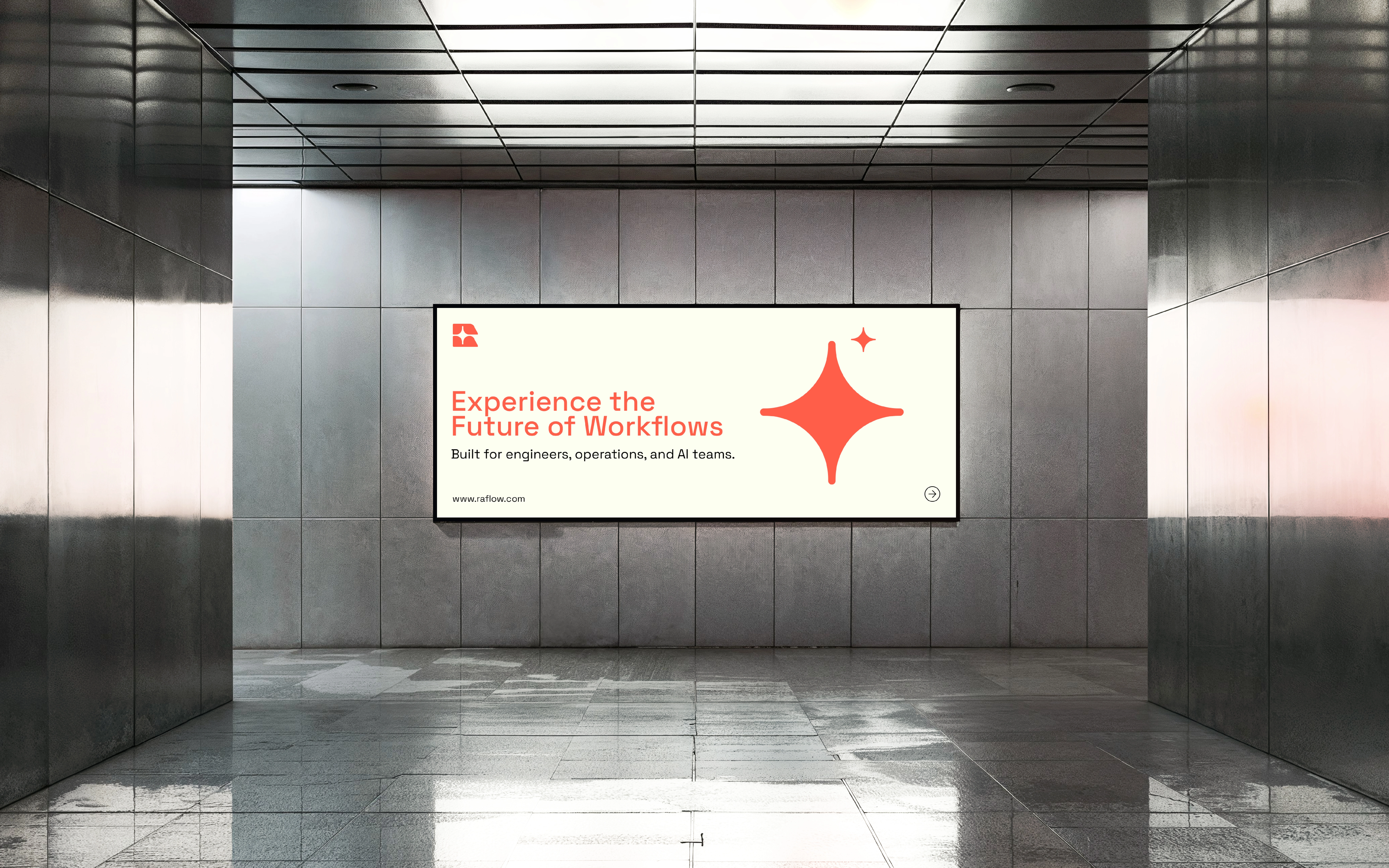
The presentation pairs the identity with a direct statement about AI-powered workflows. The tote application demonstrates how the central shape can carry recognition at a larger scale, while the smaller signature retains the name. This distinction gives the system flexibility beyond repeating the complete logo everywhere.
The outcome is an automation-brand concept expressed through a modular symbol, restrained palette and clear messaging hierarchy.

Like this project
Posted Oct 16, 2026
An AI-workflow brand concept built around coral colour, rounded modular forms and a flexible negative-space motif.