Redesigning Twitch's Busiest Interfaces – UI/UX Design
Kyle Humber
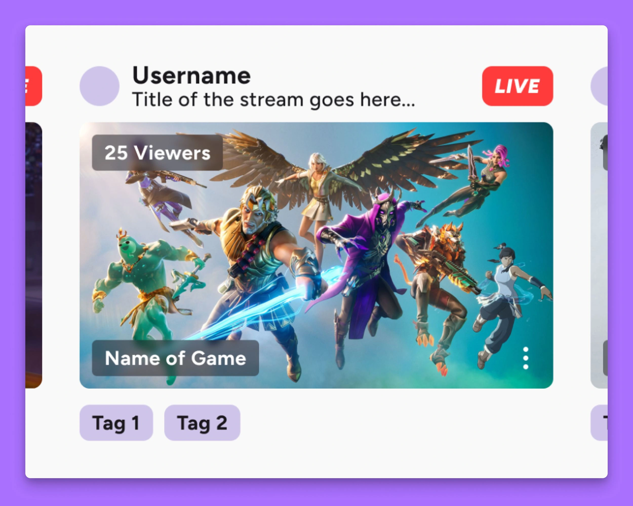
As a frequent user of Twitch, I've found the interface to be quite info-dense. While it's all necessary info being displayed, it feels cramped on any screen (especially desktop), so I set out to give it a facelift that gives every element some breathing room and friendly appeal.
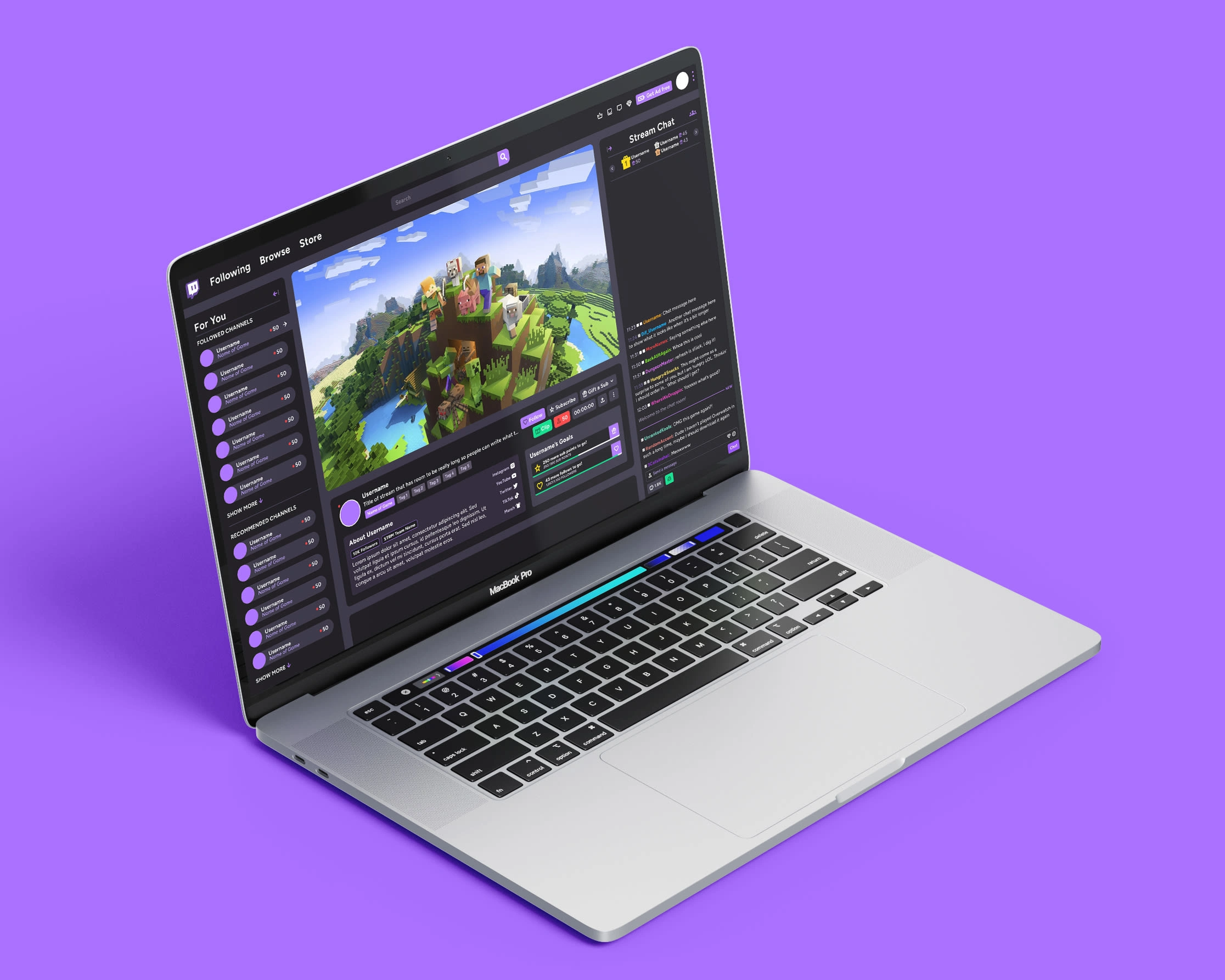
UI elements unified, aligned and flowing. This is the Twitch we deserve! All that same information is present in it's usual area, but cleaned up in a way that just makes sense.
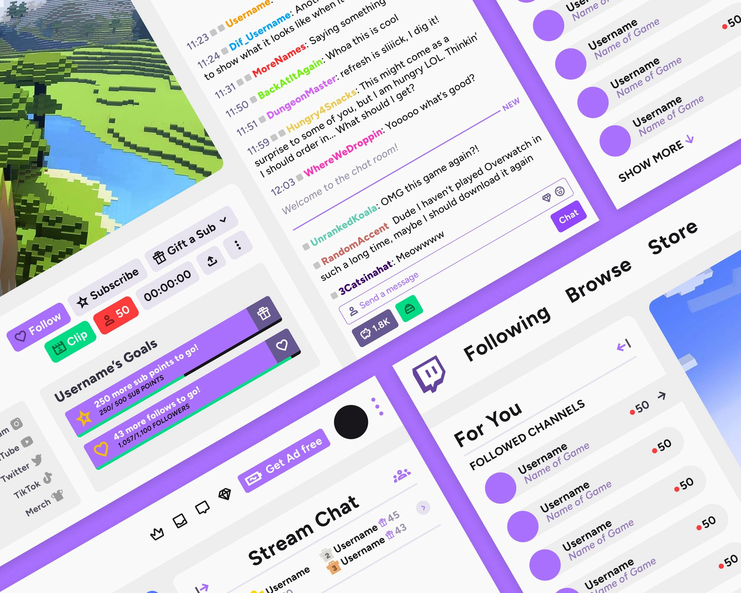
Everything down to the hundreds, if not thousands of info cards you'll see across Twitch are information-laden. It's all essential info, so I redesigned this core element to display everything in a non-cumbersome manner. (Full project breakdown coming soon, I'll link it when it's ready).
Like this project
Posted Aug 9, 2024
Twitch is an info-dense platform. I gave it a facelift to give it some breathing room and make the user experience much more fresh and friendly.
Likes
1
Views
39