Case Study (Netflix) : Fundamentals UX Design and Writing Rules

Josias Rufus


Introduction : Netflix
Netflix is an on-demand streaming service that allows users to access a vast library of content through various devices, including smart TVs, computers, smartphones, and tablets. It offers personalized recommendations, multiple user profiles, and the ability to download content for offline viewing.
Netflix has experienced remarkable growth and expanded its presence to become a dominant force in the streaming industry. Here are some noteworthy statistics that showcase its global impact:
User Base: By the beginning of the second quarter of 2022, Netflix had amassed approximately 222 million international subscribers, spanning over 190 countries (excluding China, Crimea, North Korea, Russia, and Syria). These impressive figures underline the platform’s widespread acceptance and popularity among viewers worldwide.
International Expansion: With its availability in over 190 countries, Netflix has successfully established a global presence. The company has made significant efforts to localize its content by offering subtitles and dubbing in various languages, ensuring accessibility to a diverse audience.
In this blog, we embark on an exciting journey to explore the intriguing patterns, trends, and insights hidden within Netflix’s content landscape. Leveraging the power of UX Rules and Writings Fundamentals, we dive into the vast collection of Netflix’s offerings to uncover valuable information that sheds light on content additions, User Attraction and Engagement, and how netflix through its writing can lead a beautiful journey of its user.
Through detailed image snippets and visualizations, we peel back the layers of Netflix’s content ecosystem to provide a fresh perspective on how the platform has evolved in UI/UX Journey. By analyzing release patterns, seasonal trends, and audience preferences, we aim better to understand the content dynamics within Netflix’s vast universe.
The Problem
The core problem users are encountering on Netflix is the difficulty in discovering relevant content and navigating through the extensive library. Additionally, users have expressed concerns about the lack of clear categorization, leading to frustration and reduced user retention.
The Goal
The goal of this case study is to improve user engagement, retention, and satisfaction on the Netflix platform. By addressing the core problem and enhancing the user experience, we aim to increase user loyalty and ensure seamless content discovery.
My Role
As a UX Designer, I am responsible for conducting user research, analyzing user behavior and feedback, and proposing design solutions to address the identified problems. My role involves collaborating with cross-functional teams to implement and test these design improvements.
Responsibilities
My responsibilities include:
Conducting in-depth user research and interviews.
Analyzing user data and metrics to identify pain points.
Creating wireframes and prototypes for new features.
Collaborating with UI designers and developers to implement changes.
Conducting usability testing to validate design improvements.
Understanding the User
User Research
To understand user behavior and preferences, I will employ various UX research methods, including:
Surveys to gather quantitative data on user preferences and pain points.
In-person or remote interviews to gain qualitative insights into user needs.
User analytics to track user interactions and identify usage patterns.
A/B testing to evaluate the effectiveness of design changes.
Summary
The Netflix user base consists of diverse individuals with varying content preferences and viewing habits. They seek convenience, personalized recommendations, and easy navigation to discover relevant content for an enjoyable streaming experience.
Pain Point
The primary pain point users face on Netflix is the overwhelming library and challenges in finding content tailored to their preferences. The lack of clear categorization and difficulty in content discovery lead to frustration and may cause users to abandon the platform.
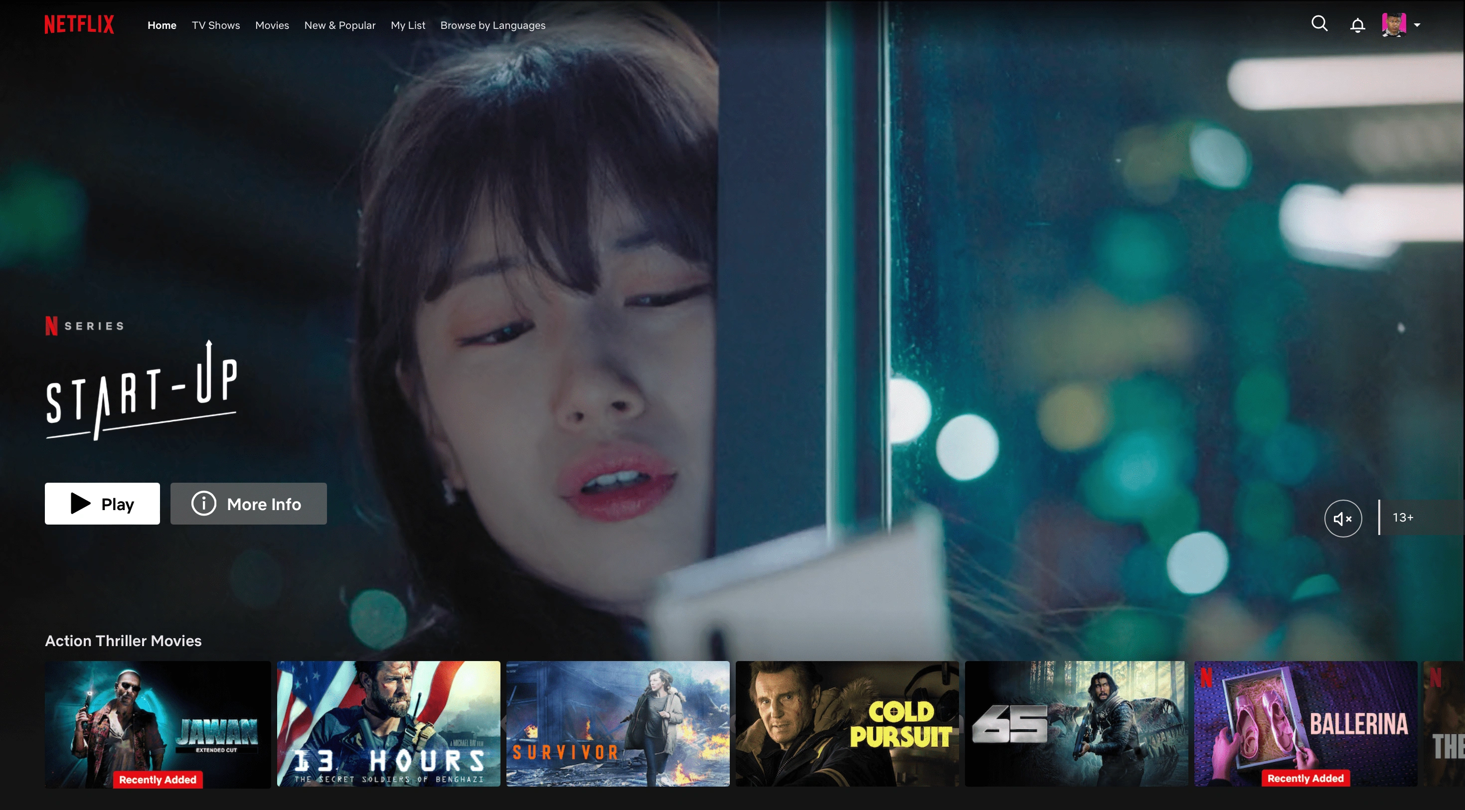
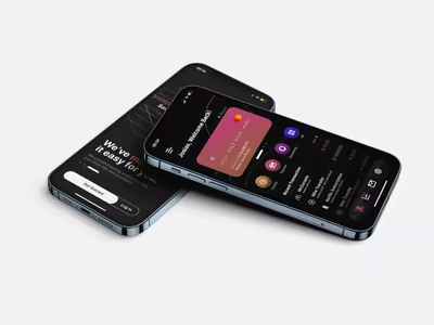
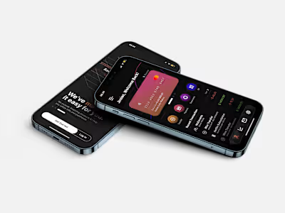
Image A - Original Netflix Homepage
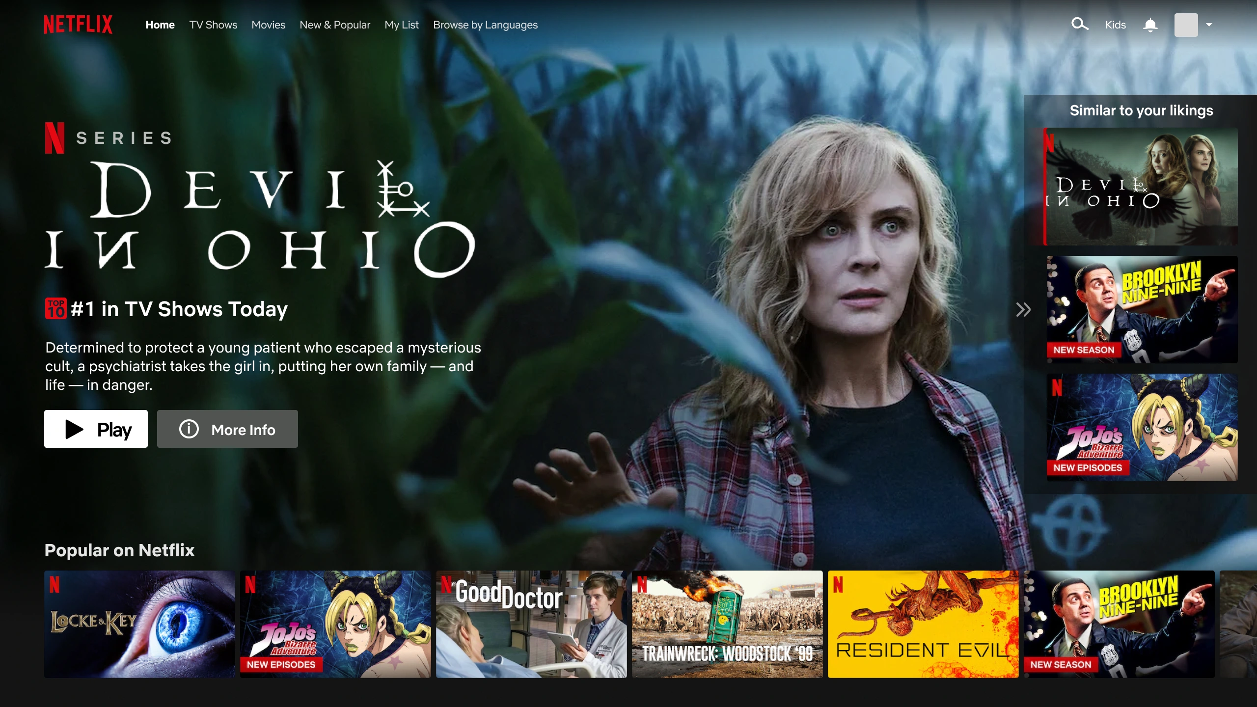
Image B - Edited to create more personalized homepage, more options to big screen preview, and calculated contents that similar to user's likings.
Personas
Persona 1: Movie Enthusiast Josias
Age: 23
Occupation: Marketing Manager
Behavior: Enjoys watching movies that similar to his likings (Action, Horror).
Goal: Easily discover popular movie releases, get personalized recommendations that similar to his likings and easy preview without having to take another step of actions.
Problem Statements and User Journey Map
Problem Statement :
Users struggle to find content that matches their preferences due to the lack of a personalized content recommendation system.
User Journey Map:
Josias logs in to Netflix to find a new movie.
She spends several minutes scrolling through the vast movie library but finds it challenging to discover something she likes.
Emma gets frustrated and decides to exit the app.
UX Structure
To address the identified problems, we propose the following UX structure:
Implement a personalized recommendation engine based on user preferences and viewing history.
Enhance content categorization with dedicated sections for new releases and trending shows.
Improve the user interface to provide clear navigation and quick access to recommended content.
UI/UX Theory Analysis
Getting Started and Suggestions : "getting started" and "suggestions" are effective customer attraction and retention strategies because they simplify the onboarding process, provide value early, offer personalized experiences, and keep users engaged. These strategies are particularly valuable in the highly competitive digital landscape, where user-friendly and personalized experiences can make a significant difference in attracting and retaining customers.
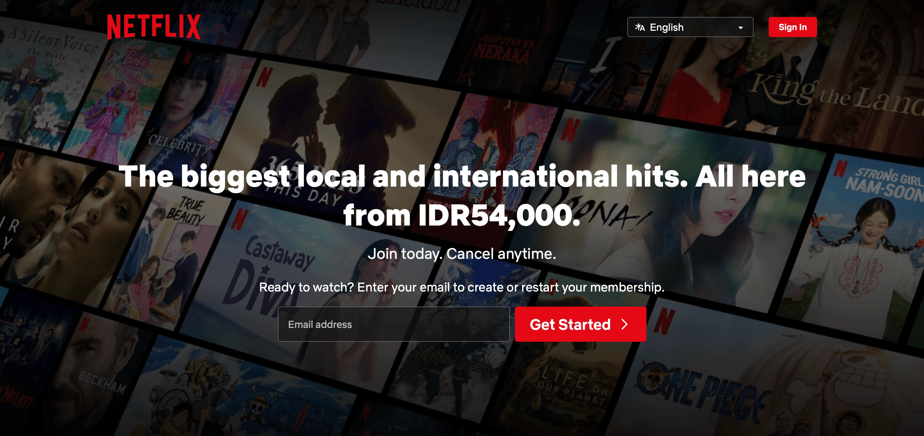
Netflix Homepage (before sign-in/up)
Suggestions to help users better in understanding the platform
Before delving deeper into writing tricks, let’s first try to understand how the consumers of our future content will actually read it. This may come as a surprise for some, but most people, in fact, quickly scan the pages for the relevant information. It is a critical stage because this is when visitors determine whether the text they’re reading is fulfilling their needs or simply wasting their time.
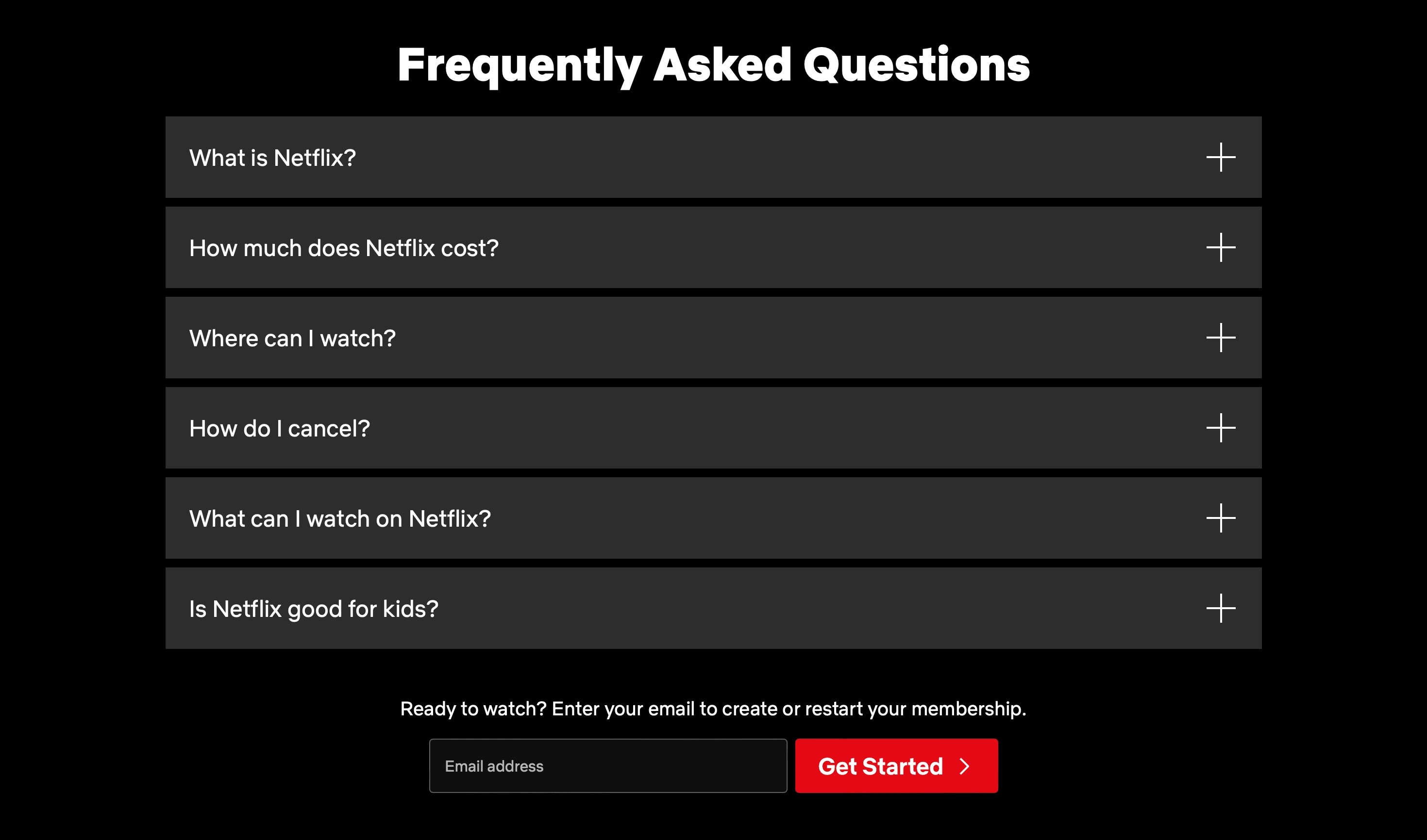
In this case, netflix shows their platform power and capabilities through headline to attract users and building trust that netflix is a reliable and fulfilling platform to entertain users. after the headline, in additions netflix also making sure the users that they are ready to connect with platform. In order to solve users questions and confusions about the platform, at the bottom of the page, they provide similar and frequently asked questions to help users understand better about their problems. Giving assistance in advance for the users create trust and providing details for users to have a better chance of conversion (subscribing). After the Questions sections, netflix also add a "get started" task to ease users continue their actions without having to scroll all the way up.
Join Today, Cancel Anytime
The example gives more engaging and attraction vibes for the users, this gives users much of flexibility and complexion about their membership, which will lead to more satisfaction and confident with their decision before making complete transaction. This is because they have been able to experience the product or service first-hand, and have a better understanding of its value and benefits.
Overall, offering a free trial can be an effective way to increase customer satisfaction, and can be a key factor in helping you acquire new customers and grow your business. By giving customers a low-risk, low-stakes way to try your product or service, you can build trust, establish a relationship, and ultimately increase customer satisfaction and loyalty.
In Summary :
Headline is clear and engaging with showing their platform power.
Buttons and Join Task are easy to understand for users
Advance assistance and questions do really help most of users to understand the platform, before getting to next section (joining)
Words are common and easy to understand
Power of Message, Verification and Metaphors : messages, verification, and metaphors are important in UX writing because they provide clarity, guidance, and feedback to users, enhance the user experience, simplify complex concepts, and contribute to the overall aesthetics and brand identity of the interface. When used effectively, these elements can make the user experience more engaging, user-friendly, and memorable.
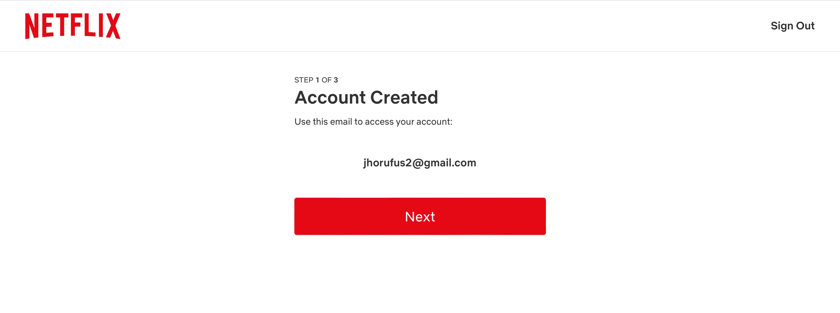
Step One : Email
Words that used in this page are common and easy to understand, this help users to understand the feedback more quickly and precisely. In addition of feedback, netflix also provides small information "Step 1 of 3" to inform users about what steps they're in right now.
Netflix also make sure and verify the user's email that will be used in account creation, this also prevent users from turning back to step 1 (in case if they just realized that they're using the wrong email address)
Button Placement and Next are the best combination to lead user's progress in account creation
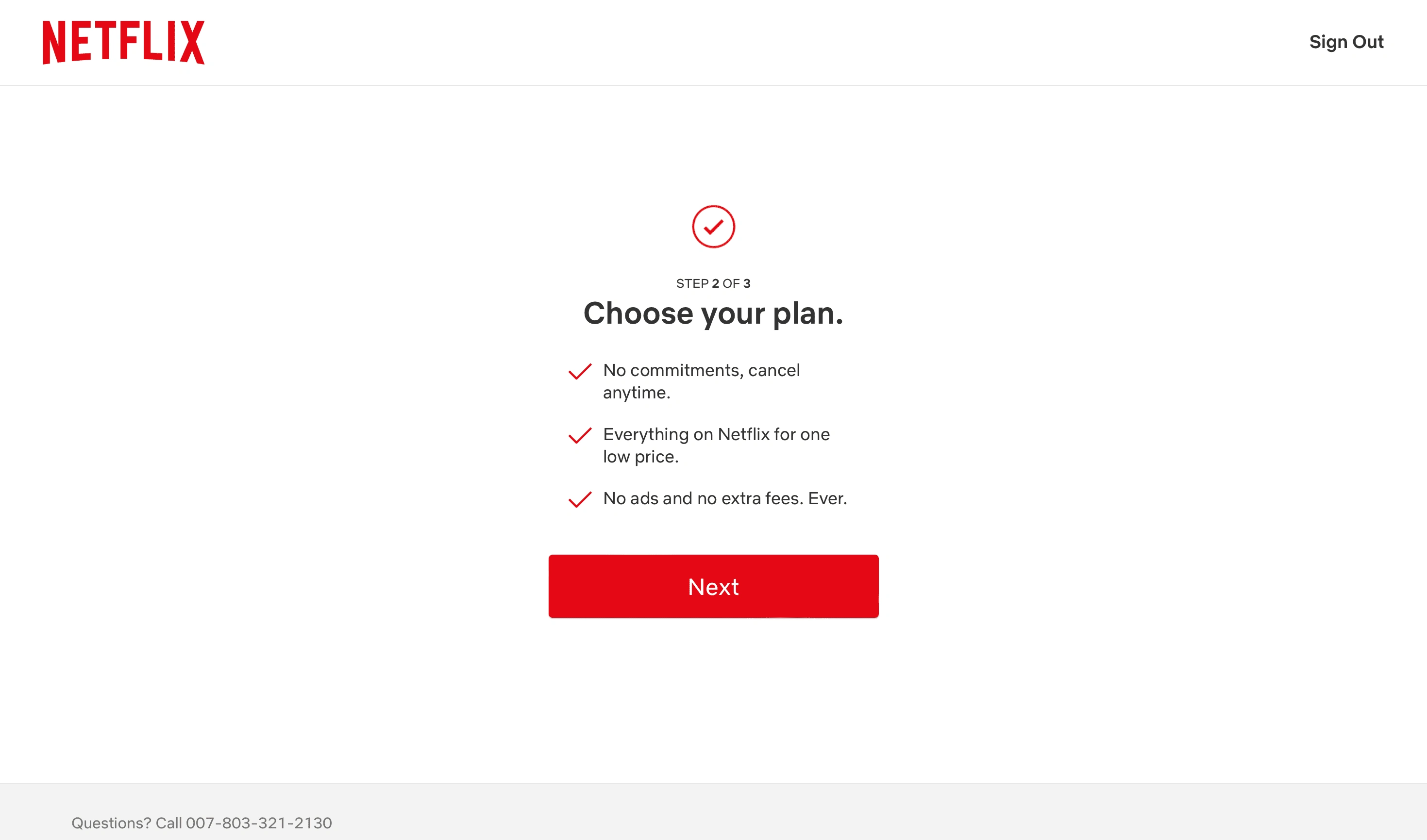
Step Two : Choose Plan
User may feel like cancelling somehow without any reason and building trust along the way of the progress is the best way to keep user's align with our goals. Netflix uses engaging and provide security about their decision by highlighting (writings) the commitments and user's decision, affordable price and transparency of their bills
Step Two : Choose Plan
Netflix in this step, still using engagement and attraction type of writing to keep users align with their goals (making subscription) by highlighting the benefits and security with all of user's decision.
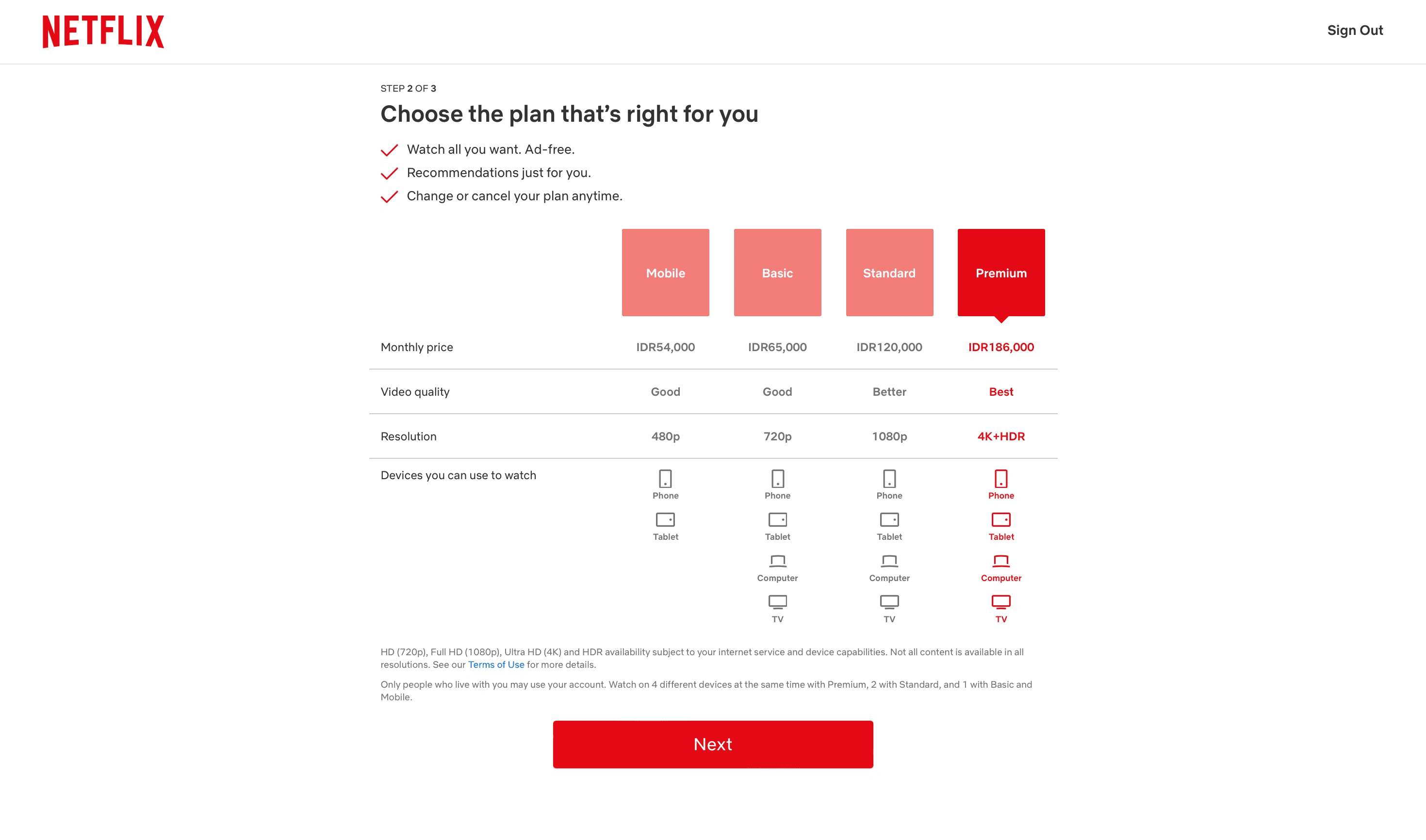
Details and plan category are described in clear and concise way as possible, in additions by using metaphors to portrait users about the device model that available in each plan. This helps users to understand better about the plan they about to choose according to their needs.
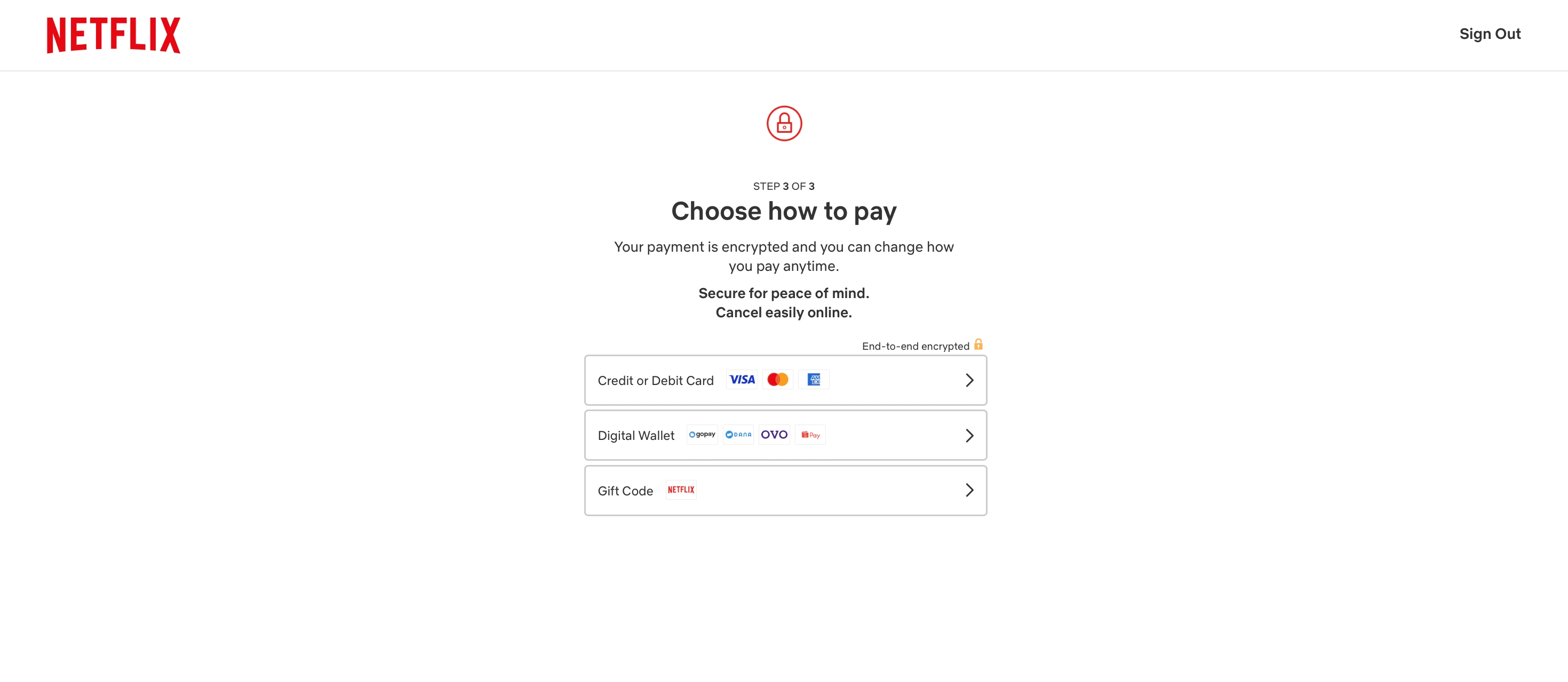
Step Three : Payment
Netflix continue to use engagement and attraction type of writing to keep users align with their goals (making subscription) by highlighting the security to all of user's payment options.
Details and options are described in clear and concise way, in additions netflix also utiliz metaphors sentence to portrait users about their payment method or brand that available in each options. This helps users to understand better about the payment they about to choose according to their needs.
In Summary :
Messages are concise and clear for users
Verification to prevent further problems that may lead to cancelations
Using Engagement sentences to build trust and security, as well as engage users to keep them in line with platform's goals
Provide necessary metaphors to make sure user's decision/payments
Show user's steps feedback to let them know which step they're in.
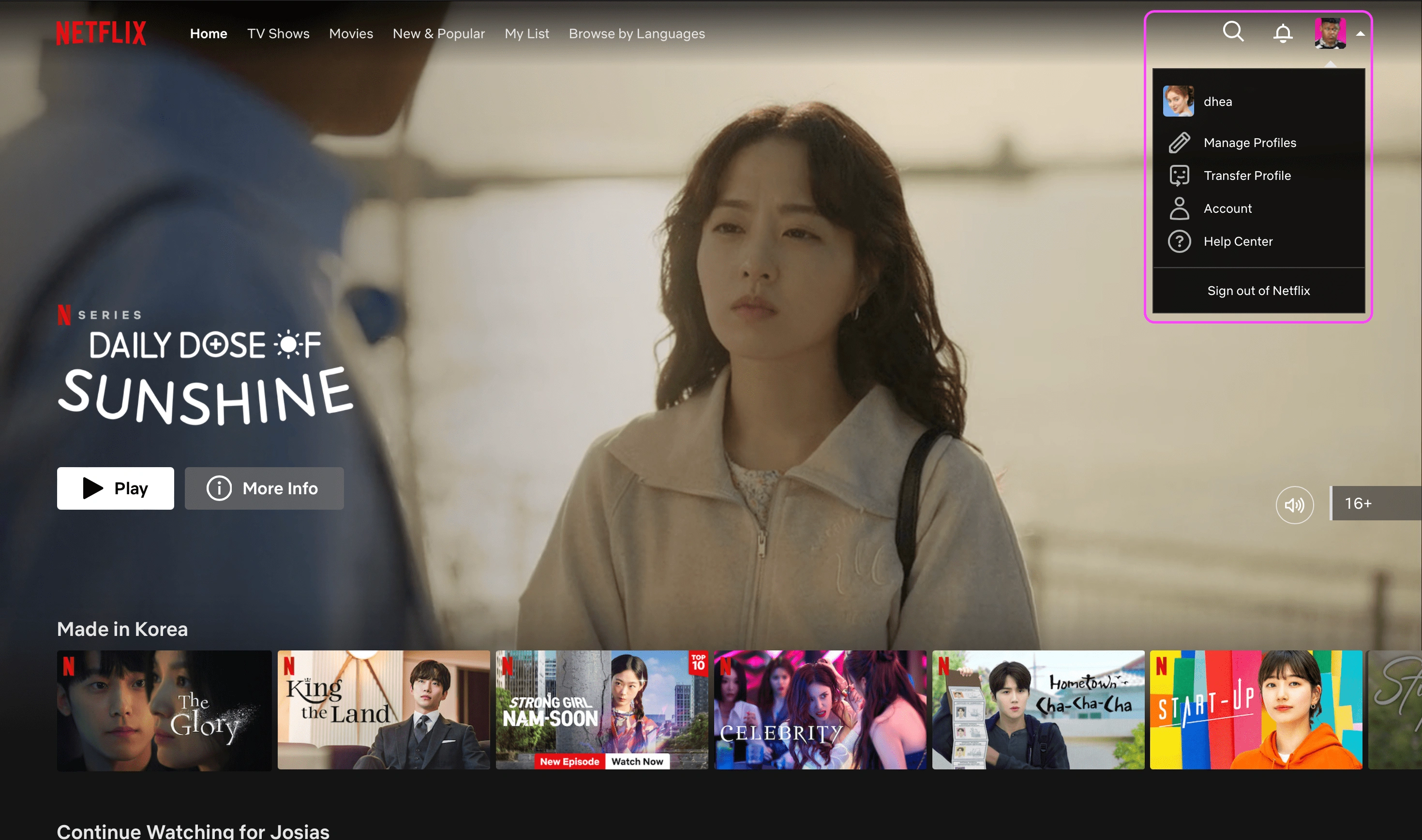
Concise and Clear Objectives/Navigation : having concise and clear objectives in UI and UX design is essential to ensure that the design is user-focused, effective, and aligned with the overall goals of the project. It leads to better communication, measurable success, user satisfaction, and the ability to iterate and improve the design.
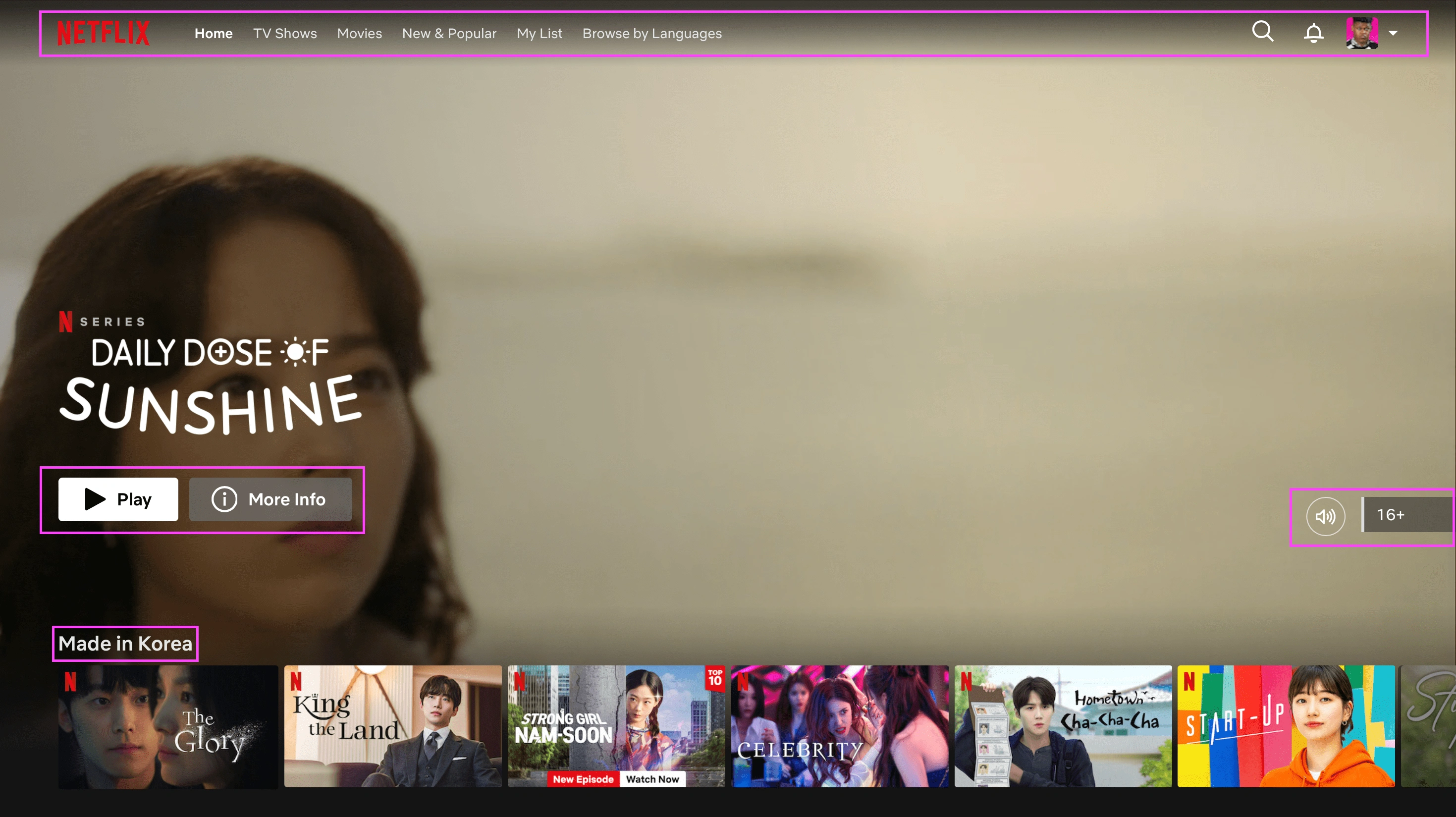
Netflix uses short and clear writing, this leads to better understanding from the user.
short and clear writing is a fundamental aspect of effective communication. It makes information more digestible, minimizes the risk of misunderstanding, and contributes to a more user-friendly and accessible experience. In today's information-rich and fast-paced digital world, the ability to convey a message clearly and concisely is a valuable skill for designers, writers, and communicators. Example from the image above, all of the writings from navigation (home, Movies, My list) to Show Category are written in clear and common words, so user doesn't need any effort to easily understand the platform.
The concept of concise and clear writing is also used in personalized menu, this leads to better understanding from the user to perform specific task.
In Summary :
Navigations are clear
Words are common and easy to understand
Buttons and small details are easy and clear to perform
Clear Data and Details Visualization : clear and detailed visualization in UI/UX design is crucial for creating user-friendly, aesthetically pleasing, and efficient interfaces. It improves user understanding, reduces cognitive load, and enhances the overall user experience. It also plays a role in branding, accessibility, and engagement, making it a fundamental aspect of design in modern digital environments.
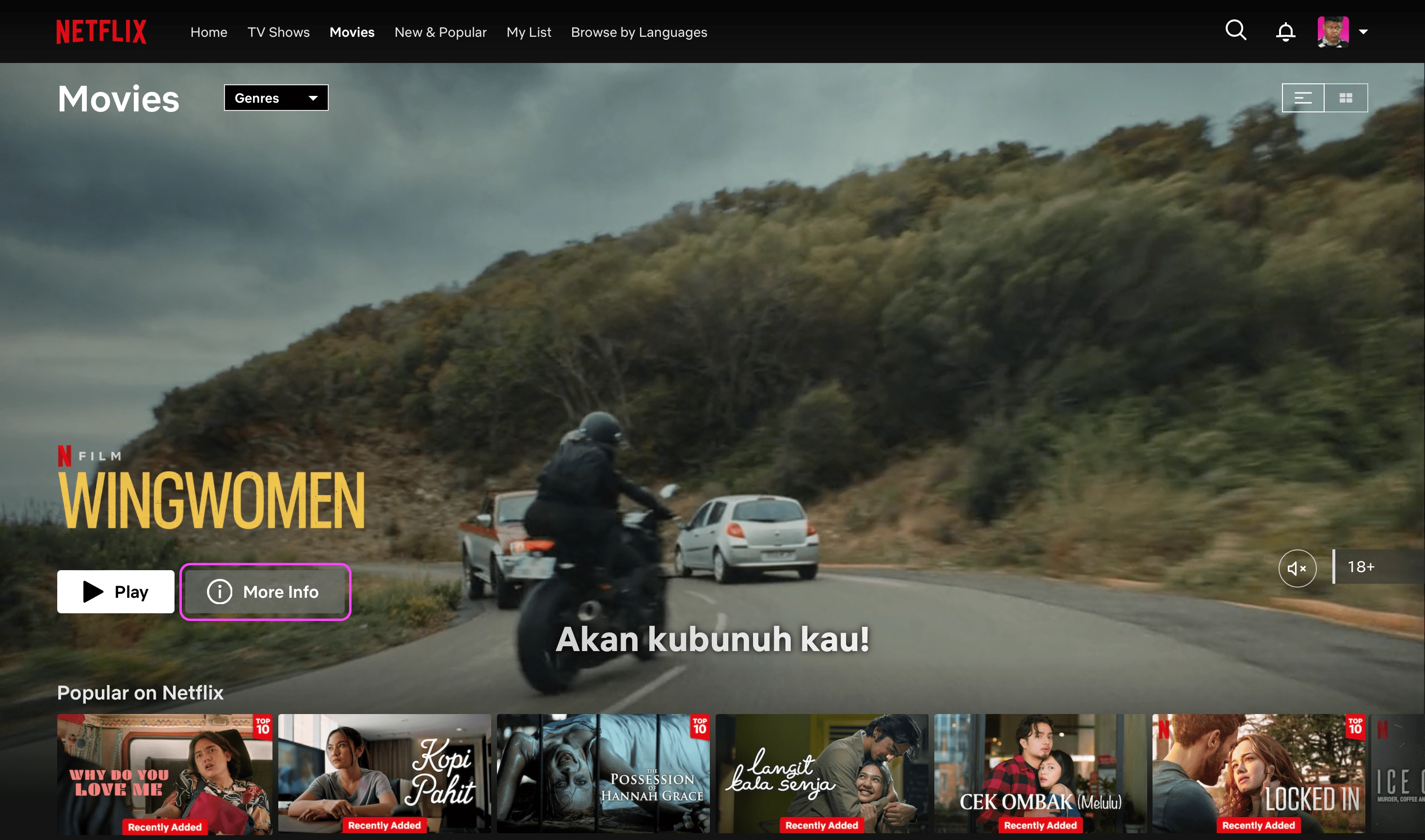
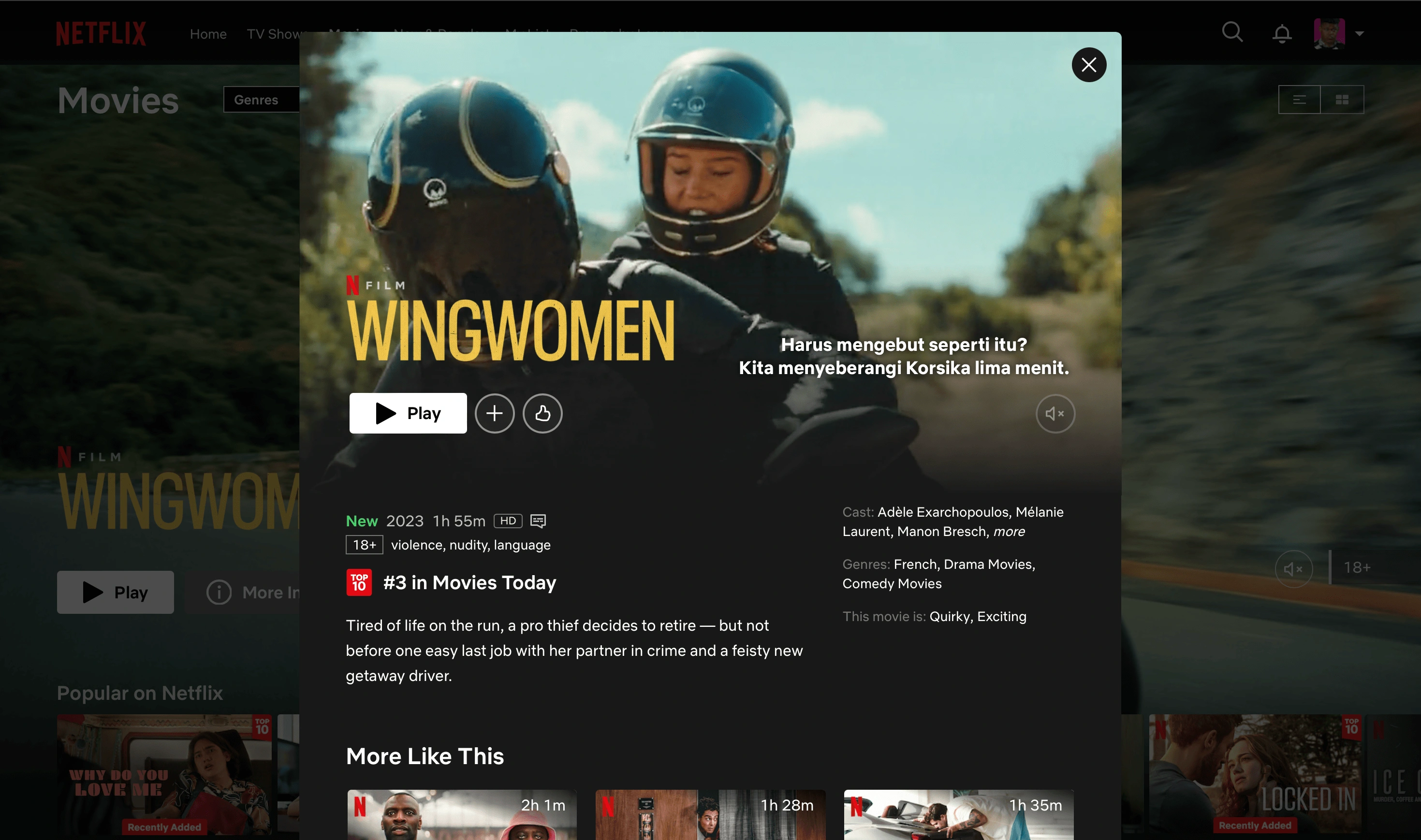
Notice how the movie Data and Details are written
netflix data visualization is really simple and doesn't need much steps to perform user's specific task. In this case, users wanted to know the film details and all they need to do is by clicking at "More Info button", then the film details will show up instantly without having to move to another film page. Words are written in common (genre, cast, description), it leads to better understanding for users. Netflix uses addition below the main content to show users there are more content available that matches their likings, this also boost user's engagement to the platform by giving them best content they need and similar alternatives that they may check now or later. User Interfaces is made in simple yet easy to do, without taking users to more further complicated task which will take more of user's time and actions.
Tired of life on the run, a pro thief decides to retire - but not before one east last job with her partner in crime and feisty new getaway drive
Notice how the description above were purposely written in High Fives fundamentals, written in simple, short, clear and yet does have a power to attract user. Creative and writing skills are also needed to simply engage users, and lead them to take more time to spend on the platform. It's also an effective way to describe most of the film in short and doesn't take much of user's time to understand what is the film about. With both of them combined, it does have a better chance to make users interested in the topic, because its easy and persuasive enough to understand for users
In Summary :
Words that used in buttons are clear and simple enough to understand the task
Details are clear and common, easy to understand
Film Data (Film length, genre and description) are clear
Description are written in Effective and Attractive way, in order to engage more users.
Additions are sometimes needed to create more engagement with users
I will update this study cases soon if theres more evidence to review
All of my studies are backed up by Data and Realtime Research, feel free to contact me at jhorufus@gmail.com about data that used in this topic. Thanks for your attention.
Like this project
Posted Nov 4, 2023
Discover how Netflix uses compelling content, intuitive navigation, and user-focused design to keep its global audience engaged.
Likes
0
Views
200


Case Study (5ifty): Researching, Interview & Testing
Case Study (FatSecret) : Balance between Aesthetic and Function
Case Study (Steam): Adaptation of UI/UX Principles
Case Study (DW) : Researching, Interview and Testing