BiteSyzed, Automatic video maker
What is Bitesyzed?
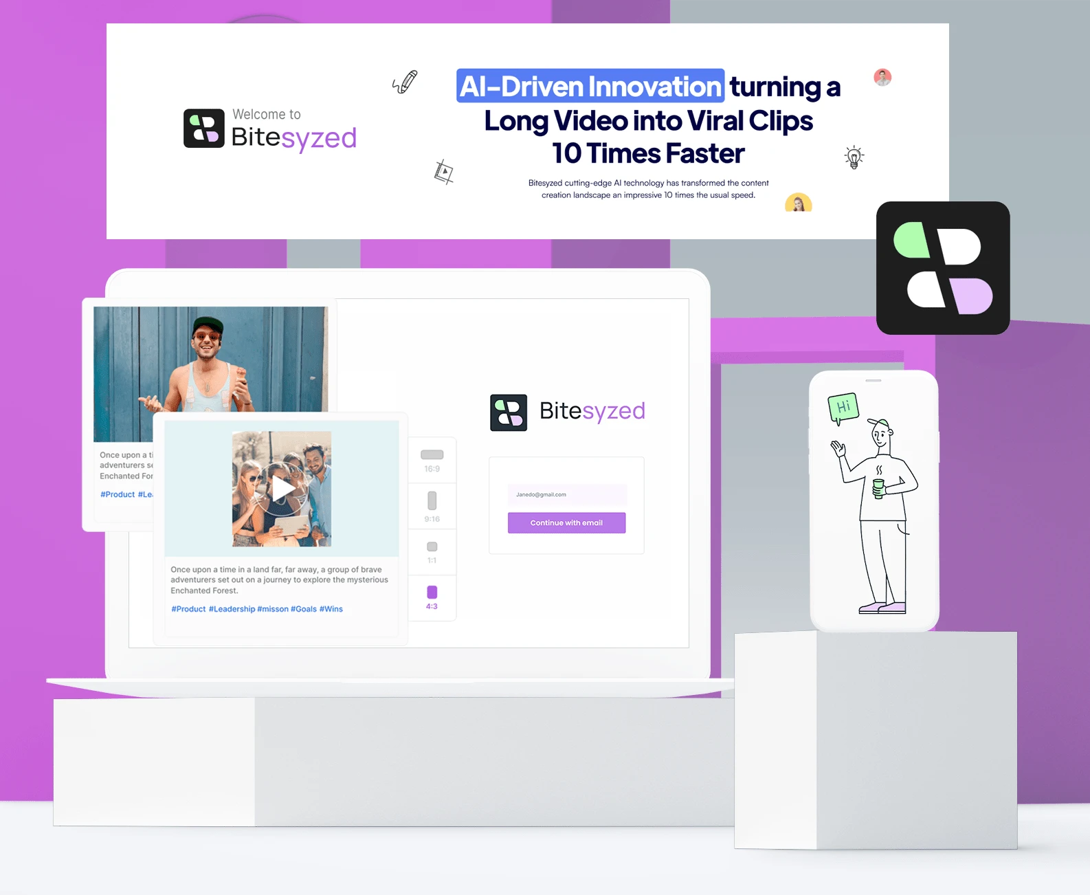
Bitesyzed is an AI-driven innovation that turns a Long Video into Viral Clips 10X Times Faster
Scope of product and deliverables
Bitesyzed began its journey with a wide-open scope, devoid of a defined brand identity or guidelines. Bitesyzed central vision revolved around harnessing the potential of AI to precisely extract and deliver significant clips from lengthy videos through a digital web product. These clips were intended to be easily shareable, ensuring a seamless and instant experience for users
Deliverables:
Breakdown of vision into tangible tasks
Brand design from 0-1
UX design for a Bitesyzed web product
Content and copy design for Bitesyzed
User interface design for Bitesyzed web product
Interaction & animations for web product
Brand Design Process
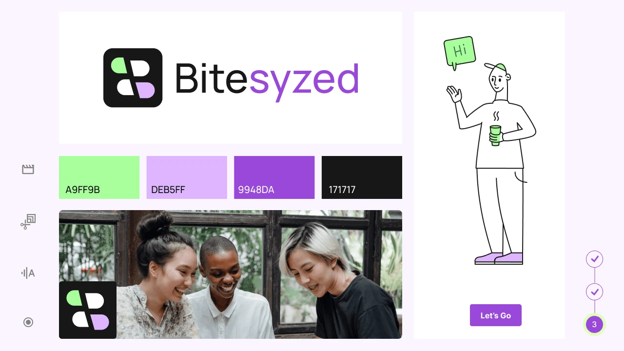
During the brand design process, we worked with stakeholders to understand their vision, positioning, and archetype for their brand. Based on that we suggested presenting them we a brand logo, typography, color palette, and some design system components.
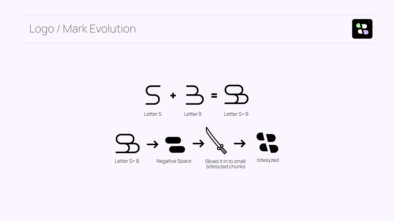
Bitesyzed mark evolution
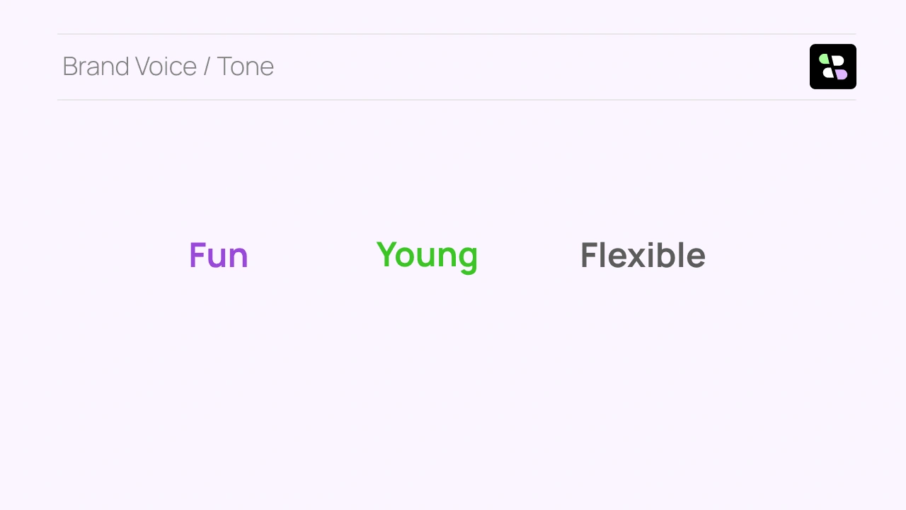
Brand voice tone
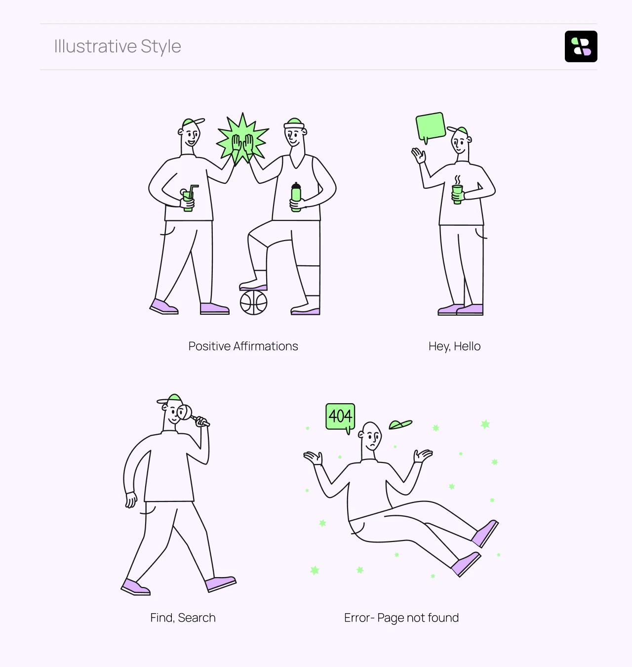
Illustrative style: we chose an illustrative style and tweaked it based on our needs
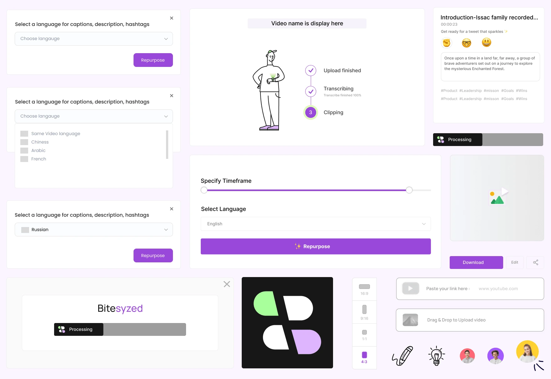
Design components
Cover animation
Product Design Process
The product design process is lengthier than the brand design process, so we wanted to build quickly, To start, we did a quick research to create segments of users who will be interested in using Bitesyzed, list down potential competitors, and study what makes them successful. Here are a few steps that we took:
Quick research was conducted to segment potential user groups interested in Bitesyzed, along with an analysis of competitors to identify successful strategies.
Rapid wireframing and user flow creation were executed to grasp the product's dynamics at a practical level.
After discussions with stakeholders, a definitive direction was established, leading to the initiation of the visual design phase.
Throughout the process, emphasis was placed on integrating brand design elements and components as guiding principles for Bitesyzed's product design.
Welcoming interaction (3-sec screen)
Delightful start: In a welcoming interaction, a character appears on screen with a waving animation greeting the user. after that login screen appears.
login screen
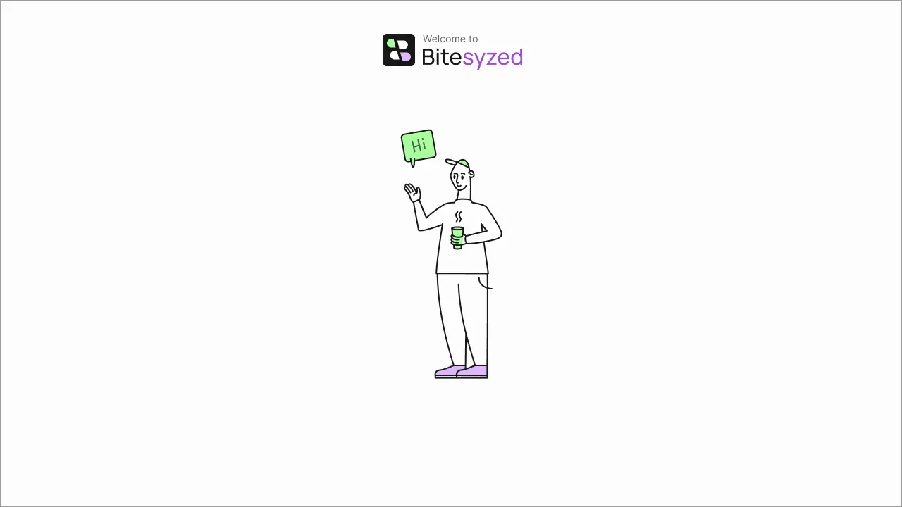
hello interaction
First-time Dashboard
The initial landing dashboard is designed to captivate and inform users effectively upon their first visit.
A tutorial video showcasing product usage is strategically placed at the forefront of the dashboard experience.
Following the tutorial, a prominent "Start Creating" section is readily available, encouraging immediate engagement with Bitesyzed.
This dashboard layout significantly enhances conversions for first-time users, offering them a choice to swiftly understand the product's functionality and value.
Users can seamlessly proceed with the platform or explore further benefits by scrolling through the dashboard.
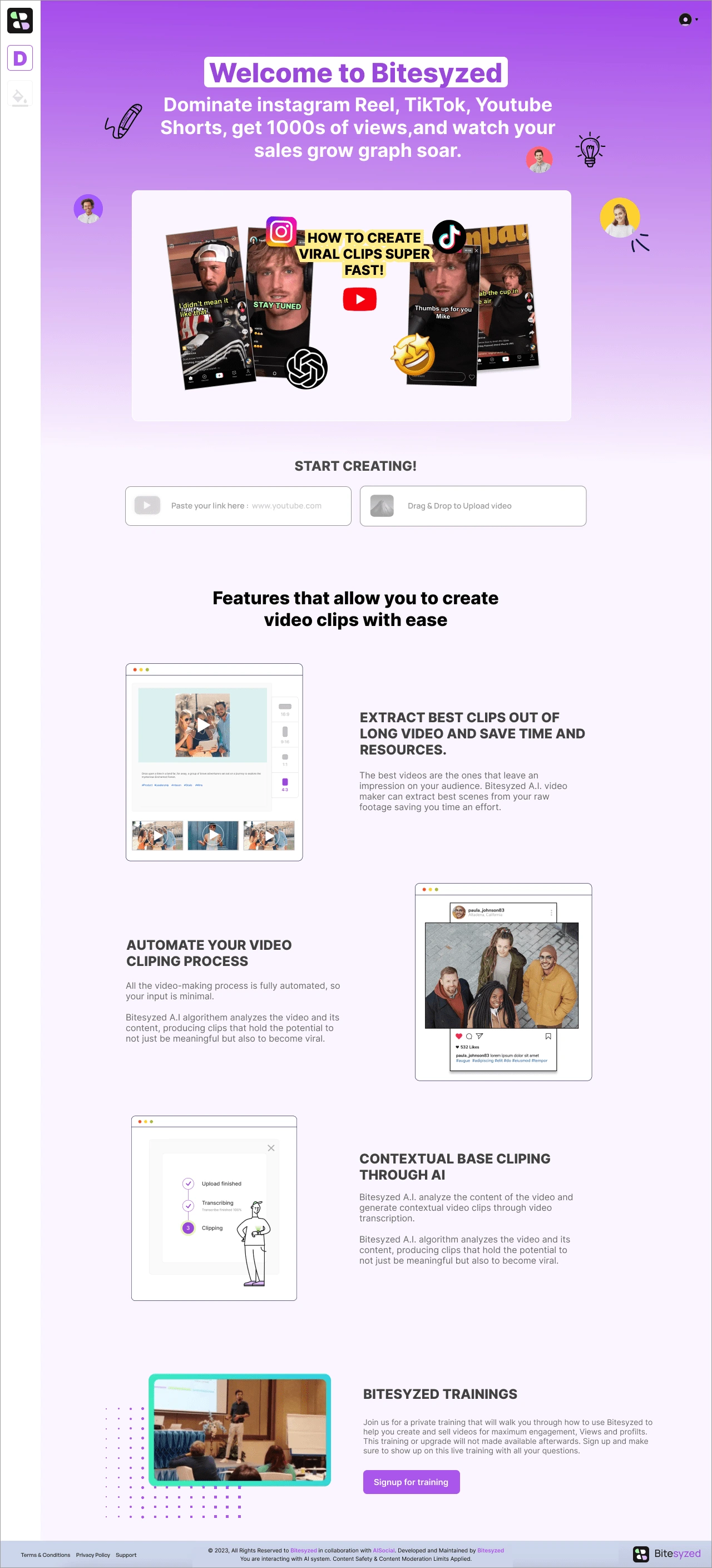
Dashboard for first time user
Start Creating
Users have a choice to either create using a YouTube link or they can upload and let AI create clips for them.
Start Creating
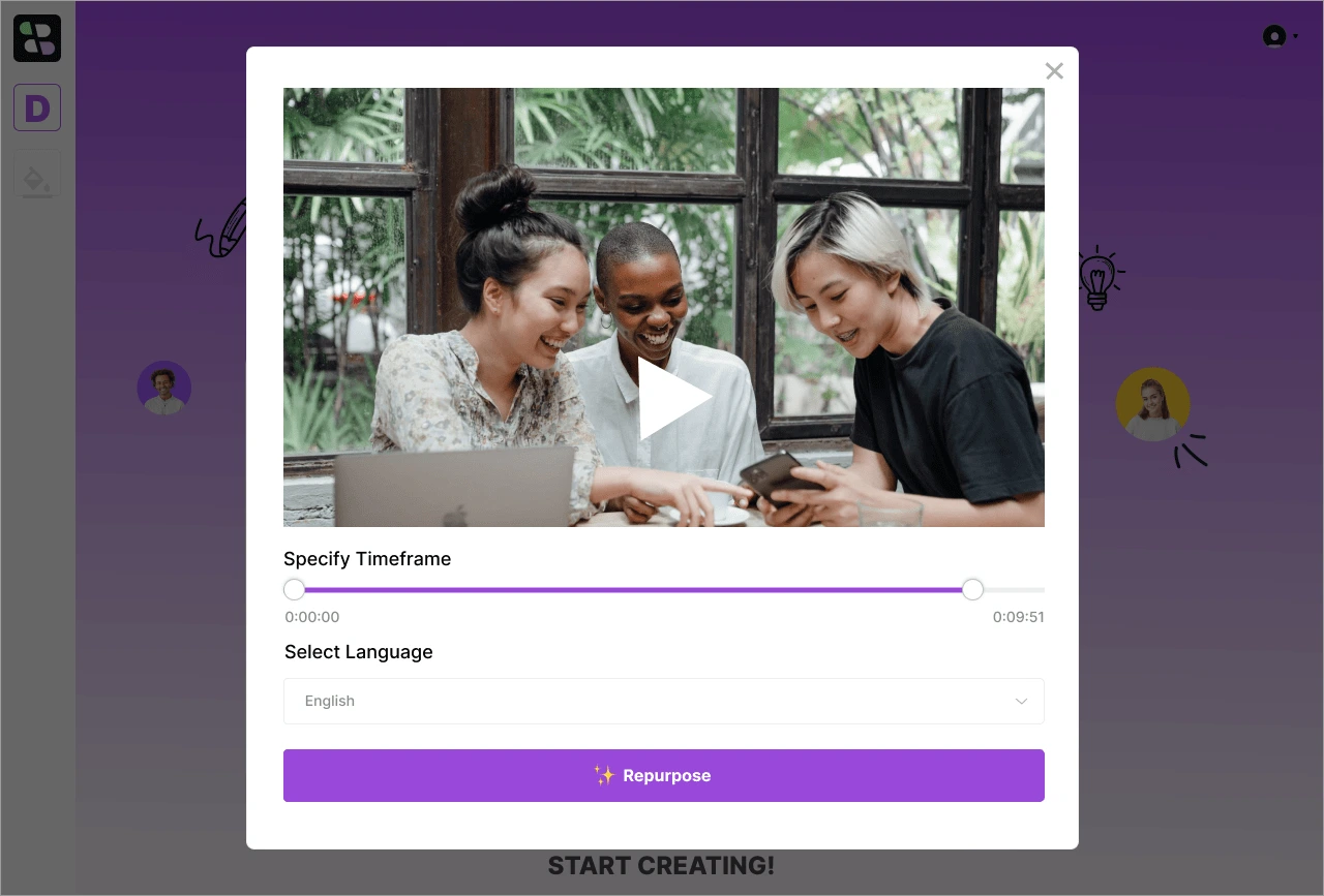
Preview Modal, Specify Time & Select Language
Users are provided with a thumbnail of their uploaded video and can set its duration. Additionally, they have the option to choose their preferred language for customizing or generating subtitles in that selected language.
Generating Short Clips
The product initiates the automatic generation of short clips through AI, accompanied by suggested headings and descriptions suitable for tweet-like content.
Users are provided with the option to either edit or re-generate text, leveraging three distinct emojis for guidance.
Each emoji corresponds to a particular tone: the fist emoji for impactful copy, the nerdy emoji for intelligent content, and the smiling emoji for cheerful messaging.
AI-generated suggestions cover headings and descriptions, presenting content tailored for social media akin to tweets.
Users can select and adjust generated text by choosing from the three designated emojis, allowing for a specified tone and style in their content.
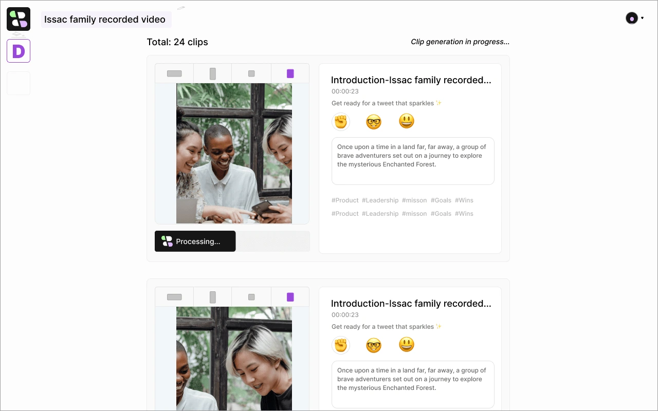
processing shot clips
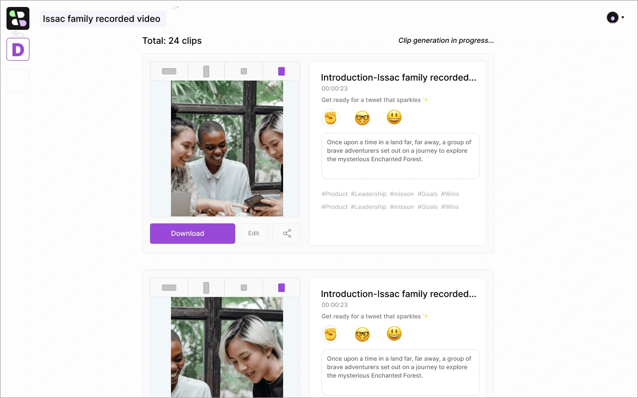
Upon completion of the processing, users will be presented with choices: they can download the clips, directly share them on various social media platforms, or opt to edit the content.
Bitesyzed Clip Editor
When a user clicks "edit" from the previous thumbnail, it will take the user to the bitesize editor. Here users can readjust the clip timeline, adjust size, and add captions too.
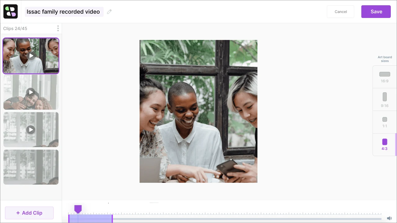
Readjusting timeline
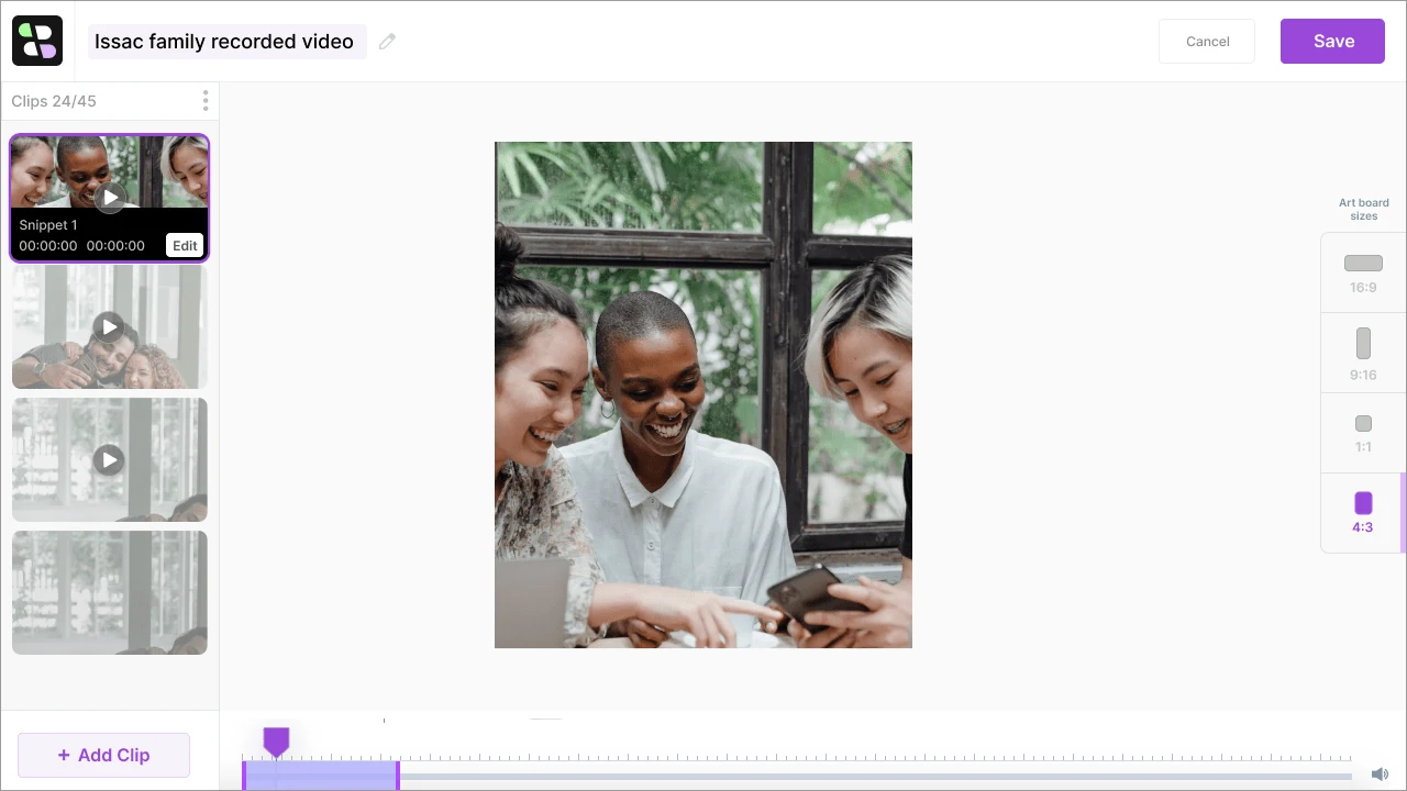
Hover the clip & click Edit to see more editing options
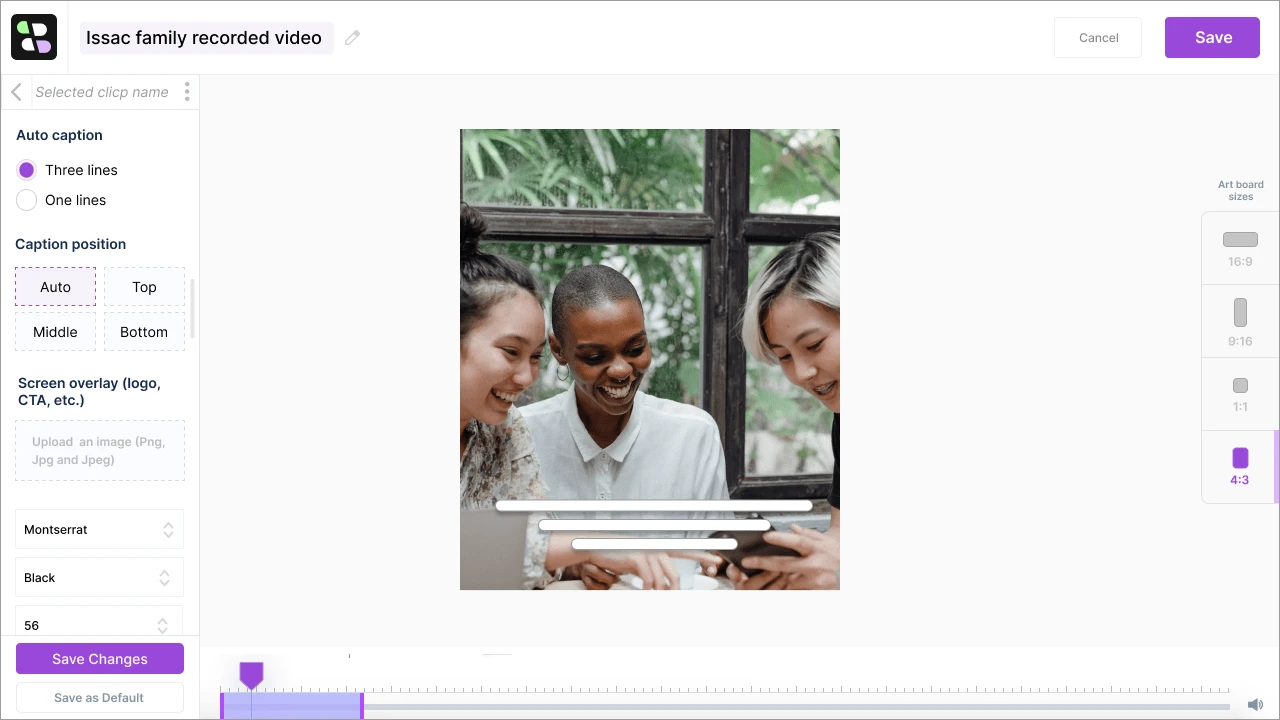
Enable captions, positions, fonts, color, and size
Share on Social Platforms
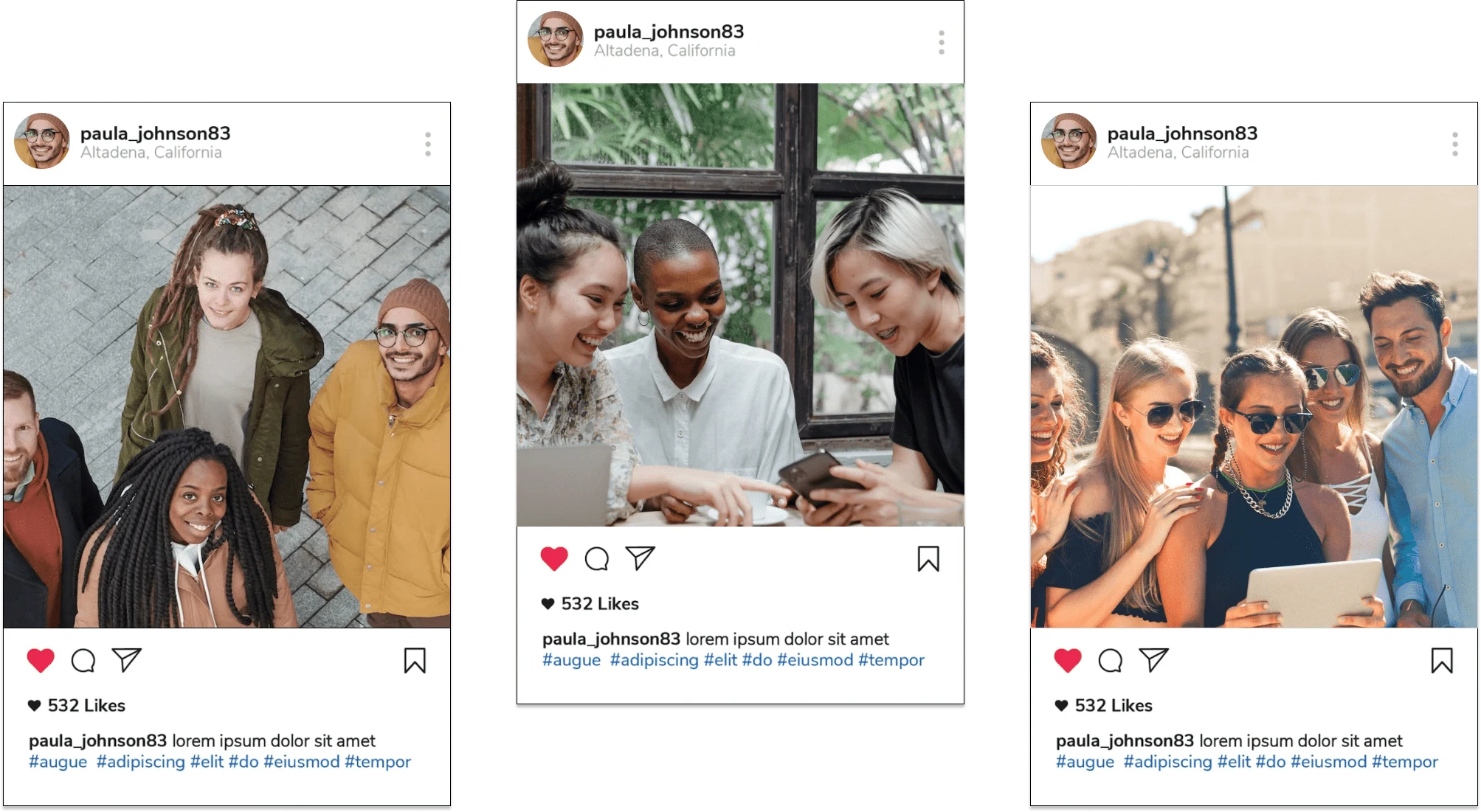
Returning Users Dashboard
This is the dashboard for returning users, here they can still create new projects, see pre-created projects, and can also organize their data by creating folders.
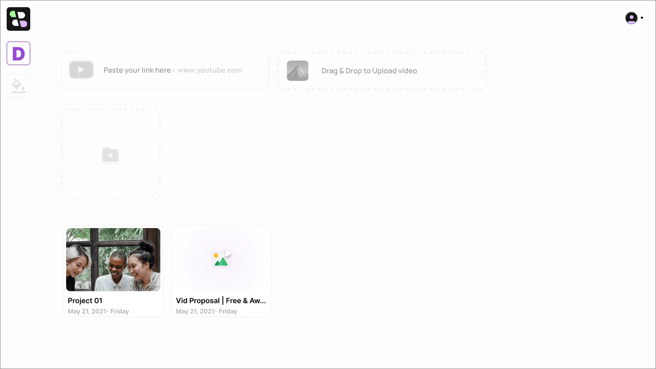
Returning user dashboard
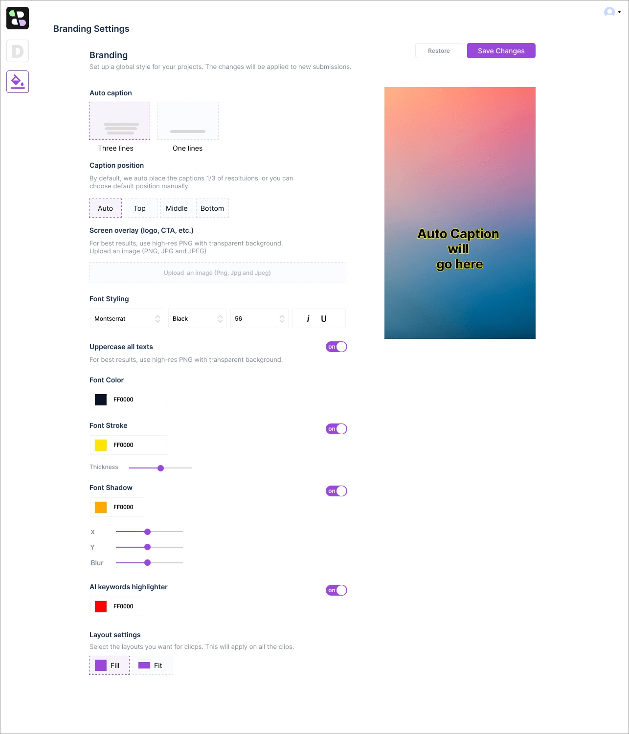
Settings Page
Default brand setting page for subtitles and styling.
That's all, thanks for viewing 🤝
Like this project
Posted Nov 13, 2023
Bitesyzed is an AI-Powered Platform for Viral Clips with Editing, Social Sharing, and Analytics
Likes
2
Views
488

