Rendair Brand System Design

Hayley Cantor
Verified


Explainer video by Eduardo from Schurhaus Motion
Rendair Brand System Design
AI rendering assistant built for architects by architects
Extended application of the brand across new touchpoints including animation, social media and deck design.
Rendair came to the project with the aim of growth systems, as they prepared for a further tool launches later in the year. Operating since 2020 with a set of simple brand guidelines and logo design that looked great on paper but were starting to break down in practice. Colours, typography and shapes existed, but they were not working together as a scalable system.
Static, Generic Brand
With fragmented implementation of basic brand guidelines, visuals weren't translating into a coherent, recognisable product experience. Colours, and typography were defined, but they behaved like isolated assets instead of a system.
Primary colours appeared inconsistently or not at all in key product touchpoints.
UI used default shapes and Inter, making the product visually highly interchangeable with other AI tools.
The homepage featured multiple competing CTAs with vague labels, weakening focus and clicks.
This made it hard to scale the brand: every new page, feature or deck risked becoming a one-off instead of part of a recognisable whole.
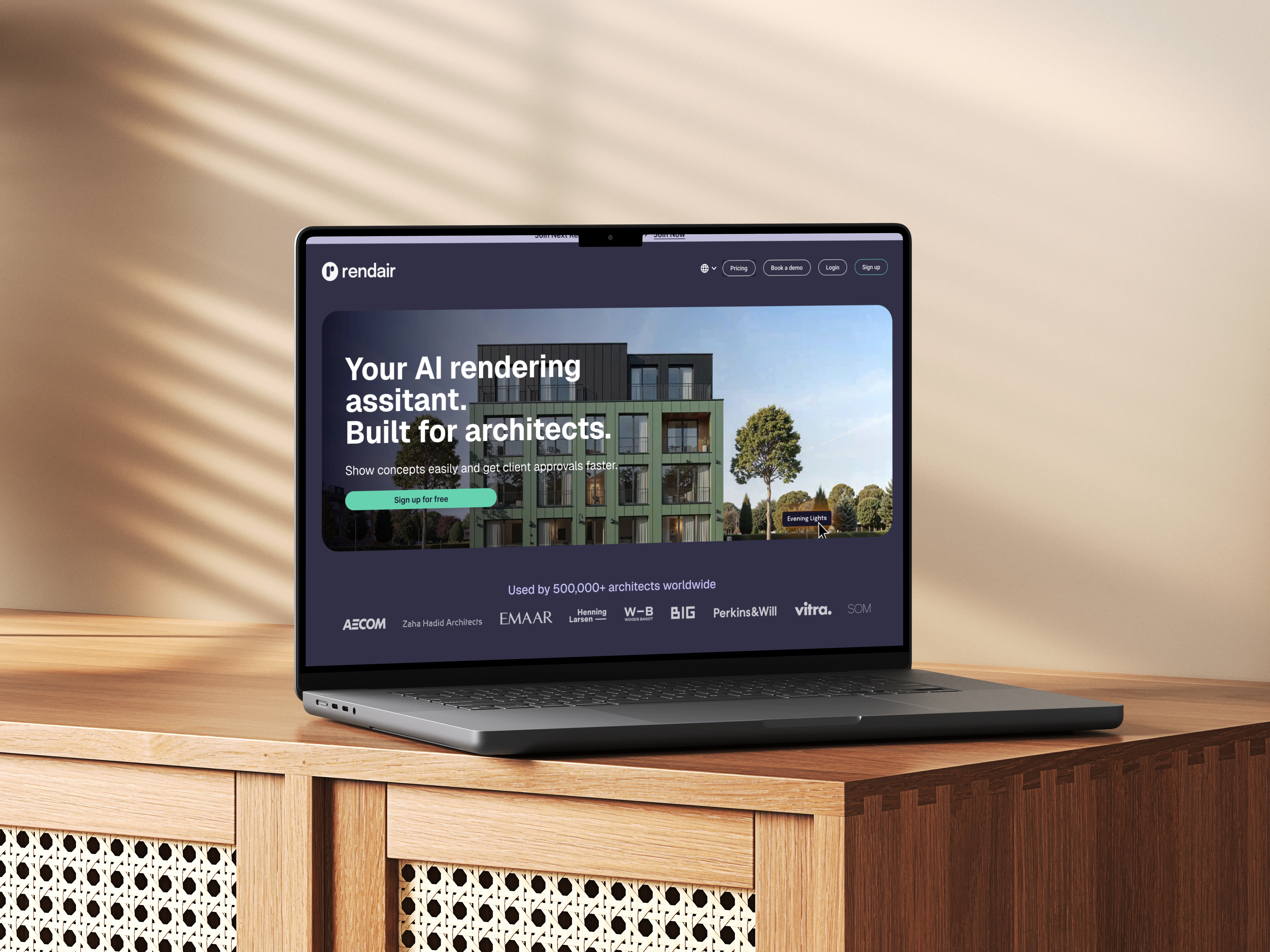
Proposed optimisation for above the fold on the home page, desktop.
Why It Was a Problem
Rendair had basic brand guidelines, but they weren’t built to scale with the product. Some colour, typography and visuals existed, but they behaved like isolated decisions instead of a cohesive system.
Core colours were used inconsistently and often disappeared in key UI screens.
Inter and generic rounded rectangles made the product look like any other AI tool.
Every new page, feature or deck required ad-hoc decisions, increasing inconsistency over time.
The brand was defined, but it wasn’t systemised, so it could not reliably support growth.
Without a system, internal teams and partners had no shared rules, so brand cohesion depended on individual decisions instead of reusable patterns.
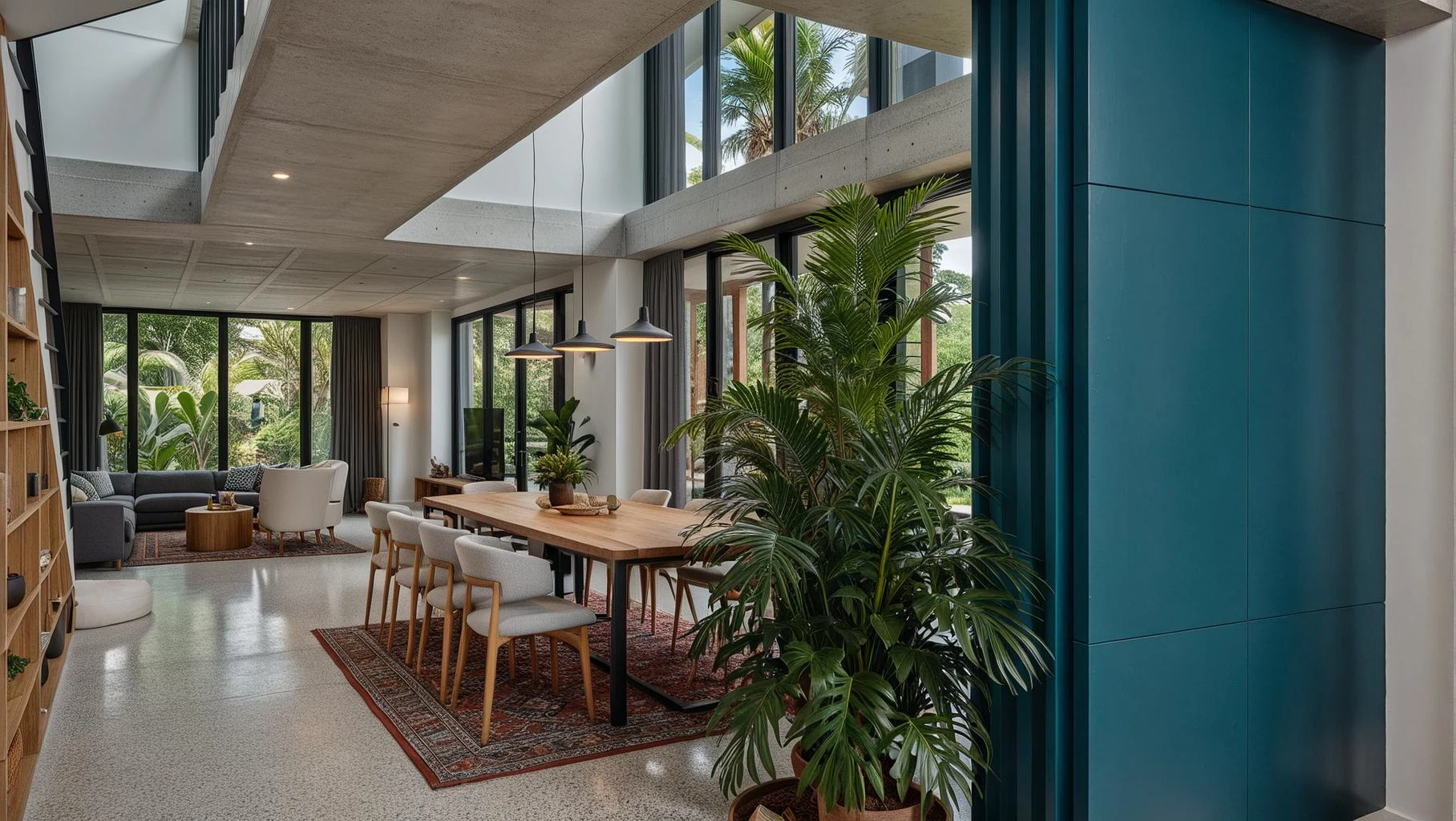
Sample render generated from the Rendair platform
Why This Blocked a Brand System
Without a system, the brand could not flex or travel.
No clear rules for how colours, type and shapes should adapt across product, marketing and internal comms.
No shared “kit of parts” for designers, engineers or collaborators to assemble from.
Visual differentiation depended on one-off executions instead of reusable, modular logic.
The risk: as the product roadmap expanded, the brand would fragment further instead of strengthening with each release.
From Guidelines to System
The project focused on turning basic visuals into a flexible, opinionated, future-facing system that scales with the product to strengthen brand recognition.
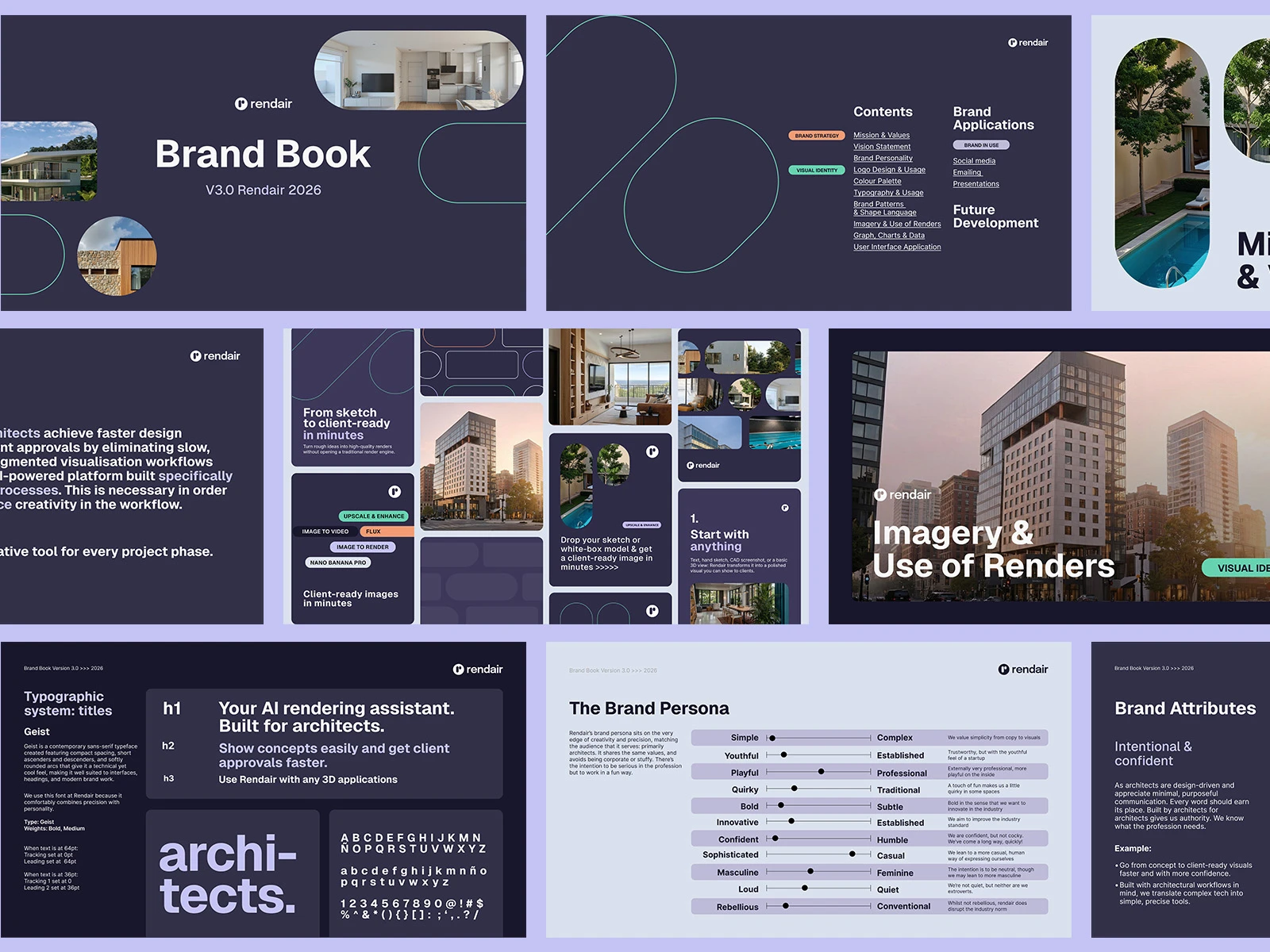
Overview of the Rendair Brand Book, the depth and evolution needed to scale.
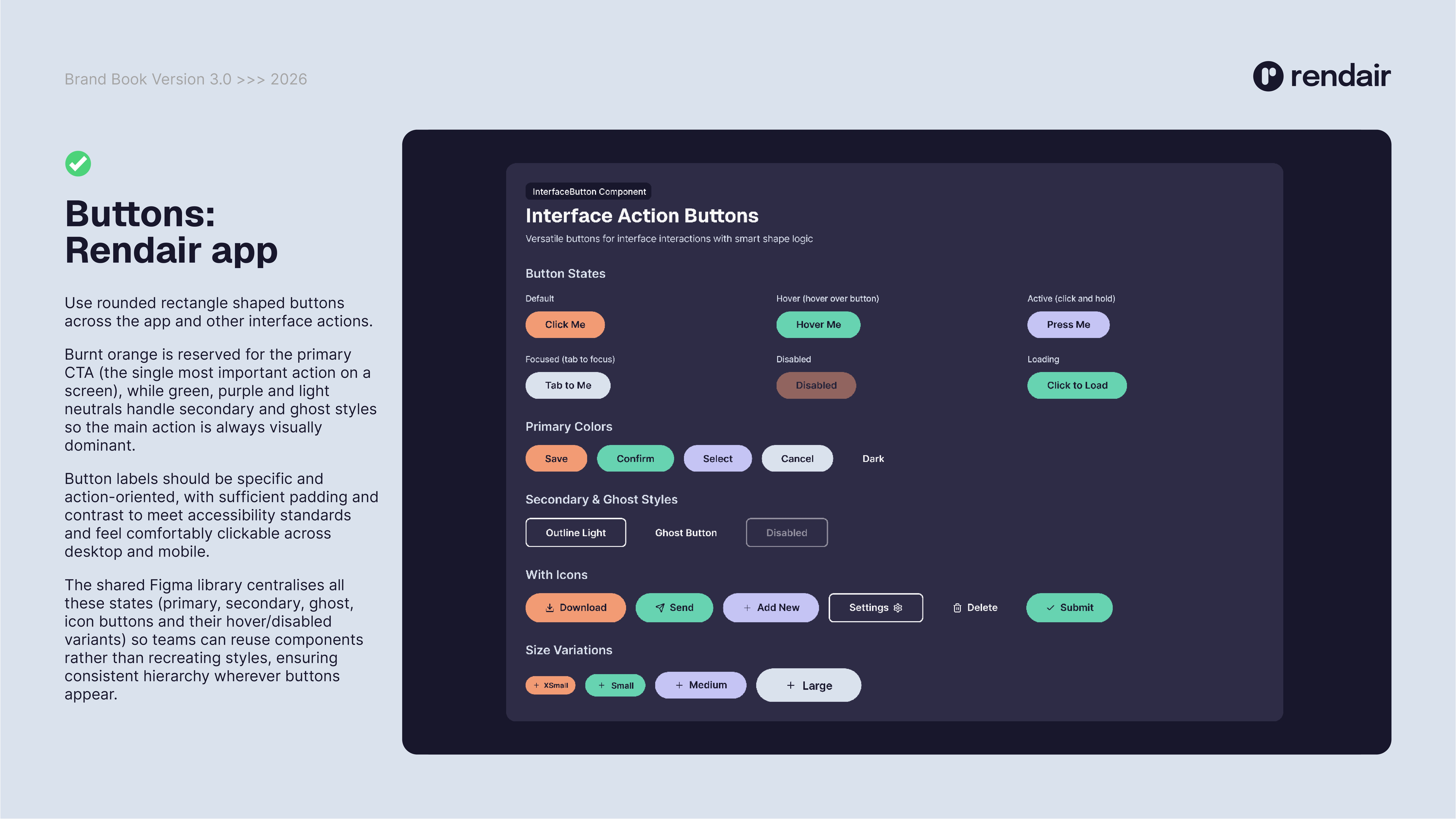
1. Clarified Colour Roles, Improved Accessibility & Systemised CTAs for Conversion
Audited existing orange and greens for alignment with the desired professional, elegant positioning.
Defined specific roles for each colour across backgrounds, CTAs and text, including accessibility-driven contrast choices.
Reduced competing primary actions and clarified a single main CTA above the fold.
Introduced pill-shaped, research-backed CTAs with better sizing, improved contrast for accessibility and more specific copy, plus sticky navigation to keep sign-up visible.
CTA design is now a reusable pattern, not a one-off design exercise on each page and colour decisions are consistent, intentional and easy to extend to new features or channels.
2. Unified Typography Around Geist
Reviewed Epilogue, Inter and unused Tanohe, identifying the gap between functional legibility and brand character.
Adopted Geist as the core typeface, with clear hierarchies for headings, UI and editorial use.
This gives Rendair a single typographic voice that works across product and communication channels.
3. Built a Shape Language from the Logo
Derived a shape system from the pill-like logo and extended it to CTAs, tags, frames, backgrounds and patterns.
Replaced generic rounded rectangles with pill CTAs to strengthen recognition and align with the brand’s approachable personality.
The logo now acts as a toolkit, not just a mark, making new layouts feel “Rendair” by default.
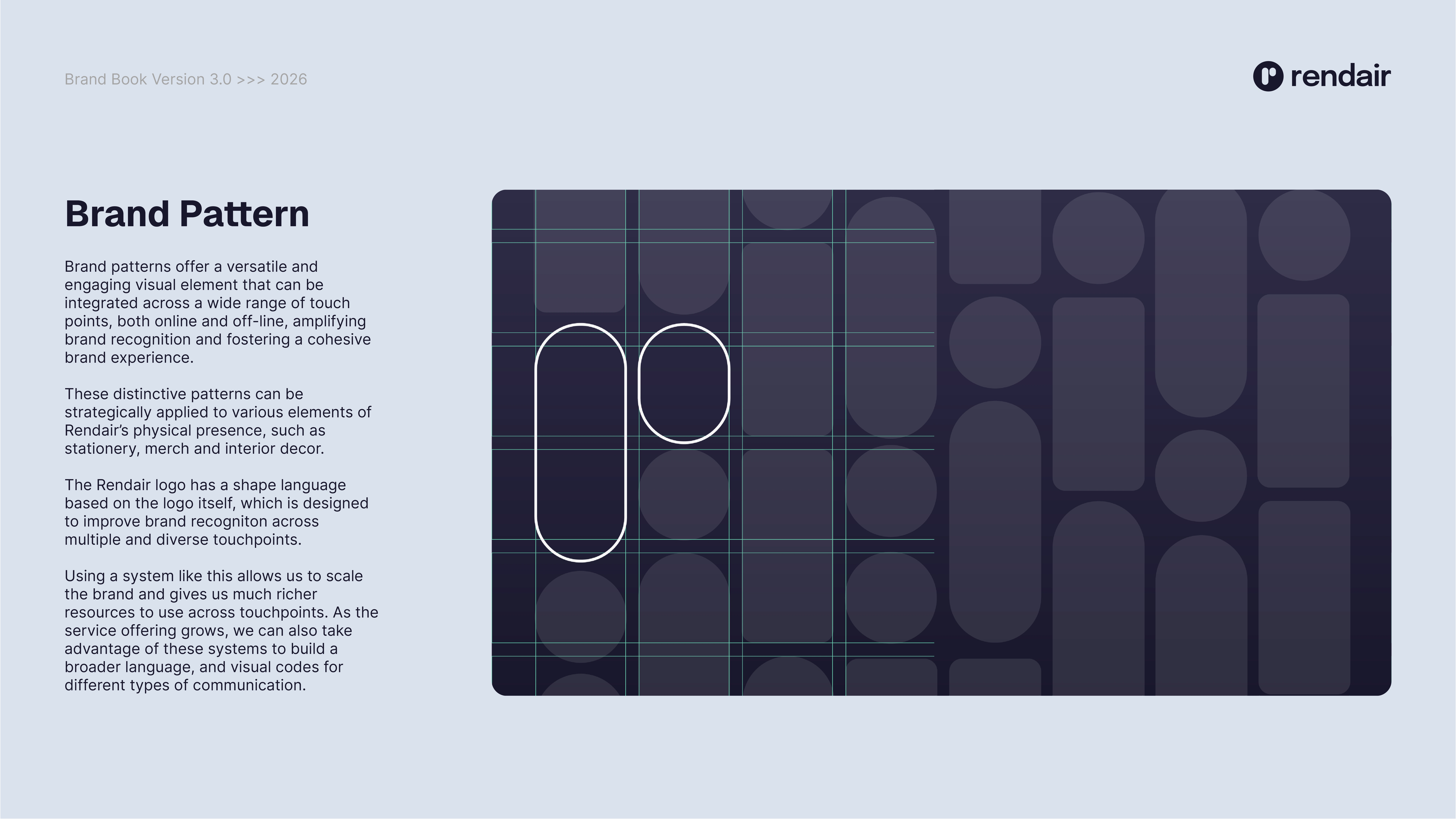
Shape language derived from the logo to form a brand system
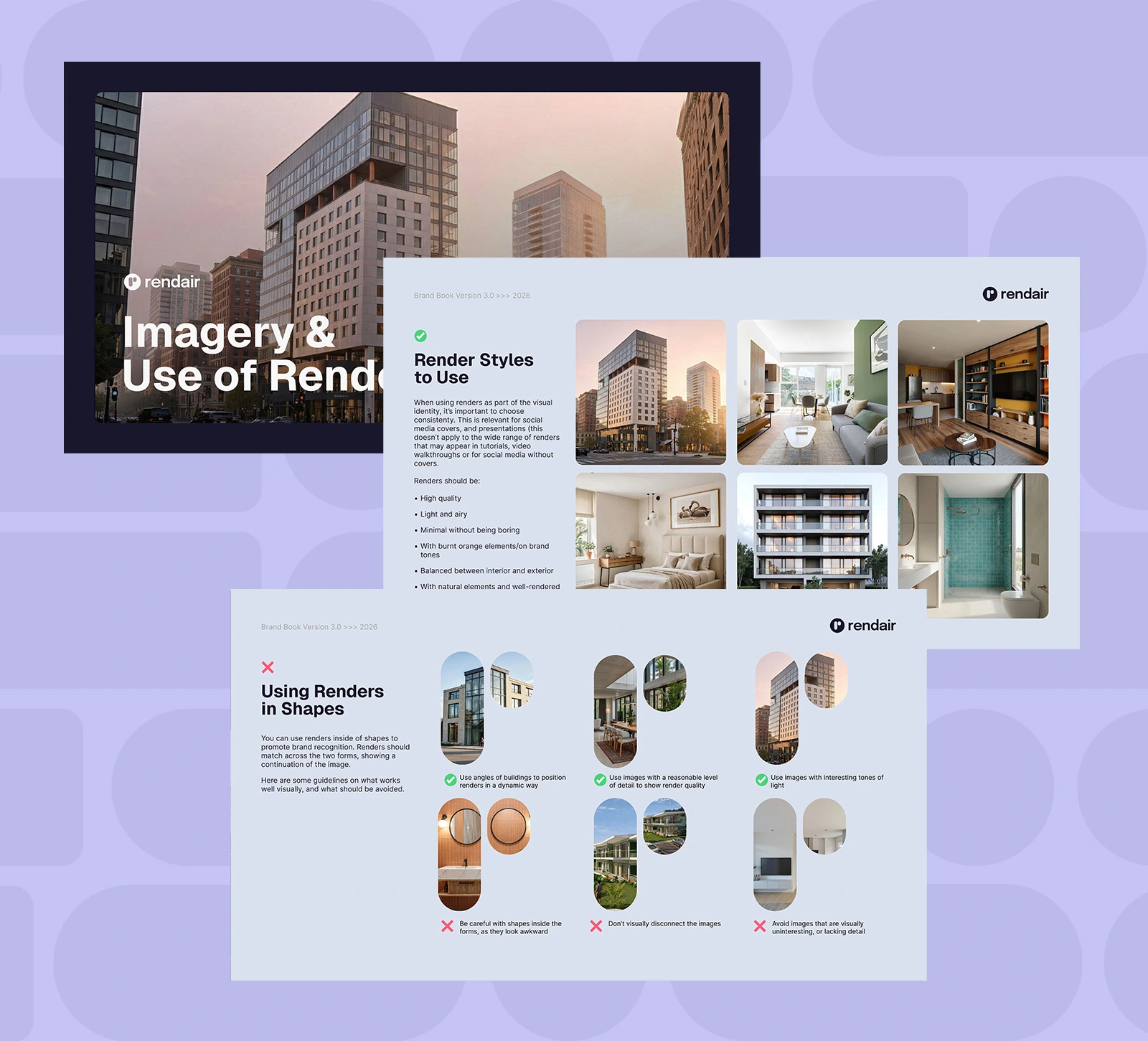
Examples of detailed usage guide for specific brand assets, in this case, render imagery combined with shape language
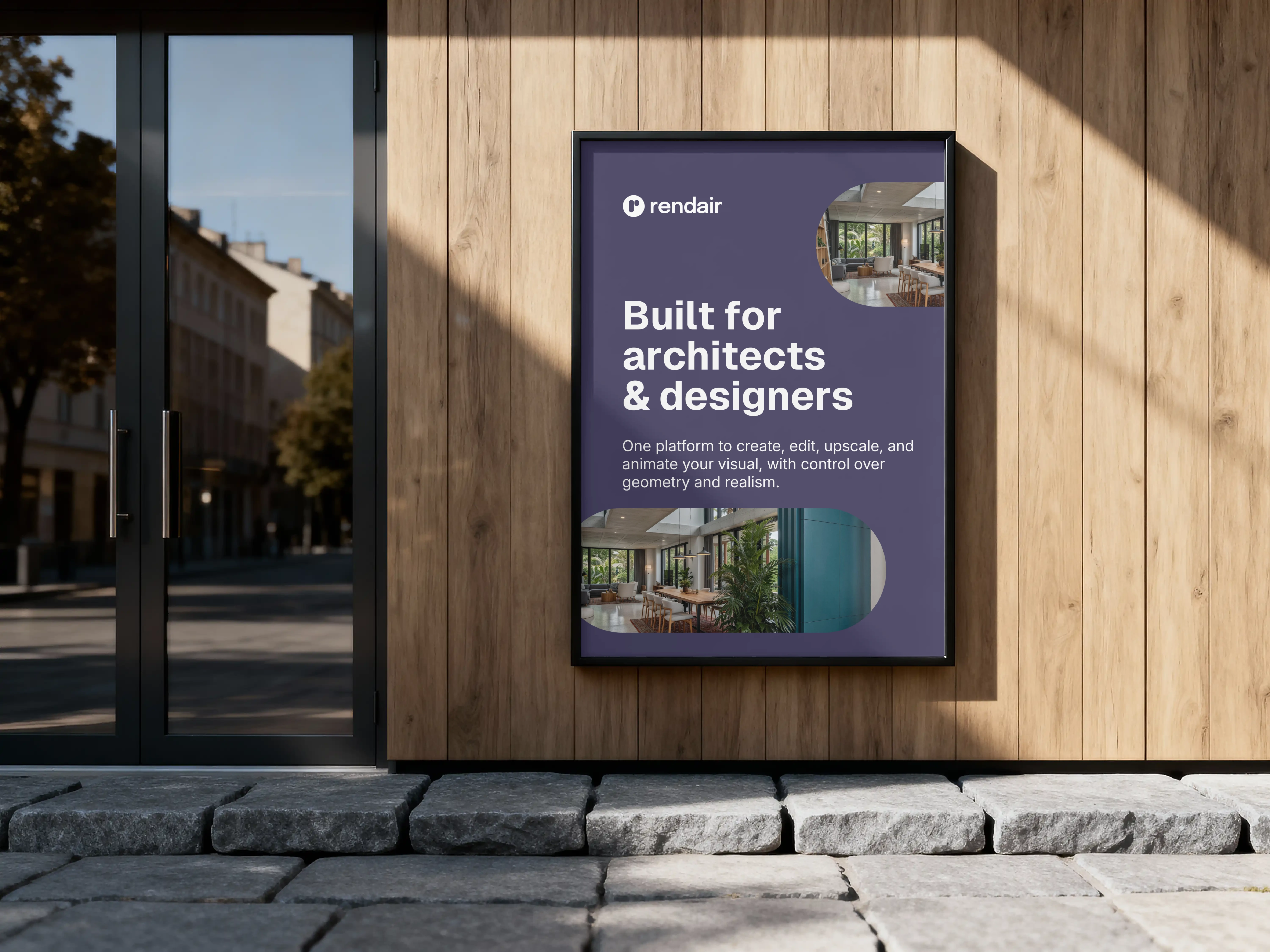
Example of how shape, colour and visuals can be applied to promote the brand
4. Proved the System in Real Applications
Updated the homepage hero to better use height, highlight trust points and centre the high-quality render.
Designed internal and external deck templates with defined colour percentages, hierarchies and graph styles.
These applications act as practical references, making it easy for teams to apply the system consistently.
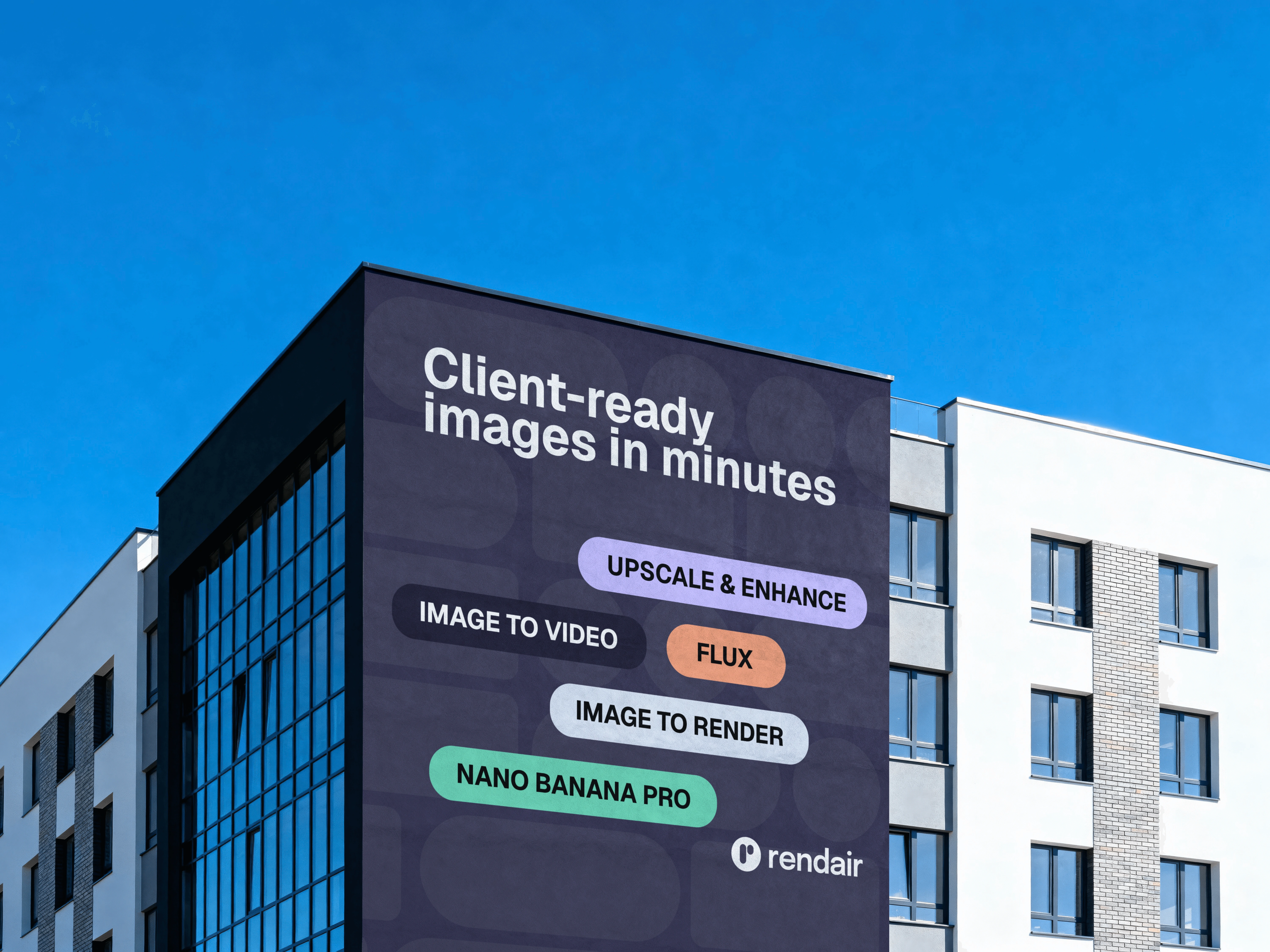
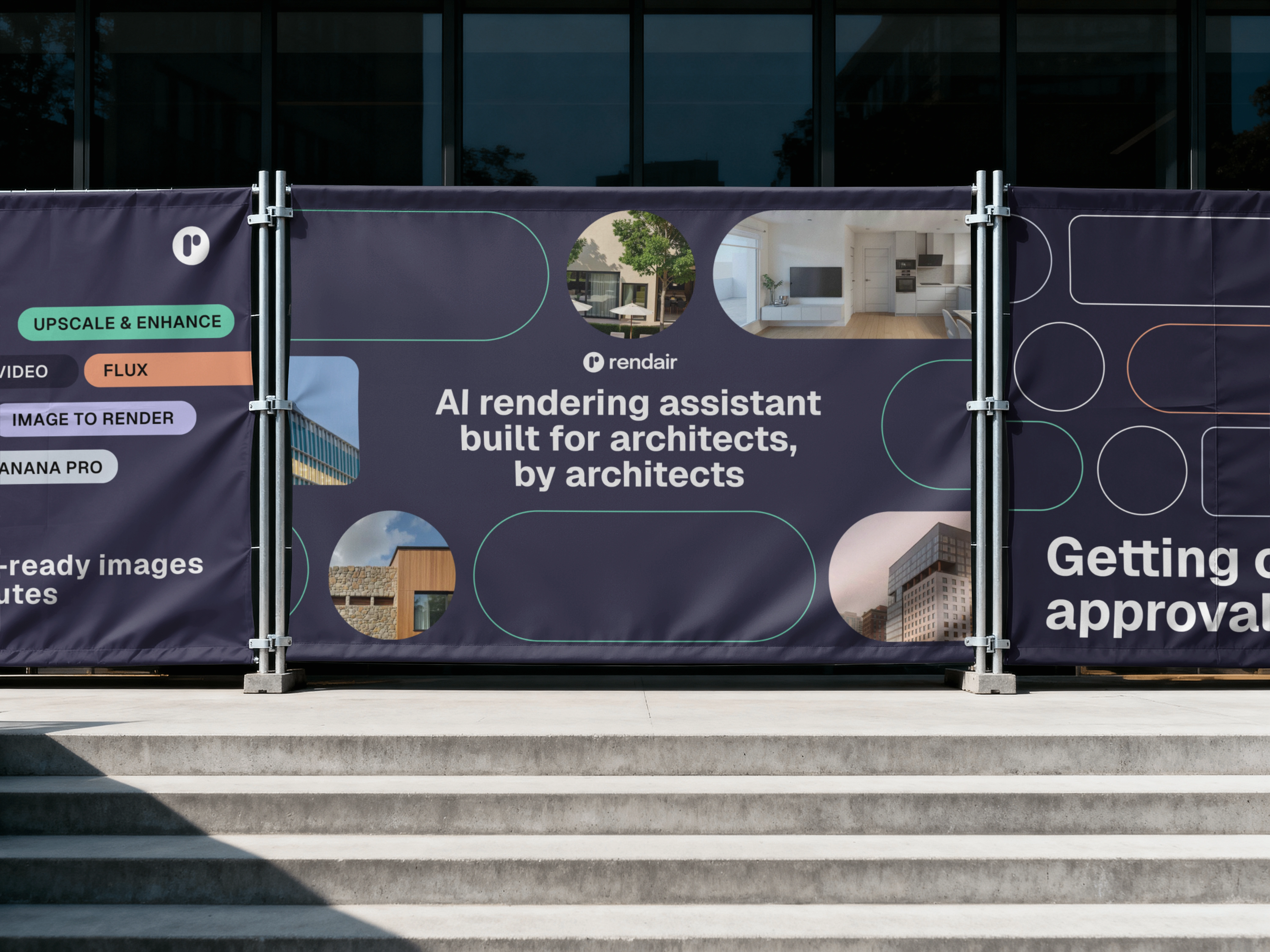
The system can now work both offline and online
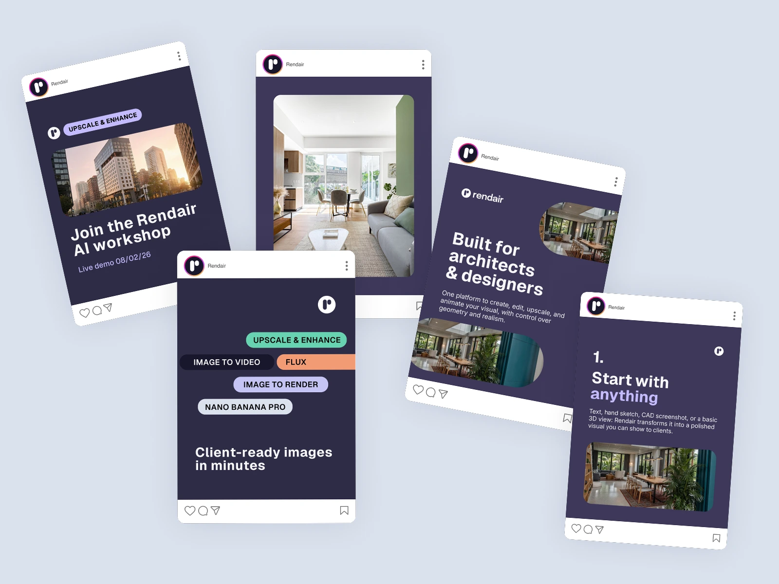
Social media design is optimised for brand recognition, so it differentiates, and aren't just flat AI renders
Social media carousel design (by Rendair team using templates + guidelines provided)
5. Created an extensive Brand Book covering detailed usage guidelines
The whole team now has both a quick guide and an extensive usage guide to support them in making design decisions. The system is flexible enough to adapt to multiple touch-points, as well as to adjust to both internal and external facing communication styles.
The team is now consistently executing high quality, consistent applications of the brand across the board.
Extensive brand system guidelines, covering 56 pages of detailed information and example applications
Outcome – A Brand System That Grows with the Product
Rendair now has a coherent, modular brand system: a defined palette with roles, a single typographic spine, a logo-derived shape language and reusable CTA/layout patterns.
As the product evolves, teams can assemble new experiences from these shared components, keeping the brand distinct, consistent and adaptable.
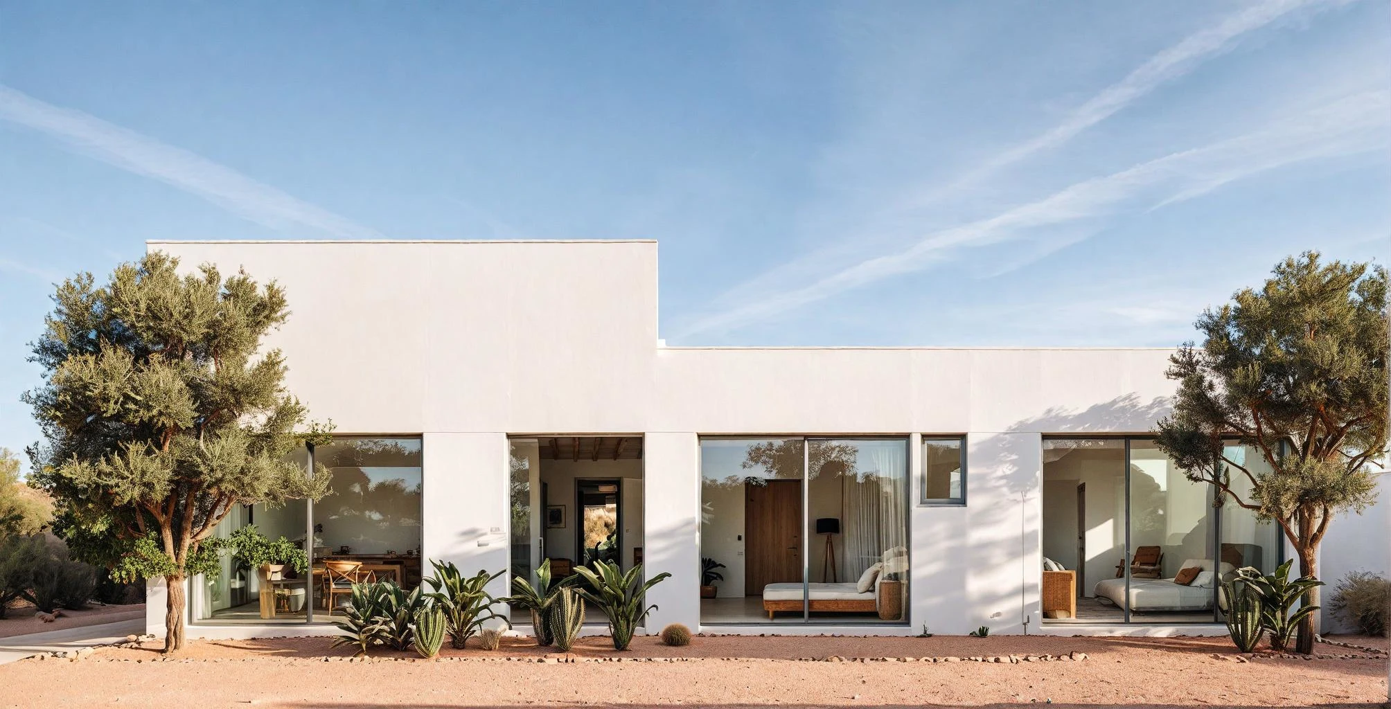
Sample render from the curated render pack provided for the brand guidelines.
Like this project
Posted Jul 27, 2026
Developed a flexible brand system for Rendair to ensure scalable growth across multiple touch-points and markets.
Likes
12
Views
197
Timeline
Jan 23, 2026 - Mar 8, 2026
Clients
Rendair Corporation