Visual Identity Design for Trust Tech Ventures

Hayley Cantor



A visual identity for Trust Tech Ventures
First-cheque and pre-seed VC for European ideas and founders working to make AI reliable, controllable, safe, secure, fair, explainable, transparent, and legally compliant.
TTV evolved from ‘just another early-stage AI fund’ on paper to a visually distinctive, credible and founder-relatable brand that reflects their depth in trust tech.
Trust Tech Ventures (TTV) is a new venture capital fund focused on “trust tech” and trustworthy AI, aiming to look credible to institutional investors and deeply relatable to researcher–founders at the very earliest stages. They needed a visual identity that clearly differentiated them from generic, “stuffy” VC brands, while avoiding the cliché climate–NGO aesthetic that many trust‑adjacent brands fall into.
At the time of the project, the fund was pre-launch with no real brand assets beyond a holding page and an in-progress pitch deck, yet branding was a critical lever for closing their initial anchor LPs and attracting a pipeline of founders in an emerging, not-yet-clearly-defined category.

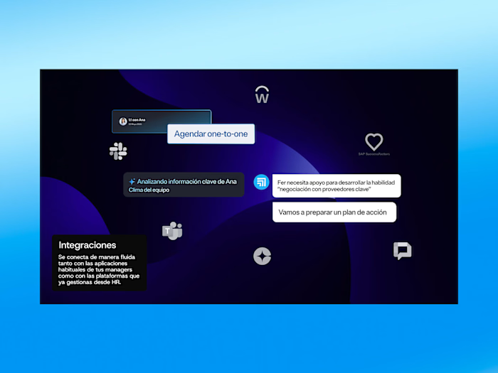
Proposal for homepage design of the future
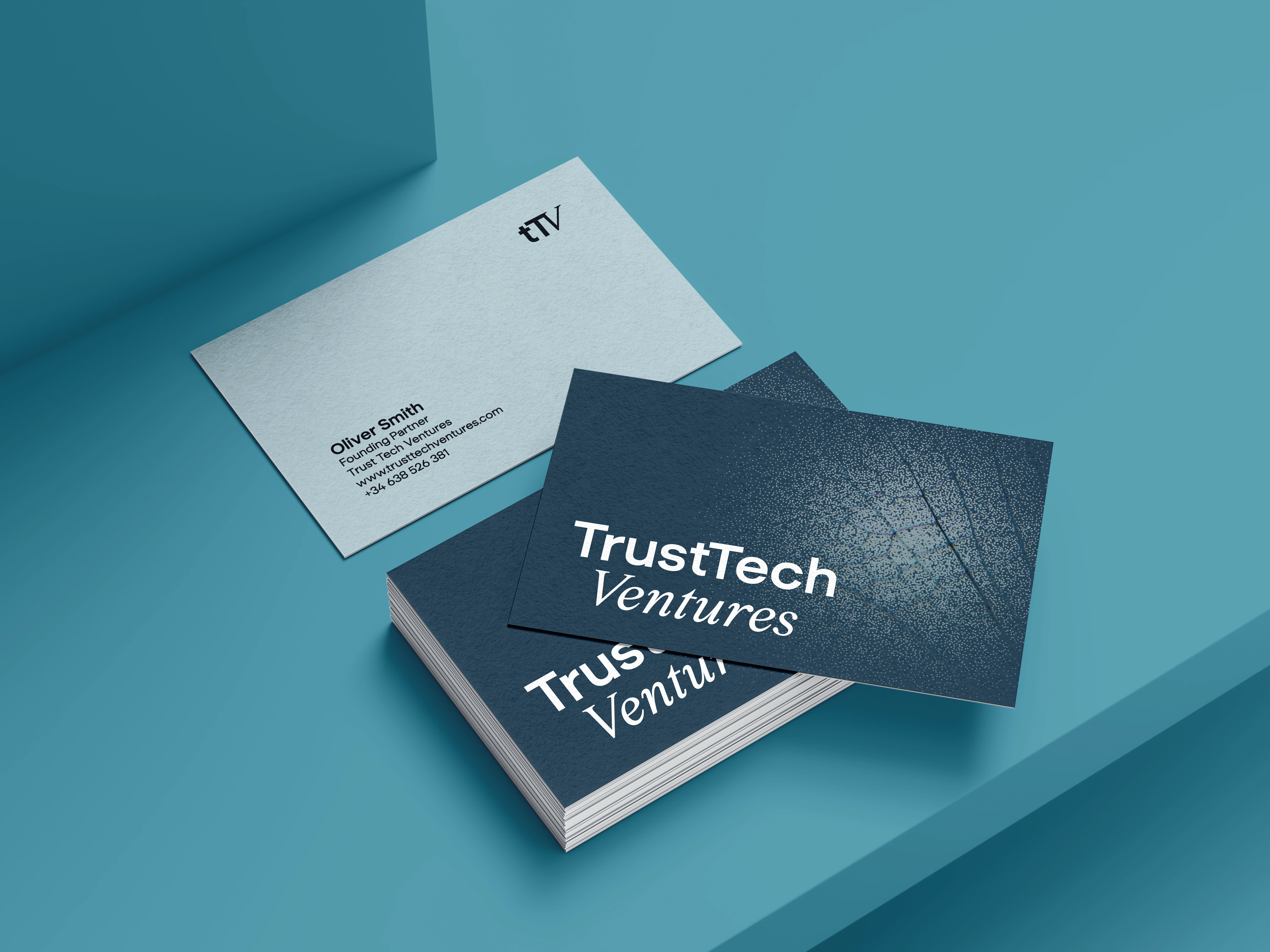
Business card designs, appropriate for the sector and client contact
Without a clear and distinctive visual identity, TTV risked blending into a broad field of early-stage European funds that talk about “AI” in general, but do not specialise in trust tech or offer genuinely hands-on support to founders. Their founders had spent a decade in trustworthy AI, but this depth of expertise and their differentiated thesis were not yet legible at a glance in their materials.
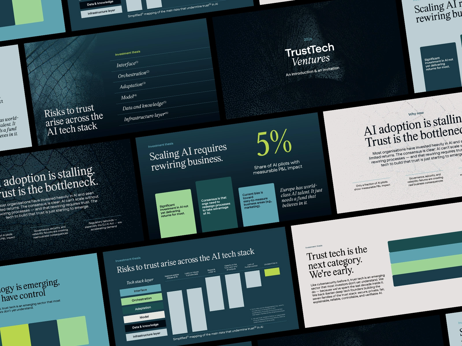
Sample presentation design templates created in Powerpoint at client's request
There was also a strategic tension inside the brief: TTV wanted to feel expert, determined and wry, “in the kitchen having an in-depth conversation, Negroni in hand,” while still coming across as modern, precise and premium. Early creative explorations risked either feeling too abstract and “design-y” (raising questions about credibility for institutional LPs) or too natural/NGO-adjacent (diluting the sharp, technical edge of their thesis).
A brand that would feel like they were "in the kitchen having an in-depth conversation, Negroni in hand."
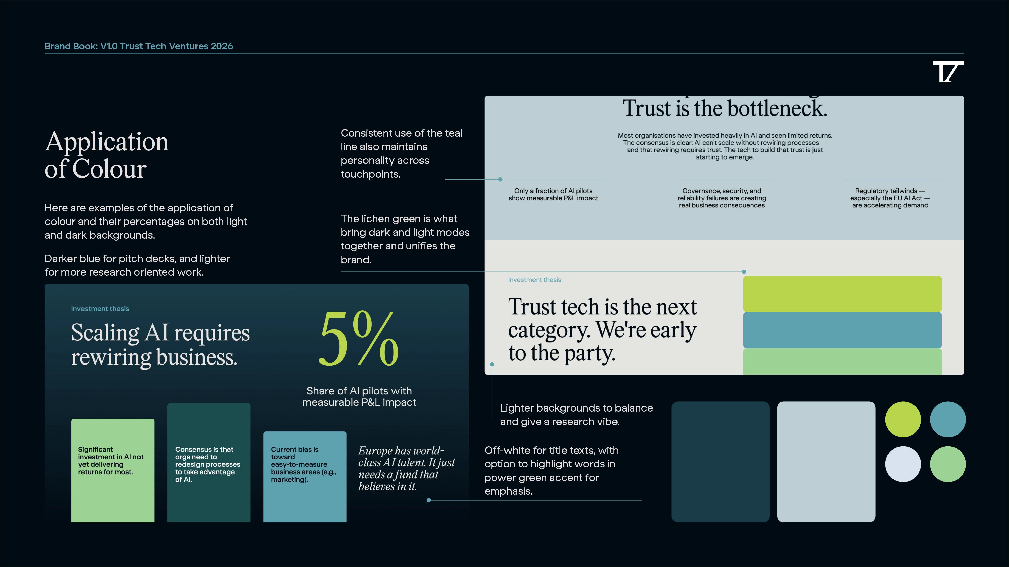
Sample of Brand book conent explaining application of colour
To resolve this, the project focused on developing a brand system anchored in “emerging precision in nature”: visuals that evoke trust, groundedness and natural systems, but rendered with the clarity and structure needed for institutional audiences. Two initial directions were explored—one more warm and abstract, the other more natural and grounded—and then merged to retain the grain, gradients and emergent forms of Direction 1 while leaning into the precision and trust vibe of Direction 2.
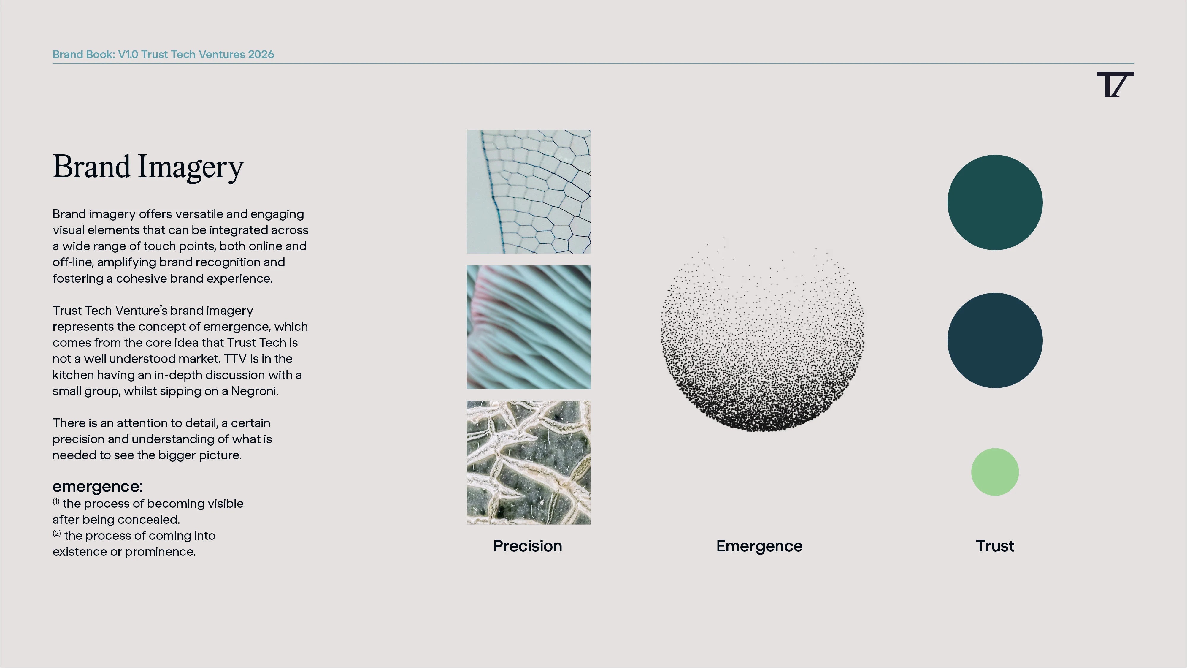
Conceptual explanation of the brand visual assets representing precision, emergence and trust
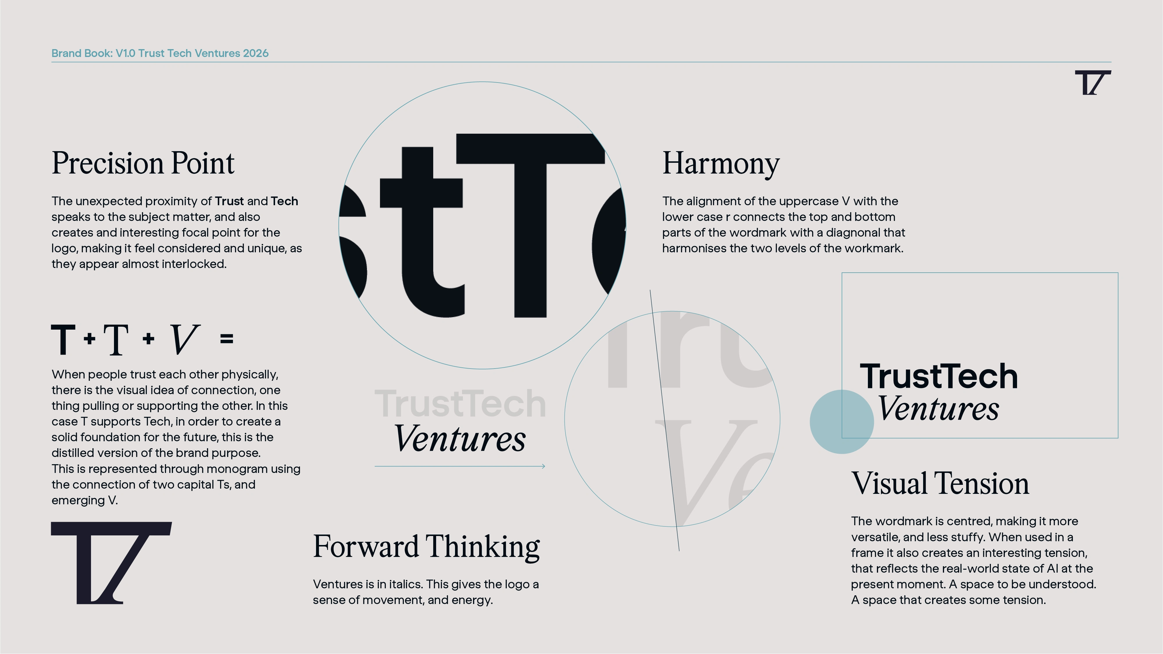
Details on the thinking behind the logo construction
Template design for Linkedin Carousels in Adobe Express
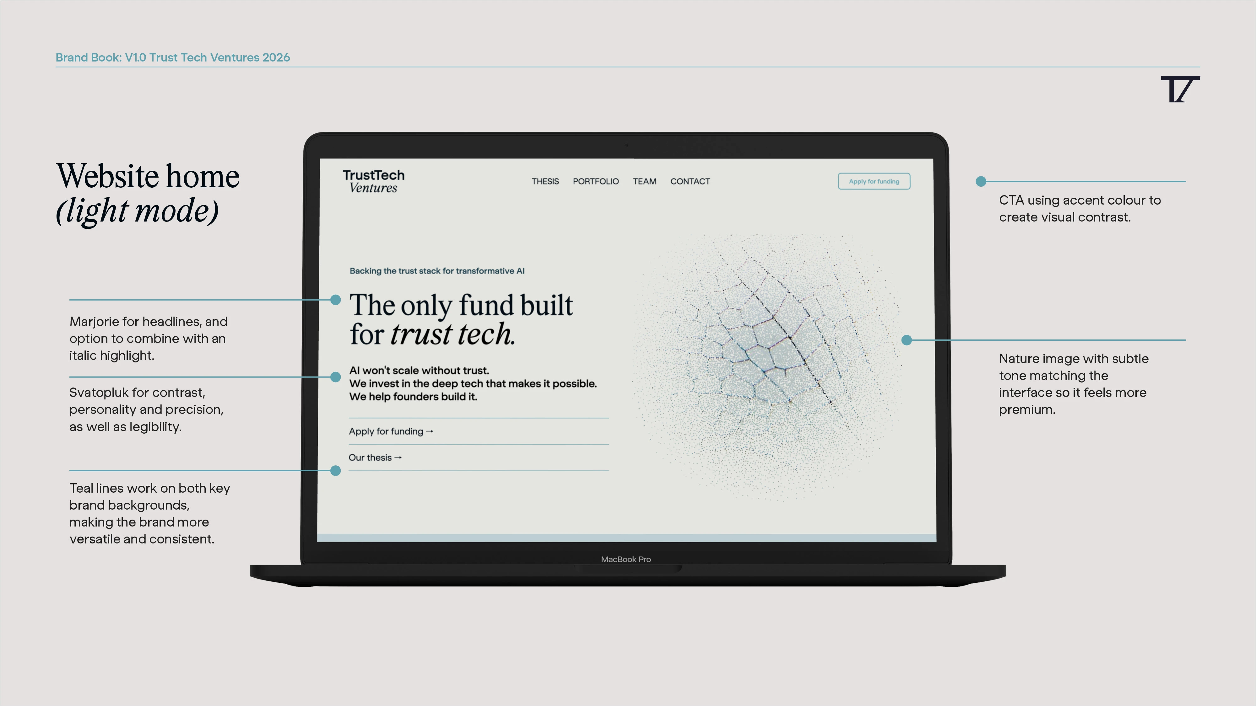
Demonstration of how the brand can work in dark or light mode, a detail reflecting brand personality and two distinct target audiences

Boardroom: presentation design on a screen

Stipple illustration detail
Like this project
Posted Jul 13, 2026
Developed a unique visual identity for Trust Tech Ventures, ready for approaching investors and collaborators