Rebranding Freedom Church: A Timeless Identity

Austyn McFadden


Rebranding Freedom Church
In 2021, we began the rebrand of Freedom Church, inspired by a shift in leadership and a clear vision to connect with a younger generation. The goal was to craft a timeless and recognizable identity—one that would represent the church for decades to come. The process was intentional and collaborative, guided by deep conversations with the church’s leadership.
Foundation in Core Values
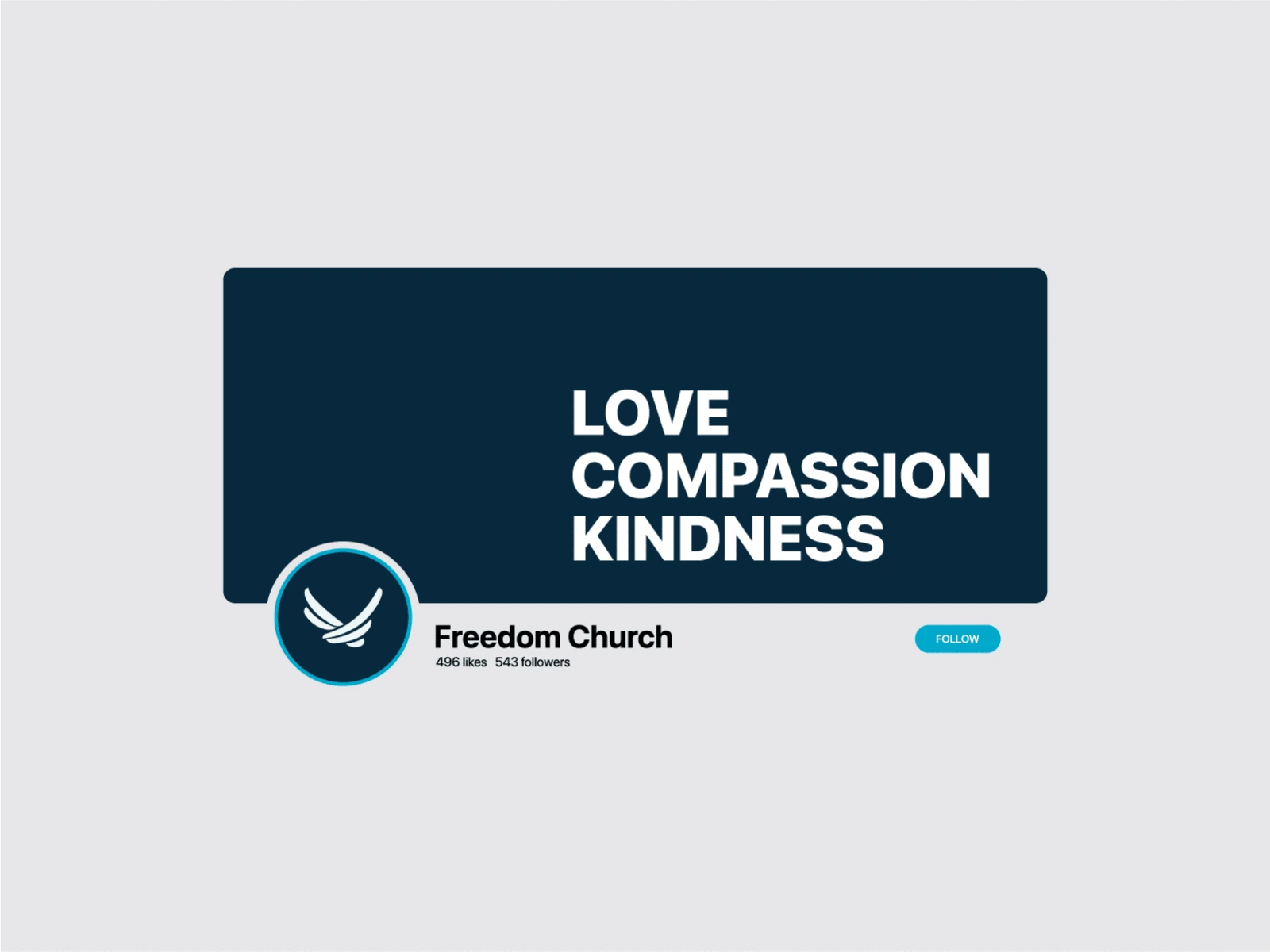
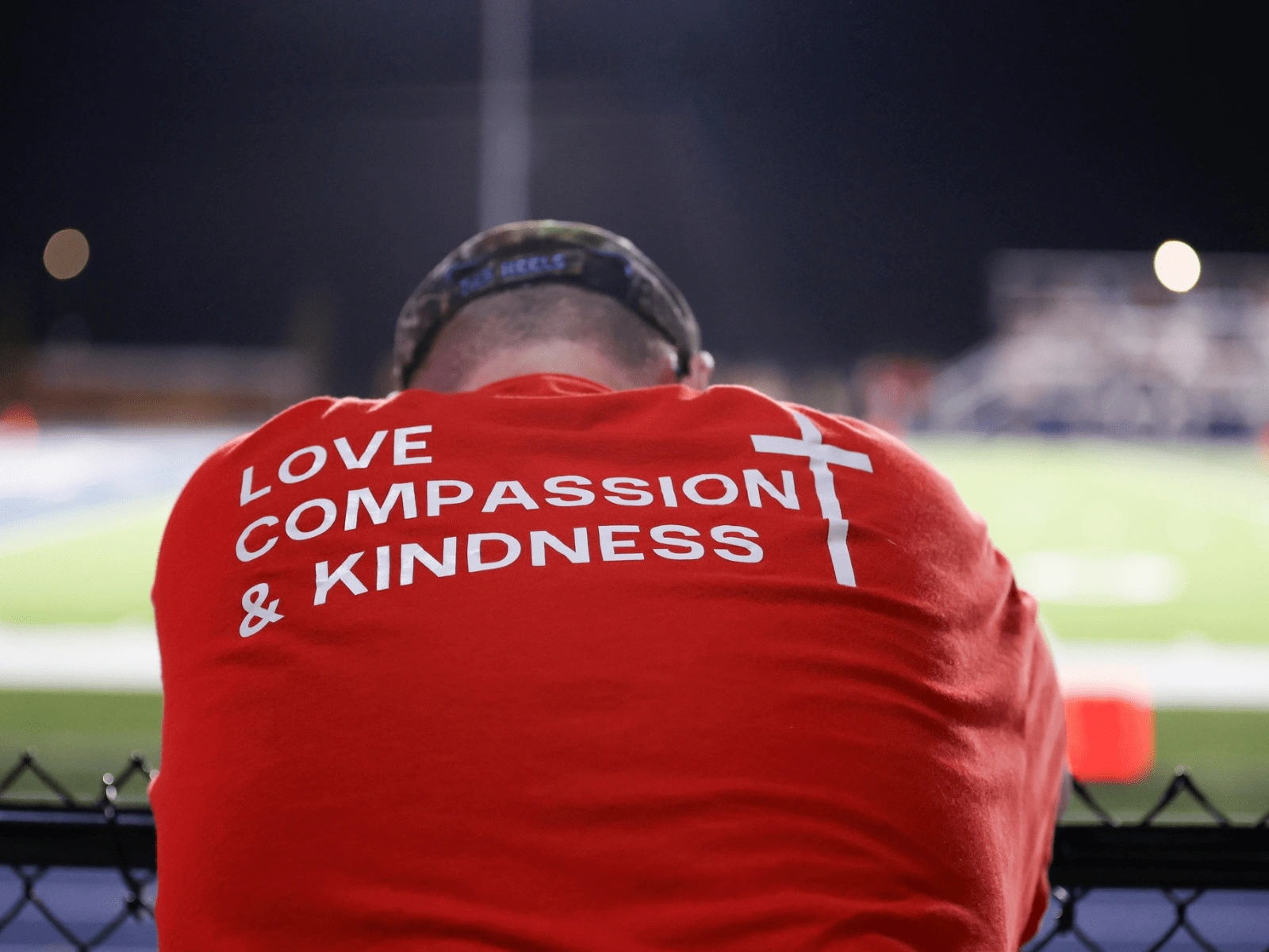
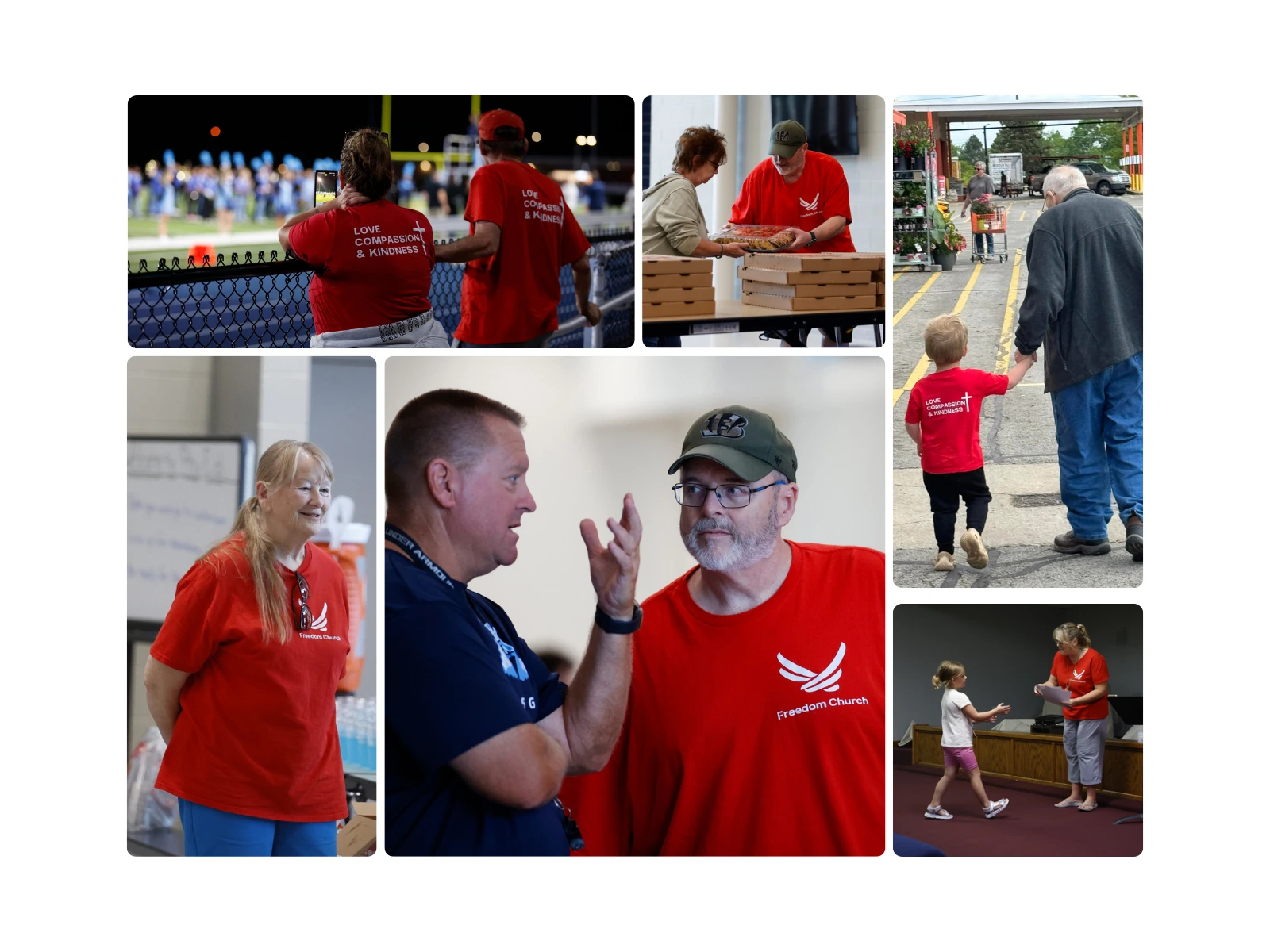
We started with a series of dinner meetings, where we explored the church’s identity, role in the community, and long-term vision. At the heart of it all were three recurring themes in the Pastor’s sermons: Love, Compassion, and Kindness. These values became the foundation of the rebrand, shaping not only the visuals but the spirit of the church’s renewed identity.
Logo Concept & Inspiration
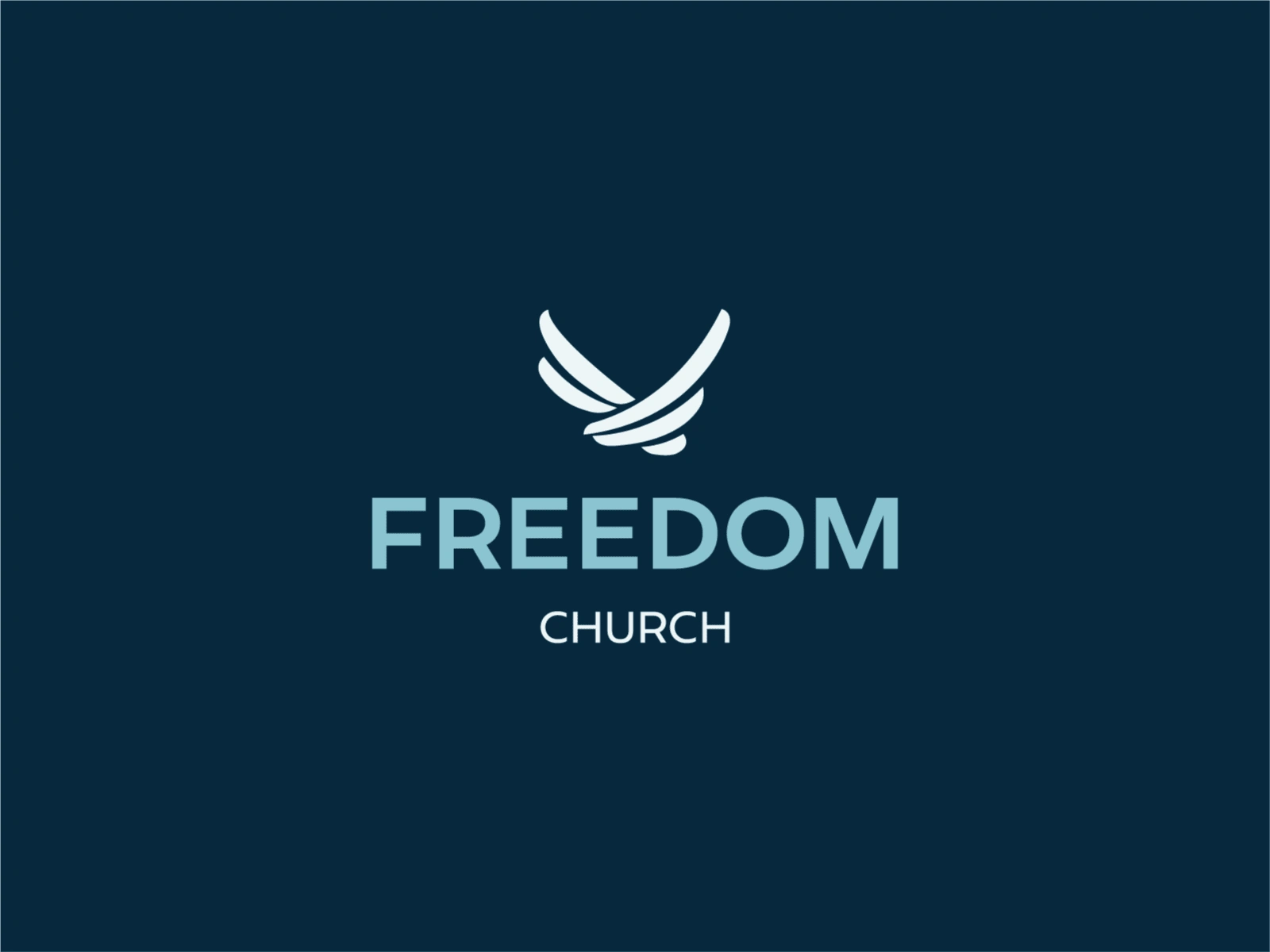
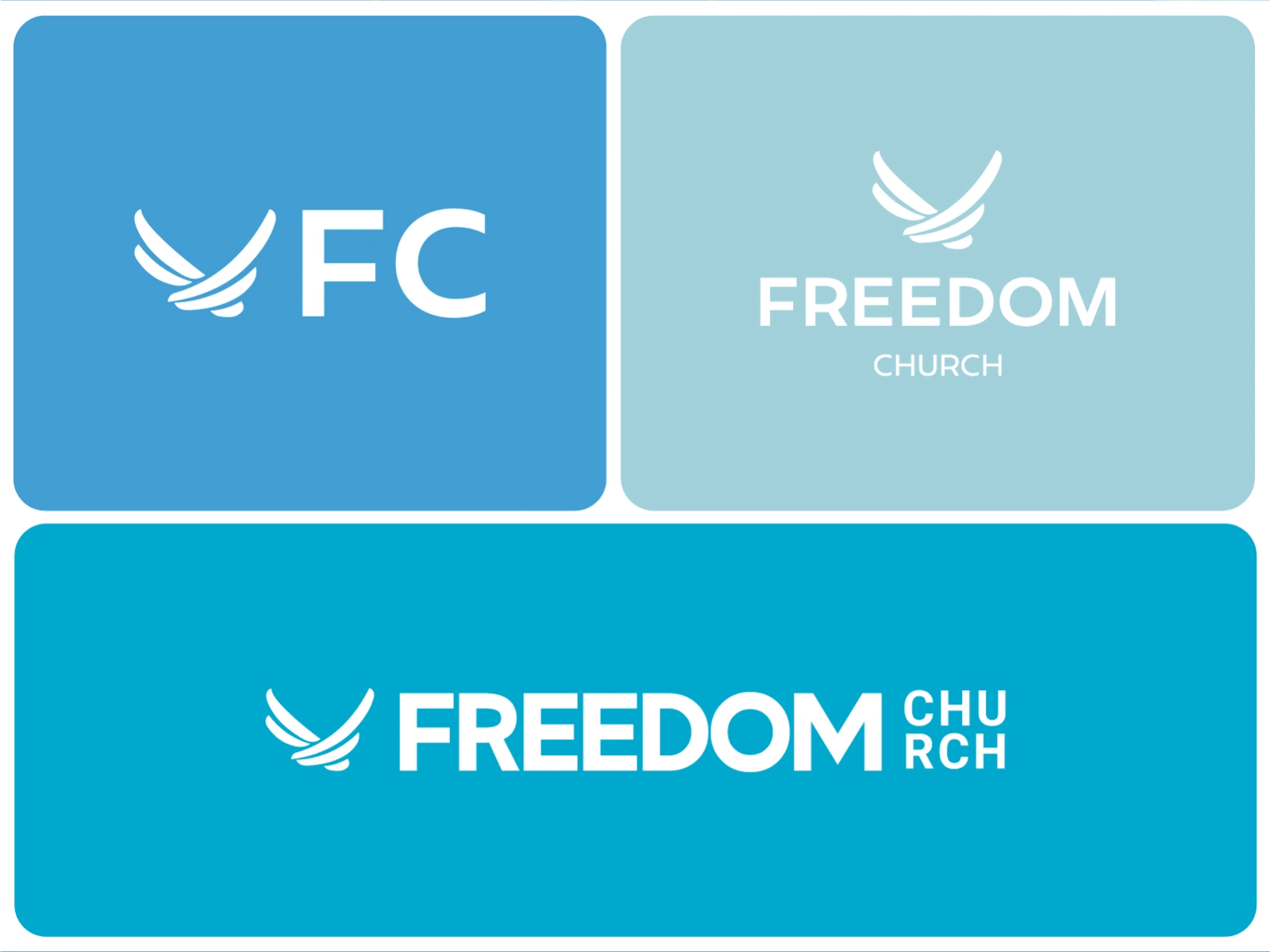
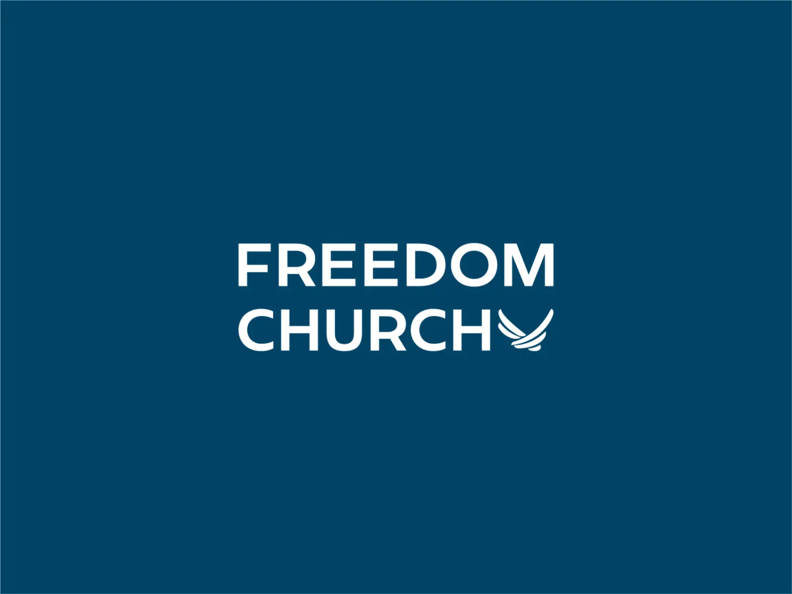
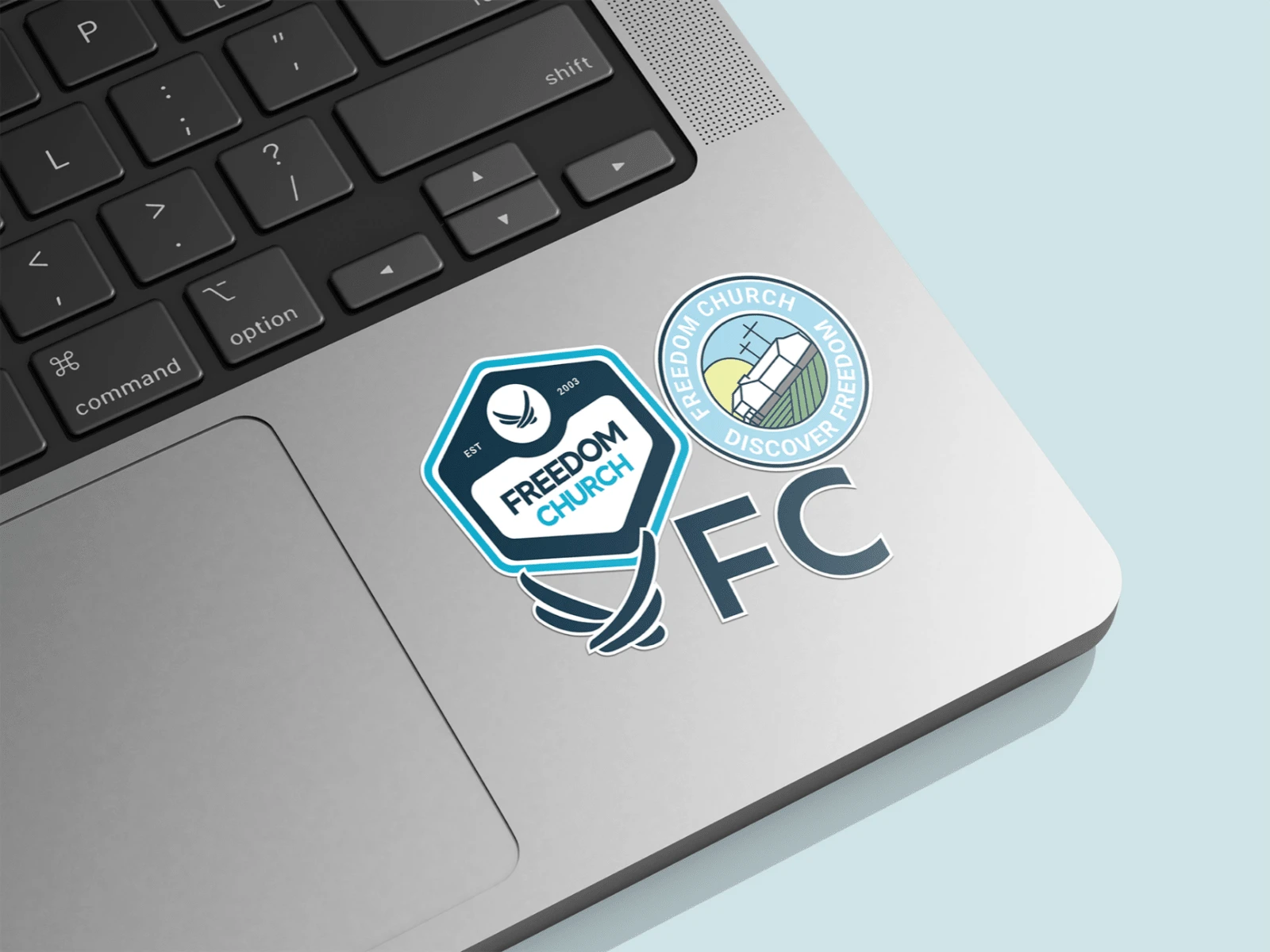
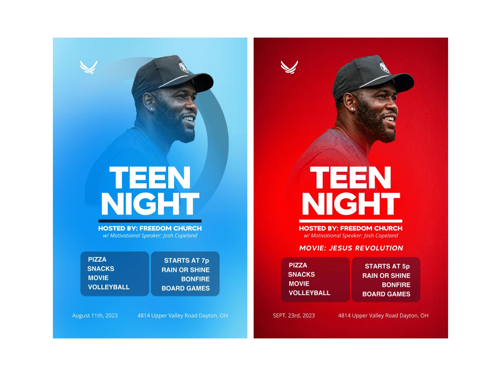
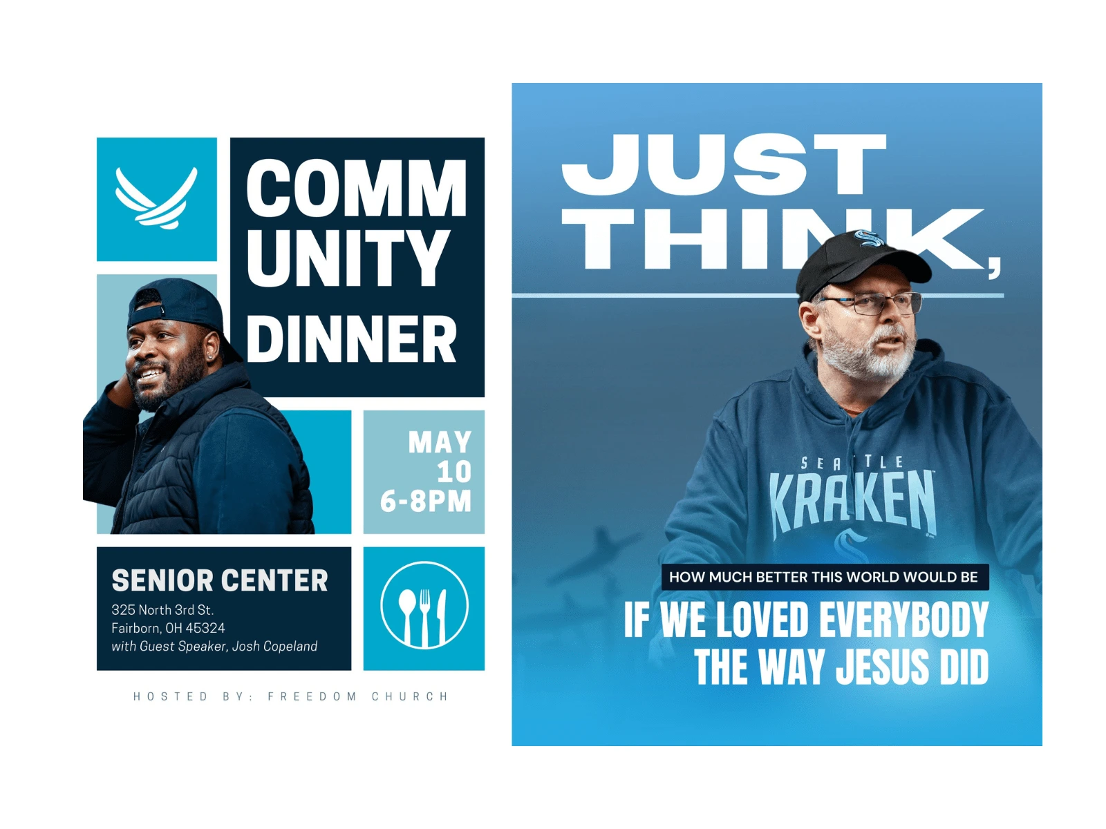
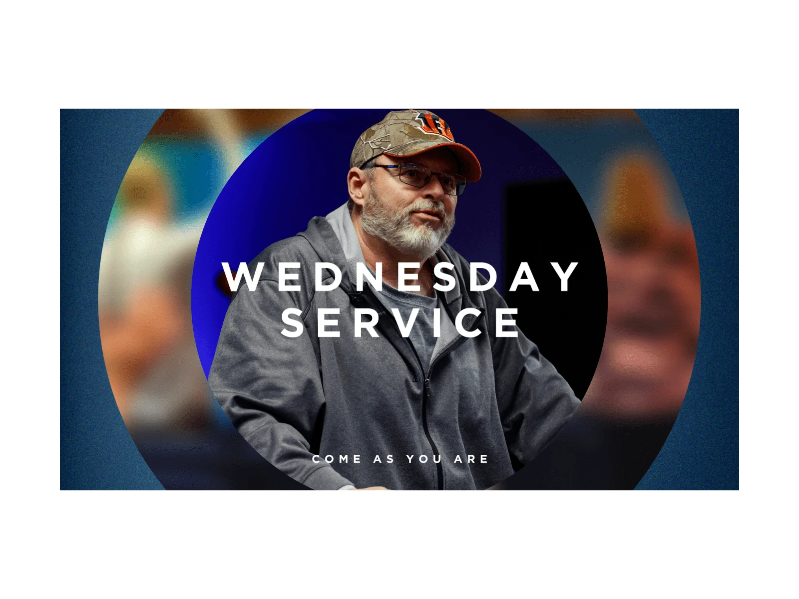
The visual identity for Freedom Church was designed to be modern, simple, and enduring—something that would speak to both long-time members and a new generation. The idea for the mark was born from the founding pastor’s service in the U.S. Air Force. Drawing inspiration from the Air Force logo, we sought a symbol that felt both aspirational and deeply personal to the church’s story.
The Eagle in Flight
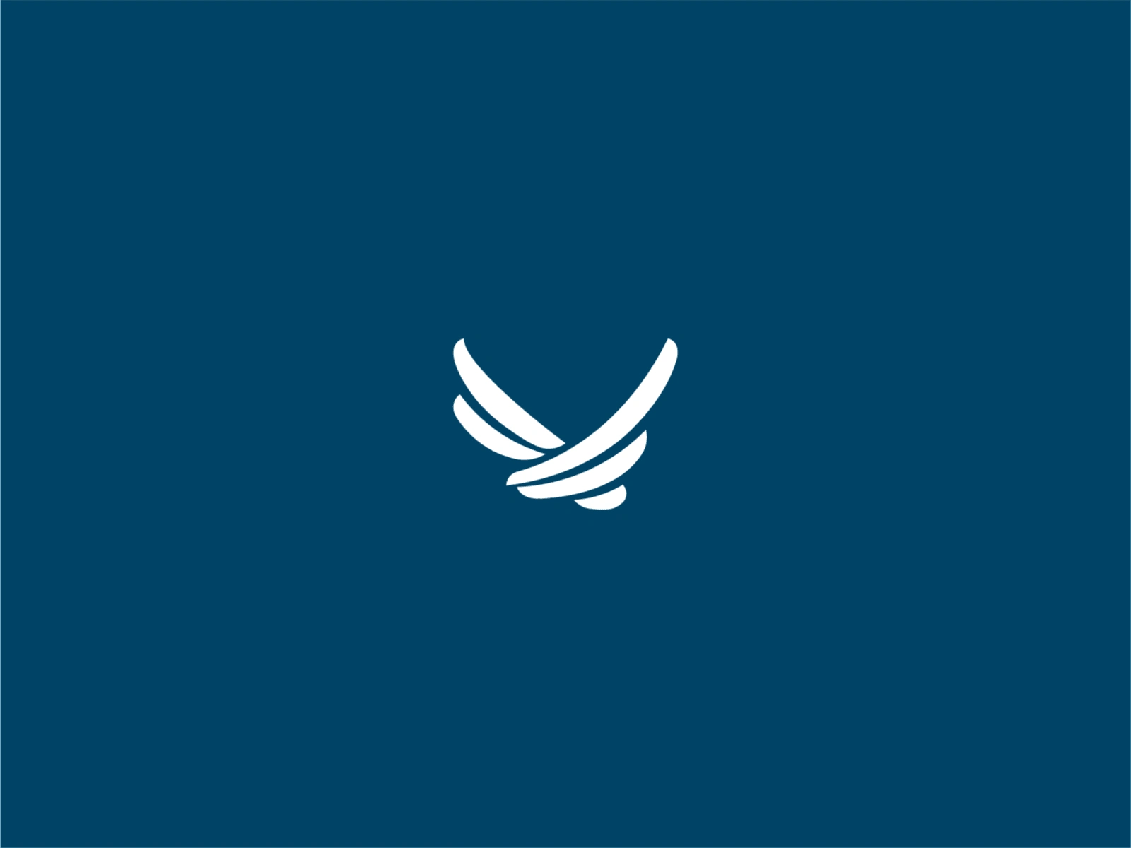
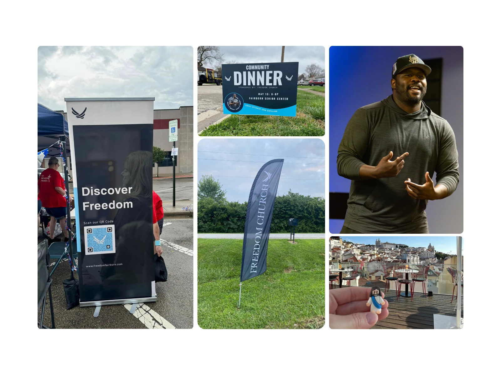
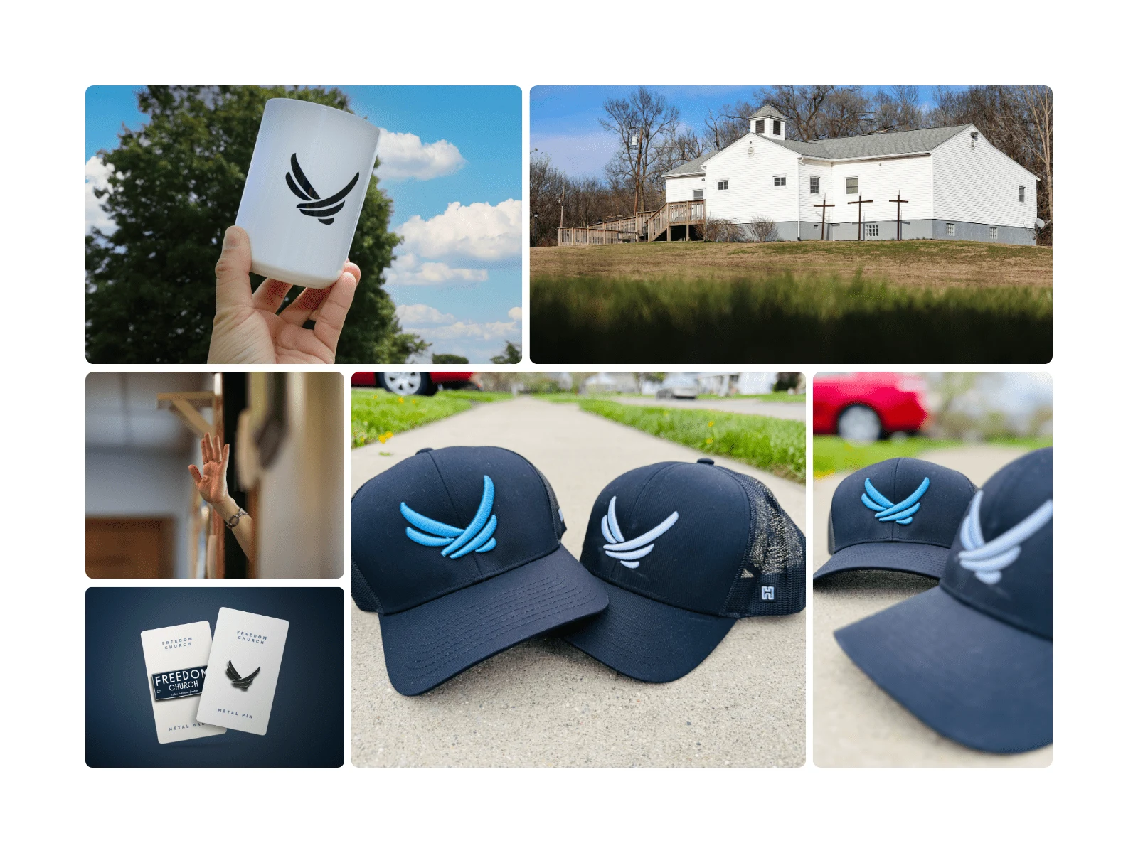
Through collaboration and exploration, we landed on a minimal, line-art silhouette of an eagle in mid-flight. The eagle represents strength, freedom, and renewal—qualities that align with the church’s mission to uplift and inspire. With its wings pointed upward, the design subtly conveys growth, movement, and a spiritual ascent.
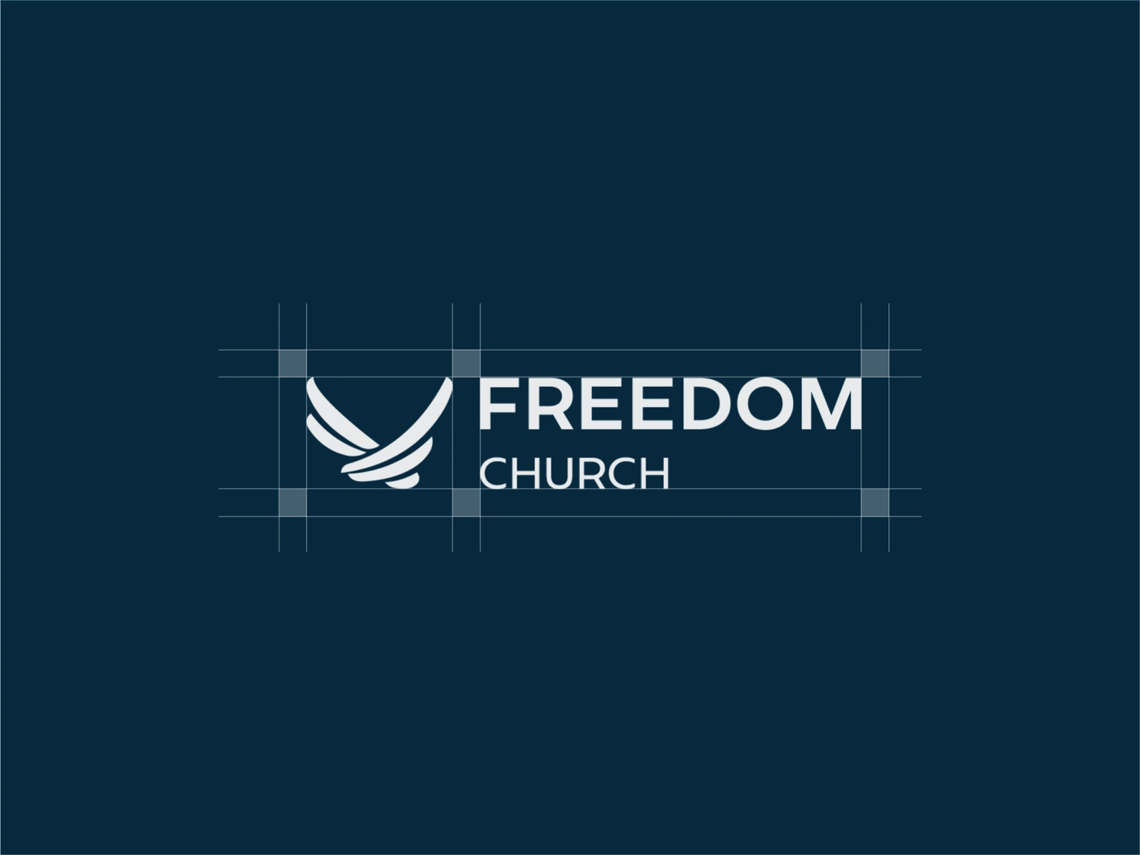
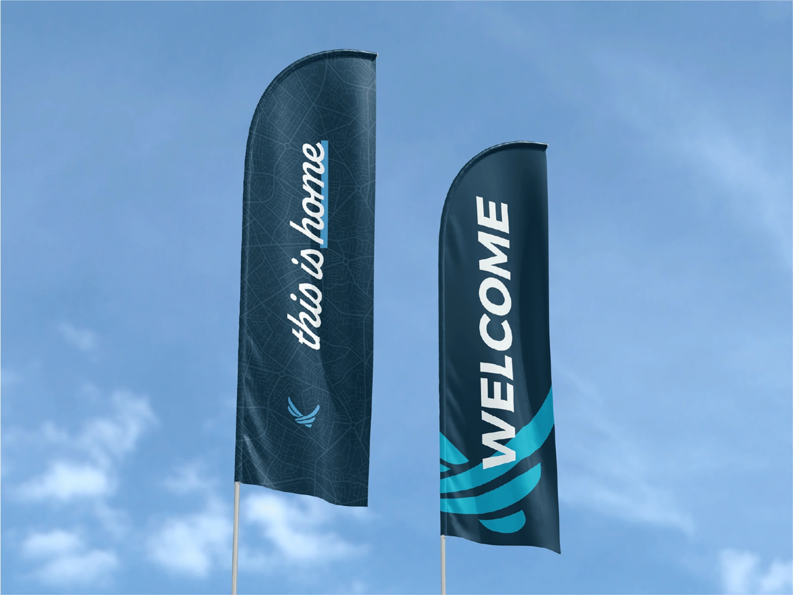
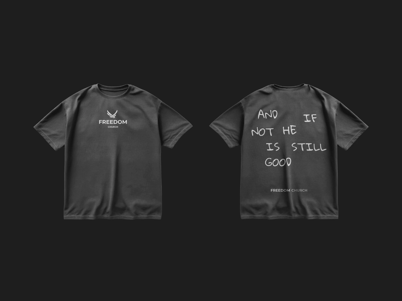
The result is a logo that’s clean, versatile, and timeless—designed to grow with the church and remain a symbol of Love, Compassion, and Kindness for generations to come.
Like this project
Posted May 5, 2025
Rebranding Freedom Church with a timeless eagle mark inspired by the Air Force—symbolizing strength, renewal, and values that uplift.
Likes
1
Views
0
Timeline
Mar 31, 2023 - Mar 1, 2025
Clients
Freedom Church


Logo Design for Topspin Racquet Club
GOODDAYS Skincare — Brand Identity & Packaging Design
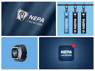
How We Built NEPA LAX News: A Lacrosse Brand
GYMSHARK - Logo Refresh