GOODDAYS Skincare — Brand Identity & Packaging Design

Austyn McFadden


GOODDAYS Brand Identity
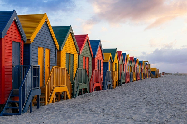
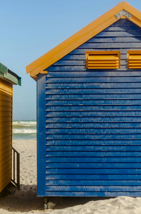
GOODDAYS is a skincare line born on the coasts of Cape Town, created by surfers for surfers. Built on a deep connection to the ocean and a frustration with conventional skincare, GOODDAYS delivers sun care and skin recovery products that protect, restore, and elevate daily routines—both in and out of the water.
To bring this mission to life, Vaughn & Co. developed a brand identity that captures the relaxed confidence of surf culture and the natural richness of South Africa’s coast. From naming and logo development to packaging and product storytelling, every element was crafted to reflect the brand’s coastal roots and commitment to clean, effective ingredients—like Cape Town sea salt.
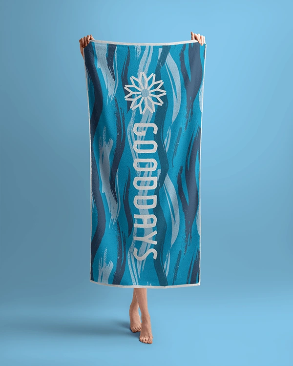
The design system blends bold yet minimal forms, tactile packaging textures, and a sun-washed color palette inspired by earth, ocean, and heat. Typography is casual but intentional, echoing the effortless rhythm of a GOODDAYS lifestyle. Brand marks and iconography are built for flexibility across formats—from beach bag tubes to digital shopfronts.
GOODDAYS stands as a new kind of skincare: functional, unfussy, and rooted in real moments spent under the sun.
Studio: Vaughn & Co. | Instagram

Bringing the Brand to Life
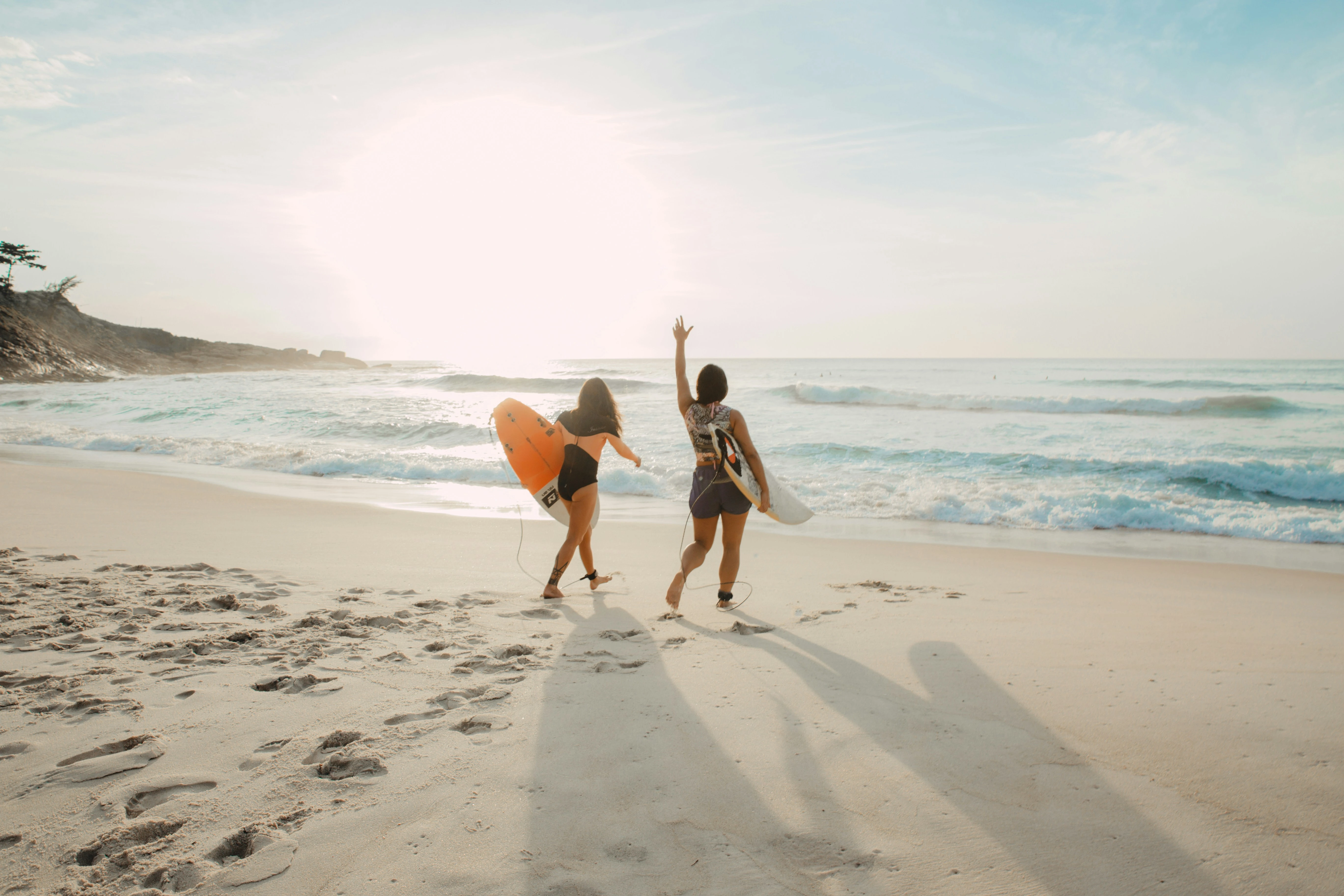
With the core identity established, the GOODDAYS brand unfolds across packaging, print, and digital touchpoints with a tone that feels equal parts casual and considered. Every mockup and material reflects the world of GOODDAYS: where sun care meets surf culture, and skincare isn't just a routine—it's part of the ride.
Typography plays a key role in reinforcing the brand's attitude: approachable yet intentional. The type system combines soft geometric forms with confident alignment, echoing the balance between effortlessness and efficacy. Photography and layout choices prioritize natural light, sandy textures, and real moments—no studio polish, just honest sun and sea.
GOODDAYS doesn’t overexplain. It shows. From the salt-sprayed hair to the golden-hour skin, the brand tells its story through feeling and form—one that’s rooted in Cape Town but made to travel wherever the waves do.
Studio: Vaughn & Co. | Instagram


Let’s Keep Building
See more behind the scenes on Instagram → @vaughn.oh
Interested in working together? Reach out here
//
Studio: Vaughn & Co.
Email: austyndmcfadden@gmail.com
Website: byvaughn.com
Creative Director: Austyn McFadden
Year: 2025
Like this project
Posted May 6, 2025
A modern skincare brand rooted in South Africa, GOODDAYS features a bold wordmark and sun icon inspired by the nation’s flag and warmth of coastal living.
Likes
1
Views
3
Timeline
Feb 18, 2024 - Mar 8, 2024


How We Built NEPA LAX News: A Lacrosse Brand
GYMSHARK - Logo Refresh

Maneo – Clinical Skincare Branding & Identity
Grip It & Sip It Classic 2023 Returning Graphics