How We Built NEPA LAX News: A Lacrosse Brand

Austyn McFadden


Case Study: Rebranding NEPA Lacrosse News
Crafting a Scalable and Iconic Identity for Pennsylvania’s Lacrosse Hub
In June 2024, NEPA Lacrosse News approached us with a clear objective: rebrand their identity to better reflect their growth, community, and long-term vision. Their existing logo was a placeholder—something that served its initial purpose but no longer aligned with the brand’s evolving presence. As their platform expanded, it became clear that a well-crafted identity was necessary for consistency across all touch points, from digital screens to merchandise and beyond.
In today’s digital landscape, where most content is consumed on mobile devices, a brand’s visual identity must be instantly recognizable, scalable, and adaptable. Our challenge was to create a mark that could be bold and impactful at full scale while retaining clarity at smaller sizes, ensuring brand cohesion across every platform.

Discovery & Research: Tying the Brand to Its Roots
Through early discussions with the NEPA LAX team, one theme emerged repeatedly: a deep connection to Pennsylvania and lacrosse—the two core pillars of their identity. To build a logo that was both meaningful and timeless, we explored Pennsylvania’s history, seeking visual symbols that could encapsulate both the state’s identity and the sport it represents.

This research led us to Pennsylvania’s Keystone State nickname. The term "keystone" originates from architecture—it refers to the central, wedge-shaped stone in an arch that holds all other stones in place. Metaphorically, Pennsylvania played a similar role in early American history, making the keystone an enduring symbol of strength, stability, and centrality.

The keystone shape is widely recognized across Pennsylvania, featured in state agency logos, road signs, and even on the U.S. Mint’s Pennsylvania quarter. Its presence on Pennsylvania State Police uniforms and government signage reinforces its connection to the state’s identity. This deep-rooted significance made it the perfect foundation for the NEPA Lacrosse News rebrand.

Design Execution: Crafting an Iconic and Scalable Mark
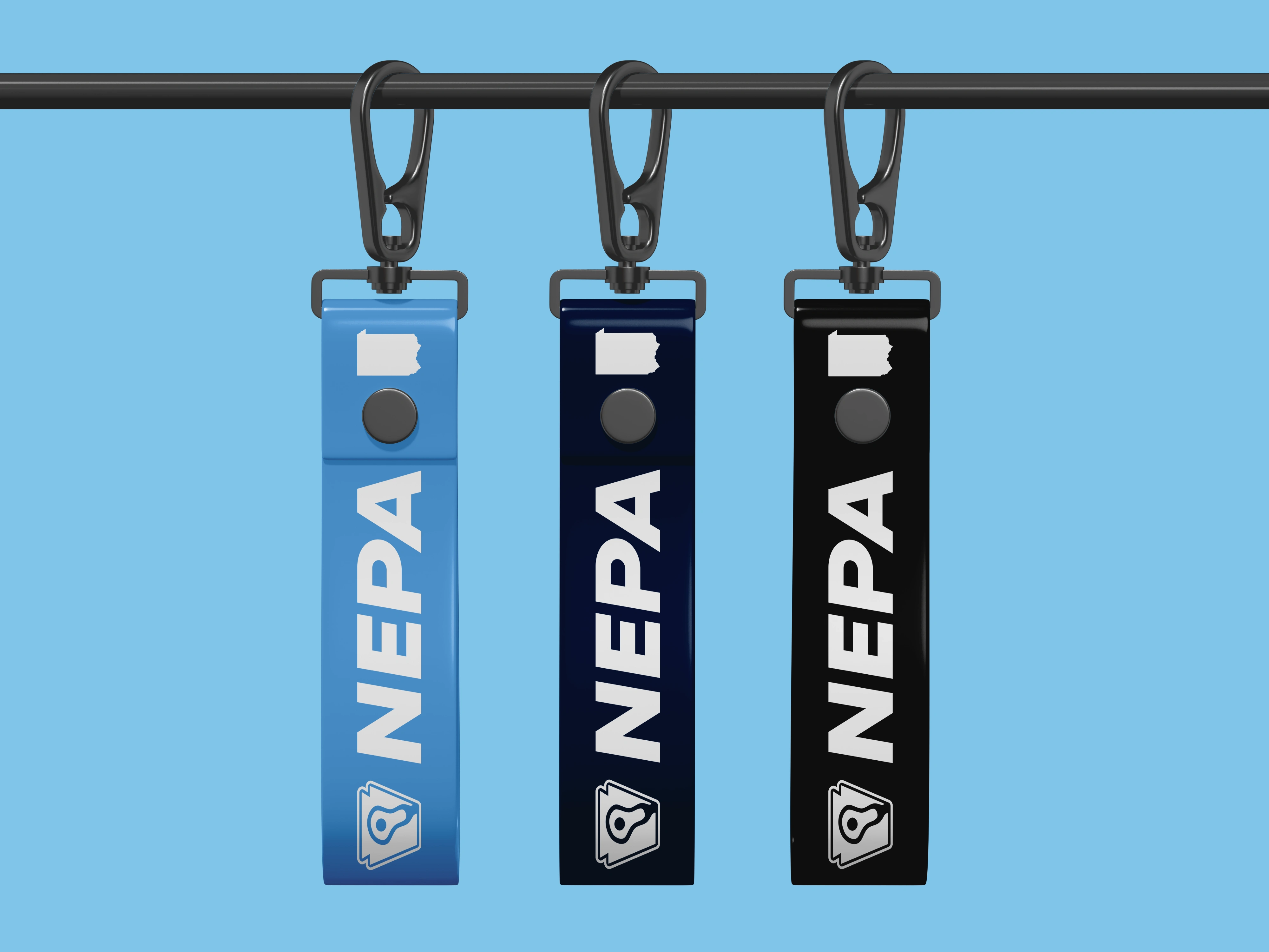
With the keystone as our foundation, we began developing a logo that would seamlessly integrate lacrosse into the design while maintaining a strong, distinctive form.
Our final solution featured:
A keystone-shaped border, serving as the dominant shape of the logo, visually anchoring it to Pennsylvania’s rich heritage.
A lacrosse stick icon, placed at the heart of the keystone, representing the sport as the core of NEPA LAX’s mission.
A design optimized for scalability, ensuring clarity whether displayed on a mobile app icon, a website header, or large-scale merchandise.

Like this project
Posted May 6, 2025
NEPA Lacrosse News’ new logo fuses a keystone shape with a lacrosse stick icon—bold, scalable, and rooted in Pennsylvania pride.
Likes
1
Views
1
Timeline
Mar 8, 2025 - Mar 8, 2025


GYMSHARK - Logo Refresh

Maneo – Clinical Skincare Branding & Identity

Grip It & Sip It Classic 2023 Returning Graphics

Huber Heights City Identity Refresh