Logo Design for Topspin Racquet Club

Austyn McFadden


Case Study: Logo Design for Topspin Racquet Club
Design by Vaughn & Co.
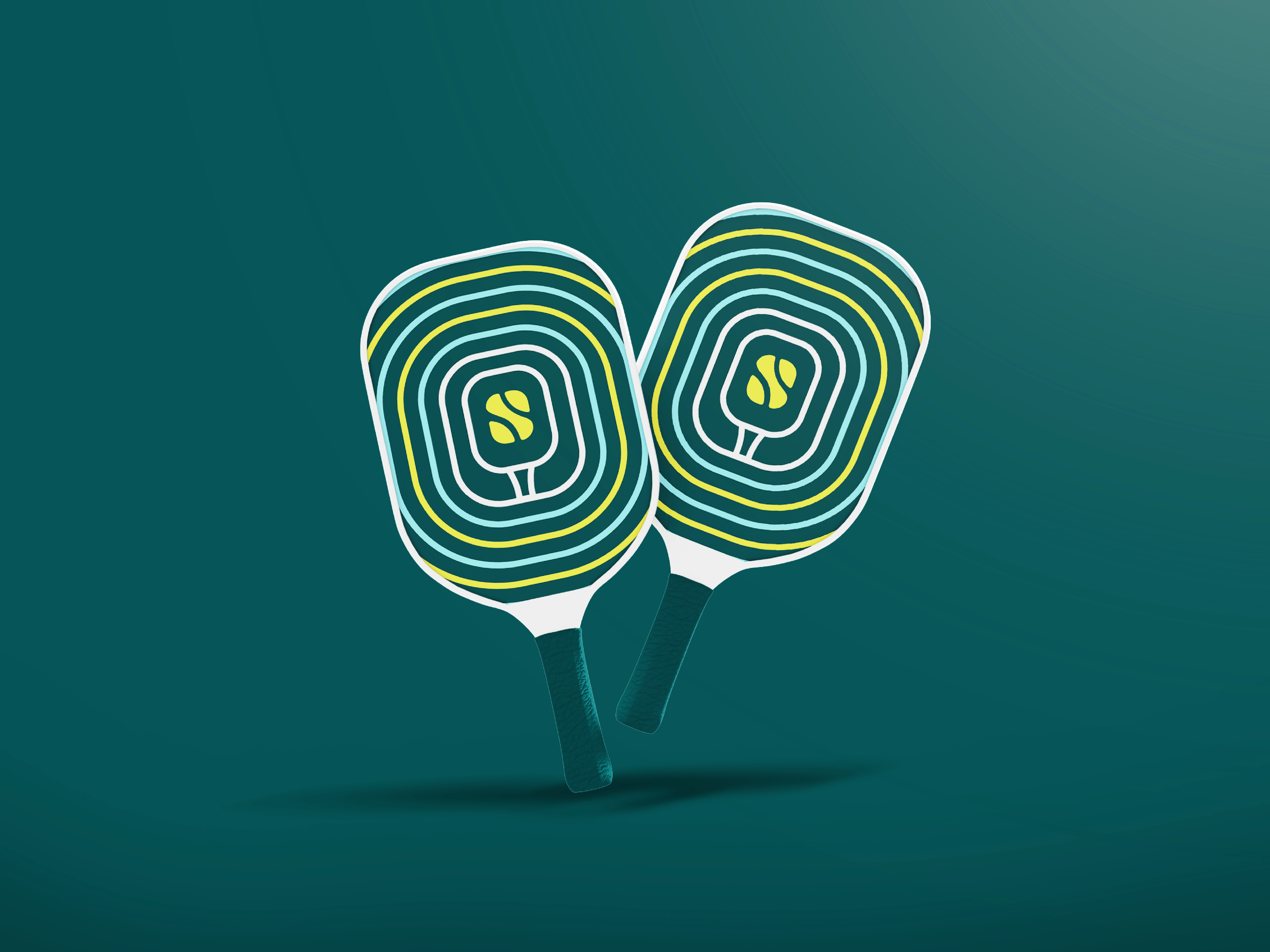
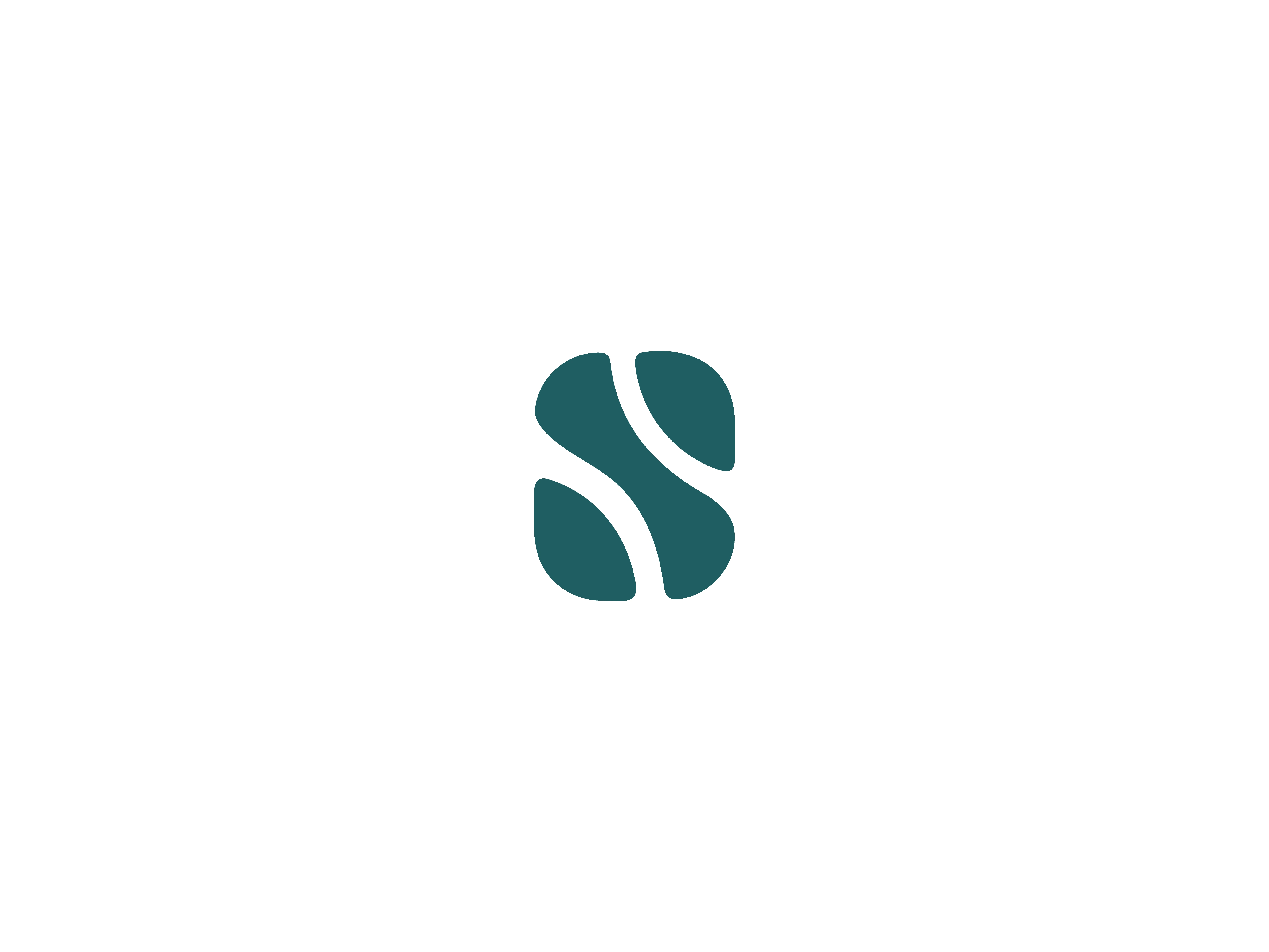
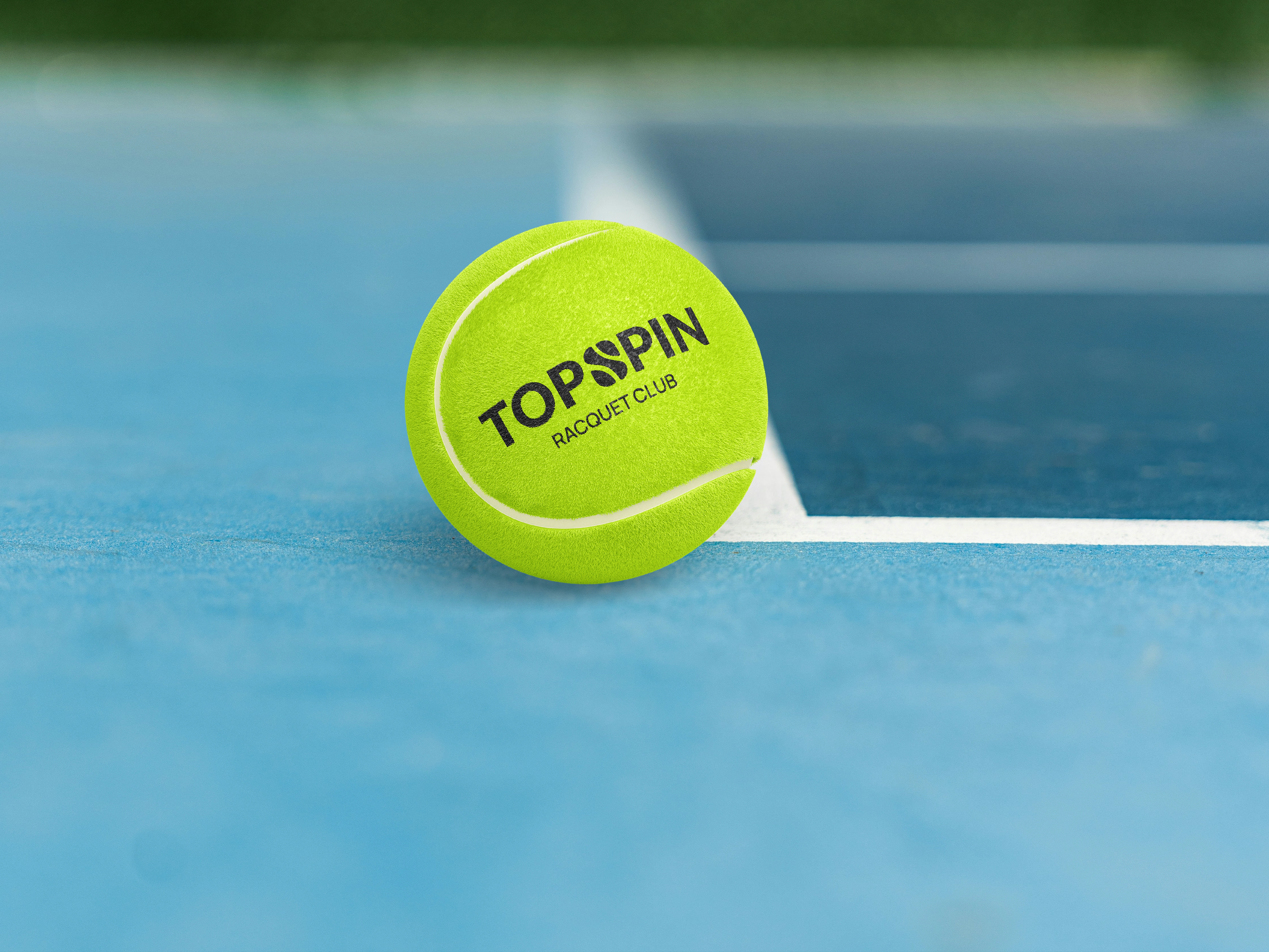
The goal for the Topspin Racquet Club identity was to create a visual mark that embodies the dynamic energy of racquet sports while remaining modern, refined, and versatile. As a central motif, the letter "S" served as a natural anchor—referencing the word "Topspin" and offering an organic shape to explore. Inspired by the familiar markings of a tennis ball, subtle lines were added to the upper and lower sections of the "S," forming a stylized, instantly recognizable symbol that connects directly to the sport. Every curve and line was intentionally refined to balance character and clarity.

This concept is rooted in the belief that great sports branding should be iconic without being loud��—simple enough to endure over time, yet distinctive enough to hold its own across varied brand touchpoints. By referencing the core equipment of racquet sports in a minimalist way, the mark becomes more than just a letter—it becomes a signal to the community it represents. Whether viewed by a seasoned player or a new club member, the logo evokes familiarity while offering a fresh visual take on a timeless game.


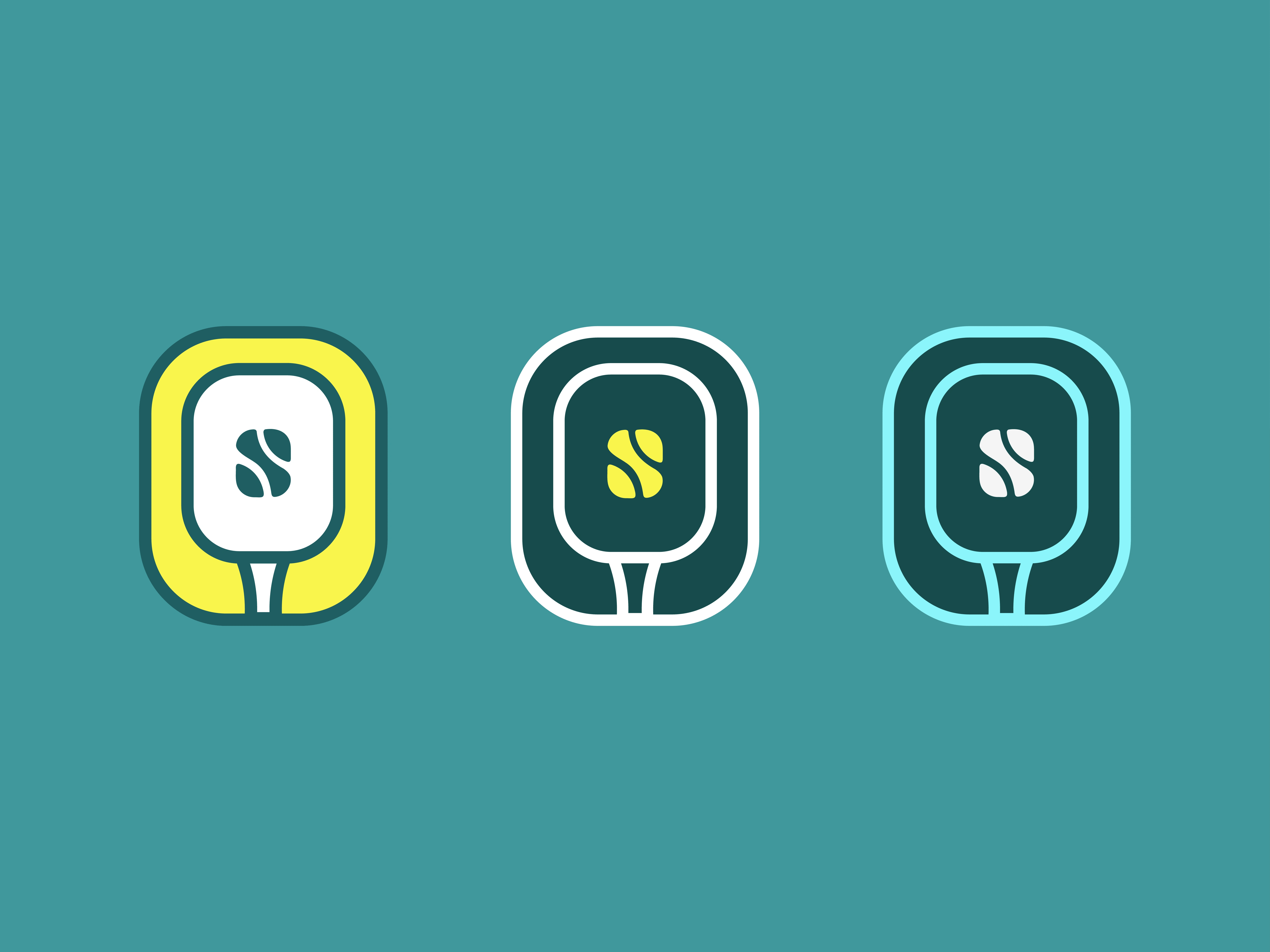
The final identity was crafted with flexibility and scalability in mind. It performs equally well in monochrome or full color and retains its integrity across digital and physical formats. From stitched emblems on apparel to court signage and custom-branded gear, the mark confidently carries the club’s personality wherever it's applied—building recognition with every swing, serve, and rally.
Like this project
Posted May 4, 2025
Crafted a modern, versatile logo for Topspin Racquet Club, inspired by tennis ball markings and designed for clarity across all brand applications.
Likes
1
Views
9
Timeline
Jul 1, 2024 - Aug 2, 2024


GOODDAYS Skincare — Brand Identity & Packaging Design
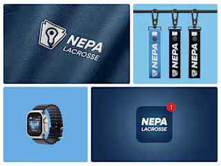
How We Built NEPA LAX News: A Lacrosse Brand
GYMSHARK - Logo Refresh

Maneo – Clinical Skincare Branding & Identity