Women's Healthcare - Mobile App
Mobile App: Vitex
Industry: Wellness / Healthcare / Medical

The Problem
Women need access to naturopathic/functional healthcare due to the failure of western medicine.
While scrolling aimlessly through Instagram everyday, I noticed a lot of holistic and naturopathic doctors sharing tips on how women can heal their bodies naturally instead of covering up the symptoms they experience with pharmaceutical drugs. Thousands of comments from women of all ages seemed to react to these videos saying things like “why were we not taught this” “I wish I knew about this sooner” “All the doctor did was prescribe birth control”.
Western medicine has failed to treat many hormone related conditions women struggle from. Polycystic Ovarian Cyst Syndrome, Endometriosis, and Premenstrual Syndrome are just three of the many possible conditions.
The Solution
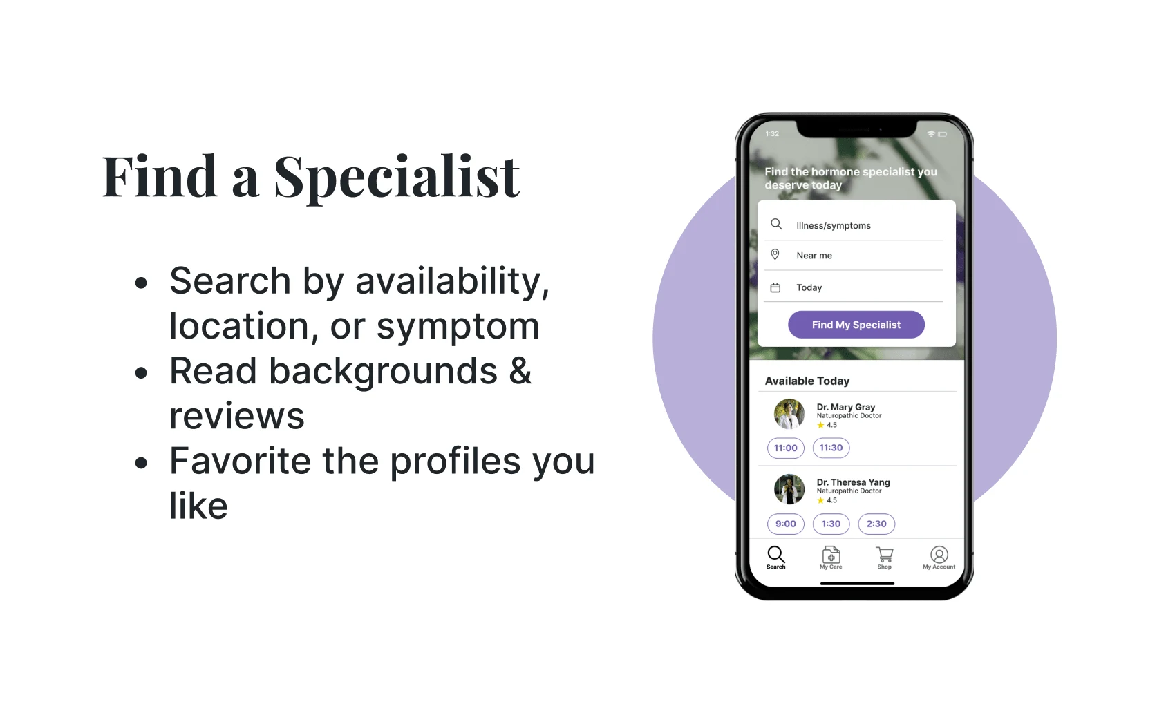
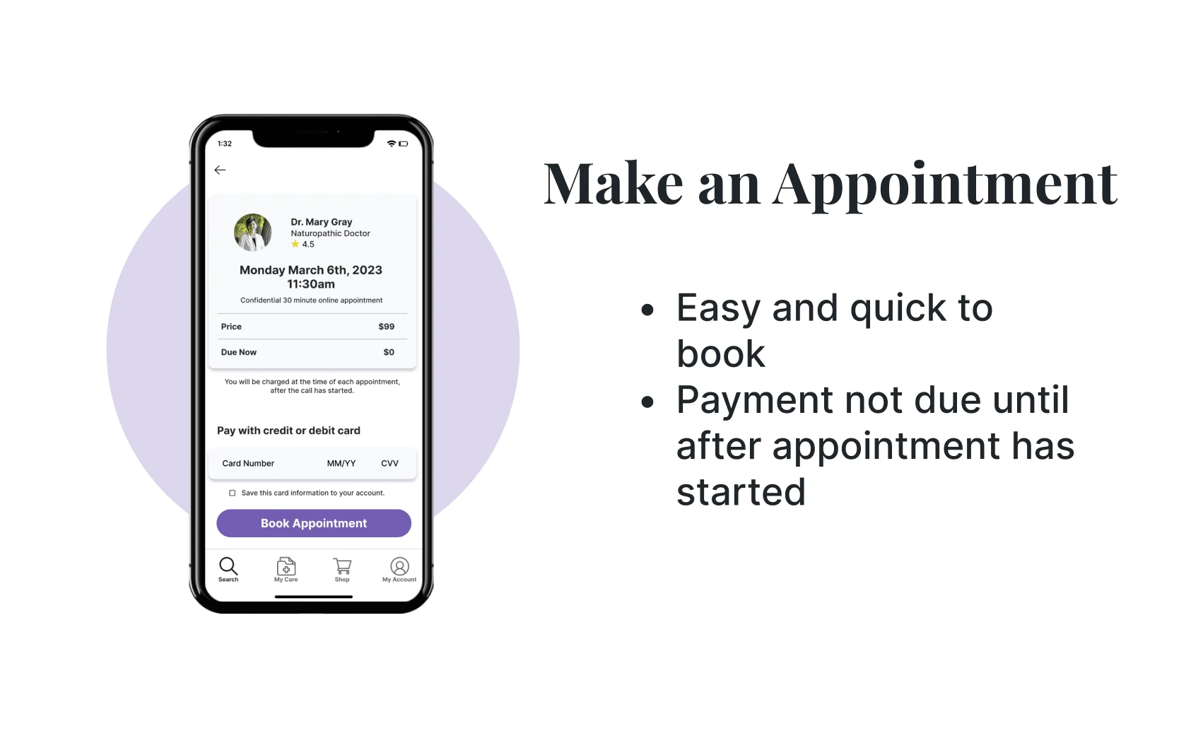
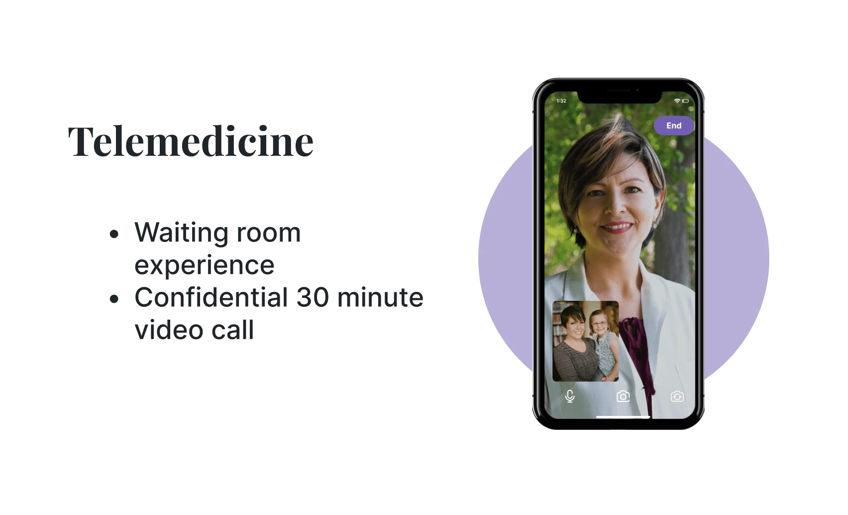
Creating a virtual healthcare experience with hormone specialists.
Research (Phase 1)
Hormone specialists aim to restore hormone levels to proper levels so that the body's functions work correctly.
Compared to other medical professionals, hormone specialists have a more in-depth knowledge of hormones, their diseases, and effective treatments. Naturopathic and functional doctors are known to treat the root cause of any condition with more natural methods rather than mask a patient’s symptoms with pharmaceutical drugs.
In this 2019 article with Dr. Gottfried, she explains her journey transitioning out of western medicine and how there is still skepticism in the United States when it comes to integrative medicine even though it is proven very effective to treat patients.
The goal is to gather that 2 percent of functional hormone specialist, into one place where patients can be treated virtually.
"Presently, only about 2 percent of medical doctors are pursuing an integrative and functional approach. We need at least 13 to 15 percent to begin market transformation." -Sara Gottfried MD
Competitor Analysis
The “future of healthcare”.
All of these competitors provide virtual healthcare experiences whether it is mental, physical, or even prescriptions. While they all seem to be growing on the market quite rapidly, some having commercials on TV, none of them tailor specifically to women’s hormonal health. Unless all you want is birth control.

Research (Phase 2)
Surveys
Over 50% of women don’t know how to support their bodies or track their menstrual cycles.
Before diving into interviews, I decided to do a survey with questions relating to women’s hormones. I wanted to get a feel for the struggles women were facing and if they knew how to care for their optimal hormone health. I had 23 random responses from women between the ages of 13-39.
Main Findings
About 74% of these women experience premenstrual symptoms or have painful, heavy, and irregular menstrual cycles.
Over 50% of these women said they don’t know how to track the different phases of their cycle or properly support their bodies for hormonal balance.
96% of women said they have never seen a hormone specialist.
When asked if they would make an appointment to see a hormone specialist, if easily accessible, around 83% of women said YES.
User Interviews
Due to all the responses from a specific age group in the survey, I branched out to interview at least 2 women above the age of 39. Both had children and have suffered from or are still suffering from hormone related health conditions. My younger interviewees in their 20’s did not have children, but still had their own health journeys to share.
The first half of my interviews included more emotional questions about women’s struggles to find a doctor who has actually helped them treat their conditions, but in the second half it was more about asking what these women wanted out of a healthcare app made just for them.
What women want
“I wanna feel like I am in a real doctor’s office but at home”
Flexible scheduling
“I want a doctor who will actually explain things to me”
Reviews
“I want to feel like they care”
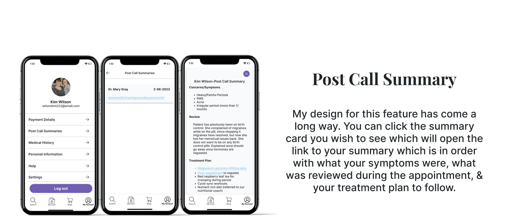
A summary of their appointment to look back on
Products that the doctors believe in and trust
Ideation
Based on my discoveries, the idea is to make the healthcare experience less stressful.
Due to our persona being any women of any age starting as young as a girl reaches menstrual maturity, or as old as reaching menopause, it is important to make this healthcare app easy to use.
Easy to use, is that the only idea behind this app?
No. This has to be easy to use because so much will be offered all in one place inside the app.
Doctor’s offices can be very overwhelming.
Calling to make an appointment can be stressful especially when there are no available dates.
Going to the store or pharmacy to buy whatever supplements and prescriptions can also be a nightmare.
This app will help to alleviate stress for women in all of those areas.
More than just making a call
After these interviews, I took in what these women want in their healthcare experience. They need reviews before making a decision of which specialist they want, they need a summary of their appointment to look back on, and they need to know the supplements they purchase are trusted.
I realized this is more than just booking an appointment and making a call; this app is the entire healthcare experience from finding the specialist to picking up the prescription.
Design
Clean & Organic
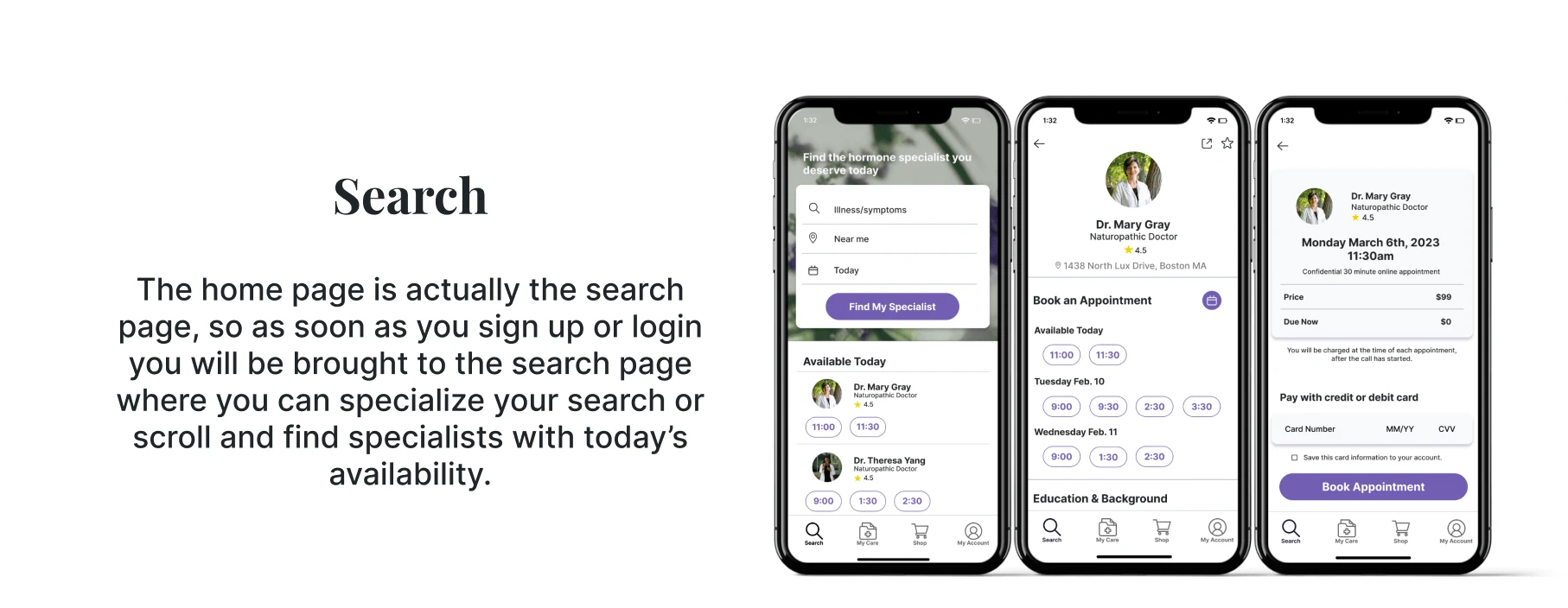
Due to all the informational content within the app, it was important to keep the UI design minimal. A lot of white space to balance the amount of text. Any colors that were used, were used as an accent on buttons or other highlighted areas.

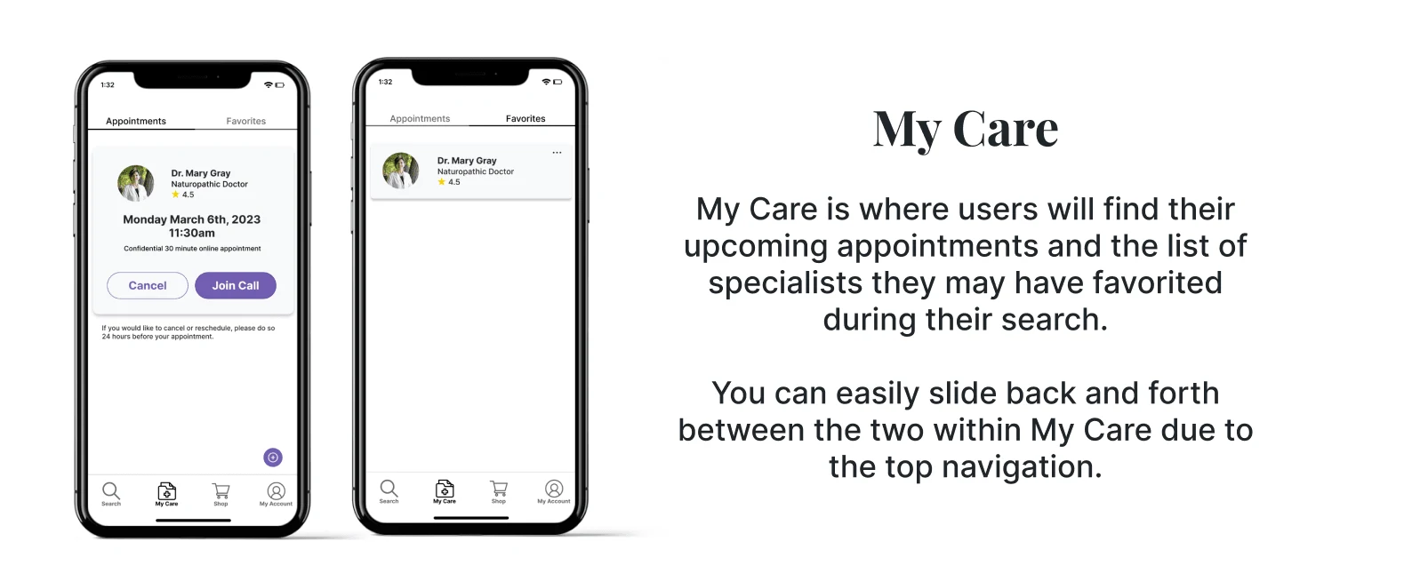

Testing & Improvements
Major improvements in my design
Through various tests, feedback from 6 peers, and my mentor’s feedback, I continually iterated my design over a span of 4-5 weeks making a few major improvements...
1. Buttons
When first building my design system I had three different sized buttons of various shades of purple. The problem with this was you could not tell what the primary, secondary, or tertiary actions were.
So I simplified the buttons by using purple filled as primary and outlined as second. This has drastically improved the overall consistency and usability of Vitex.

Buttons Before > Buttons After
2. Imagery
When I first started the UI design part of this app, I went with blurred and dark imagery as the background. I thought it would make a good contrast against the white background and other light elements.
However, after feedback I decided on one image as the background, made it clear, and a bit lighter which flowed better than I thought it would. I even did a quick A/B preference test between the two options to conclude my decision.

Before > After
3. Style Guide
As you can see my improvements were solely within User Interface. Testing showed I had a strong UX design, but the user interface and design system were parts I was still learning and practicing. My style guide changed quite a bit throughout this design process from ideation to launch.
The colors, fonts, contrast, and images all went through constant changes until I finally settled on the purple accent colors solely on the buttons and the one image of an actual Vitex tree for that calm, organic feel.
I am also giving credit to Unsplash for the images I used throughout this design. This is a glimpse of my style guide, you can also view it within the full Figma file below.
Final Product

Made in Figma
Final Prototype
Feel free to go click through the functional prototype
(try to find Dr. Gray's profile reviews)
Conclusion
What I would do differently next time.
Done is better than perfect. As a struggling perfectionist this can be my biggest frustration. I already have new ideas of what could be added here to Vitex. There can always be improvements or new features to add. In a positive way, I think that as a product grows users, I would be able to gather enough research to make changes I know are for the better.
Keep everything in one place. Through all the different ideas, solutions, and wireframes, I have learned to keep everything. And even better, keep it all in one place. I started on pen and paper. Then documented a lot of things in Google. Then, once I actually started wire framing, I found myself bouncing back and forth between all these different platforms which was a mess. Especially because you re-start and create different versions. In the future I will definitely put everything in organized pages ALL in Figma.
Simplify the UI Design. At first I had all kinds of colors picked out like shades of green, purple, and even gold. As each version of my design changed I cut a color. Ending with just two shades of purple, only to be used as an accent color in the buttons against the white background. In fact, the two largest improvements in my design were UI, not UX. I learned the aesthetic should be minimal, especially when you have an app with a lot of content.
Like this project
Posted Jan 11, 2024
From ideation to launch, this holistic health care app was designed with women's hormone wellness in mind.
Likes
0
Views
5


