Fitness - Mobile App
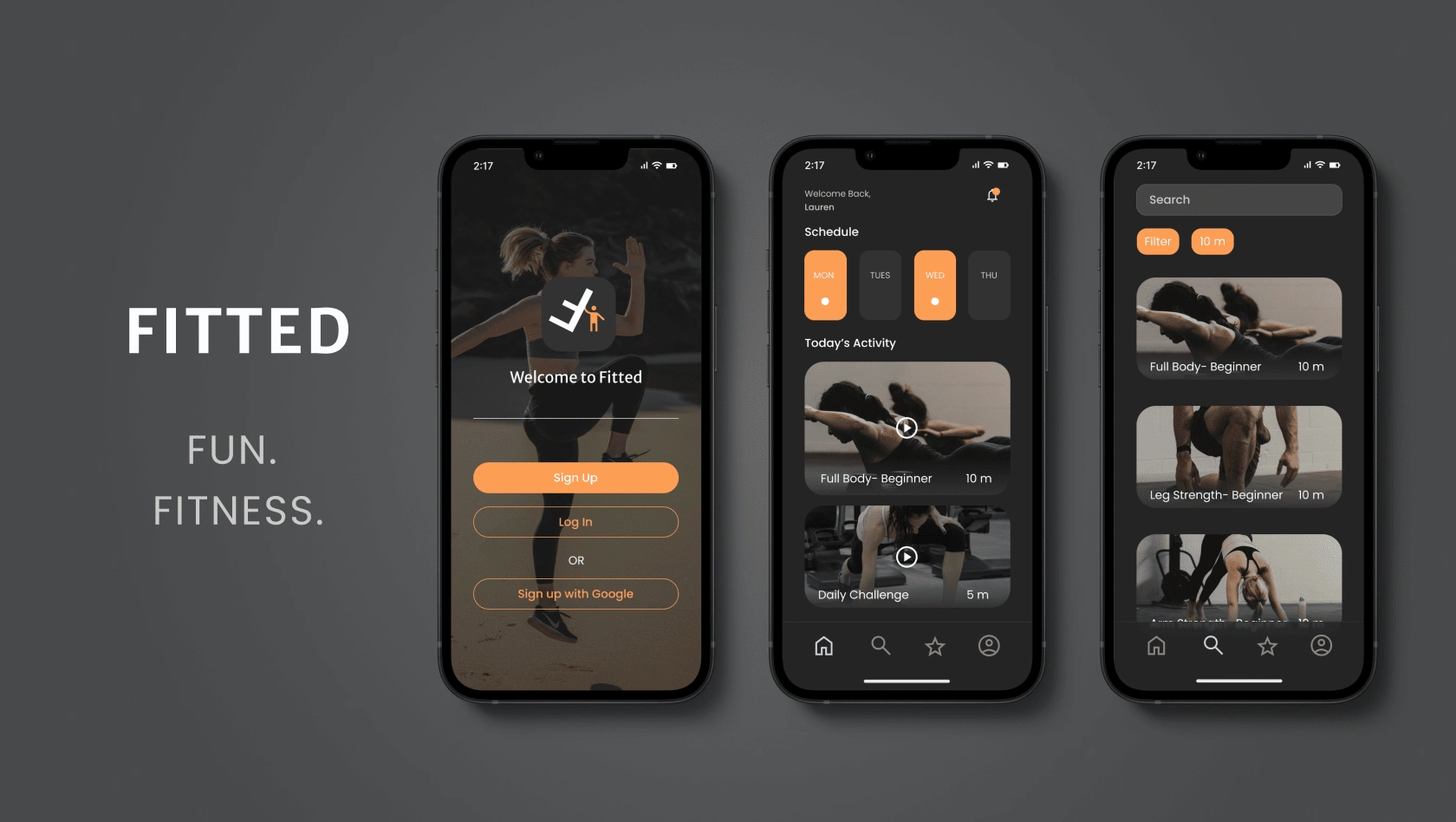
Mobile App: Fitted
Industry: Wellness
The Mission
Help users find a motivating exercise routine that fits their level, schedule, and target areas.
People are busy these days. Especially if they have full time jobs and a family to take care of, or maybe they go to school full-time and work part time after.
Where does that leave time to commit to going to the gym consistently enough to actually benefit from the exercise?
According to my research, there is NO time.
That’s right, Florian Wüest stated that 90 percent of the people who sign up to the gym around New Years, will quit after three months of going to the gym. There are of course multiple reasons why someone might quit. But a lot have to do with staying motivated and consistent!
User Persona
She wants to find short exercises that she can do multiple times per day in between other activities in order to lose weight and get in shape.
Rebecca, 26 yrs old
Sedentary Lifestyle/Job
Busy Lifestyle
Beginner
“I love the thought of having something that could really work with my schedule. Being as busy as I am makes it tough to exercise otherwise.”
Ideation
In the brain of the user…
User Flow
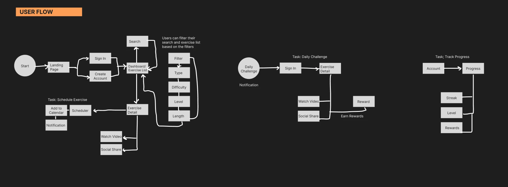
Before jumping right into designing wireframes or creating color palettes and prototypes, it was important I get organized.
In the brain of the user, where would they start and how would they navigate through this potential fitness app?
As you can see in the flow, a few tasks I created flows for were finding and scheduling their workouts, doing a daily challenge exercise, and tracking progress.
User Experience Design
Is this good enough?
This student project was for my specialization in User Interface, so one of the restrictions was practicing rapid wire framing. It was directed to set a timer for 15-30 minutes and then make our low fidelity UX wireframes.
I have to say I greatly enjoyed doing this, I think it greatly improved my ability to quickly design wireframes which could then be tested. Practicing within a time constraint is great for future projects.
One of my personal goals is to design amazing usable designs efficiently. It is much more efficient to get actual prototypes out their to test with real users, rather than sit and stare at my laptop for days wondering “is this good enough”?
Once I finished the rapid wire framing, I tested it out on just a small group of friends/family who were available. This allowed me to quickly fix any mistakes so I could move on to the UI design phase.
User Interface Design
Branding Guidelines
Instructions given at the beginning of this project included certain restrictions and partial guidelines.
The style guidelines:
Easy, fun, informative
Colors: Orange and Black
Fitness Icon
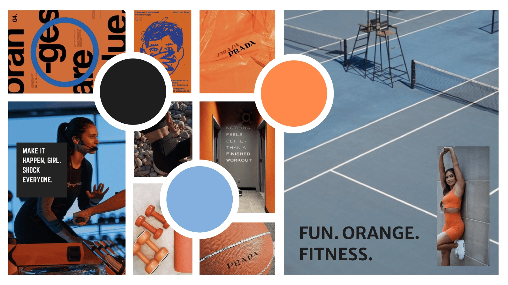
Moodboard
The user interface design process first comes with finding inspiration. With orange and black as the primary colors, I wanted to find a nice accent color.
My decision for blue was based on the calm feeling it brings, as well as the outdoor aesthetic. After all, these users are busy and while we want the app to be motivating and uplifting, I felt like adding a more calm stress free color would help balance the features.
For this app to be fun I liked the idea of bold typography, which can also be a lot easier to read if your working out!
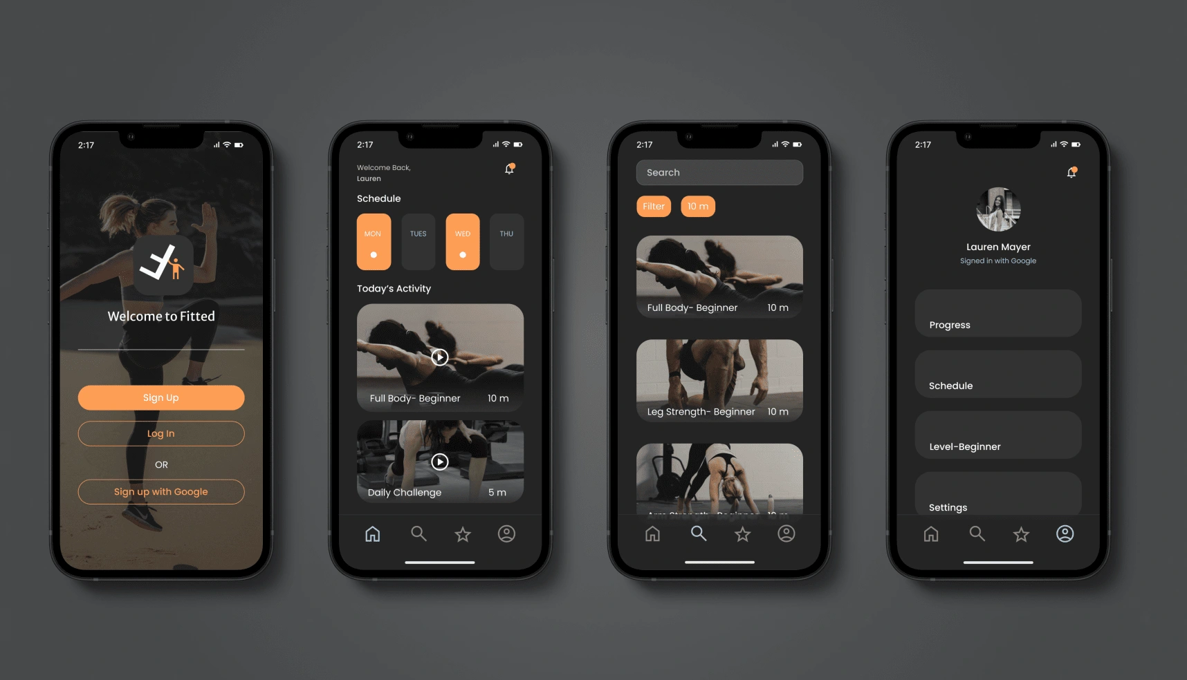
I felt that the dark mode was really fitting for the app. It allows us to use the primary color black, and then makes the orange pop really nicely. It also allows for the blue accent to pop and be easily readable.
One of the competitors I used to compare this app with was actually Youtube. The layout and darkness making it easier on the eyes when watching multiple videos for minutes to hours.
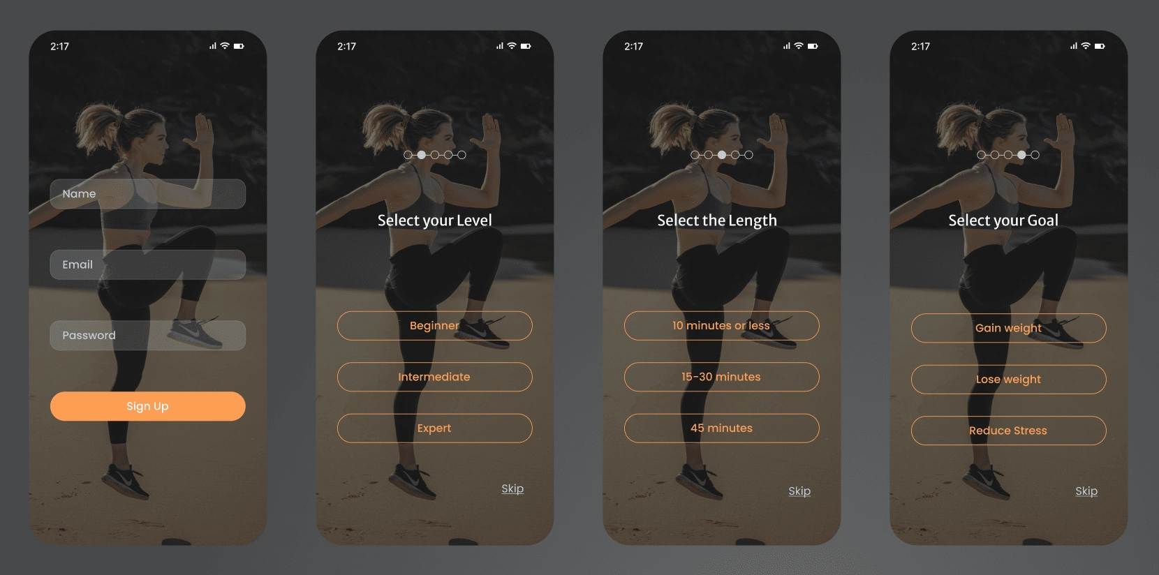
Onboarding
Above is the sign up and on boarding screens. For the user interface design, I stuck with one image as the background so that when you answer the questions or skip, the animation looks very clean and consistent.
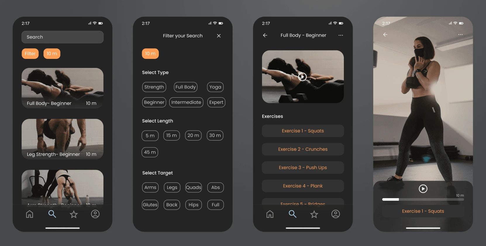
Search
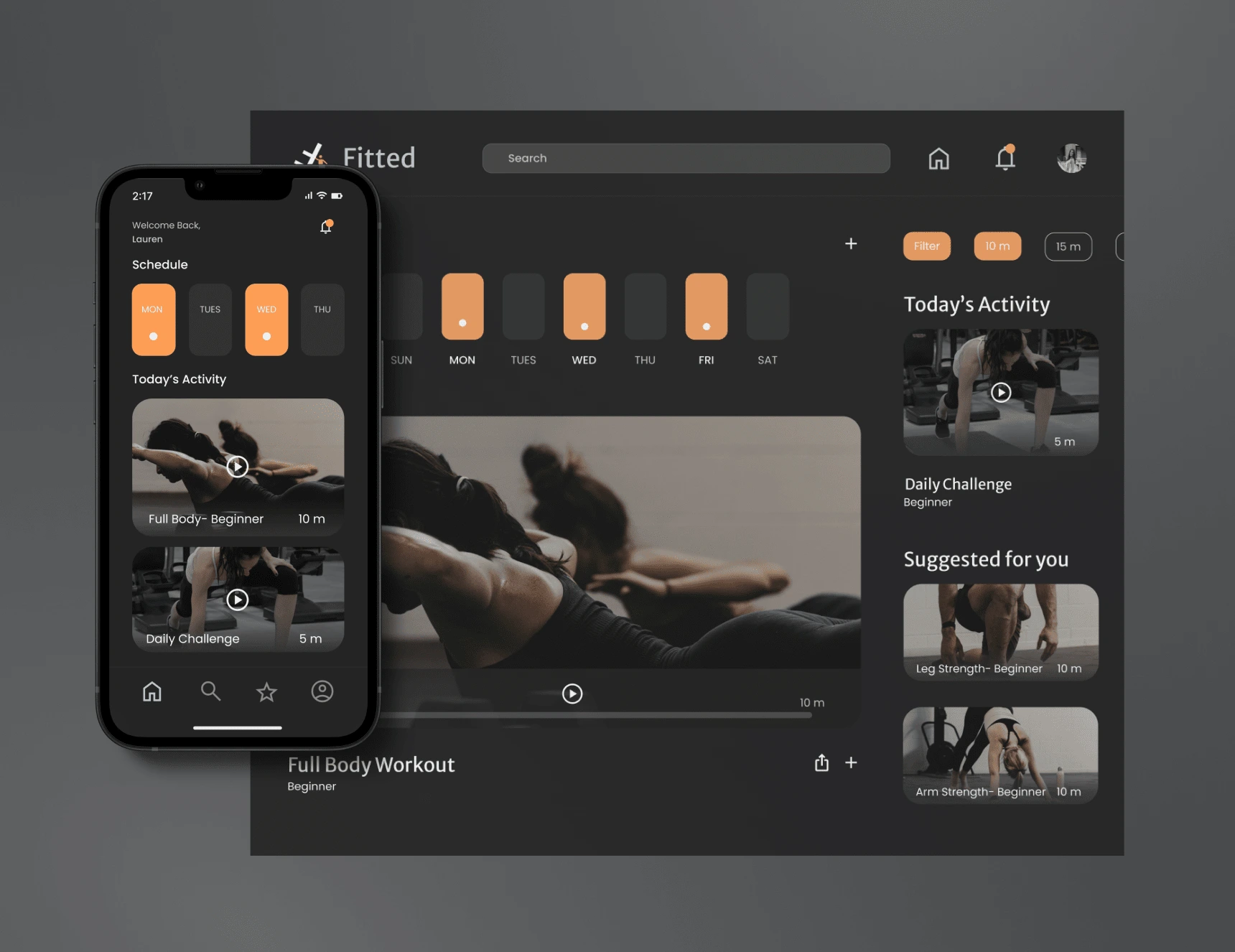
Above is the Search Page Flow for the mobile app design. The search page has its own place within the main navigation for users to easily find. Then there is the filter options based on the on boarding questions, or the user can change the filter at any time for a quick and easy search.
If you click on one of the workouts it then expands and shows you a list of each individual exercise included within that workout. To the far right, is an example of how the video would look as the user follows along with their workout.
Web Responsive Design
Designing for Different Breakpoints
Once the mobile design was finished, it was time that I make it responsive to other screen sizes like tablet and desktop.
The way I was taught in my design program was to start with the mobile design first, then make the desktop. However, I personally think starting with desktop or designing both at the same time can be super beneficial and efficient.
Grids & Breakpoints
Mobile: Small 390px
4 Columns
24 Gutter
32 Margin
Tablet: Medium 834px
8 Columns
20 Gutter
32 Margin
Desktop: Large 1440px
12 Columns
20 Gutter
40 Margin
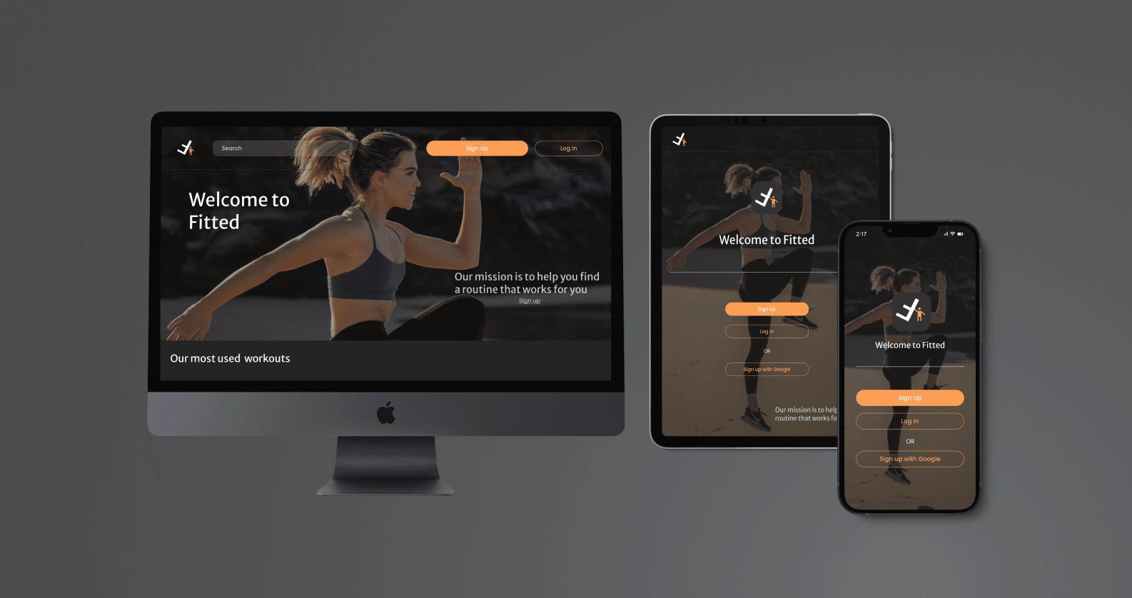
Desktop, Tablet & Mobile
With these different breakpoint sizes, it was essential to use grids to maintain the consistency within the design.
Where I had some trouble was adding additional things I did not need to consider before. The bigger the screen got, the more room and space there was. While space is good some of the screens felt empty.
I combined pages and added additional relevant content where I could. I am sure if this were an actual company project I would have resources to find the best content to boost business and SEO optimization.
Design System
Style Guide
While you have already seen the user interface design above, I wanted to provide a more in depth explanation of my design system. While a style guide is more the visual styles that you saw above, the design system also entails the components and buttons I created for this project.
1. Colors

Fitted Color Palette
2. Typography
Heading used was Merriweather. Body font was Poppins. Both were a Sans font style to give that bold typography look, and be easily readable. Sizes ranged from 14px-24px for mobile.
3. Logo Guidelines
The logo was used very minimally, only on the sign up page or in the header of the tablet and desktop versions. While I plan to invest time into learning how to make logos in the future, I would advise businesses to invest in an expert graphic designer for their branding to be cohesive across all platforms.
4. Imagery

Imagery used was dark toned with dark clothes or backgrounds to ensure consistency and go with the aesthetic of the brand. I also edited them within Figma to give them a darker exposure all of the same color for a consistent look. I even gave them a warm tint to go with our orange color contrasting that cool dark background.
Imagery is a very important part of UI design.
Images can express way more emotion, causing reactions from users. I tried to find the best images of actual people doing their exercises from anywhere. As you can see it includes men and women, people in a gym or at home in their garage.
5. Brand Tone
This brand is suppose to be motivating, fun, and encouraging. The tone should be POSITIVE and upbeat.
It should make users feel good even if they only did a 5 minute workout! It should make them want to come back, because they enjoyed the positive and easy experience.
6. Animations
For the prototype I used the Smart animate feature on some of the components and buttons in Figma. It should be set at Ease Out 400ms. Then open and close overlays for options and filters.
7. Icons
I used a set of icons from Google Materials Symbols to ensure they are consistent throughout the app. 400 weight and sized to 32 x 32 or 40 x 40px.
8. Design System Components
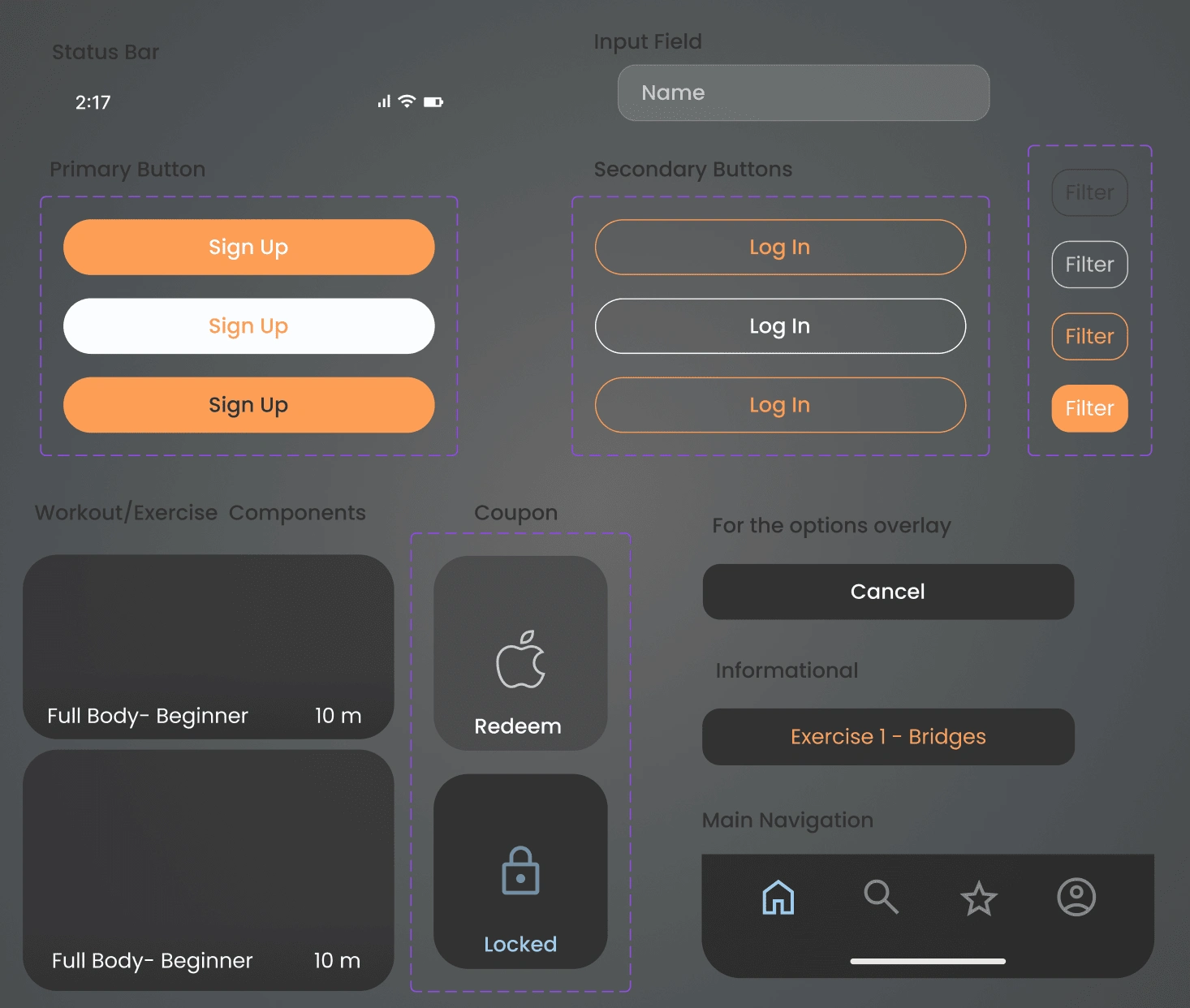
Components
As you can see above these are the main components I designed and created for the project. There are different colors of the same component for when you actually use the app, it gives the prototype that real life feel and animation.
The buttons need hover and pressed options so that users can see where they are on the screen and if the button worked.
Final Prototype
Conclusion
Another important note I would like to make before getting into what I learned, is that I did learn to export all necessary assets for developers. I exported the icons, images, and components along with the wireframes and prototypes.
Submitting them into a zip file format organized by each web responsive size (mobile/desktop/tablet). I realize each developer might need something different so I will have to communicate with the developer how they prefer everything to be marked or exported.
What I would do differently next time…
Start the design with desktop. This can be controversial and depend on what exactly needs to be designed, and the time constraints. However, I found it difficult to design from the smaller screen to the larger screen size. If you start with the large screen, and give all the content text or images a place then you can easily shrink it down to fit the smaller screen. In my personal professional opinion, it is easier to combine or cut unnecessary (maybe related) things in order to put it into the tablet and mobile sizes. For this project it was harder to enlarge or place additional things in order to make the desktop version not look so empty or disorganized. If I got the chance to at least design both sizes at the same time, I could have done this in the early UX stages and even tested the layout on potential users.
The secondary color should barely be used. The secondary color is an accent color to the two primary colors. At first I thought because I had the dark background and the primary buttons orange, I had to make a bunch of stuff blue. But the blue was suppose to be used sparingly and be useful to the user. So instead I used it in the main navigation to differ which page the user was on. Then any small text that needed emphasis. I even found images with subtle hints of blue.
Do not get attached to your designs. No design is set and stone, things are constantly changing and upgrading. I found myself starting the design with a white background because I thought thats what it had to be. But once I explored the dark mode design, I liked it even more and completely changed it. Another thing was some of the components I created at first, I thought they were very cool and visually appealing to me. However, my mentor mentioned it was hard for him to read, taking that into consideration I changed it completely making it more simple and easy to read. In the end, the UI visual design should not override the USABILITY!
Like this project
Posted Jan 11, 2024
Wellness mobile app design concept for solo student project.
Likes
0
Views
5

