UCL Employee Experience App Redesign
INTRO
Embarking on the design journey for UCL's Employee Experience app, we recognised the evolving expectations employees bring from their consumer experiences. With UCL's reputation for groundbreaking research and innovation, we set out to infuse these qualities into the design of their HR tools and systems.
THE CHALLENGE
Inside UCL needed a single, flexible platform that worked smoothly across mobile, desktop and tablet. Staff were relying on clumsy workarounds to handle basic admin tasks like booking annual leave or updating personal details. The experience felt fragmented, unintuitive and slow.
The brief was to create a progressive web app with clear, intuitive journeys that encouraged engagement without relying on explainers. It also needed to sit comfortably on a low-code foundation, support a new mobile channel and strengthen operations with a cloud-native, API-led architecture built for reliability and scale.
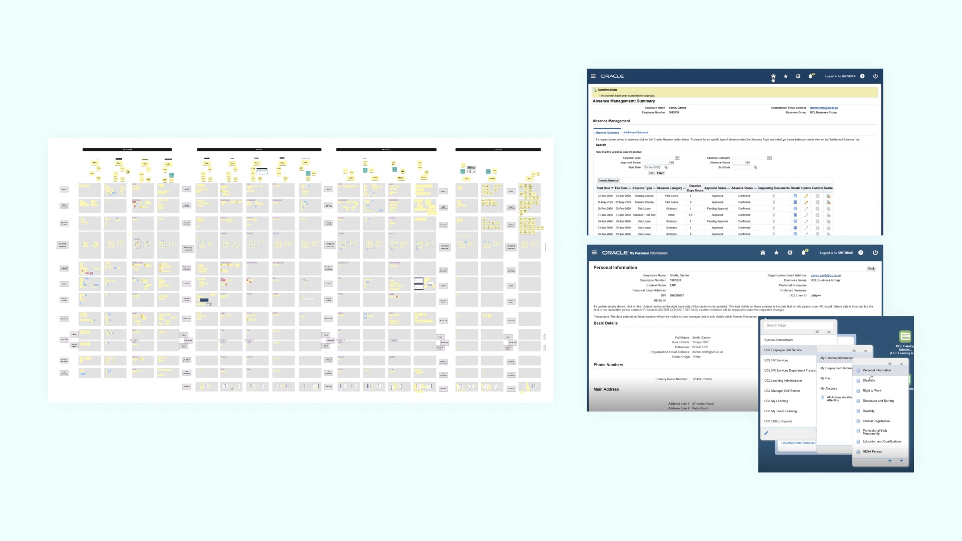
Sadly we are only privy to a lofi view.
THE SOLUTION
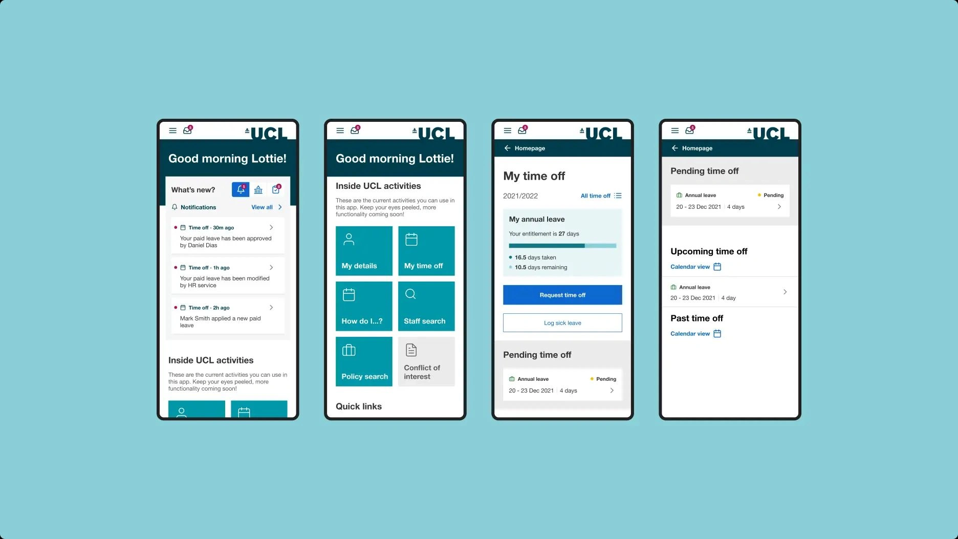
We ran three rounds of qualitative research and usability testing with UCL staff from various departments, building a grounded understanding of what they needed and where the existing tools failed them. From there I defined a clear product vision supported by five guiding principles to keep the experience consistent across every touchpoint. We mapped the key user journeys, focusing on the highest-value admin tasks such as annual leave booking and personal-detail updates. This work shaped a new component library and the foundations of a scalable design system, giving UCL a reusable visual and functional toolkit for future applications.
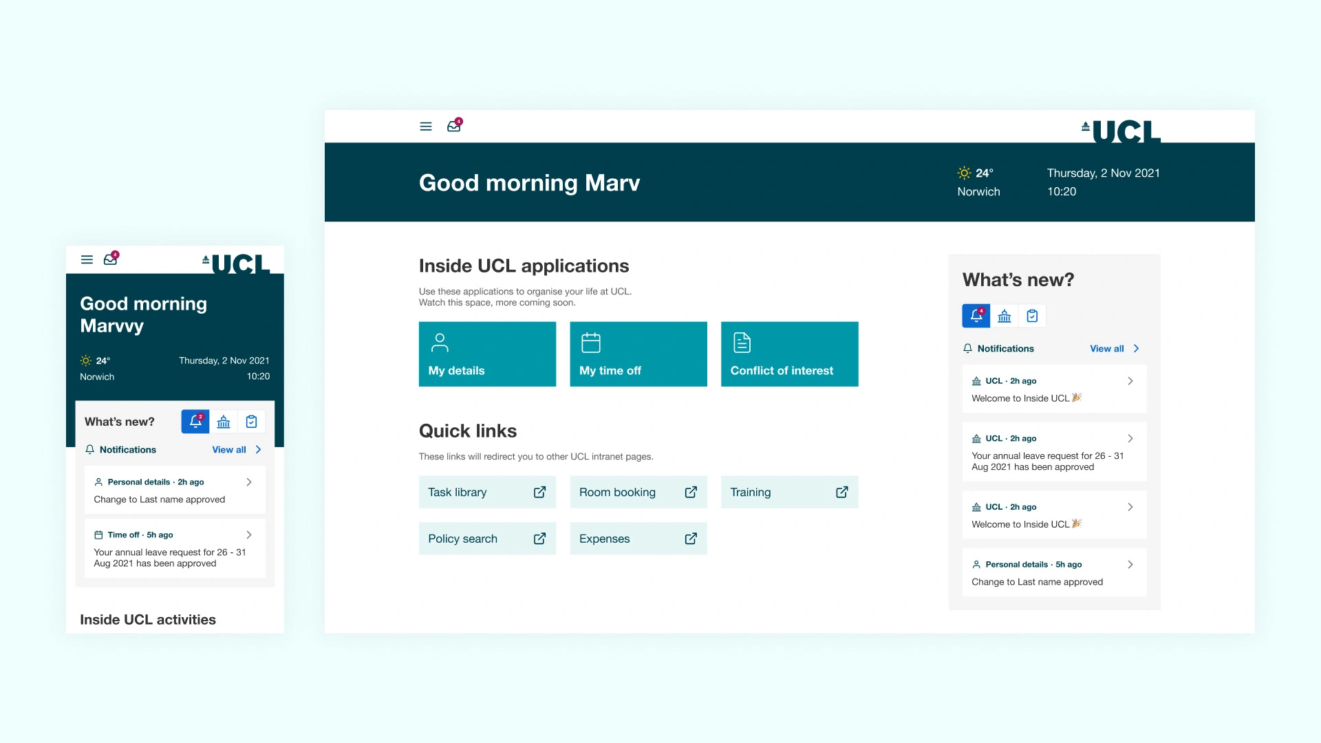
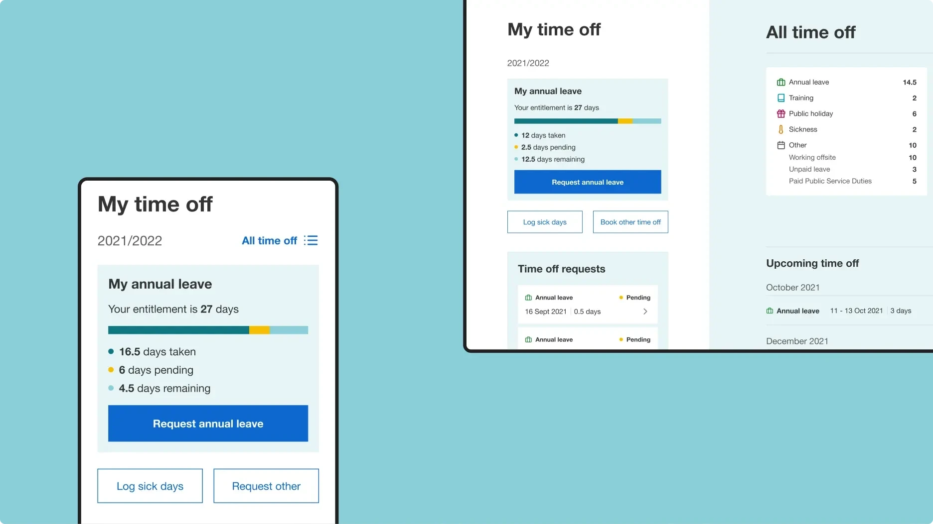
Nice application of 2 (or more) rows on the fly items towards the bottom, surfaced by our fancier experiences, such as leave calculators.
Addressing a common concern identified through staff interviews with the existing system, we observed a lack of confidence among staff when saving changes. In our revamped designs, we proactively tackled this issue by introducing distinct states for form fields, clearly delineating between viewing and editing. Furthermore, we implemented a transparent review step and a straightforward saving confirmation process to enhance user confidence and streamline system interaction.
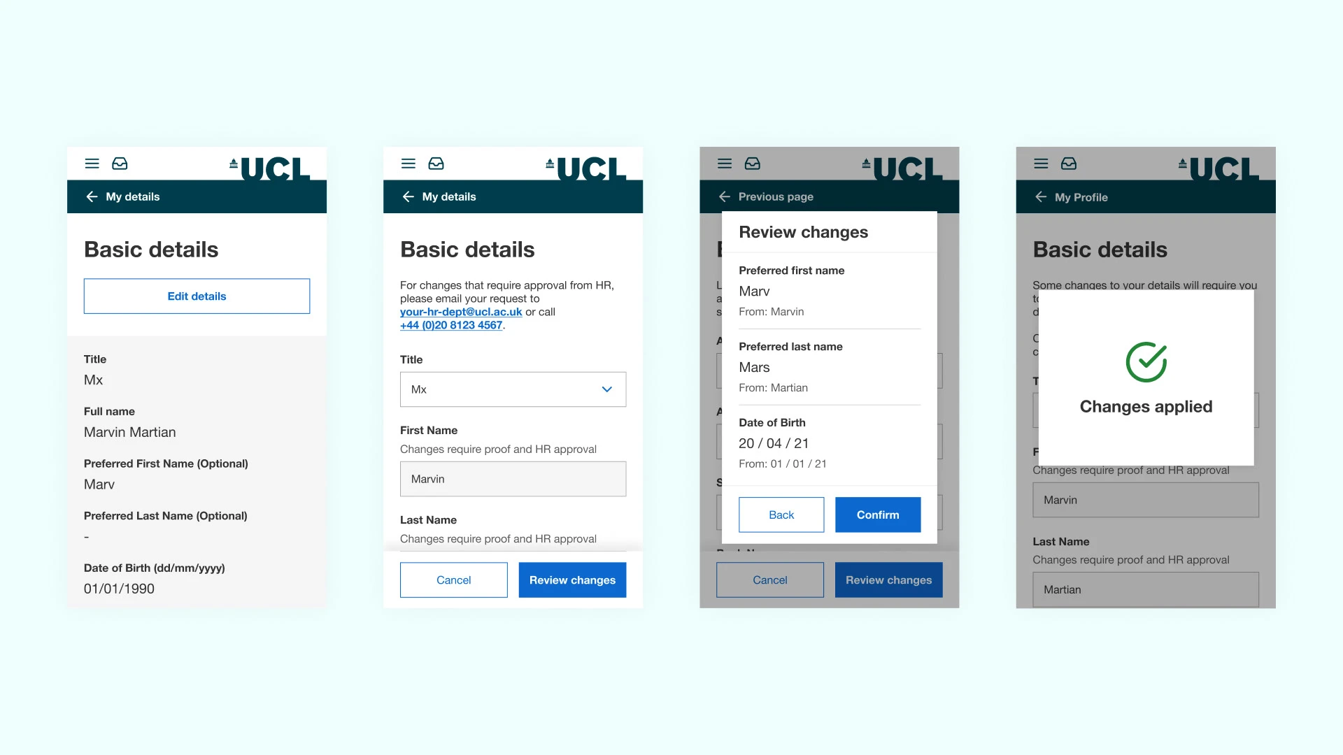
Single column typography with clear intent and mostly a harmonious use of Em, Grid portions/rhythm in spacing.
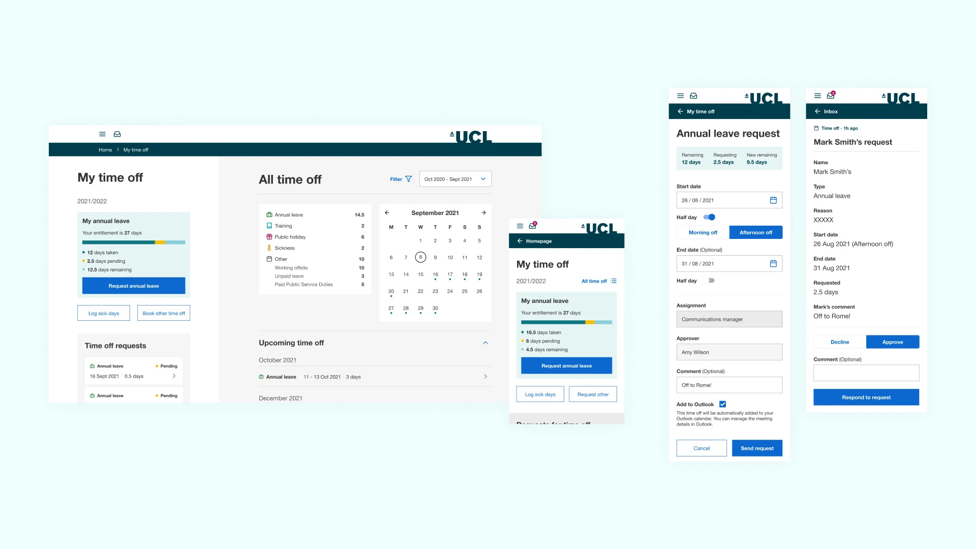
We elevated the approval process for managers by streamlining the dialogues they encountered. Additional features, we empowered managers to provide comments when declining a request, contributing to a more comprehensive and constructive feedback loop. The overall experience was significantly decluttered compared to the legacy system, ensuring a more efficient and user-friendly approval process.
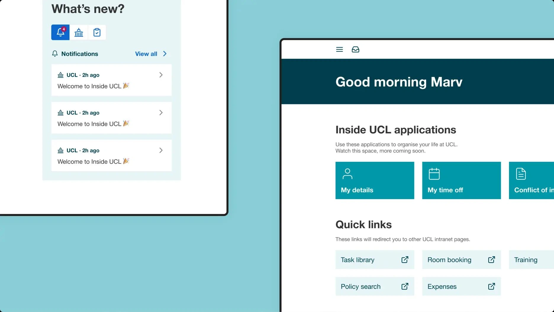

We implemented a changelog page to serve as a centralized repository for documenting changes to the design library. This dedicated space ensures that all designers and developers involved in the project have a single point of reference to stay informed about updates and modifications, fostering efficient collaboration and knowledge sharing across the team.
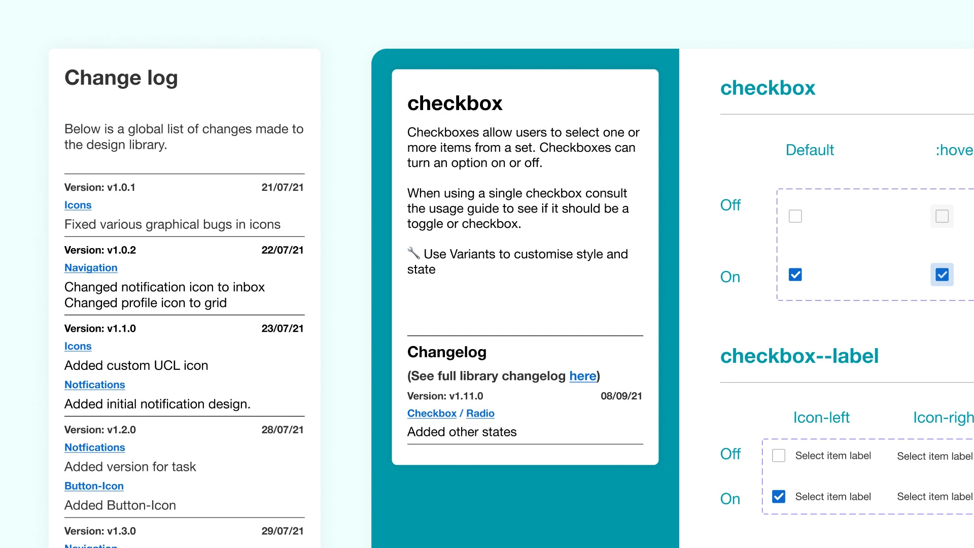
My favourite page in figma. Was so cool to feel like I was part of a technical team, responsible for their own design documentation.
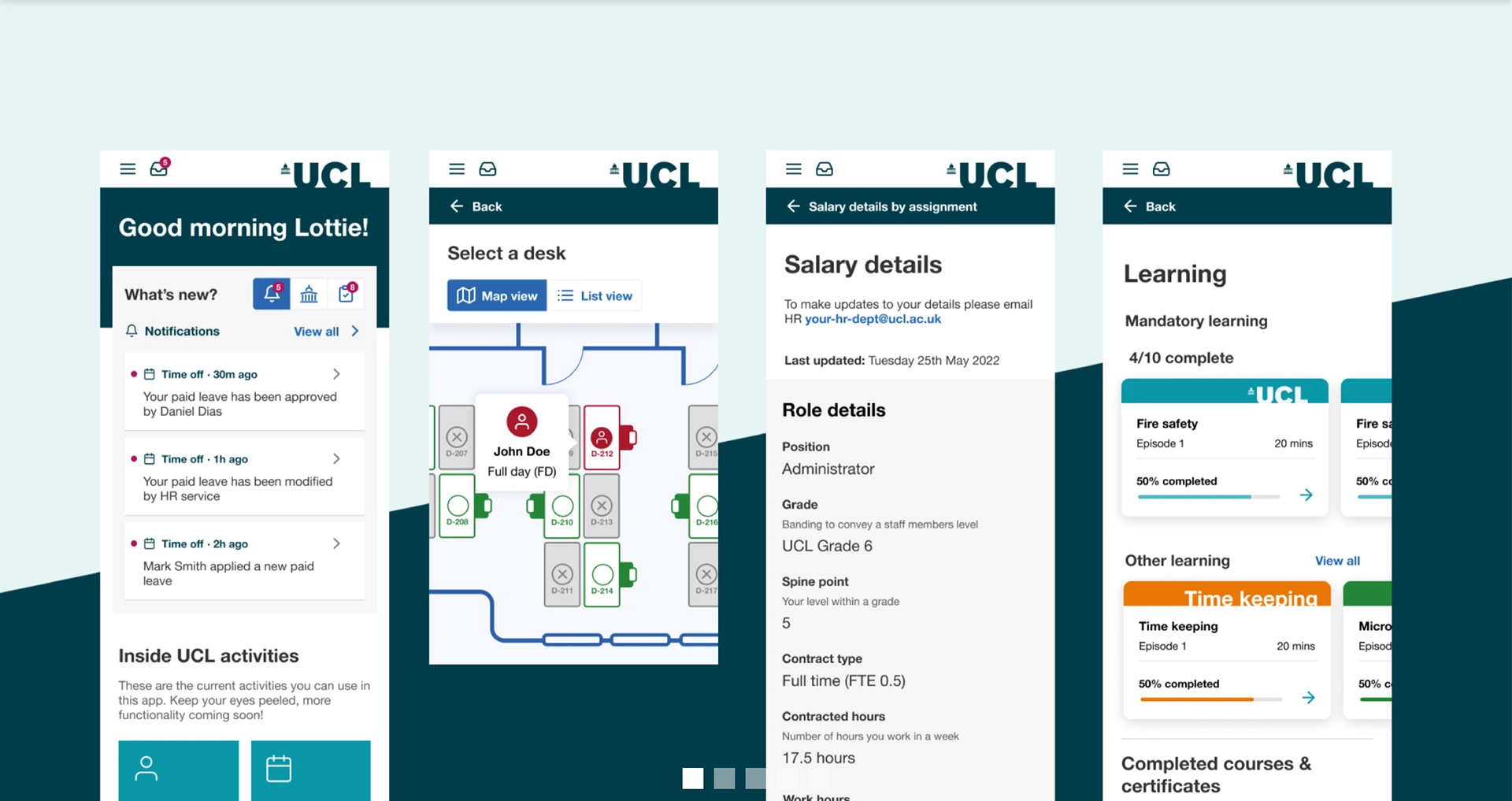
Like this project
Posted Oct 14, 2025
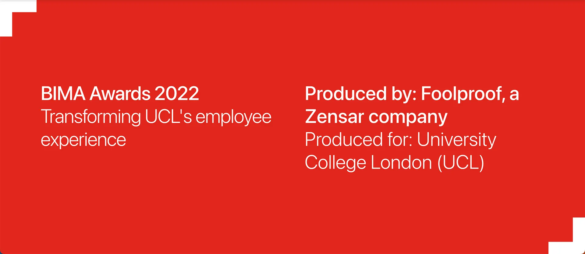
Redesigned UCL's Employee Experience app for improved user experience and functionality, won a Silver Bima. Well done to the team at Foolproof.

