Print Ad Concept & Ecommerce Demo
Matthew Dix

Rediscovered perfume bottle drawings from my graduation year and reimagined them with AI.
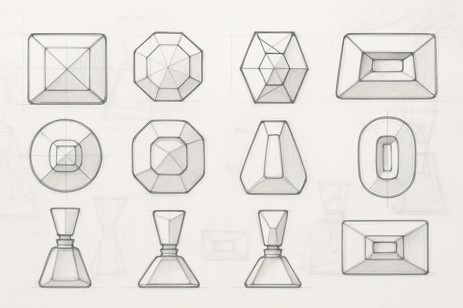
This project started as a stubborn itch to prove that dusty college drawings don’t have to die in a portfolio graveyard. I went back to my early technical drafts, pulled them out of academic retirement, and treated them like they were destined for a real product pipeline. Nothing sentimental, just a personal bet that old work can evolve if you attack it with modern intent.
Copic markers used to draw reference to this bottle creation.
The objective was simple and mildly unhinged. Take raw student-era linework, strip it of its nostalgia, and rebuild it like a commercial designer with standards, taste, and caffeine dependency. Every mark became deliberate, every detail interrogated until it felt worthy of a manufactured object instead of a lecturer’s red pen.
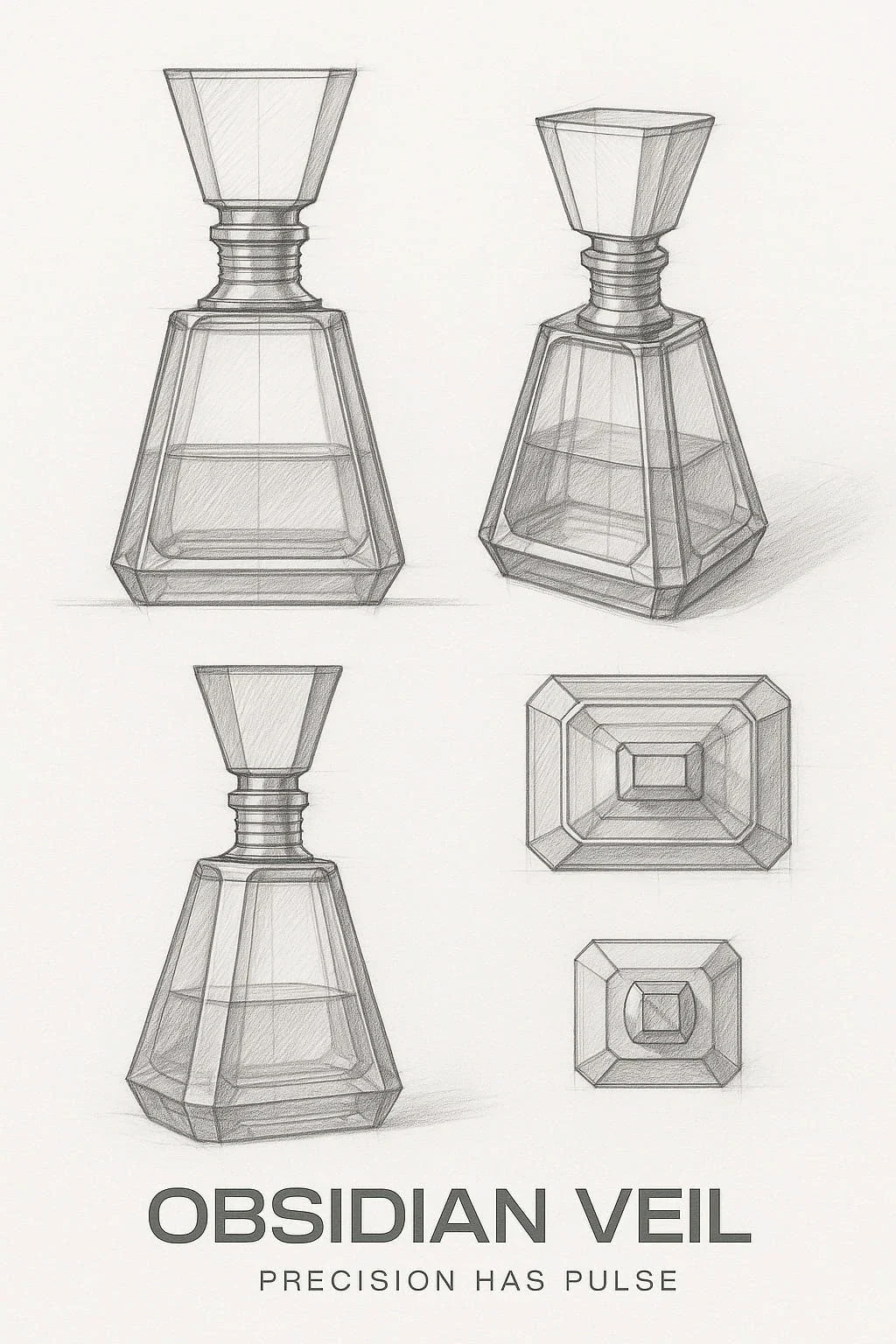
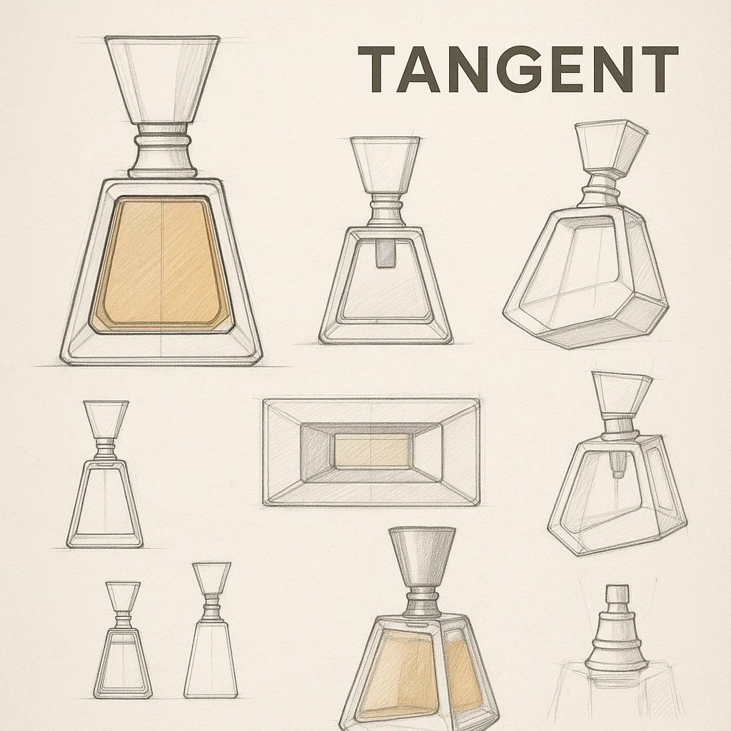
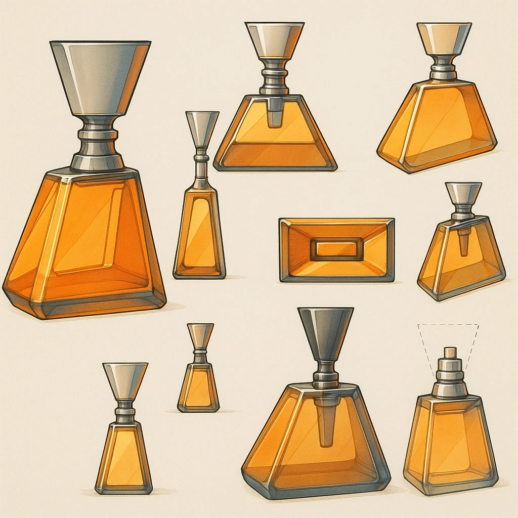
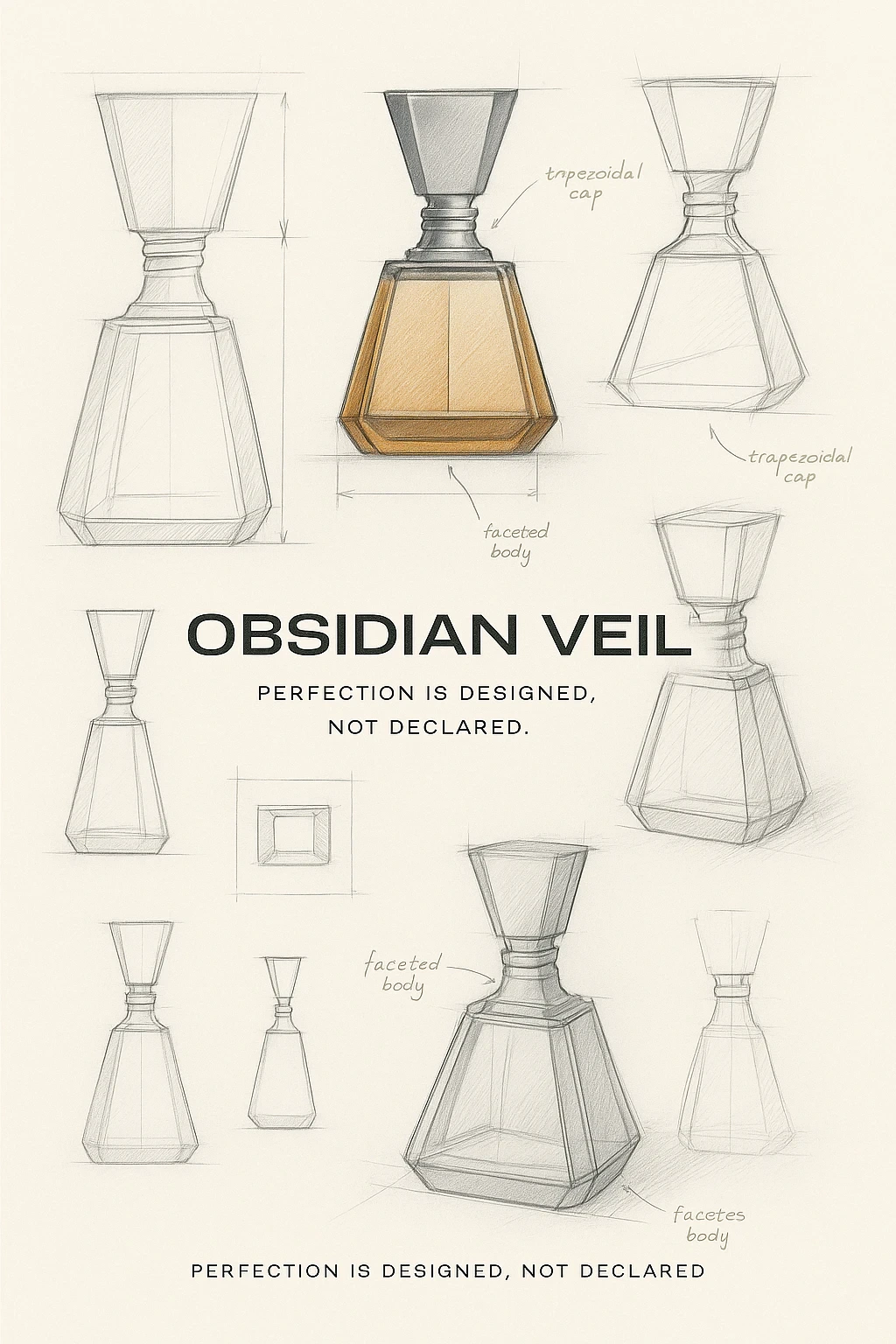
Came up with the name Obsidian Veil. Obsidian being the volcanic glass is an igneous rock formed from rapidly cooled lava, which is known for its glassy texture and sharp edges, making it useful for tools, Speaking of tools, I pumped this sort of stuff into chat GPT to help us pull back the veil on product photography. First, let's turn these sketches into a render.
To pull off this print Ad, I went for an uncomlicated bold upper caps logotype.
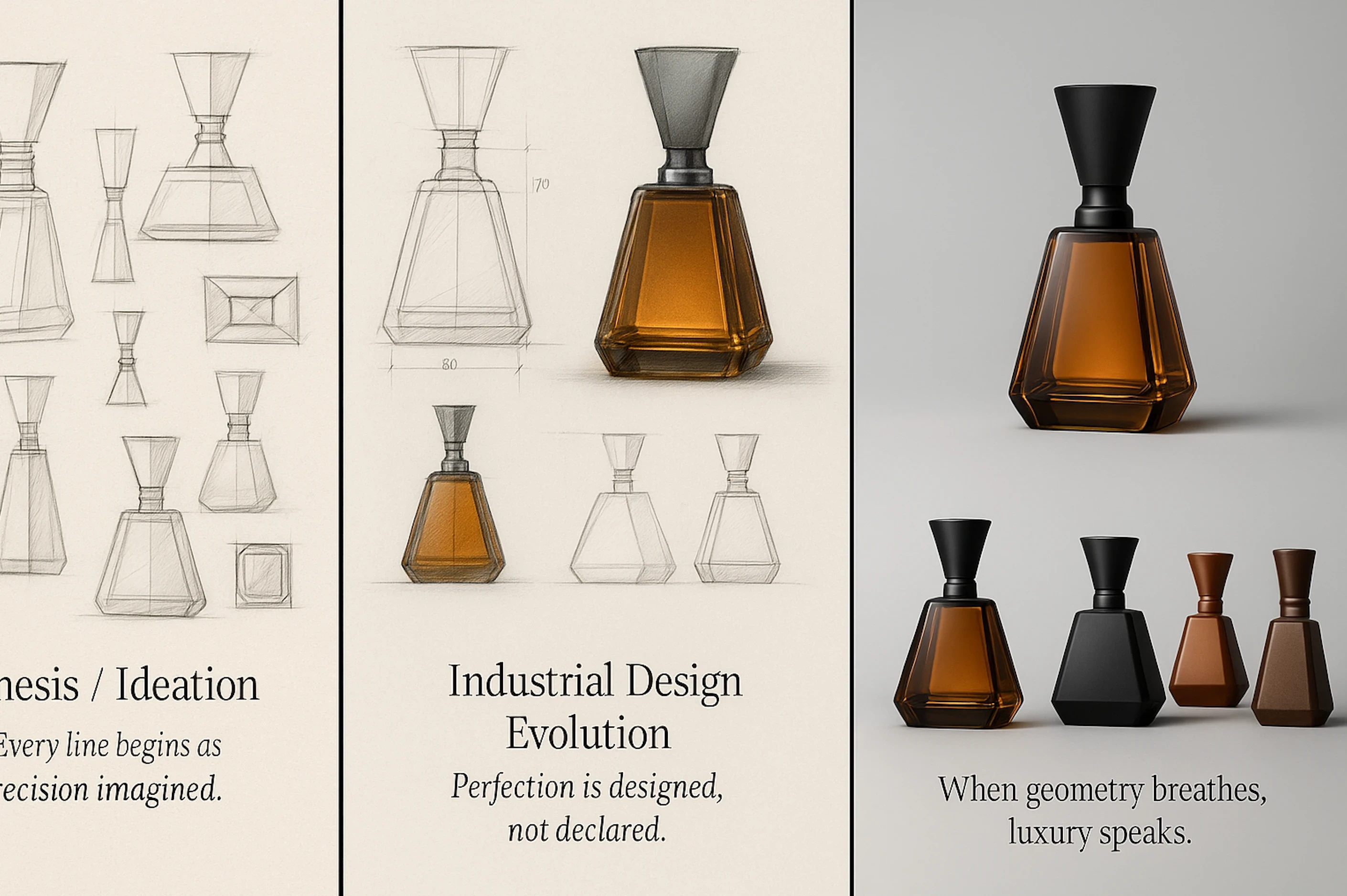
Couple of samples, which resulted on an angular and rounded lid, which inspired me to create two mockups of the product.
My approach mixed precision with art-direction flair. I refined construction lines, introduced believable materials, polished contours, and dialled in a finish that looked like it belonged on a light-box brief. I kept reminding myself that design only matters when it looks like it belongs in the real world, not a forgotten hard drive folder labelled “archive maybe”.

Textured background elements showing some noise is to add some depth and texture.
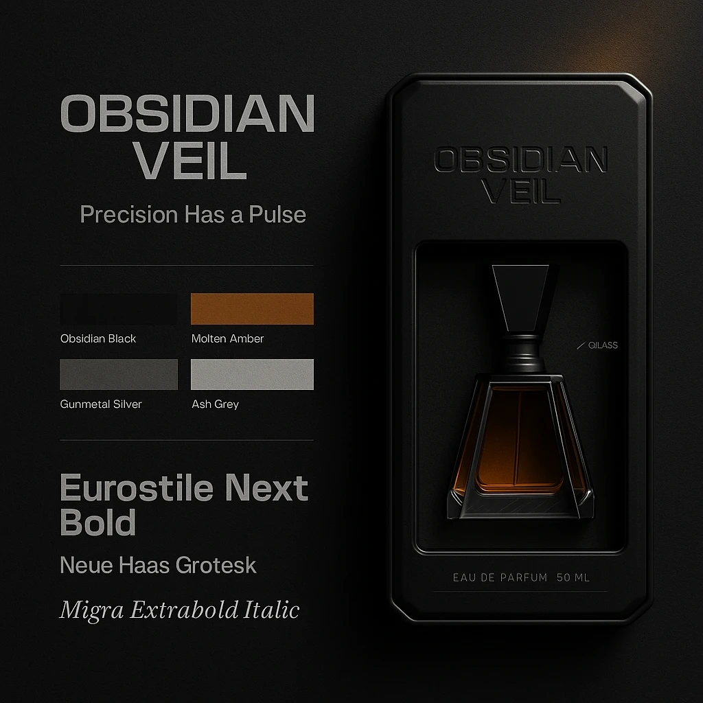
Tried to layer up a mini 'style-guide' inclusinga a 50ml EAU DE PARFUM render and mockup.
The challenge was keeping the engineering backbone intact without turning it into a sterile blueprint. I aimed for visual craftsmanship that could pass as pre-production artwork, the type that makes you wonder whether it’s a concept, a prototype, or a product you can actually buy if you know the right factory manager.
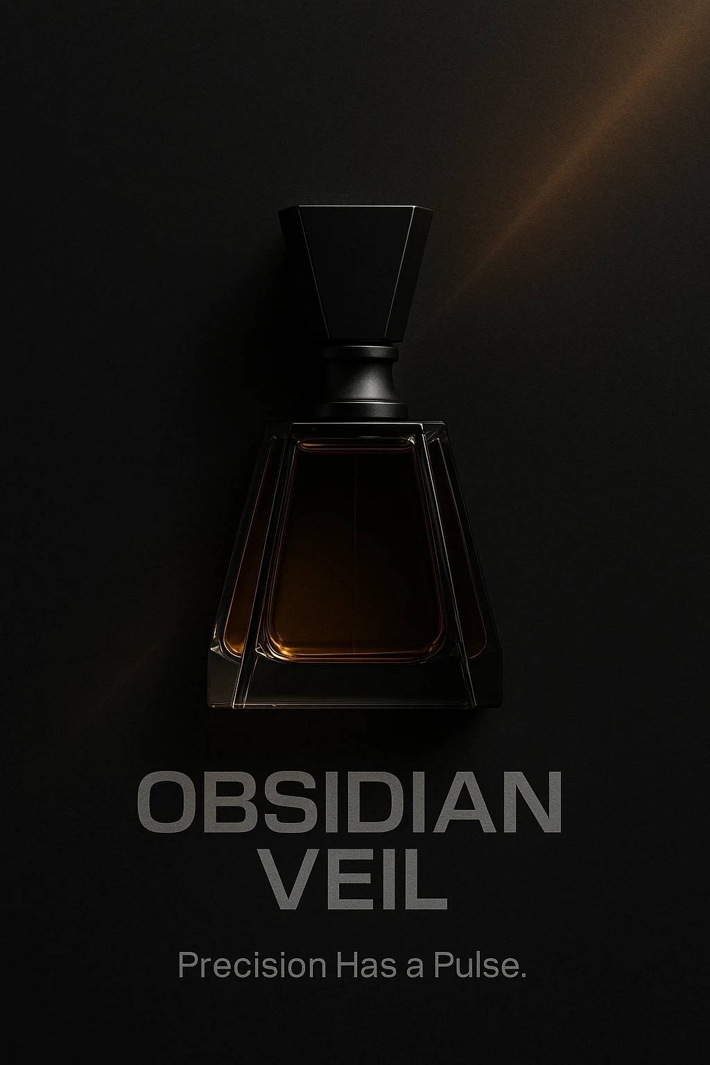
PAC Shot 1
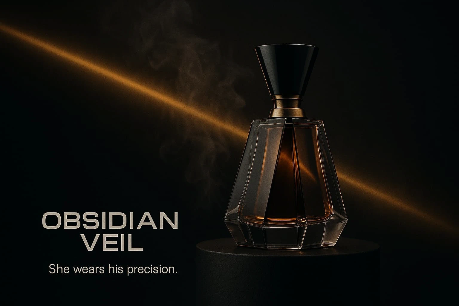
PAC Shot 2 with text and arguably a bastardized tagline turned into an ad captian.
The result is a modern, commercial-ready piece that feels intentionally built, not nostalgically rescued. It stands as proof that past work can be re-forged into something future-facing if you commit to the glow-up with zero mercy. Old ideas don’t need a funeral, they need a workshop.
Like this project
Posted Nov 16, 2025
Reworking my old college technical drawings into a polished, production-ready concept fit for real-world product photography and advertising.