Tipo Tinto Packaging

Matthew Dix
1 collaborator


Outcomes
Created a memorable FMCG brand from concept to shelf
Enabled early-stage sales growth through visual storytelling and campaign rollout
Built recognisable visual equity for a breakout SKU under the Tipo Tinto umbrella
Laid the foundation for seasonal, regional and retail expansion across southern Africa
Built with heart at Lowkey.club — where brand stories move fast and land loud.

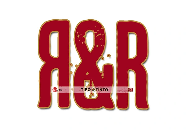
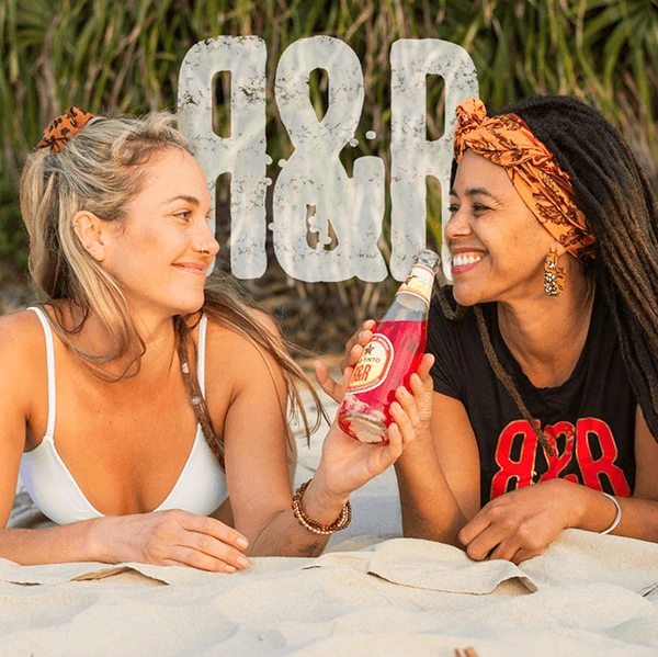
Rum & Raspberry — Tipo Tinto Roots
Brand Identity | Packaging | Campaign Creative | Photography
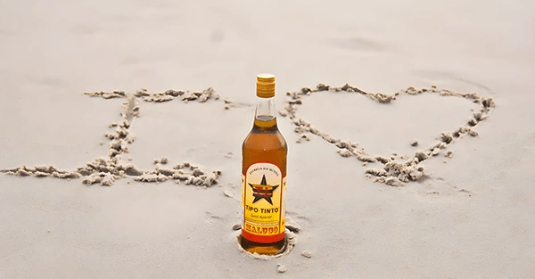
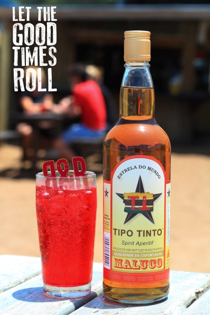
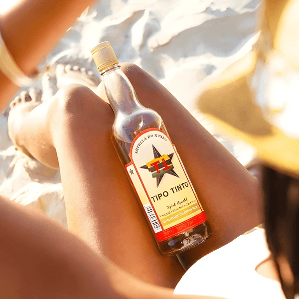
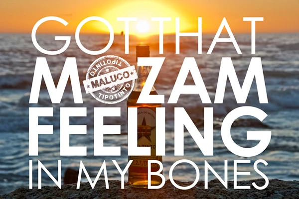
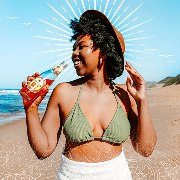
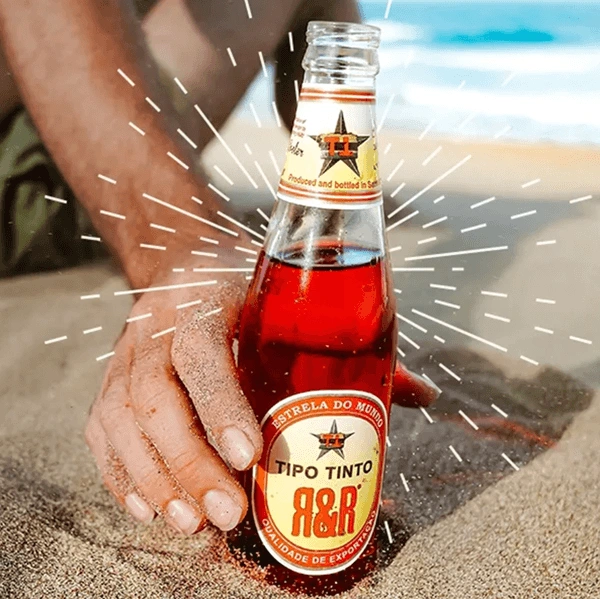
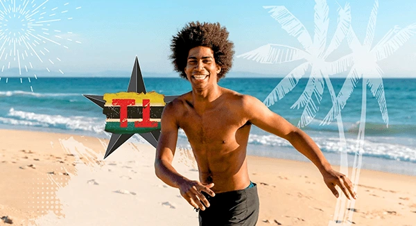
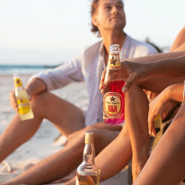
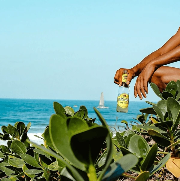
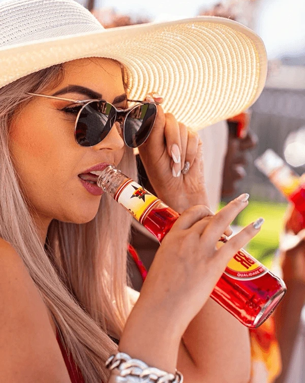
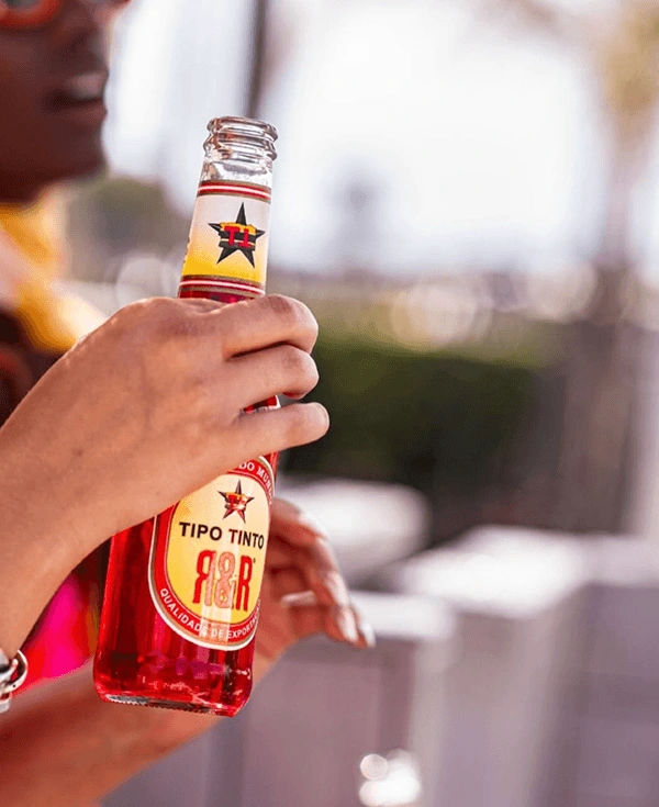
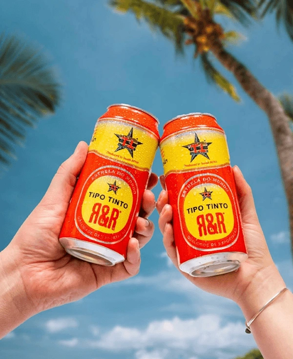
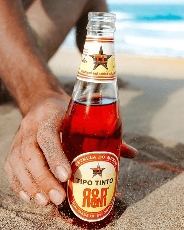
Tipo Tinto's Rum & Raspberry offering — aka R&R — was more than a flavour drop; it was a full-blown mood. Our goal? Build a brand experience that felt just as refreshing and rebellious as the product itself. From the jump, this project called for a design system that could own summer, feel culturally in tune, and be instantly iconic on-shelf and on-scroll. Every touchpoint — from the bottle silhouette and label system to lifestyle photography and POS — was crafted to turn curiosity into loyalty.


Design Approach
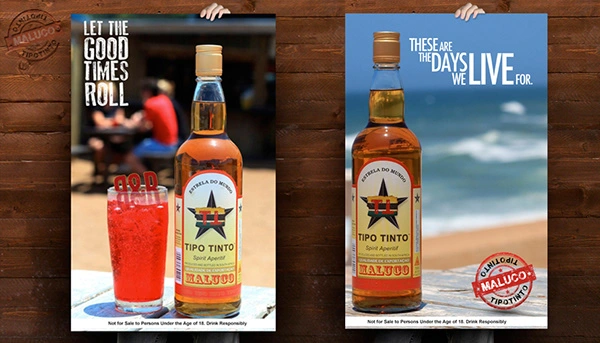
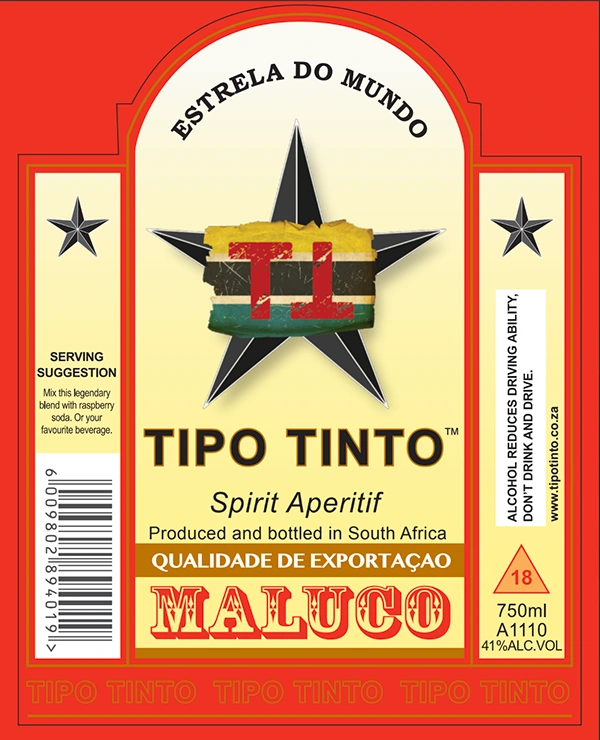
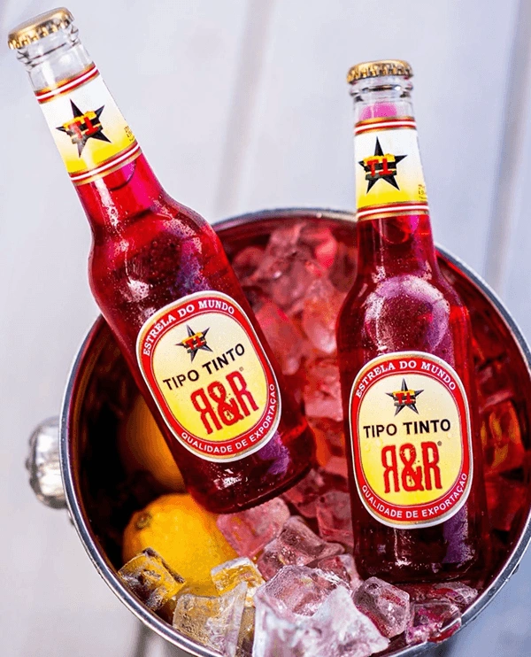
Packaging: Bold, nostalgic, and unmistakably tropical. We designed across bottle, can, and multi-pack formats to ensure standout across every buying moment — fridge, shelf, or sand.
Visual Language: A playful fusion of heritage and beach culture, balancing modern linework with warm, sun-faded hues. Inspired by Mozambique, made for anywhere fun is being had.
Photography: We directed and captured a campaign full of motion, sunlight, and social ease. From real environments to lifestyle detail shots, the visuals sell a vibe: chilled, connected, carefree.
Brand System: Modular and flexible — the identity lives across digital, print, packaging and outdoor with confidence and clarity.
Thanks to Nicholas Murphy and other TT creative contributors.

NOT FOR SALE TO PERSONS UNDER THE AGE OF 18.
Like this project
Posted Jun 4, 2025
Helped launch a breakout SKU for Tipo Tinto — a high-performing product that drove early sales and became the face of its category across Southern Africa.
Likes
0
Views
3
Timeline
Jan 10, 2012 - Oct 20, 2020
Collaborators