Crafting the Zenkhulu Vape Juice Brand

Matthew Dix

Zenkhulu Vape – Brand Mark & Packaging Design
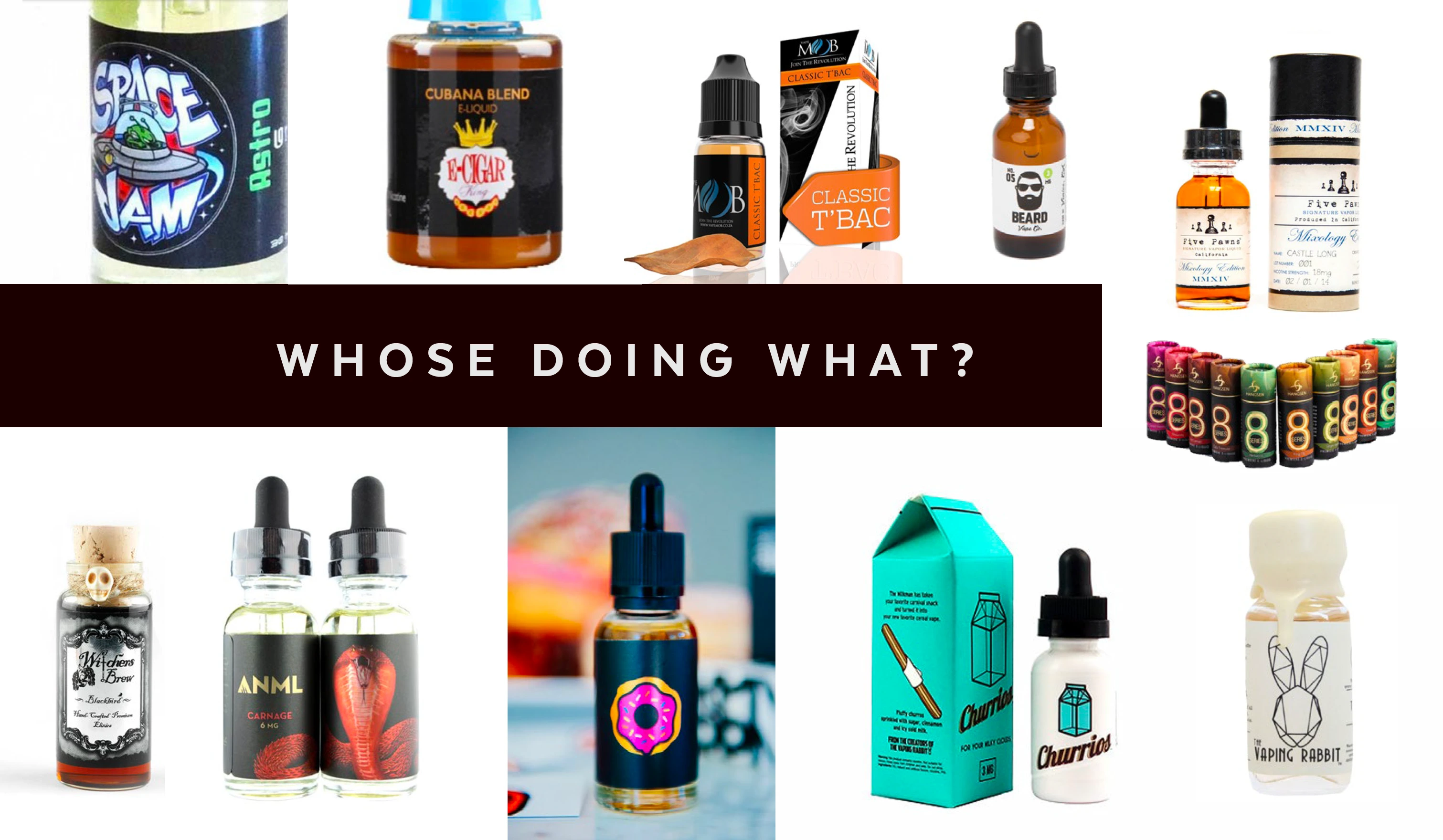
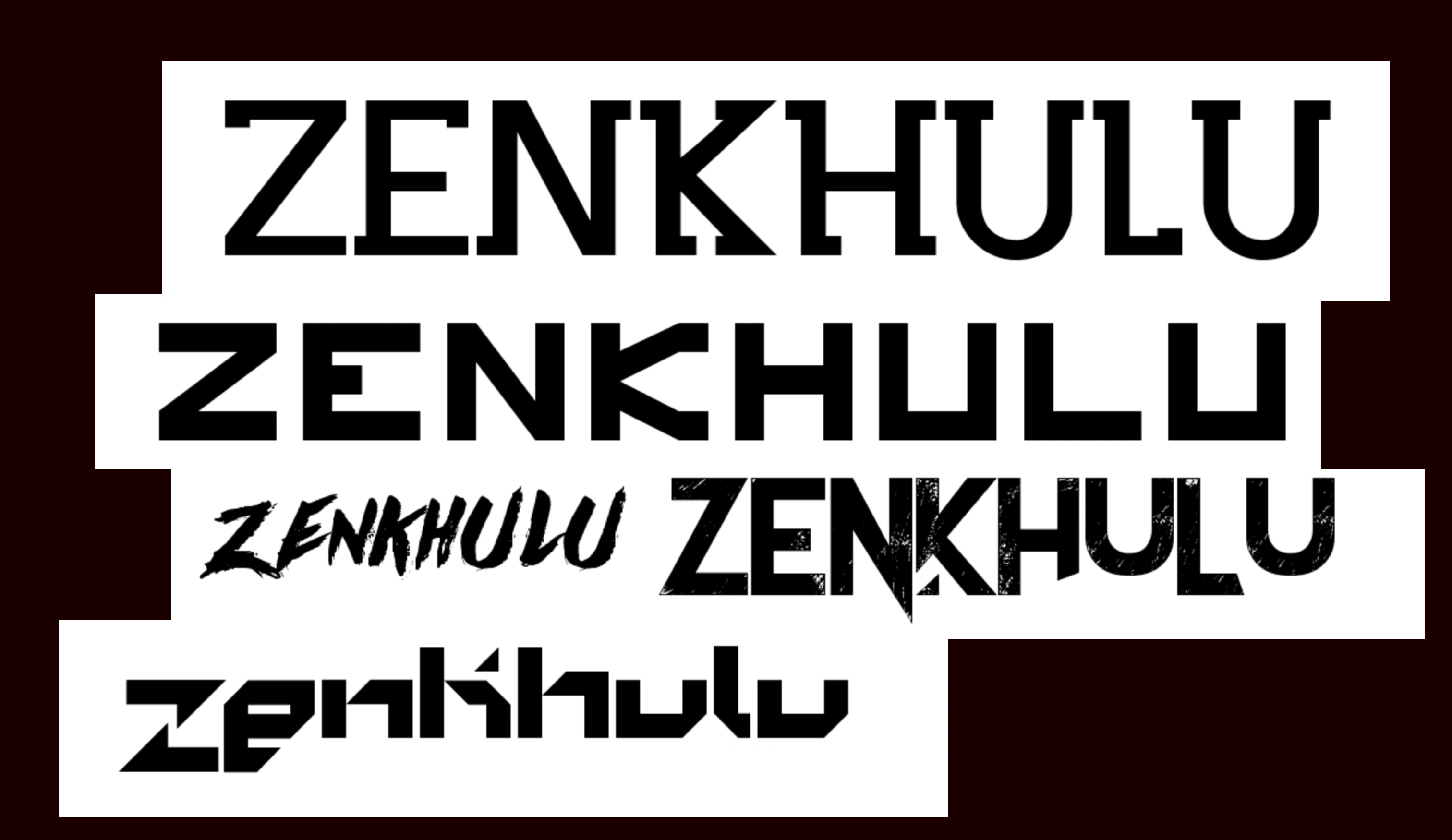

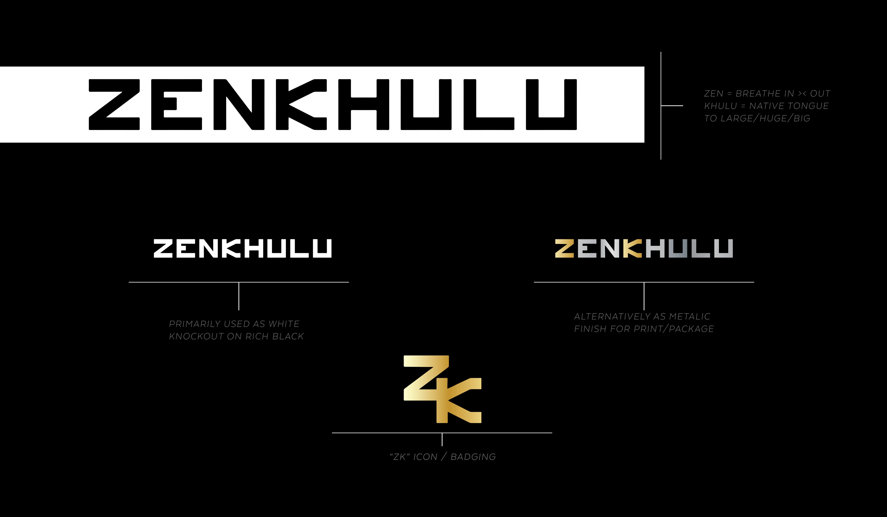
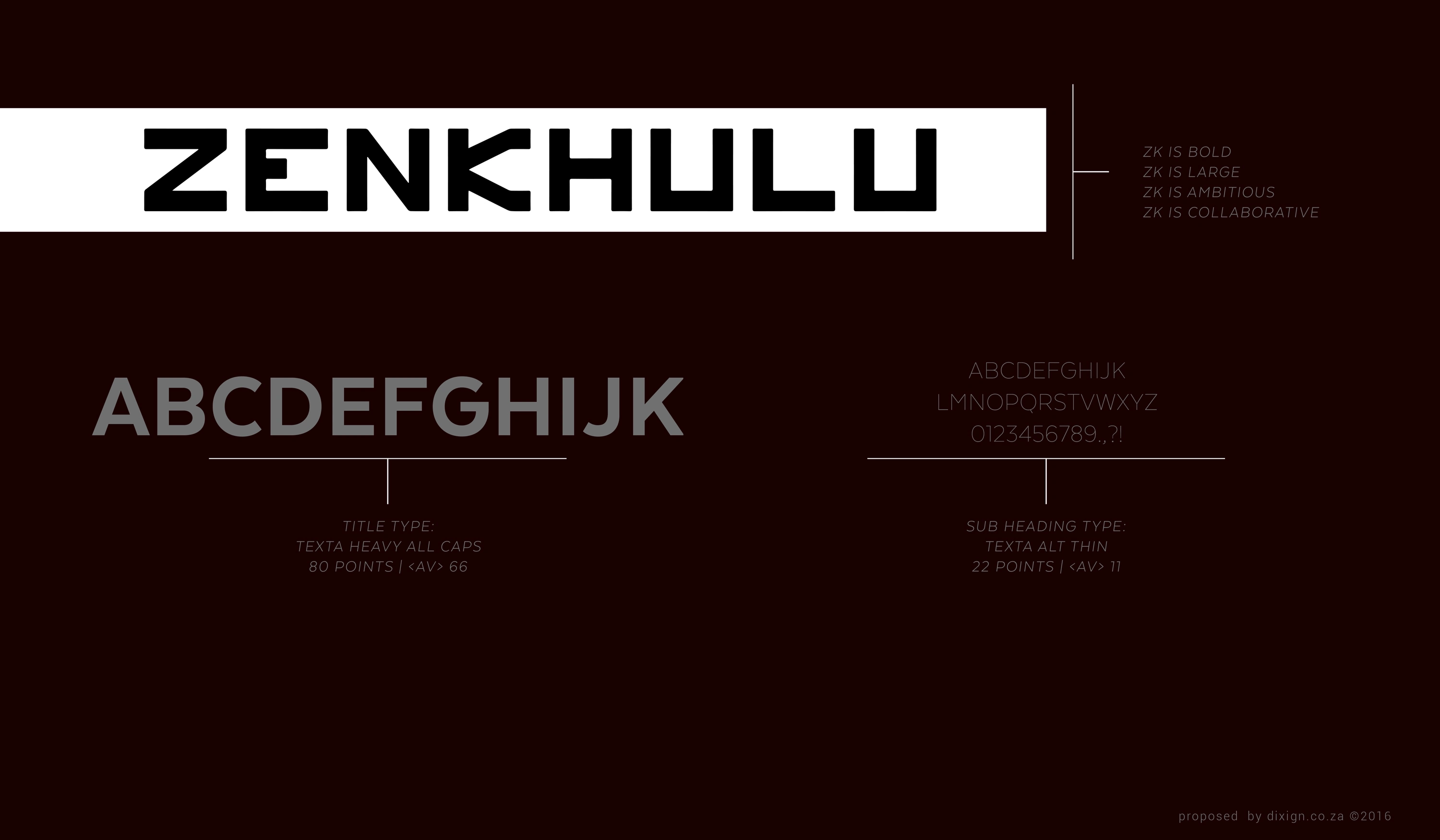
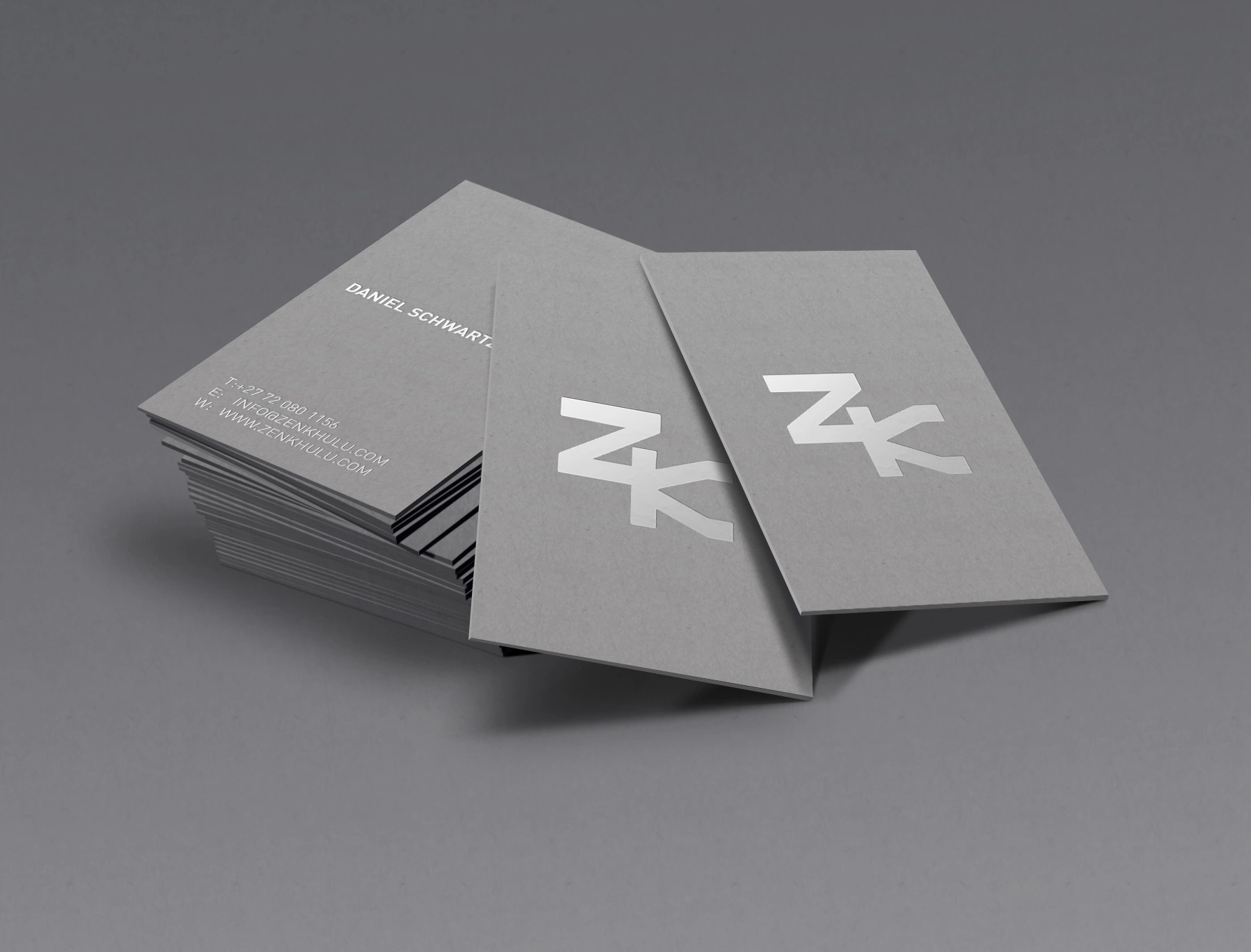
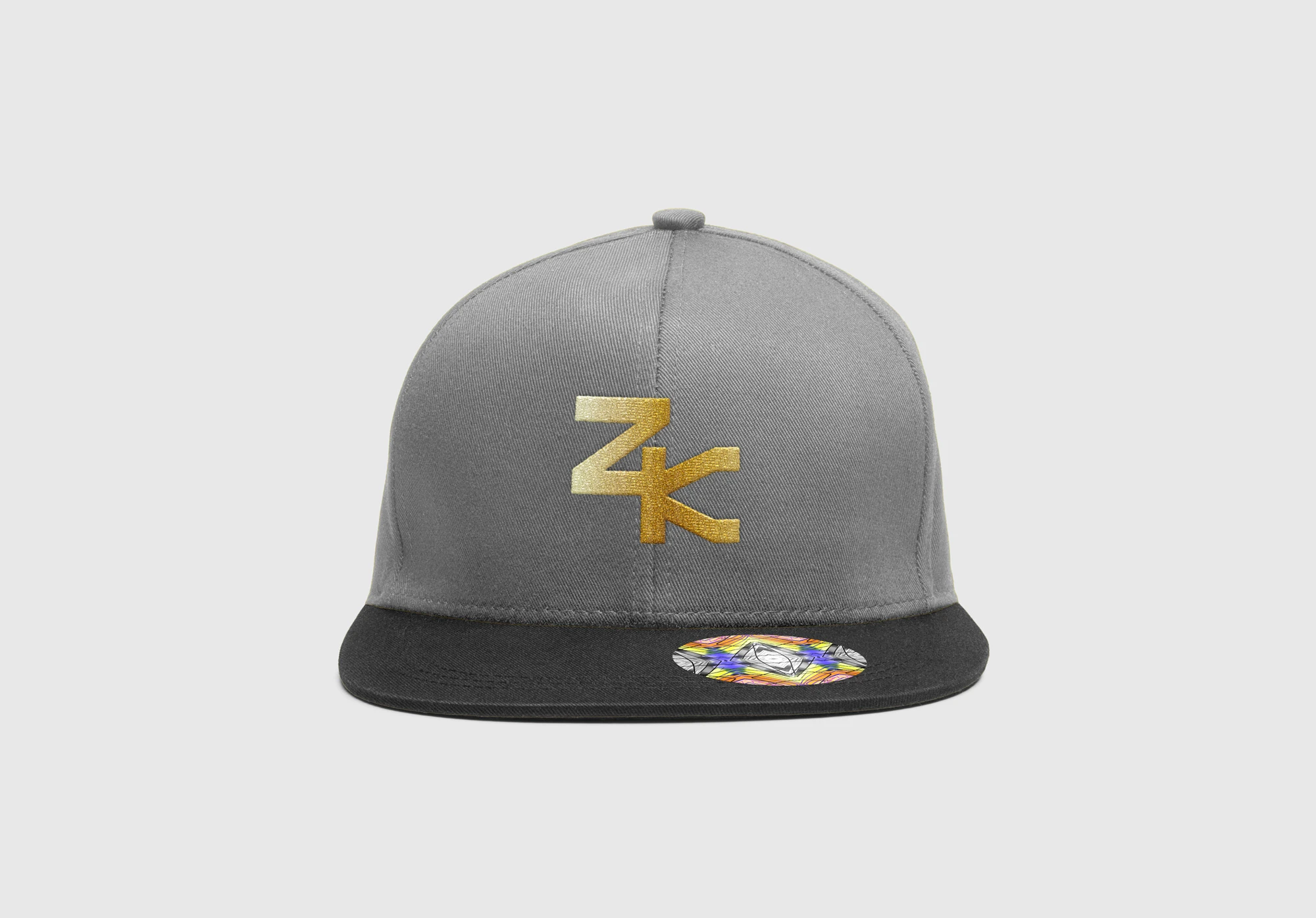
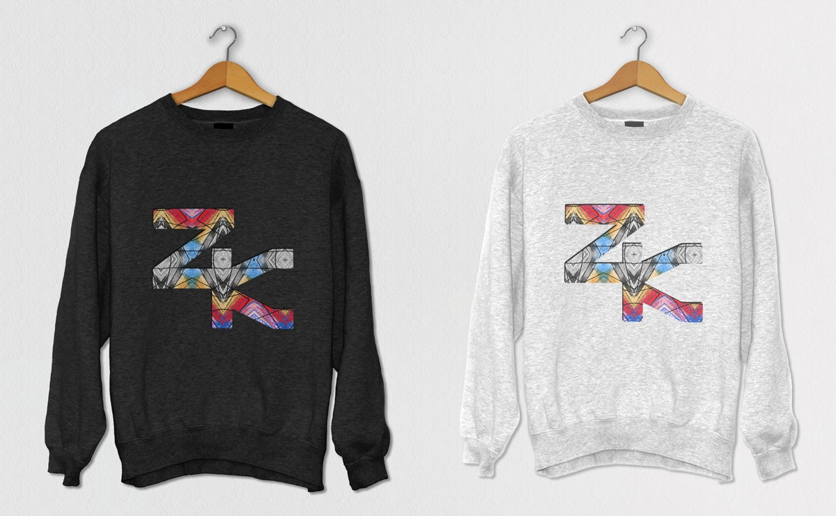
For Zenkhulu Vape, the journey began with crafting a sleek, elegant brand mark—the striking “ZK” logo.
This mark embodies boldness and clarity, perfect for a modern vape brand
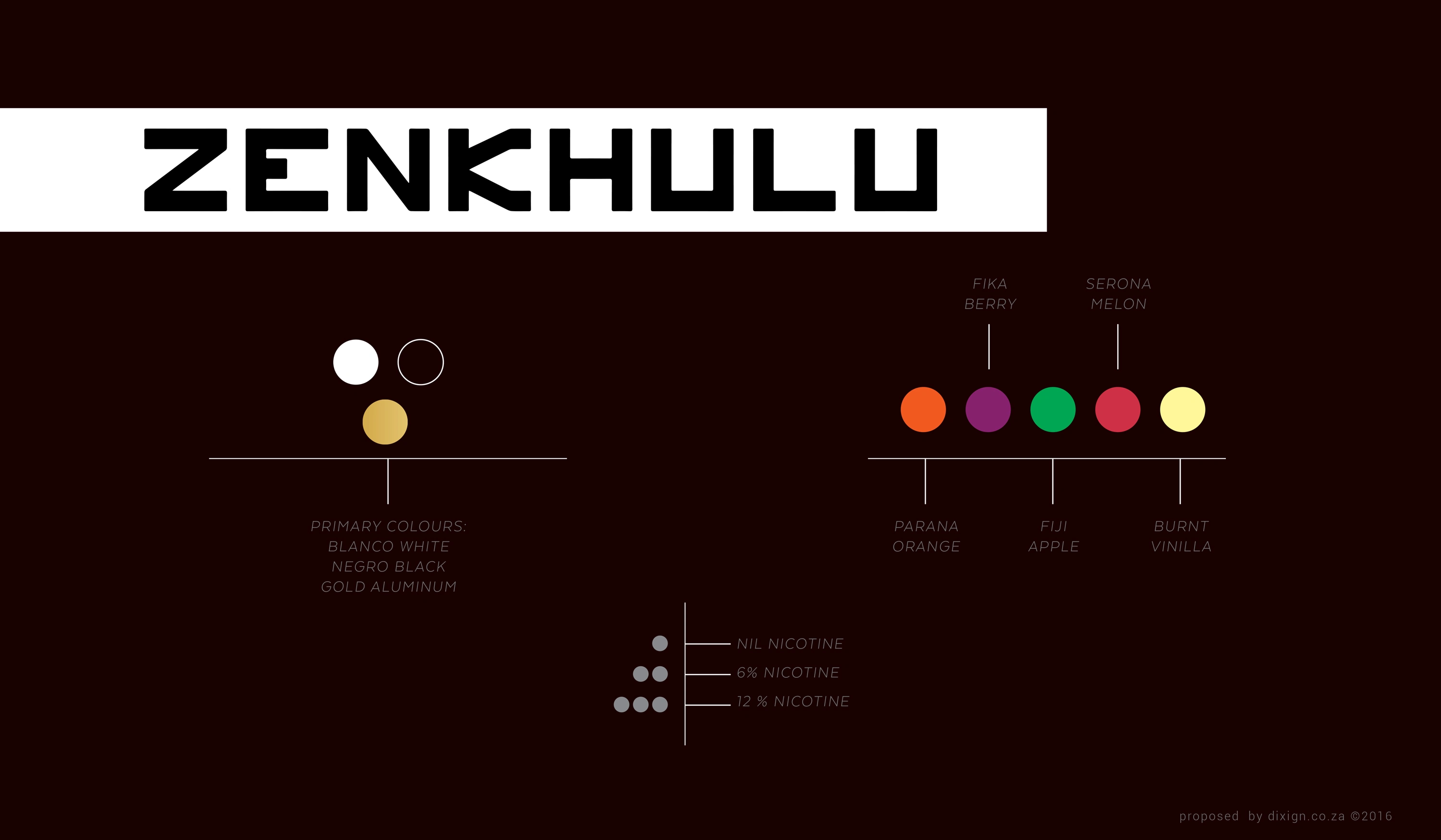
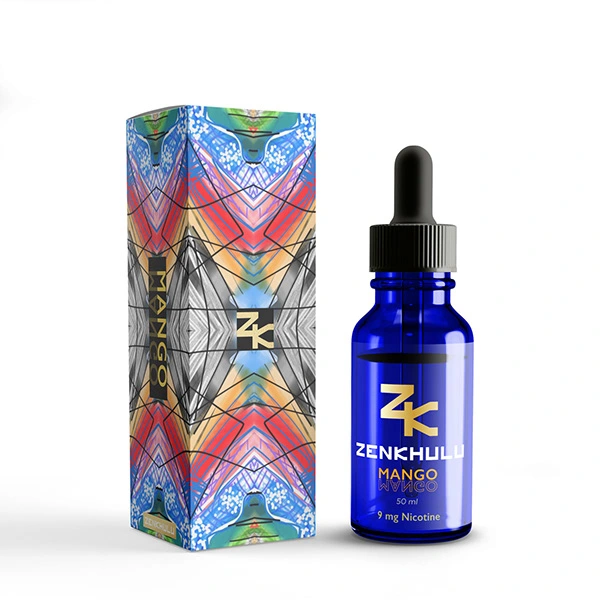
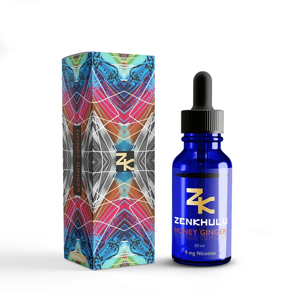
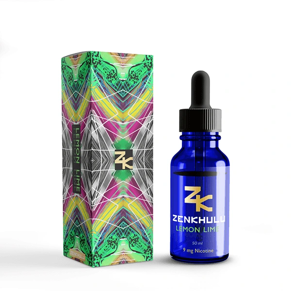
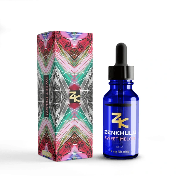
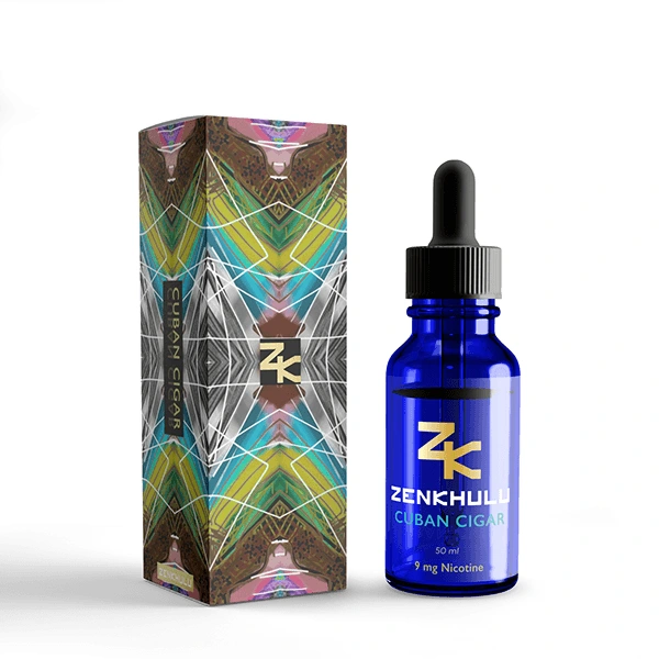
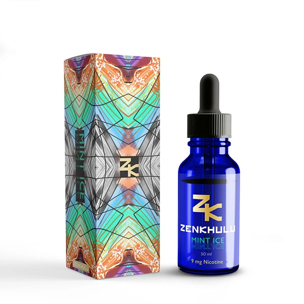
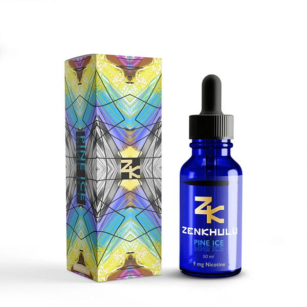
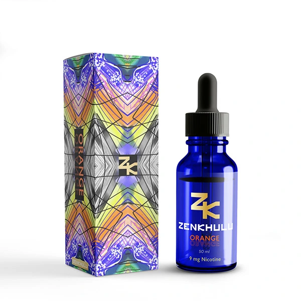
Each element was carefully curated to transport the consumer to a world of sensory delight and indulgence. The packaging design reflects Zenkhulu's commitment to excellence and craftsmanship. From the sleek lines of the bottles to the tactile texture of the labels, every detail was meticulously crafted to convey sophistication and refinement.
✨ Design Exploration:
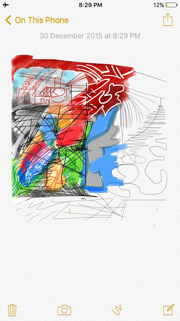
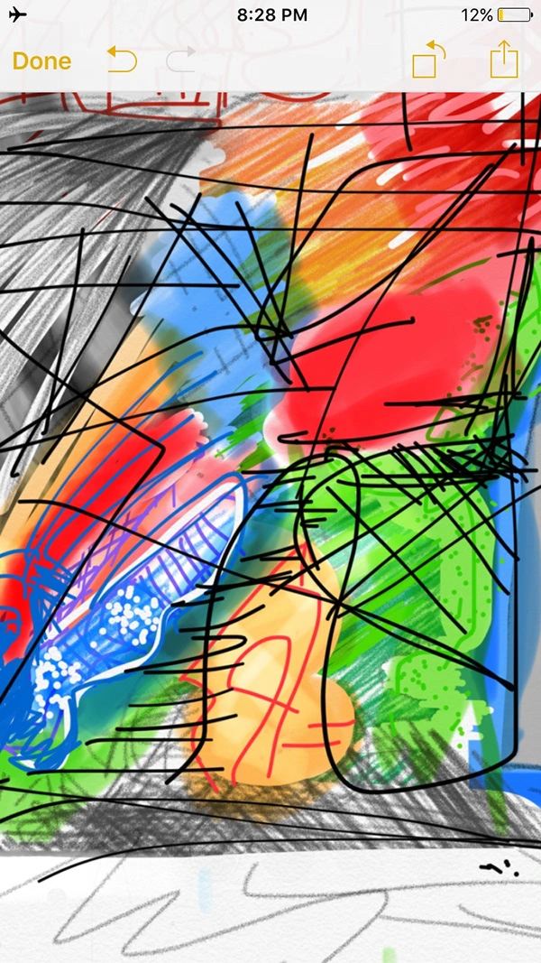
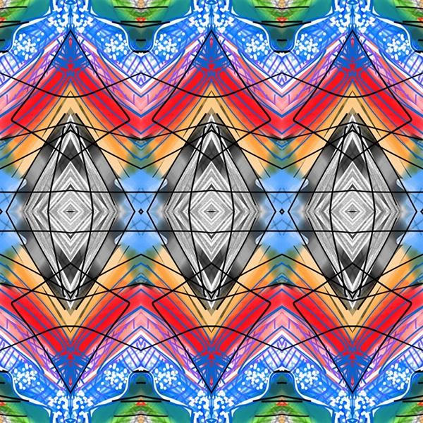
Inspired by Zenkhulu’s vibrant, tropical flavor lineup, I embraced a freestyle doodle approach—initially sketched directly on my iPhone Notes app. This playful yet organic design was transformed into a symmetrical pattern that created an eye-catching visual language for the brand’s packaging.
🌈 Vibrancy & Variety:
The final packaging was adapted into a series of bright, bold colorways, each representing a different Zenkhulu flavor. This not only created a consistent visual identity but also added a layer of differentiation between product variations.
🔗 Outcome:
The combination of a refined brand mark and dynamic, art-inspired packaging results in a product line that’s as visually compelling as it is flavorful.
Like this project
Posted Jun 4, 2025
Zenkhulu Vape — bold branding and vibrant packaging designed to stand out in a crowded market with a modern, unapologetically confident edge.