[Brand Blast] Ishikawa 🥊
Hanna Woa 🔥
🥊 Boxing club based in Japan
Ishikawa is a boxing club based in Japan. At Ishikawa, we value hard work and discipline. But, they also didn't want to be seen as the typical local boxing club. They wanted to spread a different look and feel.
➡️ Me and Ishikawa teamed up to build a strategy global direction and create the whole visual look and feel of the brand following that strategy.
⭐ Objectives
The main objective was to differentiate the brand from other boxing clubs by achieving a fresh, modern and unique visual identity and making boxing a more approachable discipline and highlighting its benefits for everyone to be seen in their daily life.
Hard work & discipline should be part of our daily lives but without being crushed below the pressure of failing. Ishikawa helps find this balance between pushing yourself to do better without demotivating you.
One of the hidden objectives of the brand was also to attract more women into fight sports.
🚀 Strategy
Step 1 - Target audience
The very first step of the strategy in order to differentiate Ishikawa from other boxing clubs was to redefine the target audience.
It initially was a very broad target audience because they wanted to attract everyone with the idea that boxing is open to everyone. However, to have a more objective-oriented visual identity & strategy, we decided to pivot into focusing on the younger generation. We believe they’re the starting point to convince other generations to try their lifestyle, and this would allow Ishikawa to reach their main mission, show that anyone can box and enter the hard-working lifestyle.
Step 2 - Visual identity
The second step of the strategy was to build a visual identity that would be relevant to the new target audience with keeping in mind the bigger & hidden objectives.
Brand keywords
Energetic • Punchy • Disciplined • Organized • Simple
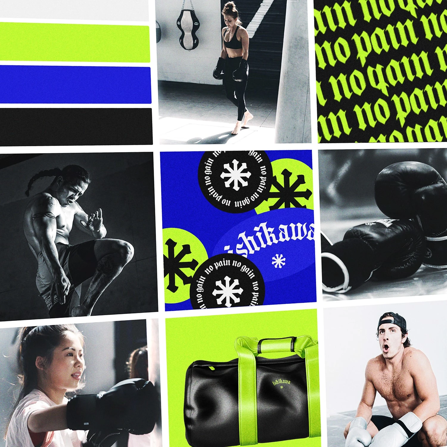
Moodboard
To attract the younger audience, we decided to completely differentiate from other boxing clubs with a combination of colors that would be fresh & punchy, without using warm colors (typically used for their meaning in fighting sports). We decided to pair it with a gothic/blackletter font for the logo, to contrast with a rebellious & edgy look (how the younger generation is seen & their energy).
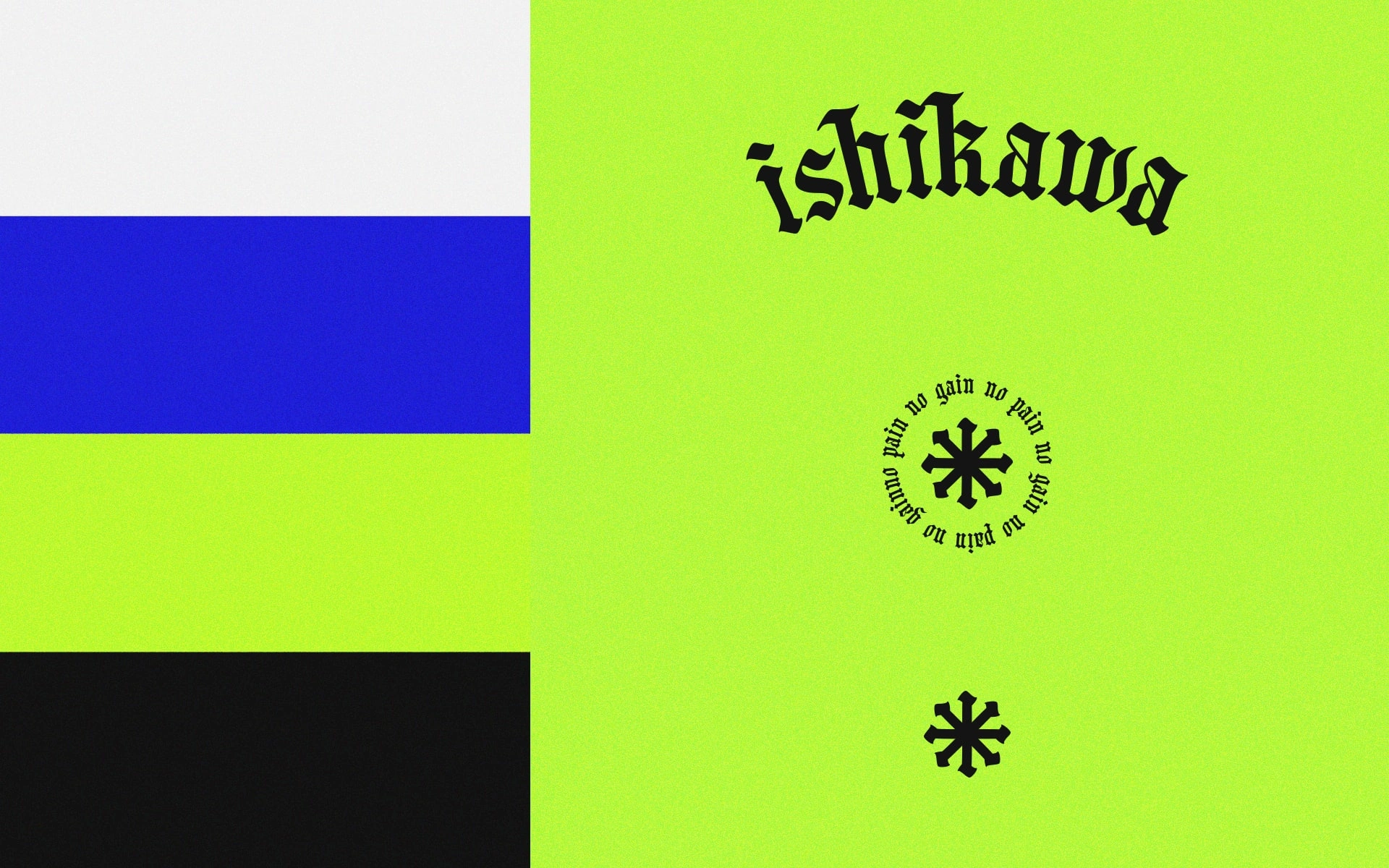
Color palette, logo & logo variations
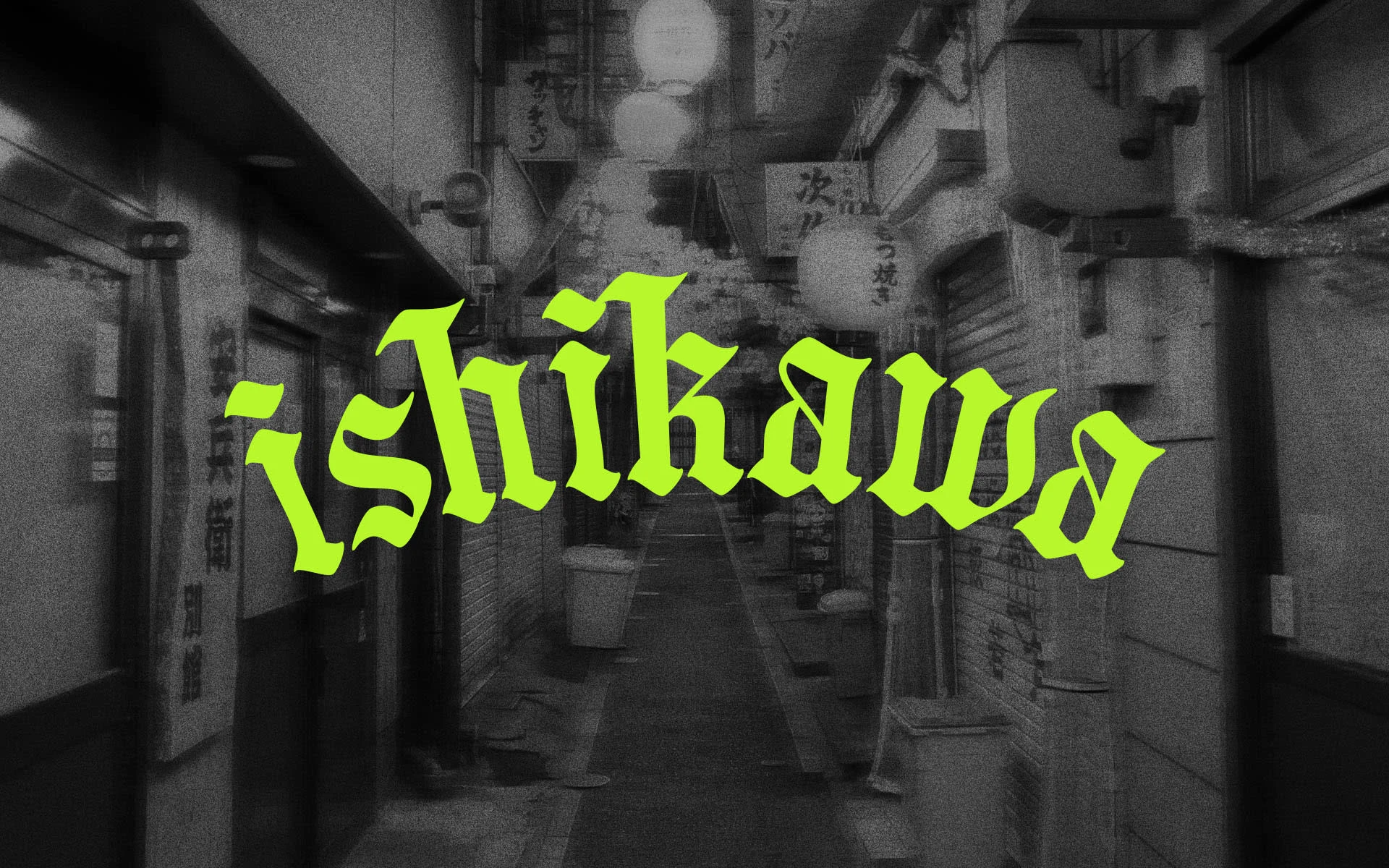
Logo design
The imagery style was also based on a high contrast between the choice of pictures that spreads intensity & energy VS calm tones (light blue here). We also set imagery guidelines that would include a wide range of women.
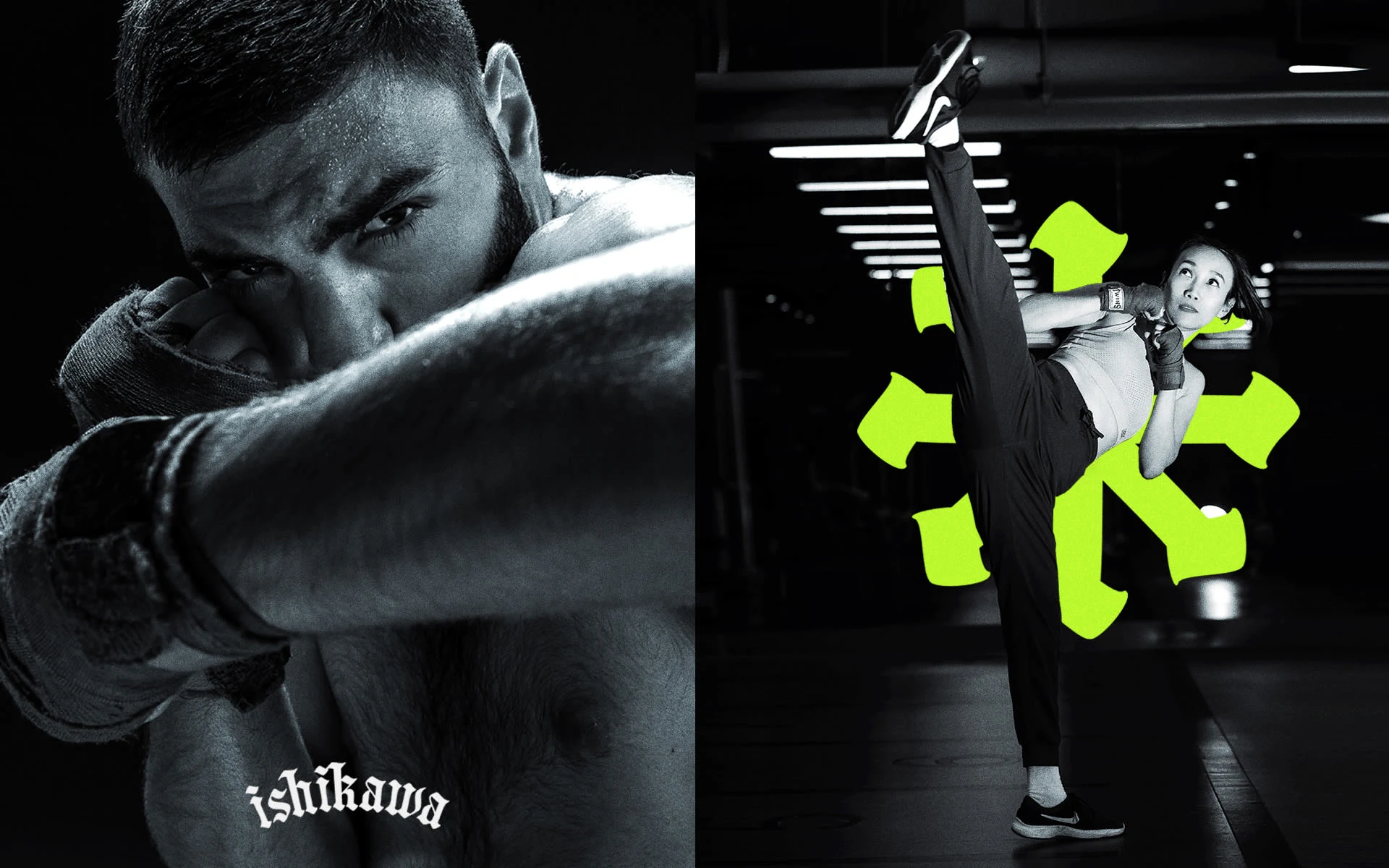
Brand imagery
The contrast between intensity & modered energies, look and feels are what would make the boxing club more approachable & more appealing to women.
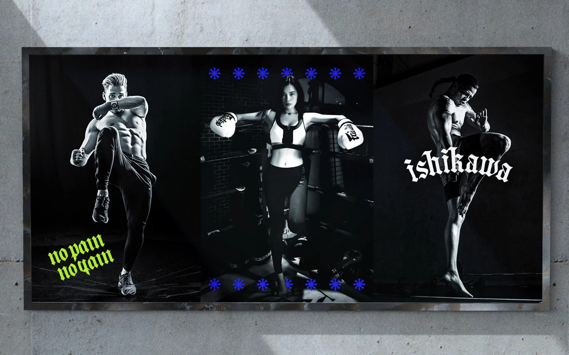
Posters
Still with the objective of attracting the younger generation, we envisioned a future digital strategy for the brand. It wasn’t the focus for this project, so we only went with a set of stickers that could either be used digitally or be printed.
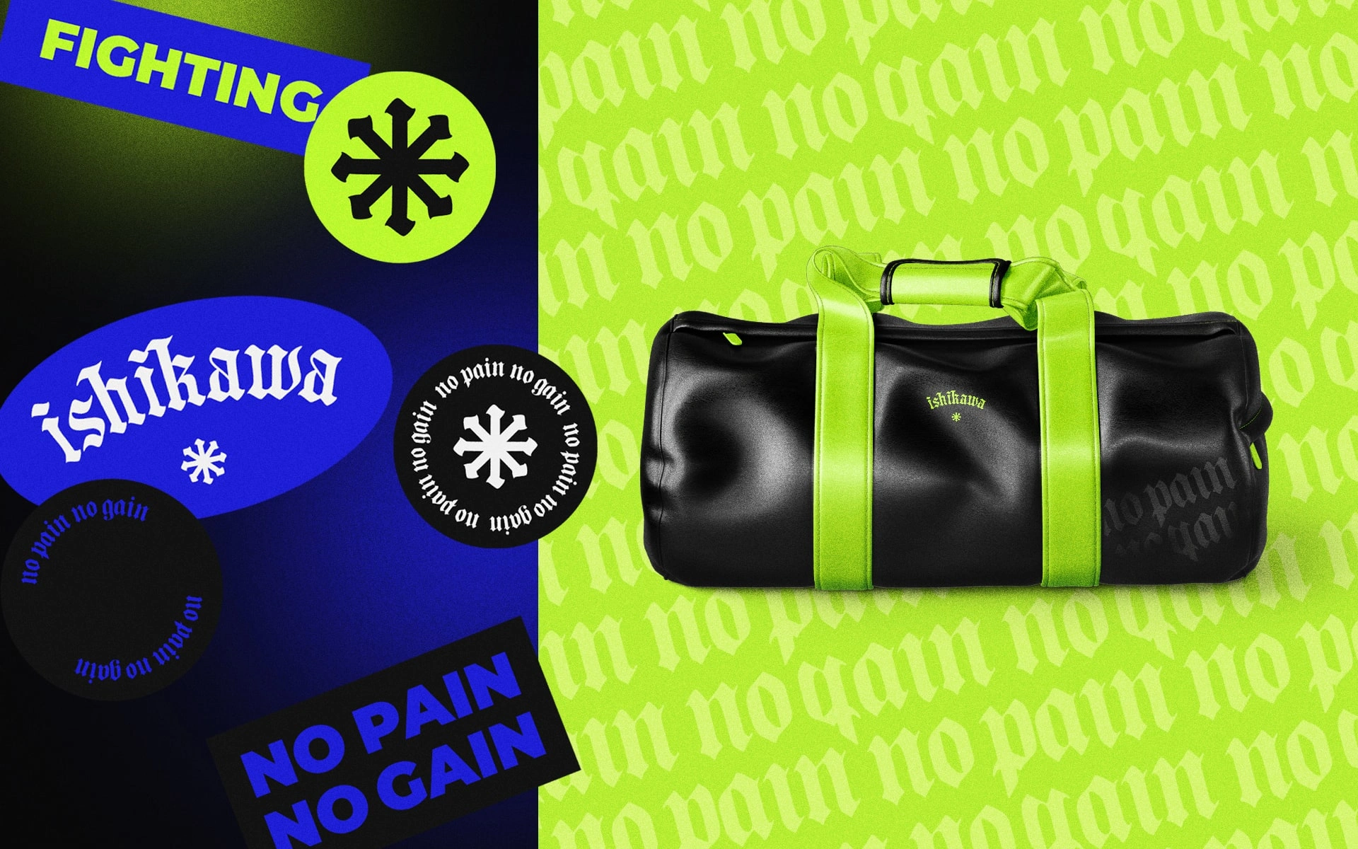
Brand stickers & mockup
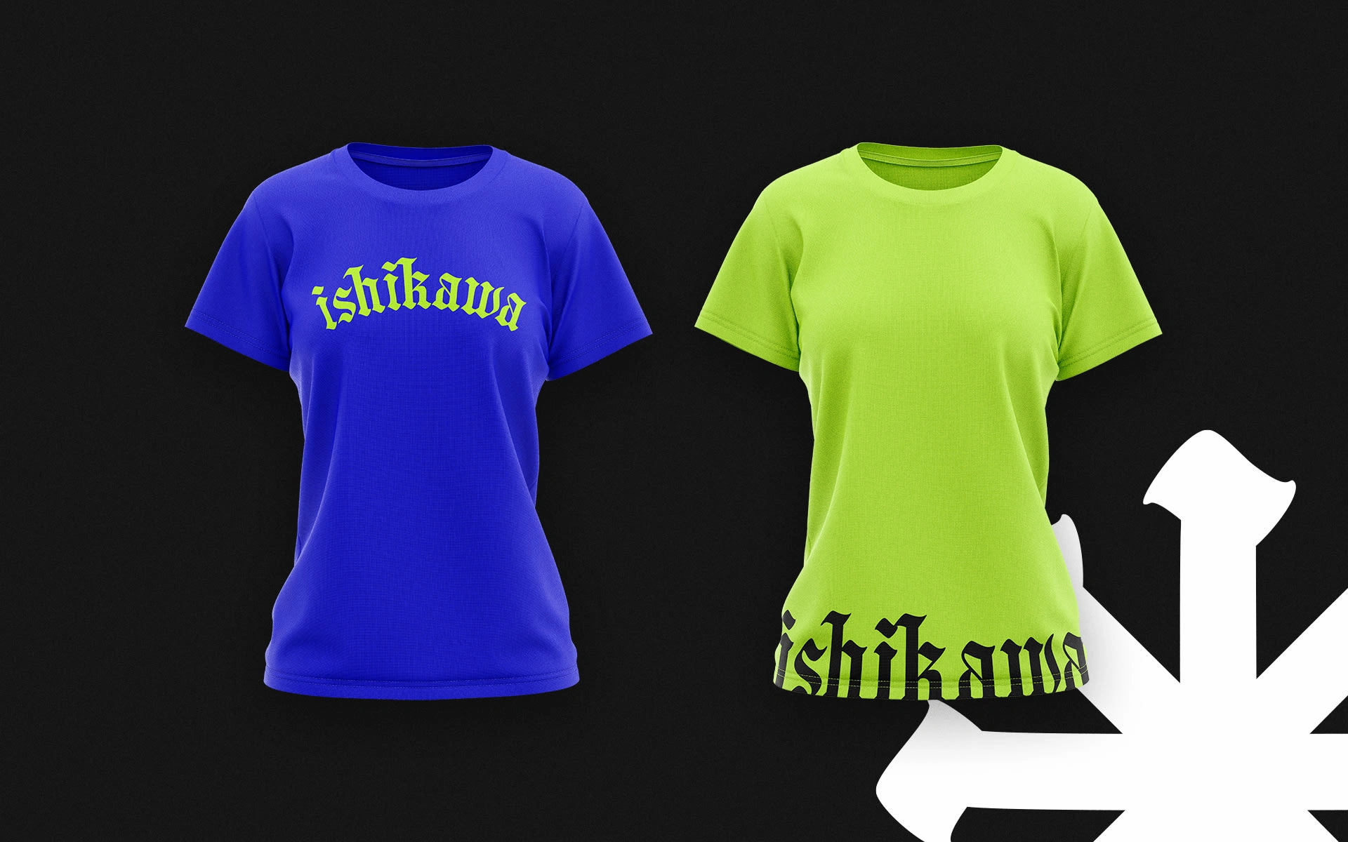
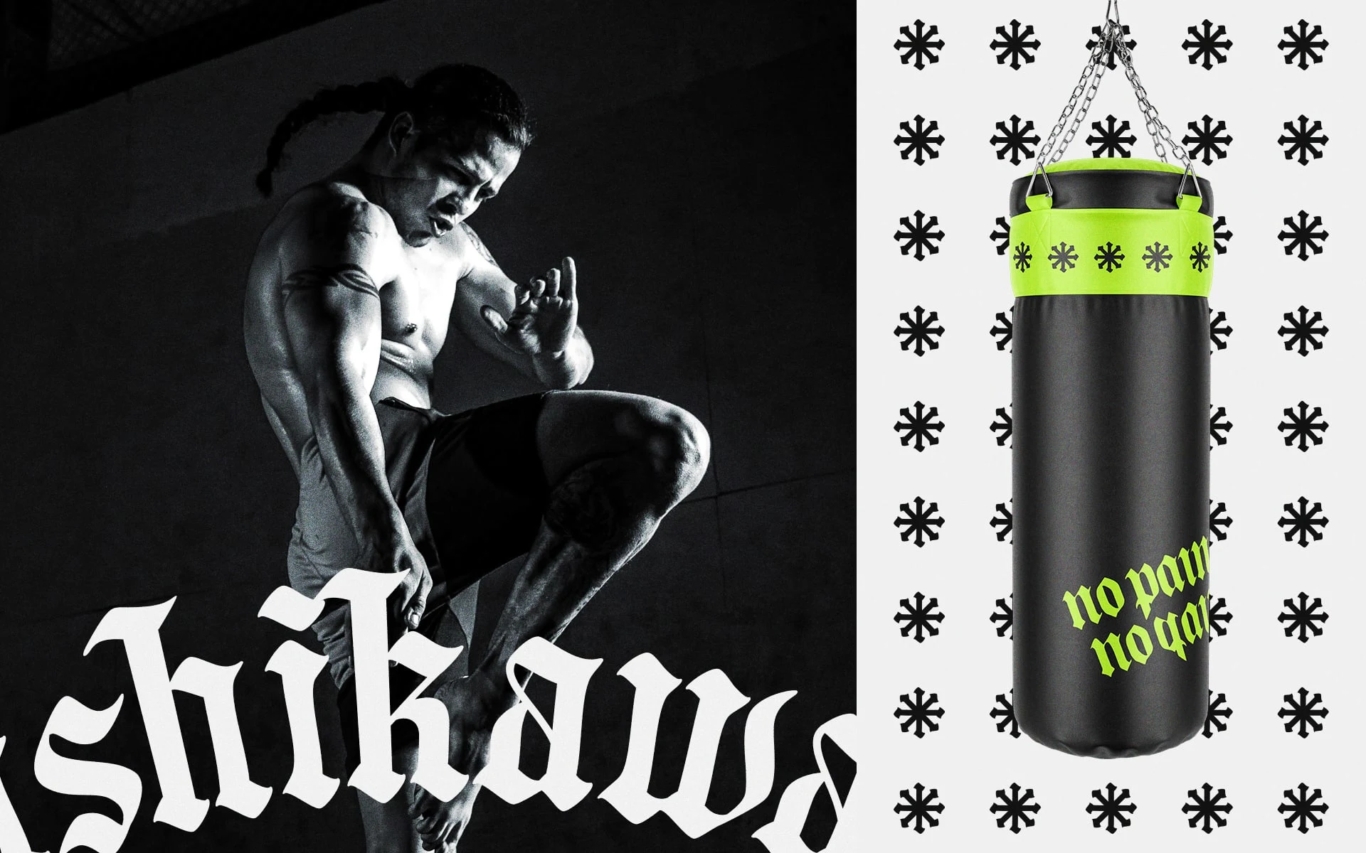
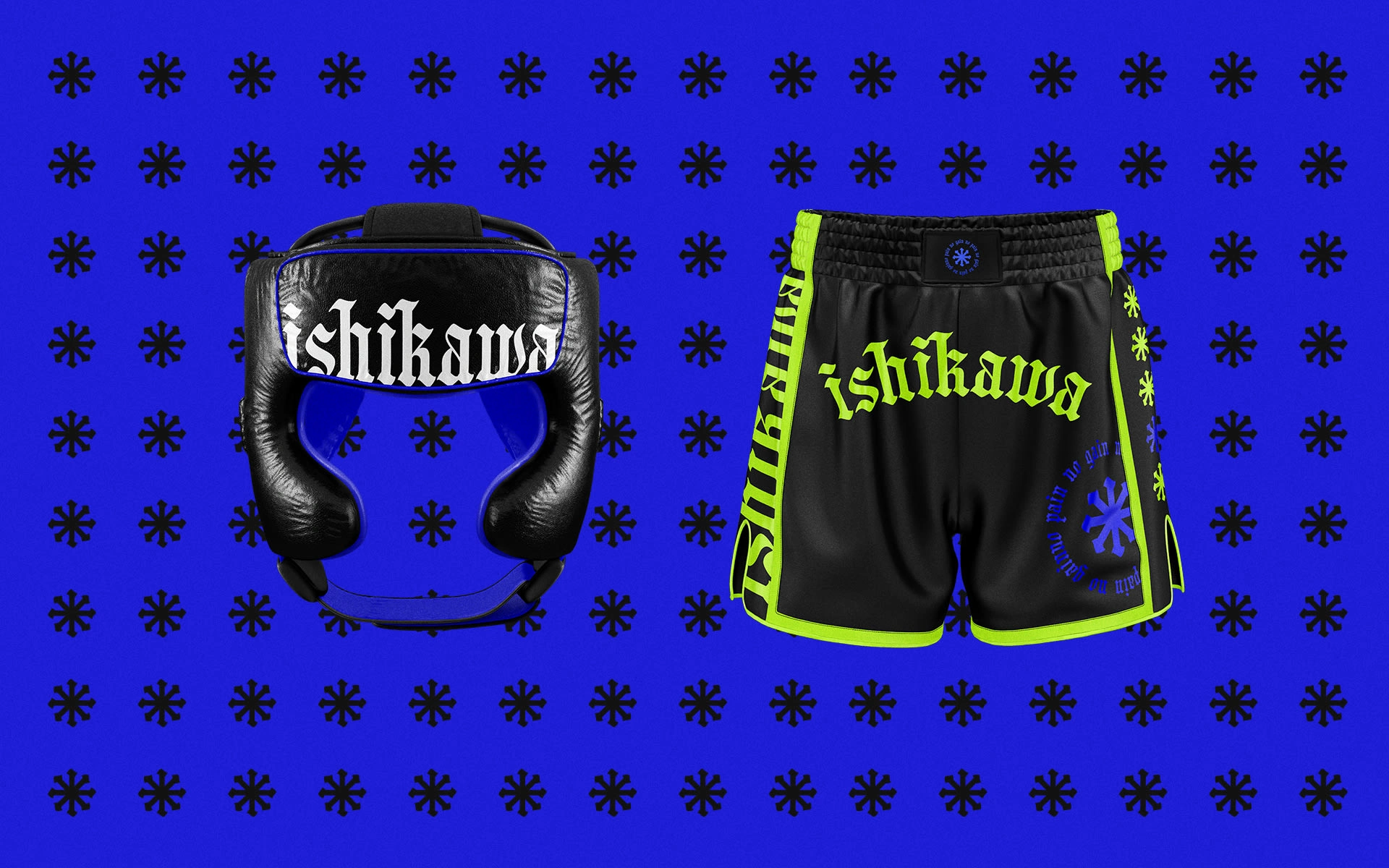
Brand merch
We also produced a few merch designs (bags, shirts, bottles) but I also added some branded equipment visuals to be able to picture how the band would look like in the future (gloves, fighting outfits, sandbag).
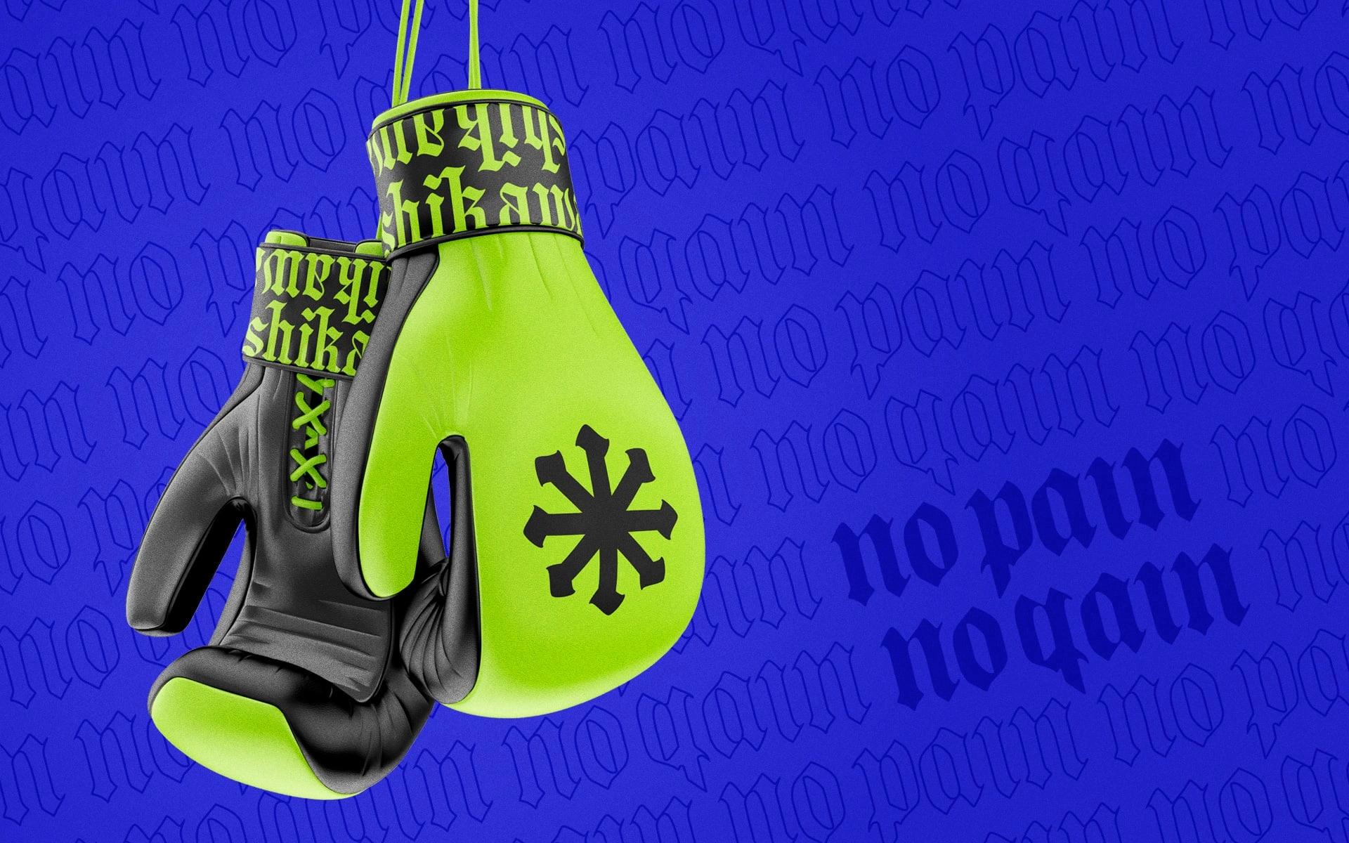
Brand visual
Brand visual & mockup
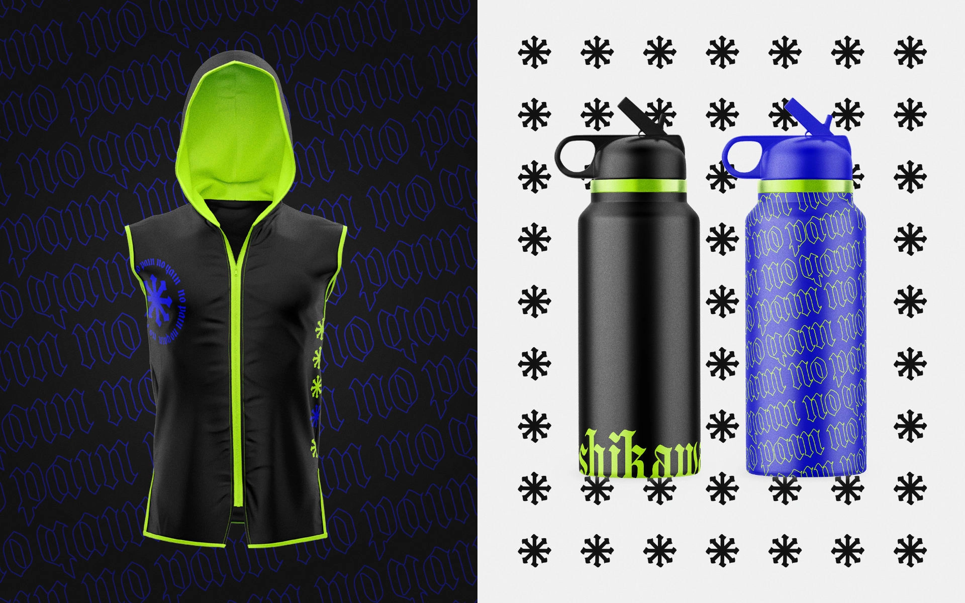
Brand outfit & merch
Brand outfit
Like this project
Posted Mar 9, 2022
A Japanese boxing club not like the others!🥊


![[Brand On Fire] Of Many Generaciones 🫶](https://media.contra.com/image/upload/c_fill,w_700/rowl4s3p30ijajhxbb9t.avif)
![[Brand On Fire] Love Killa 👙](https://media.contra.com/image/upload/c_fill,w_700/fxyya5g4kusoskvg5lw4.avif)
![[Brand Blast] Wally's NFT👾](https://media.contra.com/image/upload/c_fill,w_700/oshyst23mwlhgv944de6.avif)