Astrogears – A Futuristic Design Agency Identity
Chris Herrmann
Driven by Innovation, Fueled by Imagination.
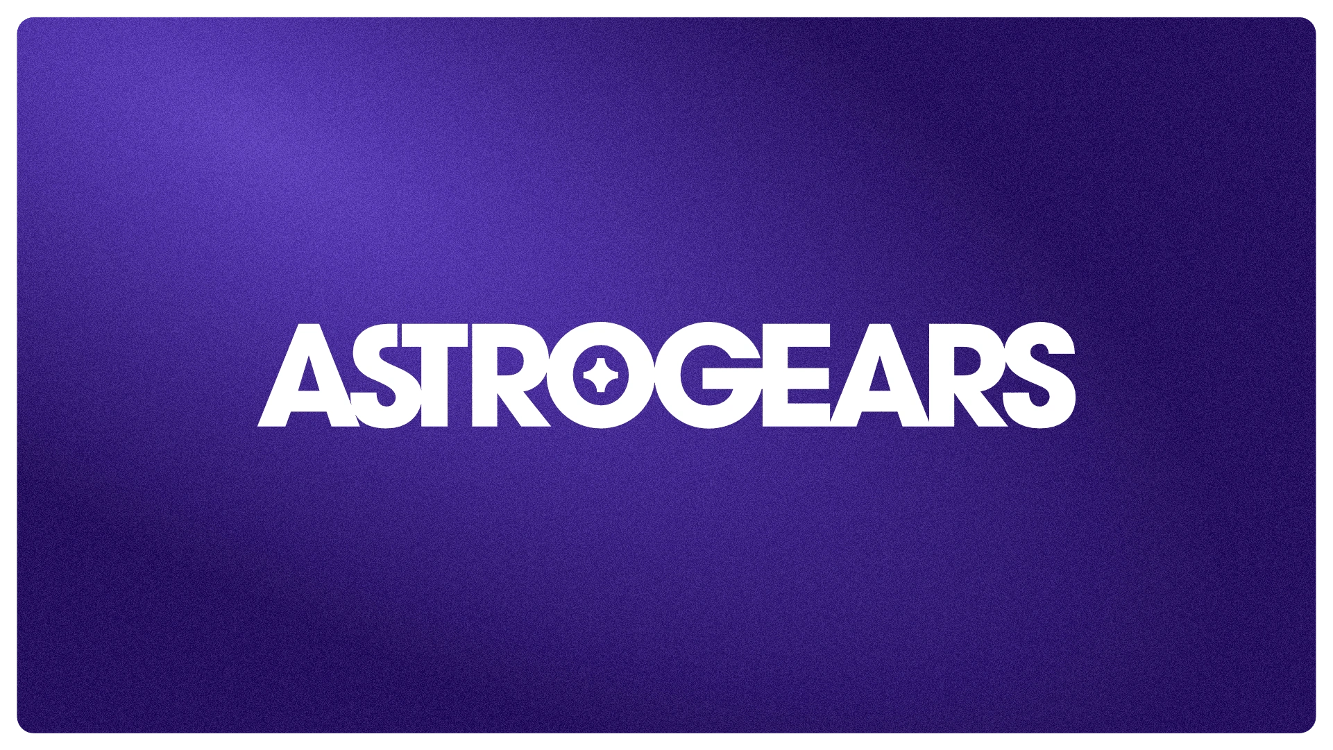
White logo on dark purple background
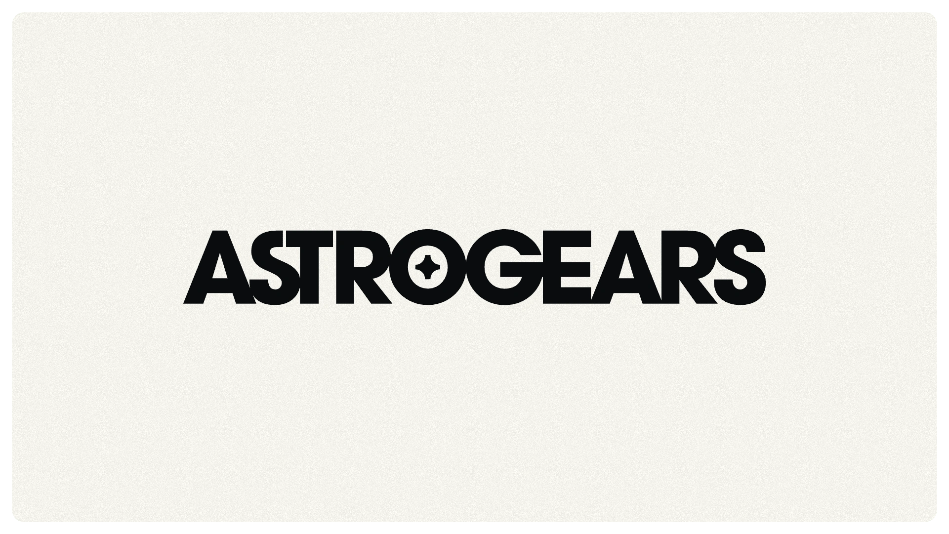
Dark logo on light background
Blending Sci-Fi with Art Nouveau Elegance
The Astrogears identity was born from a fusion of sci-fi aesthetics with an Art Nouveau twist. The goal was to create a logo that feels futuristic yet grounded, sleek yet hard-working—something that embodies movement, ambition, and a touch of the unknown.
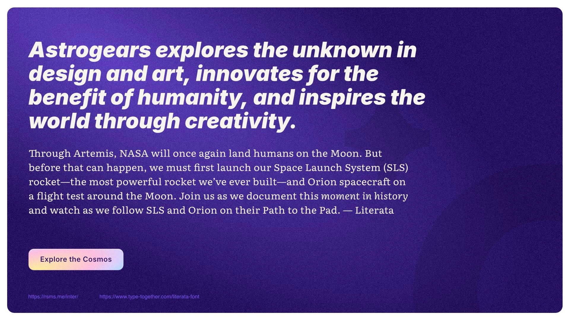
Example copy from NASA
Typography
The pairing of Inter (a modern sans-serif) and Literata (a sophisticated serif) aligns beautifully with Astrogears’ unique brand identity—one foot in the future, the other grounded in timeless elegance. They reflect Astrogears’ essence: bold, innovative, and built to inspire.
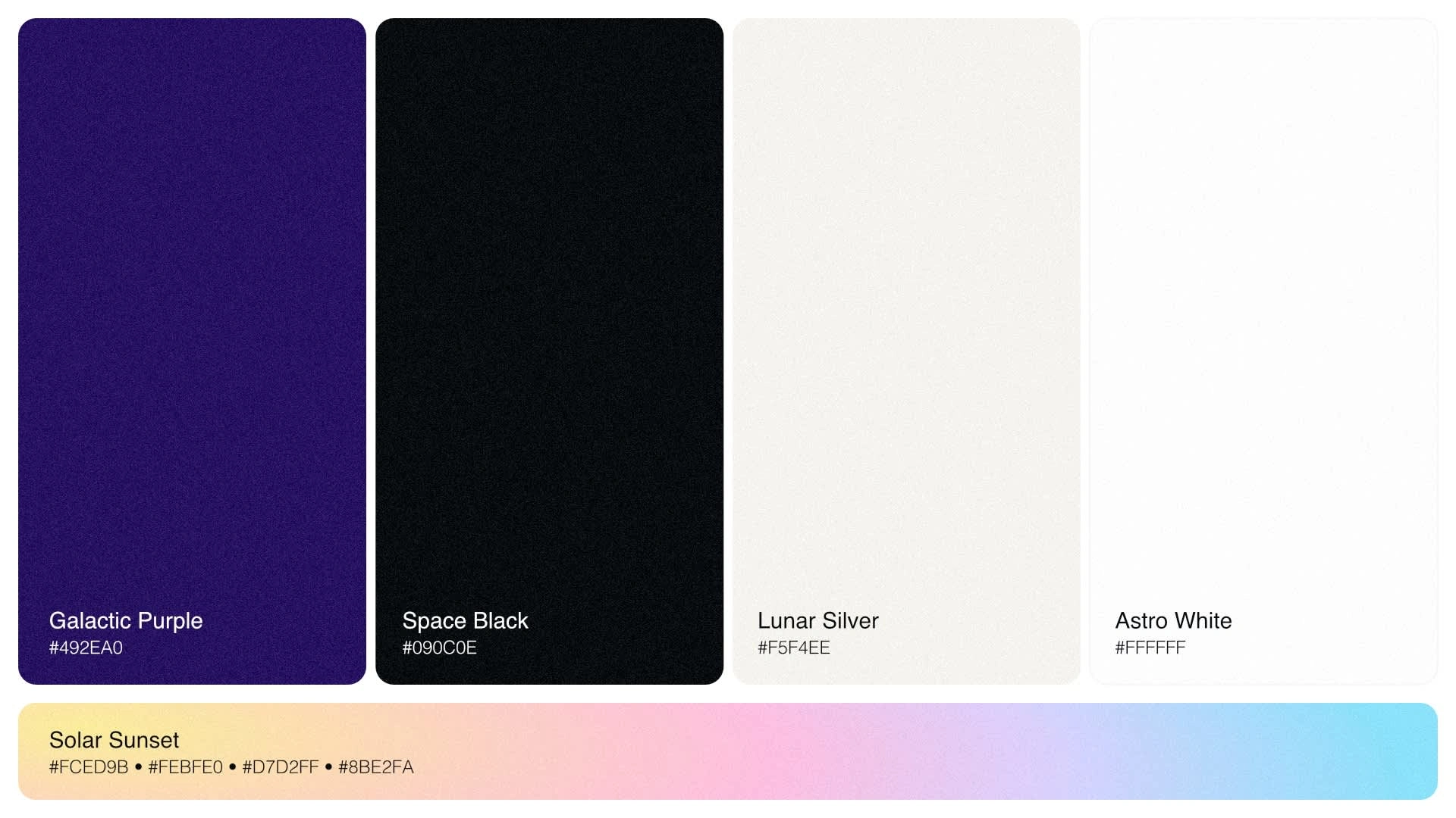
A rich, cosmic hue that evokes mystery, depth, and futuristic ambition. A Neon-Infused gradient accent.
Color
Astrogears' color choices balance deep, grounded tones with vibrant, futuristic energy, perfectly reflecting the brand’s fusion of cyberpunk sci-fi, Art Nouveau elegance, and a hard-working, forward-thinking mindset.
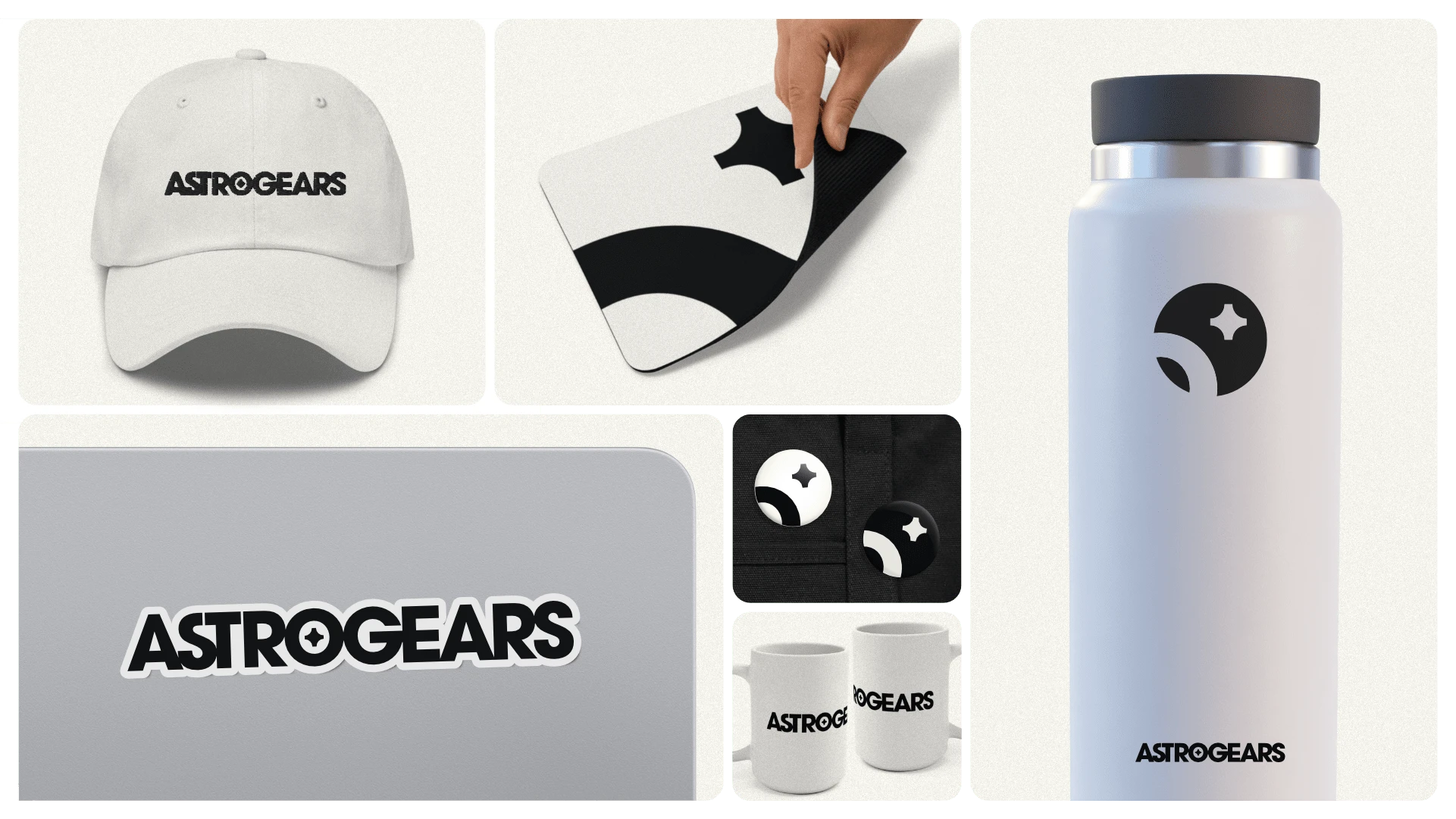
Merch mockups
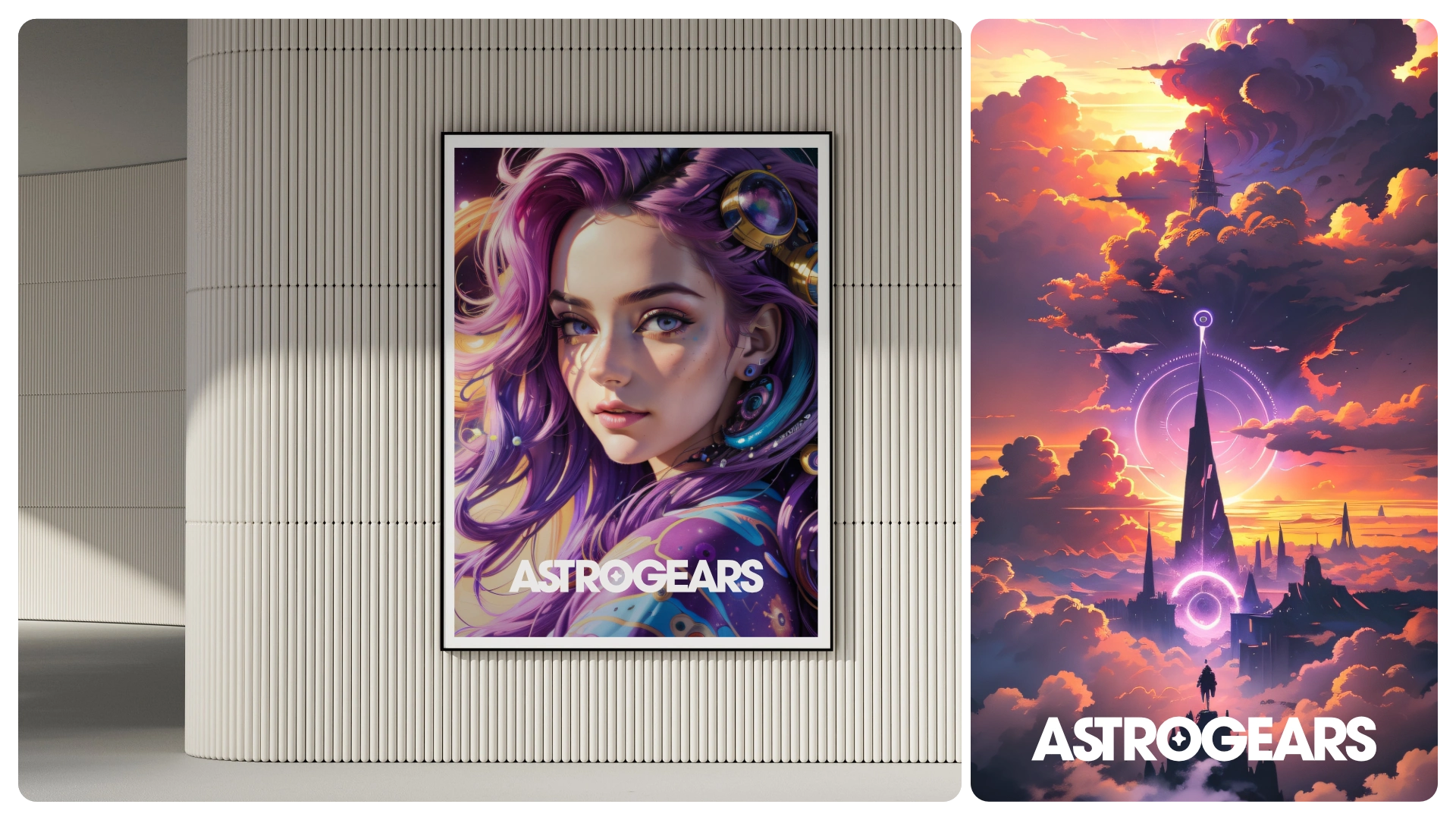
Inspirational poster mockups
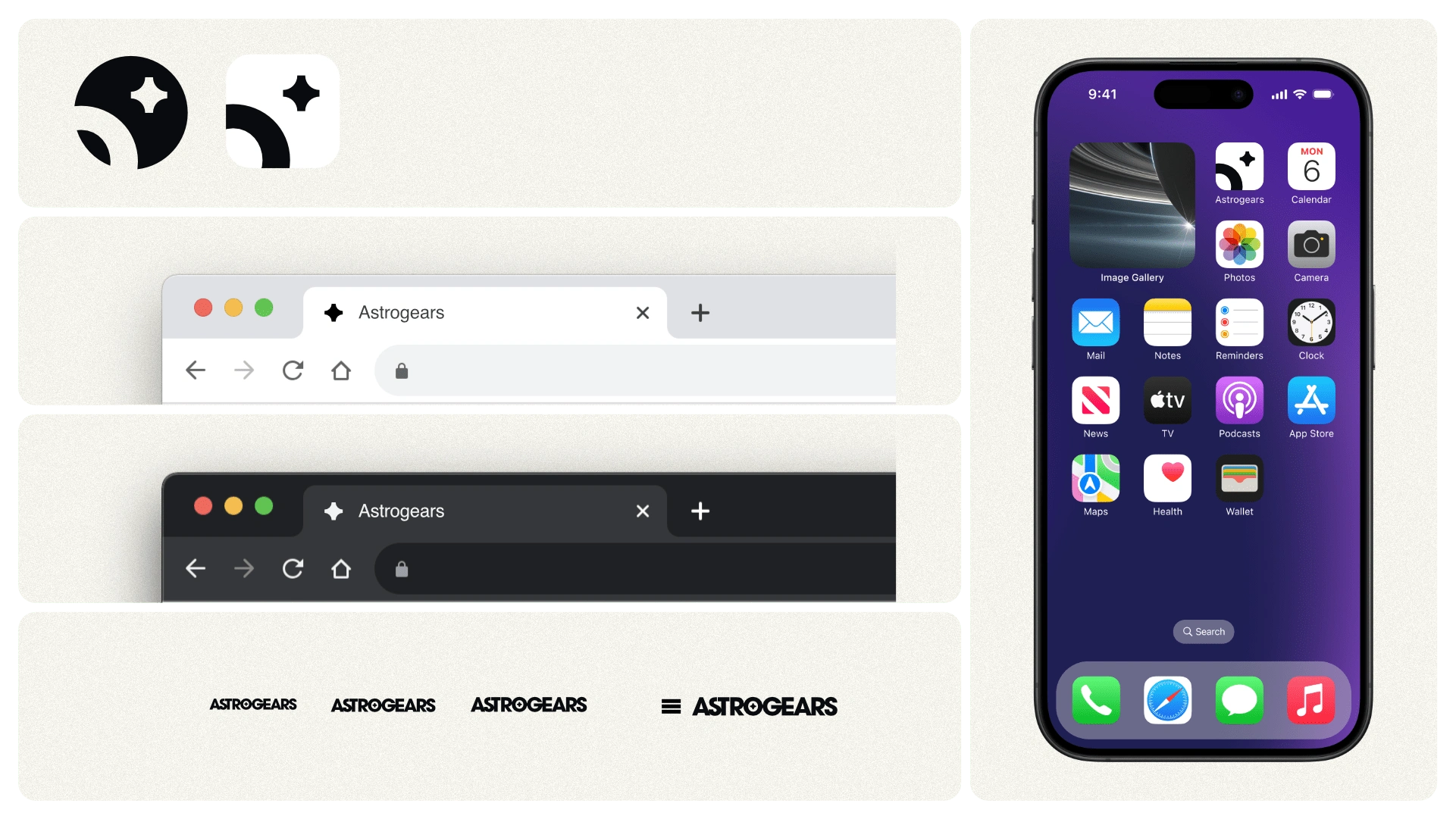
Smaller accent marks and app icons.
Owner & Creative Director: David Waggoner
c. 2024
Like this project
Posted Feb 12, 2025
Astrogears is a design agency blending sci-fi with Art Nouveau elegance, creating a bold, future-forward identity through logo, typography, and color.