Ray-Ban rebrand
Iris vD
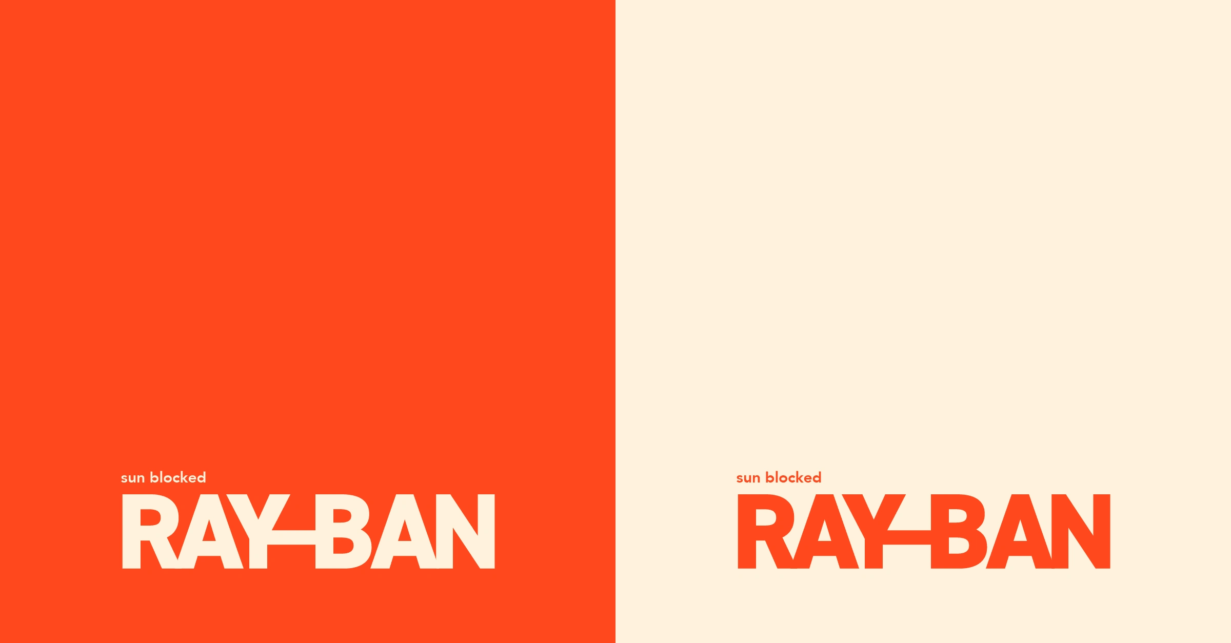
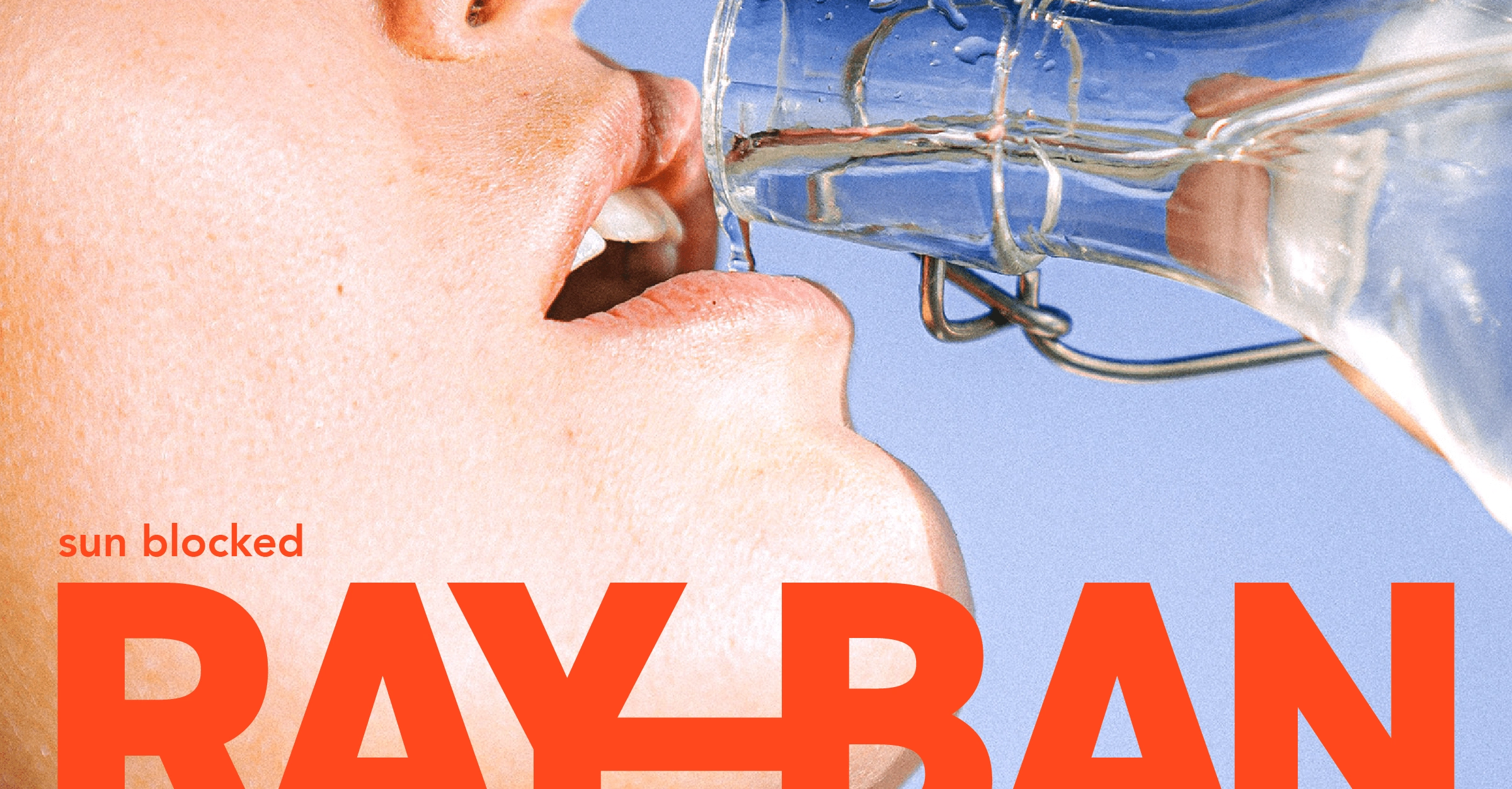
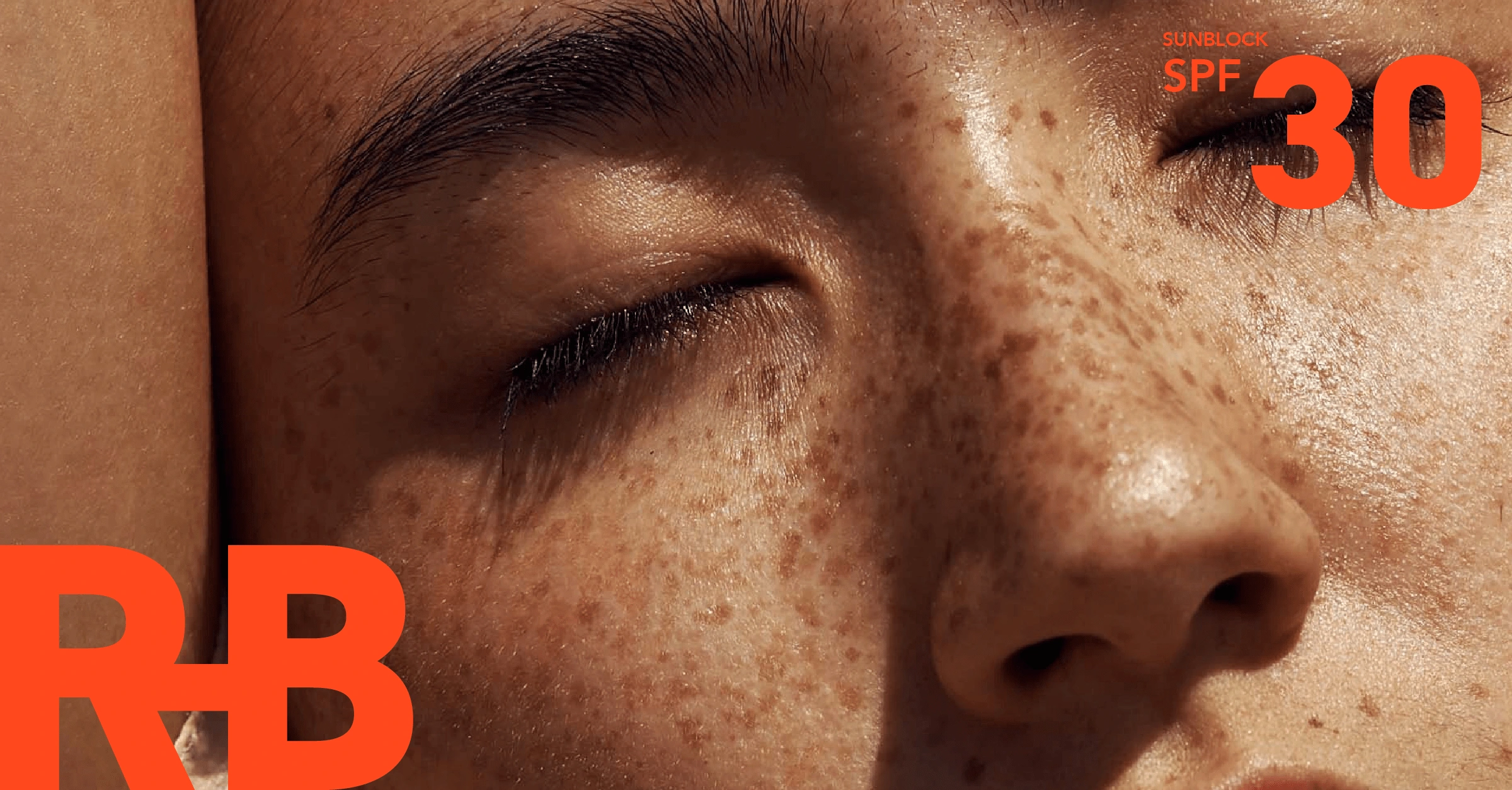
Ray-Ban as a sunblock brand instead of a sunglasses brand. Bold, daring, and functional, those were the key ideas behind this rebrand. The feeling of strong heat from the sun should be conveyed and felt right away.
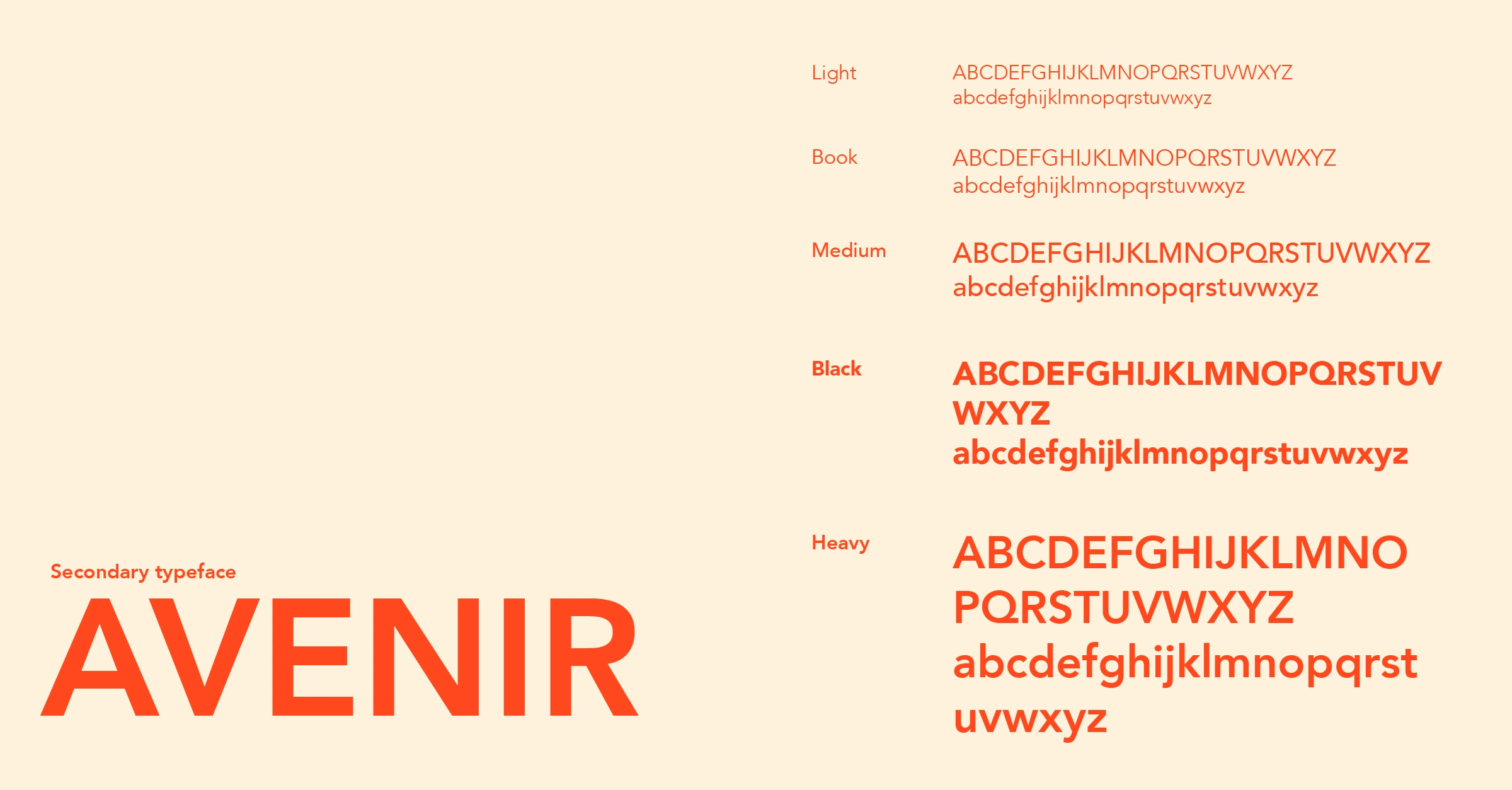
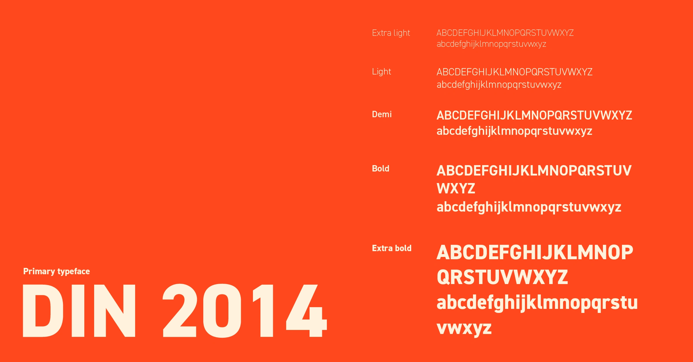
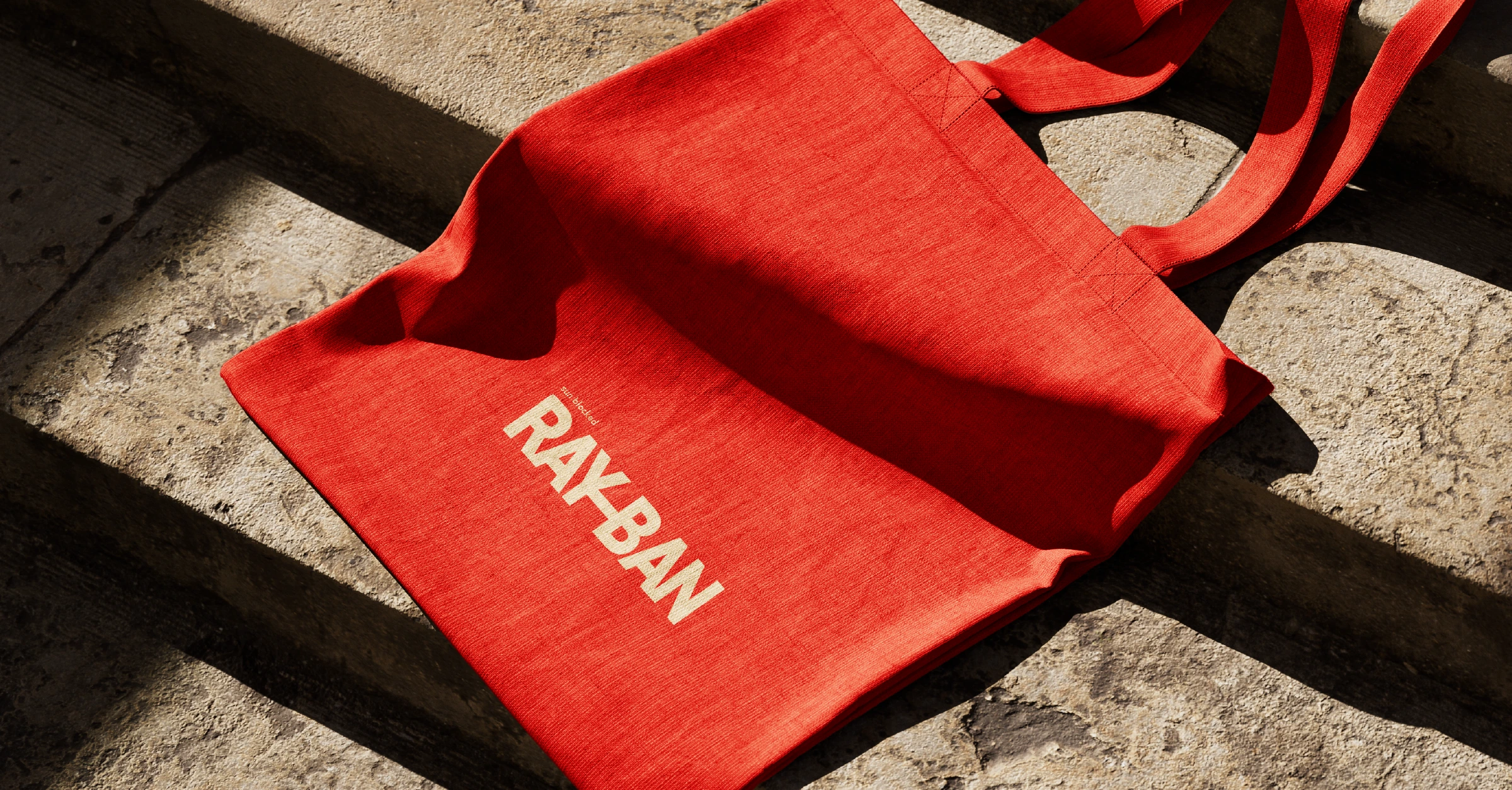
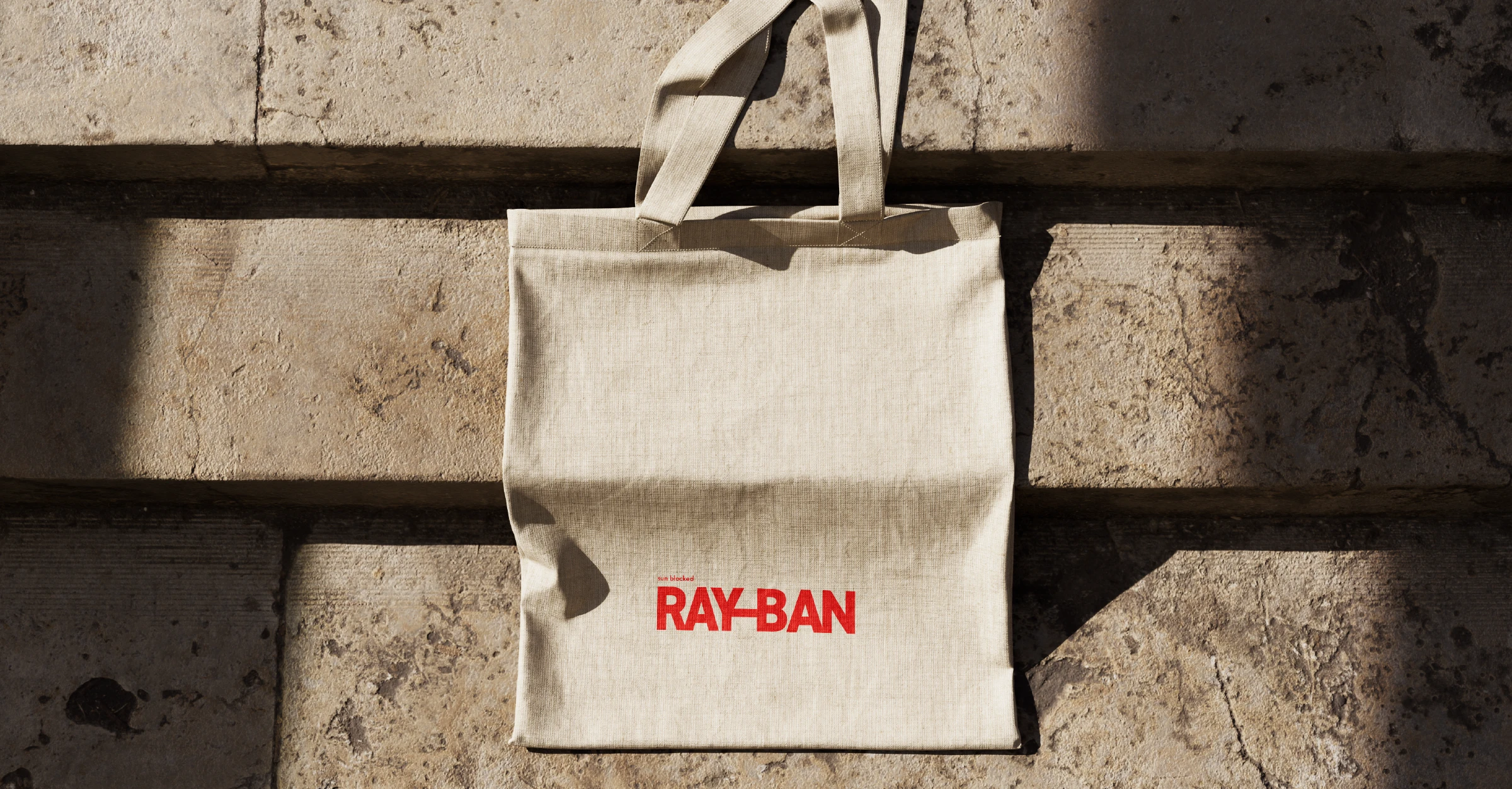
I was highly inspired by Vignelli's Hellerware for this. I chose for a bold typeface for the word mark that contrasts nicely with a soft circle hue for the brand visual. The colours reflect the heat from the sun and also provide a warm, summery feeling to the brand.
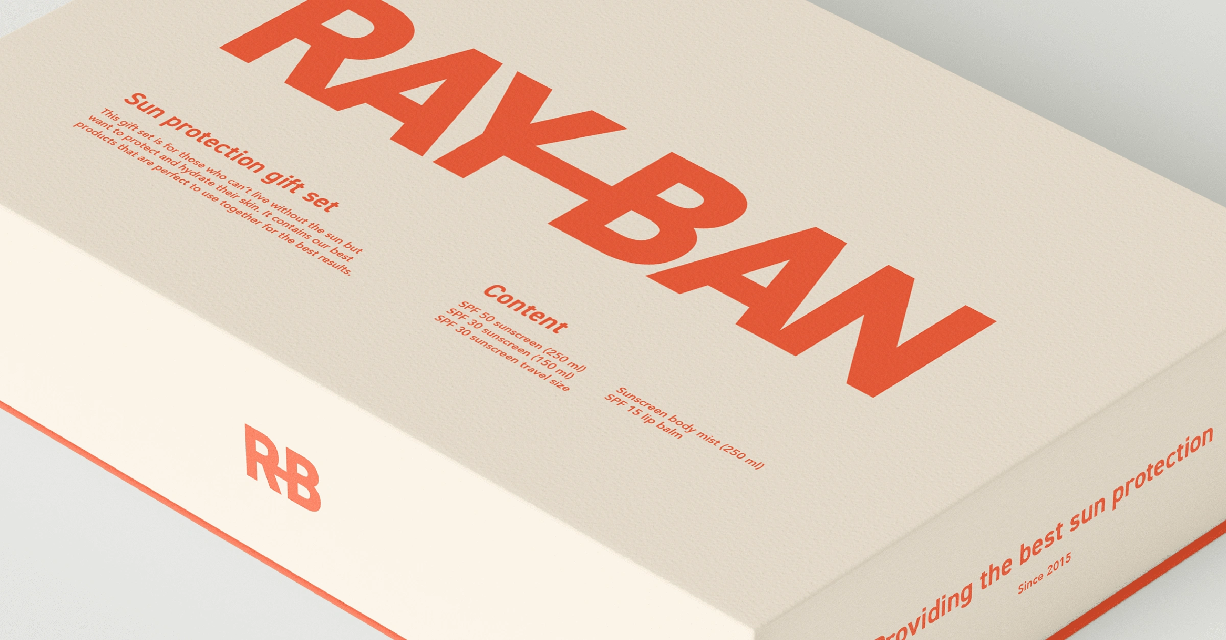
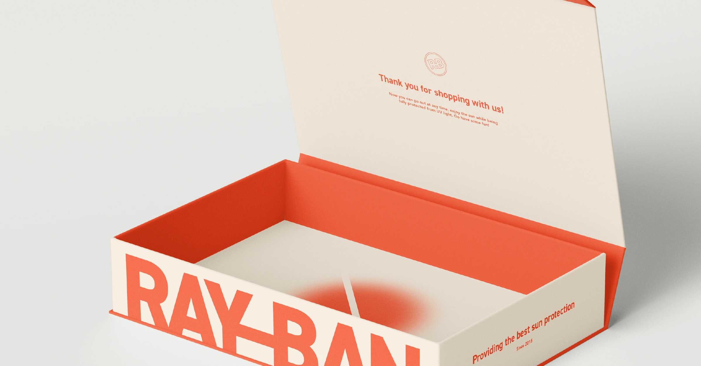
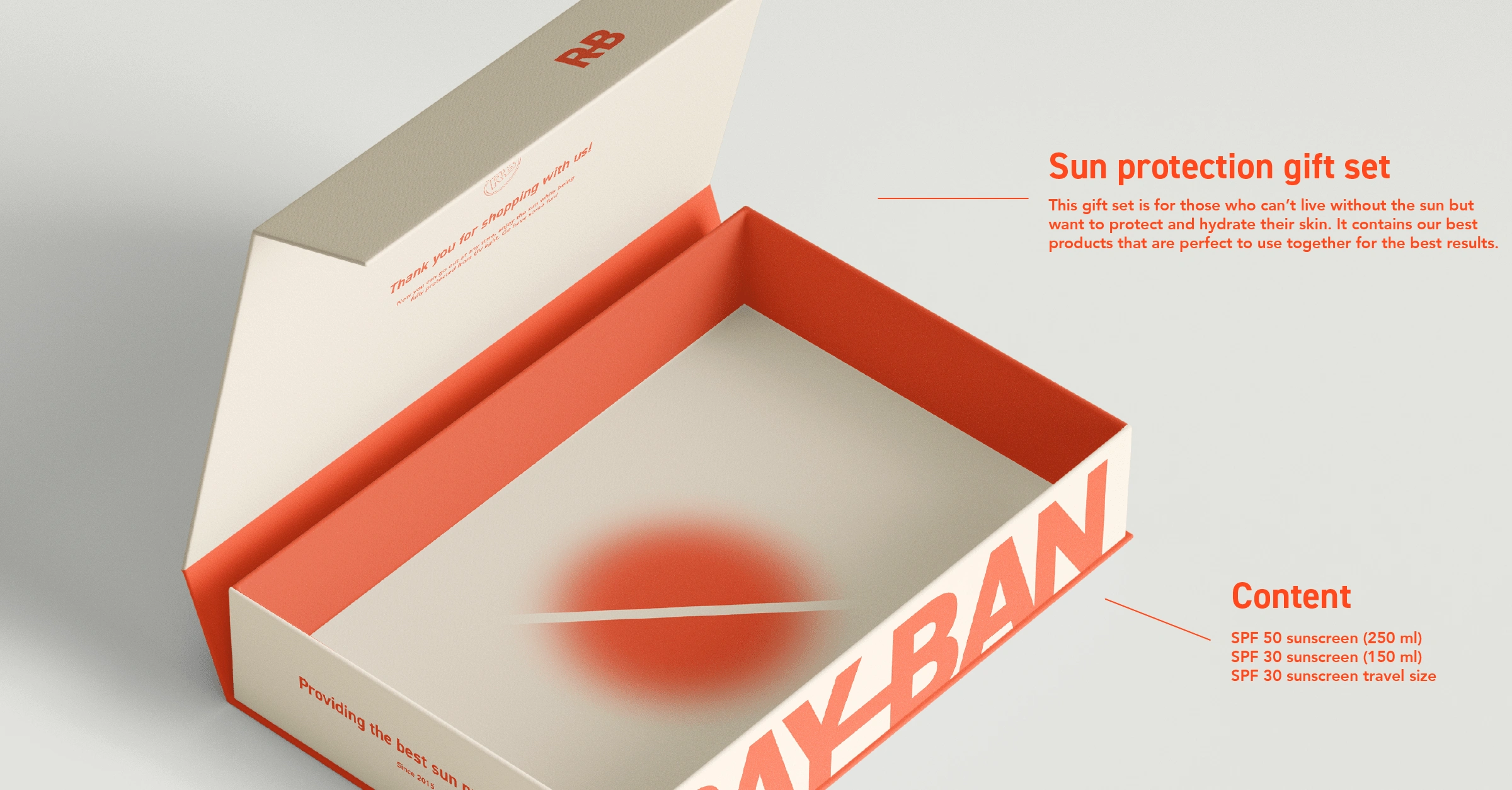
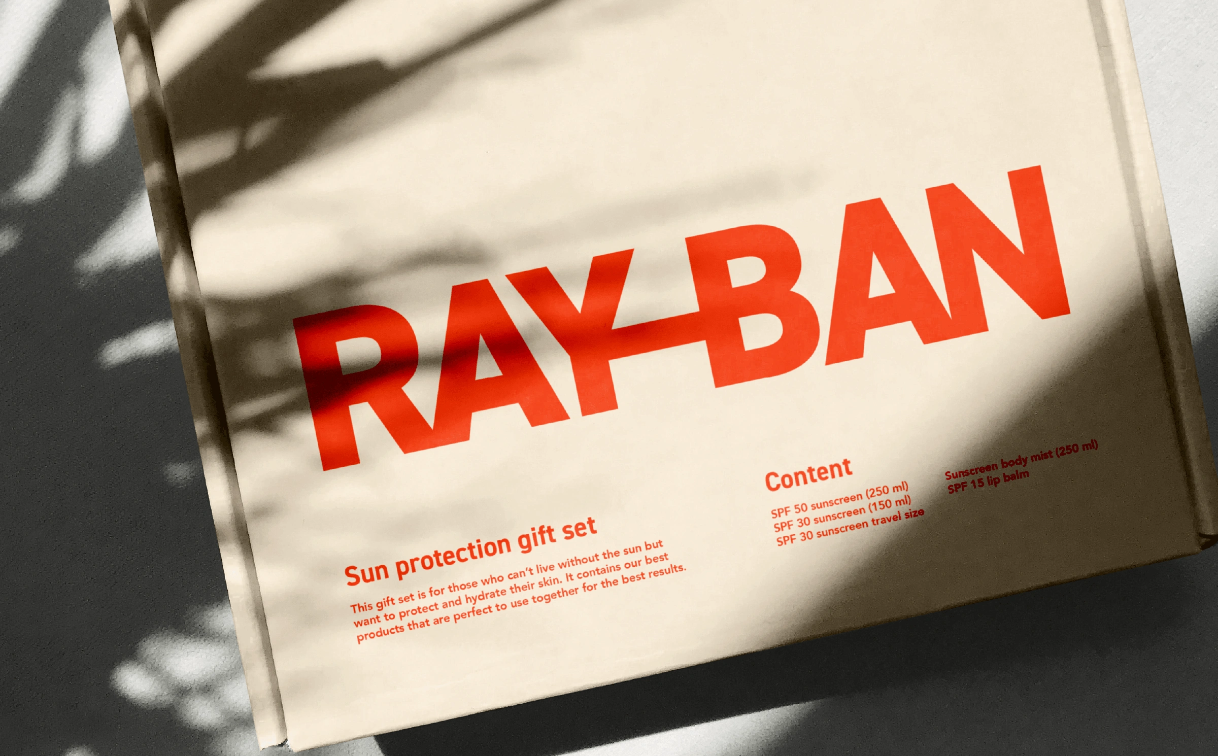
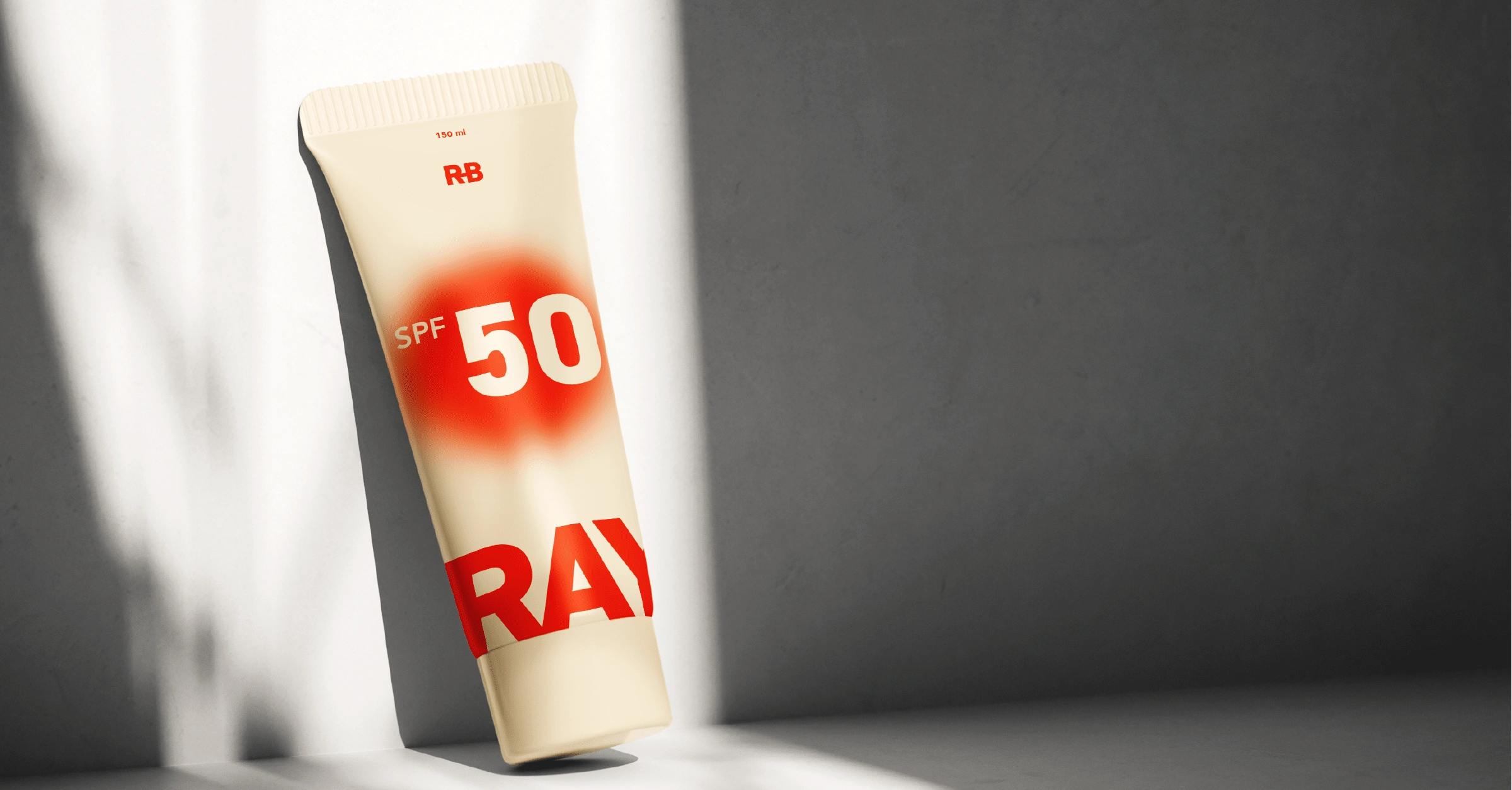
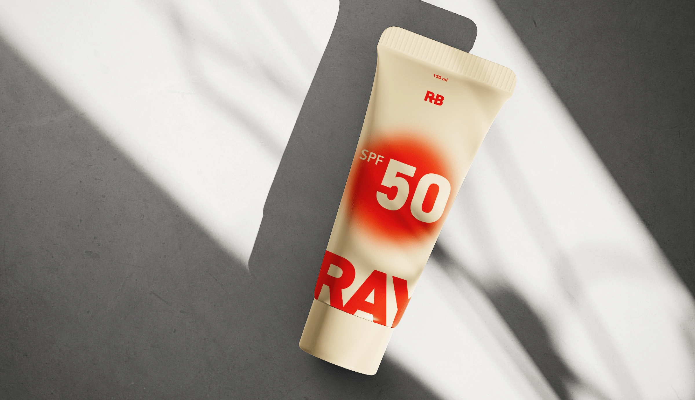
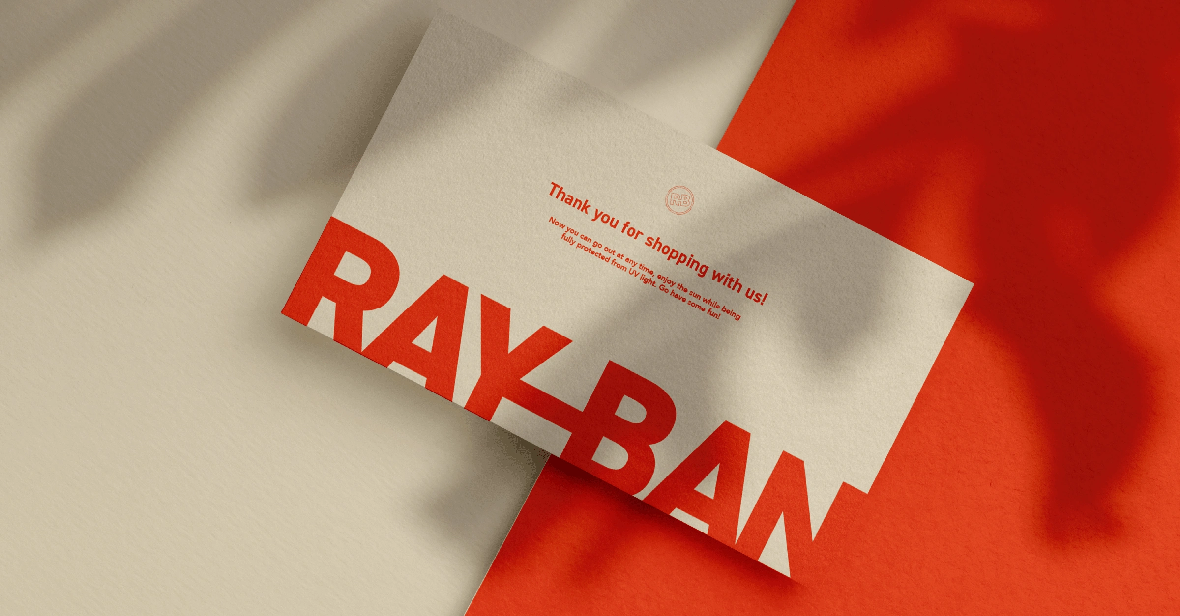
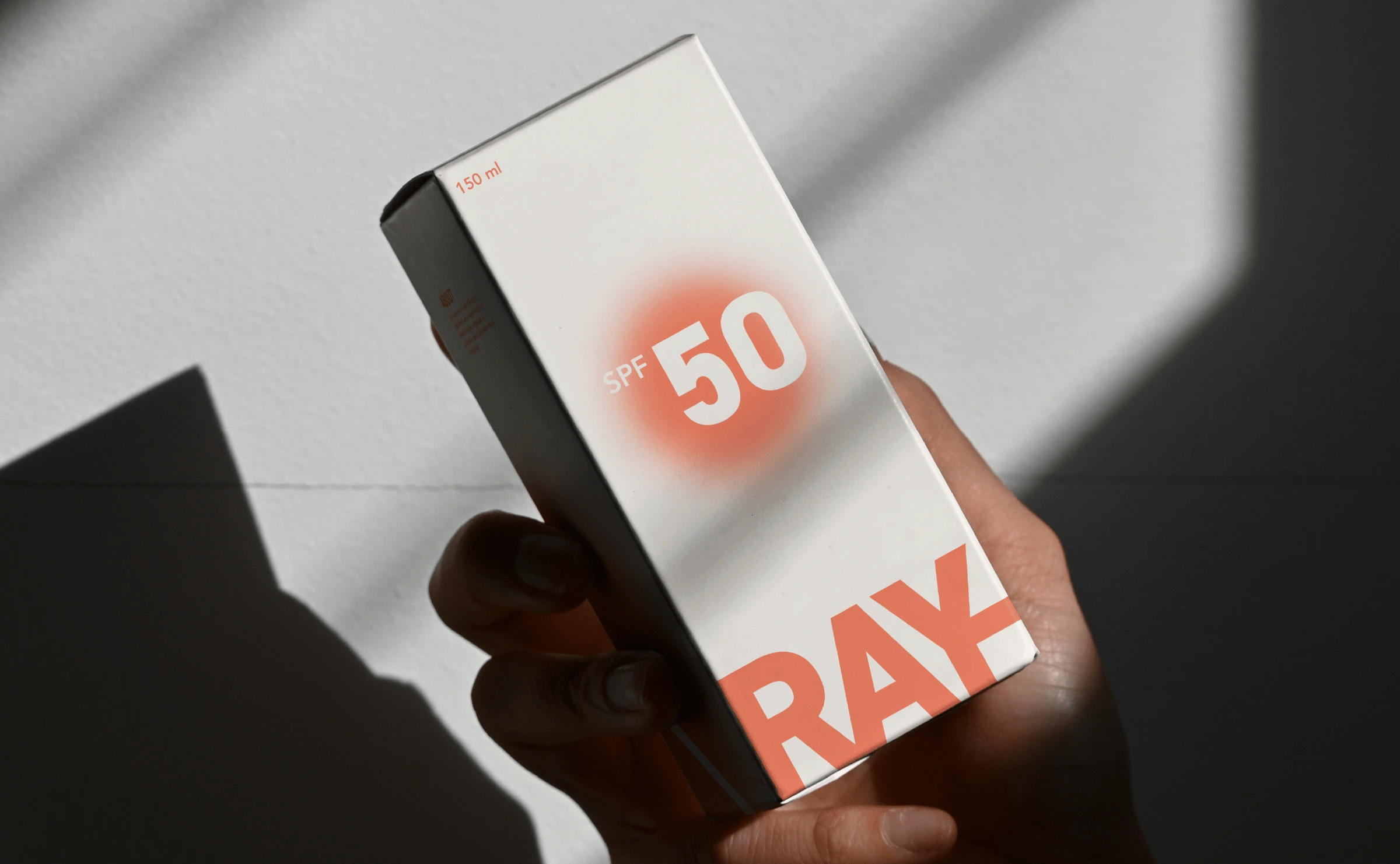
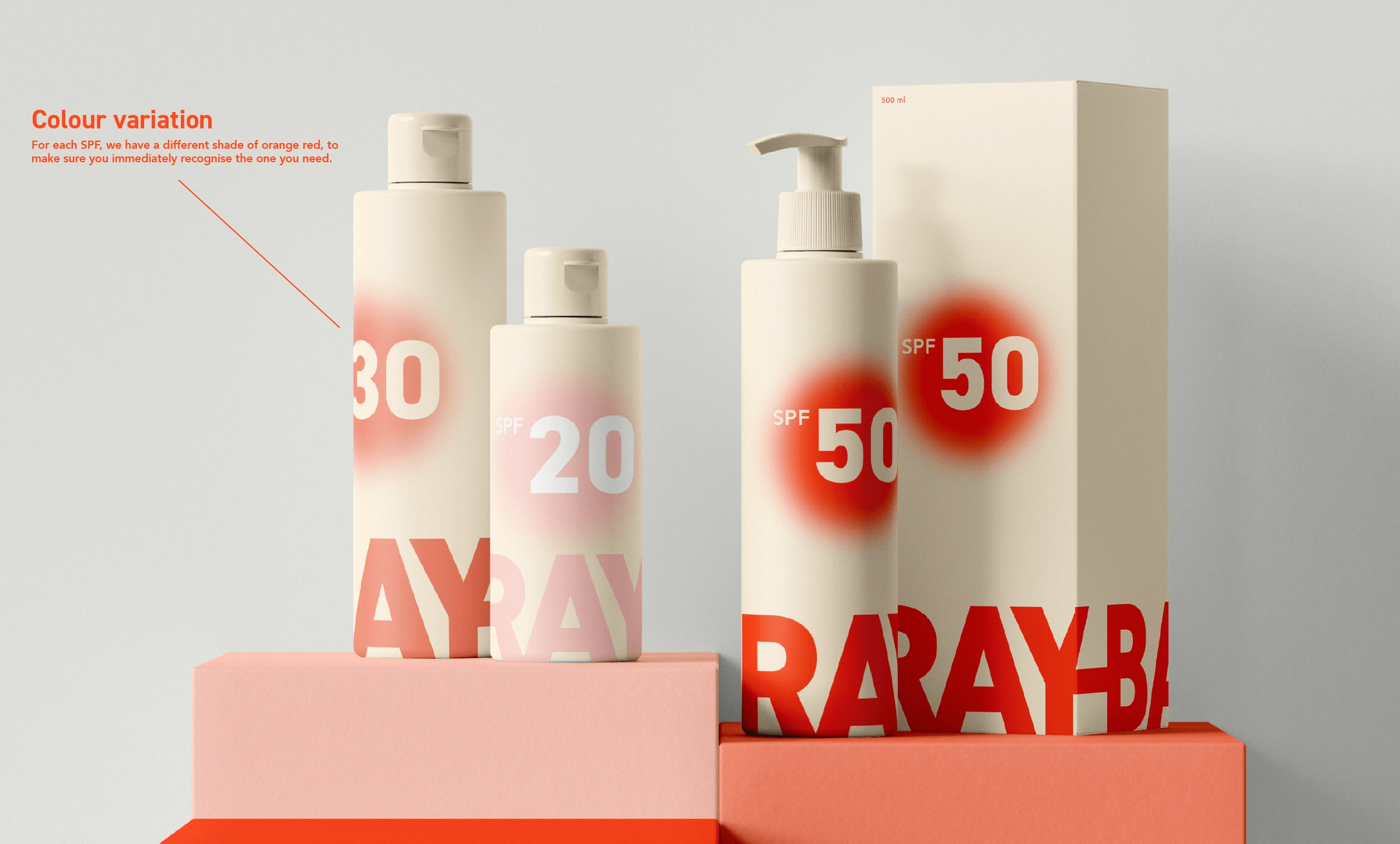
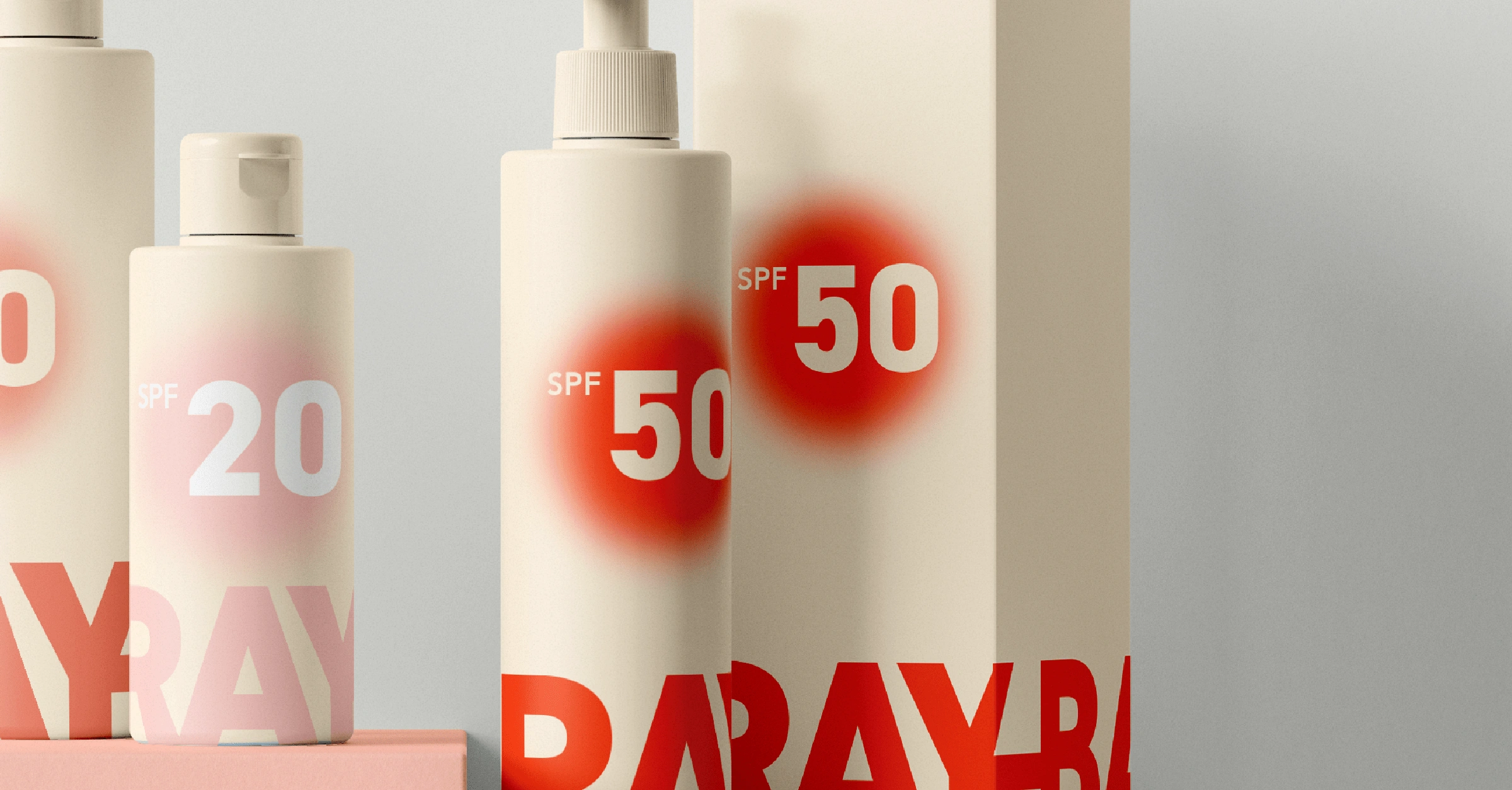
The reason why I chose these colours is because it makes the brand super recognisable at a glance. If anyone sees the orange / red in a store on a billboard, you will know right away that it's Ray-Ban sunblock.
Like this project
Posted Jun 5, 2023
Ray-Ban as a sunblock brand instead of a sunglasses brand. A bold, daring rebrand of the iconic sunglasses brand.